Special Occasion Libation

WEE DRAM | 8 x 6” | Oil on Board

As you well know about my artwork, I like to bounce around with subject matter and styles. This week’s work is a return to still life that I can relate to, namely a dram of whisky, in this case The GlenAllachie from the Speyside area of Scotland.

The artwork style is influenced by the work of Neil Carroll, the whisky by Billy Walker (more on him later). What I like about his work is the realistic look of the glass as it’s affected by the drink, be it beer, whisky or a pile of strawberries. He’s masterful with reflections, glass sweat (don’t know if that’s a real thing, but sounds good to me), and other elements that give a sense of realism while maintaining a painterly look.

WEE DRAM is a nod to the best Scotch whisky I’ve ever tasted, The GlenAllachie distillery in Speyside just outside the town of Aberlour. My wife and I visited this fantastic distillery on a recent trip to Scotland and loved everything about their operation – the people, the idyllic location, and of course the whisky. They have something really special going on at this Speyside gem, with Master Distiller, Billy Walker. We came home with one of their finest offerings, a 2006 Single Cask limited edition for The Spirit of Speyside Whisky Festival 2022, which serves as our new “special occasion” libation. While the 2006 Single Cask is no longer available, it looks like they’ve done it again with a 2007 Oloroso Puncheon. Fantastic!

The challenges with this piece were largely in the balance of orange, red, and yellow that seem to shift and shine in the glass. One of those situations where the actual whisky looks a little fake when you really think about it – I mean where does that bright yellow sparkle come from?! I’ll have to try this again with a lighter background, allowing the whisky hues to be the star of the composition. I might need to go get another bottle from the GlenAllachie collection!

Hopefully you have a special occasion libation in your home. If not, go to The GlenAllachie have a dram of their magical elixir and bring home a bottle.

Cheers!
The Best Avocados Are New York Avocados

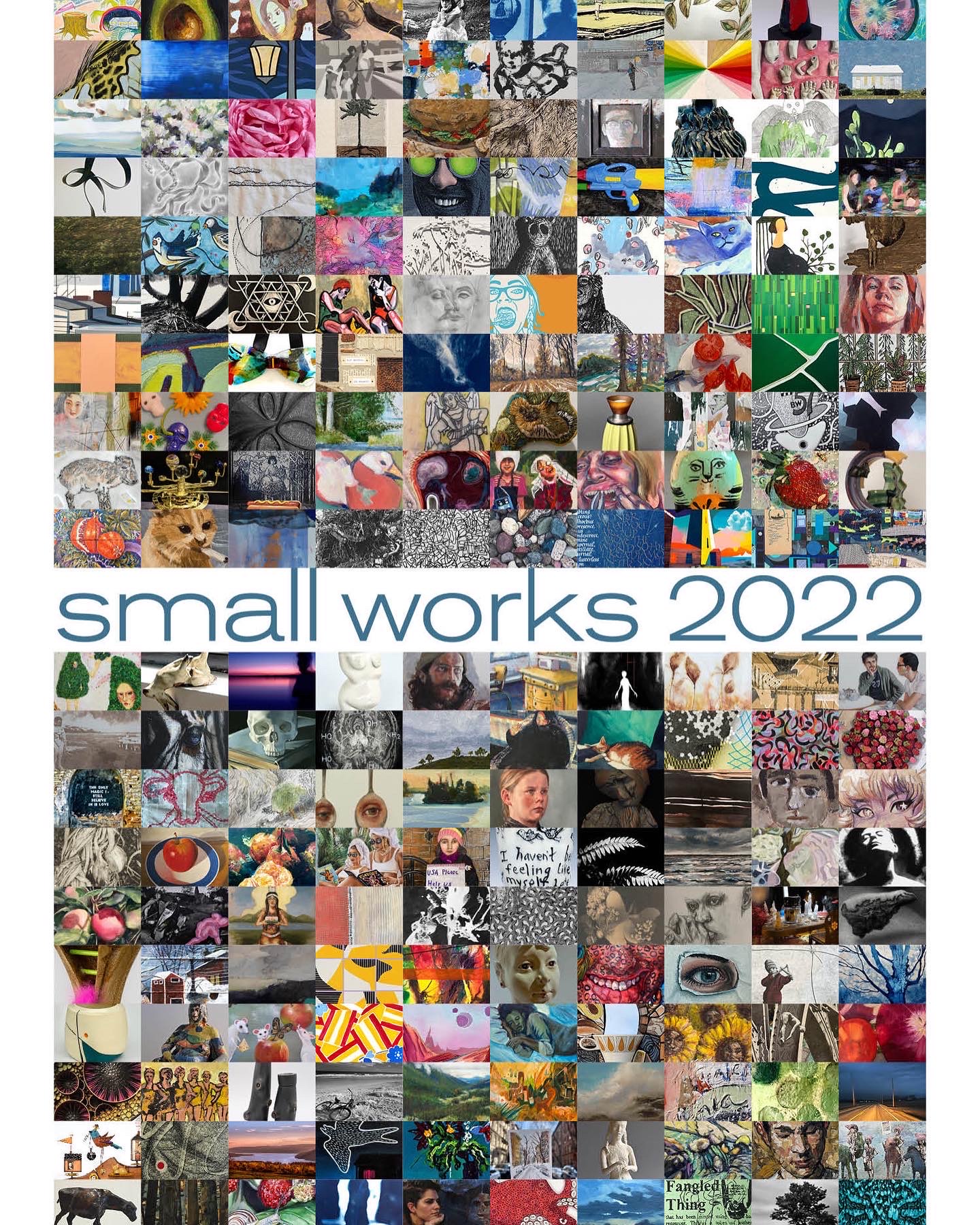
Pardon the vanity post, but I had to share the news that my avocado still life, “Just the Ripe Size,” has been selected for inclusion in a national juried show at Main Street Arts in Clifton Springs, New York. 

The show runs November 5 – December 23, 2022. See the Main Street Arts website for more pics and information www.MainStreetArtsCS.org. If you live in upstate NY you can attend the opening reception on November 5th – there will be wine and prizes. For the truly ambitious art enthusiasts, you can also make a purchase… or two. After all the show is full of smalls, so prices tend to be more tempting. 

Thanks for reading!


#artbern #berntx #crashboomzip #painting #art #abplanalp #austinartists #atxartist #atxart #oilpainting #fineart #mainstreetarts #avocado

Lighthouses and Lobster Rolls

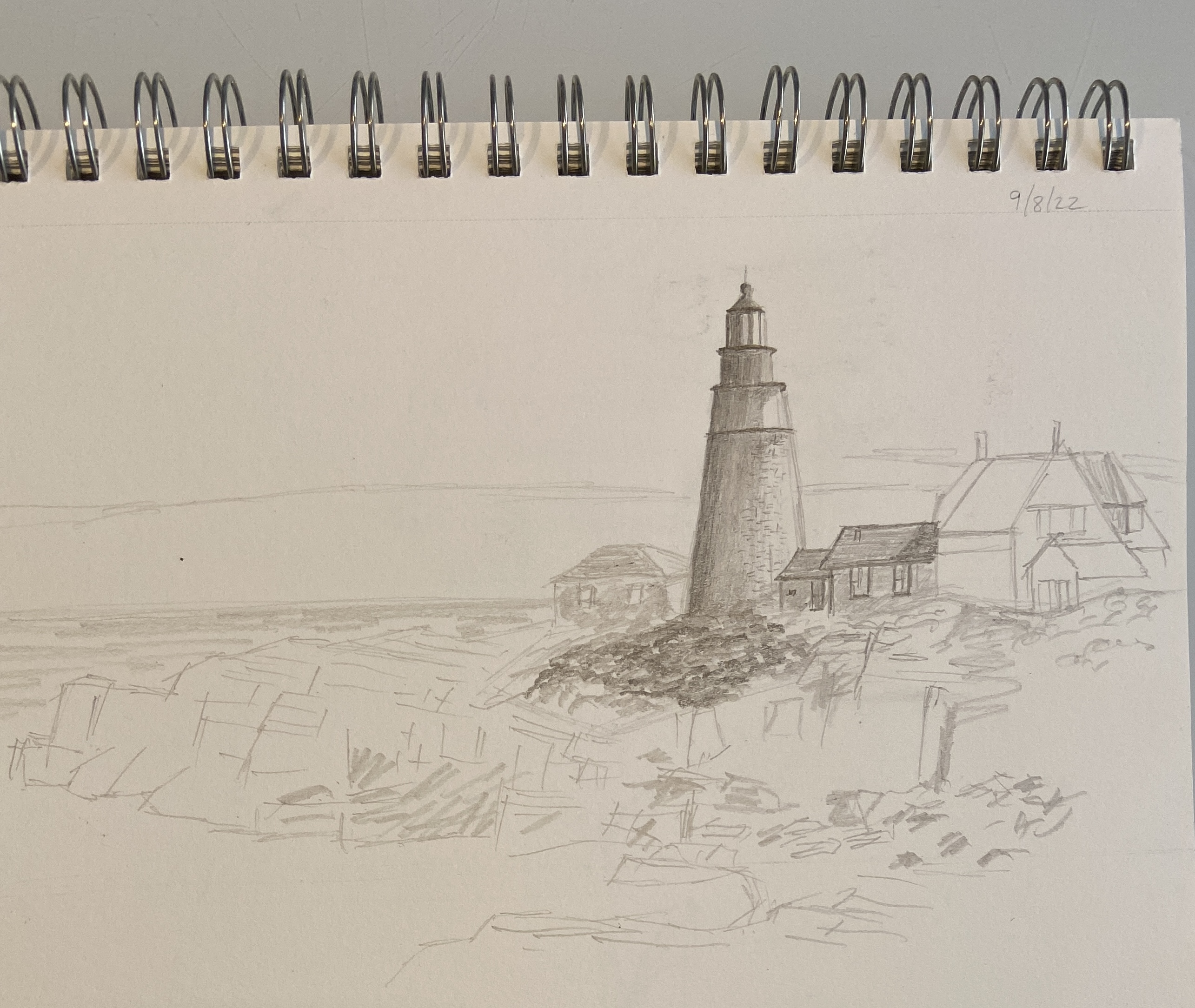
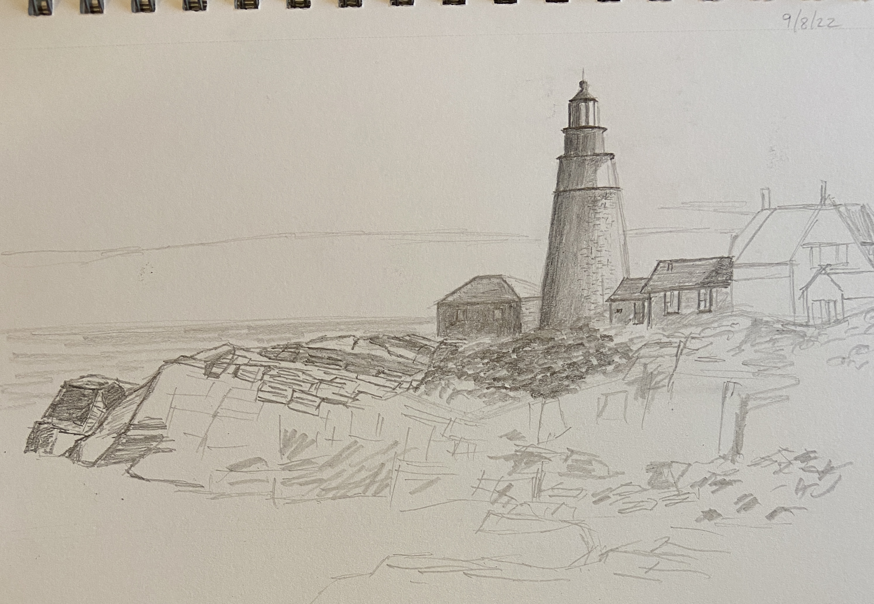
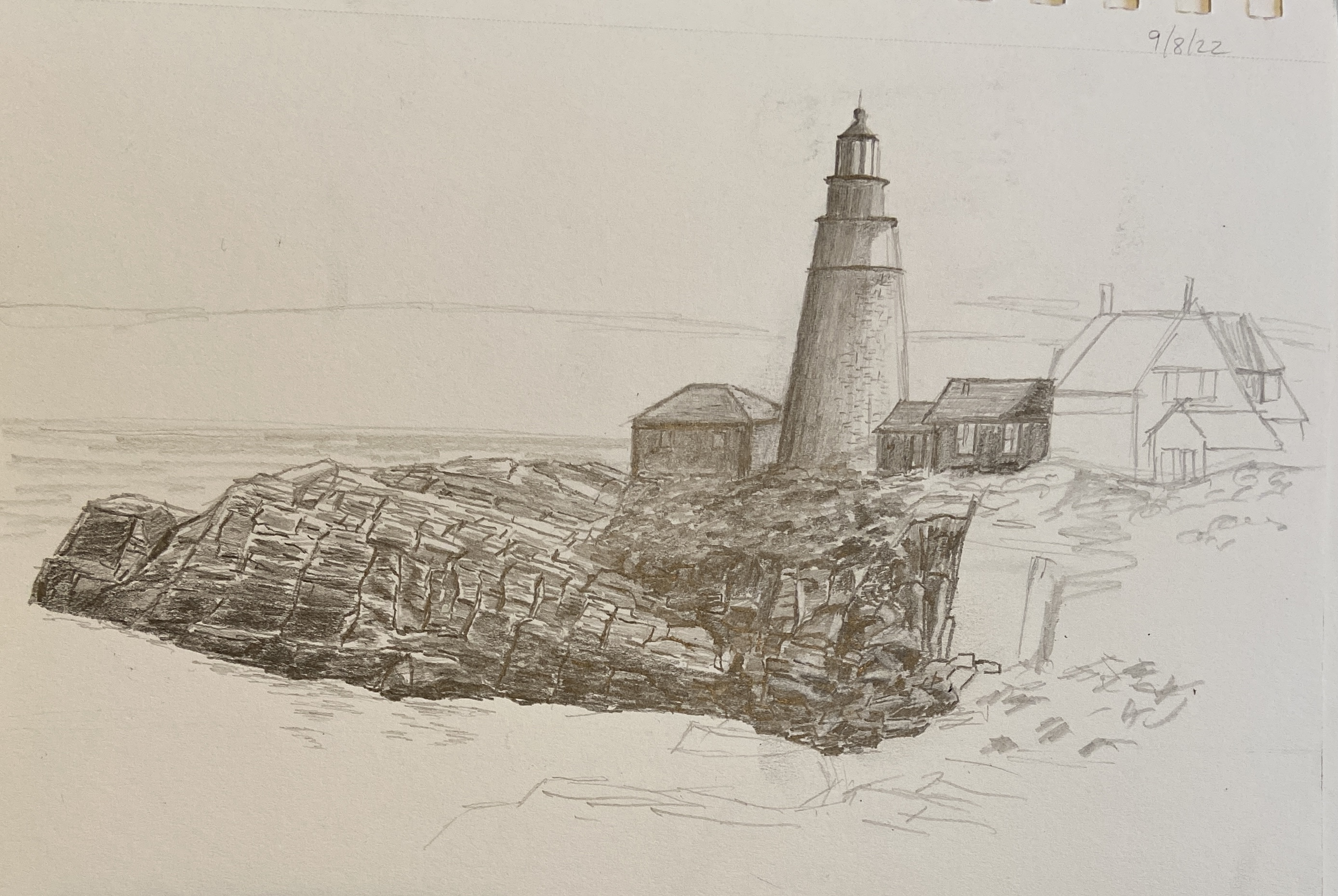
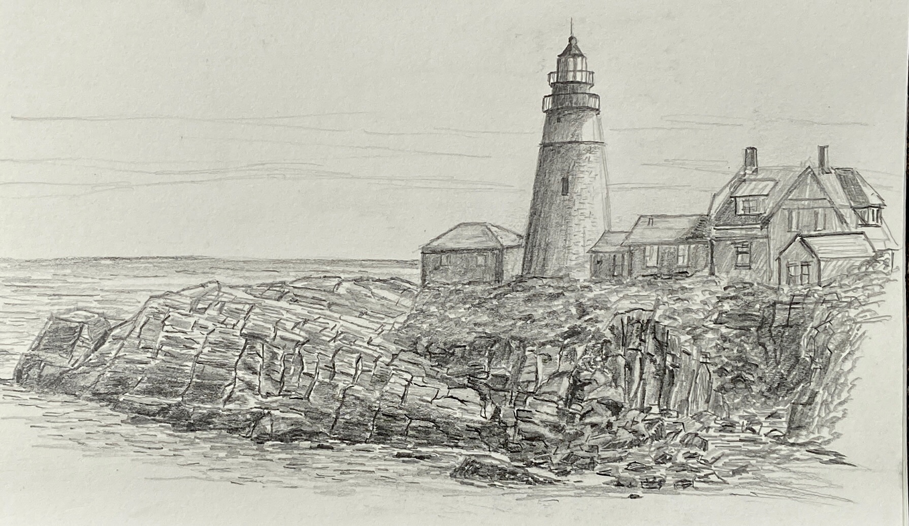
Portland Head Lighthouse | 7 x 5” | Graphite on Paper

This started as a practice sketch to familiarize myself with this iconic Maine lighthouse in preparation for some plein air sessions. But it sucked me in and turned into a full blown composition. It still needs small tweaks and refinements, but that will have to wait because I don’t have all of my drawing supplies on hand. 

The actual lighthouse was the easiest part, whereas the rocky coastline, which dominates the landscape, was the tricky, tedious bit. Despite the slog involved in drawing so many rocks, it was very rewarding as the composition came into view. I worked left to right, which made for a fun time lapse which essentially drew the rocky coast towards the lighthouse… somewhat ironic, too. 

There were some lessons learned as well. When drawing rocks, it was very helpful to focus and emphasize the vertical lines, which were the darkest elements. It was also good to draw many rocks as planes using a very angled drawing stroke, utilizing the side of the pencil instead of the tip. I’m sure that violates various drawing art conventions, but I’m pretty sure I don’t care… lemme check…. yep, confirmed, I don’t care. 

I used more dark graphite than I usually do (2B, 4B and 8B, with some HB) but it seemed to work. As one can see from the reference photo there are cast shadows on the rocks and buildings, as well as darkened rocks from crashing waves and a receding tide, which makes for a lot of graphite. 

Lastly, some advice. First, come see this lighthouse when you visit Portland, Maine. While you’re here, get the best lobster roll in the area from Bite Into Maine, which is open all week in the park. There are numerous picnic benches throughout the area, all with spectacular views. And if you have furry friends, bring them, as this is a dog friendly park. 

Thanks for reading!

#artbern #berntx #crashboomzip #painting #art #abplanalp #austinartists #atxartist #atxart #cascobay #portlandmaine #landscapesmaine #pleinair #maineart #biteintomaine #portlandheadlighthouse #portlandmaineart #drawinglandscape #landscapedrawing

Nautical Profiles

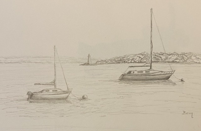
Dead Calm in Casco Bay | 9 x 12” | Graphite on Paper


The Casco Bay of Portland, Maine has an iconic harbor look, pretty much just what you’d want to see when strolling the Eastern Promenade on a cool summer day. Yes, I said cool summer day… they do exist. 

This piece is a plein air drawing from the rocky shores of Casco Bay, bathed in sunshine and 75 degrees. I finished the shading and finer details in studio, but  capturing the moment on site was a lot of fun. It’s as if the boats were posing for their profiles. Most of the practice sketches I’d done the previous week were a real plein air smack down because the slight breezes on those days kept rotating the boats. It did teach me a lesson in drawing quickly, though. 

The lighthouse is a bit of artistic license, in that it’s not part of the actual scene. However there are numerous lighthouses in the area, all of which create a dream backdrop for these nautical seascapes. If I choose to create a painting of this scene, I’ll struggle to de-emphasize the lighthouse because I love their look!

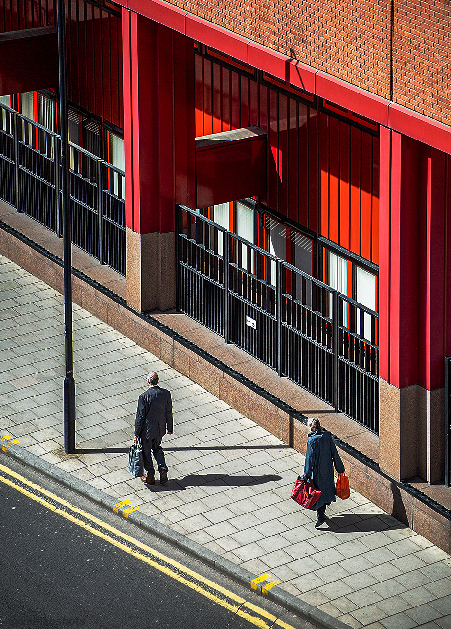
That little bit of morning air.

I love this piece because it has a balanced look between a photo and painting. I know if I tried to recreate as a paining it would fail, therefore I’ll stick to reblogging Lemanshots’ work.

lemanshots's avatarlemanshots - Fine Pictures and Digital Art

Lemanshots_morning

Photo and design by Josephine.

View original post