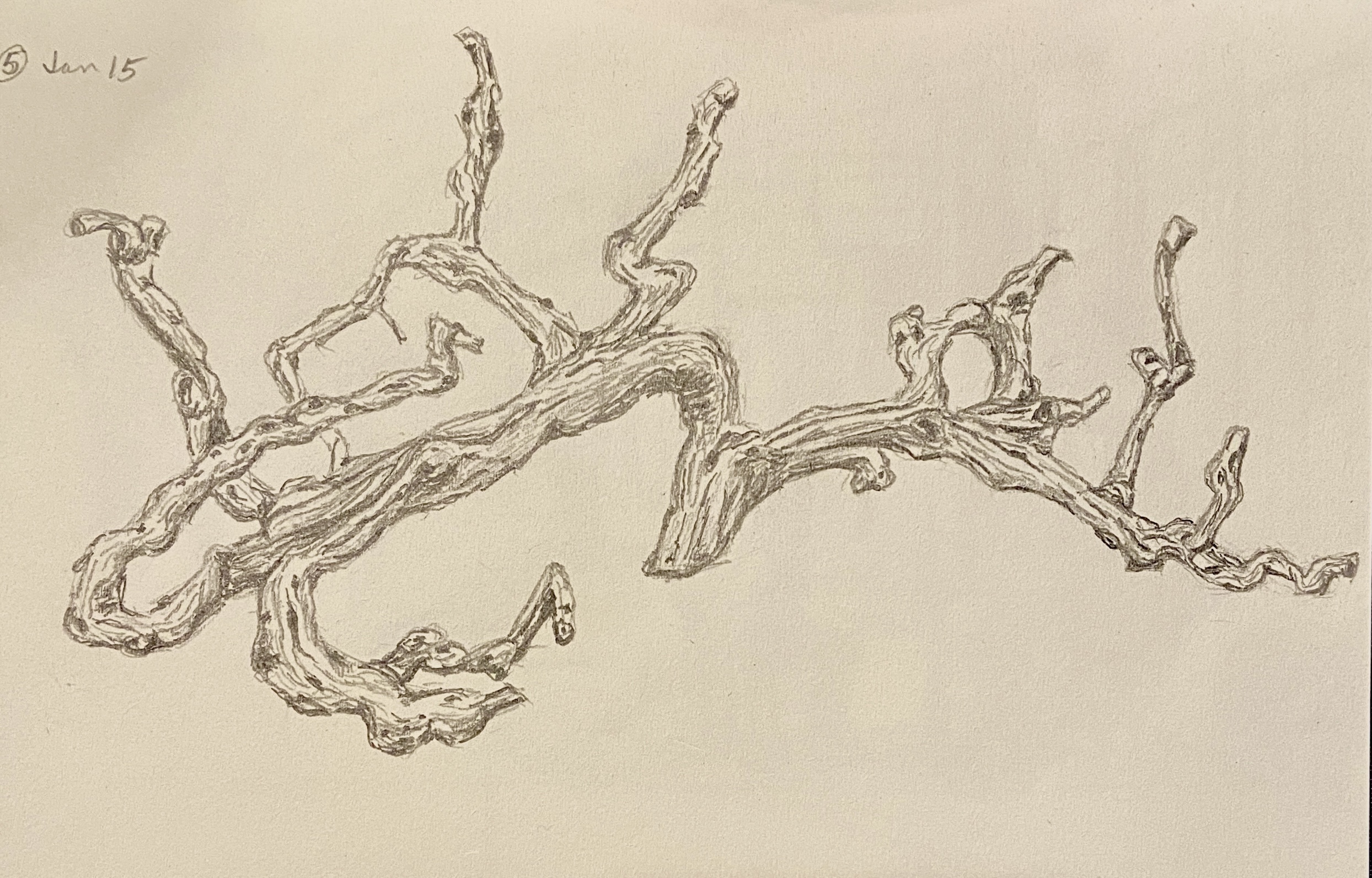
Today is for the wine lovers out there! This is one of the various drawings from this month’s draw-a-day self-imposed idiocy. I think even oenophiles would have trouble recognizing this drawing at first glance, but it hopefully becomes apparent that this is a grape vine. An old, grape-less, dead vine, but a grape vine nonetheless.
The reference photo is from my visit to The Piccolo Hotel (great place, btw) in Paso Robles, California. I didn’t realize what it was at first – I just thought it was a cool wood carving over the fireplace in the lobby. But when you get to looking at it in more detail, and taking into account the location (wine country!), the reality sets in that this is the epitome of upcycling! This grapevine, while alive, provided tasty wine… and in death is transformed into art! What’s not to love about that!
The Library at The Piccolo, Paso Robles
As an art subject, it was very tricky initially. I thought it was going to be a disaster, in large part due to the details involved, but perseverance won out and all the wavy lines and dark circles coalesced into a pretty decent drawing. More importantly, it was a lot of fun to draw and something I’ve added to the short-list of formal compositions. Drawing or painting, I’m not sure which… maybe both.
One final comment: Paso Robles wine is excellent! Makes sense, right? I mean, c’mon, the vines are beautiful, alive or dead!
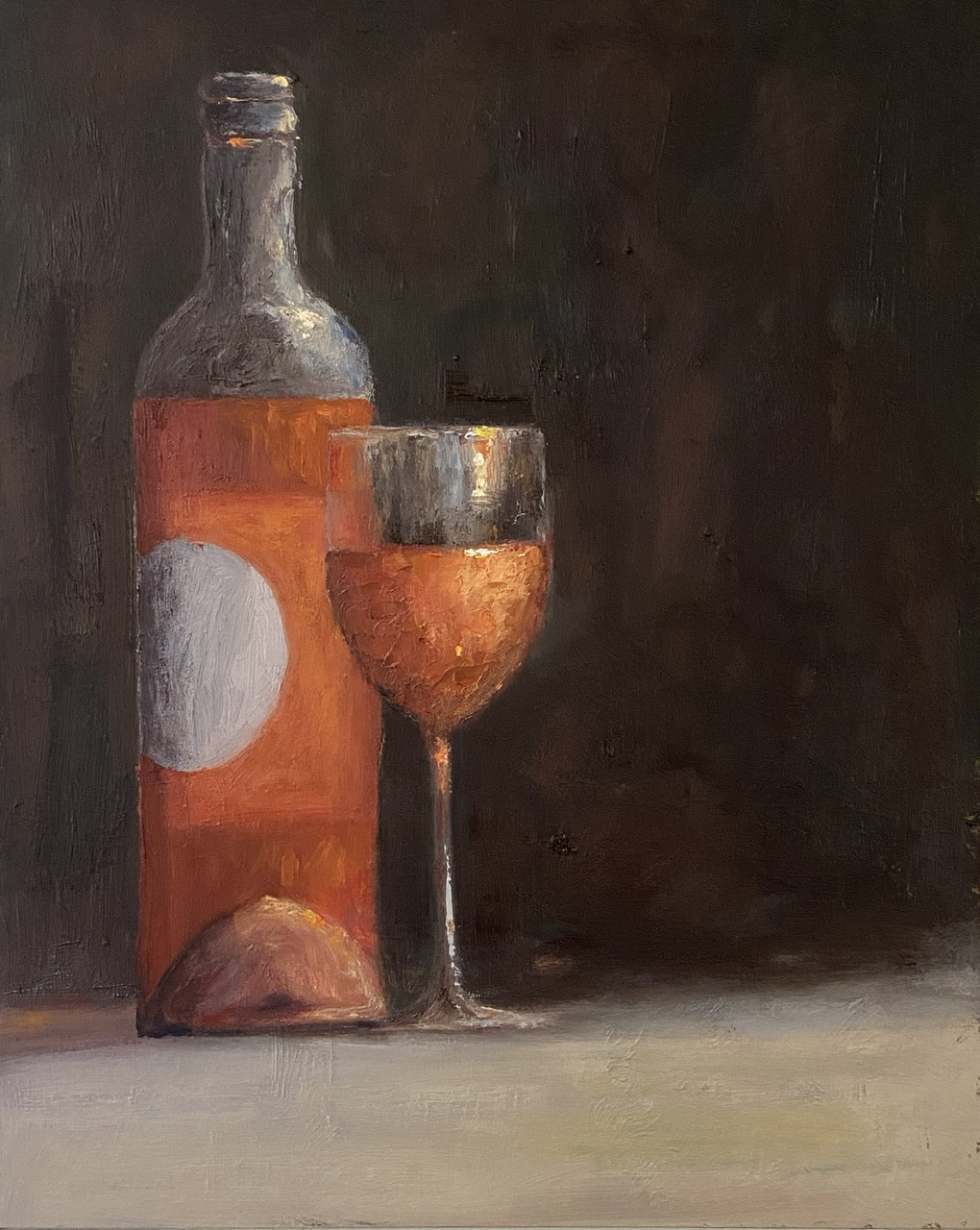
Inspired by travel with dear friends and recalling the joys of the day over a bottle of wine… or two… or three!
When time flies by chatting with friends, so too does the wine, and we all need a friend who suggests “ONE MORE BOTTLE?”. I’m lucky to have such friends.
This composition went through a few iterations and ultimately strayed so far from my original reference photo that it’s not worth sharing. The wine is a rosé from #grassinifamilyvineyards out of Santa Barbara. While I personally don’t care for many of the Santa Barbara area wines (Paso Robles is much more to my liking), the wine and setting at the Grassini tasting room patio was excellent.
The use of a dark background in this composition made for a difficult painting, namely getting the pink/orange color of the rosé to show up properly against the black backdrop. Do a Google search for “still life painting of wine”, sort by images, and see how far you have to scroll to find a composition that’s not red wine and not against a very dark background.
Regarding the largely blank right side of the composition, it’s designed to create tension for the viewer: Why the hell is half of the painting missing? Is it finished? Is there something there I can’t see? The truth is I initially planned to paint an empty bottle in that space, but ultimately felt like it would create more clutter and wouldn’t add anything of artistic interest – I mean who wants to stare at an empty wine bottle. That’s just sad. The artistic vacuum I opted for instead feeds to the ONE MORE BOTTLE theme.
Let me explain.
If you note the amount of wine in the glass and what’s remaining in the bottle, it’s pretty clear there is more in the glass than what’s not in the bottle. The viewer is left to assume that ONE MORE BOTTLE has been procured and the wine in the glass is actually what was from the previous bottle and perhaps a little topper from the new bottle.
Finally, rosé is a wine for daytime hours (at least for me), so the dark background and soft light indicates early evening or dusk, which in my mind is how time among friends can fly by – namely you start visiting at lunch in the light of day with a bottle of rosé and the next thing you know you’ve filled the recycle bin and it’s damn near time for dinner!
For the artists out there, a few notes of interest. First, there’s a lot of texture on the painting surface, which is largely a byproduct of dumb luck from working over a previous painting. Sometimes textures from old paintings are a real pain in the ass, which is why I usually gesso or sandpaper them to a smoother surface. However, this is the second painting I’ve done recently that’s used a previous failure and I neglected to smooth the surface. I gotta say, I prefer the textured option.
Lastly, I used a palette knife to do the wine in the wine glass to add texture and realism. Rosé is a chilled wine, so the glass has to have some element of water beading or glistening. Furthermore, it helps add visual interest with impasto-like thickness.
Thanks for reading and cheers to all your close friends!