Finished licking my Giverny wounds, did more research, watched some vids, and got back on the art horse tonight.
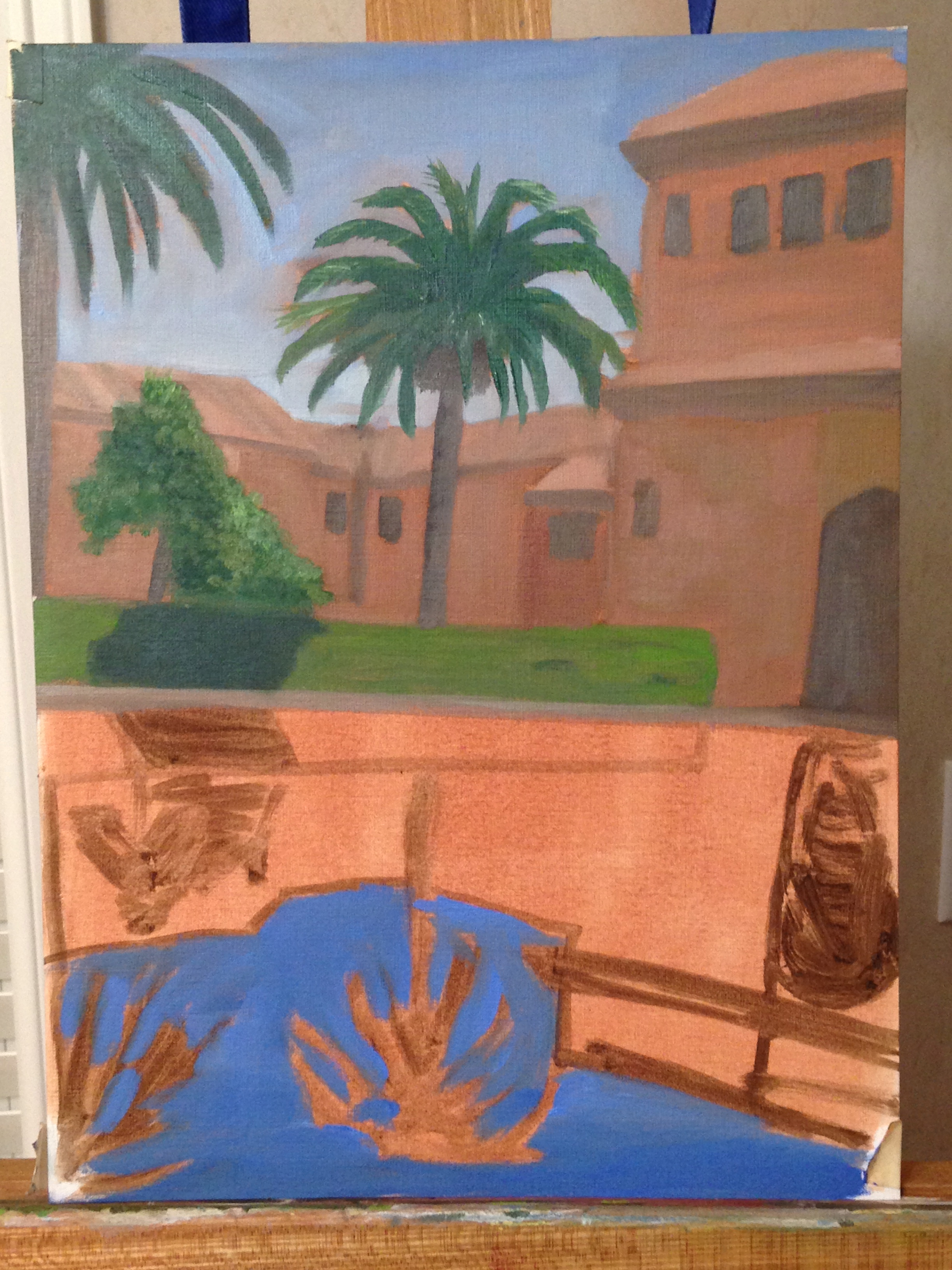
Decided to do a few practice works on paper before tackling Giverny again, or any other water reflections for that matter. Spent a couple hours on this to get it teed up for another attempt at the water reflections. Not really worried about details or the exactness of the composition, but I am paying particular attention to the color palette and values, in large part b/c those components can be integral to creating good water reflections. My plan is to tackle the reflections during my next session, which should largely wrap up this practice piece, but we’ll see how that goes.
BTW, this is a picture I took while in Granada, Spain, visiting the Alhambra – this is an amazing place! Breathtaking!
Here is the reference photo.


Great colors, Bern. How did you do the reds? Can you post the photograph??
LikeLike
Thanks for the encouragement!
The reds were Burnt Sienna, Titanium White, and a mixed green that I was using for the bushes, which I think was Viridian Green + Cad Red + White. The really dark red areas (awnings on the buildings, etc) was the above mix plus some Raw Umber.
The turpsy background wash is all Burnt Sienna.
LikeLike