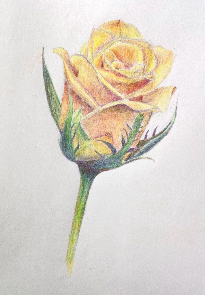
Yummy Deliciousness!

MOTHBALL | 20 x 16” | Oil on Canvas Board

MOTHBALL was inspired by a photograph I saw at a gallery show in Roundrock, Texas. My apologies for not citing the photographer’s name for this piece (I simply didn’t note his name at the time), but I did include the original photo for reference and if I can figure out his name I will update accordingly. Regardless, what grabbed my attention from the photo was that it was from the perspective of the moth, like a pilot landing a plane.

My goal with MOTHBALL initially was to simply emulate the photo as a painting, but about halfway through I got it in my head to steer towards the whimsical, which I did by taking the moth’s perspective via a few beers and a dram of whiskey. To achieve this goal, I incorporated 2 key design decisions. First, an assumption that the vision of a moth is very different from ours. Granted, I have no idea how a moth sees the world, but it’s safe to assume the focus is the flower and everything else is Mothvision noise… and probably green. Secondly, and most importantly, I wanted to get in the head of the moth and emulate how she saw the flower – this is where I shifted from beers to whiskey. What I came up with was something that screamed “YUMMY DELICIOUSNESS!”, essentially a rich, vibrant, active flower with pollen roiling on top like the surface of the sun. 

The time lapse video below starts at the point I decided to go full Mothvision. If you pay close attention you can see the changes and deletions made along the way to make things work better. 

Overall I’m very happy with MOTHBALL, although I recognize it’s a niche audience who might be drawn to such a concept. Hopefully the explanation provided here can at least drive some appreciation for the intention of the art.  

Thanks for reading!


#artbern #berntx #crashboomzip #painting #art #abplanalp #bernabplanalp #austinartists #atxartist #atxart #butterfly #moth #flower #whimsical #oilpainting #mothball #funnyart #lepidoptera #mothvision

Yellow Rose Botanical

Yellow Rose Botanical | 8” x 10” | Colored Pencil on Paper

I finished my botanical drawing (virtual) classes last week and this Yellow Rose is my final project. The sessions were 2 hours weekly for 8 weeks, the instructor (Jenny Granberry – @jennygeeberry) was hilarious, and I learned a lot about both botanical artistry and how to use colored pencils properly.

Yellow Rose Botanical Drawing

The biggest challenge was figuring out how to incorporate a range of colors beyond basic yellows to add interest, value variations, and realism. I was using a limited palette (12 pencils), but through some trial and error I managed to land on a few color combinations that added a lot of depth to the overall piece.

I’m hoping to do a few botanical series over the course of this year. I like the idea of colored pencil drawing because it incorporates drawing and a lot of oil painting concepts, although the techniques are very different.

#contemporaryatx #berntx #crashboomzip #rose #art #drawing

Lotus Flower (Studies)

Oil on Paper | 6″ x 8″

Lotus Flowers on Pond

This was one of the studies for the Brushes With Cancer composition. While it didn’t end up being the primary piece for the BWC cause, I like the colors and composition enough that I’m pretty sure I’ll return to this in the near future and do a more complete painting on canvas or panel.

Graphite on Paper | 8″ x 10″

Lotus Flowers on Pond

I did a detailed drawing prior to the painting, which turned out really well. In fact, I think I like it more than the painting.

“Emergent”: A Brushes With Cancer Collaboration

Oil on Canvas | 40” x 30” 

I’ve been working on a very exciting piece in a program called Brushes With Cancer, which “provides psycho-social support to those touched by cancer to improve the quality of life for cancer patients, their family and loved ones, through a unique art experience.” 

Emergent is a collaboration with JoAnn Sackett, another participant in the BWC program, who is a cancer survivor and the inspiration for the piece. You can learn more about our pairing and the creation of this piece at our page on the Brushes With Cancer Austin event site. 

It’s an honor to be involved with Brushes With Cancer and their Austin 2020 program. I hope you enjoy learning about their mission and enjoy the artwork in the links provided in this post. 

Flower Study #5: Pink Rose

Pink Rose (study) | Oil on Panel | 5″ x 7″

Yes, another flower! The Pink Rose started off as a white rose, but some prodding from my wife got me to adjust to something a bit more interesting and thus the improvisation towards pink. 

I’ll confess I’m not thrilled with the outcome of this small piece, but I think it’s simply a matter of style preference. The style is less realistic than I’d like, although as a drawing it works well… but it’s not a drawing, so there’s that.

Pink Rose | Oil on Panel

The reference photo is a beautiful white rose, but in hindsight I can see that it’s flat and lacking variations in value. I didn’t figure this out until I was more or less finished with the piece, but it was a very valuable reminder that grinding through a painting isn’t always the right approach if your gut tells you something is off. I see a lot of paintings on-line that have this stylistic look, so I’m pretty sure it appeals to some folks, but, ironically, it’s not for me.

Painting Flower Study #4: Yellow Rose

The 4th of a 5 part study series, Yellow Rose, came together very quickly. The gallery above shows the progression as well as the varied contrast in painting compositional styles. If you have a favorite thus far please make a comment and let me know.  

Before diving into the details of the composition on the next page, I thought the history of the “Yellow Rose of Texas” and the song lyrics were really interesting to read in tandem. I typically haven’t looked into the history of my painting subjects, but having done it with something as innocuous as this yellow rose, I found it to be a curiously motivating way to start a project. I think I’ll add it to my painting process and see if it unlocks some additional artistic mojo in future compositions. And yes, I’ll try not to bore y’all along the way. 

Painting Flower Study #3: Exploding Bouquet

The Flower Study painting series continues moving forward. Now that we have 3 studies completed (click for previous posts on this series: Study #1 Poppies, Study #2 Hydrangeas), it makes sense to line them up at the start of each related post to see how things are moving along. I want to continue exploring different compositional ideas so I can make an informed decision, both with respect to my actual skills as well as artistic considerations (what looks good), before taking on a large, formal piece for the house.

Flowers: A Poppy Wrestling Match

Last week I decided to create a large flower inspired abstract painting for the house. It’s going to take a lot of practice, though, so I’ve committed to a dozen small studies of various flowers until I find what will work both aesthetically and still be within my sphere of skills. 

The first study was essentially a wrestling match with poppies. The white poppy was first, followed by a pause of a couple days before tackling the blue flower. The goal wasn’t to create a beautiful piece of artwork, but rather test drive a few approaches, various brushes types and sizes, and play around with values to create convincing petals. 

Flower Study 1
Flower Study – White Poppy & Blue Hybrid

I used a small 5×7 canvas panel, which is fine for the initial studies, but I’ll need to switch to a gesso board or more refined canvass surface. A toothy surface like this canvas panel is great for many subjects, but it’s not going to work for flowers. Also worth noting is the blue flower isn’t a poppy at all and had nothing to do with the reference photo. I wanted to try something with more complexity in terms of petals, and thus created some kind of cross breed never before seen by humankind. 

This is a good start and got me excited to pursue more flowers. Next up will be hydrangeas with a more earnest attempt at realism.