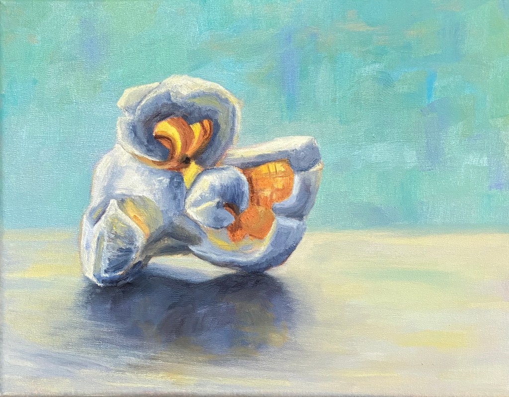
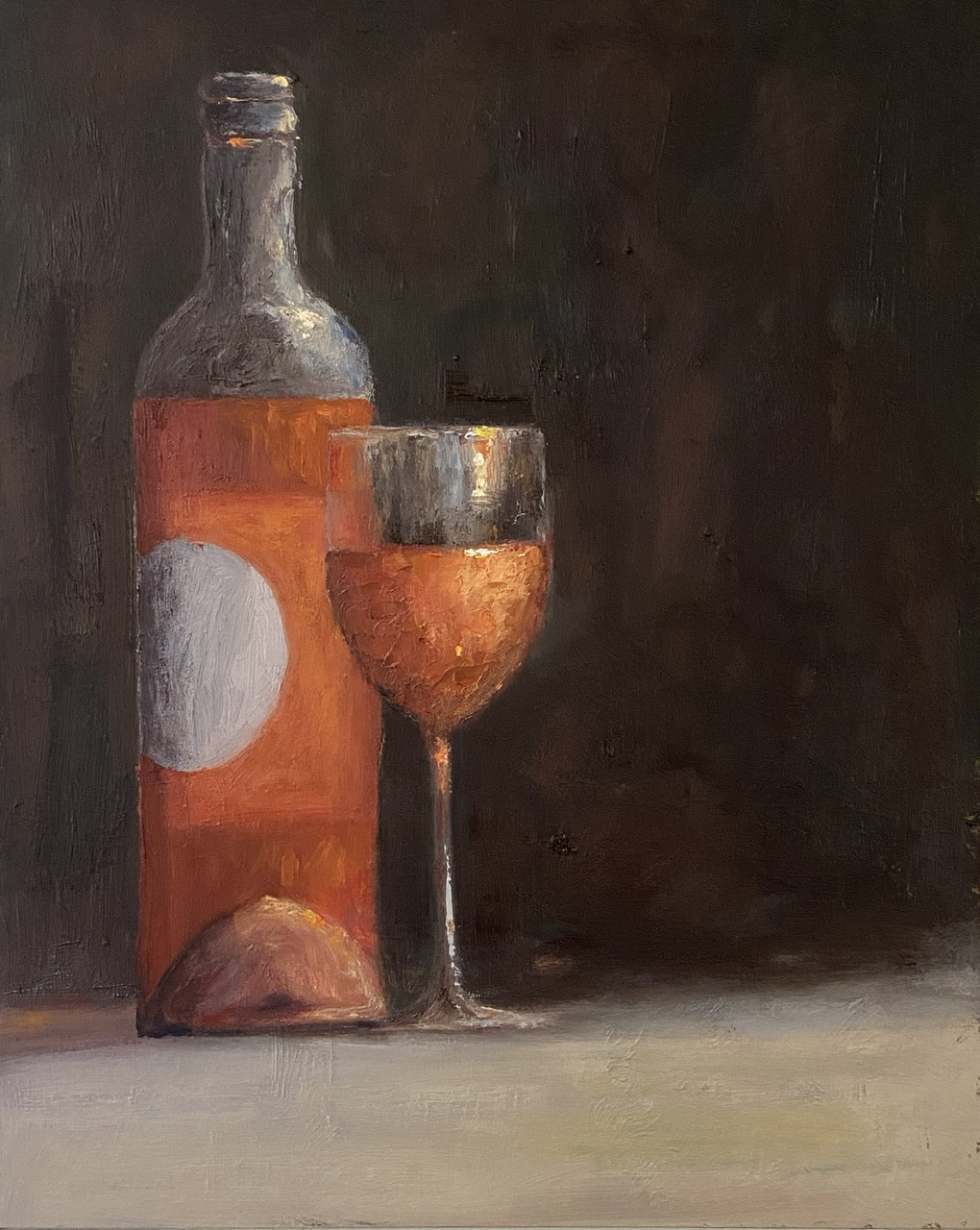
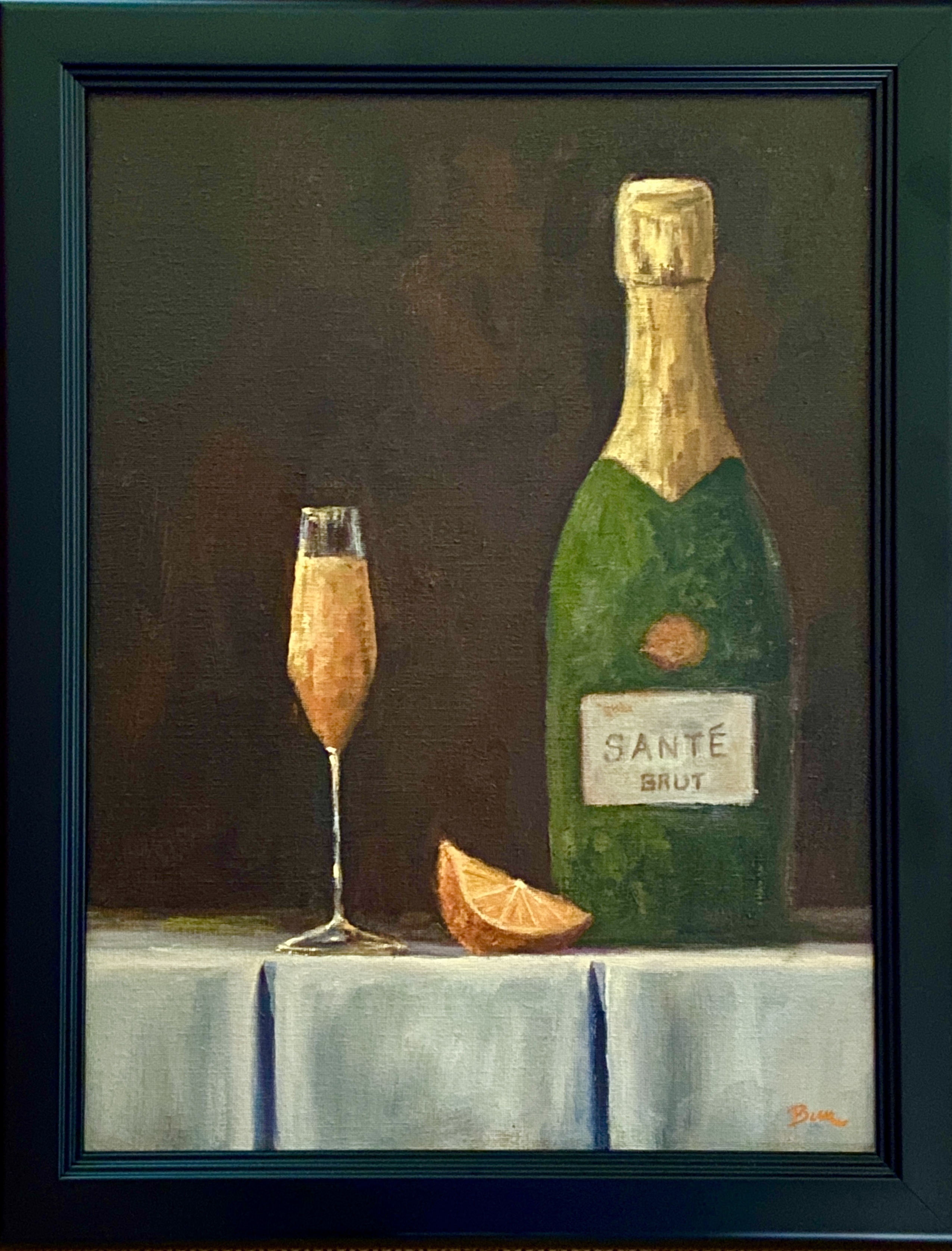
Rosé All Day… and Night?

ONE MORE BOTTLE | 9 x 12″ | Oil on Board

Inspired by travel with dear friends and recalling the joys of the day over a bottle of wine… or two… or three! 

When time flies by chatting with friends, so too does the wine, and we all need a friend who suggests “ONE MORE BOTTLE?”. I’m lucky to have such friends. 

This composition went through a few iterations and ultimately strayed so far from my original reference photo that it’s not worth sharing. The wine is a rosé from #grassinifamilyvineyards out of Santa Barbara. While I personally don’t care for many of the Santa Barbara area wines (Paso Robles is much more to my liking), the wine and setting at the Grassini tasting room patio was excellent.  

The use of a dark background in this composition made for a difficult painting, namely getting the pink/orange color of the rosé to show up properly against the black backdrop. Do a Google search for “still life painting of wine”, sort by images, and see how far you have to scroll to find a composition that’s not red wine and not against a very dark background. 

Regarding the largely blank right side of the composition, it’s designed to create tension for the viewer: Why the hell is half of the painting missing? Is it finished? Is there something there I can’t see? The truth is I initially planned to paint an empty bottle in that space, but ultimately felt like it would create more clutter and wouldn’t add anything of artistic interest – I mean who wants to stare at an empty wine bottle. That’s just sad. The artistic vacuum I opted for instead feeds to the ONE MORE BOTTLE theme.

Let me explain.

If you note the amount of wine in the glass and what’s remaining in the bottle, it’s pretty clear there is more in the glass than what’s not in the bottle. The viewer is left to assume that ONE MORE BOTTLE has been procured and the wine in the glass is actually what was from the previous bottle and perhaps a little topper from the new bottle. 

Finally, rosé is a wine for daytime hours (at least for me), so the dark background and soft light indicates early evening or dusk, which in my mind is how time among friends can fly by – namely you start visiting at lunch in the light of day with a bottle of rosé and the next thing you know you’ve filled the recycle bin and it’s damn near time for dinner! 

For the artists out there, a few notes of interest. First, there’s a lot of texture on the painting surface, which is largely a byproduct of dumb luck from working over a previous painting. Sometimes textures from old paintings are a real pain in the ass, which is why I usually gesso or sandpaper them to a smoother surface. However, this is the second painting I’ve done recently that’s used a previous failure and I neglected to smooth the surface. I gotta say, I prefer the textured option. 

Lastly, I used a palette knife to do the wine in the wine glass to add texture and realism. Rosé is a chilled wine, so the glass has to have some element of water beading or glistening. Furthermore, it helps add visual interest with impasto-like thickness. 

Thanks for reading and cheers to all your close friends!

#artbern #berntx #crashboomzip #painting #art #abplanalp #austinartists #atxartist #atxart #atxlife #contemporaryart #grassinifamilywines #santabarbarawine #onemorebottlerob #winepainting #roséwine #winepainting #onemorebottle #abplanalp #bernabplanalp

SPRINGING INTO COLOR – Group Show at Art for the People Gallery!

Welcome to Spring! I’m honored to be included in another group show at Art for the People Gallery in Austin.  Three pieces made the cut this time, including, for the first time, a plein air composition. The show runs April 1st – June 2nd, 2023. 

If you’re interested in original artwork by Austin creatives, check out AFTPG either in person in Austin or browse their online store. I’ve been involved with this gallery for a number of years and the curating by Lynnie is uniquely Austin – if she’s in the gallery during your visit, don’t be shy and make sure you chat with her. She has a world of knowledge about all the artists, their backgrounds, and what makes their art special. 

If you’re interested in any of my pieces, I’m happy to answer questions or better yet go to the gallery and check them out: 

DISC DOG | 12 x 16″ | Oil on Canvas Board | $450
SOUP PEDDLER | 9 x 12″ | Oil on Canvas | $175
WEE DRAM | 8 x 6″ | Oil on Board | $250

Thanks for reading!

#artbern #berntx #crashboomzip #abplanalp #austinartists #atxartist #atxart #artforthepeoplegallery #aftpg #rescuedogs #dogsofinstagram #pleinairaustin #souppeddler #souppeddleraustin #austinpetsalive #mutts #muttsofinstagram #beachdog #beaches #stillife #whisky #whiskey #scotch #theglenallachie #dram #happyhour

Special Occasion Libation

WEE DRAM | 8 x 6” | Oil on Board

As you well know about my artwork, I like to bounce around with subject matter and styles. This week’s work is a return to still life that I can relate to, namely a dram of whisky, in this case The GlenAllachie from the Speyside area of Scotland.

The artwork style is influenced by the work of Neil Carroll, the whisky by Billy Walker (more on him later). What I like about his work is the realistic look of the glass as it’s affected by the drink, be it beer, whisky or a pile of strawberries. He’s masterful with reflections, glass sweat (don’t know if that’s a real thing, but sounds good to me), and other elements that give a sense of realism while maintaining a painterly look.

WEE DRAM is a nod to the best Scotch whisky I’ve ever tasted, The GlenAllachie distillery in Speyside just outside the town of Aberlour. My wife and I visited this fantastic distillery on a recent trip to Scotland and loved everything about their operation – the people, the idyllic location, and of course the whisky. They have something really special going on at this Speyside gem, with Master Distiller, Billy Walker. We came home with one of their finest offerings, a 2006 Single Cask limited edition for The Spirit of Speyside Whisky Festival 2022, which serves as our new “special occasion” libation. While the 2006 Single Cask is no longer available, it looks like they’ve done it again with a 2007 Oloroso Puncheon. Fantastic!

The challenges with this piece were largely in the balance of orange, red, and yellow that seem to shift and shine in the glass. One of those situations where the actual whisky looks a little fake when you really think about it – I mean where does that bright yellow sparkle come from?! I’ll have to try this again with a lighter background, allowing the whisky hues to be the star of the composition. I might need to go get another bottle from the GlenAllachie collection!

Hopefully you have a special occasion libation in your home. If not, go to The GlenAllachie have a dram of their magical elixir and bring home a bottle.

Cheers!

The Best Avocados Are New York Avocados

Pardon the vanity post, but I had to share the news that my avocado still life, “Just the Ripe Size,” has been selected for inclusion in a national juried show at Main Street Arts in Clifton Springs, New York. 

The show runs November 5 – December 23, 2022. See the Main Street Arts website for more pics and information www.MainStreetArtsCS.org. If you live in upstate NY you can attend the opening reception on November 5th – there will be wine and prizes. For the truly ambitious art enthusiasts, you can also make a purchase… or two. After all the show is full of smalls, so prices tend to be more tempting. 

Thanks for reading!


#artbern #berntx #crashboomzip #painting #art #abplanalp #austinartists #atxartist #atxart #oilpainting #fineart #mainstreetarts #avocado

Lighthouses and Lobster Rolls

Portland Head Lighthouse | 7 x 5” | Graphite on Paper

This started as a practice sketch to familiarize myself with this iconic Maine lighthouse in preparation for some plein air sessions. But it sucked me in and turned into a full blown composition. It still needs small tweaks and refinements, but that will have to wait because I don’t have all of my drawing supplies on hand. 

The actual lighthouse was the easiest part, whereas the rocky coastline, which dominates the landscape, was the tricky, tedious bit. Despite the slog involved in drawing so many rocks, it was very rewarding as the composition came into view. I worked left to right, which made for a fun time lapse which essentially drew the rocky coast towards the lighthouse… somewhat ironic, too. 

There were some lessons learned as well. When drawing rocks, it was very helpful to focus and emphasize the vertical lines, which were the darkest elements. It was also good to draw many rocks as planes using a very angled drawing stroke, utilizing the side of the pencil instead of the tip. I’m sure that violates various drawing art conventions, but I’m pretty sure I don’t care… lemme check…. yep, confirmed, I don’t care. 

I used more dark graphite than I usually do (2B, 4B and 8B, with some HB) but it seemed to work. As one can see from the reference photo there are cast shadows on the rocks and buildings, as well as darkened rocks from crashing waves and a receding tide, which makes for a lot of graphite. 

Lastly, some advice. First, come see this lighthouse when you visit Portland, Maine. While you’re here, get the best lobster roll in the area from Bite Into Maine, which is open all week in the park. There are numerous picnic benches throughout the area, all with spectacular views. And if you have furry friends, bring them, as this is a dog friendly park. 

Thanks for reading!

#artbern #berntx #crashboomzip #painting #art #abplanalp #austinartists #atxartist #atxart #cascobay #portlandmaine #landscapesmaine #pleinair #maineart #biteintomaine #portlandheadlighthouse #portlandmaineart #drawinglandscape #landscapedrawing

Nautical Profiles

Dead Calm in Casco Bay | 9 x 12” | Graphite on Paper


The Casco Bay of Portland, Maine has an iconic harbor look, pretty much just what you’d want to see when strolling the Eastern Promenade on a cool summer day. Yes, I said cool summer day… they do exist. 

This piece is a plein air drawing from the rocky shores of Casco Bay, bathed in sunshine and 75 degrees. I finished the shading and finer details in studio, but  capturing the moment on site was a lot of fun. It’s as if the boats were posing for their profiles. Most of the practice sketches I’d done the previous week were a real plein air smack down because the slight breezes on those days kept rotating the boats. It did teach me a lesson in drawing quickly, though. 

The lighthouse is a bit of artistic license, in that it’s not part of the actual scene. However there are numerous lighthouses in the area, all of which create a dream backdrop for these nautical seascapes. If I choose to create a painting of this scene, I’ll struggle to de-emphasize the lighthouse because I love their look!

That little bit of morning air.

I love this piece because it has a balanced look between a photo and painting. I know if I tried to recreate as a paining it would fail, therefore I’ll stick to reblogging Lemanshots’ work.

lemanshots's avatarlemanshots - Fine Pictures and Digital Art

Lemanshots_morning

Photo and design by Josephine.

View original post

“ABUNDANCE” Group Show at Art for the People Gallery

Art for the People Gallery in Austin Tx, is a showcase for 100 local artists.

Art for the People Gallery in Austin has included 3 of my compositions in their Summer group show “ABUNDANCE”, which runs July 2nd through August 26th, 2022. I’m thrilled to be a part of this talented group of artists! If you’re interested in original artwork by Austin artists, check out AFTPG either in person in Austin or browse their online store. 


The following paintings are part of the show (links lead to previous blog posts about these compositions):

Sniffer | 16 x 20″ | Oil on Canvas Board

Dog Tired | 16 x 12″ | Oil on Canvas Board

  Shaken | 8 x 10″ | Oil on Board

Thanks for reading!

#artbern #berntx #crashboomzip #painting #art #abplanalp #austinartists #atxartist #atxart #atxlife #sedona #pleinairaustin #artforthepeoplegallery #aftpg #rescuedogs #bestfriends #dogsofinstagram #dogsofinsta #dogstagram #petsofinstagram #contemporaryart #fosteringsaveslives #dogsofig #adoptme #takemehome #austinpetsalive #mutts #muttsofinstagram #snouts #wetnoses #blacklabs #labradorretrievers #martinigin #monkey47 #martinipainting

Fighting the Heat at Bull Creek

Bull Creek | 8 x 10” | Oil on Canvas Board

I might have chosen the wrong year to ramp up my en plein air experience, case in point the month of May in Austin is already registering 100 degree days. Ugh! Regardless, the mornings are bearable and I had to break in a new pochade box called u.go. by New Wave Art… more on that later.

This session was at Bull Creek Park with a few other painters from Plein Air Austin. For those of you familiar with Austin, this is the northern stretch of Bull Creek near the Spicewood and 360 intersection. For the uninitiated, it’s ideal for painting outside because there’s usually some good water options along the creek and lots of shade. 

The focal point of this composition was the rocks in both the foreground where the shade and light merge, and secondarily the larger rock bathed in sunlight. I was very happy with how this turned out even before I got back into the studio for refinements. I went into this plein air session committed to focusing on values, starting by driving the darks into darkness-of-a-bat-loving-cave kinda dark, then finding high contrast opportunities for the lightest lights. I took some artistic license in this area, fabricating some water movement that wasn’t there, but it made for a more compelling viewing experience in my opinion. 

Additionally I muted the trees on the banks, especially the left side, so as to ensure they didn’t distract from the main focal points in the water. I had initially used much lighter, saturated yellow/greens on the trees, but that muted all the lighter values in the composition, which absolutely killed the scene. I’m pretty sure this is what I’ve done in past plein air sessions that has confounded me. I’ll keep my fingers crossed this will carry over into the next outing. 

The use of olive green variations on the shadow parts of the distant water were also a change in approach. One of my fellow painters made this suggestion and it proved to work really well. 
Painting outside is fantastic! This particular outing was of note because I got to share ideas and chat with the other painters. We even treated it like a workshop and did a mini critique of our works at the end of the morning. This was particularly interesting because of the 4 painters, there were 3 different mediums represented – oil, water color, and gouache. 

Lastly, my new u.go proved to be a great upgrade to my plein air armaments. Thank you to my awesome wife for giving me the perfect artist gift! The best part about the u.go is the portability. The length and width dimensions are almost identical to my EasyL pochade box, but it’s very thin, so it fits much easier in my pack. Very sturdy and compact design make it a must have piece of equipment for me.

Thanks for reading!

#artbern #berntx #crashboomzip #painting #art #abplanalp #bernabplanalp #austinartists #atxartist #atxart #atxlife #bullcreekaustin #pleinairaustin #saveourspringsaustin #sosalliance

Flat as a Cat’s Tail in a Room of Rockers

3 Pots | 9 x 12” | Oil on Paper

A composition comes around sometimes and slaps you in the face, a hard reminder that you don’t know jack squat about painting. In this case, 3 Pots told me I need to work harder on my plein air compositions, starting with the basics. There’s something addictive about plein air painting, even on the bad days that seem like you can’t get anything right.

This plein air session was at a workshop in Austin with Laurel Daniel, an exceptional artist and talented instructor. We were at Jennifer’s Gardens in central Austin and during the afternoon session I focused on 3 pots that were sitting on some terra cotta steps. They were in the shade, error #1. The green plant was in a green pot and the blue plant was in a blue pot, error #2. I decided to paint them anyway, error #3. 

Despite the challenges in the field, one thing I did get right and was pretty excited about, was the initial block in. I was able to quickly get all 3 pots laid in properly and to scale without issue, something a few years ago I would have needed a few sessions to get right. Then everything went flat. 

Chronic Muted / Flat Plein Air Work

For the life of me I couldn’t get enough value contrast going, as if I was actually ignoring that basic design tenet. I really noticed in when I returned to the studio a few days later and was frankly amazed at the mono-value of the entire composition. There was also no getting around the design error of green pot on green plant and blue pot on blue plant. 

I considered throwing it in the bin, but opted to spend a dedicated 2 hours, and not a minute more, to see how I could fix the core elements. The first step was to really push the darks throughout, which I would find later was the crux of the issue. I need to really recognize what “dark” looks like in outdoor lighting – more practice should remedy this issue. The next step of the fix was to blast the contrast in values next to the darkest darks with the brightest, most saturated hues. While I ended up painting over some of these areas later, the establishment of what the value range should entail was very helpful. Remember, error #1 was shitty composition selection, everything shaded and no lighting contrasts. 

The remainder of the rework was trying to establish nuanced color differences between the artificial color of the pots and the “same” natural colors of the plants. This part was surprisingly interesting, something I’d never done before, but it proved a valuable learning experience that I know will come in handy with urban landscapes in the future. 

I have another “flat” plein air piece to fix, but likely won’t have the patience to tackle it for a few weeks, but I will do a side by side comparison with 3 Pots when it’s done so we can see if I learned anything… or if I’m just a hopeless idiot sometimes. 

Thanks for reading!

#artbern #berntx #crashboomzip #painting #art #abplanalp #austinartists #atxartist #atxart #atxlife #jennifersgardens #laureldaniel #pleinairaustin