Fighting the Heat at Bull Creek

Bull Creek | 8 x 10” | Oil on Canvas Board

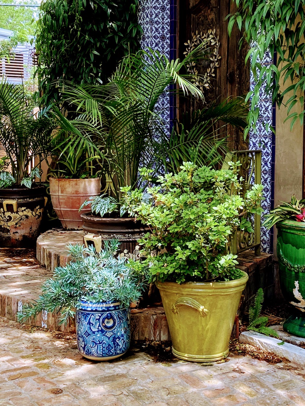
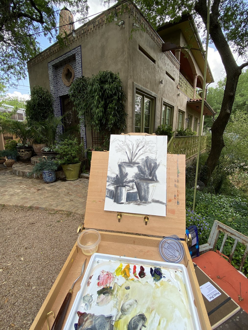
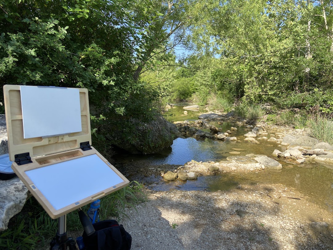
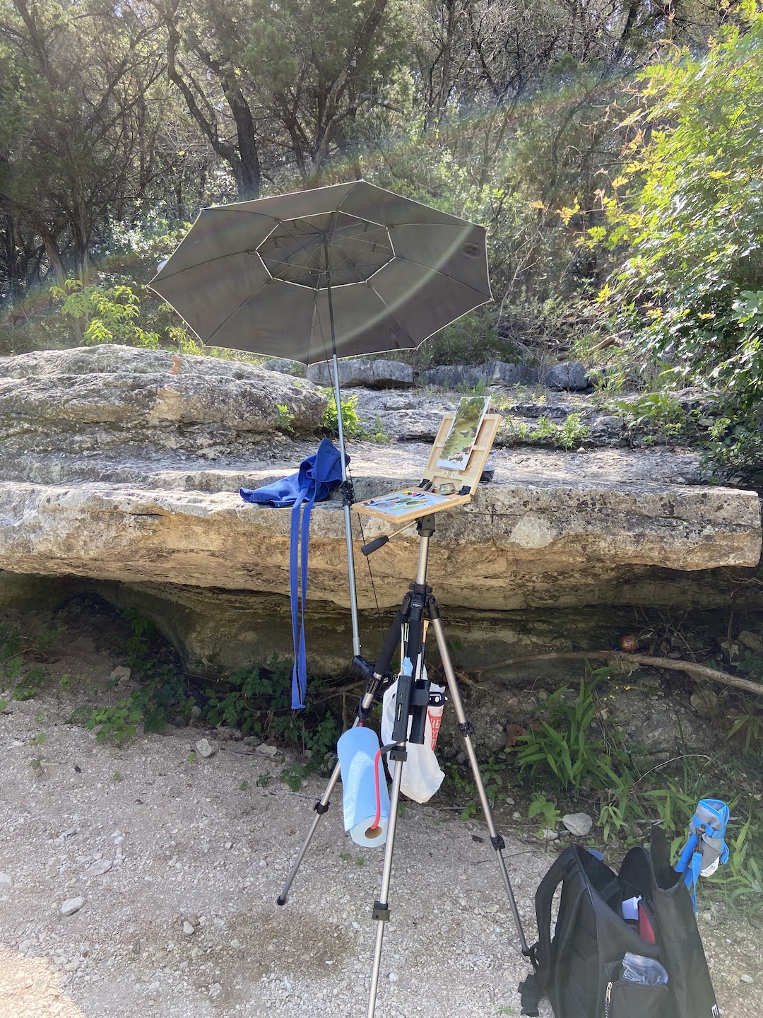
I might have chosen the wrong year to ramp up my en plein air experience, case in point the month of May in Austin is already registering 100 degree days. Ugh! Regardless, the mornings are bearable and I had to break in a new pochade box called u.go. by New Wave Art… more on that later.

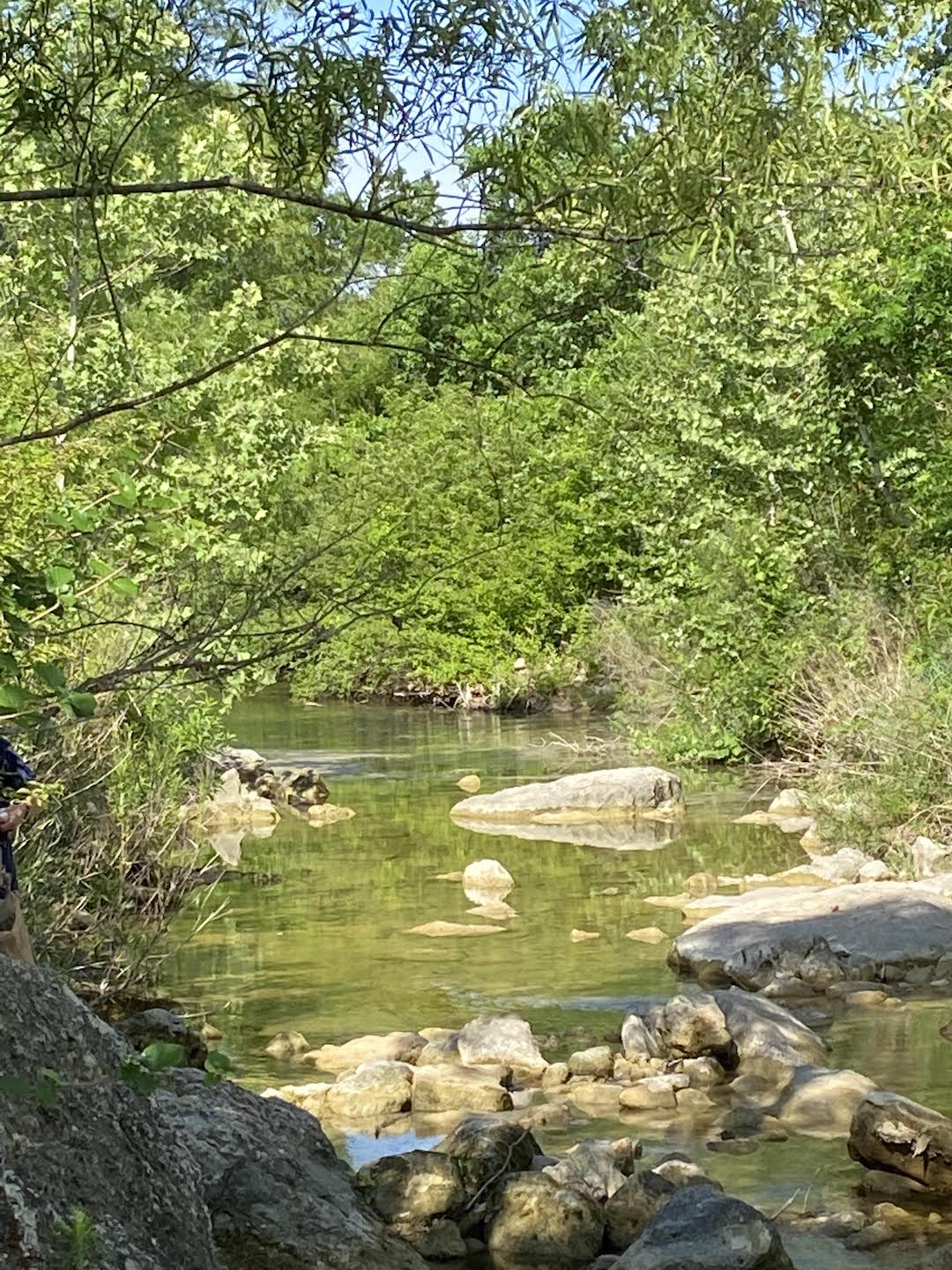
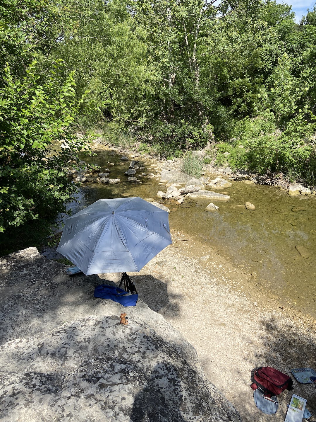
This session was at Bull Creek Park with a few other painters from Plein Air Austin. For those of you familiar with Austin, this is the northern stretch of Bull Creek near the Spicewood and 360 intersection. For the uninitiated, it’s ideal for painting outside because there’s usually some good water options along the creek and lots of shade. 

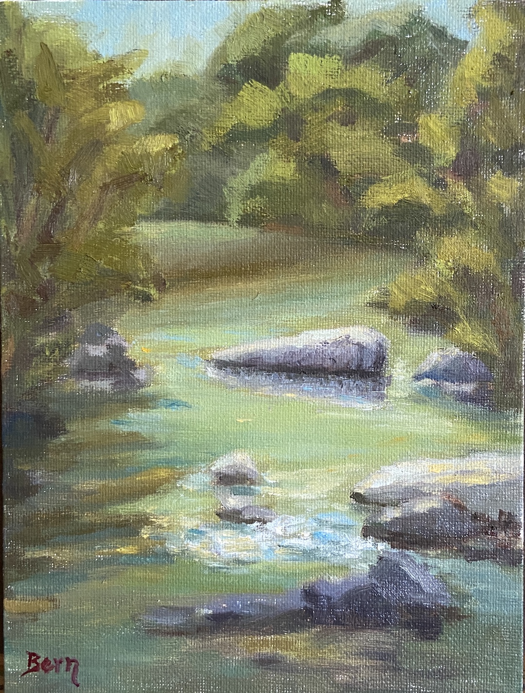
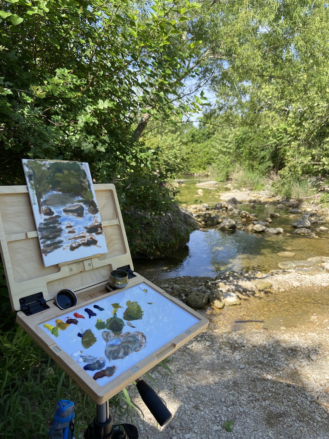
The focal point of this composition was the rocks in both the foreground where the shade and light merge, and secondarily the larger rock bathed in sunlight. I was very happy with how this turned out even before I got back into the studio for refinements. I went into this plein air session committed to focusing on values, starting by driving the darks into darkness-of-a-bat-loving-cave kinda dark, then finding high contrast opportunities for the lightest lights. I took some artistic license in this area, fabricating some water movement that wasn’t there, but it made for a more compelling viewing experience in my opinion. 

Additionally I muted the trees on the banks, especially the left side, so as to ensure they didn’t distract from the main focal points in the water. I had initially used much lighter, saturated yellow/greens on the trees, but that muted all the lighter values in the composition, which absolutely killed the scene. I’m pretty sure this is what I’ve done in past plein air sessions that has confounded me. I’ll keep my fingers crossed this will carry over into the next outing. 

The use of olive green variations on the shadow parts of the distant water were also a change in approach. One of my fellow painters made this suggestion and it proved to work really well. 
Painting outside is fantastic! This particular outing was of note because I got to share ideas and chat with the other painters. We even treated it like a workshop and did a mini critique of our works at the end of the morning. This was particularly interesting because of the 4 painters, there were 3 different mediums represented – oil, water color, and gouache. 

Lastly, my new u.go proved to be a great upgrade to my plein air armaments. Thank you to my awesome wife for giving me the perfect artist gift! The best part about the u.go is the portability. The length and width dimensions are almost identical to my EasyL pochade box, but it’s very thin, so it fits much easier in my pack. Very sturdy and compact design make it a must have piece of equipment for me.

Thanks for reading!

#artbern #berntx #crashboomzip #painting #art #abplanalp #bernabplanalp #austinartists #atxartist #atxart #atxlife #bullcreekaustin #pleinairaustin #saveourspringsaustin #sosalliance

Flat as a Cat’s Tail in a Room of Rockers

3 Pots | 9 x 12” | Oil on Paper

A composition comes around sometimes and slaps you in the face, a hard reminder that you don’t know jack squat about painting. In this case, 3 Pots told me I need to work harder on my plein air compositions, starting with the basics. There’s something addictive about plein air painting, even on the bad days that seem like you can’t get anything right.

This plein air session was at a workshop in Austin with Laurel Daniel, an exceptional artist and talented instructor. We were at Jennifer’s Gardens in central Austin and during the afternoon session I focused on 3 pots that were sitting on some terra cotta steps. They were in the shade, error #1. The green plant was in a green pot and the blue plant was in a blue pot, error #2. I decided to paint them anyway, error #3. 

Despite the challenges in the field, one thing I did get right and was pretty excited about, was the initial block in. I was able to quickly get all 3 pots laid in properly and to scale without issue, something a few years ago I would have needed a few sessions to get right. Then everything went flat. 

Chronic Muted / Flat Plein Air Work

For the life of me I couldn’t get enough value contrast going, as if I was actually ignoring that basic design tenet. I really noticed in when I returned to the studio a few days later and was frankly amazed at the mono-value of the entire composition. There was also no getting around the design error of green pot on green plant and blue pot on blue plant. 

I considered throwing it in the bin, but opted to spend a dedicated 2 hours, and not a minute more, to see how I could fix the core elements. The first step was to really push the darks throughout, which I would find later was the crux of the issue. I need to really recognize what “dark” looks like in outdoor lighting – more practice should remedy this issue. The next step of the fix was to blast the contrast in values next to the darkest darks with the brightest, most saturated hues. While I ended up painting over some of these areas later, the establishment of what the value range should entail was very helpful. Remember, error #1 was shitty composition selection, everything shaded and no lighting contrasts. 

The remainder of the rework was trying to establish nuanced color differences between the artificial color of the pots and the “same” natural colors of the plants. This part was surprisingly interesting, something I’d never done before, but it proved a valuable learning experience that I know will come in handy with urban landscapes in the future. 

I have another “flat” plein air piece to fix, but likely won’t have the patience to tackle it for a few weeks, but I will do a side by side comparison with 3 Pots when it’s done so we can see if I learned anything… or if I’m just a hopeless idiot sometimes. 

Thanks for reading!

#artbern #berntx #crashboomzip #painting #art #abplanalp #austinartists #atxartist #atxart #atxlife #jennifersgardens #laureldaniel #pleinairaustin 

Darwin Was Wrong

Darwin was wrong vaccine
Darwin | 5 x 7” | Oil on Board

I’ve been working on this piece off and on for the past few weeks. Sometimes I can get my head locked onto an idea that is not necessarily a bad concept, but I overlook the execution challenges, which are either a) well above my skill level, or b) something I forgot I hate doing. In this case it was the latter, specifically my reticence for painting anything with lettering. It’s so tedious, difficult, and frankly it blows my mind up a little every time I try. 

The reference photo for Darwin was essential because it provided the actual Pfizer vaccine label details, and this particular photo was handy because it had that laboratory look and feel. I was drawn to the blue hues and the metallic lid, so I tried to emphasize those elements. Let’s be honest, a vial of vaccine is, well, not the most compelling still life.


From a technical perspective, there were a few challenges with Darwin. The most obvious was the lettering, which I did free hand in the hopes that it would have a painterly feel to it, as opposed to using a stencil with perfect lines and symmetry. However, even with a stencil, the biggest challenge would have been the contour of the round vial and the very subtle changes the letters make based on their positioning. Lastly, the sea of blues was very tricky because the source of the blue color is unknown and yet it permeates the table and the vaccine liquid itself. 


It was also very important to point out that the “Darwin” name was replacing the vaccine manufacturer’s name, in this case Pfizer. I haven’t done a lot of compositions with alternative messaging, but this idea jumped in my head one day and it seemed to convey a number of thoughts and opinions, which could be open for interpretation depending on your own perspectives and beliefs. 

For me, I’ve always said that Darwin was wrong, and the COVID pandemic is the poster child of this sentiment. Survival of the fittest doesn’t apply to humanity – it hasn’t since the Bronze Age. The “strong” are frequently challenged to counterbalance the obstinance, stupidity, incompetence, and most of all, the narcissism of the “weak” within our species. Would Darwin advocate for a vaccine? I think not – pretty sure he was a herd immunity kinda guy. But was he an anti-vaxxer?  Or is Darwin actually right when it comes to COVID, namely that once the vaccines were rolled out, 99% (or something close to that figure) of deaths were the unvaccinated. Hmmmm… something to think about.

You gotta love the non-committal nature of messaging through art! 

#artbern #berntx #crashboomzip #painting #art #abplanalp #austinartists #atxartist #atxart #atxlife #COVID #darwin #vaccinesrule #darwinwaswrong #pfizervaccine #vaccineswork #hangupanddrive

New Show – ART SPREE at Art for the People Gallery!

The very fun, energetic and popular Austin art gallery, Art for the People Gallery, will include 3 of my pieces in the new show called ART SPREE! The show runs from January 29th – April 9th, 2022.

It’s always an honor to work with Lynnie, Hallie and of course, Charm Charm Sparkles and Tassel PomPom. Unfortunately the in-person opening reception for February had to be cancelled – damn you COVID! – but the gallery is open regular hours and the staff is as warm and welcoming as ever, so swing by if you’re in Austin and check out the art.

I’ve written blog posts about all of these pieces, but as a grouping they do a pretty good job representing me and my world. Airstream is clear nod to my love of travel (no, I don’t own an Airstream, but I know some very cool people who do); anyone who knows me can attest to my love of beer, especially a tasty porter as represented in Last Sip; and lastly, Puppy Butts! for my adoration of dogs and all they can bring to the world.

If you’re interested in any of these pieces, or anything in the ART SPREE show, you can also browse and shop using their online store. From the Art for the People Gallery store go to Shop > ART GALLERY – All Original Artwork > ART SPREE – Exhibition. I can attest that Lynnie and the AFTPG staff will do an excellent job fielding questions and making any purchasing seamless and fun.

Thanks for reading!

#berntx #crashboomzip #painting #art #abplanalp #austinartists #artforthepeoplegallery #aftpg #Airstream #LastSip #PuppyButts #austintx #Austintexas #atxlife #atxart #atx #austin360 #austinart #atxart #rescuedogs #bernabplanalp

The Champagne of Food

Popcorn | 8” x 6” | Oil on Canvas Board

First still life of 2022 inspired by the fun of popcorn! It’s basically the champagne of food if you think about it. And my wife absolutely loves popcorn, so I knew this would make her happy. 

I try to do these small still life compositions alla prima, basically in one sitting. I had to do some highlight adjustments the next day after the paint had settled, but that’s pretty typical for me because it seems wet paint is just hard to “read” as final. 

I had a lot of fun with this piece, working from a photo… real popcorn never would have lasted. If you like progression details, I made a time lapse of this piece which you can see on YouTube called “Popcorn Playalong” embedded below.  

#berntx #crashboomzip #painting #art #abplanalp #austinartists #popcorn #impasto #popcornplayalong #champagneoffood

Just the Ripe Size

Just the Ripe​ Size | 5” x 7” | Oil on Paper Board  

I​f you love a ripe avocado as much as I do, you can appreciate the moment you cut one open and just hope that a) it’s ripe and b) the pit isn’t so big there’s no actual avocado to eat. Just the Ripe Size is meant to elicit that gratification. Not quite as satisfying as a great batch of guacamole from Jack Allen’s Kitchen, but it’s a good start!

This piece was a little tricky because it’s painted on a paper-based board – basically a really nice piece of cardboard that you pay a lot more than you should at the art store. I think it will be great for graphite and maybe colored pencil drawing, but it was too quick to soak up oil paint. However, I do like the finished piece and the flat finish it has, which gives something like this avocado a more realistic look in terms of texture. I’ll try to varnish it in a couple weeks and post an update of the outcome. 

Now go grab an avocado or order some guacamole! 

#avocado #guacamole #jackallenskitchen #justtheripesize #avocadopainting #stilllife #dailypaintworks #berntx @abplanalp #crashboomzip #oilpainting #art #austinartists

You’re So Vain

You’re So Vain | 5” x 7” | Oil on Canvas Board  

This small piece is brought to you by caffeine and Carly Simon. I thought painting clouds in my coffee would be a little more straightforward, but it presented some tricky bits that will need to be tackled again in future still life. The resulting composition of this first effort is good, but I’m missing something on the technique and it ended up losing some of the cloudy effect. 

​This is an ideal composition for practicing the technique of blending wet-on-wet oil​ paint. While I’m very familiar with the technique, it’s part of the standard tool kit for painting in oils regardless of one’s skill level, I hadn’t really considered the fact that this composition was going to be dominated by wet-on-wet. It became abundantly clear that was to be the challenge once I got started, the realization making me chuckle aloud in the studio… idiot! 

Next time I’ll use a smooth surface (board) instead of a canvas, which should make for easier blending. I’ll also make more time to pre-mix a range of coffee browns to give the “cloudy” effect a more realistic look. 

This piece was also inspired by all the neighborhood coffee shops around the country and the world, all of which have their own unique vibe and appreciation for a cup well poured. Ignoring the occasional douchey independent shop filled with anti-social Wifi leeches, there’s a lot of great coffee being brewed in these shops.

My neighborhood favorite is Trianon, which has been a caffeinated cornerstone of this area since the 80s. They have dozens of coffees from around the globe and the owner, or any of his friendly staff, will take the time to walk you through the nuances of each farmer’s crop and what makes them unique. When was the last time that “barista” from Starbucks took the time to walk away from the register and come chat with you about the 20 rotating coffee beans on the wall… never!  

Thank you Trianon! 

#trianoncoffee ​#coffee #carlysimon #stilllife #dailypaintworks #berntx #crashboomzip #oilpainting #art #austinartists

Juicy

Juicy​ | 5” x 7” | Oil on Canvas Board  

JUICY

Small still life paintings are very gratifying because it’s possible to finish them in a single session, which is a nice change of pace after having worked on a number of larger pieces recently. 

Juicy is an orange (hopefully that’s abundantly clear) backlit with just enough light to see through the thinner areas. ​I used reference photos instead of an actual still life setup in the studio, but I think it would have been easier with a real orange slice as the subject. 

Lesson learned from this composition was the importance of relative values. I initially failed to darken the reds sufficiently, making it difficult to get the transparent light effect through the thin areas. I went back in and tamped down the saturation and darkened the value, which helped a great deal. I need to remember next time that instead of trying to use the lightest value for the transparency, focus first on emphasizing the adjacent darker areas to make it pop. 

Stay tuned for more small still life in the coming months… suggestions are welcome! 

#​orange ​#stilllife ​#dailypaintworks ​#berntx #crashboomzip #oil​painting #art ​#austinartists​

Getting Thirsty

Last Sip | 5” x 7” | Oil on Canvas Board

Last Sip | Oil on Canvas

Dark beer as an inspiration seemed like a great idea for this quick still life. As you can guess, I do love a good dark porter, #512brewing!

This piece is also influenced heavily by the work of Neil Carroll, who has a great talent for making simple still life transform into beautiful, relatable art. In this case, also quite quaffable.

The Last Sip was a great piece for glassware still life. I liked the challenge of defining the pint glass despite having a dark beer on a very dark background. I thought that would be more difficult than it was, but the dominance of dark values actually made it easier to pull the glass reflections out of the piece.

I also tried to work in some warmer elements of sienna, orange, and out-of-the-tube red to distinguish the porter from the dark background coming through the clear glass.

Hope you’re thirsty… go grab a beer!

Yellow Rose Botanical

Yellow Rose Botanical | 8” x 10” | Colored Pencil on Paper

I finished my botanical drawing (virtual) classes last week and this Yellow Rose is my final project. The sessions were 2 hours weekly for 8 weeks, the instructor (Jenny Granberry – @jennygeeberry) was hilarious, and I learned a lot about both botanical artistry and how to use colored pencils properly.

Yellow Rose Botanical Drawing

The biggest challenge was figuring out how to incorporate a range of colors beyond basic yellows to add interest, value variations, and realism. I was using a limited palette (12 pencils), but through some trial and error I managed to land on a few color combinations that added a lot of depth to the overall piece.

I’m hoping to do a few botanical series over the course of this year. I like the idea of colored pencil drawing because it incorporates drawing and a lot of oil painting concepts, although the techniques are very different.

#contemporaryatx #berntx #crashboomzip #rose #art #drawing