
A composition comes around sometimes and slaps you in the face, a hard reminder that you don’t know jack squat about painting. In this case, 3 Pots told me I need to work harder on my plein air compositions, starting with the basics. There’s something addictive about plein air painting, even on the bad days that seem like you can’t get anything right.
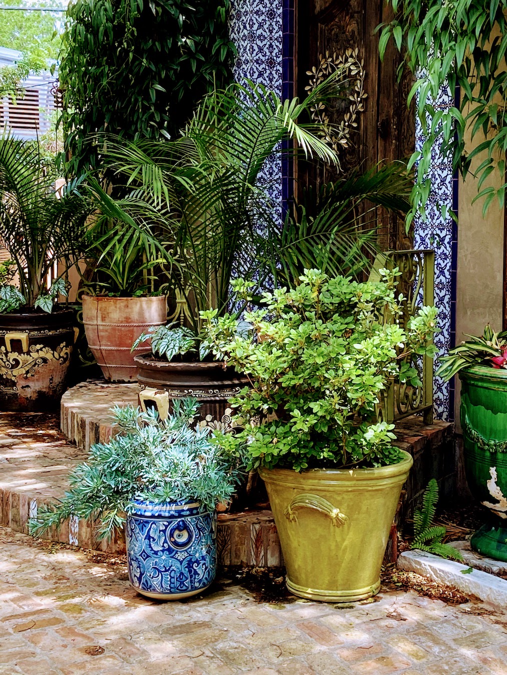
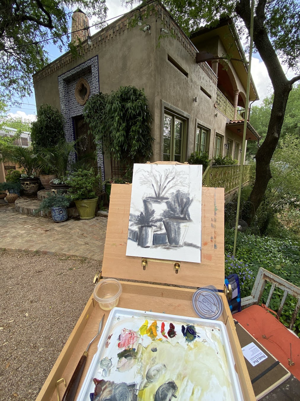
This plein air session was at a workshop in Austin with Laurel Daniel, an exceptional artist and talented instructor. We were at Jennifer’s Gardens in central Austin and during the afternoon session I focused on 3 pots that were sitting on some terra cotta steps. They were in the shade, error #1. The green plant was in a green pot and the blue plant was in a blue pot, error #2. I decided to paint them anyway, error #3.
Despite the challenges in the field, one thing I did get right and was pretty excited about, was the initial block in. I was able to quickly get all 3 pots laid in properly and to scale without issue, something a few years ago I would have needed a few sessions to get right. Then everything went flat.

For the life of me I couldn’t get enough value contrast going, as if I was actually ignoring that basic design tenet. I really noticed in when I returned to the studio a few days later and was frankly amazed at the mono-value of the entire composition. There was also no getting around the design error of green pot on green plant and blue pot on blue plant.
I considered throwing it in the bin, but opted to spend a dedicated 2 hours, and not a minute more, to see how I could fix the core elements. The first step was to really push the darks throughout, which I would find later was the crux of the issue. I need to really recognize what “dark” looks like in outdoor lighting – more practice should remedy this issue. The next step of the fix was to blast the contrast in values next to the darkest darks with the brightest, most saturated hues. While I ended up painting over some of these areas later, the establishment of what the value range should entail was very helpful. Remember, error #1 was shitty composition selection, everything shaded and no lighting contrasts.


The remainder of the rework was trying to establish nuanced color differences between the artificial color of the pots and the “same” natural colors of the plants. This part was surprisingly interesting, something I’d never done before, but it proved a valuable learning experience that I know will come in handy with urban landscapes in the future.
I have another “flat” plein air piece to fix, but likely won’t have the patience to tackle it for a few weeks, but I will do a side by side comparison with 3 Pots when it’s done so we can see if I learned anything… or if I’m just a hopeless idiot sometimes.
Thanks for reading!
#artbern #berntx #crashboomzip #painting #art #abplanalp #austinartists #atxartist #atxart #atxlife #jennifersgardens #laureldaniel #pleinairaustin
