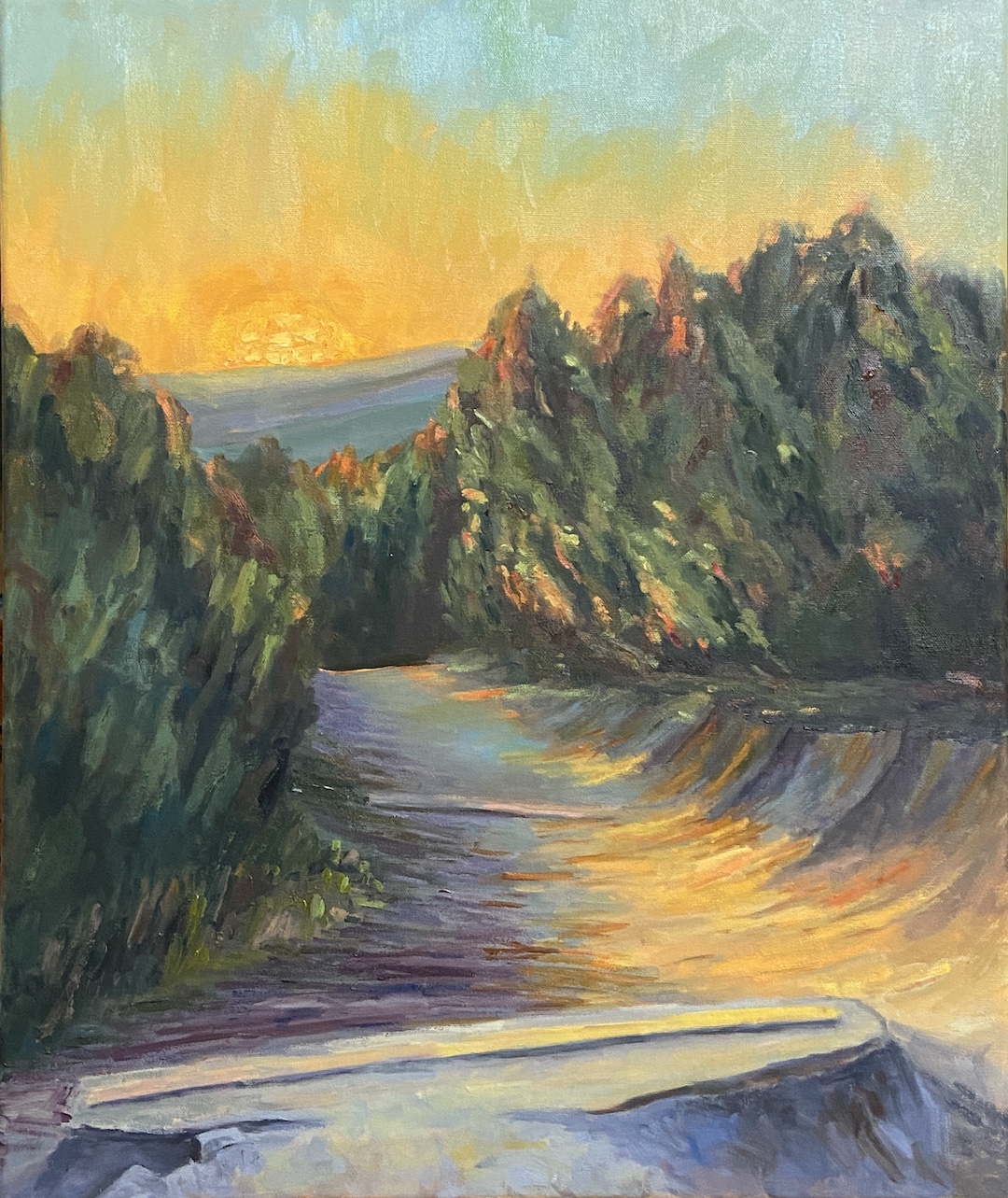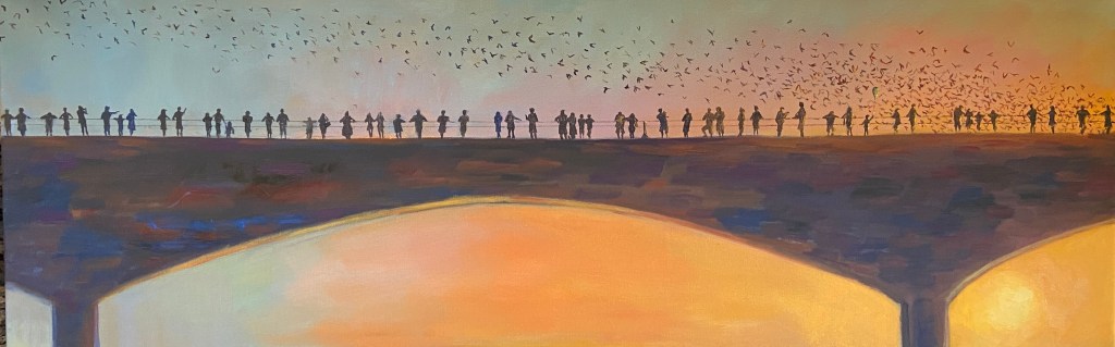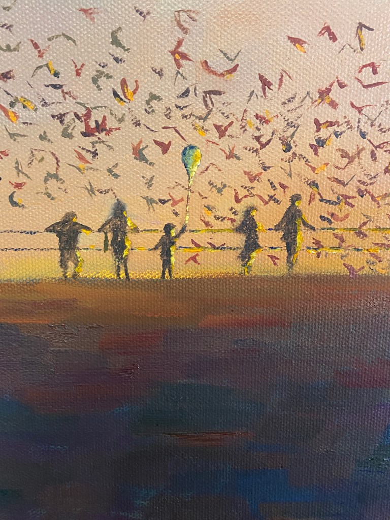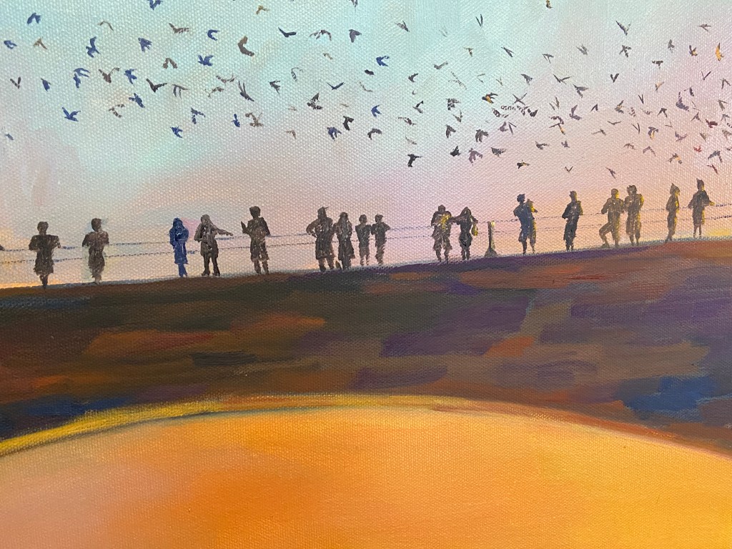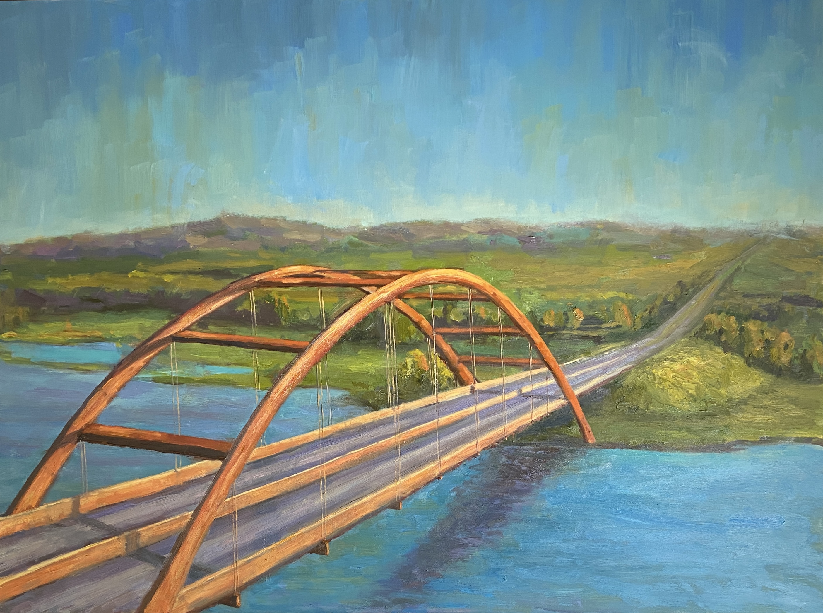
One of the most iconic landscapes of Austin is the Pennybacker Bridge, as viewed from the overlook near Courtyard Drive, which includes the pristine Austin Country Club golf course, Lake Austin, the quintessential rolling hills of central Texas, and lastly the Austin skyline. Instagram thirsty “influencers” (still not entirely sure what that means) and overwhelming herds of tourists have essentially overrun this viewing area, so in an act of social generosity I did a large painting of this scene so you don’t have to throw elbows with the dregs of the social media obsessed.
Named after Percy V. Pennybacker, a Texas engineer who made a name for himself creating innovating welding techniques, apparently, the fact that the bridge happens to have the color of a nicely aged penny has nothing to do with the Pennybacker name.
This was a bit tricky from an artistic perspective in a few ways. First, the obvious challenge of the bridge shapes and related linear perspective. Secondly, there was the need to simplify the landscape, which has a lot going on in real life. Lastly the hue of the bridge, which let’s face it, if you can’t get the coloring right on this one, there’s really no point.
The bridge is beautiful, but its shape is a maddening challenge. I refuse to use projections or tracing for my work, which has proven helpful, albeit far from perfection, when it comes to landscapes and plein air work. I’ve noticed over the years that I can free-hand a wealth of shapes and structures that I couldn’t do previously. While it took a number of adjustments throughout this project, ultimately the bridge looks “right”.
Next challenge was the complexity. If you’ve seen this view live, you know there’s a lot more going on in the background than what’s captured in this painting – distant skyline, bumper to bumper traffic, and Austin Country Club. The skyline was nixed because it is distant, and I didn’t want to take away from the focal point of the bridge; traffic has no appeal, and dropping cars along the highway would have been an exercise in tedium; and finally the country club was simplified to be the golf course without the greens and manicured fairways. Ultimately, I’m happy with the simplified outcome and the more serene feel it lends the landscape.
And last but not least, the coloring of the bridge. It’s a beautiful copper hue, and when it’s drenched in late afternoon sunlight, the shadows and highlights are striking! I used a broken color technique, starting with a large pool of a mother color, then worked in variations along the way.
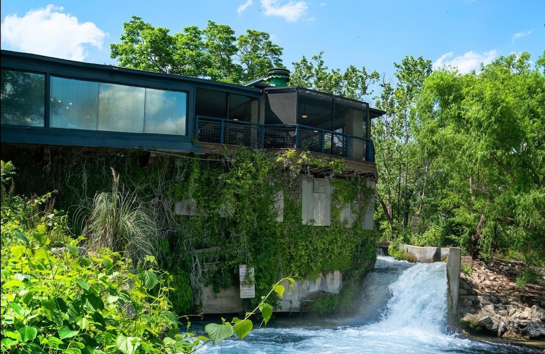
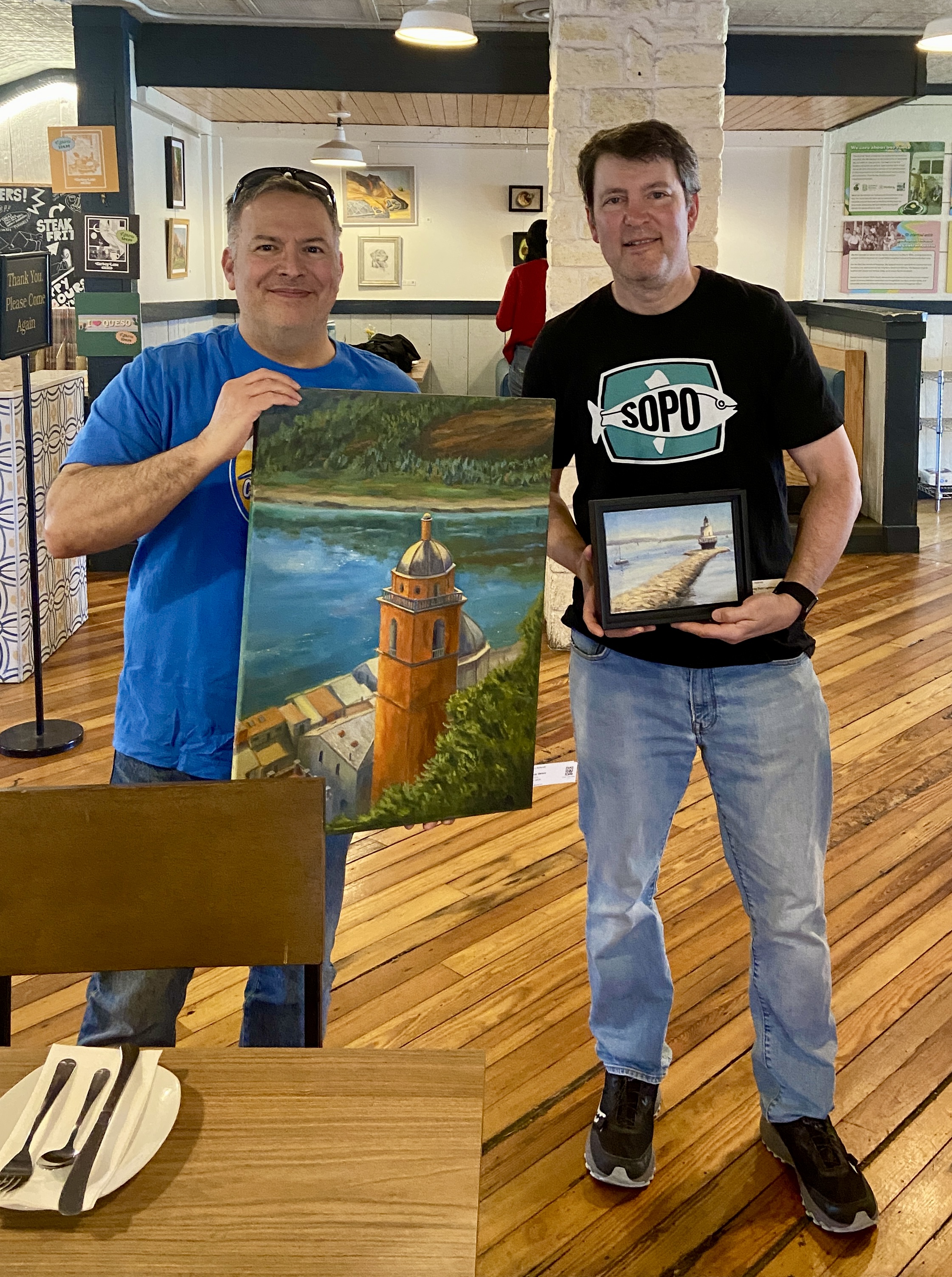
PENNYBACKER BRIDGE will be making it’s debut at my current show at the original Kerbey Lane restaurant, running through end of June. Come check it out and have some coffee and pancakes while you’re there perusing the artwork.
Thanks for reading!
#austinart #artbern #berntx #crashboomzip #abplanalp #austinartists #atxart #atxartist #atxlife #paintings #kerbeylanecafe #coffee #eateraustin #austinbrunch #pancakes #paintingsandpancakes #pennybackerbridge #iconicaustin #austincountryclub