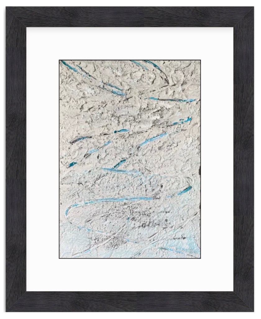
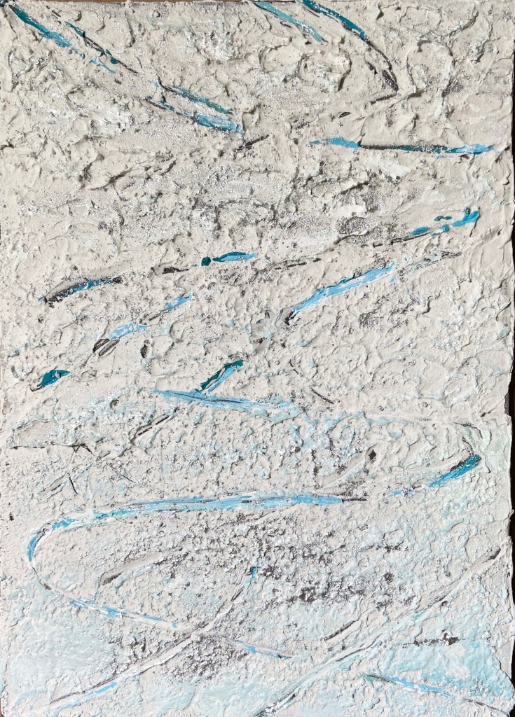
And now for something completely different! Lo and behold the first abstract piece I’ve done in years. Why, you ask? It was a gift for my niece, who had seen something similar on eBay but she didn’t win the auction. Arty farty uncle to the rescue! Well, truth be told, my wife was the one who asked if I could help out and create something similar.
Of course! I love the challenge of making a copy of an existing painting. On the occasion that my imitation successfully mimics the original, I get quite the painterly adrenaline rush!
There were two primary enhancements I made to this abstract piece, one a brilliant suggestion from my wife, the other a need to play with impasto mediums. First, my wife noted that our niece is a big Cowboys football fan, so why not substitute the metallic gold of the original with silver. For the uninitiated to the cult of Jerry Jones, the team colors are blue and silver, thus the resulting palette. The other detour was the introduction of thick impasto elements, which I felt would add further interest to an otherwise limited composition.
I was quite happy with the outcome, although I think the use of gold per the original piece is a better look… for me. Customizing for my niece gave it more meaning, and makes for a better art story when there’s something personal driving the trajectory.
I’m inclined to dabble with more abstract compositions from time to time. It’s a nice pivot from the more exacting nature of landscapes and still life works. I can also experiment with palettes that deviate from my standard setup. Should prove interesting!
Original Reference ArtworkImpasto ElementsFinished Piece
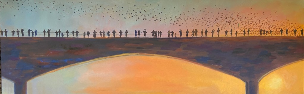
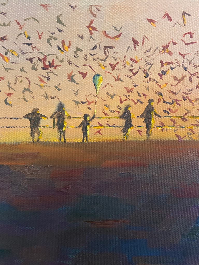
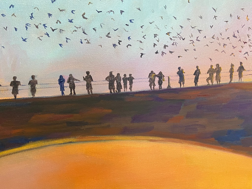
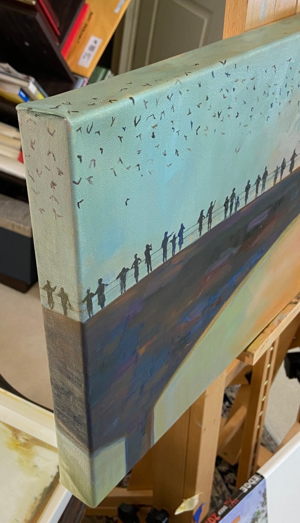
This piece is inspired by the bat colony under the Congress bridge in Austin, Texas, but note they are not the focal point. The 56 silhouettes along the bridge are the intended focal point, which as a group, show the evening observations of the bats on a summer evening. However, as you look at each individual person, you can see how their experience is unique. Hopefully you, as the observer, have some emotional response to some of these folks.
The sun plays a big part in this composition, cascading it’s golden light across the landscape, creating some strong value contrasts not only on the horizon, but also on the silhouettes, especially those on the right side of the bridge. It also creates a balance between warm and cool hues, with subtle purples in the middle creating a temperature transition. Lastly, the sun has been finished with a palette knife for an impasto effect, which helped amp up the brilliance.
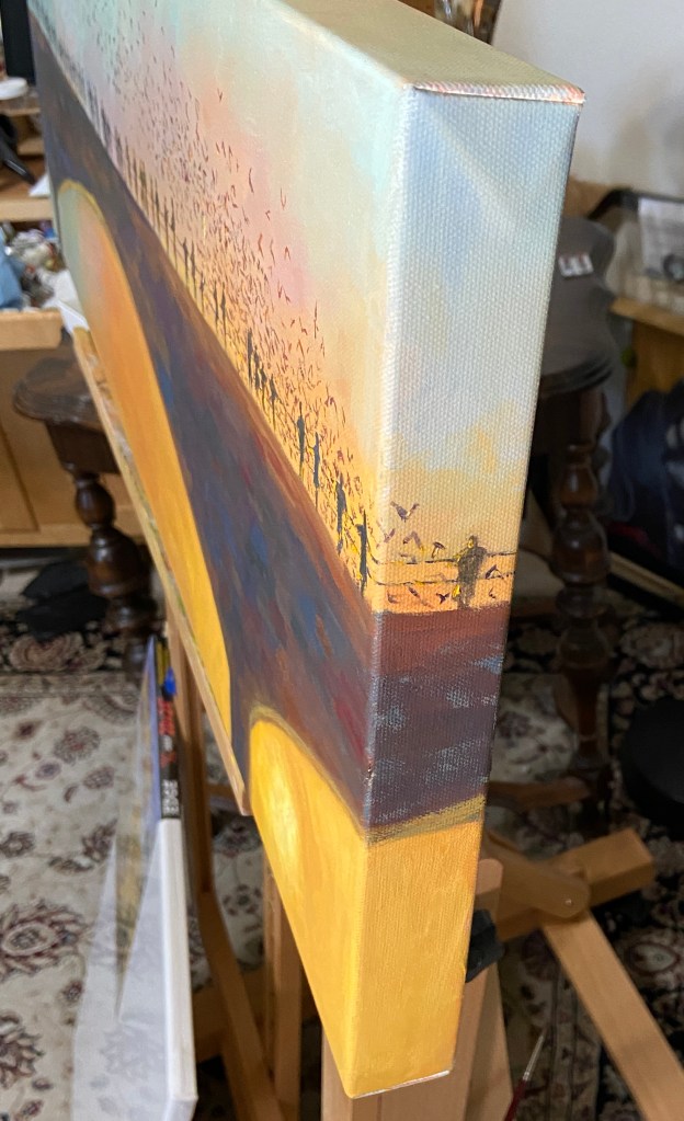
Another element of the composition is the use of the 1.5” edge of the canvas, allowing the bats and silhouettes to flow around the frame. The figures on each side are looking into the painting, which should help direct observers into the composition.
Stay tuned for additional bridge silhouette paintings!
GOING, GOING, GONE! | Triptych | 10×16” | Mixed Media on Wood
Sometimes things don’t go to plan. Bob Ross had a phrase for this in the art world, “happy accidents”. What dear ol’ Bob didn’t clarify was that sometimes the plan goes to shit before the painting begins!
GOING, GOING, GONE was supposed to be 3 square panels of equal size, the only progression being the artwork itself. However, before planning the composition I hadn’t verified the existence of 3 identical panels in my studio… AFTER having painted the middle panel, i.e. “GOING”. So rather than being the patient, pragmatic person who pauses the artistic process and acquires 2 additional identical panels before proceeding, I searched my studio for the next best option! It’s hard to tamp down unbridled excitement for starting a piece of art, so I’ll give myself a little break in that I was ready to get this thing moving without delay!
Turns out I was having a Bob Ross moment. The triptych, while unconventional, proved to be very effective in terms of turning your expectations upside down. Specifically, the pint of beer is drunk down over 3 stages, whilst the side of the panels increases. I’m sure the experience isn’t universal, but my senses get upended a little as I digest the 3 panels and have to do a double take because the detail, values, and saturation decrease as the panels dramatically increase in size. I hope it has the same effect for you, otherwise it might be a little boring.
As to the mixed media approach, I simply wanted to build on my recent foray into this technique. I suppose this could be done quite effectively with standard oil painting, but there’s something fundamentally different with the texture and chalky finish of spackle and acrylic paint that makes these artworks stand out from a crowd. That said, I think these pieces are like saltillo tile – you either love it or hate it – but either way you can appreciate its unique nature.
Lastly, I’m excited to frame this triptych, although I have no idea how I’m going to do it. However, I do like the vertical layout as done in the photo, which is a little different spin on the typical triptych layout, but it also forms the shape of a pint glass… so there’s that.
Stay tuned for the final decision. Perhaps it’s a painting you’d like on your wall?
This is project #2 from the aforementioned Textured Painting workshop at The Contemporary at Laguna Gloria. This was a real Bob Ross experience, as my original plan was to simply experiment with texture and some pottery tools to see how they manipulated the joint compound, as well as experiment on canvas board with my newfound medium. Lo and behold, I discovered ski tracks in the snow – an abstract painting exploration turned “real” composition.
The coloring of the snow is actually tinged with yellow and muted with purple, which is very hard to see in the photos. The first step was to paint the canvas panel all black, let it dry, then cover it with the off-white spackle. The pottery tool was some kind of metal prong with a very small, circular tip. Dragging this tool through the soft spackle exposed the black board underneath, sometimes closing back up over itself in the thicker sections, much like skiing through fresh snow.
On day 2, after the initial spackle had dried, using a water spritzer, I applied some kind of sparkly dust provided in the instructor’s box of goodies, which created a very cool reflective effect, like sun on snow. The last step was to apply a sky-blue acrylic mix to some of the wider tracks, which added color and the effect of the sky reflected in the snow.
Overall, I’m very happy with this abstract turned ski tracks realism piece. I think it would be a very marketable piece, too, at a larger size in a black frame for someone who loves skiing. Thank you, Bob Ross!
Virtual FrameFresh Tracks ZoomTextureTexture, Sparkles, and Blues
SPRING POINT LEDGE LIGHTHOUSE 2 | Mixed Media on Wood | 8×10″
I recently attended a 2-day workshop at The Contemporary at Laguna Gloria. The focus was textured painting, which ultimately boiled down to playing with joint compound (gypsum spackle) and acrylic paint. I was amazed at how easy and fun it was to adapt to this medium.The technique is very straightforward, whereby one mixes acrylic paints into the joint compound, which is an off-white, and do whatever you want provided it’s put on a hard surface, for which I used wooden boards.
Most of the class did abstract pieces, which make sense as you get to play with pottery tools to get cool shapes and textures. It’s very forgiving, too, because you can simply wipe it off and start over again provided you don’t wait more than a day, at which point it hardens. I chose to do still life and landscape pieces, taking advantage of the impasto nature of the spackle. The instructor said she hadn’t considered doing landscape compositions with this technique, but to me it seemed intuitively suited for the textural nature of the real world.
I intend to add some vibrancy to this composition with acrylic paint… I think. This is definitely the start of a new and exciting medium! Stay tuned for a number of new pieces in spackle and acrylics.
What the hell is a “flatiron” you ask? The really boring definition is from geomorphology, which I won’t repeat here, but the layperson’s description is “cool looking red and orange rocks pointing out of the ground at extreme angles.”
This was a plein air outing just south of Boulder, Colorado, in an area called Eldorado Canyon, at the South Mesa Trailhead to be specific. I was fortunate to spend this painting session with my mom, who had picked the location because of the great views of the Flatirons. I love seeing the Flatirons from this vantage point because you can see Devil’s Thumb very clearly and easily appreciate the jagged topography.
The location is also unique because if you turn around and look east, one can see a mere 5 -10 miles away the largest superfund site the in US history, Rocky Flats. As far as I could tell, the Flatirons weren’t glowing from the plutonium trigger waste, but I’m glad the wind was blowing in the other direction today. This may seem like a very weird mash of nature in one direction and nuclear waste in the other, but Colorado is a state full of contrasts – politically, environmentally, and geographically. As artists, though, it’s great because we all know stark contrasts make for good compositions.
I spent about 2-3 hours in the field working on this composition. I had never painted the Flatirons before, and not much by way of mountain landscapes either, so this was a challenge. Being on-site was definitely a plus in terms of capturing the essence of the Flatirons and helped shape the decision to use a palette knife and some impasto to shape the rock faces. It was also a little easier for me to get a sense of what I was looking at because decades earlier I had learned to rock climb on these very mountains! In fact, my first “real” rappel was from the top of Devil’s Thumb.
The final few hours of work was done in the studio back in Austin. In truth I had some fundamental trouble getting the depth right, namely the whole thing looked very flat, so I set it aside for a few weeks and returned with a fresh perspective. Turns out the greens were too similar throughout the piece, and the darker values in the middle ground weren’t cool enough. I think the final adjustments, especially the cooler greens in the middle ground and horizon proved to be a vast improvement.
If you’re in the Denver / Boulder area, I highly recommend a visit to Eldorado Canyon. There are some great views (obviously), beautiful hikes, and you can also watch some of the craziest free climbers in the country scale the canyon walls.
Reference PhotoHomestead at TrailheadSouth Mesa Area MapSetup and ProgressVery Flat, No Depth, Too GreenFinal Composition With Depth
Mirror Pond, Austin TX | 6 x 8” | Oil on Linen Board
Taking in more of the great Spring weather, I headed out to do some more plein air. This session was at a place called Mirror Pond in Austin, very close to Lady Bird Lake and part of the Zilker Nature Preserve, which was the first nature preserve created in Austin back in 1935 (learn more at AustinTexas.gov). No dogs allowed, so my canine assistant, Zip, could not join me today to keep the pesky squirrels away.
Mirror Pond is gorgeous and tranquil when it has water, but I was pretty sure today it would be dry, which it was. What I wasn’t expecting was such a pretty site despite the lack of water. I probably wouldn’t have noticed half of the cool geological formations had there been a pond to ogle over.
For those of you not familiar with plein air painting, one of the challenges is finding subjects that you can paint quickly and not get scuttled by the fast moving sun and shadows. I’ve included a gallery of photos below that show this effect and why it’s important to a) move fast, and b) take lots of photos early so you have something to work from in the studio to finish the work.
Fast Moving Light! The timeframe is merely 90 minutes.
This composition started out as nothing more than a “get out there and paint” goal, but once I got the piece back in the studio and began fiddling around with some compositional ideas, it sucked me in for hours!
Short Trail to Mirror Pond with Setup Views
I was asking myself “why the hell am I painting a cedar tree again?” As noted in previous posts, I hate cedar trees for many reasons, but it seems that I can channel that fury-based energy into artistic currency. In this particular case, I pivoted my initial focal point from the sideway limestone arch to the interestingly shaped cedar tree above it.
The first thing that caught my attention was the cool shape of the cedar tree; it’s actually the inverted shape of the limestone arch upon which it sits. See it? It’s not perfect, but close enough to draw my interest. Secondly, I used some artistic license to accent the red (representing my burning hatred of these trees) of the cedar limbs to make the entirety of the greens pop. It also had the unintended side effect of increasing the value contrast against all the other greens in this composition.
Painting Mirror Pond has also reminded me that the craft of plein air is often about making a mediocre landscape come to life. Not sure if I managed to pull it off this time, but I learned a lot along the way.
Block InColor and DarksGrays and RocksFinal Field WorkImpasto EffectsMirror PondProgress Gallery
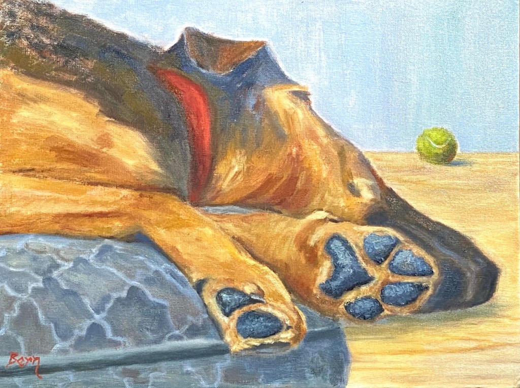
This piece is inspired by playtime with Wolfy, who loves fetch despite the challenge of galloping around with his huge paws!
Dangling Paws
There were a few new challenges with this piece, namely capturing the various golden browns of Wolfy’s shepherd-hound coat, as well as the texture of his paws. The key to the coloring was working in various reds and warm yellows, but it took a lot of experimentation to get the right likeness. The paws were more about the texture from using a painting knife instead of a brush, which made the surface of the paws look rough and realistic.
However, the hardest part was the dog bed. I got it in my head that the pattern of the bed would help give the sense of plush comfort that Wolfy’s 85 pounds was enjoying as he slept with his head and paws dangling off the edges. It turned out to be effective, but the next time the bed will have no artistic flair.
Today I wanted to share some simple varnishing techniques that can quickly and easily protect a painting. Nothing earth shattering here, but if you haven’t done a lot of varnishing of finished artwork before, or simply curious about other techniques, hopefully there are some tidbits for you in this post.
Supplies:
Varnish – I use Gamblin Gamvar Picture
Cosmetic Wedges
Rubber gloves
Paper towels
There are various types of varnish that can be used to get a good protective coat on a finished painting, but I like this particular varnish because it’s virtually odorless and very easy to use because it doesn’t become tacky too quickly. Instead of a wide soft brush to spread the varnish around the painting, I like to use cosmetic wedges instead because a) they don’t shed hairs like a brush does, b) they’re cheap, and c) it’s easier to spread varnish.
I’m varnishing 2 pieces, one large canvas and one small panel. I’ll focus on the larger canvas piece, but I wanted to provide the smaller panel periodically to illustrate another surface.
Varnishing Setup
This painting, Zip’s Flowers, was finished a couple months ago and has been stored on a drying rack, largely away from dusty conditions. Even in a nicely controlled drying condition such as this, I still take the time to wipe down the painting surface to get rid of the dust. What I find works best is first sweeping the surface with a wide clean brush, preferably one that hasn’t been used before, followed by a few wipes with a Swiffer dust cloth. The idea is to ensure that there isn’t a fine coating of dust anywhere on the painting, otherwise it’ll clump up when you apply the varnish.
To apply the varnish, lay the painting flat on a covered surface with some bright light overhead. Pour some varnish directly onto the painting. I like to pour a small puddle, about the size of quarter, in the middle of the painting, then slowly spread it around using one of the cosmetic wedges. Don’t overthink this part – just pour and spread. This allows me to see how the varnish will spread and the kind of coverage I can get with a small amount to start. It’s much easier to add more varnish than it is to try and gracefully remove excess; trust me, it’s not pretty. For every one of the DIY YouTube videos demonstrating varnishing techniques out there, I assure you there are 10 deleted videos of instructors slopped in varnish and/or furious at brush hairs drowning in tacky varnish.
Add more varnish as needed to get the entire painting surface covered, but remember it’s not about thickness, just coverage. The reason I suggested having a bright light overhead is to allow you to see the reflection of the surface and thereby quickly find spots that you missed.
First Coat Complete
Another advantage of using the cosmetic wedges over a brush is the complete mindlessness involved in spreading the varnish over the surface. Again, go back to any of the DIY YouTube videos and you’ll see how obsessed they are with brushing carefully so you a) don’t end up with too many brush hairs in the varnish, and b) getting a smooth surface. By contrast, the wedges are very soft and don’t even snag on impasto areas of the painting, so you can easily manipulate the varnish around the painting. Note that you might end up with some very tiny bubbles if you’re spreading quickly or pressing down too firmly, but they will go away in a few minutes and in my experience are never an issue.
After the varnish has been applied, I return the painting to its dust-friendly rack and let it dry. The varnish I’m using dries pretty fast, but I wait another week before applying a second coat. You can see in the gallery at the end of this post the results, but to set expectations remember this is not a high gloss finish, although you can use varnishes that give a more intense finish. Ultimately I’m looking for what I like to call fresh protection for the painting, meaning the varnish recharges the hues and vibrancy of the painting which also providing a protective layer that will allow your masterpiece to last a few hundred years.
Unvarnished
First Coat (wet)
Second Coat (Wet)
Varnished and Dry
Small Panel Varnished and Dry
Varnishing Progression (NOTE: a before & after comparison is hard to capture with photos)
The whole process takes about 15 minutes for the initial session and it’s very simple so there’s not a lot of trial and error involved.
This week’s composition is going to be auctioned off for charity to support the Central Texas Food Bank, which needs donations to support the growing demand generated by the Coronavirus pandemic. Despite the lighthearted nature of this painting, which is intended to inject some humor (at nobody’s expense) into a bleak situation, the Coronavirus is a serious challenge for the world that needs leadership and creativity to overcome. Details regarding the auction and how to participate are at the end of this post.
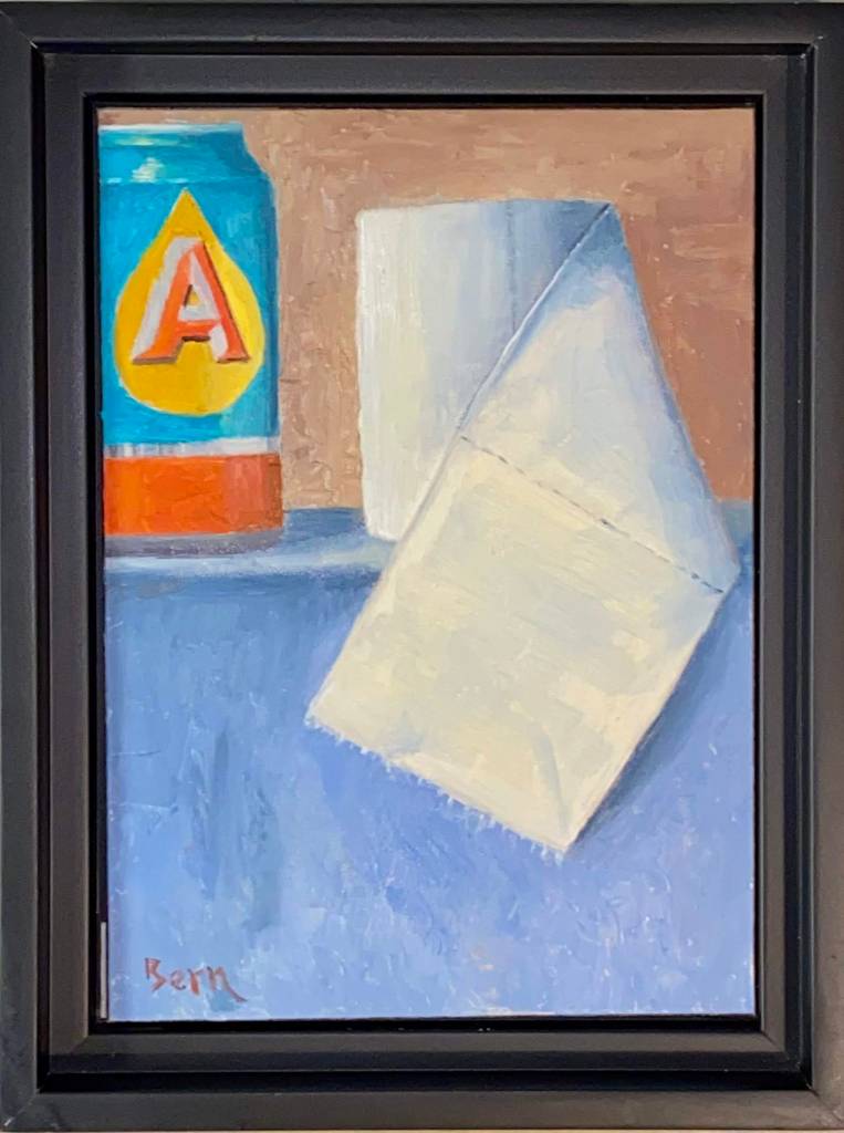
I’ve enjoyed working on more still life this year and I’m starting to get a better feel for various objects. The use of toilet paper and a beer can struck me as an interesting challenge because they are so contrasting in their own composition. In fact, if you really think about it, beer and tp have quite a strong relationship despite their contrasting structure, but that discussion is for another day. When I started this piece we had recently returned from a couple of trips to various grocery stores to stock up on supplies and at the very least, secure a couple weeks worth of toilet paper, beer, and wine. Priorities, right? Local news coverage continued to highlight hoarding and runs on tp (sorry, just can’t help myself), at which point my nervous laughter and need to find something positive in all the bad news led to the idea (hard to call any of this “inspiration”) for this composition. At the very least it gave me an outlet through art and a chuckle at the madness the world sometimes throws our way. I hope you get a guilty giggle from this piece too, but if the work is offensive in any way, please accept my heartfelt apologies as my goal was well intended. And ultimately, the related auction of this piece will provide a donation that will feed many people in need during this serious time.
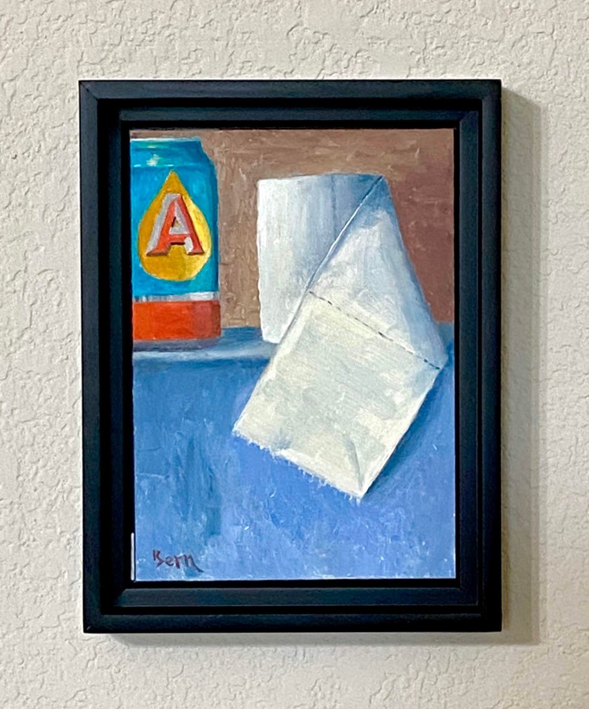
Final Close Up
Final Framed
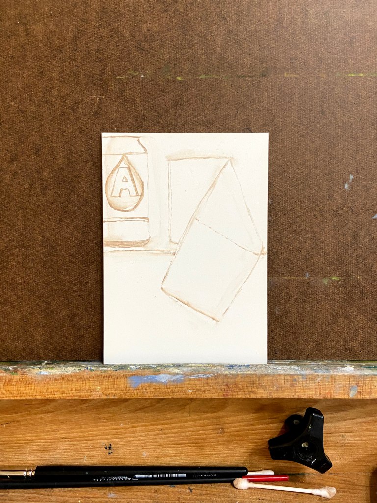
Progression
Rough In Sketch
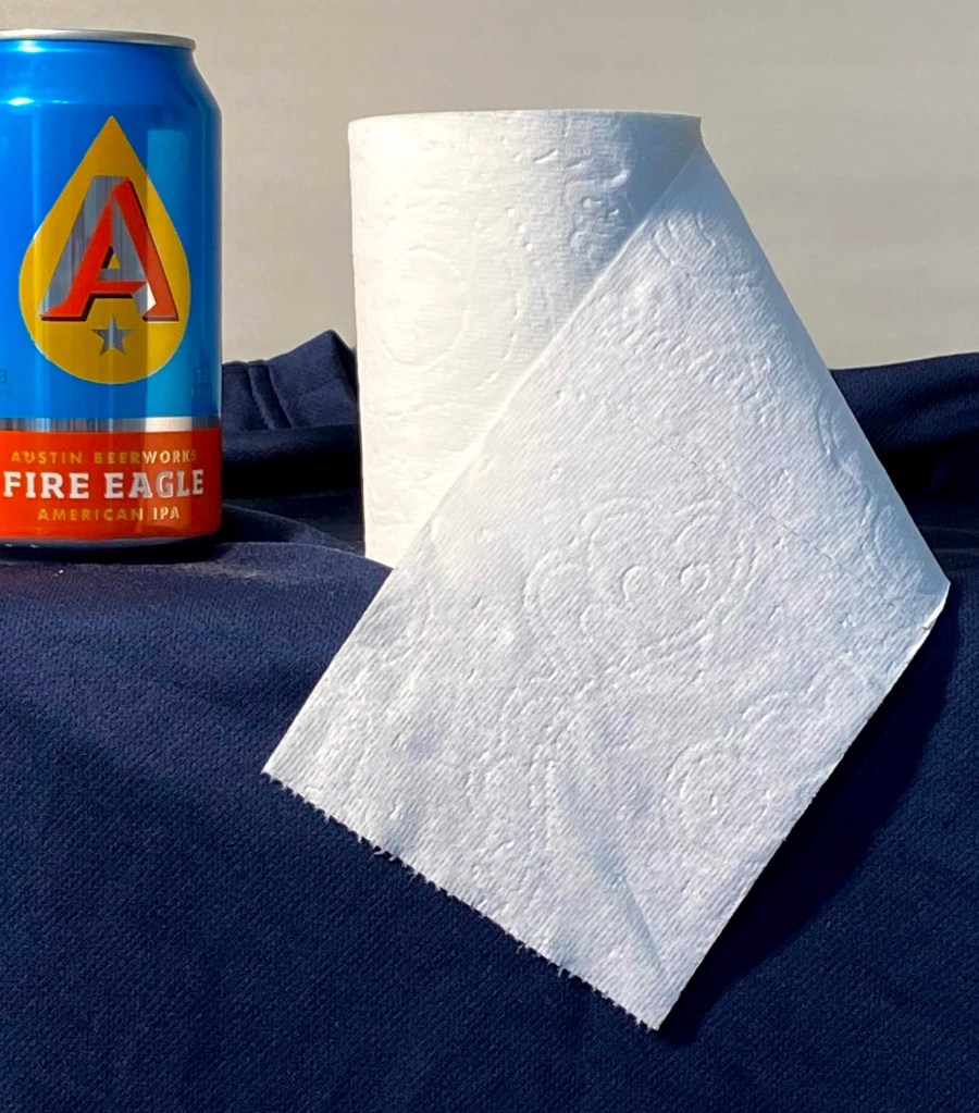
Reference Photo – TP and Austin Beerworks Fire Eagle IPA
Special Art Auction Details
This week’s composition is going to be auctioned off for charity to support the Central Texas Food Bank, which needs donations to support the growing demand generated by the pandemic.
Auction Overview
Artwork is called Pandemic. My Austin friends will recognize the beer can, but for the uninitiated, it’s Austin Beerworks’ Fire Eagle IPA. The source of the toilet paper, however, is uncertain.
This is original artwork, completed March 18th, 2020. The painting is done in oil on a 5″ x 7″ wood panel. The artwork is being sold framed.
The auction is being done as an Event on my Facebook art page, “Impasto”. Direct link to the Event is here.
100% of the winning bid will go directly to the aforementioned charity, Central Texas Food Bank. The winning bidder will receive a copy of the receipt from me showing the donation was made in full.
No shipping fees if sent to a United States address. International shipping rates will apply.
Letter of authenticity will be included (proves provenance and confirmation of original artwork).
Winning bid must pay via PayPal, Venmo or check. Artwork will be shipped upon processed payment.
If you want to participate in the auction, follow these simple steps:
Go to my Impasto Facebook page here, and navigate to the Events section, or navigate directly to the Eventhere; look for the event called “Special Art Auction Benefitting Central Texas Food Bank”. The About section of the Event will reiterate these auction guidelines and information about the artwork. Go the Discussion sectionto place bids via the Comments section.
BIDS MUST BE MADE IN THE COMMENTS SECTION OF THE EVENT.
The opening bid must be at least $50. Bidding must be done in no less than $5 increments, which means your bid must be at least $5 more than the previous high bid listed. Of course you can feel free to make incremental bids much higher than only $5!
The comments should sort old to new, so scroll to the bottom of the comments to see the latest high bid. WARNING – sometimes Facebook gets a mind of it’s own and the comment sorting logic gets whacky, so just make sure you pay attention.
Bidding opens at 12Pm CDST, Saturday, March 21, 2020. Bidding will close at 5pm CDST, Friday, March 27, 2020.
Winning bidder will be notified Friday, March 27th, 2020.