Today I wanted to share some simple varnishing techniques that can quickly and easily protect a painting. Nothing earth shattering here, but if you haven’t done a lot of varnishing of finished artwork before, or simply curious about other techniques, hopefully there are some tidbits for you in this post.
Supplies:
- Varnish – I use Gamblin Gamvar Picture
- Cosmetic Wedges
- Rubber gloves
- Paper towels
There are various types of varnish that can be used to get a good protective coat on a finished painting, but I like this particular varnish because it’s virtually odorless and very easy to use because it doesn’t become tacky too quickly. Instead of a wide soft brush to spread the varnish around the painting, I like to use cosmetic wedges instead because a) they don’t shed hairs like a brush does, b) they’re cheap, and c) it’s easier to spread varnish.
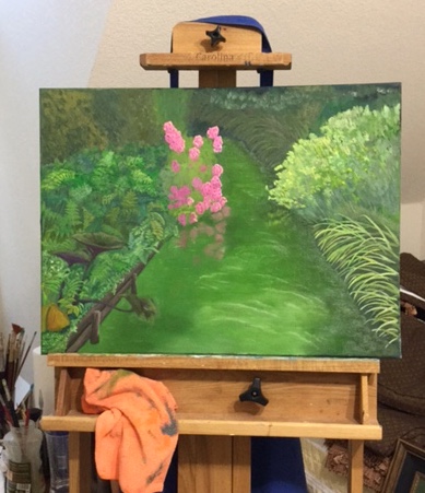
I’m varnishing 2 pieces, one large canvas and one small panel. I’ll focus on the larger canvas piece, but I wanted to provide the smaller panel periodically to illustrate another surface.

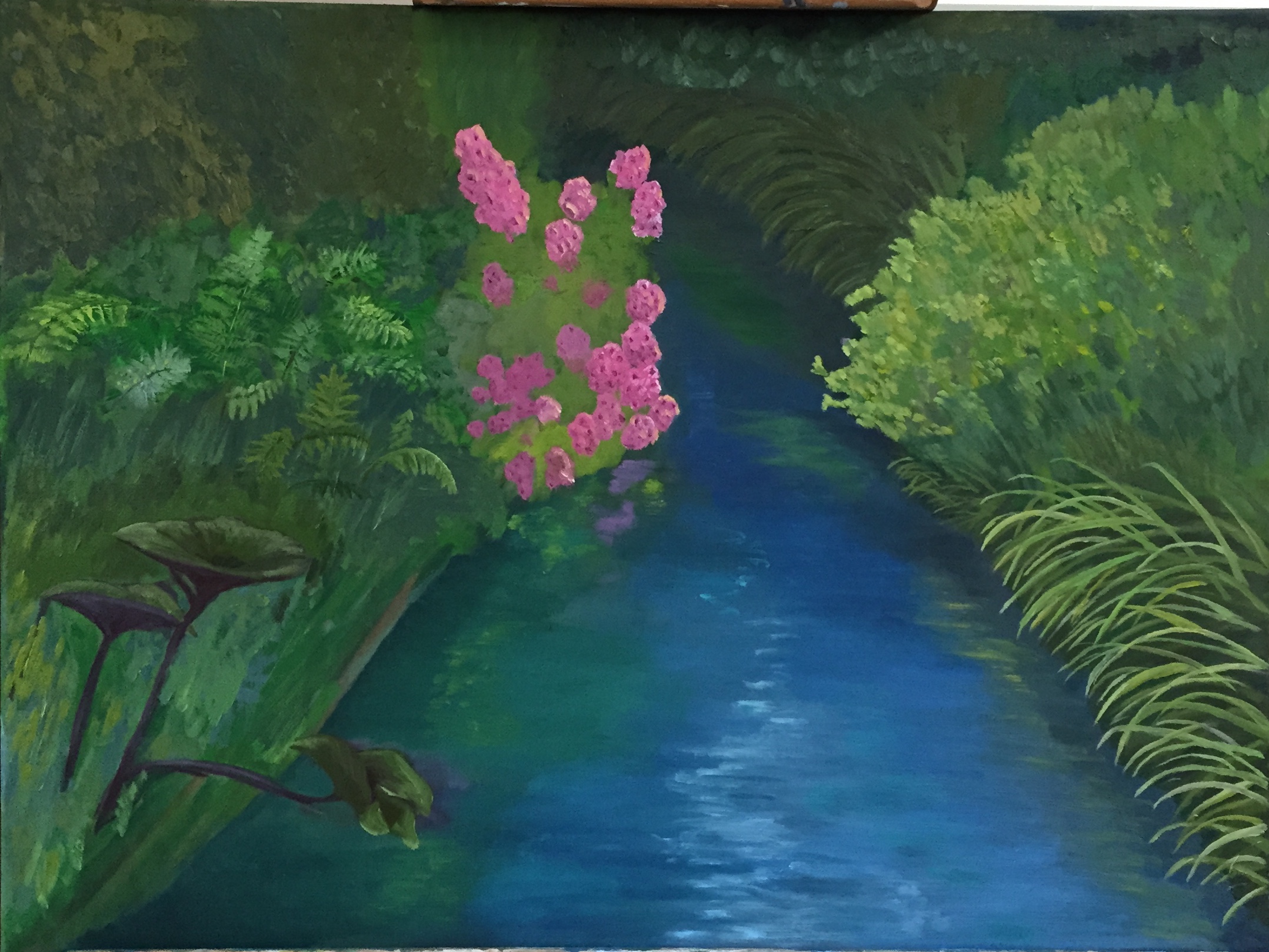
This painting, Zip’s Flowers, was finished a couple months ago and has been stored on a drying rack, largely away from dusty conditions. Even in a nicely controlled drying condition such as this, I still take the time to wipe down the painting surface to get rid of the dust. What I find works best is first sweeping the surface with a wide clean brush, preferably one that hasn’t been used before, followed by a few wipes with a Swiffer dust cloth. The idea is to ensure that there isn’t a fine coating of dust anywhere on the painting, otherwise it’ll clump up when you apply the varnish.
To apply the varnish, lay the painting flat on a covered surface with some bright light overhead. Pour some varnish directly onto the painting. I like to pour a small puddle, about the size of quarter, in the middle of the painting, then slowly spread it around using one of the cosmetic wedges. Don’t overthink this part – just pour and spread. This allows me to see how the varnish will spread and the kind of coverage I can get with a small amount to start. It’s much easier to add more varnish than it is to try and gracefully remove excess; trust me, it’s not pretty. For every one of the DIY YouTube videos demonstrating varnishing techniques out there, I assure you there are 10 deleted videos of instructors slopped in varnish and/or furious at brush hairs drowning in tacky varnish.
Add more varnish as needed to get the entire painting surface covered, but remember it’s not about thickness, just coverage. The reason I suggested having a bright light overhead is to allow you to see the reflection of the surface and thereby quickly find spots that you missed.

Another advantage of using the cosmetic wedges over a brush is the complete mindlessness involved in spreading the varnish over the surface. Again, go back to any of the DIY YouTube videos and you’ll see how obsessed they are with brushing carefully so you a) don’t end up with too many brush hairs in the varnish, and b) getting a smooth surface. By contrast, the wedges are very soft and don’t even snag on impasto areas of the painting, so you can easily manipulate the varnish around the painting. Note that you might end up with some very tiny bubbles if you’re spreading quickly or pressing down too firmly, but they will go away in a few minutes and in my experience are never an issue.
After the varnish has been applied, I return the painting to its dust-friendly rack and let it dry. The varnish I’m using dries pretty fast, but I wait another week before applying a second coat. You can see in the gallery at the end of this post the results, but to set expectations remember this is not a high gloss finish, although you can use varnishes that give a more intense finish. Ultimately I’m looking for what I like to call fresh protection for the painting, meaning the varnish recharges the hues and vibrancy of the painting which also providing a protective layer that will allow your masterpiece to last a few hundred years.

Unvarnished 
First Coat (wet) 
Second Coat (Wet) 
Varnished and Dry 
Small Panel Varnished and Dry
(NOTE: a before & after comparison is hard to capture with photos)
The whole process takes about 15 minutes for the initial session and it’s very simple so there’s not a lot of trial and error involved.
Have a great week!