Tag: Giverny
Giverny – There’s no panic in painting!
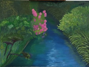
Took another stab at Giverny. Added the remaining foliage in the lower left bank, added the wooden posts, and took yet another whack at the water.
This water is looking much better than past efforts. Did some research and practice sessions to work on the technique. Pretty sure this will be easier the next time I take on moving water because it will be from a clean slate, but correcting/updating this piece is tricky. Regardless, I stuck with my “don’t panic, there’s no panic in painting” mantra and pressed forward. I’m happy with the progress, but the water will have a couple more sessions of work. However, for the first time, I feel like the basic structure and feel is in place. Yeah, some of the greens are too saturated, and the gray sky reflection (the white-ish part in the center) isn’t working yet, but it’s a huge stride past where I’d been stuck before. Feel like I’ve pushed past a plateau and can build from this. That said, anyone with helpful advice is more than welcome to offer; as you can tell from past posts on this project, I could use the help.


Back on the Canvass! Giverny Stream
Went on a short hiatus, but getting back in the swing of things. Getting ramped up on a few new projects, but knocking the rust off by revisiting an old foe – the love / hate relationship with Giverny. Original post is here.
There is a post of earlier progress on this green monster, but I’m finally starting to get my head around the challenge of reflections in moving water. See for yourself…

First, tried doing variations of blue water with white highlights, which didn’t look right. Roughed in the purple flowers in the lower left front corner.

Next idea was to do more greens with more aggressive use of whites/grays to give the sense of moving water. That didn’t work, but the additional work on the ferns on the right side was productive.

Third swing was building up much more gradual and interlaced mix of greens and grays. This photo is poor quality and doesn’t show the water very well, but it’s actually better in reality. Next session I’ll work in more of the greys to really give the sensation of moving water under a grayish sky. Also spent time reworking the reflections of the pink flowers and yellow flowers, both of which look really good in terms of glassy look on the water.
Daily Sketch #13: Giverny bamboo
Please excuse the hasty sketch today. This is the non-lily pad part of Giverny. The whole place is amazing, despite the crowds, and it’s easy to overlook this reflective pond bathed in green bamboo, green underbrush, and green boats – trust me, its a lot. The pond reflections of the bamboo are more detailed than the actual real bamboo b/c the angle of reflection reveals a larger swath. Needless to say I ignored that reality in this quick sketch. Hope the spirit of the place conveys despite the roughness.
Giverny Update
Spent a few more hours on the sea of green. Since the last post, I’ve worked on the back of the landscape, working in more dark tones to get things pushed backwards. But the bulk of time was spent on the large grouping of ferns on the left bank, and the bright pink flowers that are the focal point. Also added some life to the darkest part of the stream and the long grass hanging over it.
Prior to these past two sessions, I spent a little time experimenting with color mixing to get a wide array of greens. Greens are tricky, in my opinion, because there are so many subtle differences, even in the most innocuous of landscapes. It’s also takes some time to control the saturation values properly so the tone of the entire composition is consistent, which seems harder to do with a natural landscape full of green plants.
Next up is the stream, which is really out of whack in the current state, but I don’t think it will take a lot to get it firmed up.
New Project: Giverny – La deuxième fois
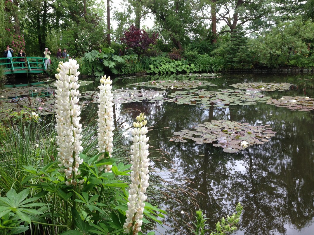
Taking on a new, larger project based on another very green Giverny photo. The good news is that I took it in person, which means I was at the stunning Giverny gardens with my beautiful wife – pretty ideal to say the least. The bad news is all that intimidating green.
Reference photo is pretty good, and it’s readily apparent how one can be lead into the photo.
I spent the better part of an hour tonight doing nothing but experimenting with mixing variations of greens, mostly using Permanent Green Light and Viridian Green, and testing how they change with the addition of various secondary colors – burnt siena, cad red, cad yellow light and medium, cad orange, and ultramarine blue. Staying away from pthalo green for now, but I’m happy with what the results are.
A couple weeks ago I got this painting started. After a quick reference drawing in my sketch book, I laid in very remedial base layers, emphasizing darks. This looks like total crap for now, but that was expected as the next session will build more value range and better greens to give it some life.
Canvas size is 24×18″, which is large for me. I’ve done this size a couple times before, but very basic stuff, so this will be different. I may also try to do some large chunks of this with a palette knife instead of a brush. I have a workshop in February with David Cheifetz and my experience with painting with a knife is very limited. Fingers crossed!
Giverny – Water and first pass at lily pads
Got the first pass at the water and lily pads done yesterday. Short 2 hour session, but was pleasantly surprised with how quickly the lily pad palette came together. Hard to see in this photo, but the range of colors includes greens, purples, and blues. The water is also darker than it appears in the photo – deeper blue gray – which makes the lily pads in the foreground sit up as if they’re on top. I think glazing will have to be done for a couple of final steps later in order to get sections of the lily pads to appear under water.
Next session will be completion of the remaining lily pads (dark areas in water on left side), rough in the bridge, and a rough in of the tall white flowers in the foreground, which re the key component to the painting. We’ll see… gonna be tough, but should be fun.

Finally got the canvass covered with a first layer. Tried to block in the base values, but I tend to over think details even at this early stage, so instead of looking like a well structured set of values, it looks like a kindergarten project. But maybe that’s how it’s supposed to look with this many details to deal with. Should be fun if I can figure out the water and lily pads, which dominate the middle of the painting and will need to be balanced just so to get this to work.

Did a single practice sketch in my small sketch pad and got the perspective pretty quickly.
Not happy with the choice in turpsy green as a starting base, but next time I’ll take some time to mix a more appropriate mid-range green.
I like the vertical and horizontal compositional components; but not sure if the final painting will have the engaging effect I’m hoping for on the viewer. We’ll see…

After a 3 month break for shoulder surgery, the painting arm is back – achy, but good enough for a few hours at a time.
Returned from a trip to France with some new material. This will be a tough one, but I’m hoping to learn a lot about a) greens and b) underpainting. Don’t have high expectations for realism with this, but it should be a great way to get the creative juices flowing again.


