Keep Those Pencils Sharp

Central Coast – Morro Bay | 9 x 12” | Colored Pencil on Paper

A few months ago we took a trip to indulge in wines of Paso Robles, California. This is a beautiful area, a little hard to get to, and the wine is fantastic. Don’t get me wrong, I’m no wine snob… my palette is worth a $40 bottle of wine at best. However, over the years we’ve done a lot of travel around the world and there is no better way to find wines you like than to be in the actual region and explore. Again, we tend not to go to places for the purpose of doing wine tastings, but what else are you going to have with dinner?

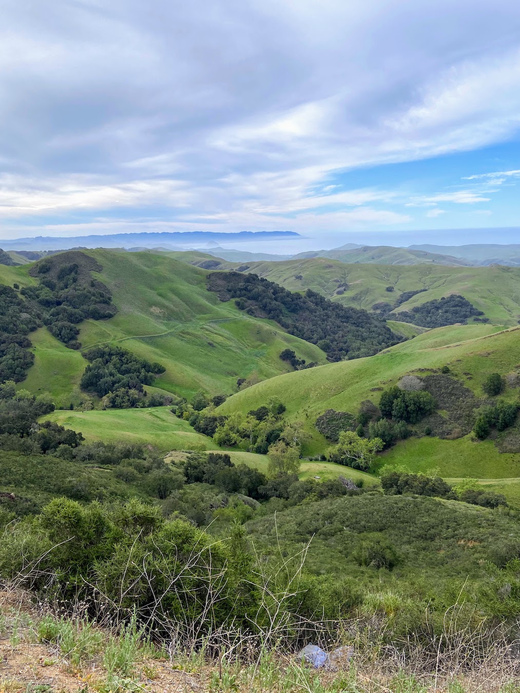
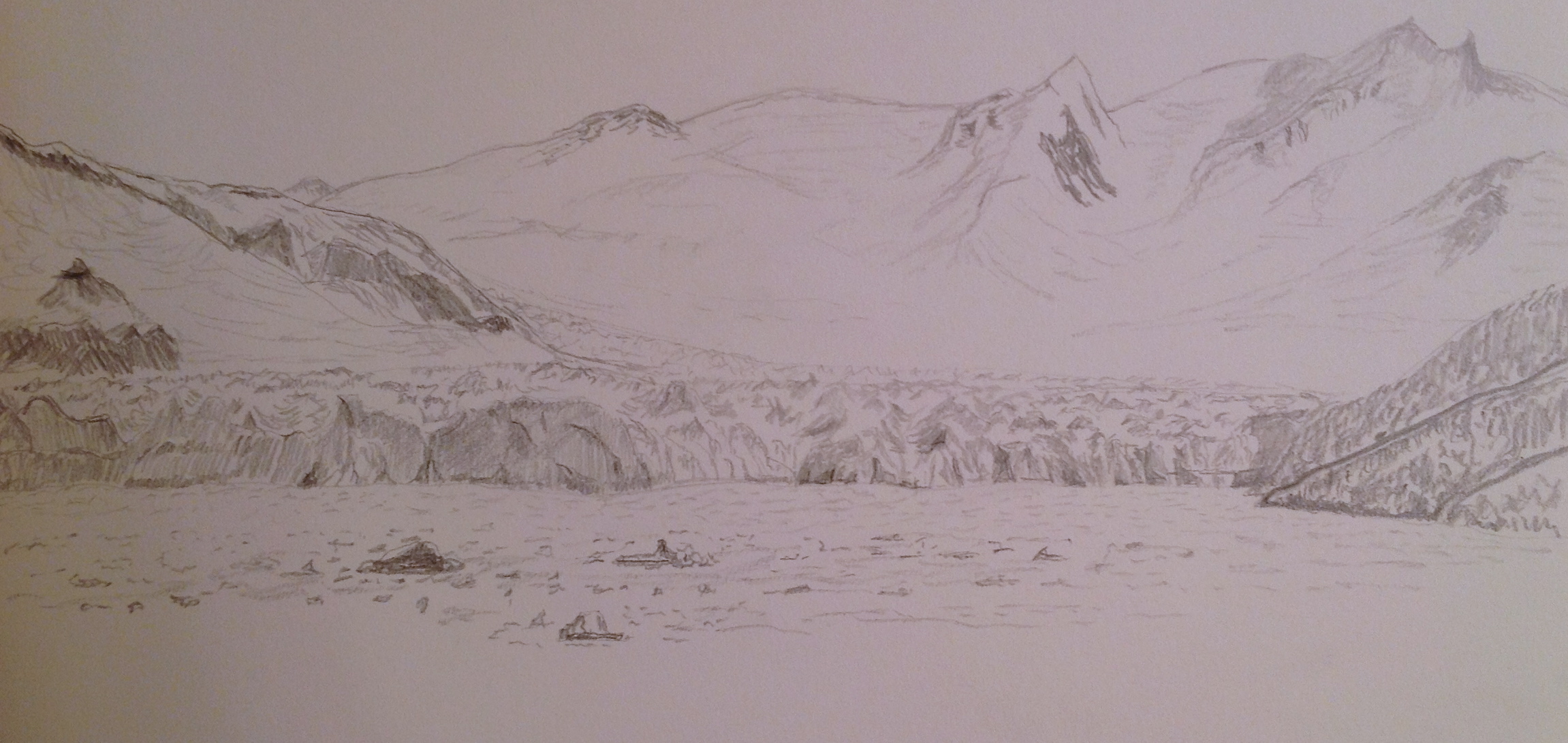
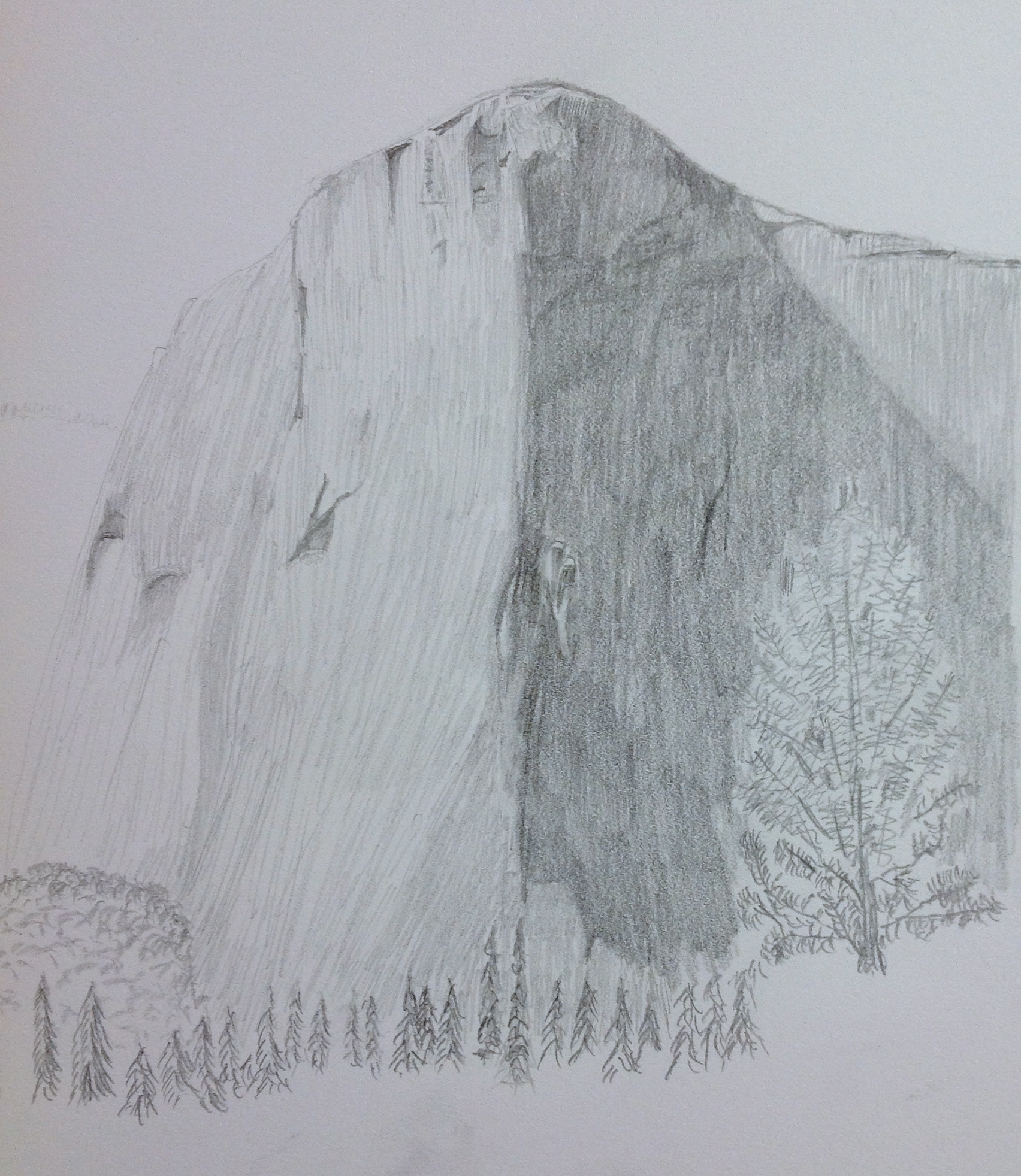
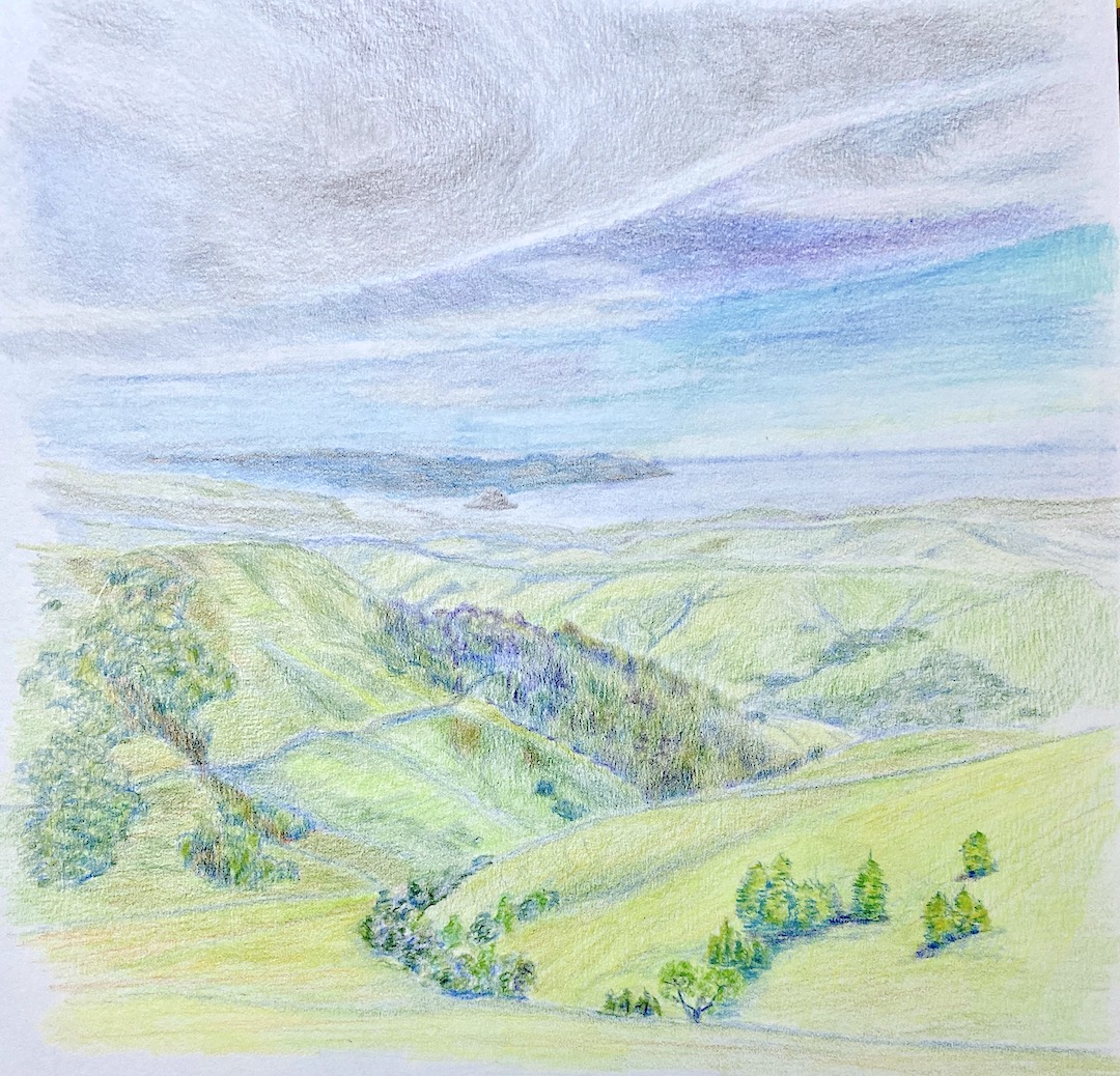
We took a beautiful drive from Paso Robles, CA to Morro Bay. Along the way we came across this stunning view, giving a first glance of the ocean as we wound through the hills. As you can see from the reference photo, it’s beautiful, but as an artist you see a whole lotta green! 

I chose to do this piece in colored pencil instead of oil paint for two reasons. First, I’ve recently started experimenting with colored pencils and the investment in a new pencil set needed some return. Secondly, it gets brutally hot in my upstairs studio during the summer, so having the pencils setup downstairs is an easy way to get my creative fix for the day if I don’t feel like running the AC for 3 hours in the middle of the afternoon. Pragmatism, go figure. 

I’ve done a few practice sessions with colored pencils after taking a workshop from Jenny Granberry, who is a great artist and instructor, a rare combination. This piece was a challenge and intended as a massive practice exercise with the goal of something “completed” in the end. This composition was a challenge for reasons beyond my lack of colored pencil experience. First, I can’t remember the last time I’d done a drawing-based landscape, and secondly, the greens! 

What I find the most interesting part of this piece is the fact that I worked from the top down (far to near), and I don’t know about you, but I can definitely see that the bottom part of the drawing is notably better than the top. I can hear Jenny now… keep your pencils sharp and go slow. I hear you Jenny, I hear you, it just took half a page to get there. 

As to the greens, I focused on blending variations of blues in the more distant hills, segueing to stronger yellow in the foreground. I wasn’t excited about the final look initially, as it lacked warmth from the sun, so I drank some wine to work up some liquid courage to grab an orange/red pencil to add an overlay to the foreground hills. Unlike oil painting, you can’t just wipe off pencil – true, it can be erased, but then you’re compromising the “tooth” of the paper, and at some point I hope to be good enough that something like that matters. 

In the end, Central Coast – Morro Bay was a great learning experience and provided a wealth of knowledge through trial and error. I also think I’ll return to this subject matter in landscape perspective for a larger oil painting. 

Thanks for reading!

Soulful Eyes

Vedder | 8 x 6” | Graphite on Paper

This is a friend’s dog, Vedder, who I’ve never met… the dog, not the friend. I only know about this adorable black lab (I’m guessing… looks like a black lab, hoping he’s a rescue dog, too) because I occasionally check Facebook and he manages to take a lot of really good photos of his dog. As a doggy dad myself, I know how hard it is to get a good pic of your dog, especially a black one. 

I’ve been spending a lot more time this year working on dog portraits and other dog related compositions. Many of them have fallen short of anything resembling artwork, thus the lack of posts on this topic. However, some things have started to click lately and I believe it’s because I’ve returned to the core exercise of drawing instead of painting dogs. I’ll bounce back to painting them very soon, but sometimes my brain needs a reset in terms of how it translates between my eyes and the canvas. 

Vedder was all about getting the face, especially those soulful eyes, just right. I’m pretty happy with the outcome, especially since the initial drawing block-in required very little adjustment. In other words, the proportions of the face and related features was accurate from the outset, something I hadn’t been getting right with the brush and canvas. 

Drawing dogs is very tedious, but it’s offset by very rewarding outcomes. The process of drawing hair via thousands of “strokes” is a test of patience, which artists really need, but oftentimes it can be elusive as you’re excited to get a composition done. Vedder is an older pup, how old I’m not sure, so he has features such as white hairs and a well-used dog nose. These are very tricky to get onto the paper with graphite only. As you can tell from this composition I missed the mark on that front, but the rest of the details I hope capture the personality of Vedder. I’ll have to cross post this on Facebook to see if my friend has an opinion. 

On the technical front, I used 3 pencils – HB, 2B, and 4B. The paper is very basic, no idea what it actually is because it’s a sketchbook that I usually tote around on trips when I want to get some sketching done to capture the place for posterity. Very convenient, but the paper has no teeth which makes it hard to layer hair strokes with value shading.

Thanks for reading… and GO HUG YOUR DOG!

#artbern #berntx #crashboomzip #painting #art #abplanalp #bernabplanalp #austinartists #rescuedogs #bestfriends #dogsofinstagram #dogsofinsta #dogstagram #oilpainting #fineart #petsofinstagram #contemporaryart #fosteringsaveslives #dogsofig #adoptme #takemehome #austinpetsalive #mutts #muttsofinstagram #snouts #wetnoses #blacklabs #hugyourdog

Daily Sketch #20: Daily Buzz

IMG_3158

Sorrento’s is the coffee shack across the street from my office. This is a more complicated sketch than I had time to complete, but this gets it most of the way there. I’ll work on this one some more and perhaps post the final drawing.

I like drawing buildings despite the exactitude of the lines. I used this sketching opportunity to free-hand all the lines instead of using a ruler. It’s good practice and gives the composition a more artistic look, as opposed to an architectural sterility.

I spent a couple hours on this one, using mostly 2B and HB pencils.

Daily Sketch #19: Pointe Du Hoc

IMG_3160

Got behind with posting, so playing catch-up for a couple days and the memory on some of the details are hazy.

This is the Normandy coast, from Pointe Du Hoc looking east. It’s a very moving place. If the sheer historical value of the place doesn’t grab you, the pill boxes and pockmarked landscape of D-Day bombs will. Words cannot express my gratitude and respect for the actions and bravery delivered by the Allies in this part of the world. An unfortunate time with a fortunate outcome.

As for the sketch, its lacking. I’m not sure how to sketch the cliffs, but I know part of the problem is too much detail and trying to be to realistic with the textures of the rocks. I’ll get it right at some point, but today wasn’t the day.

Daily Sketch #18: Ahoy Matey!

IMG_3115

Today’s sketch is courtesy of a French harbor. There was another boat alongside this one, but I took it out to reduce complexity and time. Curves on the boat were fun and the shading of the mast was essential in giving it the right shape.

All the stuff in the background is made up. Wanted to give the sketch some better context and these were easy things to add quickly.

Daily Sketch #16: Alaskan Ice

IMG_0206

Today’s sketch is an Alaskan Glacier. The actual photo has these brilliant aqua blue colors against the white snow. But it also has this very carved and complex blocks of shading throughout, which makes a sketch very challenging. Also a good test on perspective and how to give the impression of distance without using any real clear reference point in the sketch. Hoping you get the sense of sheer size of the glacial wall.

Daily Sketch #14: “On Belay”

IMG_0202

Inspiration for today’s sketch is El Capitan in Yosemite National Park. Another reference photo from a very memorable trip a few years ago. I actually did a sketch at the site en plein air while we had a picnic and watched the climbers work their way up the wall, so small I can’t even find them on the reference photo. Amazing feats of strength. Look out Festivus, here they come!

Even as a quick sketch – took about 90 minutes – I learned some interesting techniques that I was too inexperienced to consider when I first attempted this drawing. First, the simple long sketch lines naturally help define the contour and direction of the granite face, which means this is one of the rare occasions that you don’t have to worry too much about “hiding” a mass of disorganized sketch lines. Secondly, the challenge of value transitions from the light side to the shaded side is not as straight forward as it looks. The reference photo throws you off b/c it’s not accurate, but I didn’t figure that out until I had a black and white cookie on the paper instead of a iconic rock mountain. In other words, the shadow side has more variations than what it appears to have in the photo. But most importantly, the random cracks and crevices that aren’t in the shade can easily be worked too dark, which makes them jump to the front of the sketch, so I had to use a lesser value by about 2-3 scales to ensure those areas stayed tucked into the rock face instead of looking like they were dark bumps popping onto the surface.

This is one of those projects that I could stay glued to for hours. The complexity of the rock face is a fun challenge, and would be a fantastic drawing on a much larger scale (this sketch is on 9″x12″). I’ve also come to realize that compositions like this are probably much more interesting with graphite instead of paint.

Daily Sketch #13: Giverny bamboo

IMG_0201

Please excuse the hasty sketch today. This is the non-lily pad part of Giverny. The whole place is amazing, despite the crowds, and it’s easy to overlook this reflective pond bathed in green bamboo, green underbrush, and green boats – trust me, its a lot. The pond reflections of the bamboo are more detailed than the actual real bamboo b/c the angle of reflection reveals a larger swath. Needless to say I ignored that reality in this quick sketch. Hope the spirit of the place conveys despite the roughness.

Daily Sketch #11: French countryside calm

IMG_0200IMG_2423

Today’s sketch inspired by my wife and our anniversary trip to the French countryside in the romantic Loire Valley region. The light was very strong from the right side of the sketch, so the shadows were very pronounced, as was the coming storm, which never materialized by the way. The rose bushes in the foreground are testers – not part of the actual reference photo, but rather a suggestion from my wife in hopes of adding some bright color to the soon-to-be painted version. Never sketched a rose bush before, but I think it’s a great addition to the sketch.