I recently saw a question on Quora asking “when does drawing end and painting begin?”, which was a timely inquiry given a new approach I’ve been taking with some recent paintings. It’s always a bit tricky and, frankly, pretty intimidating to take on a new type of composition. For me, that tends to be something that involves shapes and/or subject matter that’s new or unfamiliar. In one of my current projects, A Stuffed Kong and Its Dog, I came to realize that while the subject of a dog toy was not a new compositional challenge, the complexity of a dog chewing and pawing something was really friggin’ hard!
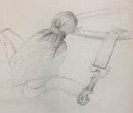
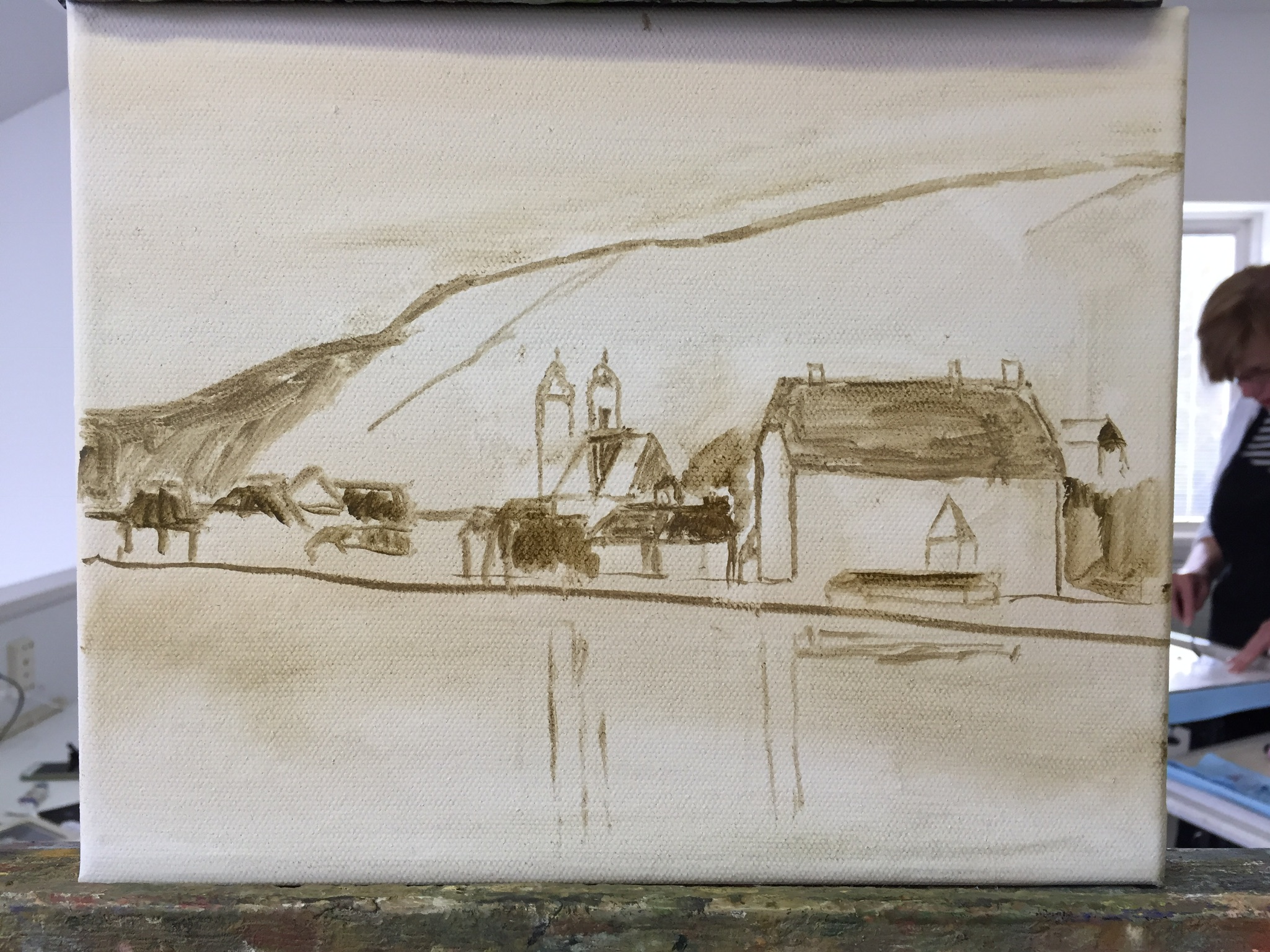
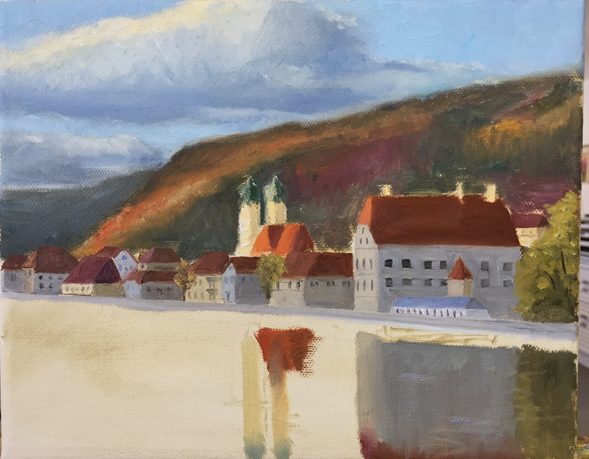
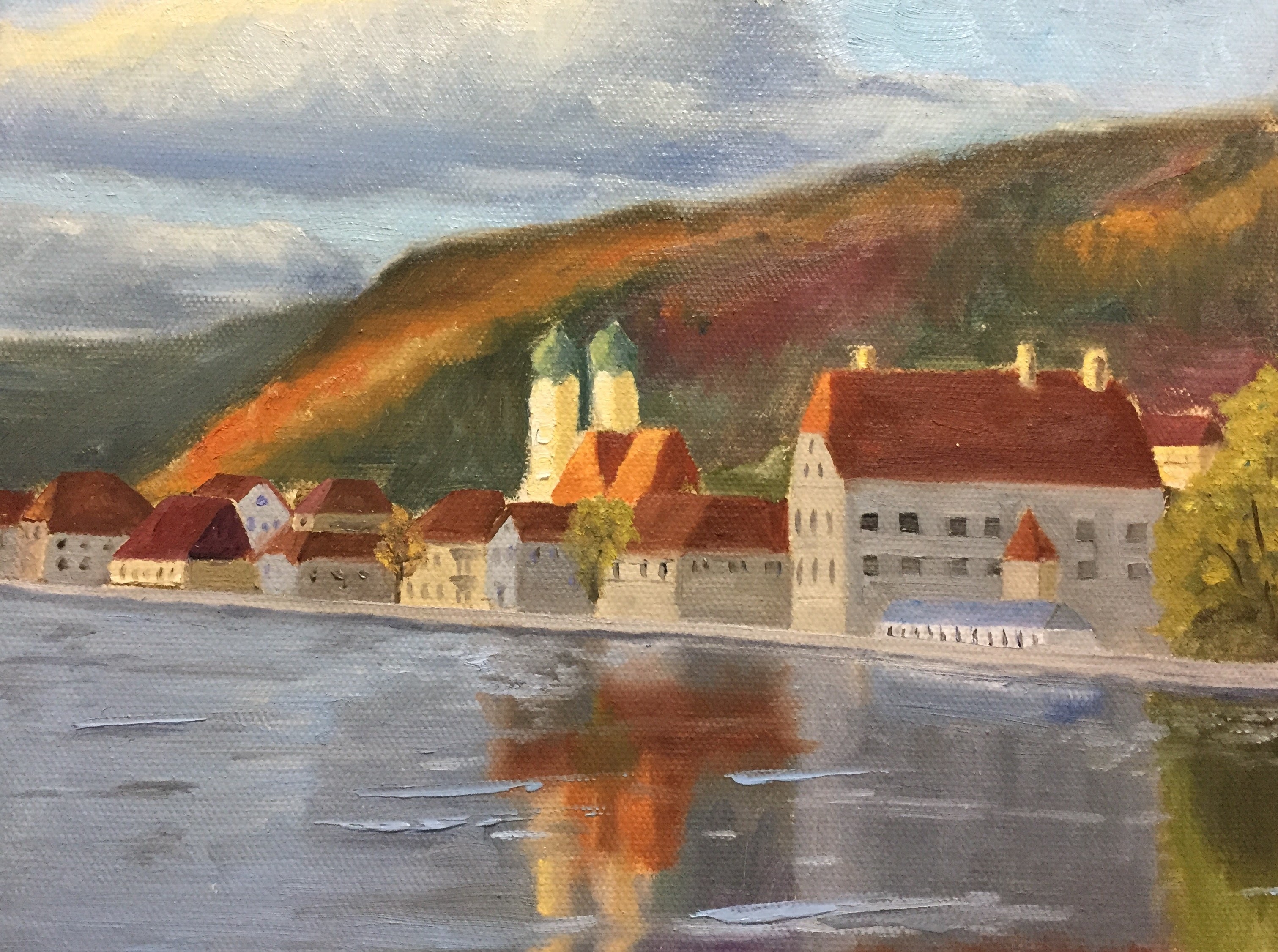
My normal process, and what’s been reinforced at workshops by artists far more experienced and talented than myself, is to do a study of the subject to help get a feel for the composition (see Dances With Squirrels blog post for more on studies). I prefer sketching as opposed to small paintings, largely because I like to sketch, it’s more expedient than painting, and it’s more flexible, i.e. erasing graphite is infinitely easier than wiping out paint. Lately, however, I’ve been refining this process whereby I still do an initial sketch before starting the painting, but as I work through the project and run into challenges, I go back to the sketch and either do another or simply refine the one I was working on earlier.
In hindsight it’s frankly a brilliant idea, of which I don’t have many, because the pause from the painting a) makes me breathe as I gather my thoughts to overcome the problem, and b) let’s me return to an existing sketch and figure out how to navigate a solution based on a similar composition. What I’ve found thus far is that I often find the same problem in the original sketch, kicking myself for not having seen the problem in the first place, but I can quickly figure out how to make changes and move forward.
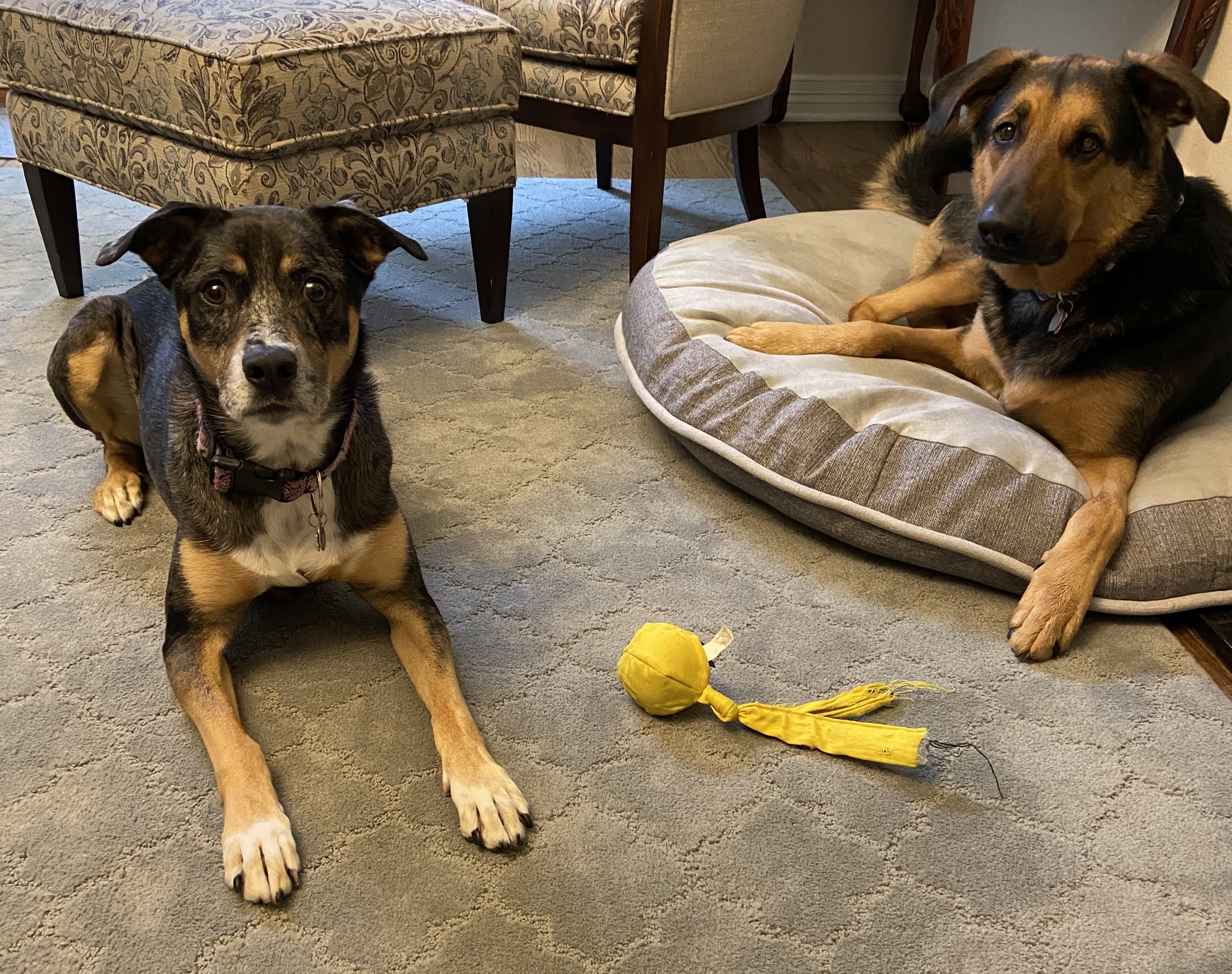
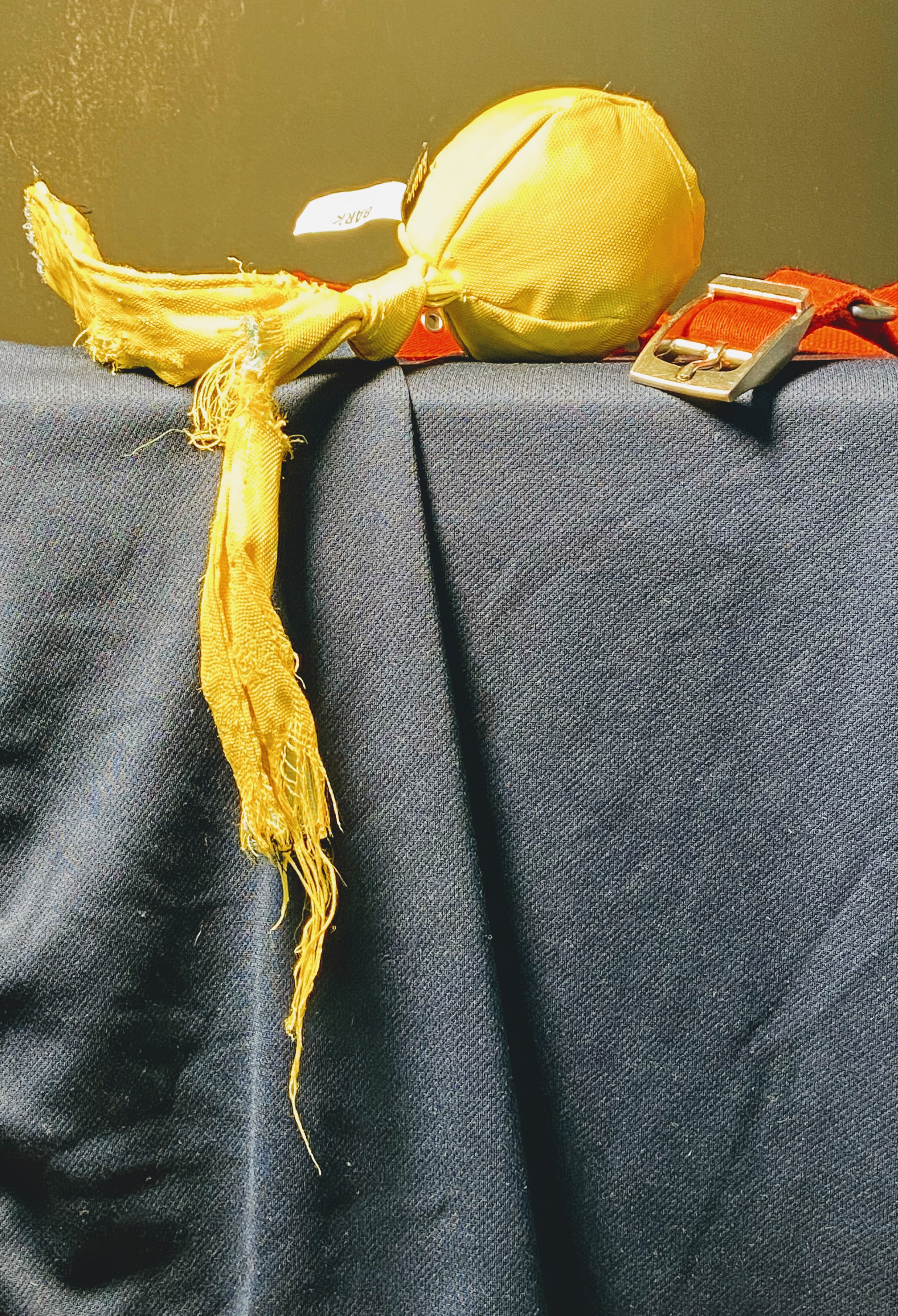
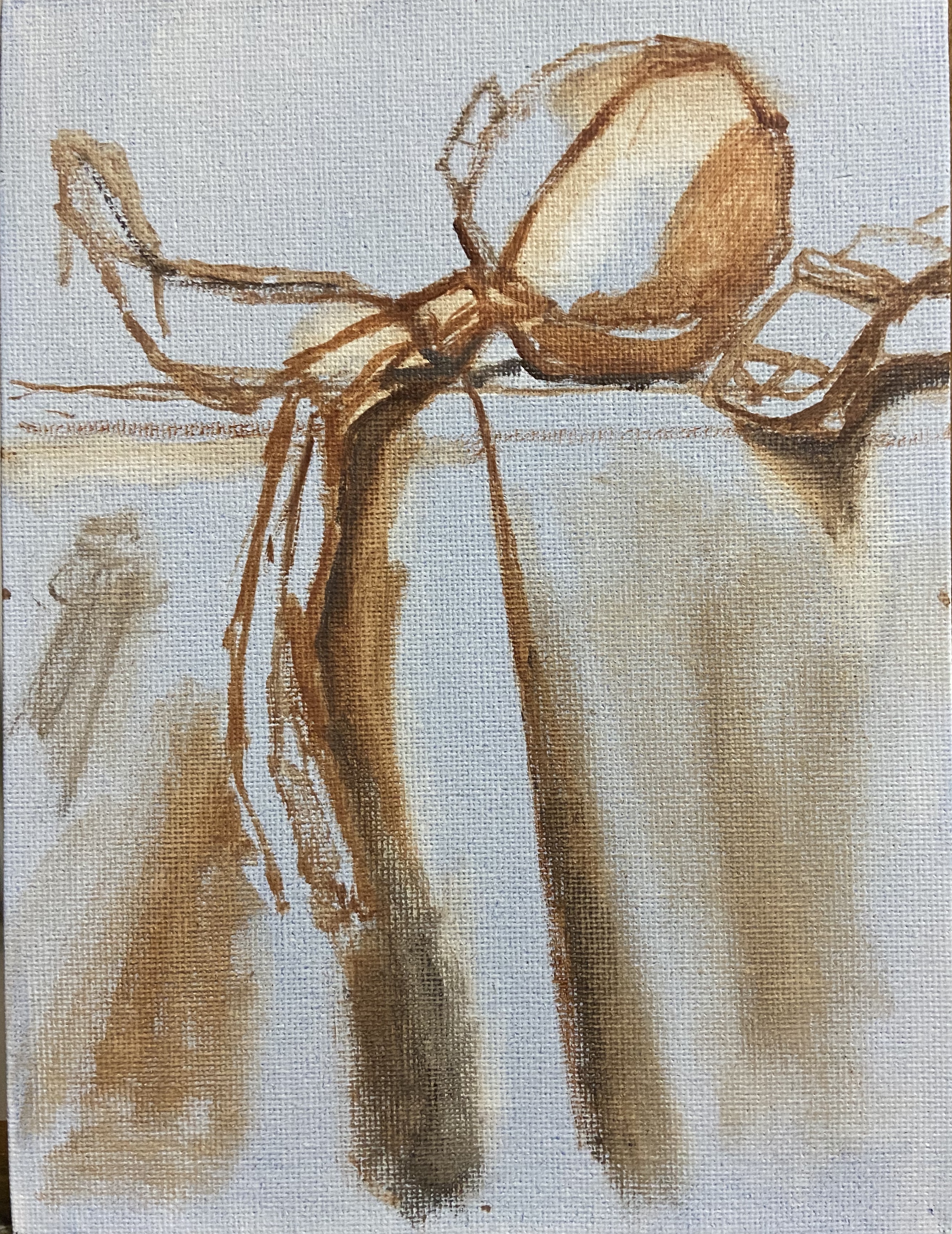
In A Stuffed Kong and Its Dog, you can see the original sketch being reworked (I forgot to take a picture of the original state of the sketch) when I ran into 2 problems. First, there was something fundamentally wrong with the Kong dog toy shape, which became clear when I returned to the sketch and saw that the bottom planes of the humps were misaligned. Secondly, I thought the size of the Black Lab’s right paw was too big once I painted it, but when I returned to the sketch and redrew it, I found that the size was actually fine and the issue was the related to the size of the black fur shadow gaps between the toes. Clear as mud, right?
The final painting will need a few minor refinements, but I want to let it dry before I make those updates. I’ll update this post when it’s really done. The intrigue with this piece is to make the viewer wonder what in the world is in that stuffed dog toy Kong! It was very hard to translate the focus and excitement of the dog as it diligently worked to get to the yummy treats out of this toy. While the focal point is the Kong, the supporting cast is the nose and that huge right paw, which in combination should convey the canine treat obsession.
Lastly, I’m not pleased with the sketch or the painting. The sketch is not supposed to be a finished work, and is muddled with various experiments to see what was going to work, so I’m. not flustered it. However, the finished painting, while not intended to be a refined piece of exceptional artwork, is ultimately a composition that doesn’t work well. The angle of the nose looks wrong relative to the muzzle, but it’s actually accurate as most dogs are able to bend that nose around in weird ways. That said, it doesn’t convey well in the painting. The large paw also creates visual confusion and seems out of place even though it’s proportionally accurate.
This exercise has taught me that all compositions aren’t destined for a “real painting”, but that’s why we do studies and small pieces to see how it plays out. I’ve also learned that my dog portrait skills need a lot of work, something I knew already, but this work has highlighted the gap and is proving to be quite motivating to start sketching my dogs’ faces!

Sketch In Progress – Dog Toy

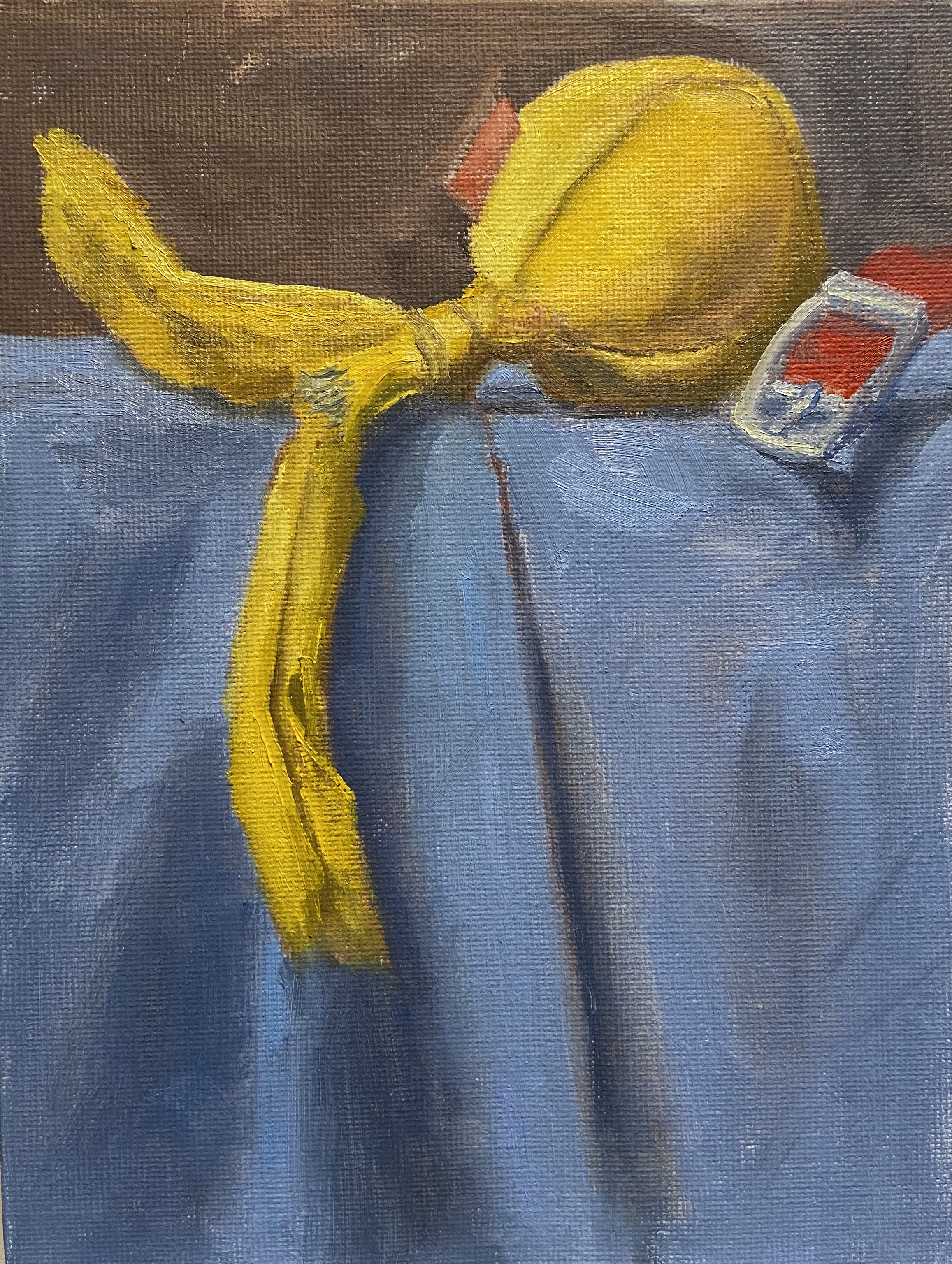
Block In

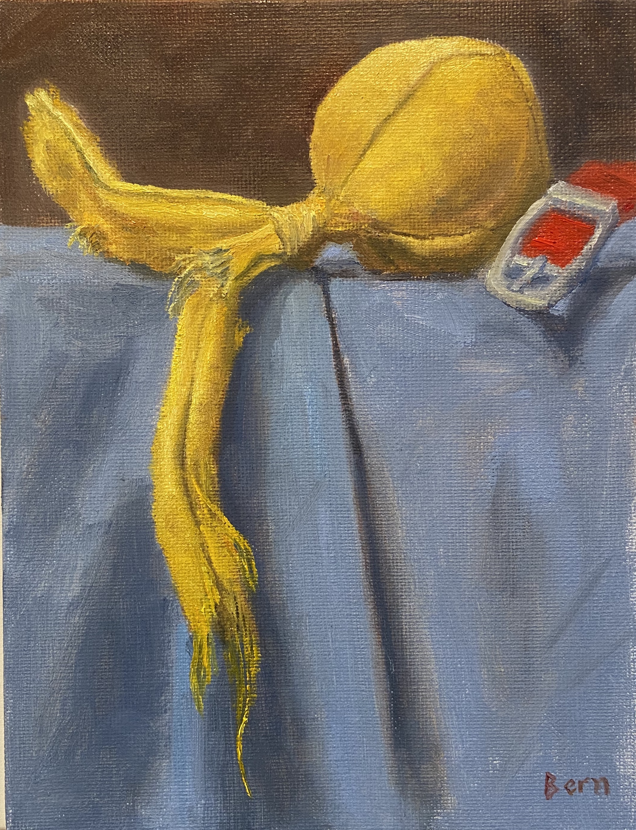
In Progress 1

In Progress 2

Final