The Texture of Porter

PORTER | 4×4” | Mixed Media on Wood

My recent foray into mixed media, courtesy of plaster and acrylic, has opened up a new perspective for my still life compositions. A good place to start was with my favorite adult beverage, a tasty Porter.

This is a very small composition, 4×4”, but in large part thanks to the 3D-ish impact of the thick plaster, it has a lot textual appeal. I did this without a reference photo, or beer model for that matter, going from memory of similarly themed past paintings. This one is most notably related to Last Sip, but oddly enough it was infinitely easier to create for a couple of reasons. First, the smaller size makes things go much faster. But more notably, the use of colored plaster and the simplicity of the subject make for a quick creation.

I might have just gotten lucky, too, and nailed it on the first try.

I might return to this specific piece and do some direct painting using acrylics on the plaster, which would add more vibrancy and get rid of the slight chalky effect.

Thanks for reading!

#artbern #berntx #crashboomzip #painting #art #abplanalp #austinartists #atxartist #contemporaryart #bernabplanalp #contemporaryatx #texturedpainting  #acrylics #beer #porter #stilllife #mixedmedia
Icy Imperfection

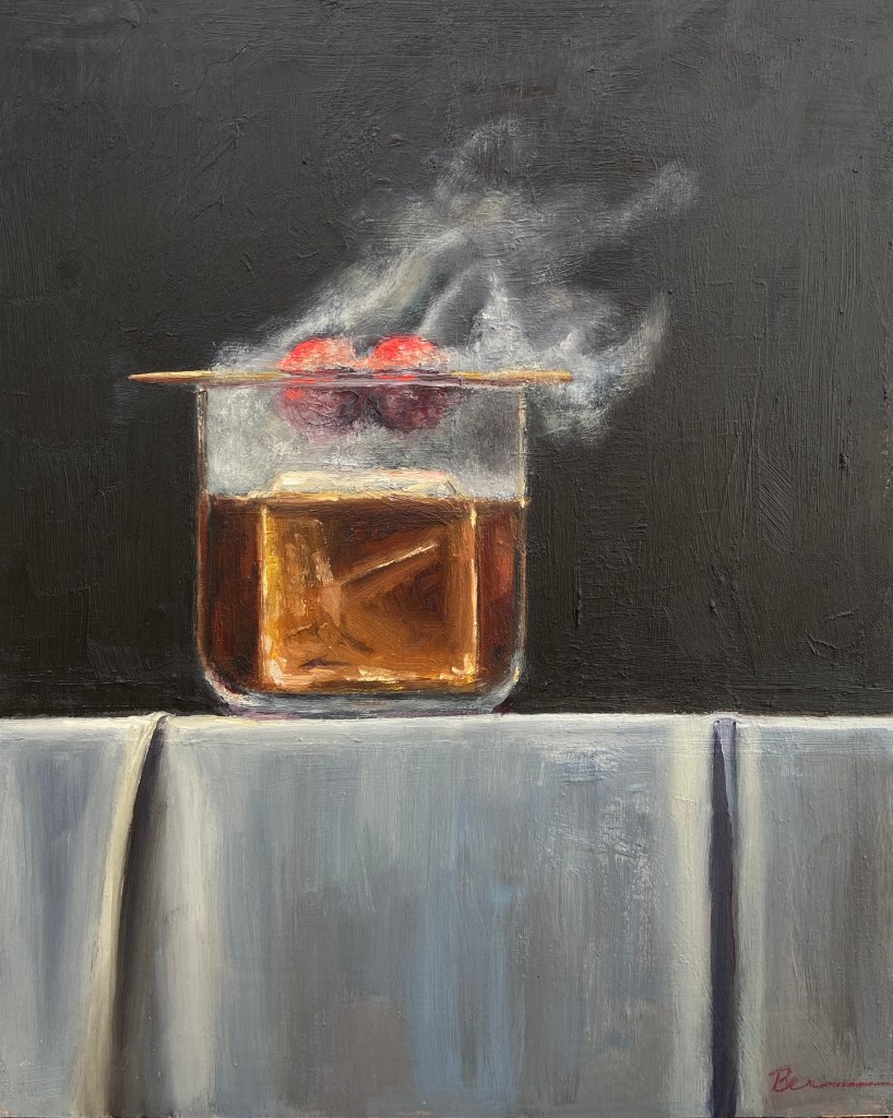
SMOKY ON ICE | Oil on Board | 8×10″

Building off my most recent still life, SMOKY OLD FASHIONED, I wanted to finish another piece with smoke effects so I could refine the process and build on the original. SMOKY ON ICE changes some core compositional structure, none of which is hard to miss, but obviously the focal point is the massive ice cube. The challenge, in addition to that pesky smoke, was making sure the other key elements worked the viewer back to the ice.

First, let’s talk about that ice cube. Even clear ice cubes have flaws, but they’re hard to see in standard light. Ironically, if you drop one in a low ball of whisky and incorporate some mood lighting, the imperfections will jump out. And these imperfections are the coolest part of a clear cube! 

The cherries hovering over the glass, immersed in smoke, are a design decision to keep the proverbial “you” in the glass… with the imperfect ice cube… and all that tasty whisky (GlenAllachie for me, please)… you’re welcome! Lastly, I used a palette knife for the cherries to give them a different texture. It also worked out better with manipulating the red colors into the smoke without smudging, which was hard to avoid when using a brush. The ice cube was done with thinner paint and brushes, ensuring a smooth, glassy look.
Thanks for reading!

#oldfashioned #cocktail #bourbon #agedandcharred #thecraftycocktail #cocktailsmokers #theglenallachie #buffalotrace #whiskey #whisky #artbern #berntx #crashboomzip #painting #art #austinartists #atxartist #atxart #atxlife #contemporaryart #abplanalp #bernabplanalp #stillife

Yosemite – El Capitan

Started a new project this week, El Capitan in Yosemite National Park. This is a massive wall of rock that is a marvel to see in person. I haven’t been able to find them on the photo, but there are a number of climbers on the wall. If I hadn’t taken the picture myself I wouldn’t believe it either.

This composition is actually a study to get some key aspects of the hues and values figured out prior to doing a much larger piece. This particular effort is being done on a 12×18 canvass board, all oils, using palette knife only.

Figuring out the variations of grays, both sunlit and shaded, is proving to be an enjoyable challenge. This is a great way to really learn the subtleties of warm and cool grays.

Another session or two and this preliminary piece should be done. Still need to get the right half of the shadow area done, but it’s moving along at a faster clip now that the value scale has finally been figured out. There’s more paint on this piece than I’d like to admit.


“Baleine!” c’est fini

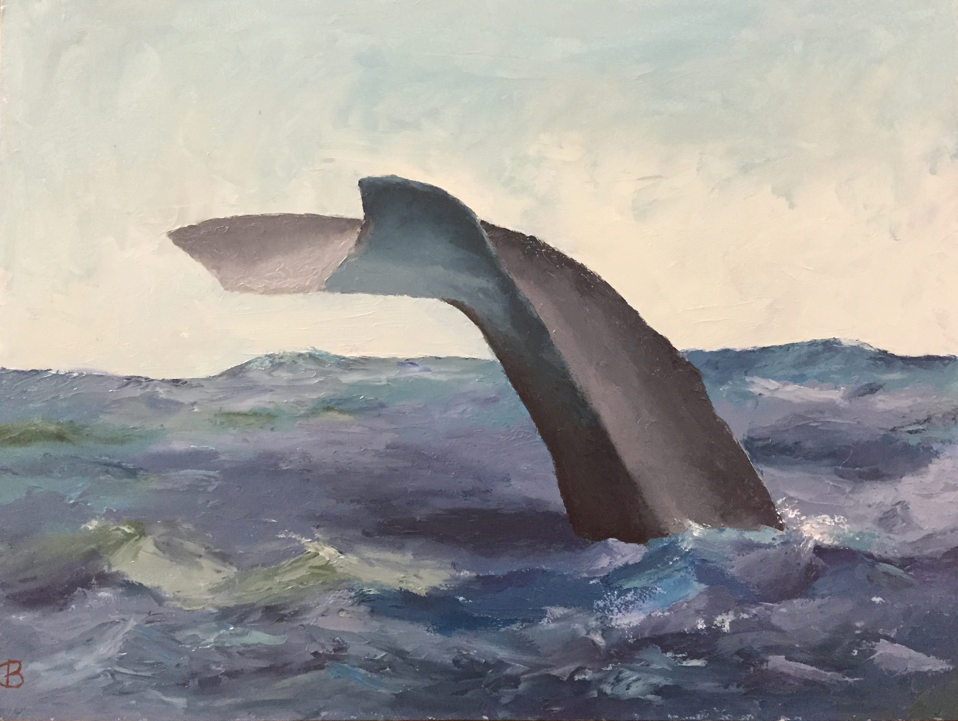
This piece came together very quickly. Pretty happy with the end result. No brush work – all knife, so I pushed myself to develop more expertise with this tool. There were a few trying moments to get edges right, but it really opened my eyes to the nuances of manipulating the paint once it’s on the board.

The iPhone photos don’t capture the textural knife effects, but hopefully you get the idea of the progressive development in the time sequence below.

IMG_3652
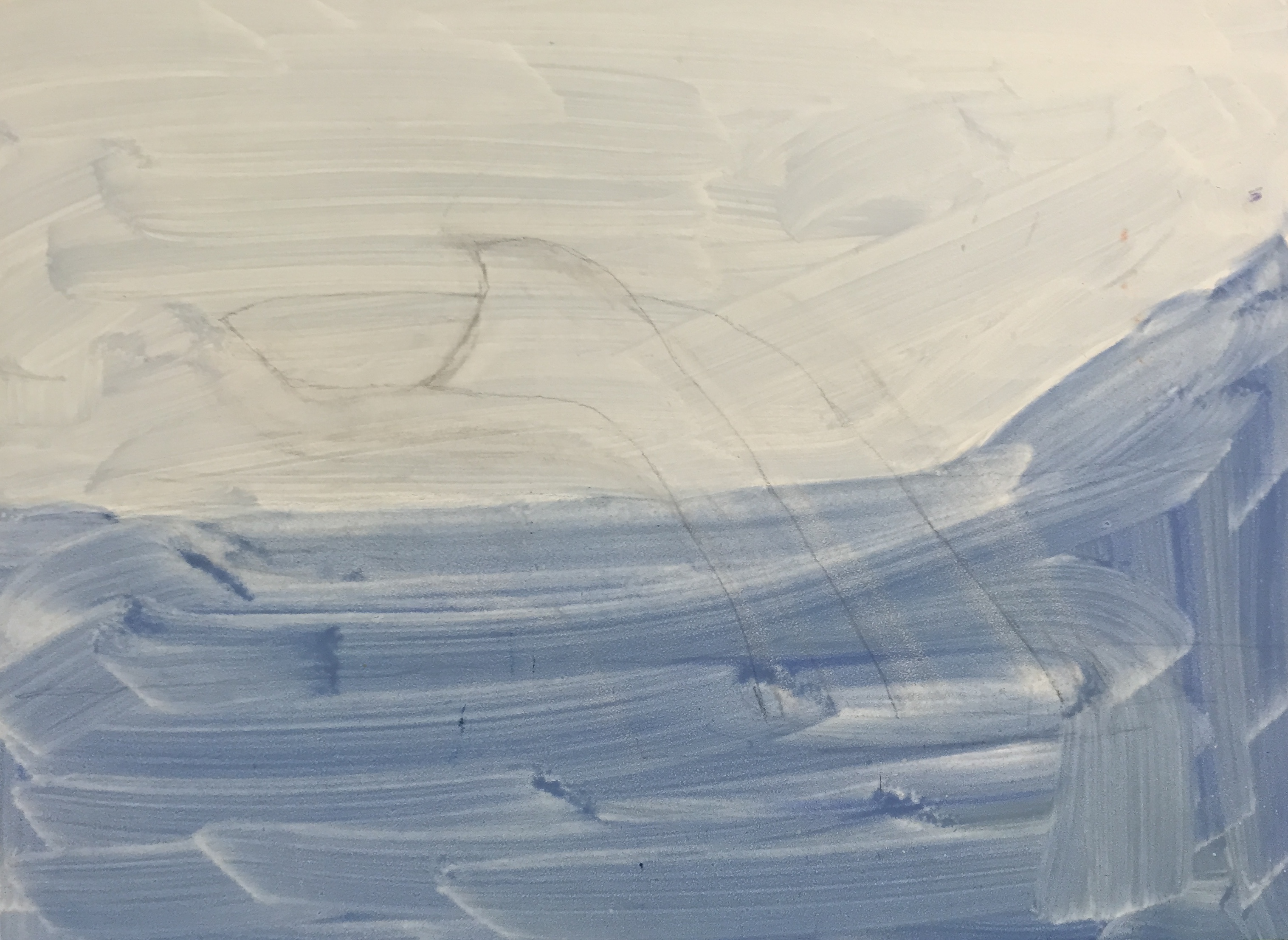
Light pencil sketch as outline.

IMG_3660
Session 2 gets the initial values, sky, and some experimentation with the ocean colors.

IMG_3661
Session 3 made big strides. Figured out the right balance of ocean colors – blues and greens. Whale tail has initial form, but needs work – too flat.

IMG_0329
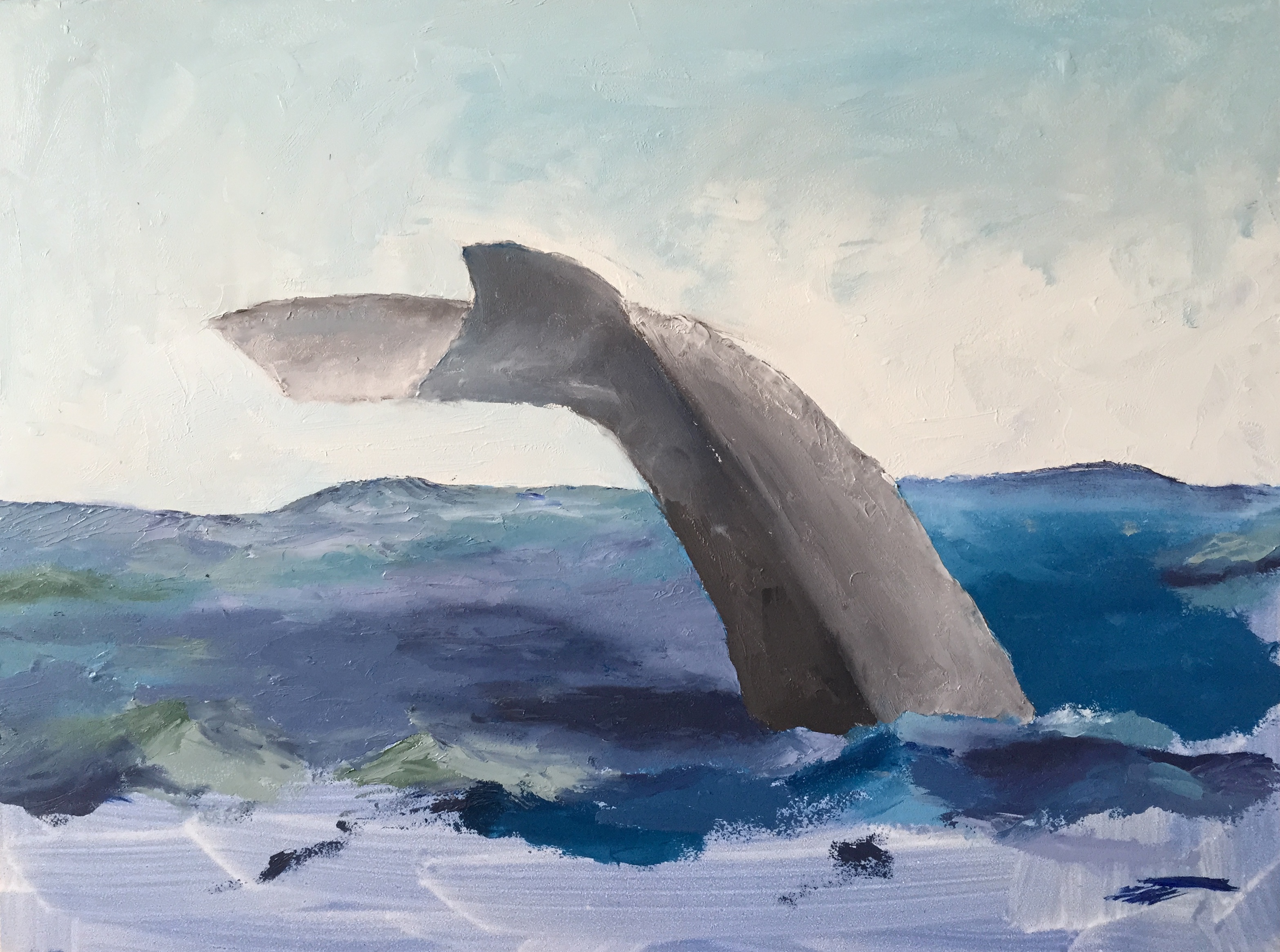
Session 4, lots of work to get the tail coloring and values right. Also figured out the water light reflection onto the bottom of the tail. Finally committed to having really tumultuous water, so added white caps and spray. Pure guesswork… no idea what I’m doing at this point. The painting knife and I were not on speaking terms for a brief span of time.

IMG_3667
Finished! Added touch ups in various places, but most notably updated the values on the horizon part of the ocean – it was too dark and contiguous, so broke it up with some white caps and lighter blue mixes.

“Baleine!”

IMG_3653

Started another piece called “Baleine!”. This is a humpback whale diving. Going to do this as a knife painting to get some texture that will reflect light and give the sense of water/wet on the whale. This is a small gesso board, which works well for knife work.

The palette is pretty straight forward, but the water will be a little tricky, largely b/c I’m a water moron. But it will be a good exercise. The whale tail itself should move quickly, as the tricky part is the initial dimensions and shape, which I spent some time already working through before putting gone the board to paint.

I roughed in the sky as part of this first session, thinking I just wanted to get the right value on the board so the contrast with the tail would work. But it turns out that the “rough” in is pretty good and likely I’ll just keep it as is.