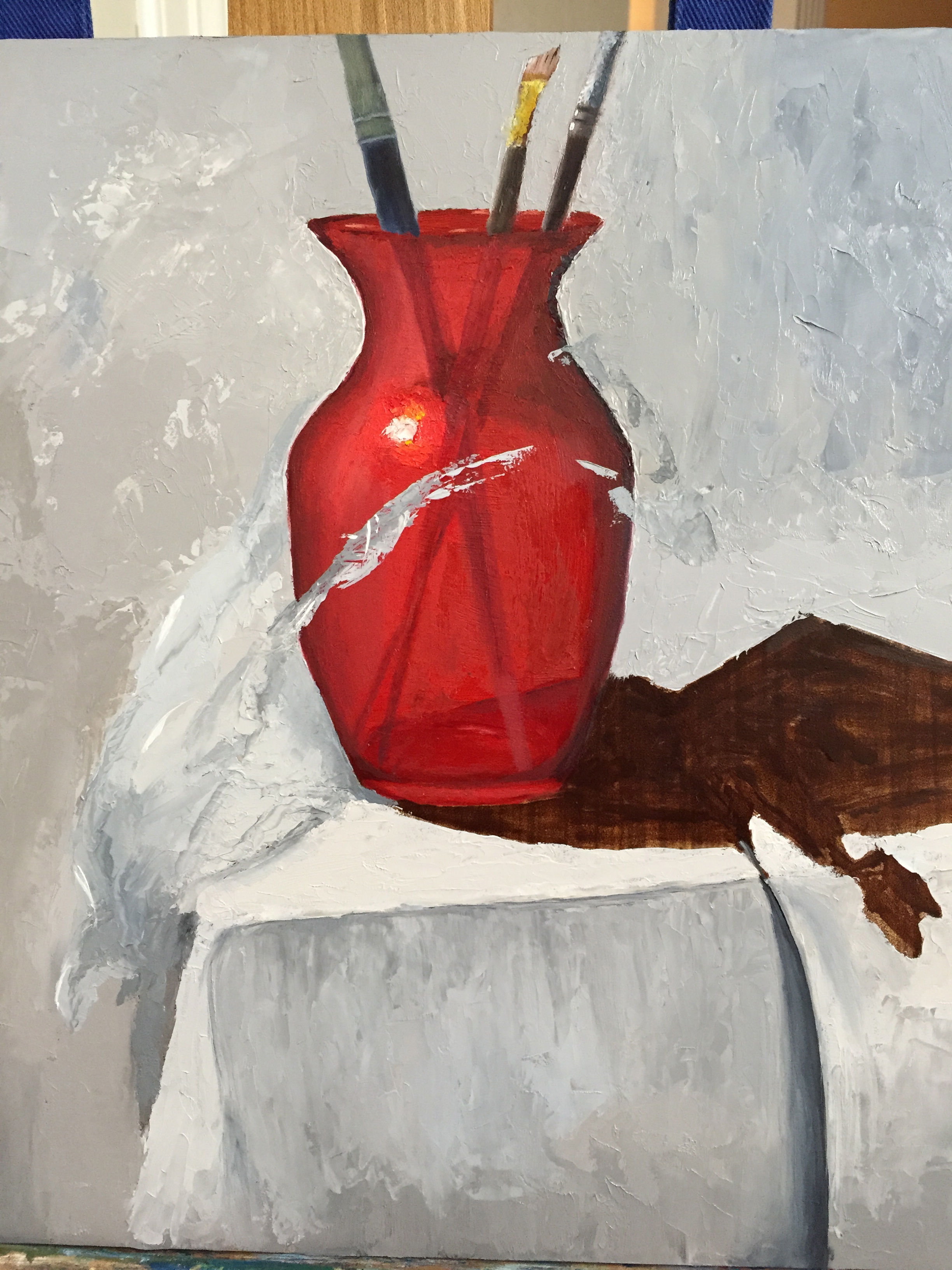
With a few deep breaths, and some tasty wine for liquid courage, I dove into the cellophane stage of this composition. I carved out a little more than an hour tonight to get the ball rolling. I was pleasantly surprised with the progress, but I will admit that my inner artist was struggling with laying gray tones on top of the pretty red vase in the name of cellophane.
It was rough going initially b/c there weren’t enough value contrasts between the white table cloth and the wide range of cellophane grays and cast shadows. Then I remembered the advice from David Cheifetz during his workshop a couple weeks ago – “Value is king! A painting with the right values but wrong colors will still look pretty good.” I’m not about to put that on a tshirt or a bumper sticker, but its great guidance. I stepped away from what seemed like the right dark and light grays and made both ends of the spectrum more extreme, darker grays and lighter grays. It seems to have worked so far.
The real power of the cellophane image won’t really come together until the grays are laid in properly and then the bright, white highlights are added on top. That’s what gives the cellophane it’s shape and texture. I’m still not entirely convinced this will look like the real thing when I’m done, but stepping back from this first stab at it, I was able to see the shape of the cellophane starting to come together. The key is going to be establishing that clingy sensation with the highlights. Fingers crossed…
[The grays of the cellophane are primarily 2 setups: Ultramarine blue + burnt umber + white OR white + ivory black. I’ll probably add a 3rd option for the cooler side of the cellophane (right side, away from the light source) of UB+raw umber+white. ]