French Countryside – Practice Study Done

Got back to the first painting study of the French Countryside (Loire Valley) landscape. Been awhile since I had worked on this one, but past post for reference here.

I liked how this came out, and ended up investing more time than originally planned. I definitely learned a lot about how I will change the composition when I do the “real” thing on a larger canvass (as opposed to this paper session), but enjoyed working in a  lose style and worked very hard on not sweating the details.

IMG_3669

I was pleased with a number of things:

  • Good balance of greens. The photo doesn’t show it very well, but the range of values also gives texture that I didn’t intend initially, but you can bet I won’t forget how it came together.
  • Dark rain clouds in the far distance have the right effect of coming storm.
  • Rose bushes, a complete improvisation, came out really well, especially given the speed at which they were done, ~ 15 minutes. I also find the red on green background works well to make them pop a little, giving them a good foreground effect to draw the viewer into the painting.
  • The fence line, meant to be wire strung along old wooden posts, can be painted better in a future composition, but I’m happy with how the variation in direction of the fence gives the sense of an undulating field. Also meant to direct the eye along the fence, across the field, and into the village and beyond. Not sure if that’s actually happening for viewers, but happy to be told I’m way off base here.
  • Trees have good depth and capture the direction of the sunlight well.
  • Clothes line, another improvisation, serves it’s primary purpose of giving a sense of wind from the approaching storm, as well as a nice focal point in the center of the composition.

What to do differently next time:

  • The village buildings are not well done. I wanted them to be muted, but I lost focus on them too much and the value variations between them are junk. For me, there are buildings further back in reality that appear to be too far forward. I also don’t like the roofs, which need to have a wider range of colors.
  • The green field in the distance is too saturated and a little too light. Need to push that back a little next time.
  • The clothes line is good, but can be improved. Wanted to add a person pulling down the clothes, but quickly learned that I don’t have that skill yet.
  • The clouds are awful. Need to practice in some other sessions, but globbed on paint too thickly and focused too much on the cloud shapes.

“Rescued” – molds and molds and molds

IMG_3641

As mentioned in the previous post, the process for creating the dog paw prints wasn’t straightforward. The challenge was finding a way to get the real prints of all 3 dogs on the canvass without having it look like a distorted mess. Sure, there are plenty of reasons to do a piece with the messy prints splayed across the canvass, and I’ll readily admit that is a good idea, too. However, that was not the direction for this project.

The other challenge was ensuring the actual prints of Crash, Boom, and Zip were used. I didn’t want to do a photo-based, realism approach, i.e. take a picture of the paws and free paint the shapes. I really wanted to have the touch and active presence of CBZ on the canvass. This became very important to me as the work progressed because it would be a forever connection to our beloved pups; a way to always reach out and touch their “real” paws.

So if you haven’t barfed from the sentimentality, you appreciate the concept… hopefully. The original thought was to slather some non-toxic kid paint on the dog’s paws and let them run on the canvass. That’s such a bad idea for so many reasons. Just think about it for a minute if you don’t know what I mean. The next idea was to paint the dog’s paws and then press their paws on the canvass myself, in a more or less controlled fashion. Aside from the obvious battle of wills that would ensue, of which I would surely be on the losing side, this doesn’t work well because the prints are muddled with hair marks, making the prints largely indiscernible. I know this because I did a trial with Boom, the mellow dog, by shaving his paws and following the technique noted above on a practice canvass. It looked like poo.

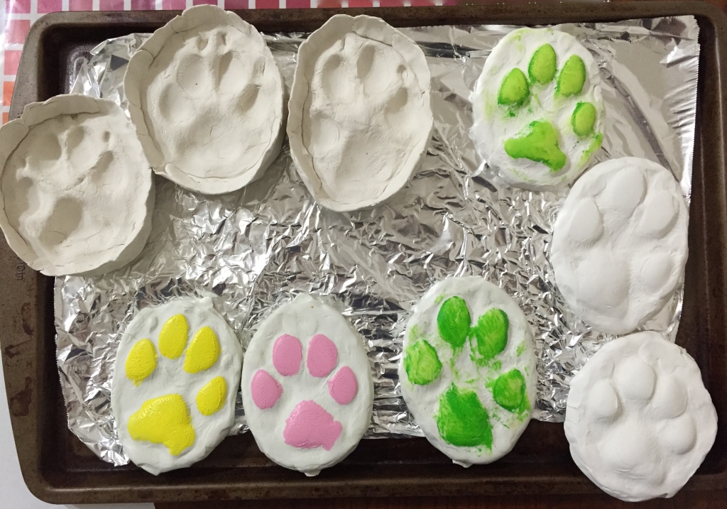
The final answer was molds in molds. The photo included has the molds I used plus one set I didn’t. The 3 molds on the top left and the set of 3 on the bottom left. Process went like this:

  • Pressed the dog’s paw into a round of molding clay.
  • Baked the molds for 30 minutes. These are the top 3 molds in the photo.
  • Using non-drying clay, pressed into the dried molds and pulled them out. These are the bottom 3 colored ones.
  • These non-drying clay molds held their shape, but could be manipulated, so I pressed each one gently down onto a flat surface to flatted out the paw prints so it would transfer the shape better.
  • Applied thin layer of paint to the clay molds and pressed carefully onto the canvass. This provided the general shape and worked surprisingly well.
  • Applied free-hand touch ups and additional layers of paint on paw prints on canvass.

The other 3 molds (on right side of photo) are a failed attempt to create oven dried impression molds as described with the non-drying clay above. They are great 3D molds of the dog’s prints, but turns out the paint doesn’t transfer well to the canvass because the paw pads are too well done, i.e. they are rounded and can’t be pressed flat to make a good stamp. One of those things you try and then feel like a moron for having overlooked such a simple mistake.

All the molds are reusable, so I can recreate this project again if I wanted to. The best part is that my wife gets the painting she asked for, plus a mold of each dog’s front left paw.

Giverny – There’s no panic in painting!

Took another stab at Giverny. Added the remaining foliage in the lower left bank, added the wooden posts, and took yet another whack at the water.

This water is looking much better than past efforts. Did some research and practice sessions to work on the technique. Pretty sure this will be easier the next time I take on moving water because it will be from a clean slate, but correcting/updating this piece is tricky. Regardless, I stuck with my “don’t panic, there’s no panic in painting” mantra and pressed forward. I’m happy with the progress, but the water will have a couple more sessions of work. However, for the first time, I feel like the basic structure and feel is in place. Yeah, some of the greens are too saturated, and the gray sky reflection (the white-ish part in the center) isn’t working yet, but it’s a huge stride past where I’d been stuck before. Feel like I’ve pushed past a plateau and can build from this. That said, anyone with helpful advice is more than welcome to offer; as you can tell from past posts on this project, I could use the help.

Reference Photo
Reference Photo
Water attempt #5!
Water attempt #5!

Daily Sketch #15: Squeeze Me

IMG_3108

Bit off more than I could chew this time. With another hour or two I can probably get this paint tube more complete, but given the self-imposed daily sketch limitations, I chose to concentrate on the ends, which had the most interest.

This is a large tube of oil paint (ultramarine blue for the curious), which looks like it’s been through a torture chamber. I’ve cursed this tube many times because the top often gets stuck and I have to use pliers to grip the lid to turn it off. You painters out there know exactly what I’m talking about! This causes the body of the tube to twist into some pretty cool ropy shapes. Because the tube material is similar to a toothpaste tube, it’ doesn’t show shadows as easily as fabric. I didn’t think about this before starting this sketch. It’s like painting twisted metal fabric, or something like that. I tried to imagine what the shading should look like b/c it was very hard to see on the live object itself, and once I did that, I made some progress.

Ironically, this composition would definitely be easier in oil.

Workshop Day 1

I’m attending a 4 day workshop taught by David Cheifetz in Lindale, TX. Learned a ton on the first day alone, especially regarding what makes up a great still life composition and how to set it up. I always knew David was a great artist, but he’s also a very engaged, effective instructor, too.

Each student has their own still life setup, but you get to learn so much from his discussions with the other students, some of whom are professional artists! More on that in a later post. My first composition gave me some challenges with getting the ellipse shape of the tea cup just right, so I spent a lot of time working through that challenge. Got started painting with just a short time remaining, so no photo of work in progress yet.

David did a couple of demos to illustrate his knife painting technique and explain the details of his composition. Before I knew it I had a long page of notes. Awesome!

Gotta run to day 2. Couple of quick photos from day 1.

IMG_1721

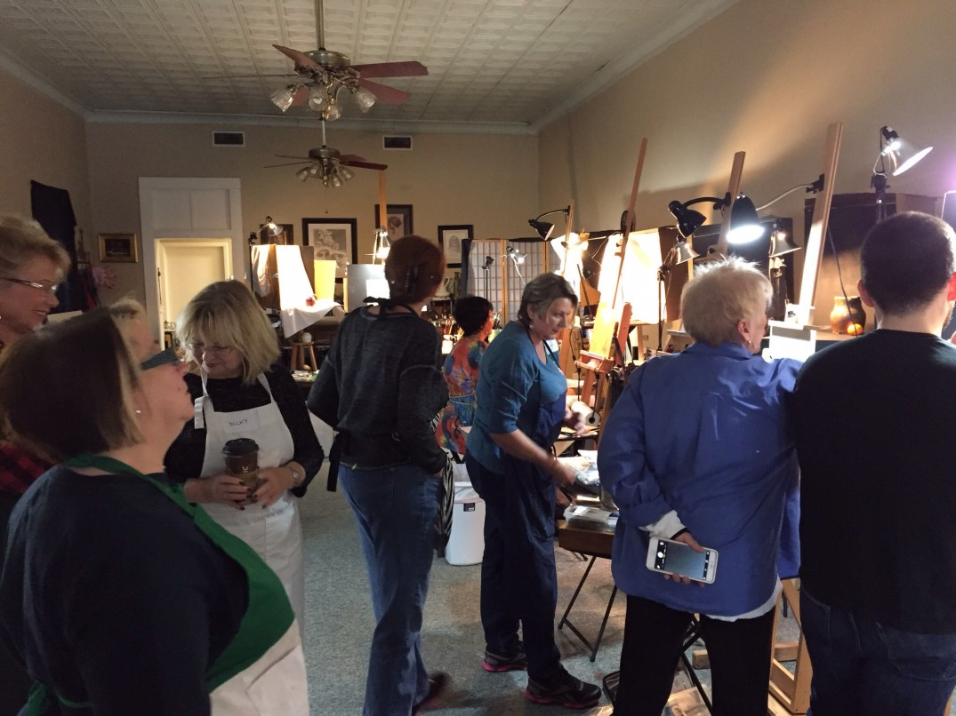
Class in session at studio

IMG_1718
My first composition layout. Focal point is the blue water pitcher.