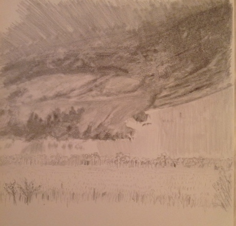
Got back to the first painting study of the French Countryside (Loire Valley) landscape. Been awhile since I had worked on this one, but past post for reference here.
I liked how this came out, and ended up investing more time than originally planned. I definitely learned a lot about how I will change the composition when I do the “real” thing on a larger canvass (as opposed to this paper session), but enjoyed working in a lose style and worked very hard on not sweating the details.

I was pleased with a number of things:
- Good balance of greens. The photo doesn’t show it very well, but the range of values also gives texture that I didn’t intend initially, but you can bet I won’t forget how it came together.
- Dark rain clouds in the far distance have the right effect of coming storm.
- Rose bushes, a complete improvisation, came out really well, especially given the speed at which they were done, ~ 15 minutes. I also find the red on green background works well to make them pop a little, giving them a good foreground effect to draw the viewer into the painting.
- The fence line, meant to be wire strung along old wooden posts, can be painted better in a future composition, but I’m happy with how the variation in direction of the fence gives the sense of an undulating field. Also meant to direct the eye along the fence, across the field, and into the village and beyond. Not sure if that’s actually happening for viewers, but happy to be told I’m way off base here.
- Trees have good depth and capture the direction of the sunlight well.
- Clothes line, another improvisation, serves it’s primary purpose of giving a sense of wind from the approaching storm, as well as a nice focal point in the center of the composition.
What to do differently next time:
- The village buildings are not well done. I wanted them to be muted, but I lost focus on them too much and the value variations between them are junk. For me, there are buildings further back in reality that appear to be too far forward. I also don’t like the roofs, which need to have a wider range of colors.
- The green field in the distance is too saturated and a little too light. Need to push that back a little next time.
- The clothes line is good, but can be improved. Wanted to add a person pulling down the clothes, but quickly learned that I don’t have that skill yet.
- The clouds are awful. Need to practice in some other sessions, but globbed on paint too thickly and focused too much on the cloud shapes.