Went on a short hiatus, but getting back in the swing of things. Getting ramped up on a few new projects, but knocking the rust off by revisiting an old foe – the love / hate relationship with Giverny. Original post is here.
There is a post of earlier progress on this green monster, but I’m finally starting to get my head around the challenge of reflections in moving water. See for yourself…
First, tried doing variations of blue water with white highlights, which didn’t look right. Roughed in the purple flowers in the lower left front corner.

Next idea was to do more greens with more aggressive use of whites/grays to give the sense of moving water. That didn’t work, but the additional work on the ferns on the right side was productive.

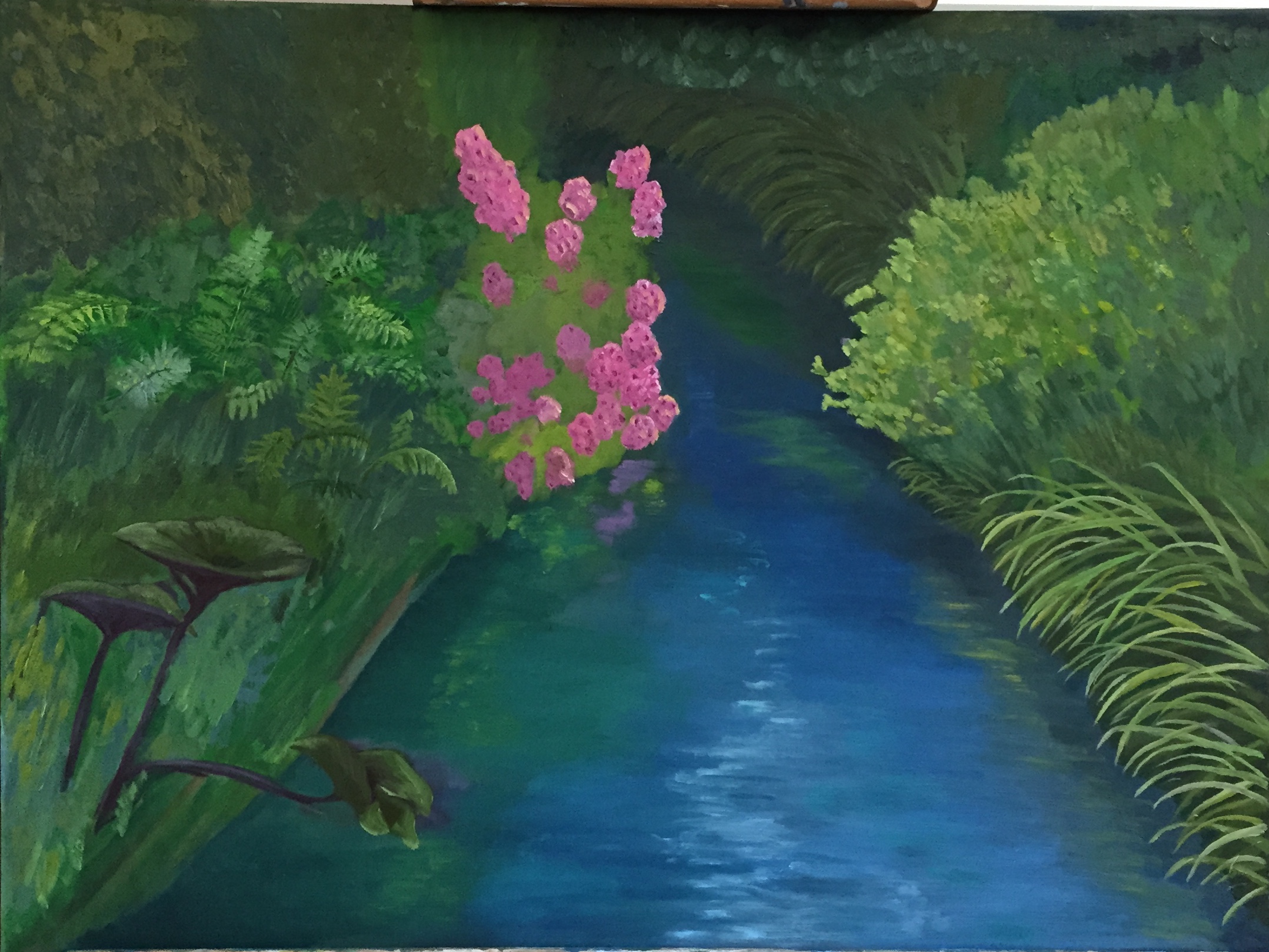
Third swing was building up much more gradual and interlaced mix of greens and grays. This photo is poor quality and doesn’t show the water very well, but it’s actually better in reality. Next session I’ll work in more of the greys to really give the sensation of moving water under a grayish sky. Also spent time reworking the reflections of the pink flowers and yellow flowers, both of which look really good in terms of glassy look on the water.

I did talk with one of my teachers (Ed)about your problem. He suggested a couple of things: one, that the lines on the outside of the water be even, rather than uneven — wrong language, but you get the idea. That would give better impression that water is still, not moving. Also suggested you have the right and left sides of the water be closer to the edge of the water. Also said to give the impression of a glassy surface you might want to have uniform value and hue in the water, to better reflect more mirror-like reflections. Hope this helps. If totally unclear, just call me — i’ll try to better explain.
LikeLike