eBay Abstraction

ABSTRACT COWBOY | 16×20” | Oil on Canvas

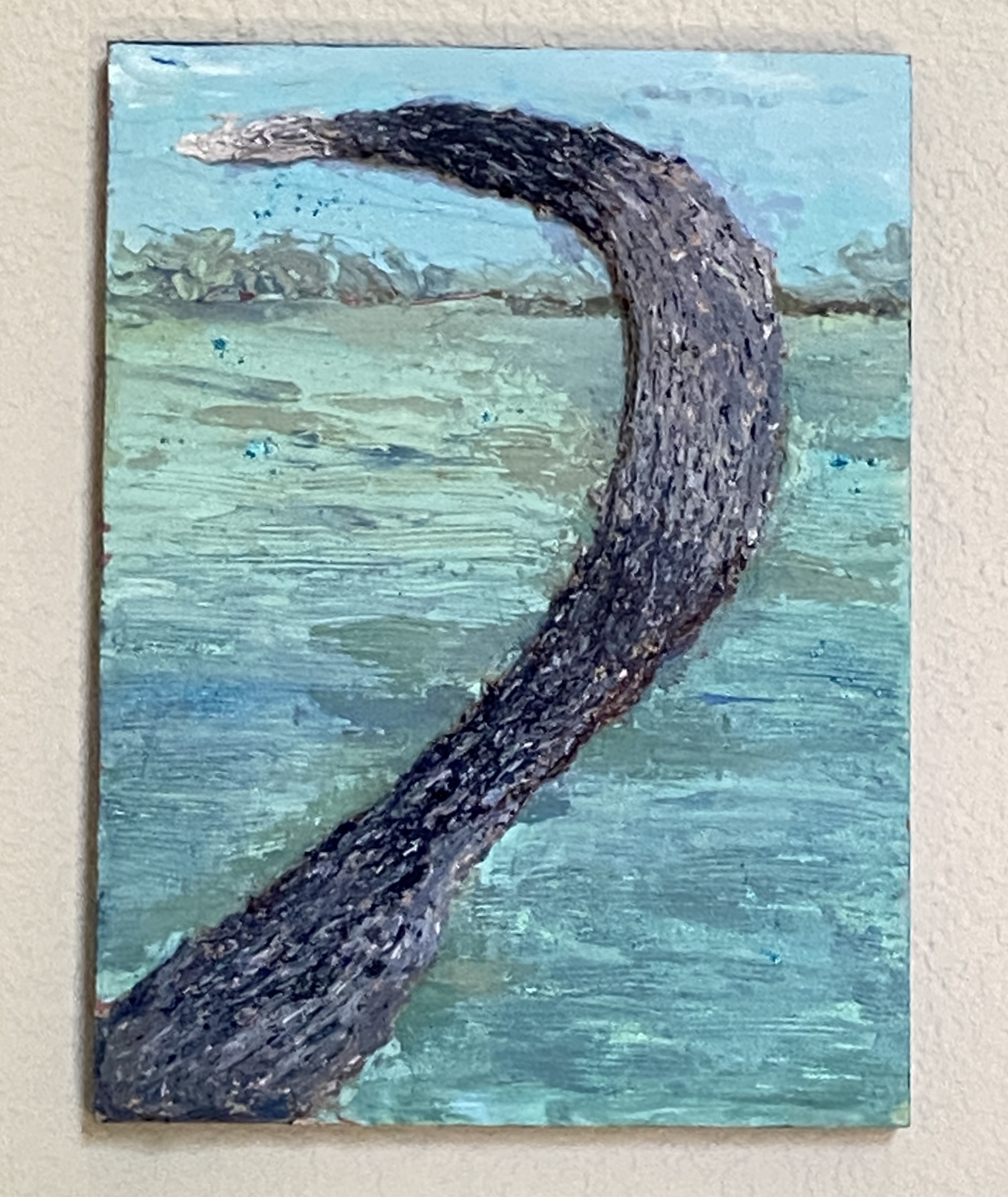
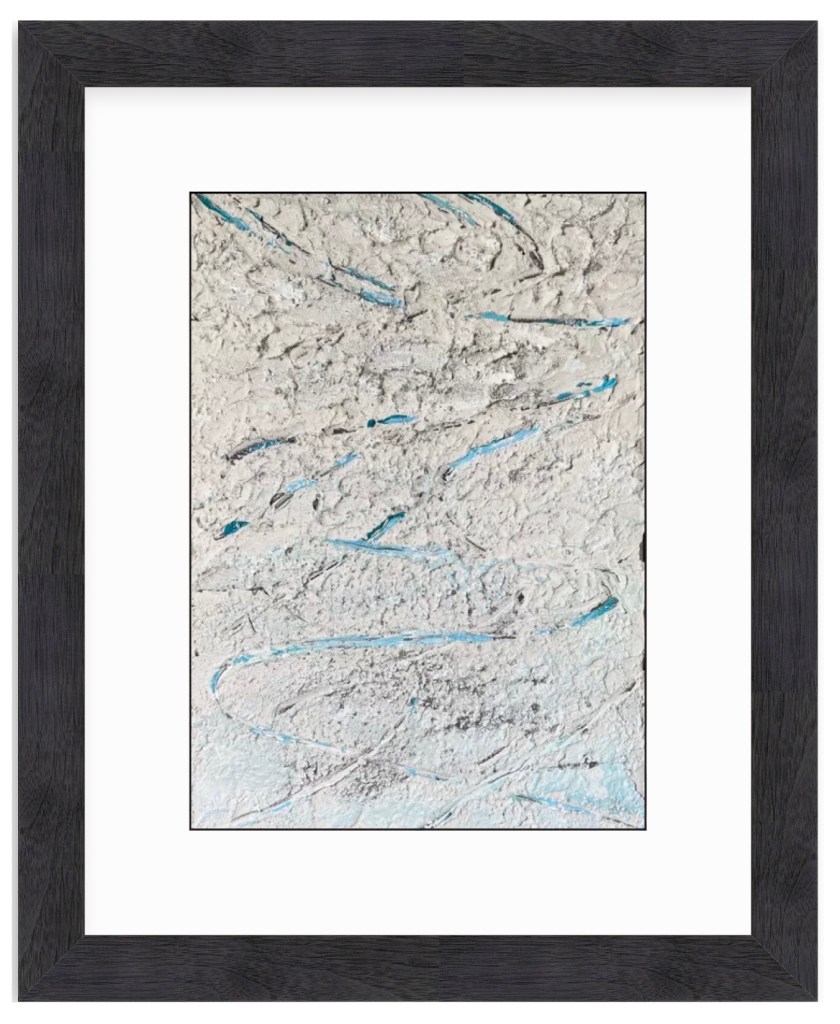
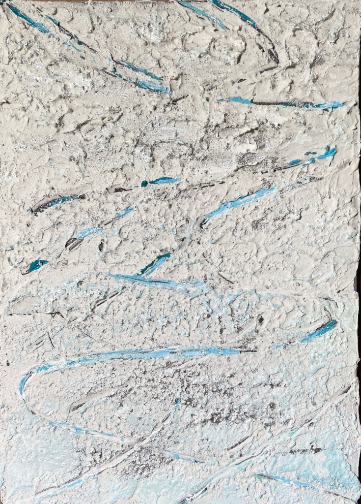
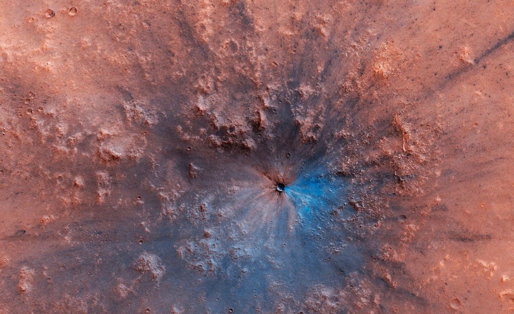
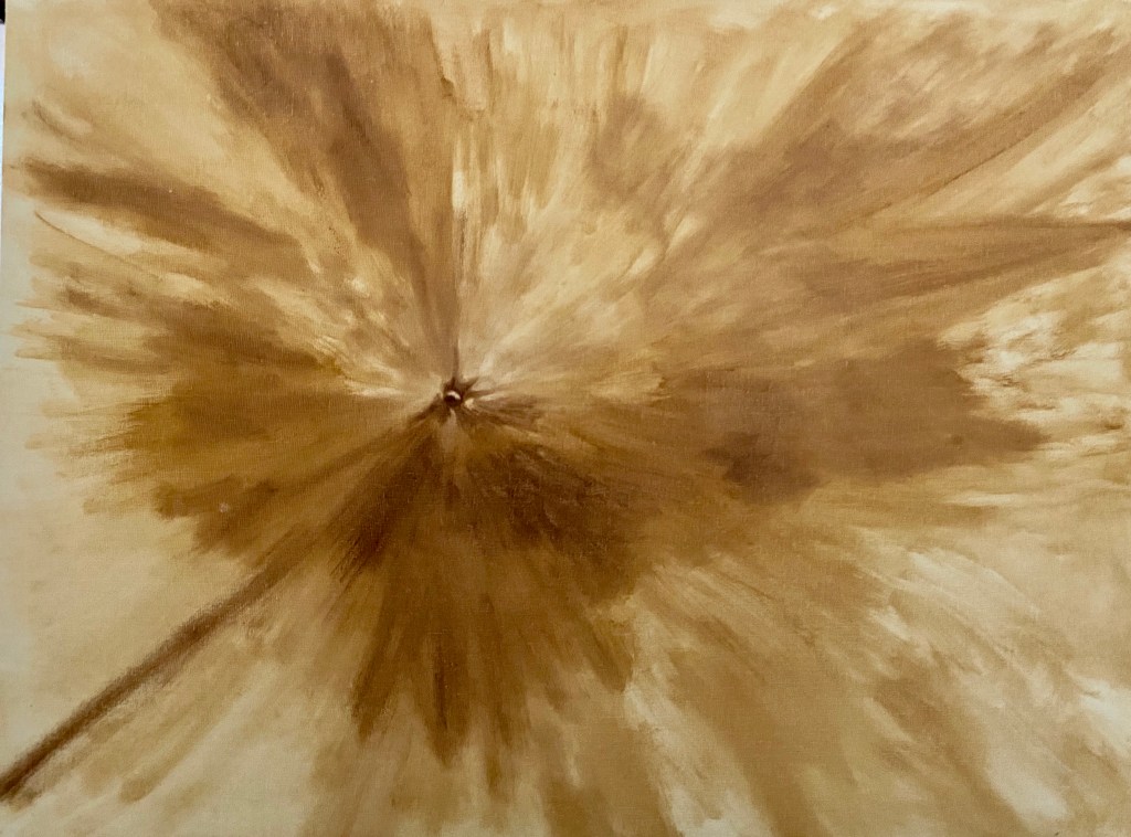
And now for something completely different! Lo and behold the first abstract piece I’ve done in years. Why, you ask? It was a gift for my niece, who had seen something similar on eBay but she didn’t win the auction. Arty farty uncle to the rescue! Well, truth be told, my wife was the one who asked if I could help out and create something similar. 

Of course! I love the challenge of making a copy of an existing painting. On the occasion that my imitation successfully mimics the original, I get quite the painterly adrenaline rush! 

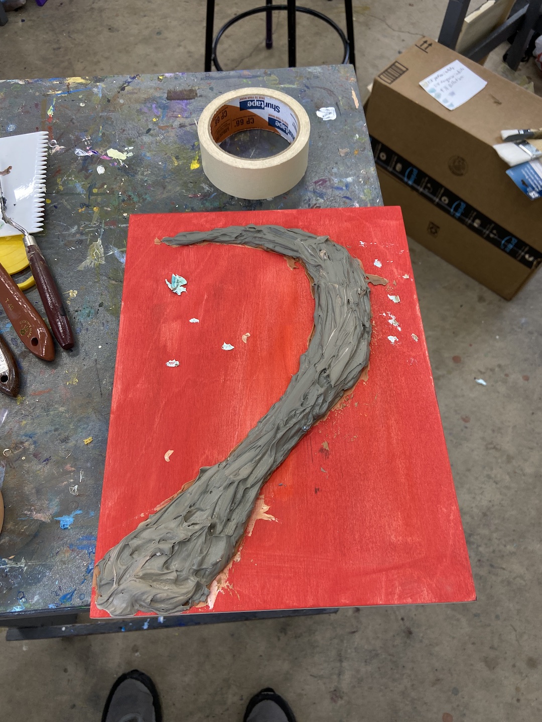
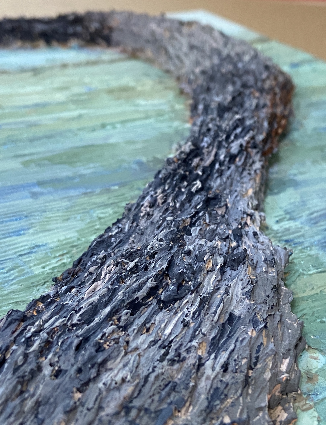
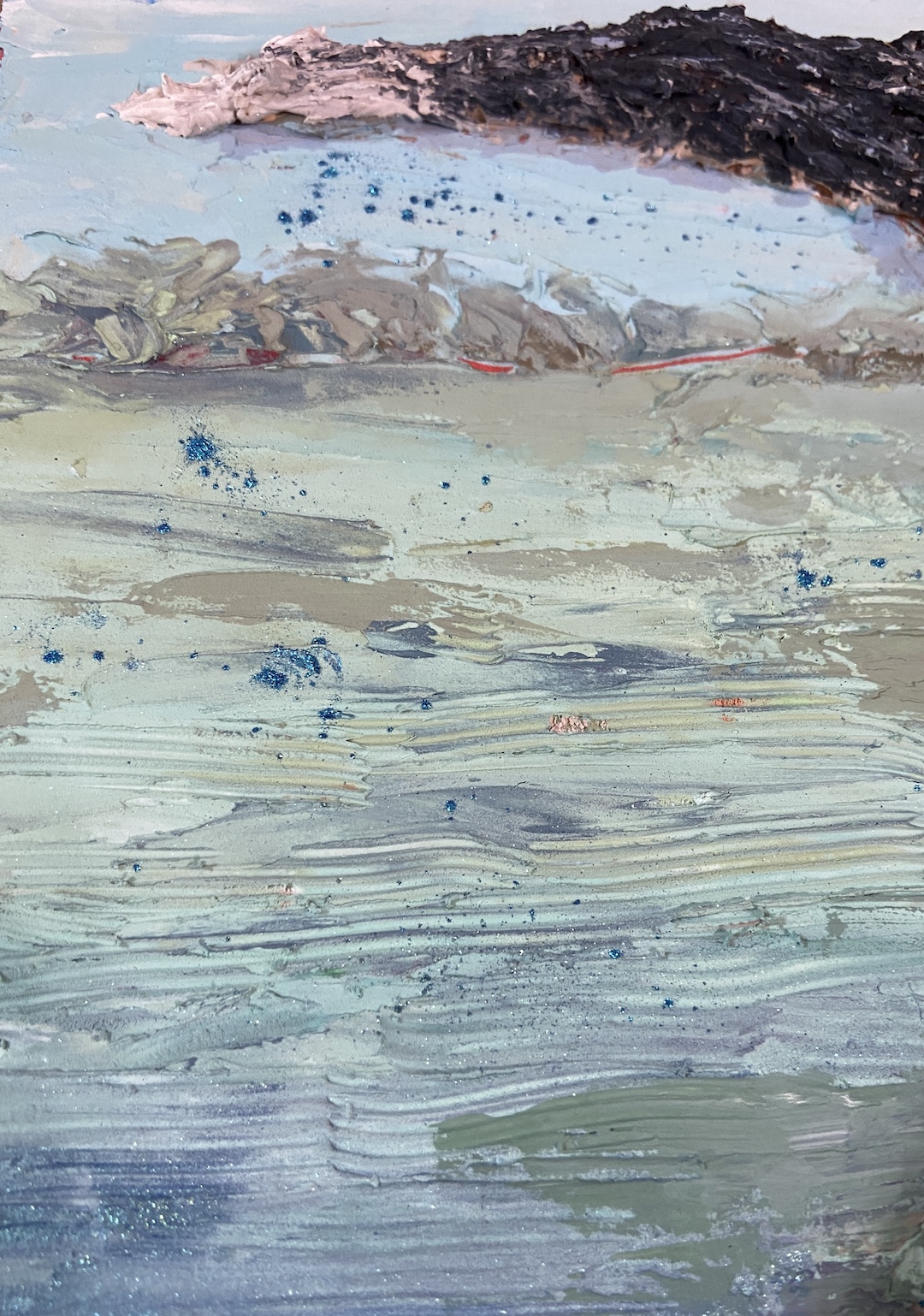
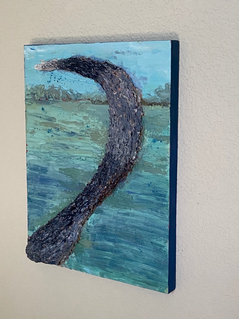
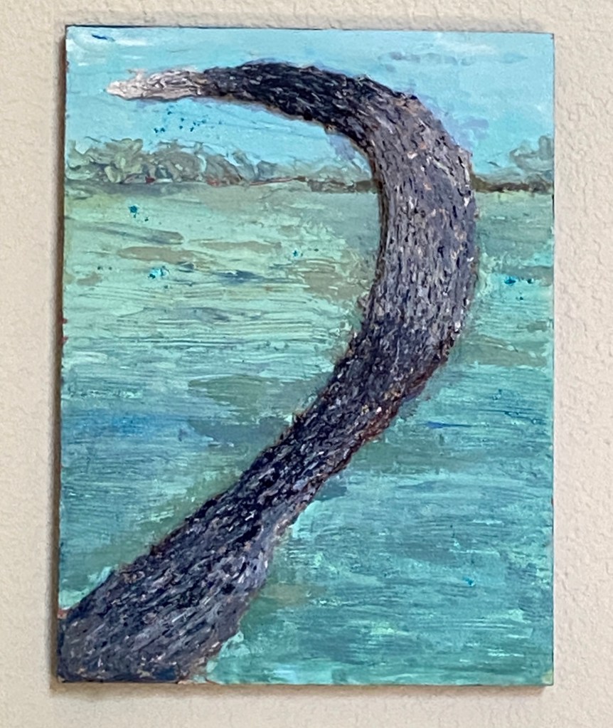
There were two primary enhancements I made to this abstract piece, one a brilliant suggestion from my wife, the other a need to play with impasto mediums. First, my wife noted that our niece is a big Cowboys football fan, so why not substitute the metallic gold of the original with silver. For the uninitiated to the cult of Jerry Jones, the team colors are blue and silver, thus the resulting palette. The other detour was the introduction of thick impasto elements, which I felt would add further interest to an otherwise limited composition. 

I was quite happy with the outcome, although I think the use of gold per the original piece is a better look… for me. Customizing for my niece gave it more meaning, and makes for a better art story when there’s something personal driving the trajectory. 

I’m inclined to dabble with more abstract compositions from time to time. It’s a nice pivot from the more exacting nature of landscapes and still life works. I can also experiment with palettes that deviate from my standard setup. Should prove interesting! 


#austinart #artbern #berntx #crashboomzip #abplanalp #austinartists #abstractart #dallascowboys #silverandgold #impasto #atxart #atxartist #atxlife #contemporaryart #paintings 

The Stick Won’t Throw Itself

ZIP TOOT | Mixed Media on Board | 8×10”

Painting and the creative process has always been a zen-zone for me, even on days when the paint just won’t line up right! When life decides to punch you in the face, painting can be calming, even downright cathartic.   

Our beloved pup, Zip – aka “Zippy”, “Zipster”, “Zipper”, “Toot”, “The Pip” and dozens of other nicknames – took her trip to the Rainbow Bridge a couple months ago. She was a HUGE personality, the boss of any space she occupied, and a precious family member who will be forever in our hearts. She loved food, playing ball, car rides, hikes, and she even enjoyed the occasional trip with me into the landscape to paint “en plein air”. But more than anything in the world, she loved to swim, especially if a stick was involved. ZIP TOOT is a nod to her larger than life personality doing what she loved more than anything else.  

As to the artwork itself, this is another foray with spackle, but leveraging the unique opportunity to create textures that simply can’t be done in oil paint – at least not by me. The spackle was laid down in multiple layers, oftentimes so thick that it created a lot of cracking when it dried, which actually played well with the subject matter. Once the shape of the tail was done, I used a dark gray layer (almost black) as the base, then textured in lighter grays and whites. The effect is to give the impression of various hair colors intermixed, even in the areas that are dominated by black or white. Zip was a spotty dog, so getting this right was tricky, but manipulating the spackle while it was still soft made for an effective outcome. 

The final step was going back in with acrylic paint to make the entire tail look more vibrant, which is a weird comment given we’re dealing with black, white and grays. The background is intended to represent her swimming days, the last of which were on Lake Austin at a boat ramp next to Mozart’s Coffee. If you look closely you can see some blue glittery bits splashed around the tip of her tail, reminding me of her need to shake thoroughly between throws and her all-out rush back into the water to recover her favorite stick. 

Go play with your dog cuz the stick won’t throw itself.

RIP Zip

#artbern #berntx #crashboomzip #painting #art #abplanalp #austinartists #atxartist #atxart #atxlife #contemporaryart #bernabplanalp #zip #mozartscoffee #rainbowbridge #fetch #mixedmedia #dogswimming 

Bob Ross Goes Skiing

FRESH TRACKS | Mixed Media on Canvas Panel | 5×7”


This is project #2 from the aforementioned Textured Painting workshop at The Contemporary at Laguna Gloria. This was a real Bob Ross experience, as my original plan was to simply experiment with texture and some pottery tools to see how they manipulated the joint compound, as well as experiment on canvas board with my newfound medium. Lo and behold, I discovered ski tracks in the snow – an abstract painting exploration turned “real” composition.

The coloring of the snow is actually tinged with yellow and muted with purple, which is very hard to see in the photos. The first step was to paint the canvas panel all black, let it dry, then cover it with the off-white spackle. The pottery tool was some kind of metal prong with a very small, circular tip. Dragging this tool through the soft spackle exposed the black board underneath, sometimes closing back up over itself in the thicker sections, much like skiing through fresh snow. 

On day 2, after the initial spackle had dried, using a water spritzer, I applied some kind of sparkly dust provided in the instructor’s box of goodies, which created a very cool reflective effect, like sun on snow. The last step was to apply a sky-blue acrylic mix to some of the wider tracks, which added color and the effect of the sky reflected in the snow. 

Overall, I’m very happy with this abstract turned ski tracks realism piece. I think it would be a very marketable piece, too, at a larger size in a black frame for someone who loves skiing. Thank you, Bob Ross!

artbern #berntx #crashboomzip #painting #art #abplanalp #austinartists #atxartist #contemporaryart #steamboatsprings #skicolorado #bernabplanalp #getoutside #contemporaryatx #texturedpainting  #acrylics #mixedmedia #bobross #happyaccident

Meteor Spray

The mission to Mars is complete! This larger piece was a lot of fun on many fronts and allowed for some variations in technique and colors. This is largely an abstract project, although I worked to replicate the essence of the Martian surface, albeit with some wild colors. 

After the block-in, which was described in the Meteors and Squirrels post last month, I focused on the colors. It was at times infuriating trying to create other worldly space dust hues, but I kept at it until I found something that resonated with me. Along the way, I will admit, there was a lot of wasted paint. The solution was glazing, whereby I was able to push and pull the hue and intensity as needed through thin layers atop an initial color scheme. There were 3 glaze layers in total, but the first one was the most impactful, essentially making the whole piece pop and really come alive! It was an exciting moment and something I absolutely love as an artist, namely when you make a creative decision to change the approach and it actually works! Hell yeah! 

After 2 glazing layers, I made another compositional decision to invest more time and effort in multiple craters. The piece needed to convey the powerful impact of the main focal crater, but the addition of other craters enhances the overall painting and incorporates some needed texture. The craters also unwittingly added a strong sense of value contrast and lighting direction that I didn’t realize was lacking until I started dropping them into the Martian surface. 

The final glaze layer was more opaque than previous layers and it was selectively done across the composition to soften and blur many of the larger craters so one gets the sense of a dusty surface – otherwise they simply looked too crisp and clean, an effect I wanted on the focal point but not the other craters. 

Overall, this piece was fun to do, but I’m not excited about the outcome. I absolutely love the impact crater – still now sure how that came together so nicely – and the projection of colored Mars dust (meteor spray) worked well, but I realized the composition isn’t something that appeals to me visually. The final colors aren’t what I’d envisioned and I simply couldn’t get away from the red orange… and I don’t really like that hue, so in the end it was a stupid decision on my part. That said, I’ll be interested to see who likes this piece, either because of the pronounced coloring, or perhaps the Martian space theme, which isn’t a typical painting subject.

Technical details for my fellow art dorks:

  • Oil on canvas board, 30″x24″
  • Glazing done in final layers, but not atop the focal crater
  • Brush sizes were primarily 2 or 6, mostly Flats and Rounds,