Fix and Finish Spring Point Lighthouse

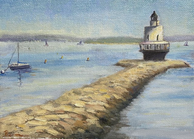
SPRING POINT LEDGE LIGHTHOUSE | 6×8”| Oil on Canvas Board

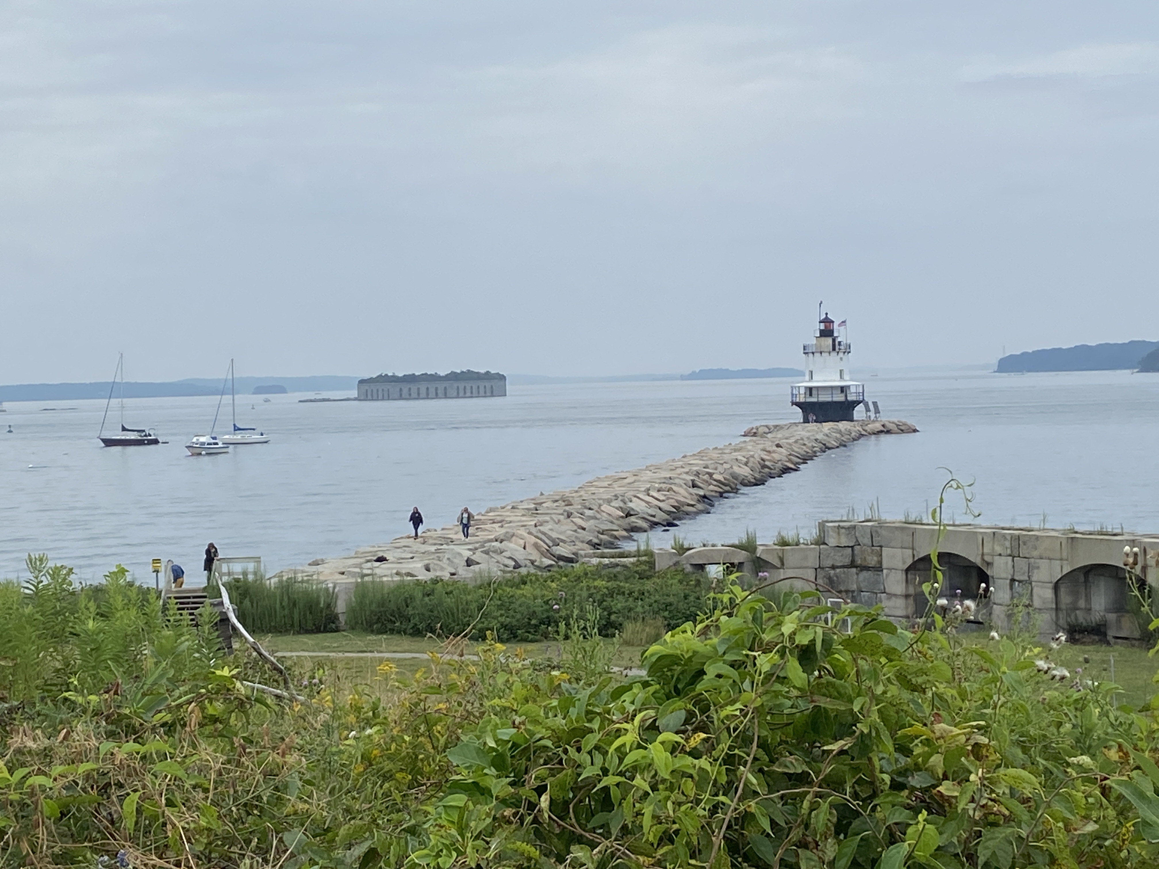
Finished! I’ve posted a couple of progress related updates regarding this composition and I’m happy to say the 3rd time is a charm… this one’s done! If you look at the previous progress post, you’ll notice the removal of the tiny island fortress of Fort Gorges, an extreme application of artistic license. It was giving me fits compositionally, in part because the intent to use it as a balance with the lighthouse on the right was more of a distraction than something complimentary. I was going to simply mute the greens of the trees and push it back in the scene, ensuring the lighthouse was the focus, but what I discovered was that it’s such an unusual structure that it took over the composition as the viewer is sucked into wondering “what the hell is that?” I mean seriously, how often do you see an old fort on an island with a miniature forest growing in the center? I tried to convince myself that I painted it so realistically and thus it was a distraction, but in reality it’s simply weird to see out of the full context of Casco Bay, so I wiped it out… in the interest of artistic integrity.

The fort was easy enough to wipe out, but the issue it was meant to address, namely a well balanced composition, was still a problem. Not a pro at just dropping shit into a painting out of thin air, this seemed like a good scenario for practice. I’m pretty happy with the result, but it took a conscious effort to ignore details and simply work in some loose brush strokes. I also incorporated some of the ubiquitous lobster buoys found in and around Casco Bay, and lastly some distant sailboats to give the sense of an active afternoon on the water.

As to the focal point, the final result of the lighthouse and the complex stones of the jetty came out pretty well given my relatively minimal subject matter experience. As any of you artists know, tackling new subjects can be a reminder of the impossibility of knowing how to paint anything and everything equally well. The process was very enjoyable and satisfying, so there will be more lighthouses in the near future. I might expand my new found rock painting knowledge to some coastal scenes, too. 

Thanks for reading! 

#artbern #berntx #crashboomzip #painting #art #abplanalp #austinartists #atxartist #contemporaryart #southportlandmaine #abplanalp #bernabplanalp #springpointledgelighthouse #lighthouse #maine #portlandmaine #getoutside #fortgorges

Gray and Rainy… Perfect Day to Paint

SPRING POINT LIGHTHOUSE | 8×10”| Oil on Canvas Board

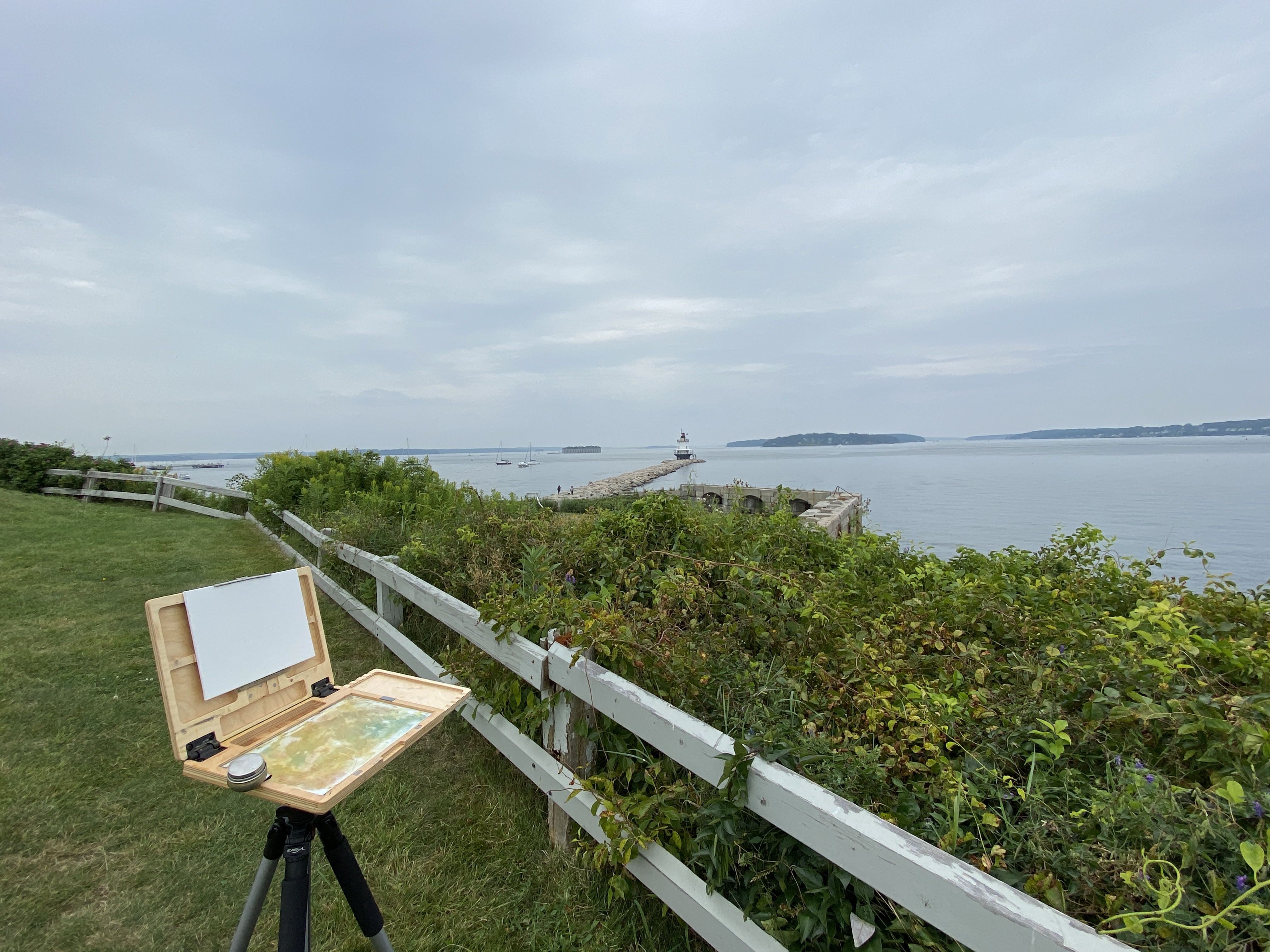
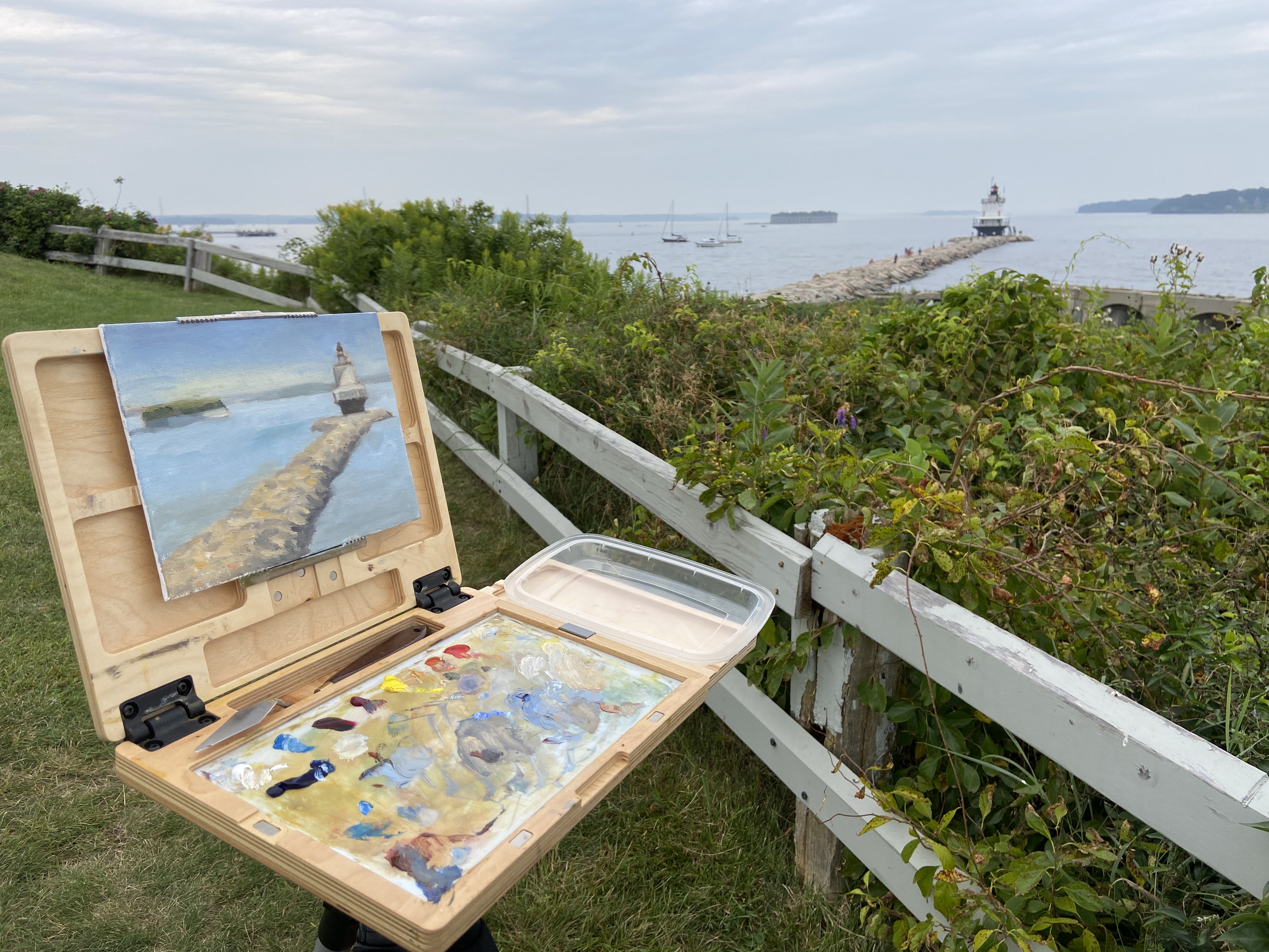
Presented with a sketchy weather forecast for the coming few days, my need to get out and tackle this lighthouse painting got the best of me and I made a rare late afternoon plein air session happen. Nothing about the timing or the weather made sense for an outdoor session, but when the temperature is in the lower 70s that’s all the motivation I really need. 

The drawing session from last week proved very helpful with this composition. I knew exactly how I wanted to orient everything, which in this case was the jetty, NOT the lighthouse. I need to remember this for future works, namely to find the piece of the composition that’s going to serve as the anchor for all perspective and measurements and start there, noting that this isn’t always going to be the focal point. The vertical orientation of everything on the horizon and the width/centering of the lighthouse relative to the jetty was also key. This made things move very fast so I could get to the business of putting oil on canvas. 

Starting with the sky and working forward was my approach this session. I’m ultimately ignoring the very gray, muted light because I know what this looks like on a sunny day and the plan is to polish things up in the studio or return to this location to finish it off with better contrasts. However, I’m very happy with what I finished today in just over an hour. A part of me says I should leave it as is and simply shore up the lighthouse details. Maybe I’ll put myself on an hour limit and refine whatever I can within that time constraint? Something to think about. 

Side note, a family with a young girl come by to ask if they could check out the painting. Apparently she likes to paint and seeing someone doing it outside on a day like today was either very cool, or just weird. Either way they seemed to be entertained and were very appreciative of our brief chat. I’ve never understood plein air painters who get so bent out of shape when people ask to check out what they’re working on. Doesn’t bother me, especially if what I’m painting doesn’t look like garbage. 

Thanks for reading!

#artbern #berntx #crashboomzip #painting #art #abplanalp #austinartists #atxartist #contemporaryart #southportlandmaine #abplanalp #bernabplanalp #springpointledgelighthouse #paintingintherain 

So Much Granite!

This is a preliminary drawing for a plein air session I plan to do later this week. This particular lighthouse is accessible via a jetty made of granite, which I can say from personal experience is deceptively long. As is the case with many lighthouses, the setting is often more impressive than the structure, which makes sense given they’re designed to protect navigators from the very dangerous geographies upon which they sit. Ironically, in a world where technology has made many lighthouses functionally irrelevant, they’re wildly popular destinations for visitors to explore… on land. 

The other attraction to lighthouses, as an artist, is they’re much like snowflakes whereby no two are alike, so there’s something new to tackle with every composition. Combined with their intriguing landscapes, lighthouses are a must do as an artist. 

I like to do detailed drawings instead of quick sketches when the subject is complicated or something new. The jetty is very intimidating for me, so it was important to get a handle on how to simplify while not losing the feel of all those massive granite blocks. I’m not sure if the drawing approach will translate to the painting, but a few things become clear from this exercise. First, the layout of the blocks needs to have defined directional lines in the fore and mid ground planes to capture the overall shape of the jetty. Secondly, there are numerous tiny shadows and value variations that give the blocks their distinct shapes, which will require some trial and error once the paint hits the canvas. 

Stay tuned for more on Spring Point lighthouse!

#artbern #berntx #crashboomzip #painting #art #abplanalp #austinartists #atxartist #contemporaryart #southportlandmaine #abplanalp #bernabplanalp #springpointledgelighthouse #lighthouse #lighthousepaintings

A Gaggle of Geese – Part 2

MILL CREEK POND | 8 x 6” | Oil on Canvas Board

This is a follow-up from the Gaggle of Geese post a few weeks ago. The finishing “touches” for the studio ended up being a little more like finish “construction”, but I finally got to a point that seemed good enough. 

Let me admit, I don’t like this composition, but I really like parts. Others might see something more appealing, as art tends to work that way, but it seems artists trying to sell works tend to force themselves into liking everything they paint. To the uninitiated, know that they’re lying. There’s not an artist out there who likes even most of their final pieces. At the end of the day, our compositions tend to have really cool elements that we love, and various faults that distract us to no end. 


MILL CREEK POND was a joy to paint. If you’ve read the previous post and seen the video of the geese, you understand why. In terms of the studio work, I was really focused on simplifying the trees. Apparently I ignored a few basic compositional tenets along the way and ended up with two trees perfectly aligned left and right, meeting in the middle of the canvas. So annoying, but that’s what happens if you don’t step back frequently at the beginning and take the time to ensure the layout works. 


Regardless of the “amateur hour” compositional oversights, I had a lot of fun learning how to simplify the masses of the trees, especially the purple oak. Living in Texas, there are no purple oaks, and everything that’s green has a coating of yellow cedar pollen, so things skew very warm. Painting a very dark purple oak tree with huge leaves that gather in numerous masses is, well, an awkward endeavor and hard to create on the first go. Ultimately I gave up, said it’s good enough, and pivoted to the warmth of the setting sun on the trunks, grass, and lily pads. 


Hope you enjoy the final product regardless of my self-critique. It worked out in the end… kinda. 
Thanks for reading!


#artbern #berntx #crashboomzip #painting #art #abplanalp #austinartists #atxartist #atxart #atxlife #contemporaryart #southportlandmaine #abplanalp #bernabplanalp #pleinair #pleinairaustin #geese #millcreekpond

Cuz White is Boring

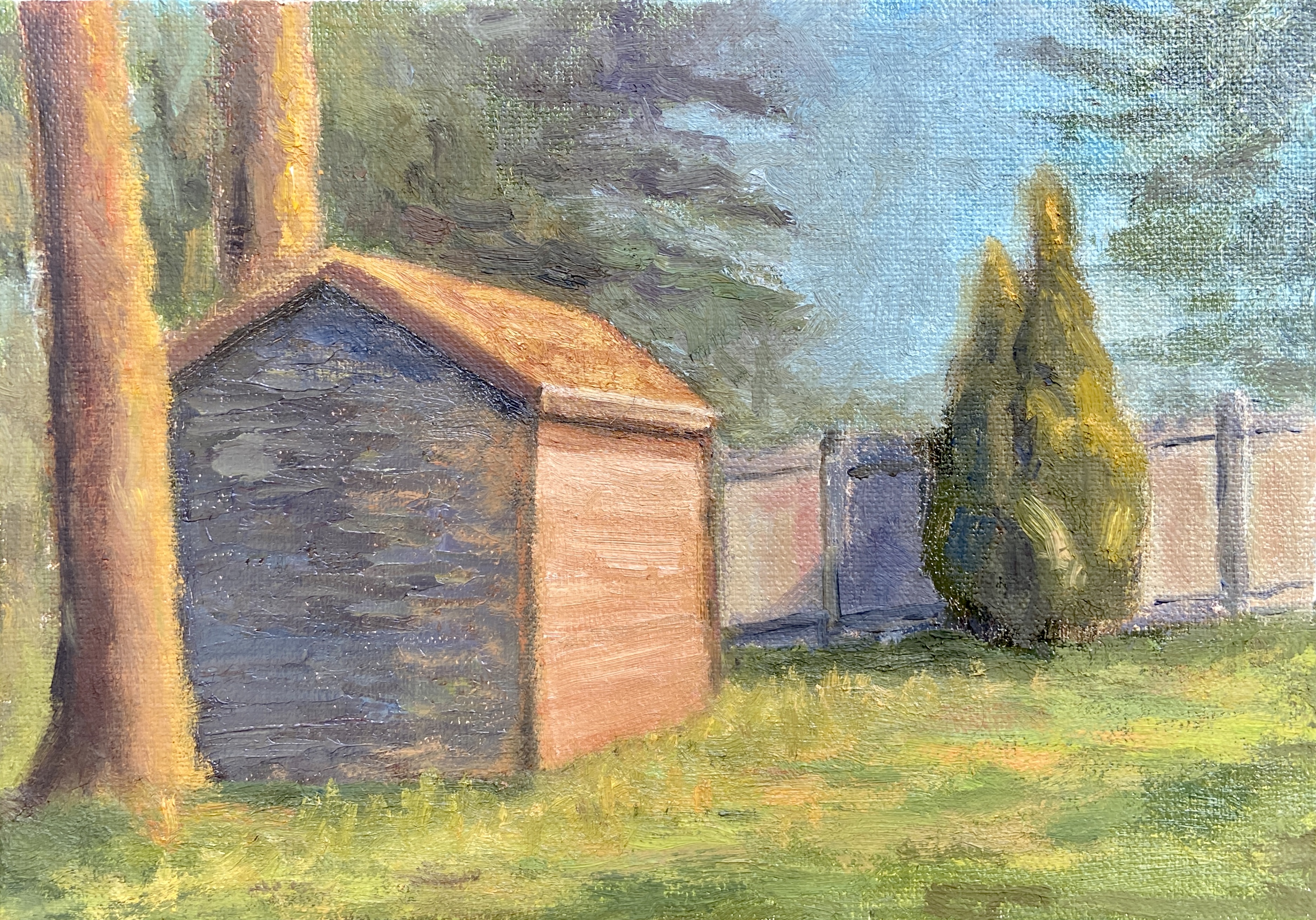
PREBLE SHED | 8 x 6″ | Oil on Canvas Board

In an effort to up my “en plein air” game, I’m going to do a few sessions this summer focused on simplification. The plan is to either find scenes that are lacking details and complexity, or zoom in on the focal area of a detailed scene and cut out the noise in an effort to simplify. 

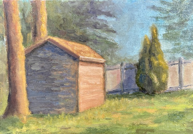
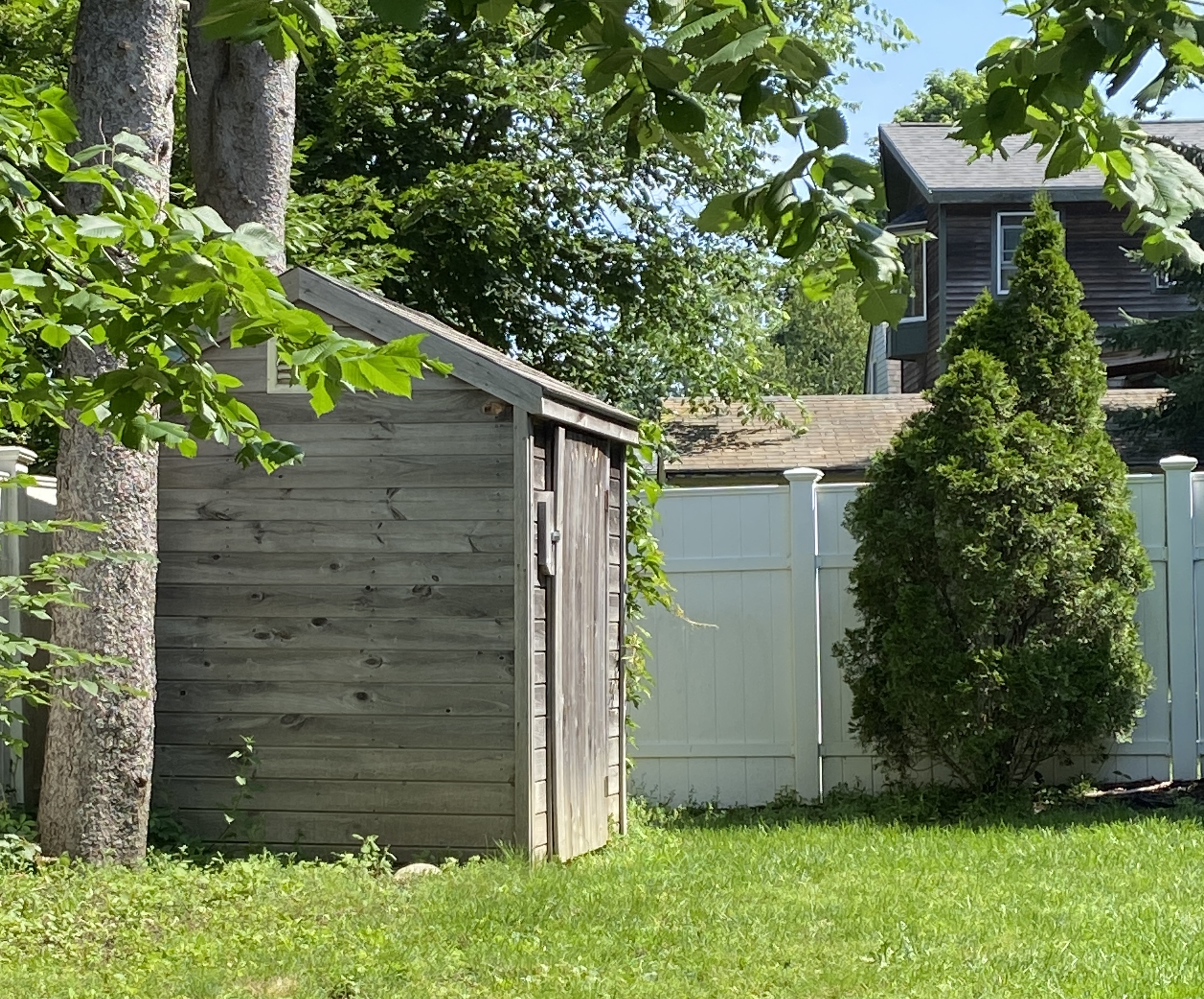
The Preble Shed is an example of the former approach, namely it ain’t complicated… it’s a shed. However, I spent a lot of time also streamlining the background, almost ignoring what trees were actually in the background. I also made a point to blend, perhaps even muddle, the tree edges into the sky. I think it worked pretty well and added atmospheric perspective, something that has eluded many of my previous efforts. Progress!

Not surprisingly, the shed itself was the real challenge. It has a thick coating  of paint because there were a number of re-dos as I struggled to find a good light and dark color pairing. I noticed that so many professional artists who do sun-drenched urban landscapes tend to focus on white or very light yellow, using a contrasting blue-purple for the shadowed sides of the structure, which works really well, but honestly strikes me as a little boring. My goal with the shed was to use some hues that could be incorporated into other elements of the landscape – namely the flanking tree in the foreground, the fence in the background, and the sunlit grasses. I went with orange, about the 50th attempt, and can’t tell if I stopped there because I was satisfied or just worn out trying. 

Thanks for reading!

artbern #berntx #crashboomzip #painting #art #abplanalp #austinartists #atxartist #atxart #atxlife #contemporaryart #southportlandmaine #abplanalp #bernabplanalp #pleinair #pleinairaustin #pleinairmaine #maineartists #mainelife