AVOCADO | 6×8” | Oil on PanelMIMOSA | 12×16” | Oil on Canvas Board
Two more paintings have found their forever home! AVOCADO and MIMOSA caught the eye of a customer while having breakfast tacos at Kerbey Lane Cafe last week. The stories of why people buy a given painting is a very rewarding part of the experience for me. In this case, the buyer was planning to gift the paintings to an Aunt she was visiting while in the San Marcos area. I guess she’s a fan of brunch.
This sale also provided me the opportunity to conduct my first “virtual” sale of the “Something For Everyone” show, which went seamlessly and worked well for everyone involved. As someone who spent the majority of their career in high tech, the logistics of a virtual sale make for a fun intersection between art and tech. Each piece of art at the show has a label detailing the name, size, medium, and price, as well as a QR code. The QR code allows a diner at the cafe to simply scan with their phone, which brings them to my website, www.artbern.art, from which they can readily find my contact information.
After a few email and text exchanges, she sent me payment via Venmo and I notified the restaurant that the paintings could be removed from the wall and left in the office for customer pickup. Aside from taking the paintings off the wall, the restaurant staff didn’t have to deal with any logistics. Everyone was happy with the process and the final outcome!
Stay tuned to find out about the new artwork that will replace AVOCADO and MIMOSA!
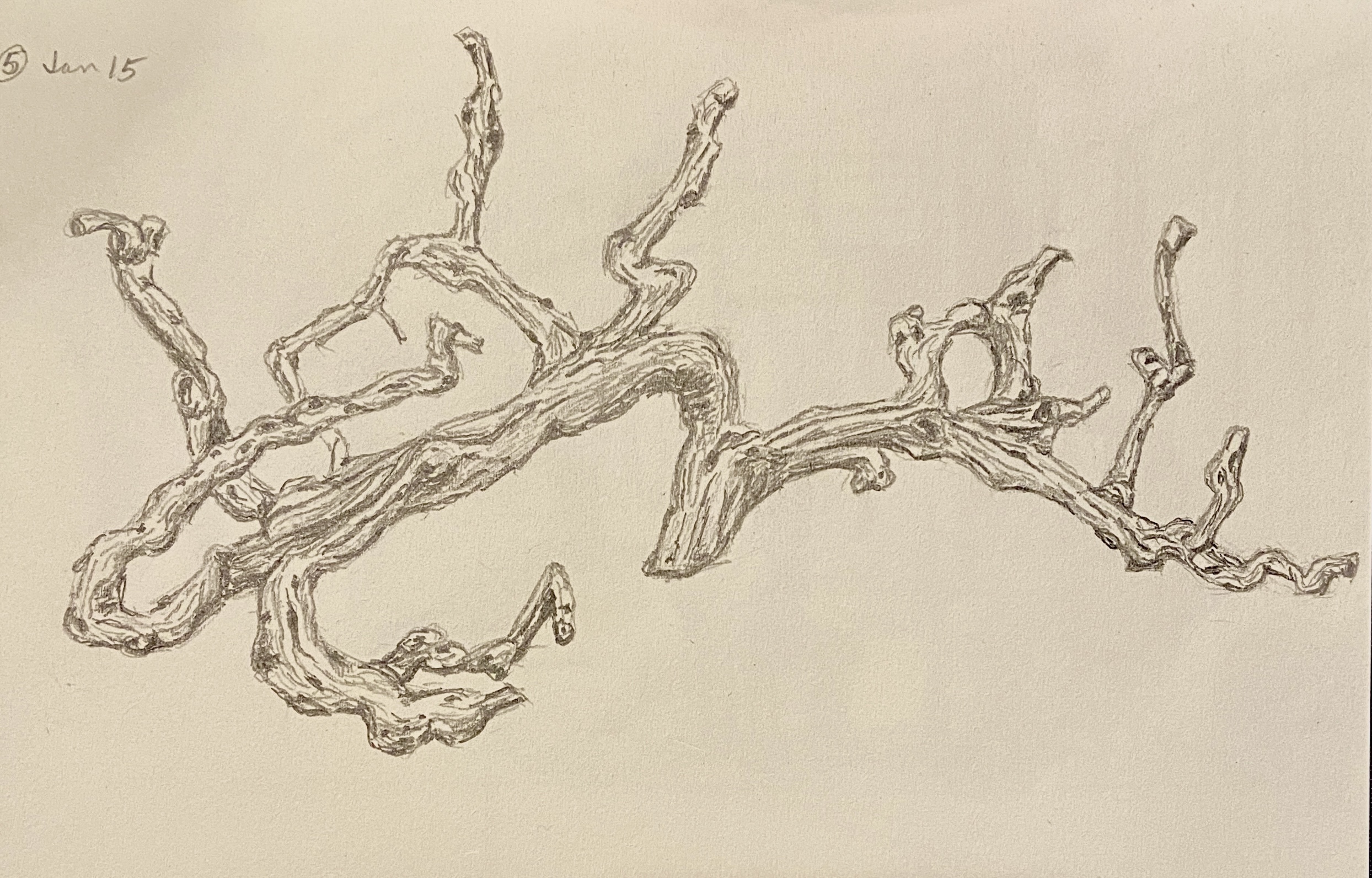
Today is for the wine lovers out there! This is one of the various drawings from this month’s draw-a-day self-imposed idiocy. I think even oenophiles would have trouble recognizing this drawing at first glance, but it hopefully becomes apparent that this is a grape vine. An old, grape-less, dead vine, but a grape vine nonetheless.
The reference photo is from my visit to The Piccolo Hotel (great place, btw) in Paso Robles, California. I didn’t realize what it was at first – I just thought it was a cool wood carving over the fireplace in the lobby. But when you get to looking at it in more detail, and taking into account the location (wine country!), the reality sets in that this is the epitome of upcycling! This grapevine, while alive, provided tasty wine… and in death is transformed into art! What’s not to love about that!
The Library at The Piccolo, Paso Robles
As an art subject, it was very tricky initially. I thought it was going to be a disaster, in large part due to the details involved, but perseverance won out and all the wavy lines and dark circles coalesced into a pretty decent drawing. More importantly, it was a lot of fun to draw and something I’ve added to the short-list of formal compositions. Drawing or painting, I’m not sure which… maybe both.
One final comment: Paso Robles wine is excellent! Makes sense, right? I mean, c’mon, the vines are beautiful, alive or dead!
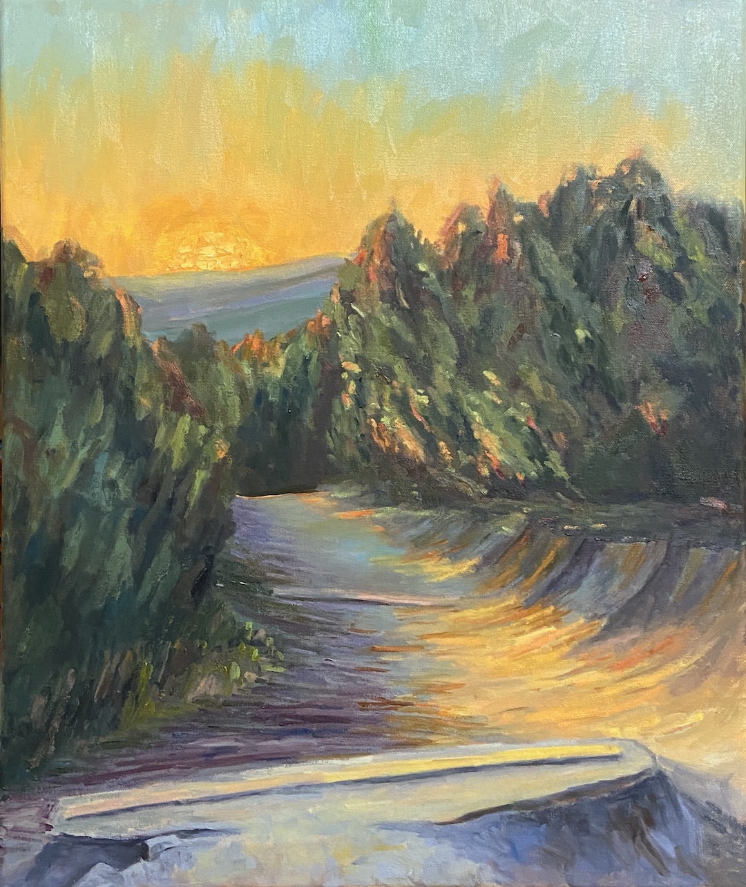
Say hello to the inaugural composition for 2025, HILL OF LIFE. If you’re a mountain biker living in Austin, then you know. For the rest of you, this is the northern endpoint of the Barton Creek Greenbelt, 7 miles upstream from one of Austin’s most iconic sights, Barton Springs.
It’s fitting that the two ends of the greenbelt are polar opposites. The southern end is accessible via a short walk from a parking lot, and is suited for swimming, cooling off, and relaxing in the shade of live oaks. Conversely, the northern entry is a sketchy ride down a steep, rocky, 300 foot drop-in and is suited for mountain bikers with a death wish or adrenaline junkies.
The HOL is actually an old maintenance road that was used (I believe) by the city to access the trail in emergencies, be it fire fighting or EMS services for some poor bastard who’s riding skills couldn’t cash the check their ego was writing. Over the years, the road was decommissioned and all that remains are the cement joints that connected the main sections. Over the years, erosion has created big “steps” off the lip of these joints… and therein lies the focal point of HILL OF LIFE. Oh, and great sunsets, too!
This piece started with plein air sketches, which was easy to do given this location is a 5 minute hike from my house. I had intended to do a plein air study from this location, too, but after the sketches and my own personal experience with this trail over 20+ years, I felt like a study wasn’t necessary. So I teed this up in the studio and started throwing paint at the canvas!
Hill of Life Old RoadHill of Life SunsetImpasto SunHill of Life Kerbey Lane Show
The obvious focal point is the huge setting sun, but I also consider the darkest section, namely the last ledge down the trail, as a main hook for the viewer. The odd looking concrete bar at the base of the painting is one of the aforementioned joints in the original road, which makes a little more sense when you look at the painting and reference photo side-by-side. I spent considerable time ensuring this was more realistic than impressionistic to garner interest in the piece, hopefully without causing confusion for those who haven’t been to the Hill of Life.
Lastly, the sun is done primarily with thicker paint application using a palette knife, which gives it more texture and a stronger presence on this larger canvas. It also allows for more blending, which I find helpful when trying to nail the value and warmth of something as intimidating as the sun.
For those of you in the Austin area, this piece is part of my solo show, “Something for Everyone”, on display (and for sale) through end of June at Kerbey Lane in San Marcos.
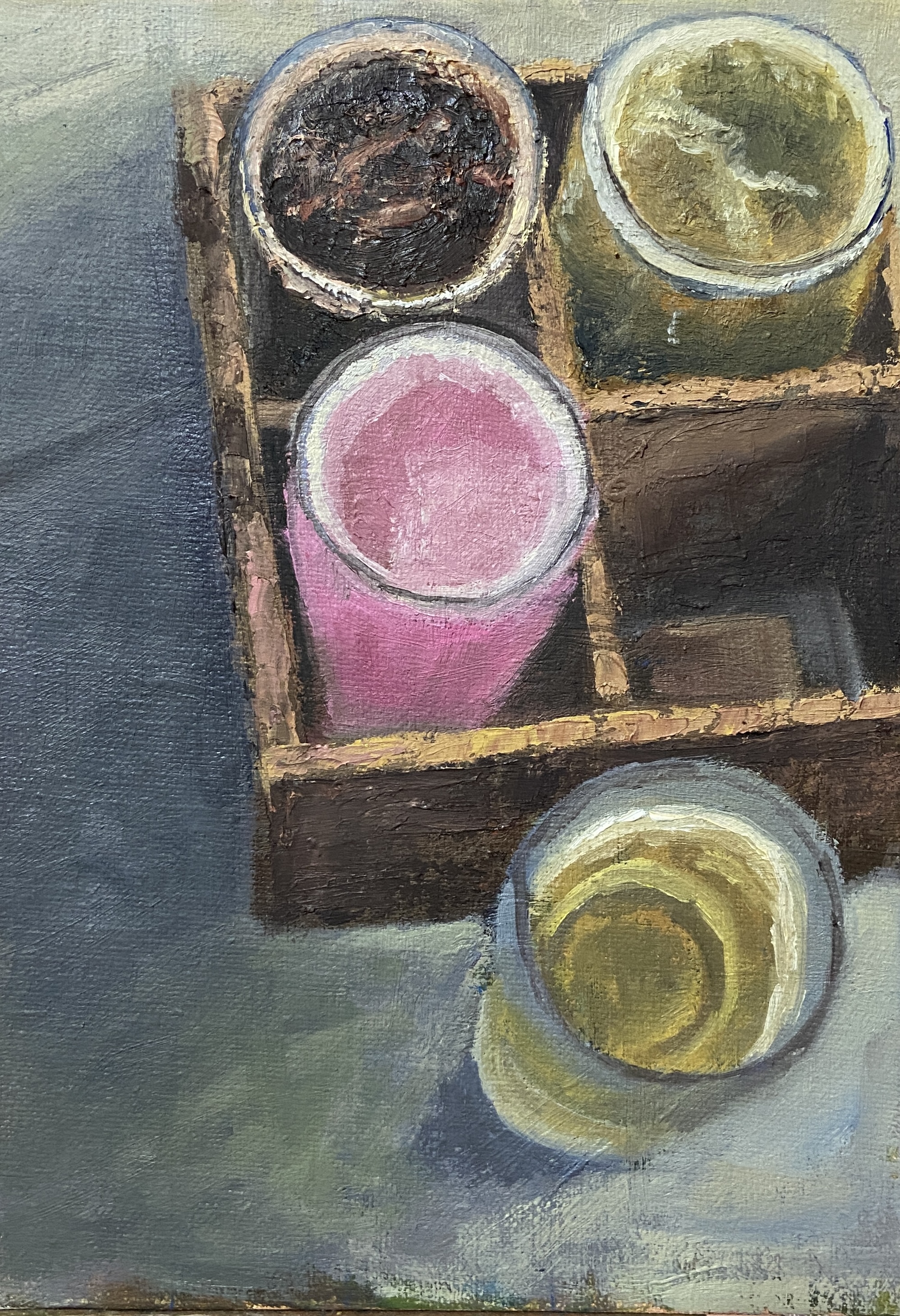
This piece was done earlier this year using a reference photo I took while in Portland, Maine. Most of my works in that area are either “en plein air” or based on my own coastal reference photos. For those of you who have followed my work over the years, you well know I tend to veer to still life from time to time, with a particular affinity for libations. Thus, BEER BOX, technically a beer flight, from Rising Tide Brewery in Portland comes as no surprise.
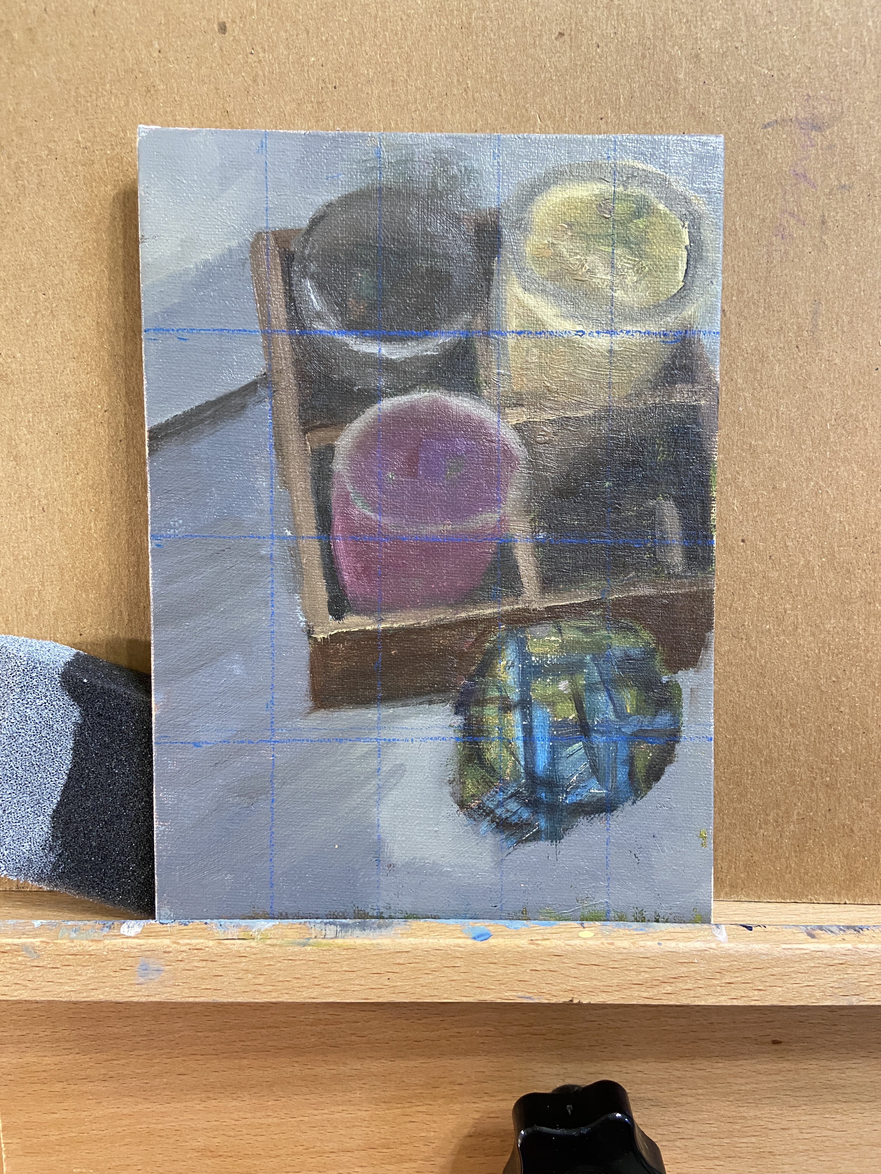
For the painters out there, remember the use of photo reference is a blessing and a curse. On the one hand, they capture a place or moment for future reference, when perhaps your memory might not be willing to cooperate. On the other hand, they can significantly distort reality and create more problems than they solve. While most of what you read about “painting from photos” (virtually every painting book covers this point) emphasizes the distortions created by photos relative to lighting and hues, IMHO the real terrorist activity of reference photos is their ability to jack with shapes.
In BEER BOX, I overlooked the shape shifting my iPhone had done to “improve” the photo. I even used a grid to try and get the shapes right, something I rarely employ, and I still didn’t realize the reference photo was just a bit tweaked! It’s hard to notice at first, but the top portion is actually skewed outward, kind of a mini fish-eyed effect. I noticed this after I’d already committed to the compositional structure, so I just rolled with it to see how it would turn out.
In the end, this piece proved to be a perfect mix of frustration and satisfaction. I think it turned out well, despite the odd birds-eye view, and I learned a lot in terms of subtle hue and value changes required to capture the depth of the beer box and how the glassware fades into the deep shadows.
BTW, Rising Tide Brewery makes some great beers and should be a stop on any Portland, Maine brewery crawl. I don’t recall the specific beers in this flight, but the 4 styles were Stout, IPA, Pilsner, and the pink one was a delicious Sour.
This was a commission piece for a friend, Jason, who had recently lost their beloved furry family member, Vedder. His wife, Alicia, reached out to me and wanted to have the piece done as a surprise. I knew the loss of Vedder was very difficult for both of them, having seen various remembrance posts from Jason on Facebook recently, it was clear this was a difficult time, so I wanted to make sure I got this right.
Alicia was extremely easy to work with, remaining very flexible in terms of what she wanted, essentially leaving most of the creative decisions up to me, saying she had confidence that whatever I created would be wonderful. At least that made one of us.
Then the pressure set in! This had to be perfection given the subject matter.
Ultimately I devised a number of possible compositions based on pictures and videos of Vedder, created sketches, and passed them along to Alicia for review. Thankfully her top 2 choices were the ones I wanted to paint the most.
I’m not a pet portrait expert, at least not at this point in my creative experience. That said, I have done a number of what I like to call “dogs in motion” pieces, so not having to tackle the task of Vedder’s face in detail was going to make this a lot easier.
There were a few compositional elements I wanted to bake into this piece. First and foremost, Vedder had to look like Vedder, even if his face was in profile, there’s still the challenge of getting his body just right. I wanted someone who knew Vedder to walk into the room where the painting was hanging and be able to tell at a distance “hey, that’s Vedder!” Secondly, the setting had to be his favorite excursion location, which was this unnamed rocky beach along the coast (they live in the Los Angeles area), and there had to be clear elements that made it recognizable as that beach. Lastly, I wanted to include “Easter Eggs” in the composition that would give the work more meaning and personalization for Jason and Alicia.
The initial block-in went well, despite the need to improvise the landscape a bit – the natural rocky jetty wasn’t in the same view as Vedder in photos, but it was an integral element of the beach, so it had to be included. The initial draft of Vedder’s silhouette was a lot more difficult, having gone through at least 10 variations before landing on the final version. I also made the decision to incorporate a calmer ocean than what was typically in the reference photos, which often featured a very active surf.
The most difficult technical challenges were the very black coat of Vedder, and the !*$king sand! First, the sand…
I’ll need to do a number of seascapes featuring beaches this year so I can capitalize on the lessons learned with sand. First, sand apparently comes in a wide range of colors, none of which you recognize until you try to paint said granules. I thought there was simply dry sand (light brown) and dark sand (dark brown). This is not the case. For the record, a beach full of sand has an infinite number of value and color gradations. Suffice to say it worked out, but I have a newfound appreciation for professional painters who incorporate footprints along the beach.
The biggest challenge, as expected, was Vedder. Getting the shape right, and I hope it is (you’d have to ask Jason and Alicia), wasn’t too bad, but trying to get the black hair to pop on the canvas and work the reflection of the sun on his coat, well that took some experimentation. Ultimately it came down to the magic of alternating warm and cool blues. I also incorporated a lot of knife work so there was some texture to his coat, as well as some fine brush work on the edges so he looked wet. When I asked Alicia what Vedder likes to do at the beach, thinking I could incorporate a ball, stick or frisbee into the artwork, she said “he just likes to run around”, or something to that effect. He was simply a happy, energetic, loving dog!
As to the Easter Eggs, namely hidden references in the artwork, I like to use these in commission pieces because it adds personalization and helps lend meaning to the work. The trick is to not do too many, keep them simple, and above all else, don’t compromise the quality of the art. In the case of VEDDER, I incorporated 3 Easter Eggs, two of which I’ll share here. First, Vedder’s paws create a rainbow reflection in the sheen of the water, representing the Rainbow Bridge. This element is designed to be subtle and not something you notice until you look very closely at the artwork. The other Easter Egg can be seen in the rocky peninsula. If you turn the painting upside down, reading left to right are the letters “VeddEr”. They’re not easy to see at first, but the intent is to make it hard to find initially, but then it’s impossible to look at the painting and not see them going forward.
Overall I’m very happy with how this piece turned out. More importantly, Jason and Alicia loved it, at least that’s what they told me. Haha! All kidding aside, the fact that I got a text from Jason with a picture of him holding the painting with a huge smile on his face was all the thanks I needed.