Getting more Kerbey Lane love this Summer with a new solo show, “PAINTINGS & PANCAKES,” at the Westlake location! As of July 2nd, more than 20 pieces of artwork adorn the walls of the restaurant. I’ll be swapping in at least 6 new pieces this month, so the show will always have wet canvases joining the sweet smell of syrup and pancakes!
A huge thank you to @kerbeylanecafe for another opportunity to work together on what’s likely the greatest collaboration concept of all time – art and food!
Check back later this week to see pictures from the show!
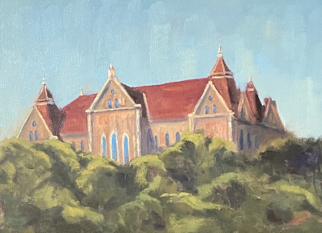
OLD MAIN – TEXAS STATE | 9 x 12” | Oil on Canvas Board
I’m a fan of wandering university campuses, both in the US and abroad, in large part because they’re often home to intriguing architecture, beautiful grounds, and chock full of history. Some do it better than others. For example, the University of Texas is by many measures a great school, but let’s be honest, people don’t go there for campus aesthetics. Alternatively, wander onto the stunning grounds of the University of Colorado and you may never leave.
However, there are also a long list of wonderful colleges and universities – no, I don’t know the difference -hidden between neighborhoods and history, more notable for their pride than their size, and arguably constitute the backbone of “usable” degrees. While I’ve never spent a day as a student at Texas State University, I can say with assurity that the San Marcos campus has enough beautiful open space and intriguing buildings to make for a nice afternoon wander.
In this piece I wanted to capture the university using an iconic building… say hello to OLD MAIN at Texas State. I assume this is one of, if not the site of the original building on campus, which is a beautiful piece of architecture. I used a reference photo from the University website, but it was pretty flat in terms of lighting, yet the perspective of the composition was excellent. I opted to “wing it” with the lighting, incorporating strong sunlight that lit up the facade and cast dark shadows downstream.
Ideally this piece finds a home with a Texas State alumni, but failing that it would be well suited for a fan of architecture. I’ve been pushing my painting style to be more impressionistic, but I had to tamp that back a little with OLD MAIN so as to include the necessary details of this beautiful building.
OLD MAIN will be added to the “Something for Everyone” show at Kerbey Lane Cafe in San Marcos. Drop by for a beer, some pancakes and art!
More European inspiration, this time from a little city called Cuenca, Spain, which is located about 100 miles east of Madrid. Cuenca is magnificent and thankfully not on the itinerary of the selfie-taking, speaker phone talking, culturally ignorant hordes. This city is in the mountains, founded by the Moors (like most everything in central Spain), and best known for their hanging houses, called “casas colgadas”. In my view, they’re the original “room with a view” architecture, and it’s frankly amazing they’re still clinging to the cliffs.
We were visiting in late May and did a lot of strolling as we explored the old town. This particular scene is from the Plaza Mayor, looking north towards the Cathedral of Santa Maria and San Julian of Cuenca. Even during this morning hour, there was a lot of activity and the city had a sense of energy and vitality, which I’ve tried to capture with this piece.
Initially, the intent was to do a quick study in preparation for a larger piece. While I still intend to do a larger, more composed painting, I kept getting sucked into the details of CUENCA. There are two focal points – I know, I know, that’s not how the rules work – but I’ve developed the opinion that multi-focal point perspective in a composition can work really well. In this case, focal point 1 is the Cathedral, which anchors the background as it captures the morning light before the rest of the buildings. Focal point 2 is the guy in the foreground walking right at you, also touched by the light, contrasted by the shaded patio immediately behind.
Lastly, there are various bits of sky blue incorporated through the piece. It’s an experiment to see if it gives the viewer the sense of having a relatively blue sky overhead, adding to the depth of the painting. Not sure if it works because I was actually in Cuenca to take this photo, therefore I always have that sense of a sky overhead when I think about this scene.
If you haven’t been to Cuenca, Spain… go! The setting, sights, food and people are wonderful.
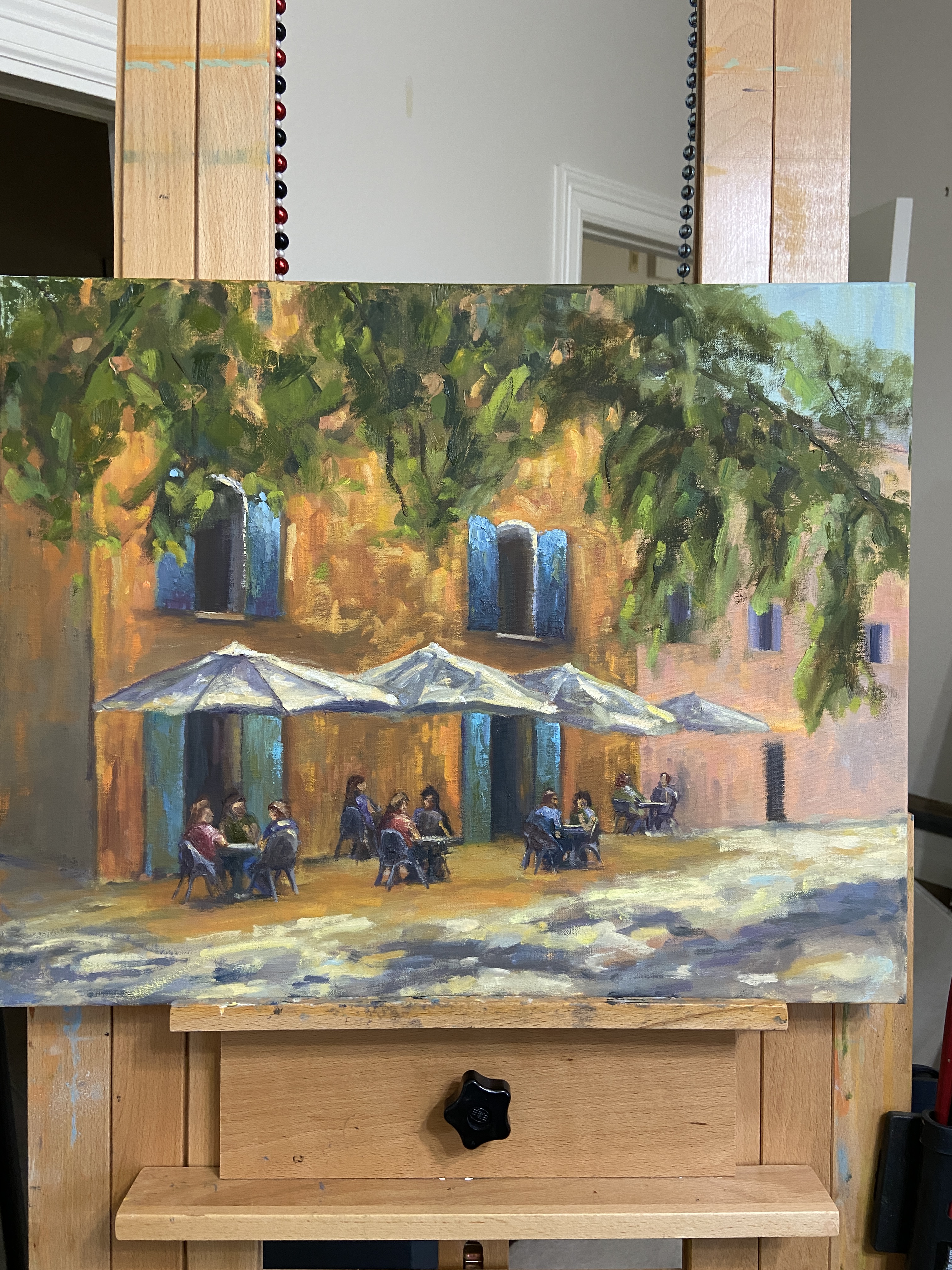
Inspired by past trips to Europe while enjoying a mid-afternoon lunch on a beautiful day, LATE LUNCH is meant to capture the slow pace of catching up with friends in an idyllic setting.
There were numerous challenges with this one, most of them self-inflicted as I really wanted to capture the presence of people doing their thing at the restaurant. I have a fair bit of experience incorporating people in landscapes, but not many have been seated. To my surprise, managing proportions of someone seated is particularly tricky and takes some practice. But even more arduous were the chairs, which have shapes that are all over the place and best done in an impressionistic style… which I will do next time.
Ultimately, though, LATE LUNCH is anchored on dappled sunlight and starkly contrasting values from tree shade. The dappled effect is designed to frame the scene between the umbrellas and the foreground, with the expansive green tree limbs putting the viewer in the cool shade of the afternoon.
AVOCADO | 6×8” | Oil on PanelMIMOSA | 12×16” | Oil on Canvas Board
Two more paintings have found their forever home! AVOCADO and MIMOSA caught the eye of a customer while having breakfast tacos at Kerbey Lane Cafe last week. The stories of why people buy a given painting is a very rewarding part of the experience for me. In this case, the buyer was planning to gift the paintings to an Aunt she was visiting while in the San Marcos area. I guess she’s a fan of brunch.
This sale also provided me the opportunity to conduct my first “virtual” sale of the “Something For Everyone” show, which went seamlessly and worked well for everyone involved. As someone who spent the majority of their career in high tech, the logistics of a virtual sale make for a fun intersection between art and tech. Each piece of art at the show has a label detailing the name, size, medium, and price, as well as a QR code. The QR code allows a diner at the cafe to simply scan with their phone, which brings them to my website, www.artbern.art, from which they can readily find my contact information.
After a few email and text exchanges, she sent me payment via Venmo and I notified the restaurant that the paintings could be removed from the wall and left in the office for customer pickup. Aside from taking the paintings off the wall, the restaurant staff didn’t have to deal with any logistics. Everyone was happy with the process and the final outcome!
Stay tuned to find out about the new artwork that will replace AVOCADO and MIMOSA!
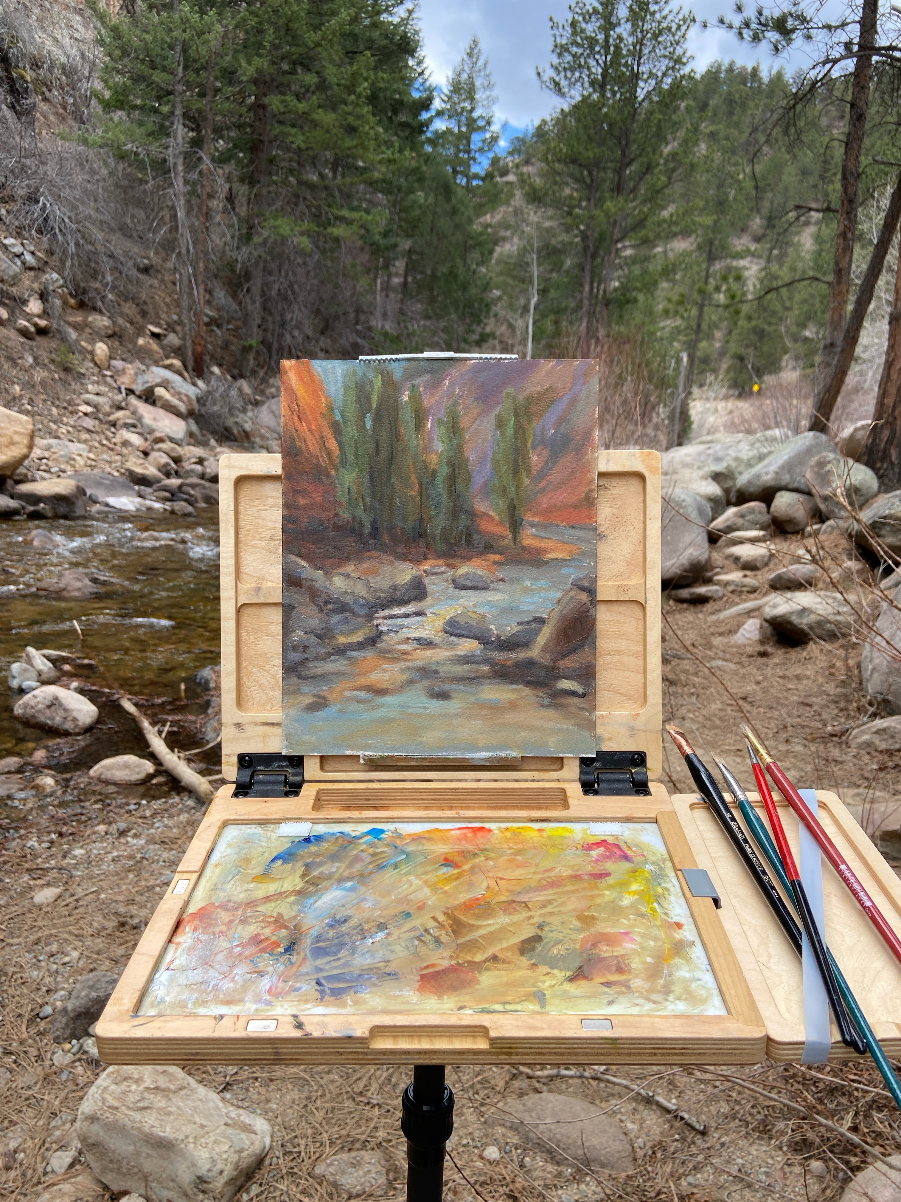
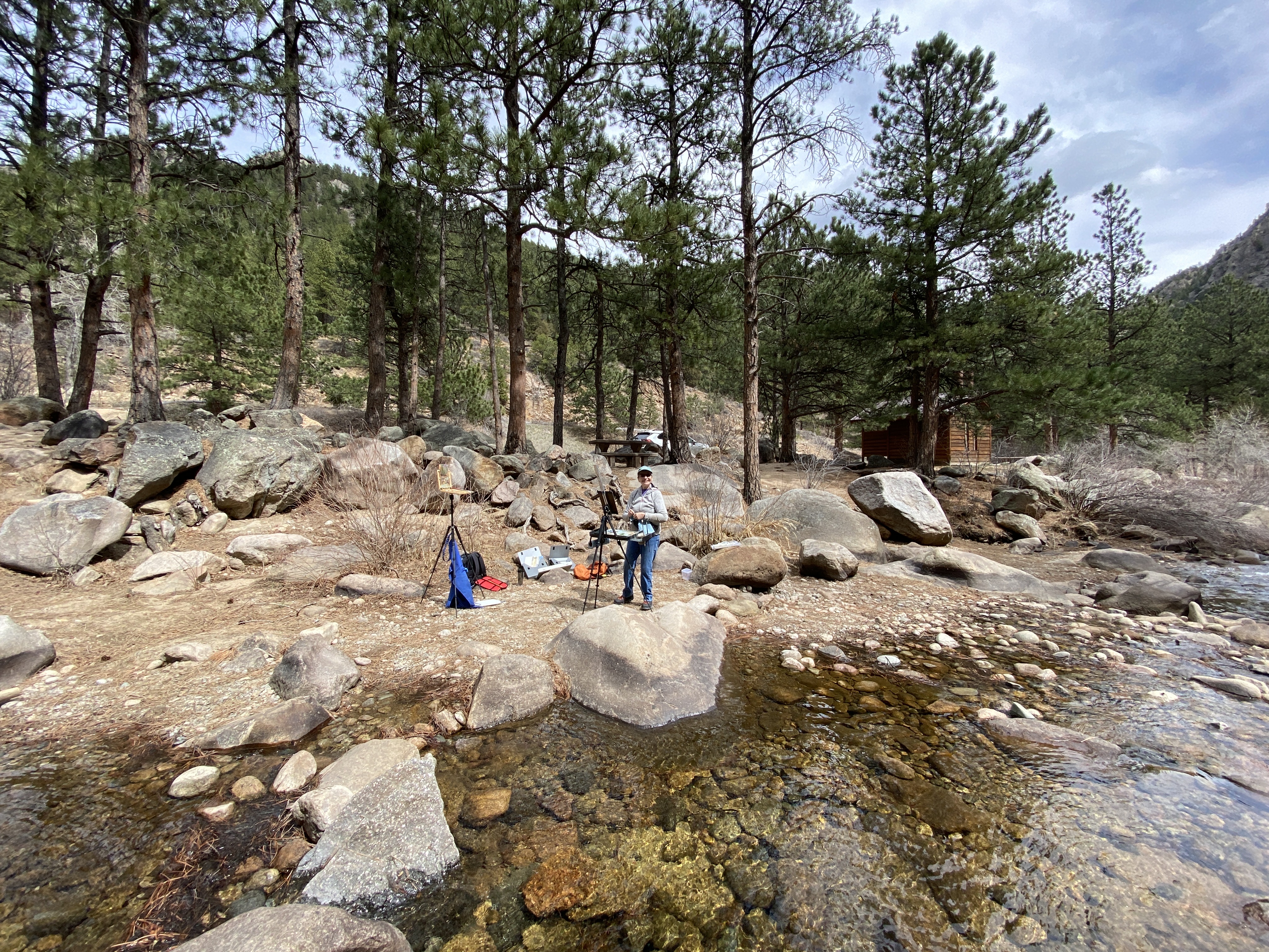
A great day of painting en plein air in Colorado with my mom. The weather and setting were perfect, so the fact that the paintings turned out nice put our day in the bonus.
The location is just off highway 36 north of Lyons, a couple miles up the canyon towards Estes Park. The compositional options were wide-ranging and, in all honesty, a little overwhelming. Upstream or downstream? Canyon walls or creek… or both? Wide focus or narrow? Ultimately, I opted to highlight the creek while leveraging the canyon walls for perspective.
I haven’t done a lot of plein air this year, but it continues to be preferred over painting in the studio, in large part because it makes me paint smarter. The quick pace forces one to make instinctive decisions without overthinking things, which can fail sometimes, but on this day it proved effective.
This piece will need some refinement in the studio, but I’d say it’s 80% complete, which is pretty good for me in terms of getting it done outside in one session. My mom did a bang-up job on her piece, too, opting for the wider view of the canyon to include the water and the tops of the canyon walls. And, like I said, painting with my mom on a perfect afternoon was pretty awesome!
A few months ago I finished this triptych, now called “GOING GOING GONE”, but it sat around in the studio waiting for framing inspiration. Well, that inspiration finally showed up in the form of cork foam board, an orphaned 12×26″ frame, and a whole lot of JB Weld epoxy glue.
If you’re interested in the details of this artwork, follow the link to the post in the above paragraph. Otherwise, read on to learn about the challenging world of custom framing, at home, with nary a YouTube DIY video to be had.
Challenge #1: How does one attach wood blocks to a frame without backing? I was headed down the path of cutting a custom wood back, but then I stumbled across a 1/4” thick foam board while looking for balsa wood as a lighter alternative to plywood. I also happen to have a matt cutter, which is much more finger friendly than my rotary saw, which is buried somewhere in the garage.
Challenge #2: How to attach foam board to frame? Also known as “glue or screw?” I was leaning screws, but as I was digging through my massive drawer of miscellaneous art crap, I came across a tube of JB Weld, an epoxy glue that’s stickier than a wet booger. Despite having been used once in the past, probably more than 3 years ago, it still worked!
Challenge #3: What was the best way to affix the wood blocks to the newly added foam core backing? See aforementioned sticky booger solution. But, the trickiest part was ensuring the 3 blocks, all of which are different sizes, were lined up properly. I’m positive there’s a better way to do this, but I opted to use a center string and blue tape at right angles to ensure the blocks were glued in the right spot.
Surprisingly, it worked out! I used the cork side of the foam board so I didn’t have to paint the white side, and I kinda liked the light brown coloring, which looked like a porter or amber beer. The best part, which my wife pointed out, was that by using the cork side for the backing, it was similar to a coaster bottom… like for a cold pint of beer… get it?
This piece will likely be added to my solo show, “Something for Everyone”, at Kerbey Lane Cafe in San Marcos, Texas, available for the reasonable price of 10 cases of Guinness or (512) Pecan Porter.
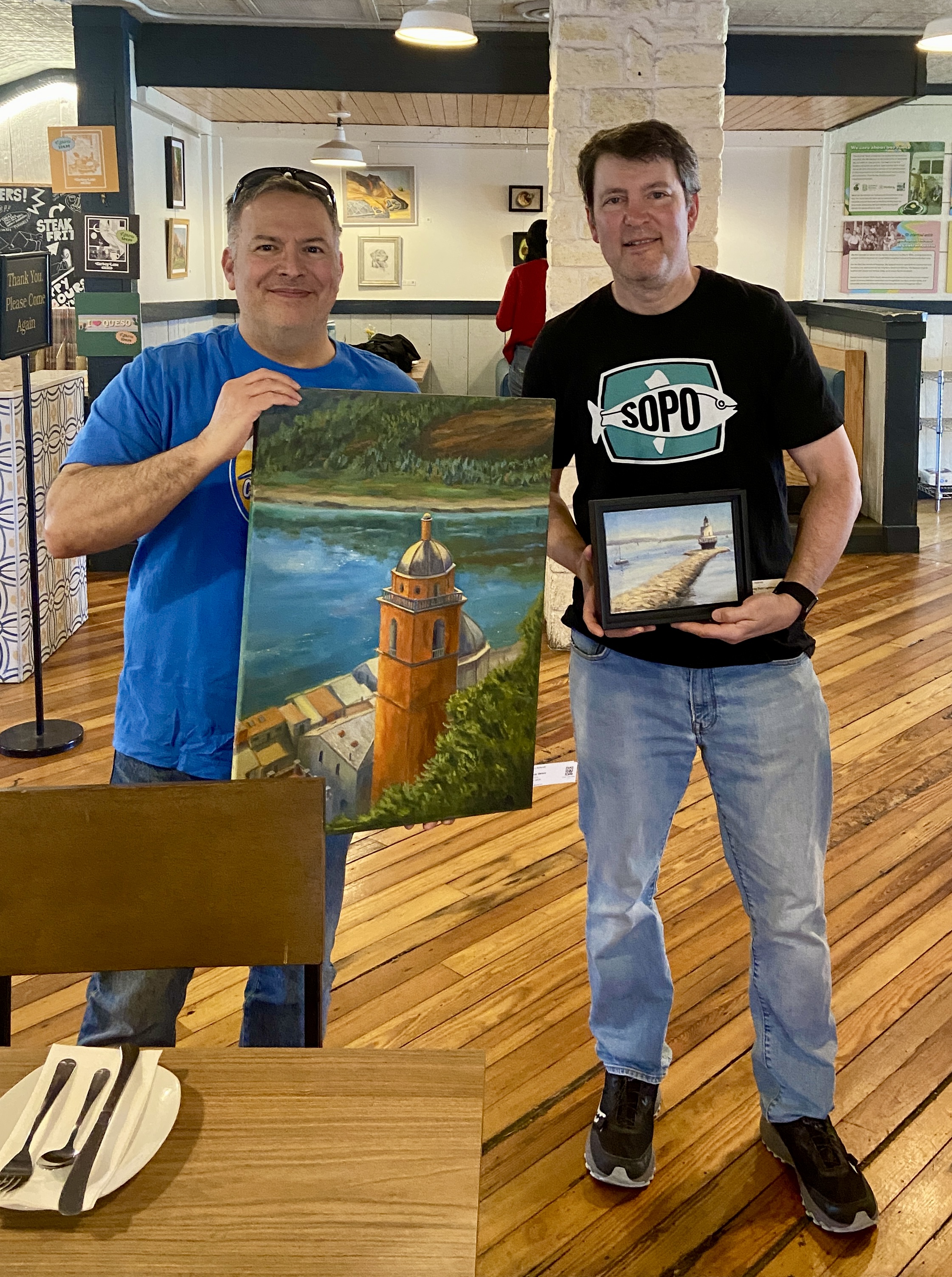
New Collector John with Artist Bern (me, wearing SoPo shirt)
I recently had the good fortune of selling 2 pieces from my solo show, “Something for Everyone”, at Kerbey Lane Restaurant in San Marcos, TX. I got to meet John, who bought 2 of my favorite pieces, “Porto Venere Bell Tower” and “Spring Point Lighthouse”. It’s awesome that he liked two pieces that were different in so many ways – size (small vs large), pallets (bright, warm vs subdued, cool), and landscape locations (Porto Venere, Italy vs South Portland, Maine)! Just proves how versatile art can be!
One of the most rewarding things about selling a painting, even rivaling the cold hard cash, is the chance to meet people who are actually intrigued by something I created. The inspiration I have for a composition isn’t always what piques a collector’s interest. Having the opportunity to chat with new buyers is always an interesting and enjoyable experience for me, as I get to learn about some sliver of their lives and where their newly purchased artwork will fit into their world.
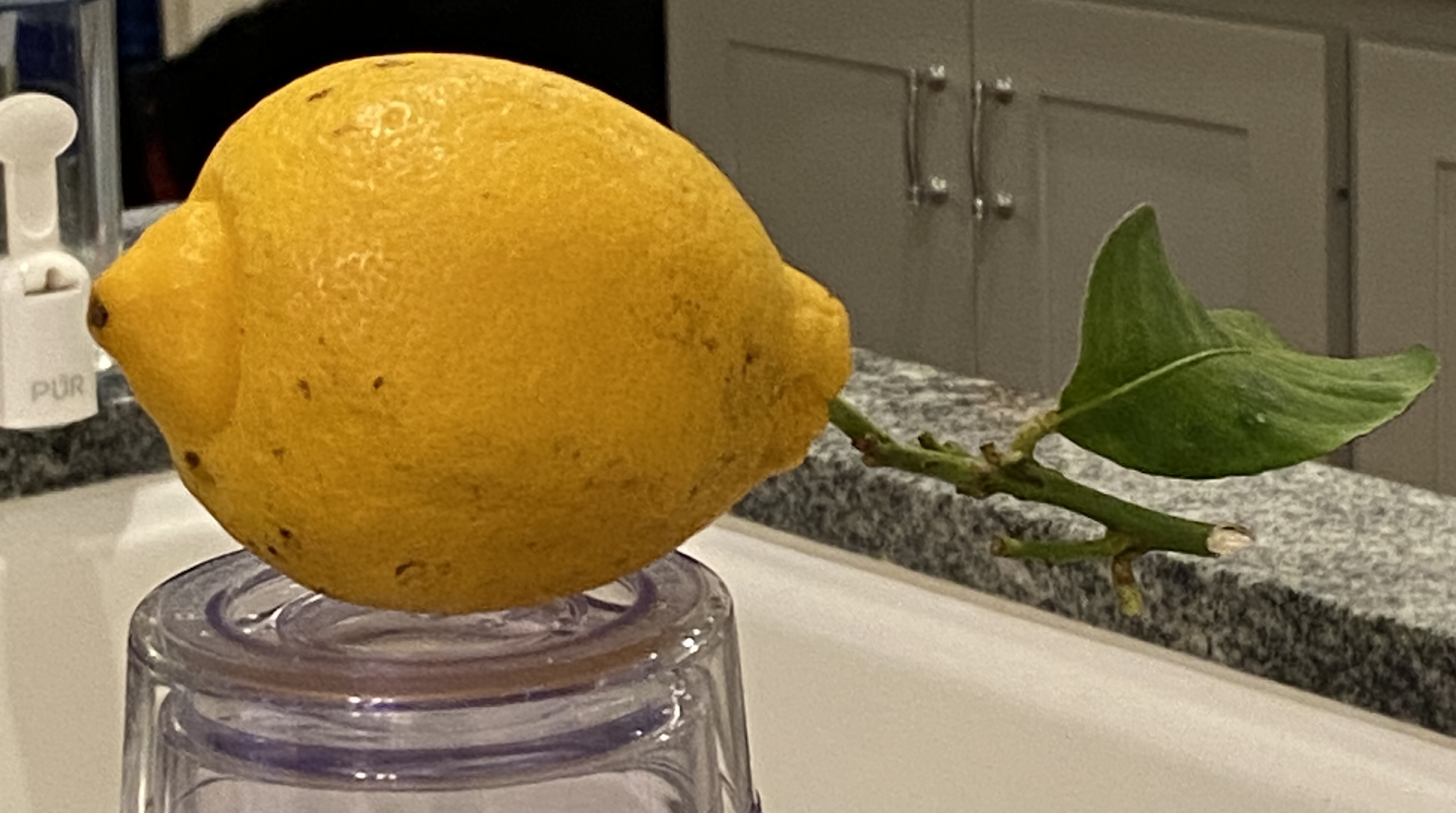
The lemon used in this drawing was given to me and my wife by our long-time neighbor, who brought it from her kid’s home in California! She toted it home on the plane, along with some oranges, not as a “thank you” for watching her house while she was out of town… she was just being neighborly!
Before I cut into this fine fruit, I wanted to do a proper drawing, as I was struck by it’s slightly odd shape and the long stem with a single leaf still attached. If I didn’t know better I would have guessed this lemon was stolen, quickly yanked from the tree under the cover of darkness!
I used four different pencils to get the proper shading – H, B, 2B, and 4B. For those of you who don’t draw, these are how darkness levels are rated on pencils. For this example, H is the lightest, 4B the darkest. You’ll notice the reference photo has the lemon perched on a glass, making you ask “what is that about?”. This was intentional, a matter of pragmatism so I didn’t have to hunch over for a proper viewing angle.
Lastly, I’ll point out that the focal point is… the leaf! It’s not only unusual to see the stem/leaf on a lemon still life, but it’s also a unique shape, probably a result of being slightly emaciated, causing it to curlycue rather abruptly. Hopefully you can tell it’s a leaf and the fact that it’s a bit oddball doesn’t detract from the overall composition.
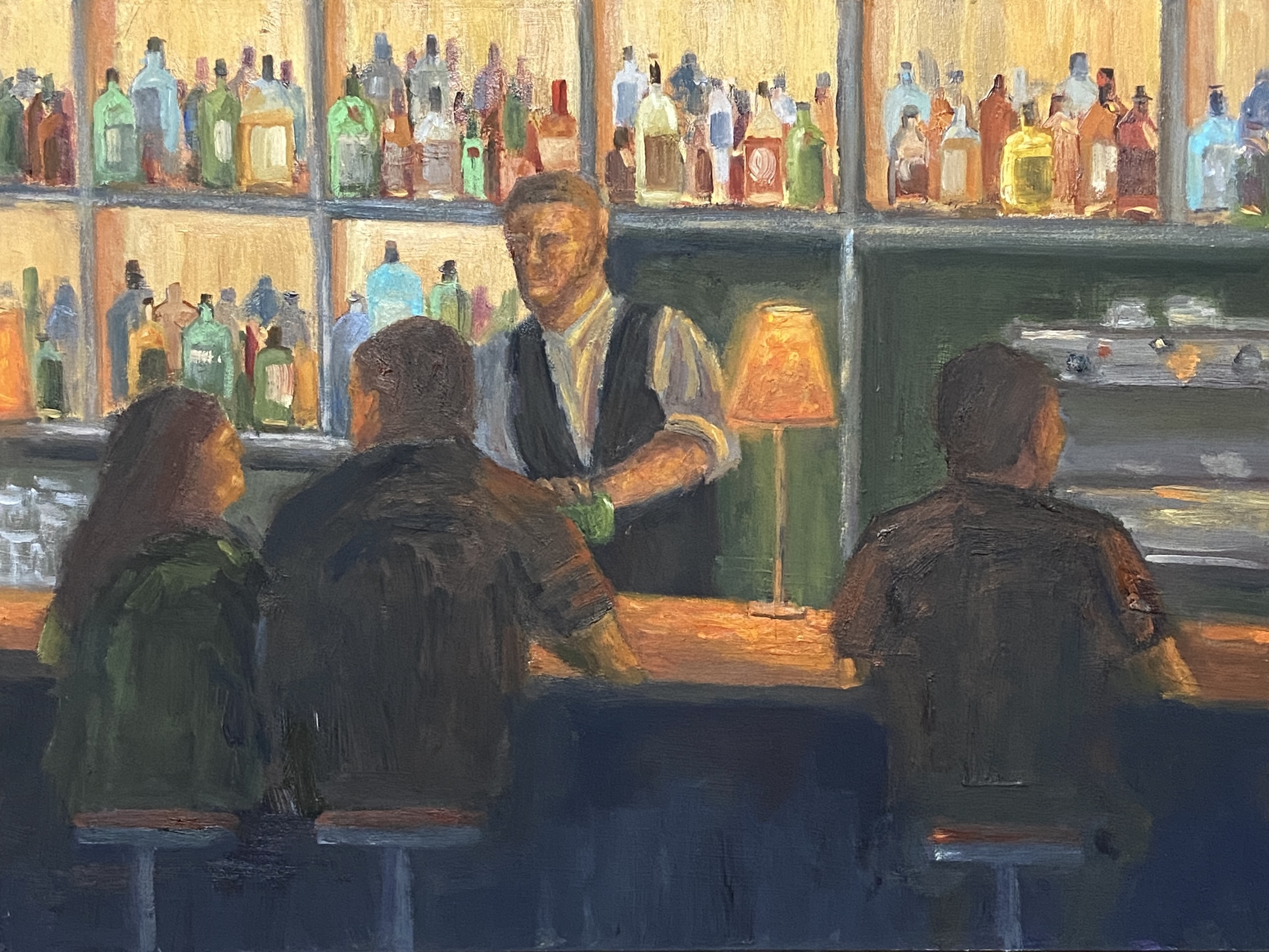
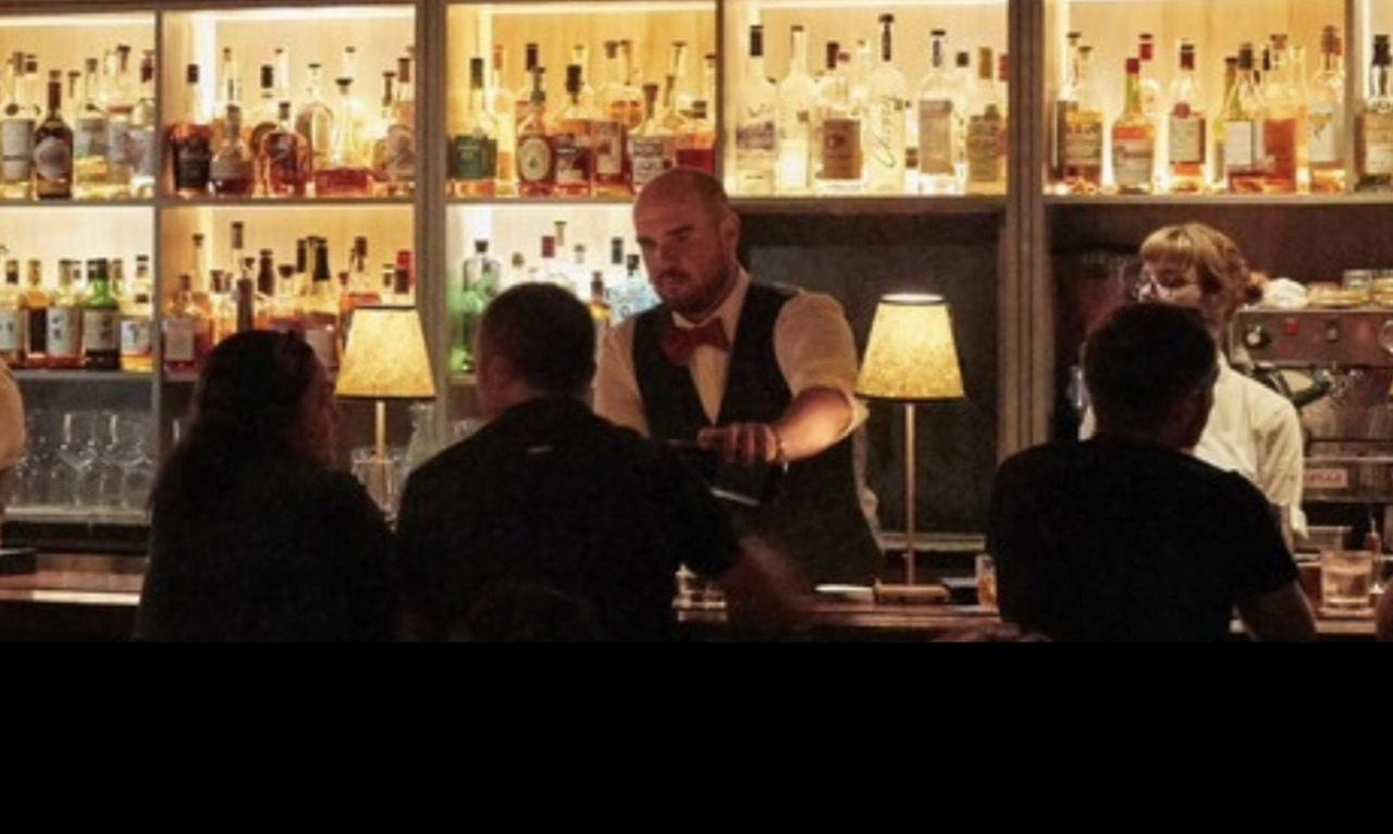
Oftentimes I use my own photos as inspiration for my paintings, but I also use pics from people I don’t know. This is something I believe most painters do, typically for a couple of possible reasons. First, I paint, I’m no photographer, so my photos are, well, not very good. Some things even an iPhone can’t fix. So I might use my own photo as the main reference, but find other options online of the same area to enhance the view. The other main reason for using a reference shot from someone else, be it an individual, magazine, etc., is because it’s something or some place I’ve never seen or been to personally. It’s this latter reason that applies to this new piece, LAMP GLOW.
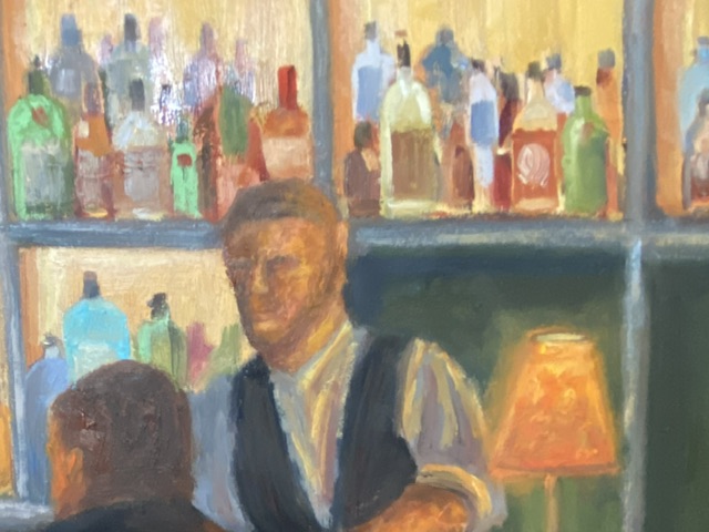
I spent a lot of time on the canvas with this one, which was expected given my lack of experience painting people in detail. In fact, I must have wiped the face of the bartender no less than 6 times, and reshaped the bar patrons many times as well. Ultimately, I’m happy with the result and I learned a lot in terms of technique and what NOT to do.
Lamp Glow Detail
The focal point of LAMP GLOW is the glow from the lamp on the bar, not the lamp itself. Because the glow is a soft light with a mid-range value, it was a little tricky to make it work. Usually, the focal point of a composition is highlighted by things such as high contrast values or sharp edges. Lacking these options I pushed the saturation and ensured the soft, orange light bathed the primary elements in the painting, which (hopefully) makes the glowing lamp a clear focal point given it emanates throughout the scene.
In terms of design decisions, I’m not sure I took the right approach regarding the liquor bottles in the background. While they turned out nicely, I think they’re ultimately a distraction and might be more effective if they were softer and less saturated. Oh, and painting 67 individual bottles is a wee bit tedious.