Yellow Rose Botanical

Yellow Rose Botanical | 8” x 10” | Colored Pencil on Paper

I finished my botanical drawing (virtual) classes last week and this Yellow Rose is my final project. The sessions were 2 hours weekly for 8 weeks, the instructor (Jenny Granberry – @jennygeeberry) was hilarious, and I learned a lot about both botanical artistry and how to use colored pencils properly.
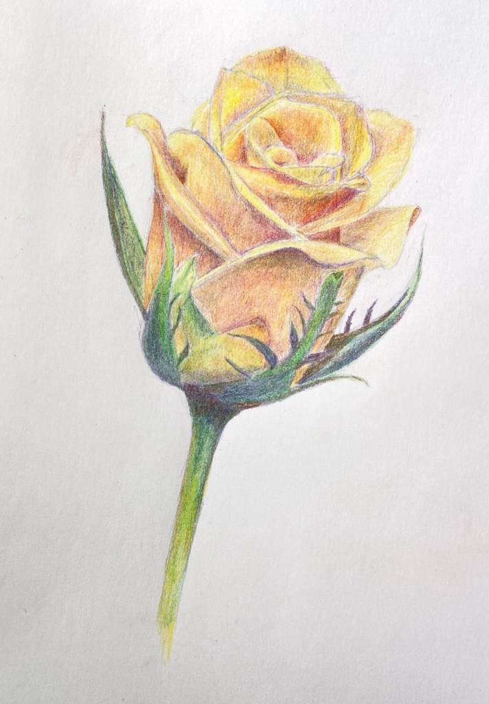
Yellow Rose Botanical Drawing

The biggest challenge was figuring out how to incorporate a range of colors beyond basic yellows to add interest, value variations, and realism. I was using a limited palette (12 pencils), but through some trial and error I managed to land on a few color combinations that added a lot of depth to the overall piece.

I’m hoping to do a few botanical series over the course of this year. I like the idea of colored pencil drawing because it incorporates drawing and a lot of oil painting concepts, although the techniques are very different.

#contemporaryatx #berntx #crashboomzip #rose #art #drawing

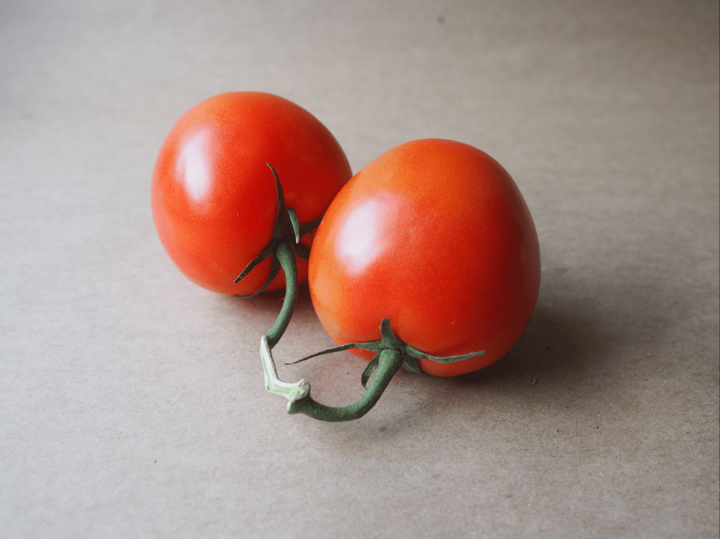
Vine Tomatoes in Colored Pencils

As we settle into a new year, hopefully a better one than 2020, I thought it was time to learn something new on the art front. To that end, I’ve been attending a weekly Botanical Drawing class. The theme of “new” is splattered all over this class – it’s done virtually (a first for me), focused on botanical drawing (another first), and in colored pencil medium (yet another first… kinda). 

This week’s subject was a pair of tomatoes on the vine. The first two classes were graphite only, no colored pencils, so this was the first session that introduced color. I’m using a small set of 12 SoHo colored pencils, which are very vibrant and so far seem to do the trick. It’s going to be a challenge pivoting from oil painting, where colors are seemingly endless through mixing of a core set of hues. The colored pencils are a different challenge because there’s only so much layering of colors that the paper will tolerate. In oil painting, if you overdo it with oil paint colors it goes brown or a dirty grey, but you can wipe it off the canvas. The colored pencils, however, can only support a limited amount of mixing on paper, and it’s largely un-erasable. It’s a wee bit stressful at times!

I really like the challenge of capturing the reality of botanicals, which is at the heart of botanical drawing. It will be interesting to see how the various compositions evolve on the color and value front over the remaining 5 weeks of class. 


This week’s composition vine tomatoes is done on standard paper and measures about 7 x 5”. 

Lyra – Spotty Dog Portrait

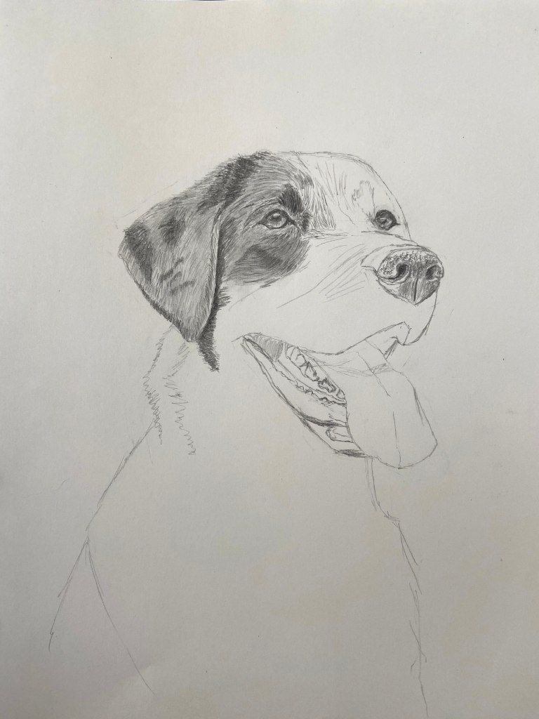
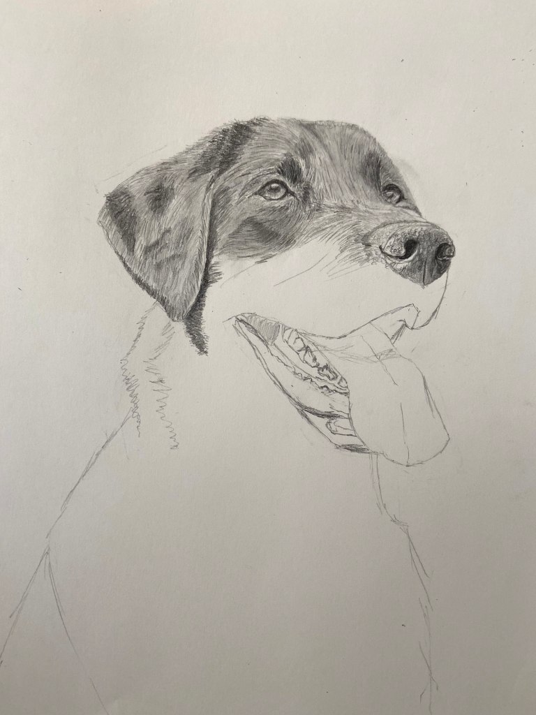
This one was a challenge for a few reasons. First, this adorable pup is a newly rescued dog one of my good friends adopted recently, so there’s the pressure of getting it right for a multitude of reasons. Secondly, Lyra’s stare is very intense in this portrait, so the need to capture that “what are you looking at?” essence is a new challenge for me. And lastly, Lyra has LOTS OF SPOTS!

Looking through the progression shots in the gallery below, it’s clear that there were a few challenges with the length of her snout. There’s nothing more frustrating than nailing a dog’s nose only to realize that it needs to be erased because you gave the pup a Pinocchio nose. Glad I did opt to erase, though, because it made all the difference in getting her likeness right. In fact, this composition reminded me that I frequently err on the side of Pinocchio noses, so I need to remind myself every time I start a portrait to keep it short!

Back to my friends who adopted Lyra…. she’s a lucky girl to have found such a great home! My friends live in a part of the country that lends itself to great outdoor adventures and plenty of room to run. While there were some lose leash walking and other training challenges early on, Lyra eventually figured out what was expected of her and what seemed like insurmountable issues became distant memories. It never ceases to amaze me how adaptable dogs are to the world, so willing to forgive and live in the now while embracing those who show them love and compassion.

Adopt, don’t buy!

Wolfgang Portrait

Graphite on Paper | 4” x 6” 

Wolfgang Portrait

Say hello to Wolfgang (Wolfy), who was willing to take a short break from his squirrel hunting to pose for this quick portrait. This is a smaller piece that isn’t quite as refined and complete as the previous Happy Lab portrait from last month, but the intent was to practice a couple of smaller drawings before taking on a more comprehensive composition.

This is actually the second effort at this portrait, the first having gotten off track just enough to warrant starting over. Despite carefully checking and verifying the dimensions and proportions along the way, somewhere along the process I inadvertently extended his snout, which threw everything off. It took me a little while to figure out what was going on, as the error was ultimately very small, but that seems to be the challenge with portraits – the slightest proportional error is magnified, but it sneaks up on you in a very insidious way. 

I also wasn’t very happy with the focal point of his left eye in the original effort, which I had redrawn at least twice prior to discovering the proportional issue with his snout, so I decided to restart the entire composition. Rather than flipping to another page in my drawing book, I used the opposite page so I could contrast and compare along the way. The immediacy of the failed effort staring me in the face proved very helpful as a reminder of where the key problem areas were initially.

Final on Left | Initial Fail on Right

In the end Wolfy’s draft portrait came to life pretty nicely – see progression gallery below. It’s very hard for me to incorporate the variations of his brown, gold, and black coat, but focusing on the key patterns instead of every detail captured the essence of his inquisitive look and cute face. 

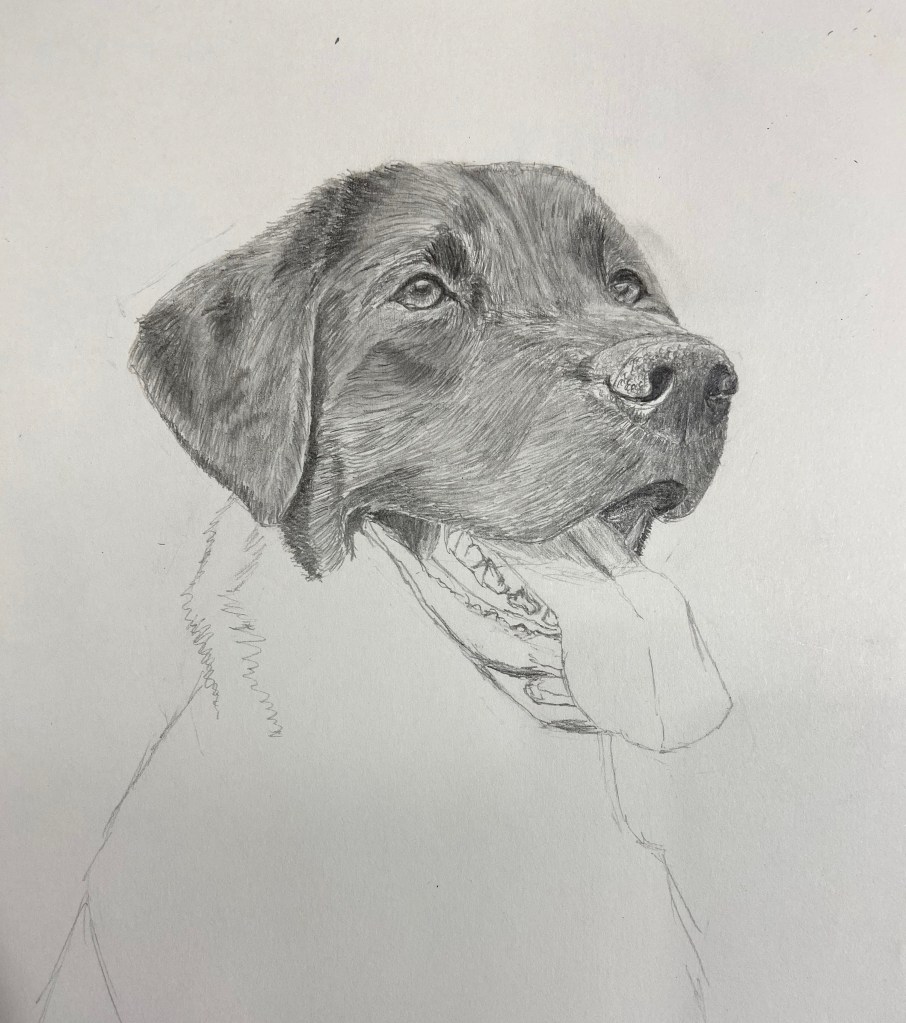
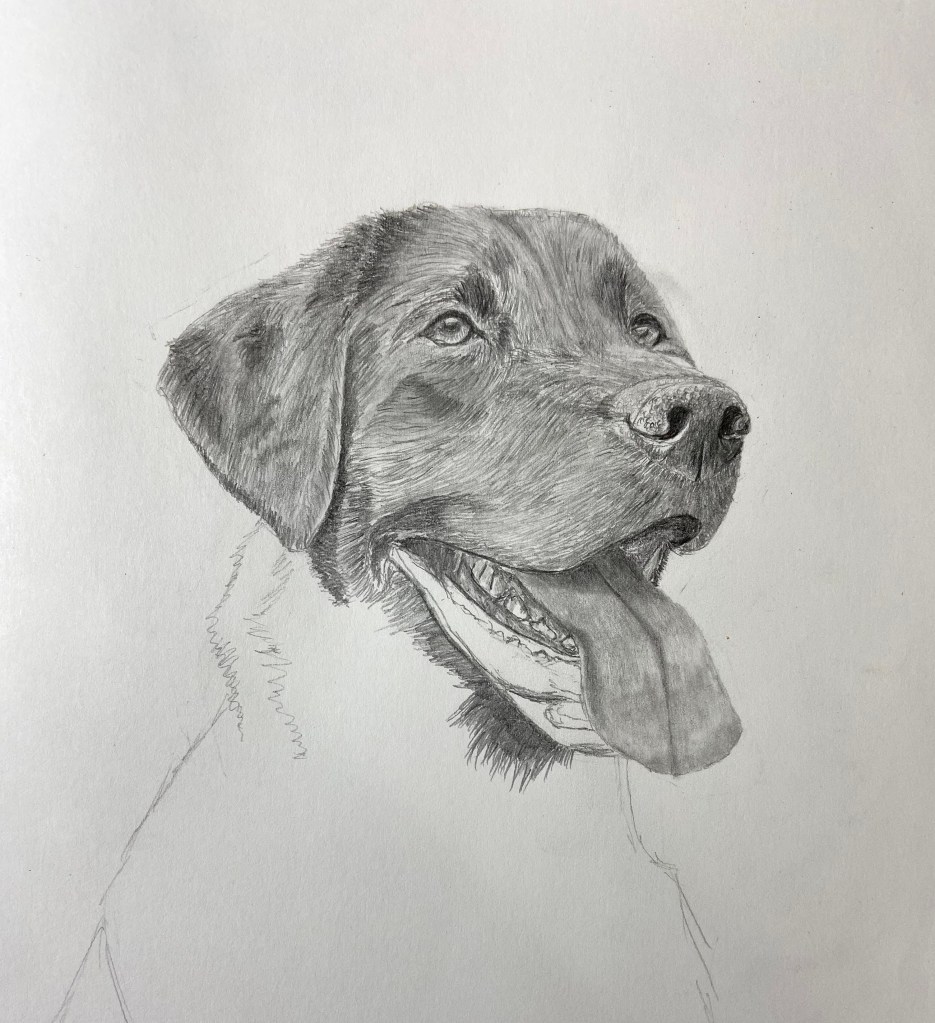
Happy Lab Portrait

Graphite on Paper | 6” x 8” 

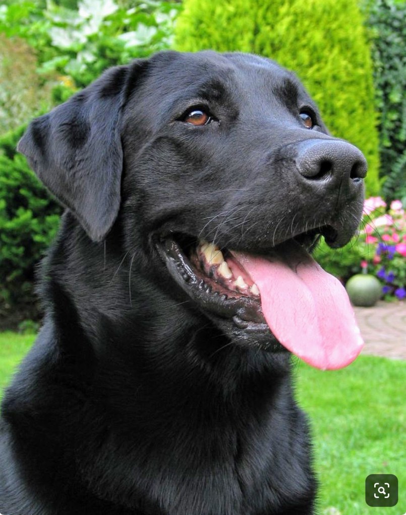
dog-labrador-art-drawing-Abplanalp
Happy Lab Portrait | Graphite on Paper

This Labrador’s smile and overall happy, expressive face quickly caught my attention. I have no idea who this dog is, but I know s/he’s never met a stranger. 

I thoroughly enjoyed the slow, methodical pace of working through this drawing. One of my focal areas this year is something I call “dogs in motion”, basically dog’s doing stuff (see Frisbee Dog), which remains my primary interest when it comes to dog related art. However, the challenge of doing a realistic dog portrait has always nagged at me, in large part because I could never figure it out. This composition is either a fluke, which is entirely possible, or something clicked in my art brain – my big, smushy, oft confused art brain. 

The technical keys to this drawing, at least for me, were as follows:

  • Proportions: Free-hand drawing, no tracing is mandatory for me… otherwise I won’t learn a damn thing. There’s something elusive about getting the snout of a dog just so. Eye spacing and size of the nose, which is a lot bigger than you think, were also key.
  • Eyes: Oh those precious stares! The expressive nature of a dog oftentimes exudes from their eyes, but I realized so much of that expression is from the hair around the eyes, too. 
  • Hair Strokes: The darker areas of the coat are a combination of different types of pencil hardness, but also more variations of stroke density, i.e. darker areas have more strokes, which is obvious now that I say it aloud. 

Hopefully the progression shots above are helpful to see the compositional approach. There’s a lot of bouncing around, but ultimately it’s about getting the eyes and nose nailed and then building out from those anchors. 

Thanks for reading!