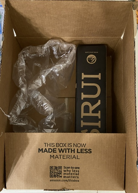
I ordered a new tripod for my New Wave u.go plein air pochade box from Amazon this week. More on the tripod in a minute, but first I had to share the shipping fail, which made me laugh. Do you see it in the image below? Note Amazon marketing hard at work touting their environmental credentials, extolling their green leadership with “This box is now made with less material”, all the while shipping a 3”x3”x18” product in a box that’s easily 4x larger than necessary. Seriously, Amazon? FAIL!
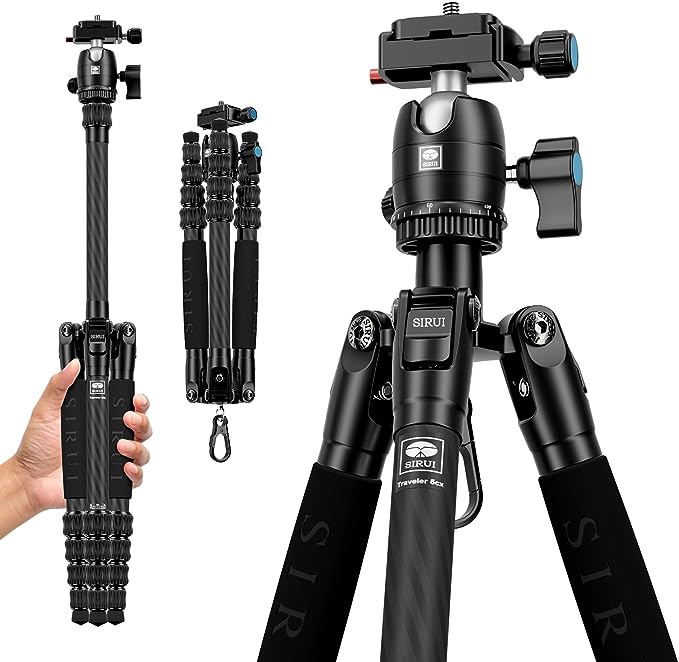
Despite the dim witted packaging, the Sirui tripod looks good and could prove to be a major update to my plein air setup. Sirui has a wide range of tripods, but I needed something that was sturdy, portable and lightweight, so I went with the Sirui Carbon Fiber Travel Tripod. I have yet to use it in the field, but the setup in the studio was surprisingly quick and easy. The horizontal and vertical swivel heads are liquid smooth and easy to lock, the legs invert to fold up around the neck of the tripod so it compacts to 13”, and there’s an actual clip for hanging a weight bag (or backpack) in the center for further stability. This isn’t advertised as a painter’s tripod, but it should be!
Stay tuned for an update on the Sirui field test later this week!
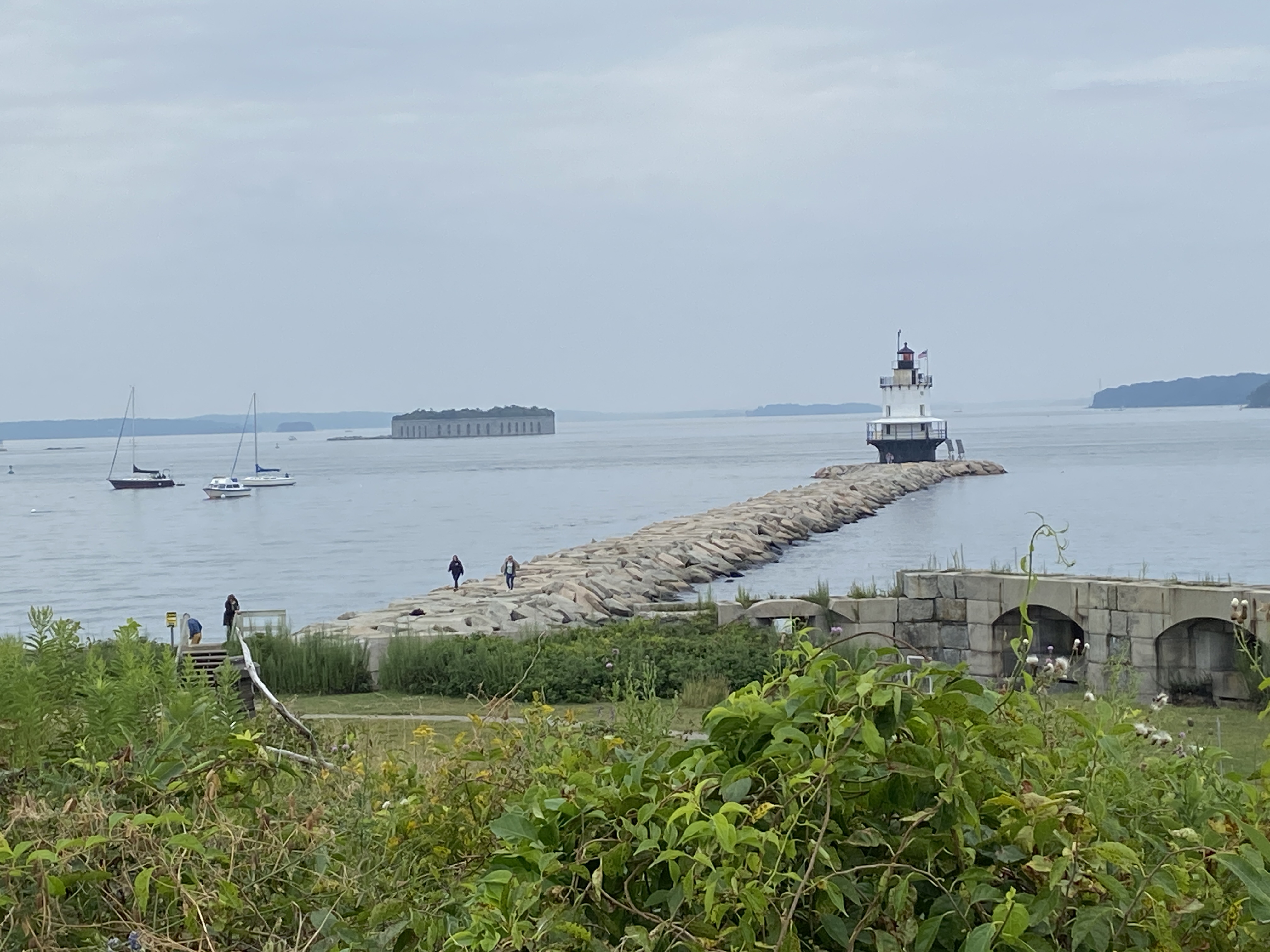
SPRING POINT BOATS is a work in progress from a gorgeous day on a pier overlooking a marina adjacent to Spring Point Ledge Lighthouse. This initial session was about 2.5 hours, half of which was spent establishing the composition structure and a practice sketch to verify the arrangement of the boats. Note that boats move, even when they’re tightly anchored in the marina, so photos of each boat in the desired position are essential to finishing a seascape like this in the studio.
The temperature was perfection in the shade, my wife was with me enjoying the outdoors and providing very helpful compositional tips, and there was a family of Ospreys on the other side of the marina (right behind us) that are the talk of the town… amongst bird people at least. I’ll admit they are interesting to watch, as the parent (not sure which one, I’m not up to speed on Osprey gender identification) was busy dropping off fresh caught fish for the two babies. At some point, one of the bird watchers rounded the corner of the pier where I was painting, said “hi”, and I was convinced she was about to ask to see what I was working on, only to then question “why aren’t you painting the Ospreys?” Of course I told her I hate birds, was dismayed at the tankards of shit they spray all over town, and that their screeching was something of nightmares.
Of course that was with my inside voice. My public self, using my actual voice, told her instead that the Ospreys were entertaining but difficult to paint, an answer she seemed to deem acceptable – perhaps she hadn’t considered the complexity of painting moving birds in a nest of twigs atop a 75’ pole in the middle of the bay. She giggled and shuffled away, apparently never having noticed I was painting. Perhaps some grumpy plein air painters – you know who you are – scared her off in the past and she’s afraid to ask. I digress…
As to this painting, I had already decided this was going to be a 50/50 job, namely half outside, half in studio. The goal was to lay down a solid structure and really balance the massive blue expanse of the sky and sea with the focal points of the boats. The lighthouse should give perspective and some added interest to the piece, but the intent to so give the sense of place sitting on the water watching the day go by. For me, this is still very difficult because virtually all sailboats are dominated by white, either the sails or the top deck, so the brush strokes have to be very intentional and the values need to shift much stronger than what I see “live”, at least that’s how I think it should be done.
Stay tuned for the completed work, which I’ll keep very loose and painterly in an attempt to put the viewer outside with the boats.
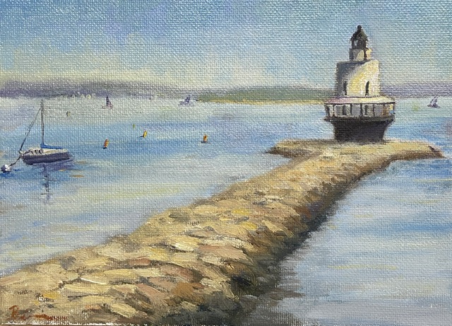
SPRING POINT LEDGE LIGHTHOUSE | 6×8”| Oil on Canvas Board
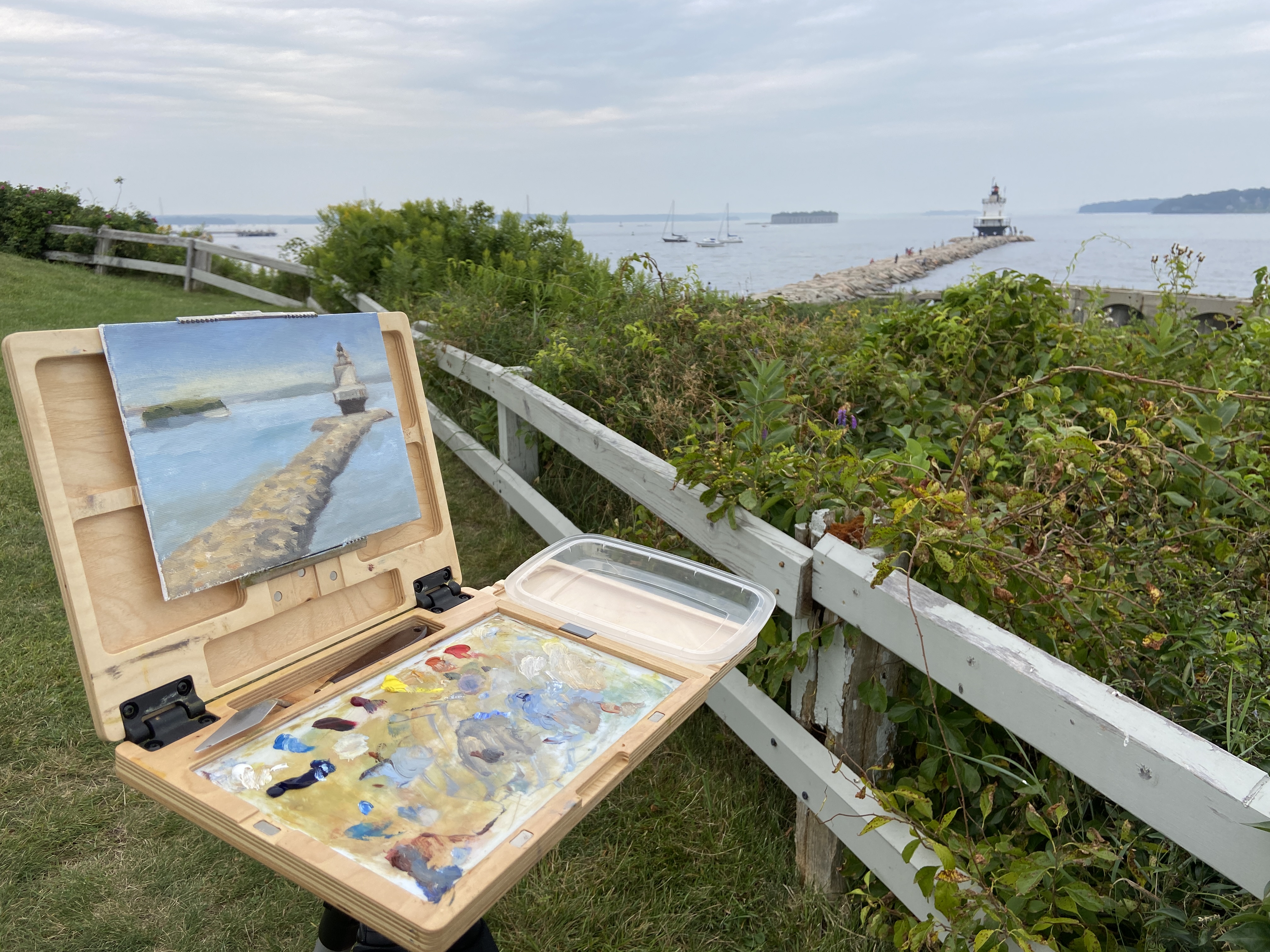
Finished! I’ve posted a couple of progress related updates regarding this composition and I’m happy to say the 3rd time is a charm… this one’s done! If you look at the previous progress post, you’ll notice the removal of the tiny island fortress of Fort Gorges, an extreme application of artistic license. It was giving me fits compositionally, in part because the intent to use it as a balance with the lighthouse on the right was more of a distraction than something complimentary. I was going to simply mute the greens of the trees and push it back in the scene, ensuring the lighthouse was the focus, but what I discovered was that it’s such an unusual structure that it took over the composition as the viewer is sucked into wondering “what the hell is that?” I mean seriously, how often do you see an old fort on an island with a miniature forest growing in the center? I tried to convince myself that I painted it so realistically and thus it was a distraction, but in reality it’s simply weird to see out of the full context of Casco Bay, so I wiped it out… in the interest of artistic integrity.
The fort was easy enough to wipe out, but the issue it was meant to address, namely a well balanced composition, was still a problem. Not a pro at just dropping shit into a painting out of thin air, this seemed like a good scenario for practice. I’m pretty happy with the result, but it took a conscious effort to ignore details and simply work in some loose brush strokes. I also incorporated some of the ubiquitous lobster buoys found in and around Casco Bay, and lastly some distant sailboats to give the sense of an active afternoon on the water.
As to the focal point, the final result of the lighthouse and the complex stones of the jetty came out pretty well given my relatively minimal subject matter experience. As any of you artists know, tackling new subjects can be a reminder of the impossibility of knowing how to paint anything and everything equally well. The process was very enjoyable and satisfying, so there will be more lighthouses in the near future. I might expand my new found rock painting knowledge to some coastal scenes, too.
SPRING POINT LIGHTHOUSE | 8×10”| Oil on Canvas Board
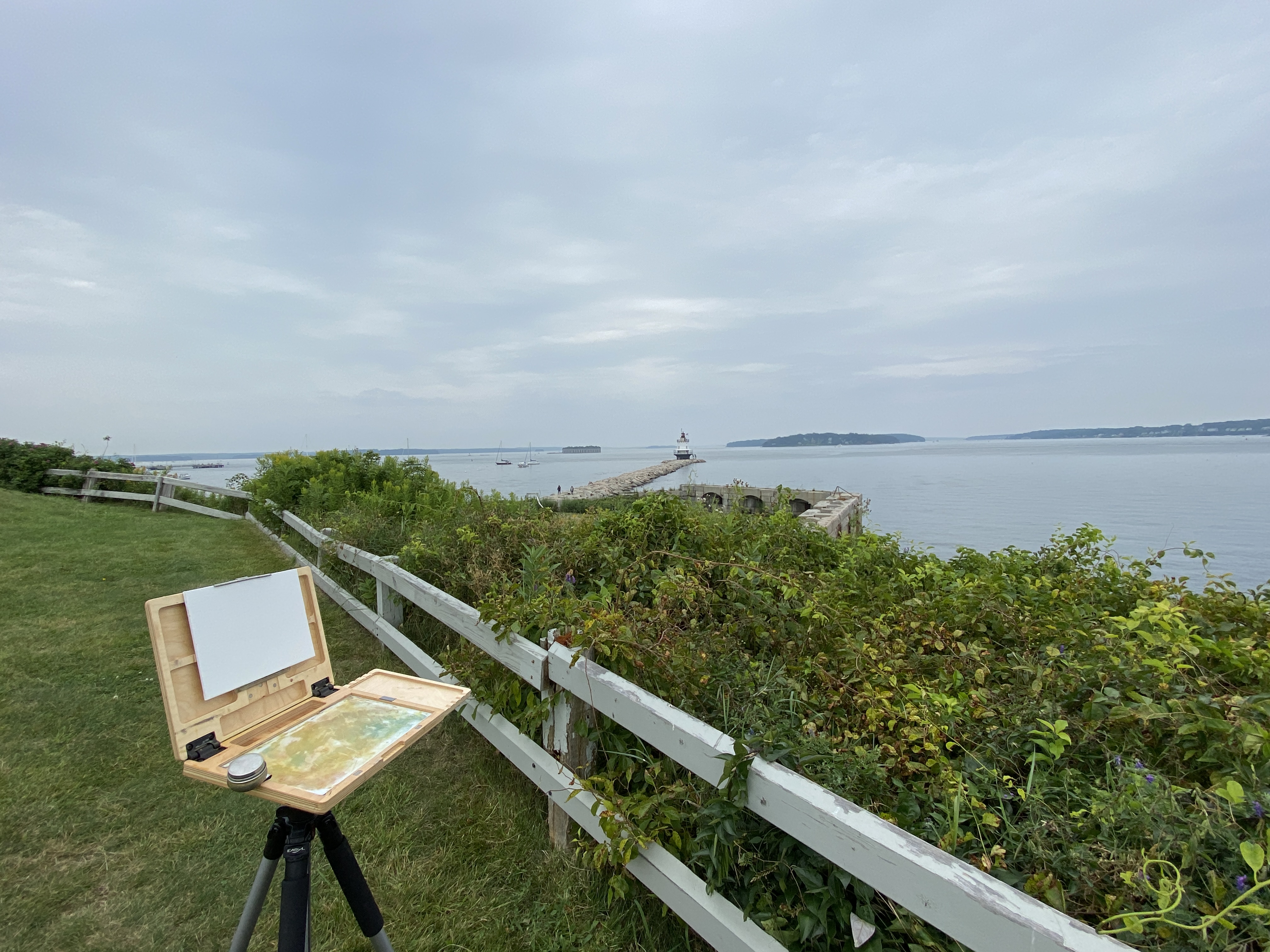
Presented with a sketchy weather forecast for the coming few days, my need to get out and tackle this lighthouse painting got the best of me and I made a rare late afternoon plein air session happen. Nothing about the timing or the weather made sense for an outdoor session, but when the temperature is in the lower 70s that’s all the motivation I really need.
The drawing session from last week proved very helpful with this composition. I knew exactly how I wanted to orient everything, which in this case was the jetty, NOT the lighthouse. I need to remember this for future works, namely to find the piece of the composition that’s going to serve as the anchor for all perspective and measurements and start there, noting that this isn’t always going to be the focal point. The vertical orientation of everything on the horizon and the width/centering of the lighthouse relative to the jetty was also key. This made things move very fast so I could get to the business of putting oil on canvas.
Starting with the sky and working forward was my approach this session. I’m ultimately ignoring the very gray, muted light because I know what this looks like on a sunny day and the plan is to polish things up in the studio or return to this location to finish it off with better contrasts. However, I’m very happy with what I finished today in just over an hour. A part of me says I should leave it as is and simply shore up the lighthouse details. Maybe I’ll put myself on an hour limit and refine whatever I can within that time constraint? Something to think about.
Side note, a family with a young girl come by to ask if they could check out the painting. Apparently she likes to paint and seeing someone doing it outside on a day like today was either very cool, or just weird. Either way they seemed to be entertained and were very appreciative of our brief chat. I’ve never understood plein air painters who get so bent out of shape when people ask to check out what they’re working on. Doesn’t bother me, especially if what I’m painting doesn’t look like garbage.
SPRING POINT LIGHTHOUSE | 8 x 6” | Graphite on Paper
This is a preliminary drawing for a plein air session I plan to do later this week. This particular lighthouse is accessible via a jetty made of granite, which I can say from personal experience is deceptively long. As is the case with many lighthouses, the setting is often more impressive than the structure, which makes sense given they’re designed to protect navigators from the very dangerous geographies upon which they sit. Ironically, in a world where technology has made many lighthouses functionally irrelevant, they’re wildly popular destinations for visitors to explore… on land.
The other attraction to lighthouses, as an artist, is they’re much like snowflakes whereby no two are alike, so there’s something new to tackle with every composition. Combined with their intriguing landscapes, lighthouses are a must do as an artist.
I like to do detailed drawings instead of quick sketches when the subject is complicated or something new. The jetty is very intimidating for me, so it was important to get a handle on how to simplify while not losing the feel of all those massive granite blocks. I’m not sure if the drawing approach will translate to the painting, but a few things become clear from this exercise. First, the layout of the blocks needs to have defined directional lines in the fore and mid ground planes to capture the overall shape of the jetty. Secondly, there are numerous tiny shadows and value variations that give the blocks their distinct shapes, which will require some trial and error once the paint hits the canvas.
This is a follow-up from the Gaggle of Geese post a few weeks ago. The finishing “touches” for the studio ended up being a little more like finish “construction”, but I finally got to a point that seemed good enough.
Let me admit, I don’t like this composition, but I really like parts. Others might see something more appealing, as art tends to work that way, but it seems artists trying to sell works tend to force themselves into liking everything they paint. To the uninitiated, know that they’re lying. There’s not an artist out there who likes even most of their final pieces. At the end of the day, our compositions tend to have really cool elements that we love, and various faults that distract us to no end.
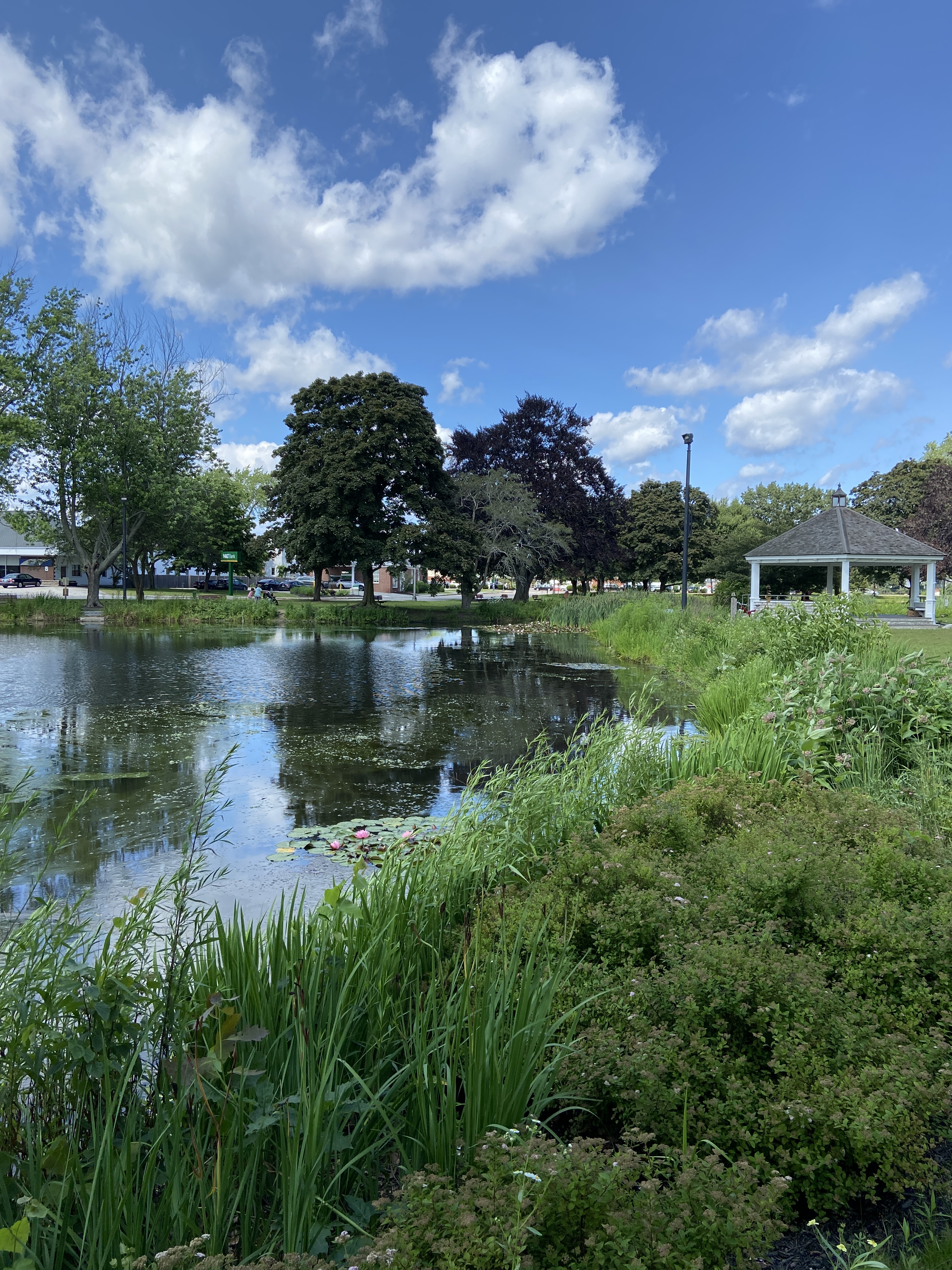
MILL CREEK POND was a joy to paint. If you’ve read the previous post and seen the video of the geese, you understand why. In terms of the studio work, I was really focused on simplifying the trees. Apparently I ignored a few basic compositional tenets along the way and ended up with two trees perfectly aligned left and right, meeting in the middle of the canvas. So annoying, but that’s what happens if you don’t step back frequently at the beginning and take the time to ensure the layout works.
Regardless of the “amateur hour” compositional oversights, I had a lot of fun learning how to simplify the masses of the trees, especially the purple oak. Living in Texas, there are no purple oaks, and everything that’s green has a coating of yellow cedar pollen, so things skew very warm. Painting a very dark purple oak tree with huge leaves that gather in numerous masses is, well, an awkward endeavor and hard to create on the first go. Ultimately I gave up, said it’s good enough, and pivoted to the warmth of the setting sun on the trunks, grass, and lily pads.
Hope you enjoy the final product regardless of my self-critique. It worked out in the end… kinda. Thanks for reading!
In an effort to up my “en plein air” game, I’m going to do a few sessions this summer focused on simplification. The plan is to either find scenes that are lacking details and complexity, or zoom in on the focal area of a detailed scene and cut out the noise in an effort to simplify.
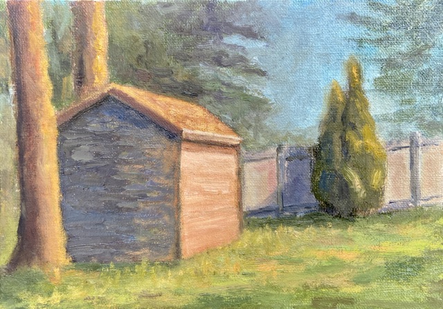
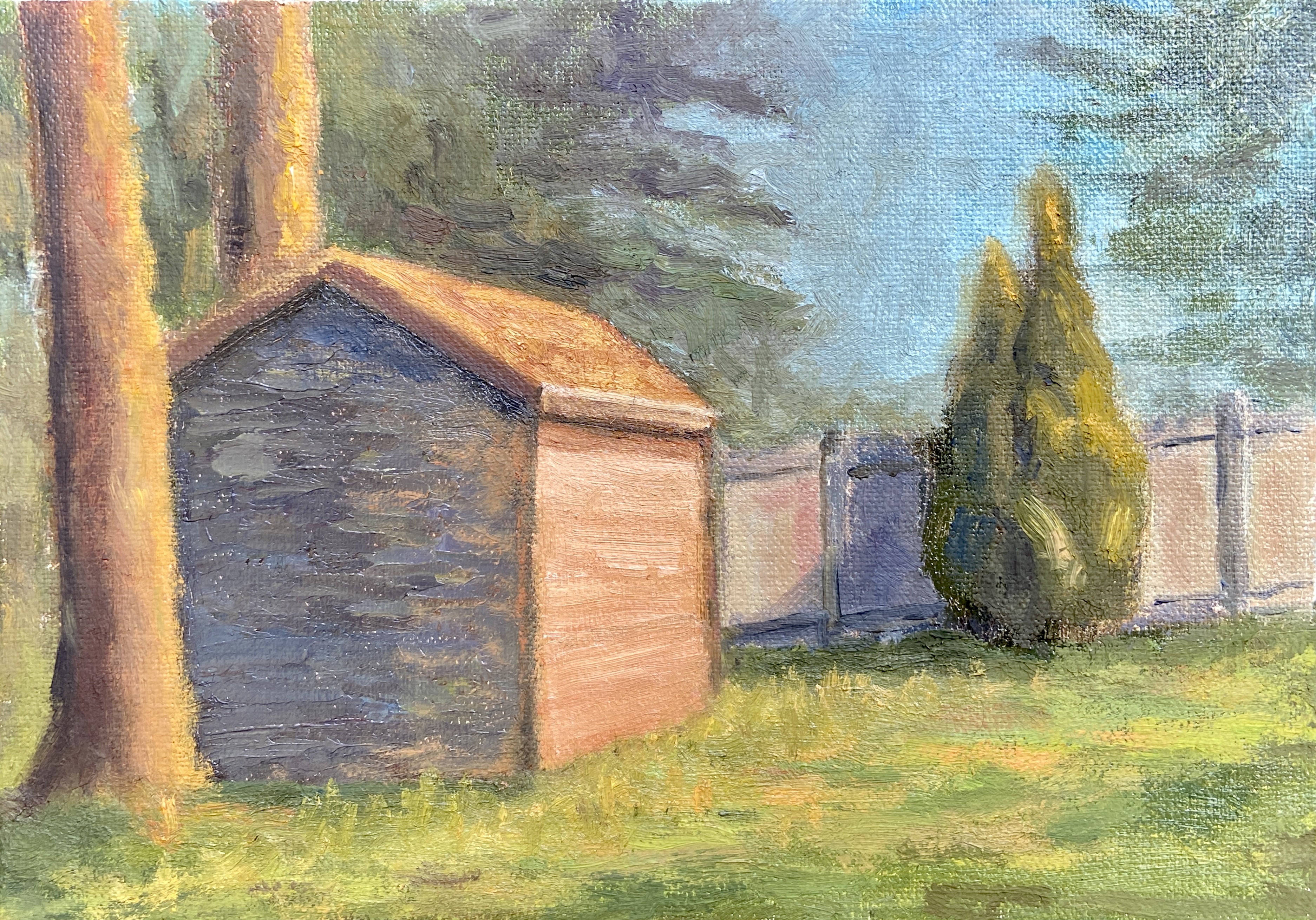
The Preble Shed is an example of the former approach, namely it ain’t complicated… it’s a shed. However, I spent a lot of time also streamlining the background, almost ignoring what trees were actually in the background. I also made a point to blend, perhaps even muddle, the tree edges into the sky. I think it worked pretty well and added atmospheric perspective, something that has eluded many of my previous efforts. Progress!
Not surprisingly, the shed itself was the real challenge. It has a thick coating of paint because there were a number of re-dos as I struggled to find a good light and dark color pairing. I noticed that so many professional artists who do sun-drenched urban landscapes tend to focus on white or very light yellow, using a contrasting blue-purple for the shadowed sides of the structure, which works really well, but honestly strikes me as a little boring. My goal with the shed was to use some hues that could be incorporated into other elements of the landscape – namely the flanking tree in the foreground, the fence in the background, and the sunlit grasses. I went with orange, about the 50th attempt, and can’t tell if I stopped there because I was satisfied or just worn out trying.
I typically don’t share work in progress posts, but I think that tendency will have to change as I ramp up my “en plein air” sessions. Why? Well, there are so many entertaining things that happen when you’re in the field trying to make art. Some of it can be frustrating, like sudden wind gusts that knock over everything, to entertaining and curious, such as bugs that end up as impasto effects in a painting.
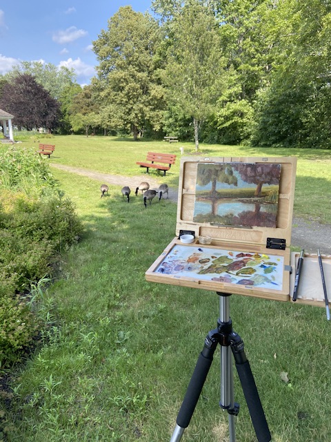
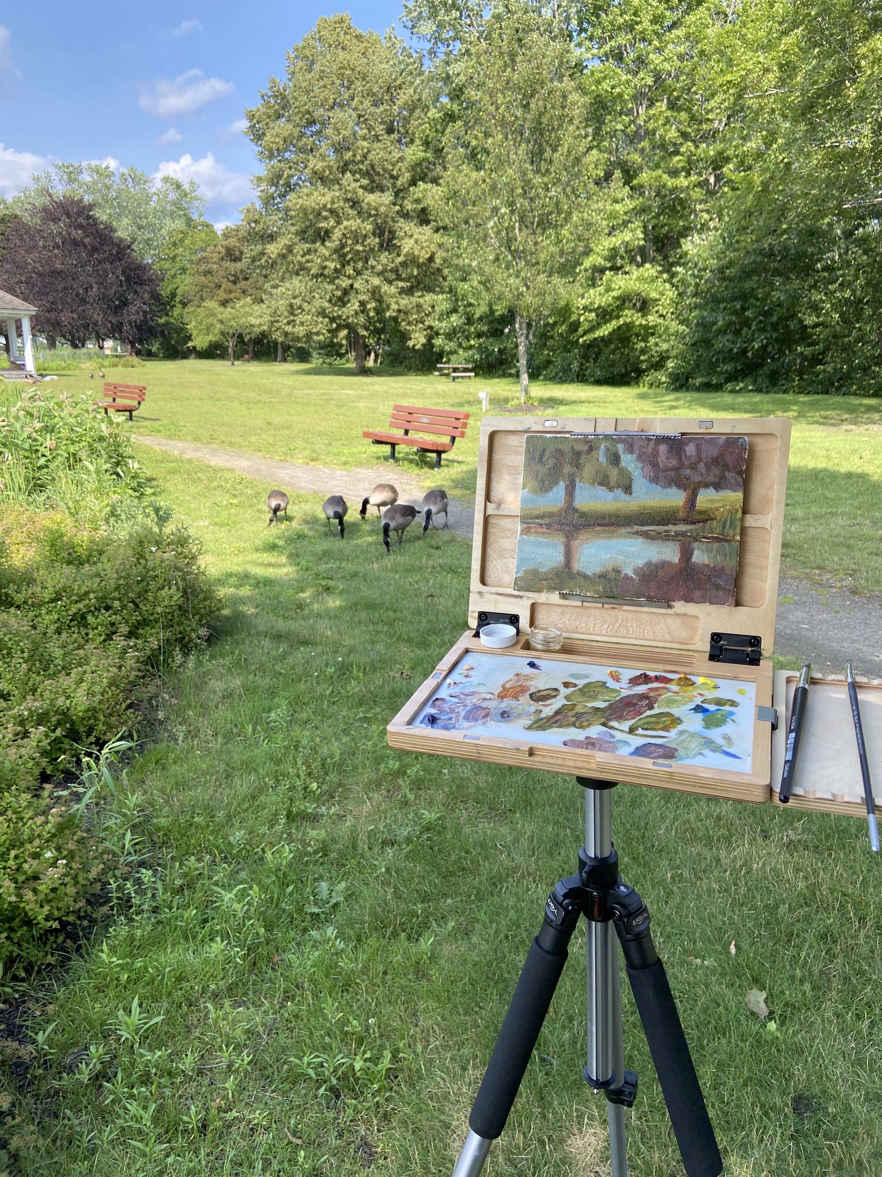
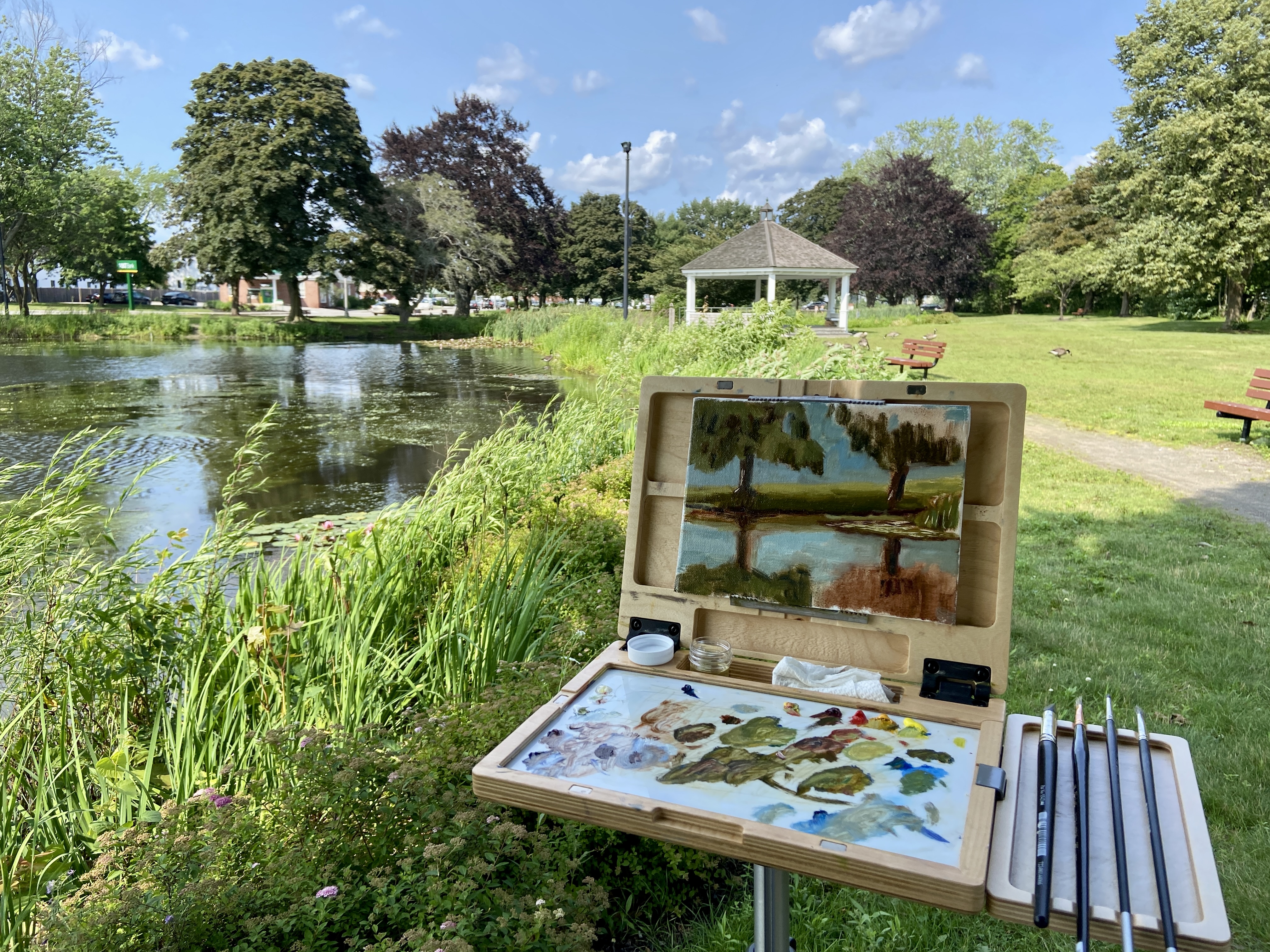
Today, I was painting by a beautiful pond on a calm afternoon, as if that weren’t perfect enough, when along comes a gaggle (is it gaggle?) of geese. Apparently I had setup adjacent to their entry ramp into the pond, but my presence didn’t distract them at all. Usually I have a dog in tow, which tends to keep all manner of water fowl in the water, but I didn’t have my handy apprentice, Zip, with me today. She doesn’t care much about the geese, but she finds goose poop to be the caviar delicacy of the great outdoors.
As to the artwork, the focal point, which is impossible to tell at this mid-paint stage, is the strip of water lilies wrapped around the right side of the composition. I was only in the field for a little over an hour, but I’m happy with the structure of the painting and the aggressive approach with the dark values, which I tend to screw up initially.
Stay tuned for an update of the finished work in the studio. Thanks for reading!
What the hell is a “flatiron” you ask? The really boring definition is from geomorphology, which I won’t repeat here, but the layperson’s description is “cool looking red and orange rocks pointing out of the ground at extreme angles.”
This was a plein air outing just south of Boulder, Colorado, in an area called Eldorado Canyon, at the South Mesa Trailhead to be specific. I was fortunate to spend this painting session with my mom, who had picked the location because of the great views of the Flatirons. I love seeing the Flatirons from this vantage point because you can see Devil’s Thumb very clearly and easily appreciate the jagged topography.
The location is also unique because if you turn around and look east, one can see a mere 5 -10 miles away the largest superfund site the in US history, Rocky Flats. As far as I could tell, the Flatirons weren’t glowing from the plutonium trigger waste, but I’m glad the wind was blowing in the other direction today. This may seem like a very weird mash of nature in one direction and nuclear waste in the other, but Colorado is a state full of contrasts – politically, environmentally, and geographically. As artists, though, it’s great because we all know stark contrasts make for good compositions.
I spent about 2-3 hours in the field working on this composition. I had never painted the Flatirons before, and not much by way of mountain landscapes either, so this was a challenge. Being on-site was definitely a plus in terms of capturing the essence of the Flatirons and helped shape the decision to use a palette knife and some impasto to shape the rock faces. It was also a little easier for me to get a sense of what I was looking at because decades earlier I had learned to rock climb on these very mountains! In fact, my first “real” rappel was from the top of Devil’s Thumb.
The final few hours of work was done in the studio back in Austin. In truth I had some fundamental trouble getting the depth right, namely the whole thing looked very flat, so I set it aside for a few weeks and returned with a fresh perspective. Turns out the greens were too similar throughout the piece, and the darker values in the middle ground weren’t cool enough. I think the final adjustments, especially the cooler greens in the middle ground and horizon proved to be a vast improvement.
If you’re in the Denver / Boulder area, I highly recommend a visit to Eldorado Canyon. There are some great views (obviously), beautiful hikes, and you can also watch some of the craziest free climbers in the country scale the canyon walls.
Reference PhotoHomestead at TrailheadSouth Mesa Area MapSetup and ProgressVery Flat, No Depth, Too GreenFinal Composition With Depth
Welcome to Spring! I’m honored to be included in another group show at Art for the People Gallery in Austin. Three pieces made the cut this time, including, for the first time, a plein air composition. The show runs April 1st – June 2nd, 2023.
If you’re interested in original artwork by Austin creatives, check out AFTPG either in person in Austin or browse their online store. I’ve been involved with this gallery for a number of years and the curating by Lynnie is uniquely Austin – if she’s in the gallery during your visit, don’t be shy and make sure you chat with her. She has a world of knowledge about all the artists, their backgrounds, and what makes their art special.
If you’re interested in any of my pieces, I’m happy to answer questions or better yet go to the gallery and check them out: