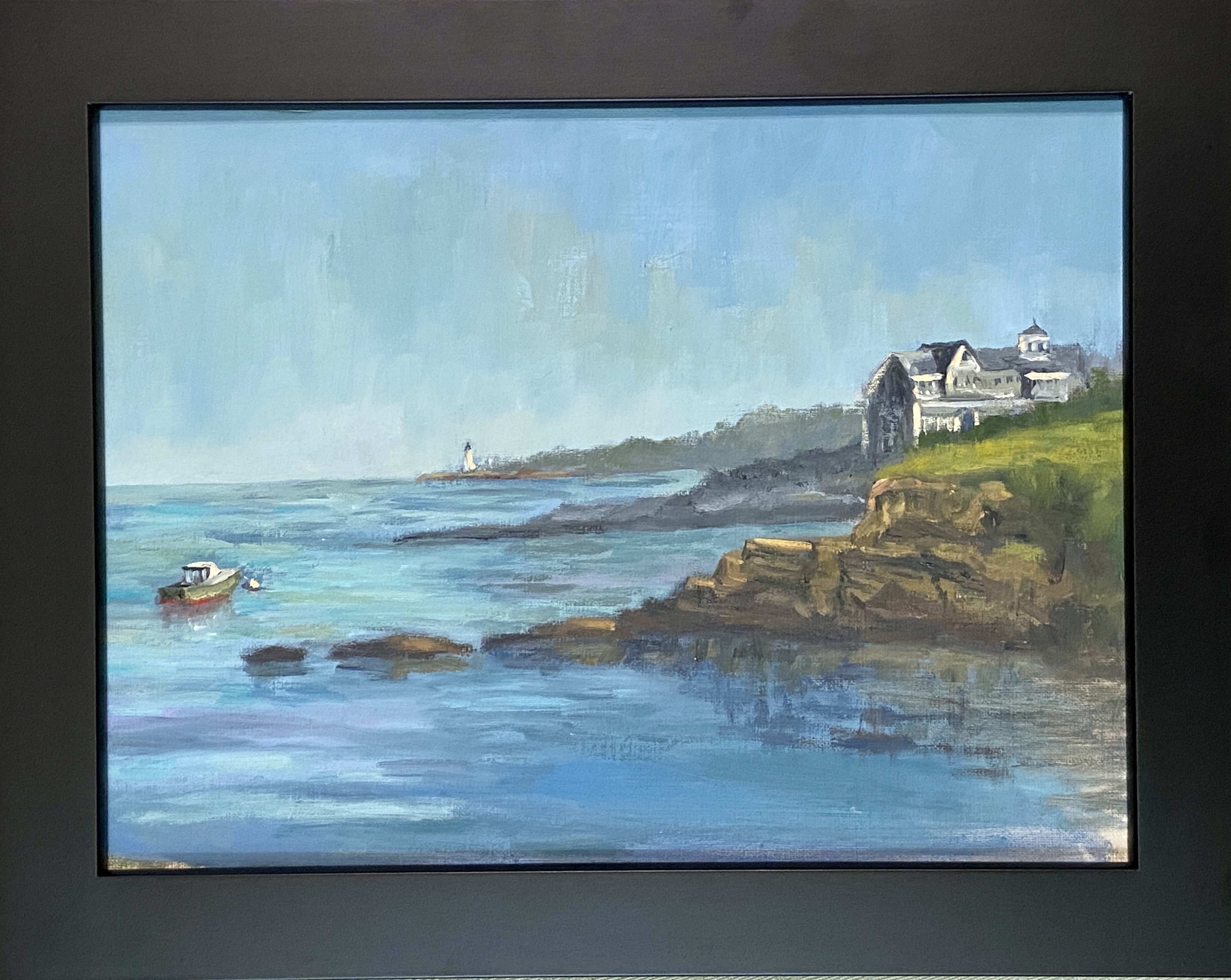
I’m privileged to be included in another group show at Art for the People Gallery in Austin! I’ll have two pieces in the show, FISHERMANS POINT and SMOKY ON ICE. I’m especially stoked at this opportunity because these pieces showcase two very distinct painting styles, namely landscape and still life.
The show runs June 7th – August 17th, 2024, opening reception NEXT SATURDAY, June 8th, 12-4pm CDT at the new location of Art for the People Gallery in Austin, Texas.
Note that the Art for the People Gallery has moved locations and is no longer on South 1st street. They are part of Good Dad Studios located at 2801 S. I-35 Frontage Rd. Good Dad Studios is Texas’ largest artist complex, which means they have a lot of artist studio space, and within the facility are galleries and other businesses, one of the most notable being Art for the People Gallery.
Reach out if you have any questions, or better yet go to the gallery and check out all the art.
GOING, GOING, GONE! | Triptych | 10×16” | Mixed Media on Wood
Sometimes things don’t go to plan. Bob Ross had a phrase for this in the art world, “happy accidents”. What dear ol’ Bob didn’t clarify was that sometimes the plan goes to shit before the painting begins!
GOING, GOING, GONE was supposed to be 3 square panels of equal size, the only progression being the artwork itself. However, before planning the composition I hadn’t verified the existence of 3 identical panels in my studio… AFTER having painted the middle panel, i.e. “GOING”. So rather than being the patient, pragmatic person who pauses the artistic process and acquires 2 additional identical panels before proceeding, I searched my studio for the next best option! It’s hard to tamp down unbridled excitement for starting a piece of art, so I’ll give myself a little break in that I was ready to get this thing moving without delay!
Turns out I was having a Bob Ross moment. The triptych, while unconventional, proved to be very effective in terms of turning your expectations upside down. Specifically, the pint of beer is drunk down over 3 stages, whilst the side of the panels increases. I’m sure the experience isn’t universal, but my senses get upended a little as I digest the 3 panels and have to do a double take because the detail, values, and saturation decrease as the panels dramatically increase in size. I hope it has the same effect for you, otherwise it might be a little boring.
As to the mixed media approach, I simply wanted to build on my recent foray into this technique. I suppose this could be done quite effectively with standard oil painting, but there’s something fundamentally different with the texture and chalky finish of spackle and acrylic paint that makes these artworks stand out from a crowd. That said, I think these pieces are like saltillo tile – you either love it or hate it – but either way you can appreciate its unique nature.
Lastly, I’m excited to frame this triptych, although I have no idea how I’m going to do it. However, I do like the vertical layout as done in the photo, which is a little different spin on the typical triptych layout, but it also forms the shape of a pint glass… so there’s that.
Stay tuned for the final decision. Perhaps it’s a painting you’d like on your wall?
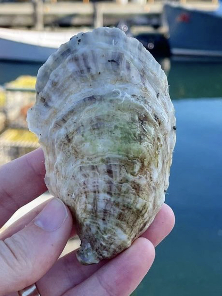
HALF SHELL STUDY | Graphite on Paper | 4×6”SOPO Seafood Oyster, South Portland, ME
East coast oysters, specifically Maine oysters, are the best in the world according to my palette. My favorite place to eat oysters is at SoPo Seafood in South Portland, Maine. In a word – AMAZEBALLS! – the food surpassed only by the charm, expertise, and knowledge of the staff.
A painting of a massive oyster shell is forthcoming, thus this study drawing. What I learned is that oyster shells have a LOT of friggin’ lines! Not something you really think about when eating oysters, but the shells are beautiful, albeit a bit on the gray side.
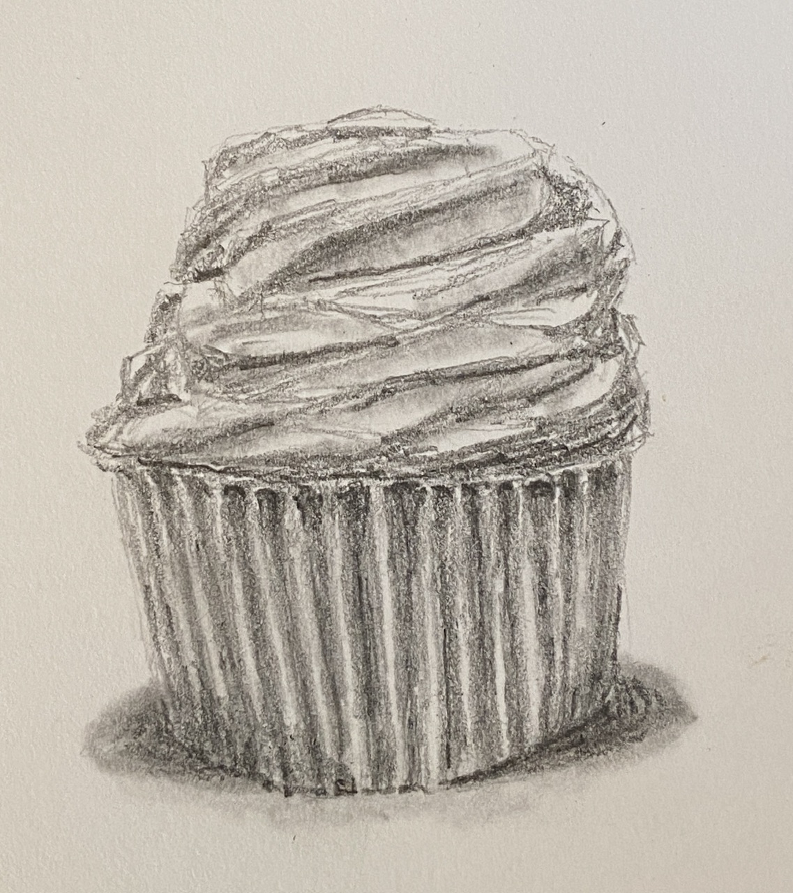
I’m going to do a new still life piece of a cupcake, but first I need to practice, because as it turns out, they’re deceptively tricky to draw. While I’ve eaten my weight in the delectable mini-cakes over the years, so I know them well, painting them I have not done. This study kinda just kept going, in large part because it was a fun challenge. While the outcome isn’t as righteously beautiful as the cupcakes from Captain Quackenbush, hopefully it still motivates the viewer’s sweet tooth.
The intention was to get a feel for how to draw (and subsequently paint) the weird geometries of icing, and how to properly shade/value the baking cups. I’m looking forward to the painting, which will probably incorporate some serious impasto elements to make the cupcake jump at the viewer and make them say “YUUMMMY!”.
My recent foray into mixed media, courtesy of plaster and acrylic, has opened up a new perspective for my still life compositions. A good place to start was with my favorite adult beverage, a tasty Porter.
This is a very small composition, 4×4”, but in large part thanks to the 3D-ish impact of the thick plaster, it has a lot textual appeal. I did this without a reference photo, or beer model for that matter, going from memory of similarly themed past paintings. This one is most notably related to Last Sip, but oddly enough it was infinitely easier to create for a couple of reasons. First, the smaller size makes things go much faster. But more notably, the use of colored plaster and the simplicity of the subject make for a quick creation.
I might have just gotten lucky, too, and nailed it on the first try.
I might return to this specific piece and do some direct painting using acrylics on the plaster, which would add more vibrancy and get rid of the slight chalky effect.
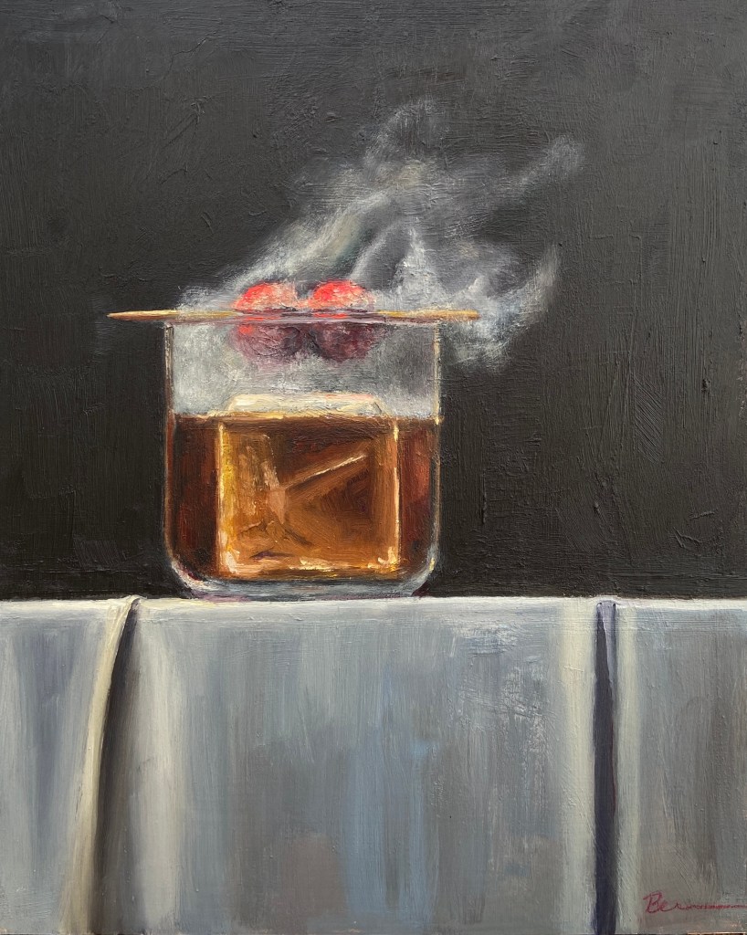
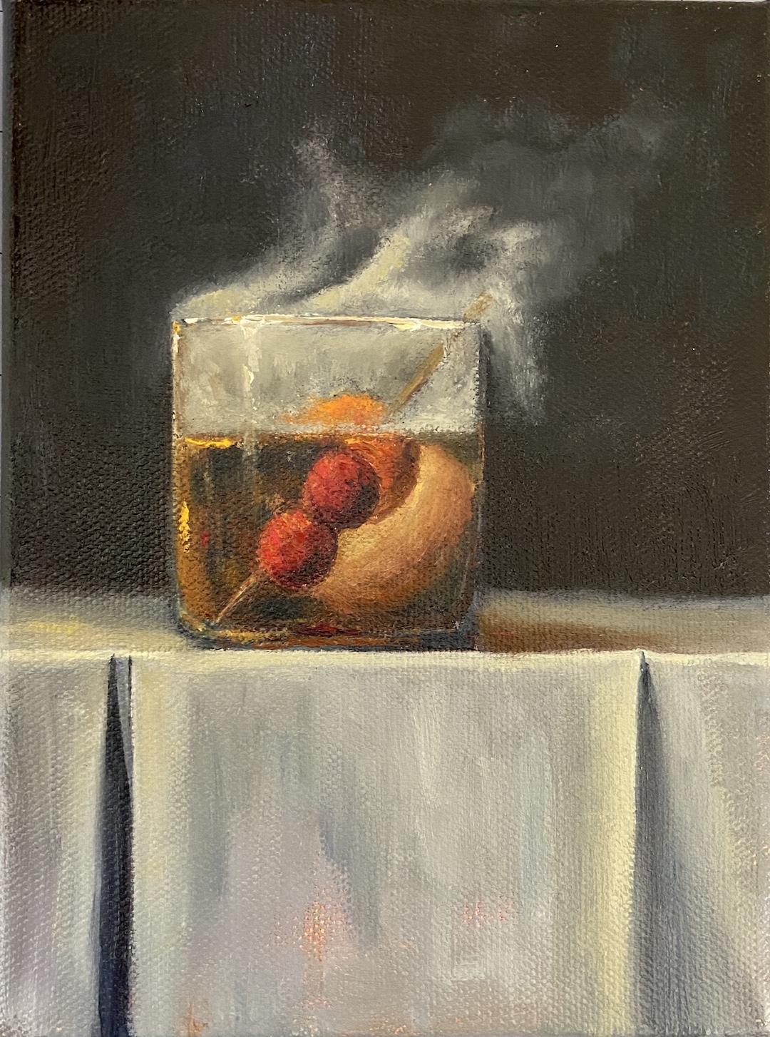
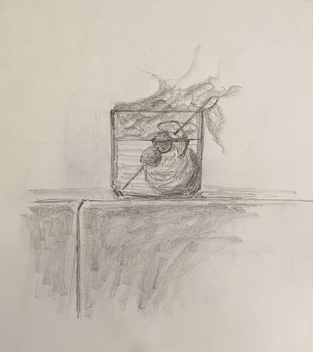
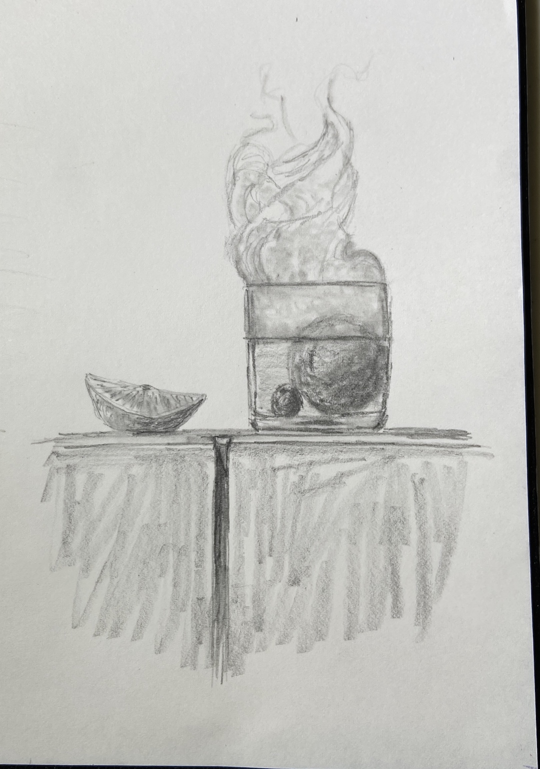
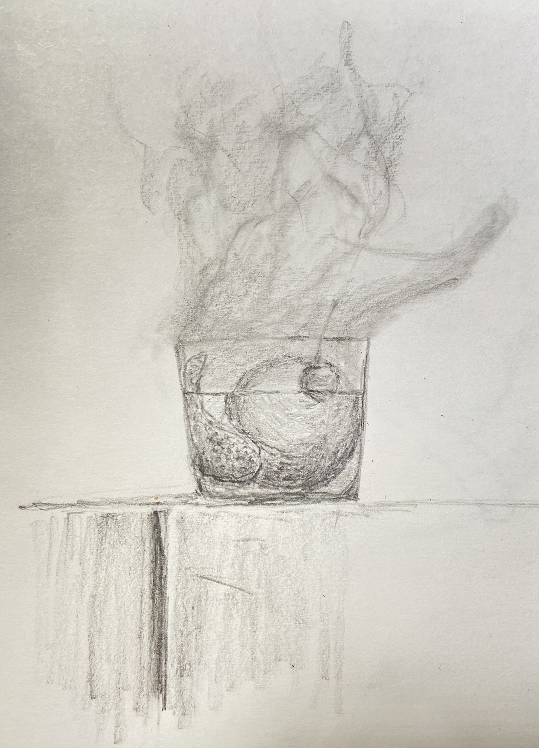
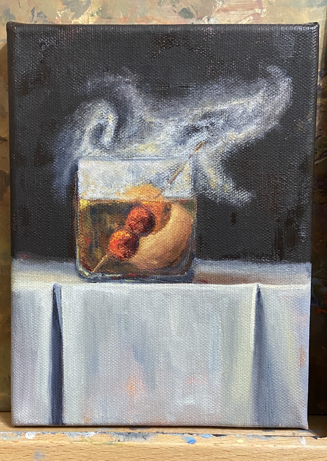
Building off my most recent still life, SMOKY OLD FASHIONED, I wanted to finish another piece with smoke effects so I could refine the process and build on the original. SMOKY ON ICE changes some core compositional structure, none of which is hard to miss, but obviously the focal point is the massive ice cube. The challenge, in addition to that pesky smoke, was making sure the other key elements worked the viewer back to the ice.
First, let’s talk about that ice cube. Even clear ice cubes have flaws, but they’re hard to see in standard light. Ironically, if you drop one in a low ball of whisky and incorporate some mood lighting, the imperfections will jump out. And these imperfections are the coolest part of a clear cube!
The cherries hovering over the glass, immersed in smoke, are a design decision to keep the proverbial “you” in the glass… with the imperfect ice cube… and all that tasty whisky (GlenAllachie for me, please)… you’re welcome! Lastly, I used a palette knife for the cherries to give them a different texture. It also worked out better with manipulating the red colors into the smoke without smudging, which was hard to avoid when using a brush. The ice cube was done with thinner paint and brushes, ensuring a smooth, glassy look. Thanks for reading!
Every once in awhile I find the motivation, and patience, to make a time lapse video of a painting. I did this for Smoky Old Fashioned, but it was done over the course of numerous short painting sessions (1-2 hours), so it gets a bit frenetic at times with lighting and zoom variations. Tight cropping and good music are included so as to distract from the lack of cinematography talent.
I’ve learned a lot about the process and iterations artists have to endure to get a composition just right by watching time lapse videos. Having done a few of my own this year, I’ve learned they’re also a great way to capture how I did something and be able to return to it later as reference for future work that harnesses the same subject matter.
I have the good fortune of 7 of my paintings being included at Austin Fine Art Gallery’s annual holiday group show of small arwtorks called “small WONDERS”! All works are framed and ready to go on your walls, or, given their relatively small size, they’re easy to ship to friends and family who might appreciate authentic art from an Austin artist.
BLACK LAB | Graphite on Paper | 11×13″
BULL CREEK, AUSTIN | Oil on Board | 6×8″
DOG TIRED | Oil on Board | 16×12″
JUST THE RIPE SIZE | Oil on Panel | 5×7″
SPRING POINT LEDGE LIGHTHOUSE | Oil on Board | 8×6″
POPCORN | Oil on Canvas | 14×11″
SOMETHING BLUE | Oil on Board | 12×9″
Small WONDERS will consist of over 300 mini works by over 35 greater Austin artists, ranging from 5×7’s to 16×20’s. Everything will be PRICED to GIFT with prices ranging from $100 to $600. Don’t miss this wonderful show to start or add to an art collection for you and your loved ones!There will be an opening reception on Saturday, December 9th from 4-7pm. There will be holiday treats, drinks and live music during the opening reception. The show runs through early January.
For more information about the gallery and this show specifically, go to www.artframingservices.com, navigate to the “small WONDERS” show announcement, and consider dropping by for some holiday cheer and say hi during the opening reception.
Artists showing include:
BERN ABPLANALP UMBREEN AHMAD TOM BENTLEY VICKI BREVELL TAMMY BROWN HOLLY CRAIG ALAN EHRLICH PAT FLATHOUSE ANN FLEMINGS JULIA FLETCHER SALLY FRASER OLGA GORALEWICZ LACY HUSMANN JESSICA GREENWOOD PING IRVIN CRAIG IRVIN CHRISTINE JAMES CAROLYN KILDAY MELISSA KOTZEV SCOTT LEOPOLD MARCH MATTINGLY LINDA MONTIGNANI M MURDOCK EDD OGDEN NANCY PATON RICARDO ROBLES JOYCELYN SCHEDLER ANASTASIA SHIMANSKAYA CELESTE SMITH CONNIE TAYLOR MINDEN TEN EYCK LILIANA VASQUEZ LINDA WELLS JOHN WEST ELIZABETH WILSON WALKER WINN RENEE WOMACK
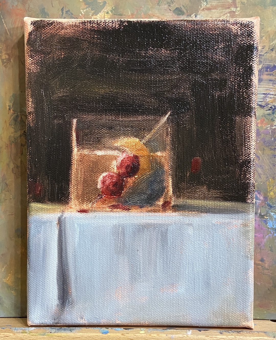
SMOKY OLD FASHIONED is a recent commission piece, something I love doing, especially when it’s for a gift or something sentimental. In this instance, the painting is for a gift for someone who apparently has everything. Painting to the rescue!
My process for custom work involves a number of preliminary discussions followed by sketches that give compositional options. Just like blocking in the value structure of the actual painting is key to a good outcome, with a custom piece, coming to an agreement on the core elements and structure of the composition is vital.
I’ve painted a number of libation-based still life compositions, but nothing with smoke. It required me to investigate if painting smoke was similar to creating fog, mist, or larger fire-based plumes.
The answer, it turns out, was an emphatic NO! It seems that once you pump smoke into a cocktail glass, weird shit happens and it becomes lifelike and animated. Looking at reference photos further complicates matters, introducing possibilities of upward windy smoky tendrils, or smoky bits that spill over the edge toward the table. Come to discover both of these considerations are smoked red herrings! Smoky tendrils are “fresh” burning anomalies, and the only smoke that sinks seems to be dry ice based smoke, which you can imagine is in a lot of cocktail glamour shots.
The trick with this piece was clearly… smoke! But before getting to that challenge, there was the issue of compositional tension. Technically, an Old Fashioned isn’t so much a cocktail as an origins story of composition. The Meehan’s Bartending Guide, my personal true North for all things cocktail, notes “the cocktail was first defined on May 6, 1806, in The Balance and Columbian Repository as ‘a stimulating liquor, composed of spirits of any kind, sugar, water and bitters’. By the time it showed up in a professional bar manual for the first time in Theodore Proulx’s 1888 The Bartender’s Manual, it was already “old-fashioned”.” My personal preference is rye whiskey, simple syrup, bitters, 1 cherry and an orange twist. Now back to the painting…
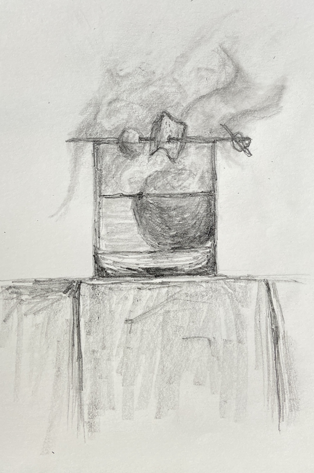
The request for this piece was to incorporate Luxardo cherries, orange peel, and a large round ice cube. Figuring out how best to structure this as a piece of art was trickier than I thought, even without the smoke. Once you put all that stuff into a lowball glass, it’s impossible to not notice the tension of so many things jammed into a small space. To tackle this problem we simply talked through various sketches that presented different solutions, and we ultimately landed on cherries on a toothpick, angled into the glass, orange peel also on the toothpick but above the whiskey line, and lastly a demotion of the round ice to the background. As a pleasant surprise, once the smoke was added, it significantly improved the compositional structure because it broadened the view and seems to have further reduced the tension, essentially granting the viewer a larger viewing room.
Lastly, the smoke technique. I still need to refine the approach, so stay tuned for more smoky cocktails, but the core approach seems sound. The smoke is not white, that’s the first thing. Turns out it’s about 20 variations of gray, leaning warm (cad yellow deep) above the glass, and a little cool (lemon yellow) below the rim. The brushwork boils down to a lot of push and pull between the light grays and the black background, using a lot of scumbling with an oversized round brush. As the smoke expands above the glass, it was important to make sure there was a very thin layer on the outside edges of the core smoke to lend it a sense of movement. The person who commissioned this piece has a cocktail smoker top, which sits on the top of the glass and is then pulled off in a flourish when the smoking is done, which pulls some of the smoke up and out of the glass. It’s all very entertaining, until you try to paint it!
Gallery! Welcome to Winter(ish)! I’m honored to be included in another group show at Art for the People Gallery in Austin. I’ll have 4 paintings in the show covering a wide range of topics – beaches, mountains, dogs, rowing, and champagne!
Ready for the ShowMIMOSABEACH DOGFLATIRONSMORNING ROWFalling into Winter show
The show runs October 28th, 2023 – January 5th, 2024, opening reception Saturday, November 4th, 12-4pm CDT.
Reach out if you have any questions, or better yet go to the gallery and check out all the arts:
MIMOSA | 12 x 16″ | Oil on Canvas Board | $400
MORNING ROW | 9 x 12″ | Oil on Canvas Paper | $275