Iconic Austin Theater

ONE NIGHT ONLY | 11 x 14” | Oil on Board

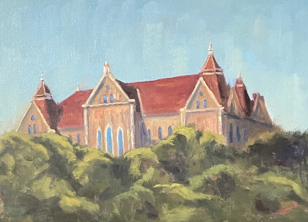
What makes something iconic? “Widely recognized and well-established” is the Merriam-Webster technical definition. For me, it’s something that is instantly recognizable and evokes a sense of place, which means that one person’s “iconic” is another person’s “what the…?” 

As an artist, creating an artwork based on an iconic place can be a tall order, something that the voice in your head quips “you better get this right”. There’s also a category of artists, the ones with more ego than talent or sense, who consider many subjects beneath them and not worth the flex of their brush. For these nimrods, the most egregious waste of their precious time is painting something iconic, cataloging the entirety of these subjects as passé, predictable and pedestrian. 

What the aforementioned dolts don’t seem to understand is that most people gravitate to artwork that’s relatable, and there’s no better way to make something relatable than to make it recognizable!  When it comes to leveraging the power of an iconic subject for a painting, I think its important to “get it right”, whatever that really means, but also put it in a setting or context that grabs the viewer’s attention. One way to pull this off is to present the icon in the evening, known as a “nocturne” in fancy art vernacular, whereby the setting is atypical yet still recognizable. 

ONE NIGHT ONLY is, hopefully, instantly recognizable by any resident, past or present, of Austin, Texas. The Paramount Theater, and arguably to a lesser degree, the State Theater, epitomize the Old Guard that is downtown Austin. The Austin skyline has transformed over the past 15 years at an insane pace, but it’s hard to wax nostalgia over skyscrapers, in large part because, in my humble opinion, none are iconic, with two possible exceptions. First is the State Capitol, the original skyscraper of Austin, which held the crown of the tallest building in Austin for more than 70 years!  Second, the Frost Tower Building (full disclosure, it’ one of, if not my wife’s favorite downtown building), which while it held the crown for a meager 4 years (2004 – 2008), was such a beautiful piece of architecture, residents readily recognized it in pictures and movies… by name! In other words, it was iconic. 

Finally, there are a few technical details you might find of interest, and perhaps elicit some additional joy from the painting. Or not.

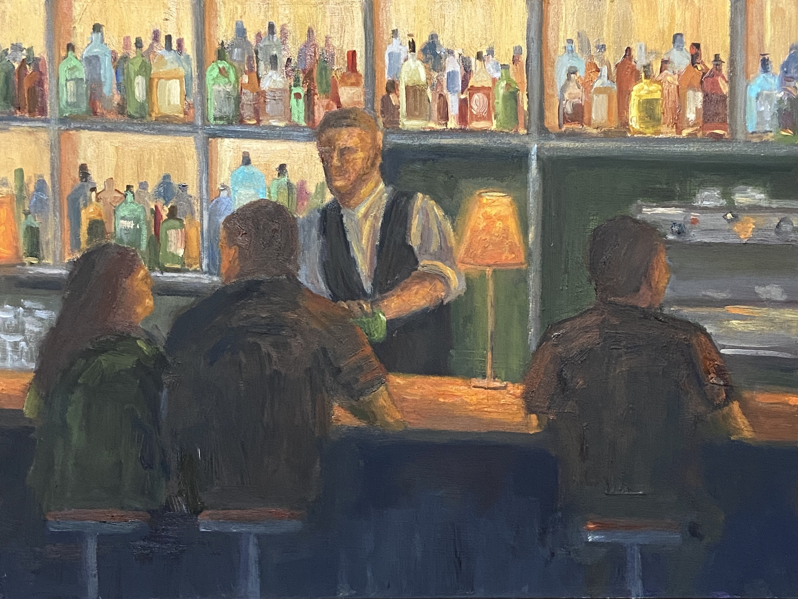
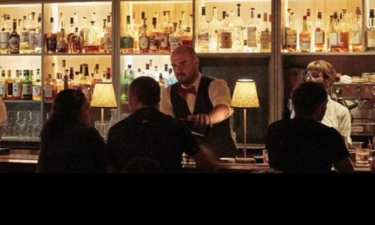
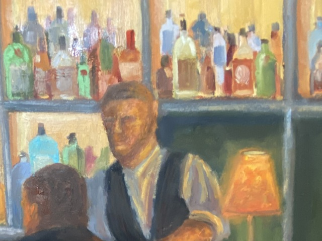
First, there was a lot of simplification, which was driven by equal parts fear and intent. As chance would have it, the very basic, loose structure of the dark buildings in the background turned out to be a happy accident. Initially, these were a simple dark value block-in that were necessary to contrast the very bright elements of the signs. I never bothered to go back and refine this area, frankly forgot about it, and then realized it did a fantastic job of directing viewers to the focal points. The second bit of artistic license was the exclusion of pretty much all of the Paramount building details. This is the fear factor, whereby I didn’t want to tank the composition with the distraction of what would have certainly been mediocre windows and brick detail. The cast shadows on the roof paired with the glowing orange wall is meant to anchor the right side of the work, which would have been difficult to do with architectural details.

As you can tell from the progression gallery below, the lettering of the signs was done by hand, no stencil and it evolved quite a bit over painting sessions. I practiced the lettering on separate paper canvas, experimenting with different brush shapes and sizes, as well as variations in paint load.

Regarding the Paramount marquis, the ultimate focal point of the work, it has virtually no paint! I washed the underpainting off of that area early on, and like the simplified background buildings, I never went back to it until the very end, and that was only to add “ONE NIGHT ONLY” lettering.

Lastly, note the lack of people on the street. This was intentional, but I struggled with the decision. I like adding people to urban scenes like this, in large part because they add interest, motion, and a sense of place. However, without them, the scene has that feel of a theater that has a full house and nobody is lingering outside. Hopefully that intent translates to you, too.

ONE NIGHT ONLY will be making its public debut this week at my solo show at Kerbey Lane Cafe (Westlake), “Paintings and Pancakes”. Come by and check out the 25+ pieces of artwork while enjoying the sweet nectar of pancakes and syrup! 

#austinart #artbern #berntx #crashboomzip #abplanalp #austinartists #pleinair #pleinairaustin #paa #atxart #atxartist #atxlife #contemporaryart #paintings #kerbeylanecafe #coffee #westlakeaustin #eateraustin #austinbrunch #pancakes #paintingsandpancakes #paramoutaustin #iconic #statetheater #downtownaustin #austinliving #austinevents

Texas State Architecture

OLD MAIN – TEXAS STATE | 9 x 12” | Oil on Canvas Board 

I’m a fan of wandering university campuses, both in the US and abroad, in large part because they’re often home to intriguing architecture, beautiful grounds, and chock full of history. Some do it better than others. For example, the University of Texas is by many measures a great school, but let’s be honest, people don’t go there for campus aesthetics. Alternatively, wander onto the stunning grounds of the University of Colorado and you may never leave. 

However, there are also a long list of wonderful colleges and universities – no, I don’t know the difference -hidden between neighborhoods and history, more notable for their pride than their size, and arguably constitute the backbone of “usable” degrees. While I’ve never spent a day as a student at Texas State University, I can say with assurity that the San Marcos campus has enough beautiful open space and intriguing buildings to make for a nice afternoon wander.

In this piece I wanted to capture the university using an iconic building… say hello to OLD MAIN at Texas State. I assume this is one of, if not the site of the original building on campus, which is a beautiful piece of architecture. I used a reference photo from the University website, but it was pretty flat in terms of lighting, yet the perspective of the composition was excellent. I opted to “wing it” with the lighting, incorporating strong sunlight that lit up the facade and cast dark shadows downstream. 

Ideally this piece finds a home with a Texas State alumni, but failing that it would be well suited for a fan of architecture. I’ve been pushing my painting style to be more impressionistic, but I had to tamp that back a little with OLD MAIN so as to include the necessary details of this beautiful building. 

​OLD MAIN will be added to the “Something for Everyone” show at Kerbey Lane Cafe in San Marcos. Drop by for a beer, some pancakes and art! 

Thanks for reading!

#austinart #artbern #berntx #crashboomzip #abplanalp #austinartists ​#​texasstate #txst #oldmain #texasarchitecture #sanmarcos #paintings #kerbeylanecafe

Cuenca: Multi-Focal Point Strategy

CUENCA | 9 x 12” | Oil on Canvas Paper

More European inspiration, this time from a little city called Cuenca, Spain, which is located about 100 miles east of Madrid. Cuenca is magnificent and thankfully not on  the itinerary of the selfie-taking, speaker phone talking, culturally ignorant hordes. This city is in the mountains, founded by the Moors (like most everything in central Spain), and best known for their hanging houses, called “casas colgadas”. In my view, they’re the original “room with a view” architecture, and it’s frankly amazing they’re still clinging to the cliffs. 

We were visiting in late May and did a lot of strolling as we explored the old town. This particular scene is from the Plaza Mayor, looking north towards the Cathedral of Santa Maria and San Julian of Cuenca. Even during this morning hour, there was a lot of activity and the city had a sense of energy and vitality, which I’ve tried to capture with this piece.

Initially, the intent was to do a quick study in preparation for a larger piece. While I still intend to do a larger, more composed painting, I kept getting sucked into the details of CUENCA. There are two focal points – I know, I know, that’s not how the rules work – but I’ve developed the opinion that multi-focal point perspective in a composition can work really well. In this case, focal point 1 is the Cathedral, which anchors the background as it captures the morning light before the rest of the buildings. Focal point 2 is the guy in the foreground walking right at you, also touched by the light, contrasted by the shaded patio immediately behind. 

Lastly, there are various bits of sky blue incorporated through the piece. It’s an experiment to see if it gives the viewer the sense of having a relatively blue sky overhead, adding to the depth of the painting. Not sure if it works because I was actually in Cuenca to take this photo, therefore I always have that sense of a sky overhead when I think about this scene. 

If you haven’t been to Cuenca, Spain… go! The setting, sights, food and people are wonderful. 

Thanks for reading!

#austinart #artbern #berntx #crashboomzip #abplanalp #austinartists #pleinair #cafe #spanishcafe #spain #cuenca #patio #europe #atxart #atxartist #atxlife #contemporaryart #spainart

Glowing Happy Hour

LAMP GLOW | 10×14” | Oil on Panel
Reference Photo, Photographer Unknown

Oftentimes I use my own photos as inspiration for my paintings, but I also use pics from people I don’t know. This is something I believe most painters do, typically for a couple of possible reasons. First, I paint, I’m no photographer, so my photos are, well, not very good. Some things even an iPhone can’t fix. So I might use my own photo as the main reference, but find other options online of the same area to enhance the view. The other main reason for using a reference shot from someone else, be it an individual, magazine, etc., is because it’s something or some place I’ve never seen or been to personally. It’s this latter reason that applies to this new piece, LAMP GLOW. 

I spent a lot of time on the canvas with this one, which was expected given my lack of experience painting people in detail. In fact, I must have wiped the face of the bartender no less than 6 times, and reshaped the bar patrons many times as well. Ultimately, I’m happy with the result and I learned a lot in terms of technique and what NOT to do. 

Lamp Glow Detail

The focal point of LAMP GLOW is the glow from the lamp on the bar, not the lamp itself. Because the glow is a soft light with a mid-range value, it was a little tricky to make it work. Usually, the focal point of a composition is highlighted by things such as high contrast values or sharp edges. Lacking these options I pushed the saturation and ensured the soft, orange light bathed the primary elements in the painting, which (hopefully) makes the glowing lamp a clear focal point given it emanates throughout the scene. 

In terms of design decisions, I’m not sure I took the right approach regarding the liquor bottles in the background. While they turned out nicely, I think they’re ultimately a distraction and might be more effective if they were softer and less saturated. Oh, and painting 67 individual bottles is a wee bit tedious.

Stay tuned for more bar scenes! 

#austinart #artbern #berntx #crashboomzip #abplanalp #austinartists #bartender #bars #nightlife #happyhour #atxlife #steakhouse #lampglow #cocktails

Acorn Street, Boston

As promised, here is the finished work (maybe) of the ACORN STREET study. I say “maybe” because I might opt to add people and give it more activity, but I also like the calm, quiet morning vibe this gives off. I’m guessing the early mornings are the favorite time for the residents of this street as the tourist throngs are still in their AirBnBs second guessing why they hadn’t opted for a hotel with an in-room coffee machine and room service.

I wanted to ensure value contrasts and a loose painting style were key elements of this piece. The flag and sunlit building opposite were intended to draw the viewer down the street, which wasn’t difficult to do as this composition kinda designed itself. The big challenge since the original progress post was adjusting the light from the photo reference so that it realistically “hit” the flag, which meant letting it sneak up the end of the street more than was originally planned. 

Lastly, the cobblestones were a last minute addition. I was trying to avoid anything too detailed in an effort to keep the painterly feel, but anyone who’s been on this street knows the cobblestones are integral to the charm. I need to refine my technique in future work, but there are a lot of cobblestone streets that I’d love to paint in the future! 

#acornstreet #boston ​#​cobblestones #austinart #artbern #berntx #crashboomzip #abplanalp #austinartists #atxart #atxartist #atxlife ​#cambridge #flag #unitedstates #oilpainting #fineart #atx

Boston Study

New work-in-progress, ACORN STREET, oil on canvas board. This piece is also serving the purpose of a study for a larger composition, provided it turns out well. It’s off to a good start, though, but it will take a few more hours on the easel to get there. The perspective and values are solid and should provide the foundation for an eye-grabbing painting. 

This was also my first session as a student in an open studio class taught by Robin Cheers. Her artwork is beautiful, very painterly, and really captures a sense of place and activity. As an instructor, she made a very strong first impression and provided some great insights that will go a long way to improve my technique. 

Stay tuned for the finished work!

#acornstreet #boston #robincheers #austinart #artbern #berntx #crashboomzip #abplanalp #austinartists #atxart #atxartist #atxlife 

Bat Skrawing

The bats are coming! This is a skrawing, or is it a dretch… I dunno, whatever you call the in between gray area of an informal sketch and a structured drawing. Regardless, the plan is to do a larger piece, at least by my standards, of the iconic Austin bats departing their home under the Congress Street bridge. 

The focal point will be the silhouettes of the people on the bridge, secondarily the bats. The anchor, not something that’s officially a painting term as far as I know, will be the brilliant sun in the lower right corner, which is very tricky in a drawing, so you’ll have to use your imagination. The value contrasts will be extreme, so balance is going to be key. Why I’m attempting this is beyond me…

12×36 will be the dimensions… stay tuned! 

Soup for You!

The Soup Peddler (study) | 12 x 9” | Oil on Canvas Paper

I’m learning a lot more lately en plein air, painting outside essentially. In 2023 I intend to get in at least 30 days outside – I’ll keep track and post updates against that goal… more to hold myself accountable, but perhaps it will entertain all of you as well. 


There is a great artist group in Austin called Plein Air Austin (www.pleinairaustin.org), which organizes multiple outings monthly for members – non members are encouraged to come join us to see what it’s all about, too. This particular outing was what we call “Urban”, where we get together in an area of town that has great architecture and buildings, as opposed to nature-based landscapes, and try to capture the scene. This particular outing was on South 1st near Mary Street, which has plenty to work with in terms of urban scenes. I tagged along with one of the other artists who had scoped out these great blue green umbrellas at a restaurant called The Soup Peddler. 


The weather was ideal, a little chill in the air, but the clouds cleared out around 10 and gave us plenty of sunlight. It was tricky to simplify this scene, an ongoing challenge for me with plein air compositions, so I tried focusing on the umbrellas first and building the painting outward. Having just painted umbrellas in a recent studio piece, I was able to quickly get the bones of this piece on the canvas before the lighting changed. Luckily the lighting was steadily improving all morning, so I never panicked due to major shifts in value. 


In terms of compositional challenges, I got most of it worked out in the field because I was happy with the umbrellas themselves. I also got very lucky in getting the structure of the building, sign, and patio details on the first try. Sometimes those architectural details trick me and I have to make a few attempts to get it right, or at least avoid having it tank the painting before it even begins. The updates I made in the studio were pretty straight forward, building on what I had already started, but I did leverage some artistic license. Most notably I opted to exclude the cactus coming out of the metal planter, in large part because it was nearly the same color as the umbrellas, and even a deviation from the coloring would have been a distraction. And while I don’t love the final look of the metal planter it serves as a good balance for the composition. Maybe I’ll add some other plants in the future, but for now I’m calling it done. 


Thanks for reading! 

#artbern #berntx #crashboomzip #painting #art #abplanalp #bernabplanalp #austinartists #atxartist #atxart #atxlife #bullcreekaustin #pleinairaustin #souppeddler #souppeddleraustin

Umbrellas of San Juan, Puerto Rico

20” x 30” | Oil on Canvas Board

This composition was one of the more complex and difficult pieces I’ve done to date. I’ll admit that after painting close to 100 umbrellas, I seem to have developed a bit of an umbrella-related phobia, which apparently is a thing called “Umbrellaphobia or “Pellebaphobia”. 


This piece was a commission for a good friend from my college days, who was very patient and helpful throughout the process. I couldn’t have taken longer to get this done, but the size was a new challenge for me, and because it was for a friend, I really wanted to get it just right. Initially there was going to be an empty street with beautiful, bright buildings and a canopy of umbrellas. But the end result was less than festive, so we agreed that adding some people would liven things up a bit. 

The guidance for this piece was to capture the vibe and beauty of San Juan, Puerto Rico. Fortaleza Street was a prime choice, as it’s not only beautiful with the umbrellas, but its a very significant landmark that leads to La Fortaleza​, the residence of the Governor of Puerto Rico. The residence is essentially a fortress that is a UNESCO World Heritage Site. 


When it comes to painting people, there was a lot of additional practice needed “off canvas”. I’d done street scenes previously, but for this piece there were some new twists to figure out. First, and probably most challenging of all, the scale of people on this street seemed out of whack. The doorways and size of the windows seemed far too large, but when I checked numerous reference photos for Fortaleza Street, I found that the reality was, well, kinda Lilliputian. It’s very hard to paint reality when reality doesn’t align with expectations, like a very old city with strangely gargantuan doorways. Not sure what was going on in San Juan when Fortaleza street was conceived, but it should be investigated… something strange was going on.  The second obstacle was how many people to drop into the scene. In highsight, I think a few more could have been added, but I also like the sense of either early morning or early evening timing with this scene, when fewer people would be wandering around. 


​The focal point of this composition was initially going to be the glowing element of the most crisply painted umbrellas, which I know is something that would piss off all of my past workshop instructors and teachers because it breaks about every rule out there for compositional structure, but it’s what was important to my friend. That said, ​​when I added in the people, I had a lightbulb moment and made a point to really focus on the couple holding hands in the lower right foreground. They are literally walking into the scene, which works really well at also drawing in the viewer to look left for the rest of the street activity (couple sitting at cafe table), and then up to the umbrella canopy, which effectively redirects the view back down to the governor’s residence at the end of the street.

​Lastly, to the umbrellas… lordy lordy, so many umbrellas! The geometry of an umbrella is hard for me, but the added element of linear perspective as they fade back into the horizon line of the composition was a real brain teaser. ​Additionally, the power of value contrasts that ultimately made each individual umbrella get the right shape, namely they looked like blobs of color until I painted the actual metal rods within each umbrella. At that point it started to work better and things moved along quickly.  


If you’re ever in San Juan, go check out Fortaleza Street and let me know if the doorways are really that large!


#oilpainting #fineart #atx #berntx #crashboomzip #oilpainting #austinartists #abplanalp #fortaleza #sanjuan #puertorico #Pellebaphobia

Rothenburg ob der Tauber

Oil on Panel | 9” x 12”

This composition is from a trip we made to Germany not too long ago, although after this awful year it seems like a hundred years in the past. Since traveling isn’t an option, I’ve decided to start painting great locations as a meager alternative.

If you Google Rothenburg ob der Tauber, this scene is what will show up in the list of photos. While I agree it’s an outstanding view, I wanted to drive the focal point to the clock tower instead of the orange wooden house in the foreground.

This is the end of a late Fall day, which wasn’t very clear without the addition of bundled up people walking through the streets. I struggled with the decision to add people to the piece, but in the end I wanted to convey the sense of season and a more idyllic time without tourists.