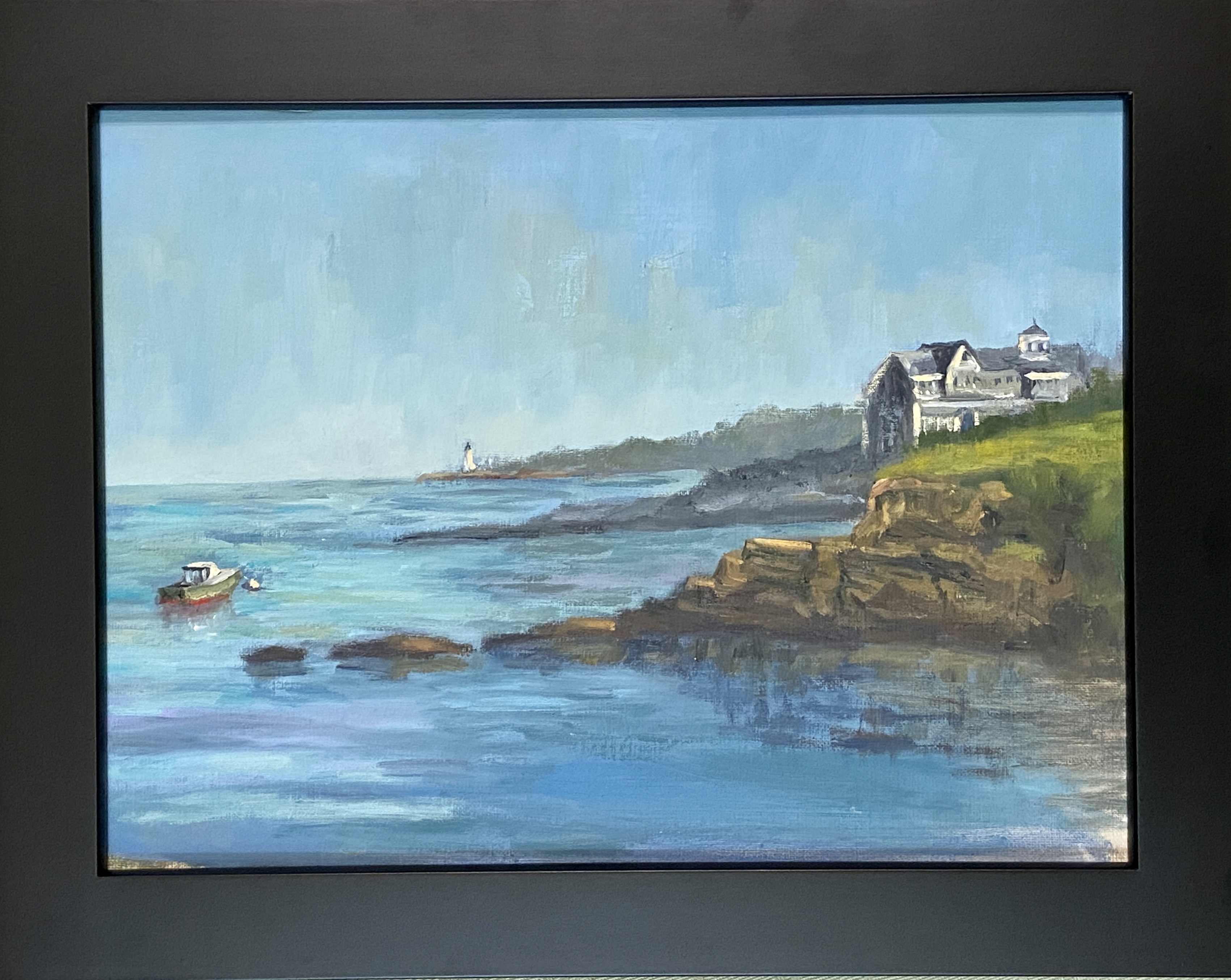
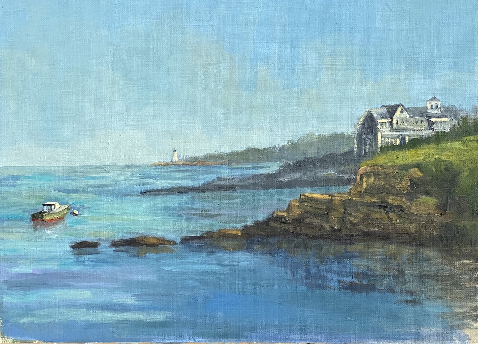
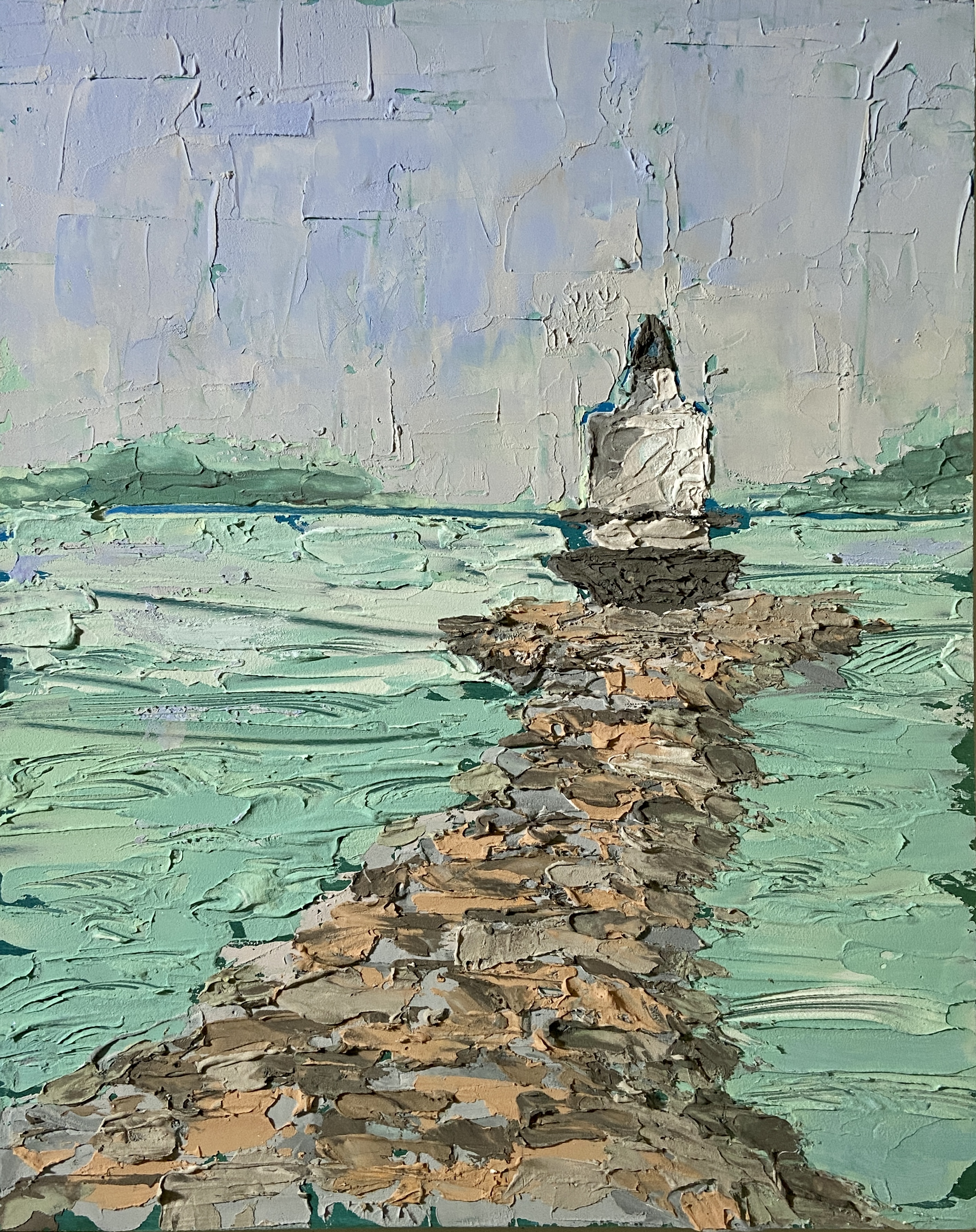
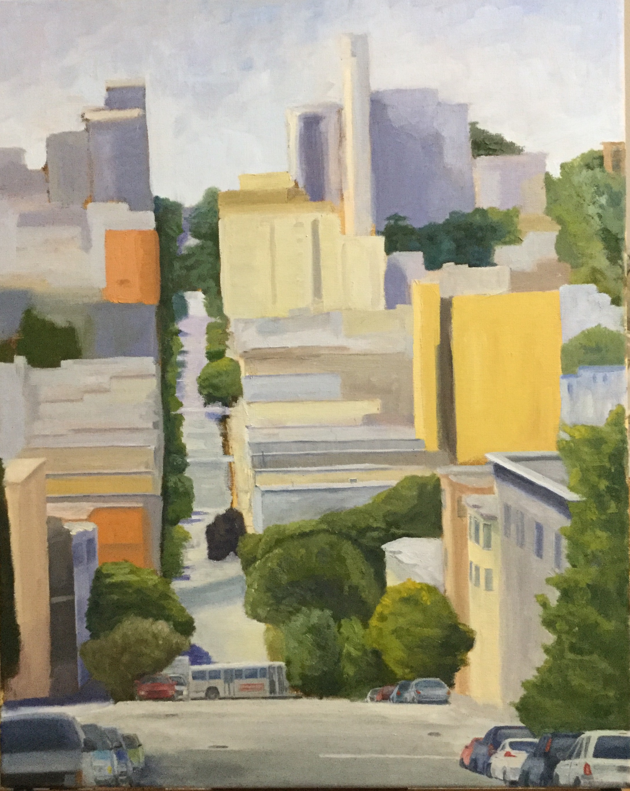
I’m privileged to be included in another group show at Art for the People Gallery in Austin! I’ll have two pieces in the show, FISHERMANS POINT and SMOKY ON ICE. I’m especially stoked at this opportunity because these pieces showcase two very distinct painting styles, namely landscape and still life.
The show runs June 7th – August 17th, 2024, opening reception NEXT SATURDAY, June 8th, 12-4pm CDT at the new location of Art for the People Gallery in Austin, Texas.
Note that the Art for the People Gallery has moved locations and is no longer on South 1st street. They are part of Good Dad Studios located at 2801 S. I-35 Frontage Rd. Good Dad Studios is Texas’ largest artist complex, which means they have a lot of artist studio space, and within the facility are galleries and other businesses, one of the most notable being Art for the People Gallery.
Reach out if you have any questions, or better yet go to the gallery and check out all the art.
When I first started painting, the term “study” was something I did to suspicious food at a dive restaurant. Over time, I learned that “study” oftentimes meant “practice”, typically done as a trial effort before tackling the same composition on a larger scale. This interpretation is meant to allow the artist to figure out technique, color palette, and orientation of the work. Fast forward to current day, I’ve come to find that “study” can mean a brutal self-critique of a practice painting that becomes more than a mere invalidation of the compositional structure, but rather a realization that you buggered it up entirely!
Of course sometimes a “study” can magically have no serious flaws, the plaint flowed effortlessly, and all your compositional ideas worked beautifully. Sometimes.
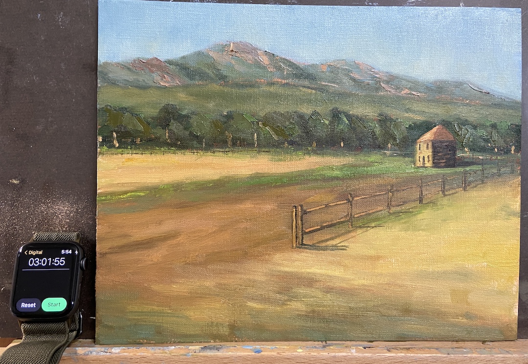
The study FLATIRON HOMESTEAD is proof that this practice has merit! That said, I like this piece because at the end of the day it was a lot of fun, the palette is pretty good, and doing a “real” painting is a likely outcome. There are progress photos per usual, but I’ve also included an annotated version of the completed study to point out the issues of which are detailed below.
This was painted from a reference photo taken by my mom during a plein air session we did last year near El Dorado Canyon, Colorado. It’s a beautiful location as you can see for miles along the Front Range with the Flatirons as the backdrop. To insert a human-made structure as the focal point of the piece felt wrong and awkward, but in the end it worked out.
I did a couple of sketches to mock-up compositional options, taking more time than I normally would, which I think proved beneficial because the core approach turned out to be much more compelling than the reference photo itself. The other key to this study was setting a time limit, which I chose to be 3 hours. The idea being to not overthink it, but give myself enough time to get the core elements fleshed out properly. This worked well because in the end I had to make major design change decisions (see fence line) quickly, focus on values over hues, and avoid the complication of detailed brush strokes.
Following is the summary of what I learned from this “study”:
1. The tree line is oddly symmetrical in terms of height. Not good! Need to change that next time and always be conscious of varying heights.
2. The fence line is a little too straight, even after the compositional decision to remove part of the fence so it didn’t cut the painting in half.
3. Light source is inconsistent. This would never happen if I painted this en plein air because it would have been impossible to ignore the sun, but drop me in the studio and things can get whacky. The sun is overhead for the flatirons and fields between the trees and the mountains, but the foreground and focal point are clearly lit by a sun that’s more on the horizon, albeit not sunrise.
4. Cast shadows of the fence line are critical and extremely effective. On a larger piece this will really grab the viewer and suck them into the painting.
5. The homestead building angles aren’t right, most likely the front side that’s lit by the sun needs to be a little less wide. This is the only real negative I found by having a time limit because I could have taken the time to repaint this part… then again, why bother if this is a “study”?
6. The highlighted tree trunks, meant to capture the high value contrast of the sunlight coming across the field, are effective and something I want to use in a larger piece, but in this study they are way too big/wide. Should have used a lighter touch with a think brush.
7. The sky color is excellent! I made an adjustment in the 2nd hour to the sky, deciding it was too blue and dark. This has been a problem for me in the past with landscapes, but I think this provides better awareness going forward, namely start lighter than I think it accurate and darken if needed.
8. The flatirons look really good, even though they’re just supporting background to the main elements. I used a palette knife to scrape the granite colors into the greens and that worked well. Need to remember that trick for future efforts.
So, that about sums it up. As you can see, you can learn a lot if you “study”!
Flatiron Homestead ReferenceBlock In – Values!Uhm… lotta greenPalaette and Values WorkingFence Line Needs Help3 Hours Limit!Final FLATIRON HOMESTEAD
If you’ve lived in South Portland, you knew the Fishing Shacks. If you don’t, please get out more and explore the wonders of your own backyard!
For the uninitiated, the last of the 3 remaining, dare I say “iconic”, Fishing Shacks were sucked into Casco Bay on January 13, 2024. Over their 120+ years, these historical structures had endured whatever the tumultuous Maine coast could throw at them, but a record tide (14.57 feet) coupled with a massive storm surge was a one-two punch they simply couldn’t withstand.
Many Fishing Shacks On Willard BeachShacks Stored Fishing Gear… Maybe Bodies 🙂Fishing Shacks With Metal RoofsReference Photo of Fishing Shacks – August 2023
Despite their absence, they leave many fond memories, a rare marriage of human structures and the natural environment which, together, made Fishermans Point a better place. As an artist, one of my primary inspirations is to return to a fond location and remember the time I spent there by recreating a view or experience on the canvas. Regarding the Fishing Shacks, my wife and I spent many happy hours soaking in the sights, sounds, and sea air on Fishermans Point, the shacks standing guard. It was, and still is, our happy place… just a little different now.
The painting (not my first of the shacks, see Fishing for Edward Hopper) is meant to capture that unique light at the end of the day when the world is bathed in golden rays and everything looks just a little more inviting. I used very little artistic license regarding the shacks themselves, as I wanted to preserve their actual structure as much as possible, including their positioning on the rocky point.
Experimenting with color to figure out the right palette for the waterZoom In Shacks
I used a painting knife and broken color on the illuminated side of the shacks to ensure they were the focal point of the work, most notably the railing leading to the first shack, guiding the viewer into the work. The use of high contrast values of the railing against the sunlit side of the shack should pull you back to that point every time you look at the piece, supported further by the diagonal cast shadows of the railing on the shack wall.
Compositionally the piece could be unbalanced and wonky, the shacks and rocky point stacked on the right side.To offset this issue, I incorporated a lot of high value, strong chroma setting sun reflection in the still(ish) blue waters on the left side. This is a relatively new compositional strategy I learned from another artist, Jeanne Hougen , who I had the pleasure of taking a class earlier this year.
Lastly, there is some hidden meaning in this composition, most notably the lack of the rocky point and the supporting stilts of the shacks in the water’s reflection. This was done intentionally and is meant to represent the physical disconnection of the shacks from Fishermans Point, but also a reminder of their powerful presence in the memories of all of us who shared time with them looking across the bay.
Reference PhotoBlock InProgress – Sky Sets ToneBright Blue Water Aint RightWorking in ReflectionsSunlight Reflection for BalanceSHACKS OF GOLD | 20×16″ | Oil on Canvas
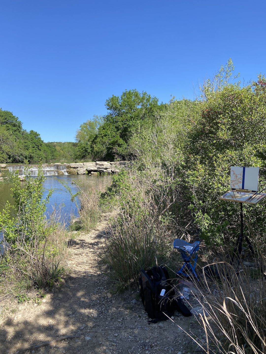
Dam at Hill of Life Falls, AustinBlock InNice Day at the OfficeValue Contrasts!Not Bad for 90 Minutes
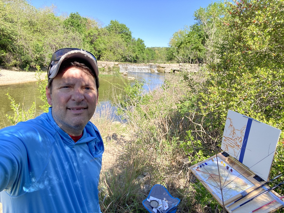
2024 will be the year of more en plein air! I love being outside painting in the field, but it does require getting up earlier, planning the night before, and a commitment regardless of the weather. This is a whole lot like camping, which I used to do all the time many years ago, so perhaps I just need to think of it as a short camping trip without sleeping on the hard ground.
I’ve finally made a return to this site after more than a year, which is kinda sad given it’s about a 20 minute hike out my front door. I’ve had a lot more practice since my last session (Breath of Plein Air) at this location, so I was excited to see how this study would compare to the previous work.
I opted for a profile perspective this time instead of landscape, as I feel that compositionally it just works better. The eyes are drawn down and up into the waterfall, the clar focal point of this work. The horizontal landscape can work, too, but I feel like it takes away from the expanse of the landscape, which flows naturally top to bottom. Structure is important, something I didn’t understand entirely when I tackled this last time.
I also split my board in half with blue tape, the intention being a return to this same spot later this month to build on what was learned from this session. I might play with this work a little more in the studio, but I’m more interested in developing experience and skills in the field, most notably improving value contrasts that really capture the outdoors, and secondarily developing a better palette that emphasizes atmospheric perspective.
This study lasted about 1.5 hours of actual painting, so I’m pleased with how much was done in that short timeframe. I’ll get out earlier next time – I started at 10am – and spend a full 3 hours and see how things turn out.
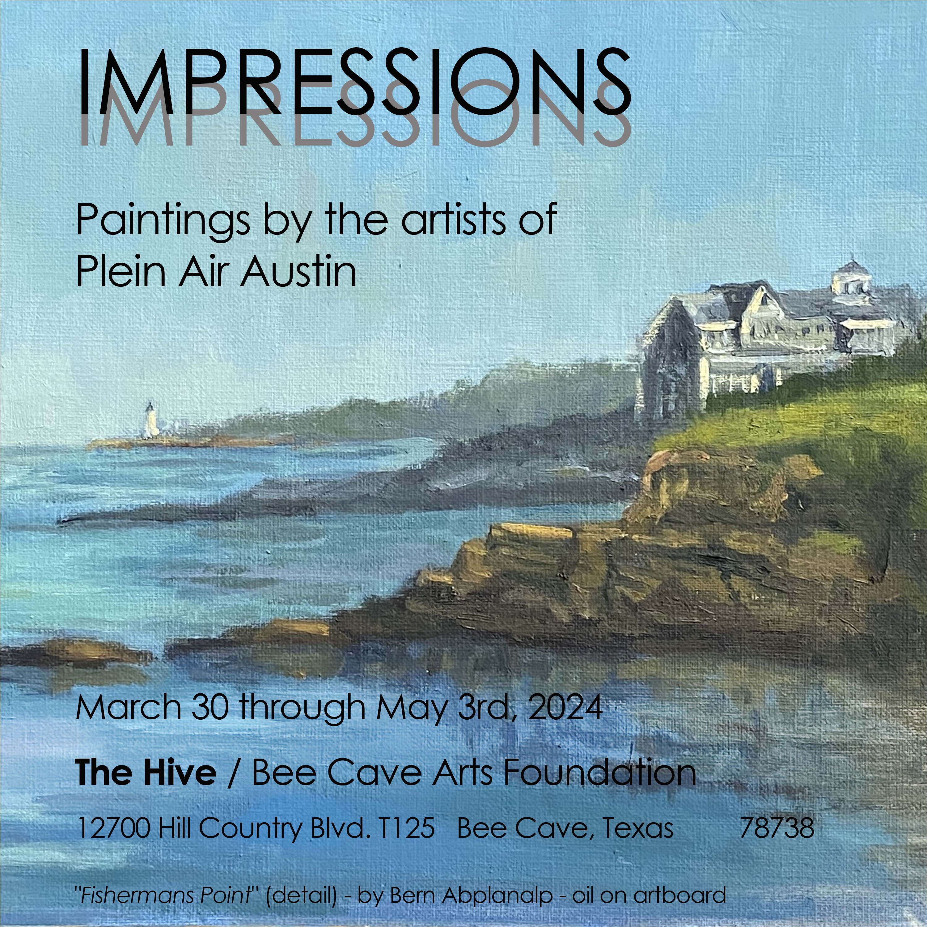
I’m very excited to be included in a new exhibition called “IMPRESSIONS: Paintings by the artists of Plein Air Austin”, happening at The Hive in Bee Caves, TX. This show celebrates the 150th anniversary of the Impressionist painters. If you don’t know much about the Impressionists, even if you don’t like the style (weirdo!), the history is fascinating.
In short, the movement, as it were, was actually facilitated by an American painter, John Rand, who in 1841 invented… wait for it… paint in a tube! Over the following years, some artists started to take their hobby outdoors (thanks to their tubes of paint) and began capturing the scenes of the world around them, a major break from compositional structures of the time, and emphasizing light and color to give a sense of place.
The debut party for the Impressionists is what’s marked as the anniversary, which occurred in 1874 in Paris at a show called “The Cooperative and Anonymous Association of Painters, Sculptors, and Engravers”. This group of arty-farty rebels included some of the (now) most recognizable names of the art world, including Monet, Renoir, Pissarro, Degas and Cézanne.
One final fun fact. The term “Impressionists” was initially an insulting critique from the press, who hated the style, calling one of Monet’s paintings “Impression, Sunrise” and comparing it to wallpaper.
Back to the opening, where 6 of my pieces will be included in this fantastic group show of plein air works. Opening reception will be Saturday, April 6th, 2-4pm. Swing by if you’re so inclined and meet some artists who love the outdoors and have created some amazeballs artwork! Let me know if you plan to drop by and I’ll keep an eye out for you.
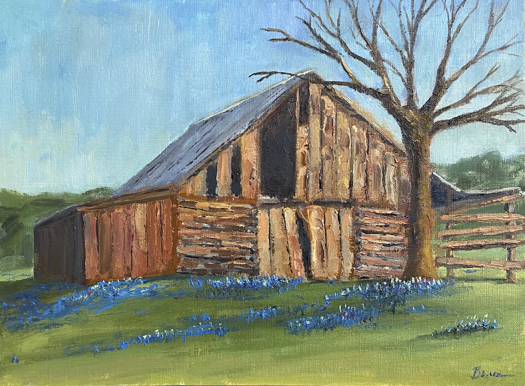
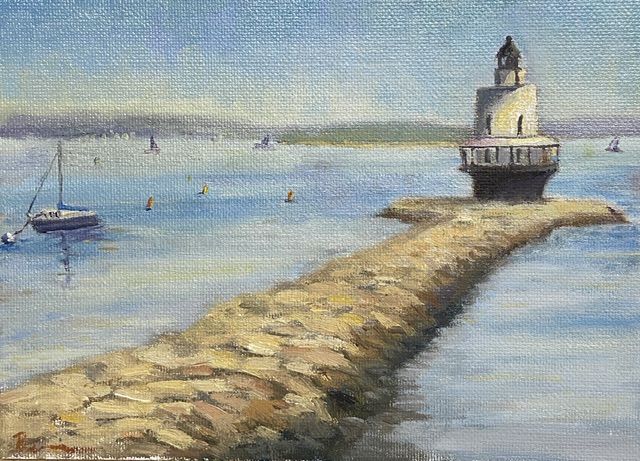
COMMONS FORD RANCH BARN | Oil on Board | 9×12″ FISHERMANS POINT | Oil on Board | 9×12″ BREAKWATER MARINA | Oil on Canvas Board | 8×10″ SPRING POINT LIGHTHOUSE 1 | Oil on Canvas Board | 9×12″SPRING POINT LIGHTHOUSE 2 | Mixed Media on Board | 10×8″ GREENWICH VIEW | Oil on Canvas | 20×16″ 6 Paintings in IMPRESSIONS Show