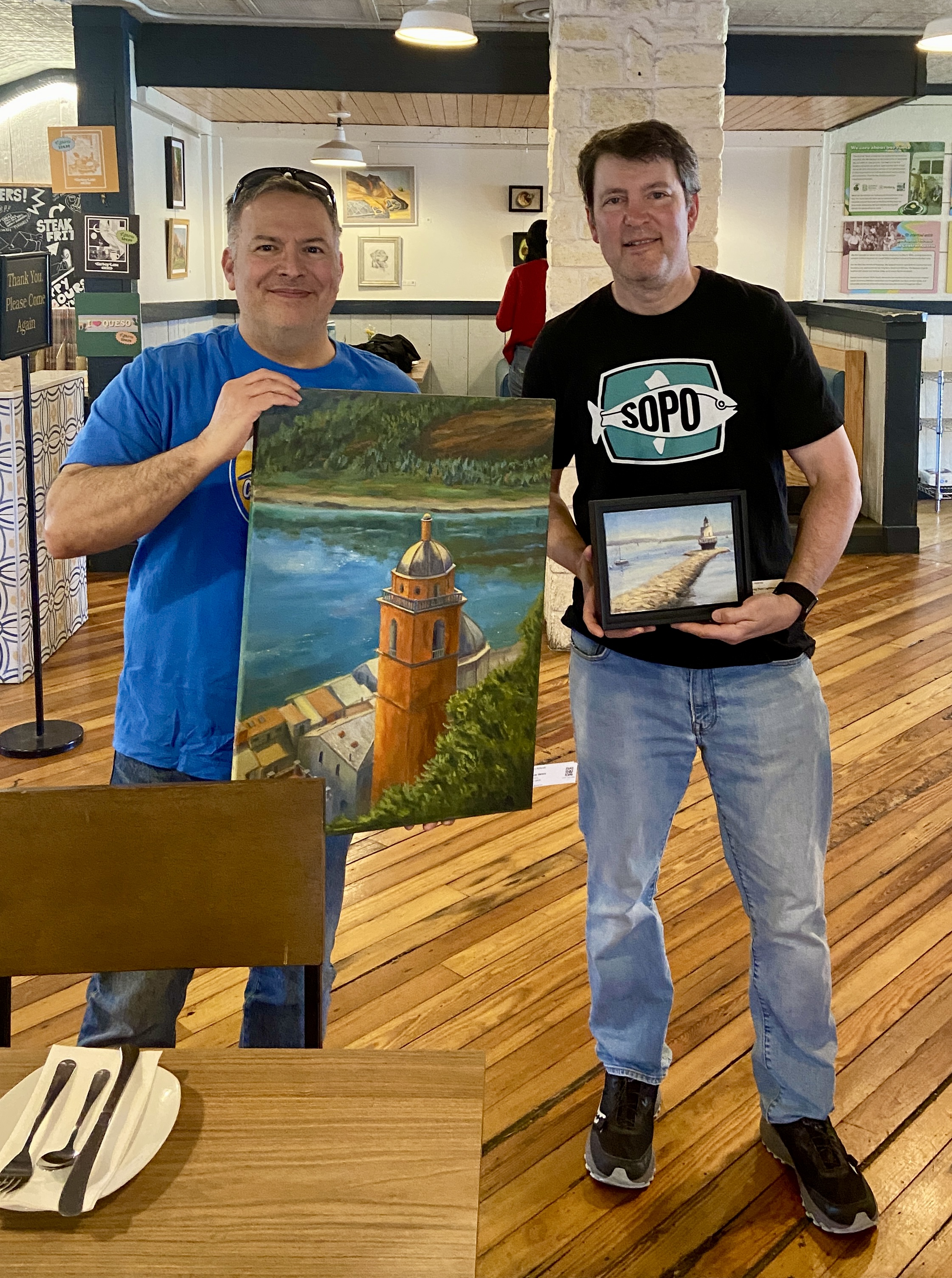
New Collector John with Artist Bern (me, wearing SoPo shirt)
I recently had the good fortune of selling 2 pieces from my solo show, “Something for Everyone”, at Kerbey Lane Restaurant in San Marcos, TX. I got to meet John, who bought 2 of my favorite pieces, “Porto Venere Bell Tower” and “Spring Point Lighthouse”. It’s awesome that he liked two pieces that were different in so many ways – size (small vs large), pallets (bright, warm vs subdued, cool), and landscape locations (Porto Venere, Italy vs South Portland, Maine)! Just proves how versatile art can be!
One of the most rewarding things about selling a painting, even rivaling the cold hard cash, is the chance to meet people who are actually intrigued by something I created. The inspiration I have for a composition isn’t always what piques a collector’s interest. Having the opportunity to chat with new buyers is always an interesting and enjoyable experience for me, as I get to learn about some sliver of their lives and where their newly purchased artwork will fit into their world.
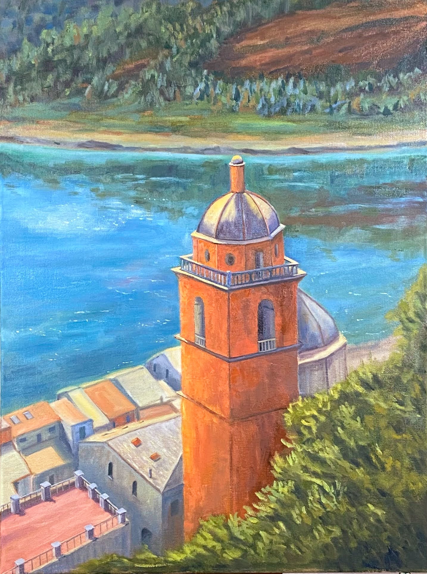
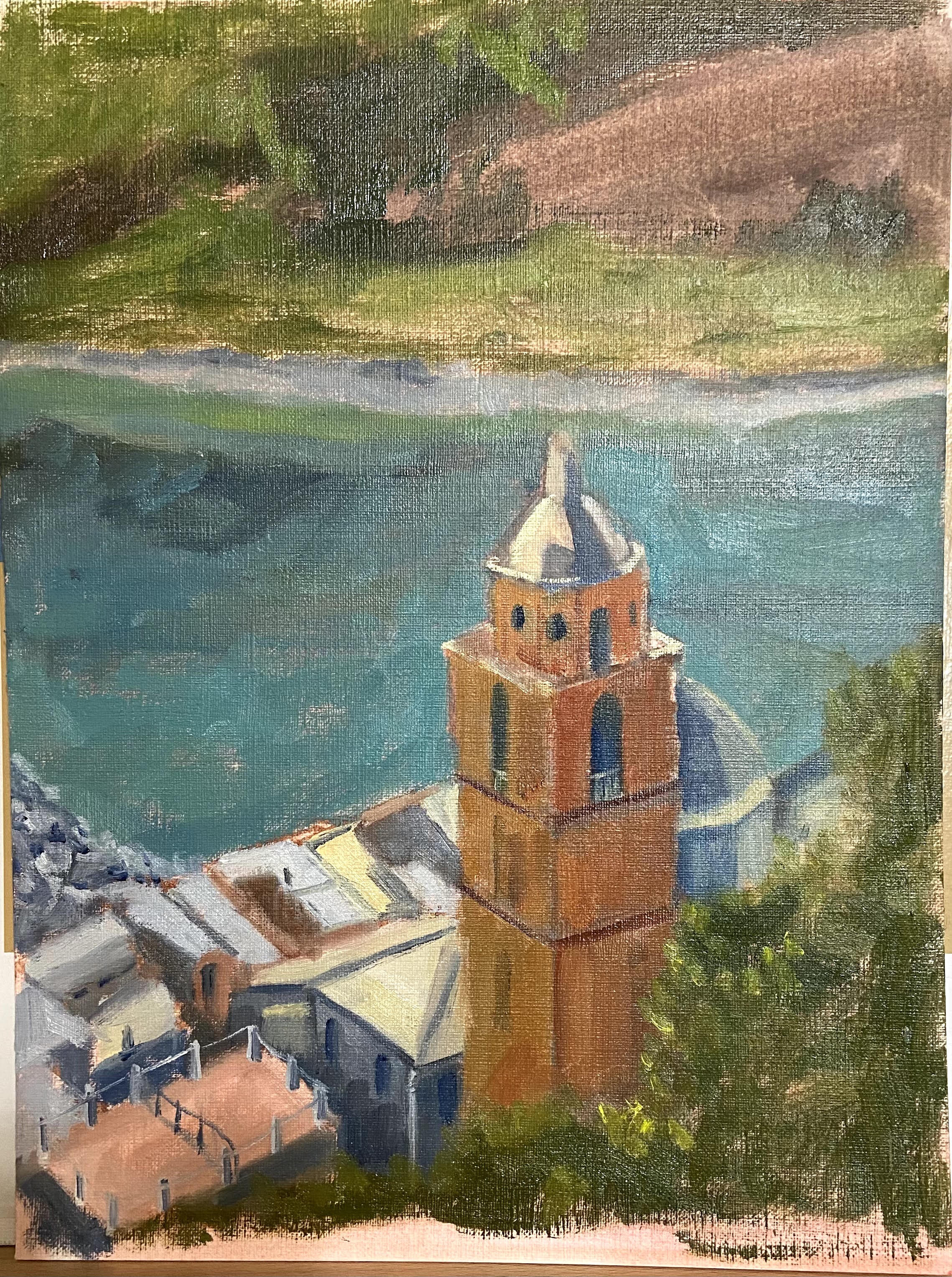
Earlier this year, I did a quick study of this composition and instantly loved the bones of the work. Sometimes you get a sense for a painting right away and you just know it’s going to be fun to paint!
The original study can be found in this previous post, Porto Venere (study), which was much smaller, 9 x 12” on paper. It was clear that the key elements to this piece were lighting and linear perspective. The values in the photo are crap (midday, washed out), so it required some improvisation and memory recall from the day I was actually in Porto Venere. I wanted to make sure the sense of the very bright sun was captured in the light and shadow contrasts, but still find a way to make the rooftops surrounding the main tower look interesting and not entirely washed out. To help get an idea of what good looks like, I referenced some works by Kanna Aoki (https://www.kannaaoki.com), who has a great talent for capturing the essence of bright sunny days in San Francisco.
The linear perspective is always a challenge (albeit a fun one) when dealing with cityscapes, but this piece was all about the tower. I took the reference photo from the castle on top of the hill upon which the town is built, so my vantage point was above the tower, but getting the lines right was still very important to convey the size of the building. The trickiest part, however, was the dome. Rather than try and explain the myriad ways it tripped me up, go ahead and try to draw just that part of the building. Too many lines and curves for a mere mortal to tackle.
There was also a wonderful Bob Ross moment as I experimented with the tower. I was mixing some orange color options on my palette and decided to quickly lay down a little paint on the canvas with a palette knife. The intent was to simply dab a little on the canvas, but my hand slipped and spread a big splotch! That happy accident, turns out, gave the impression of old time stucco, or whatever these old buildings are crafted from, and I loved the texture and realistic result. Nowhere else on the composition did I use a palette knife technique, so it helps add complexity to the piece and focus the viewer to the tower.
Last note is the use of reflections of the landscape in the water, which is not in the reference photo. I redid the water numerous times, and each time I used a variation of blue without reflections it dominated the painting and became a distraction. The reflections, I think, give a lot more depth and perspective, which I’m happy with, but one day I’ll have to learn how to do muddled reflections so the water doesn’t look so still.
If you get a chance to go to this part of Italy, stay in Porto Venere and avoid the crushing crowds of the Cinque Terre. Just don’t tell anyone else – it’s a wonderful place because it’s still a bit of a secret.
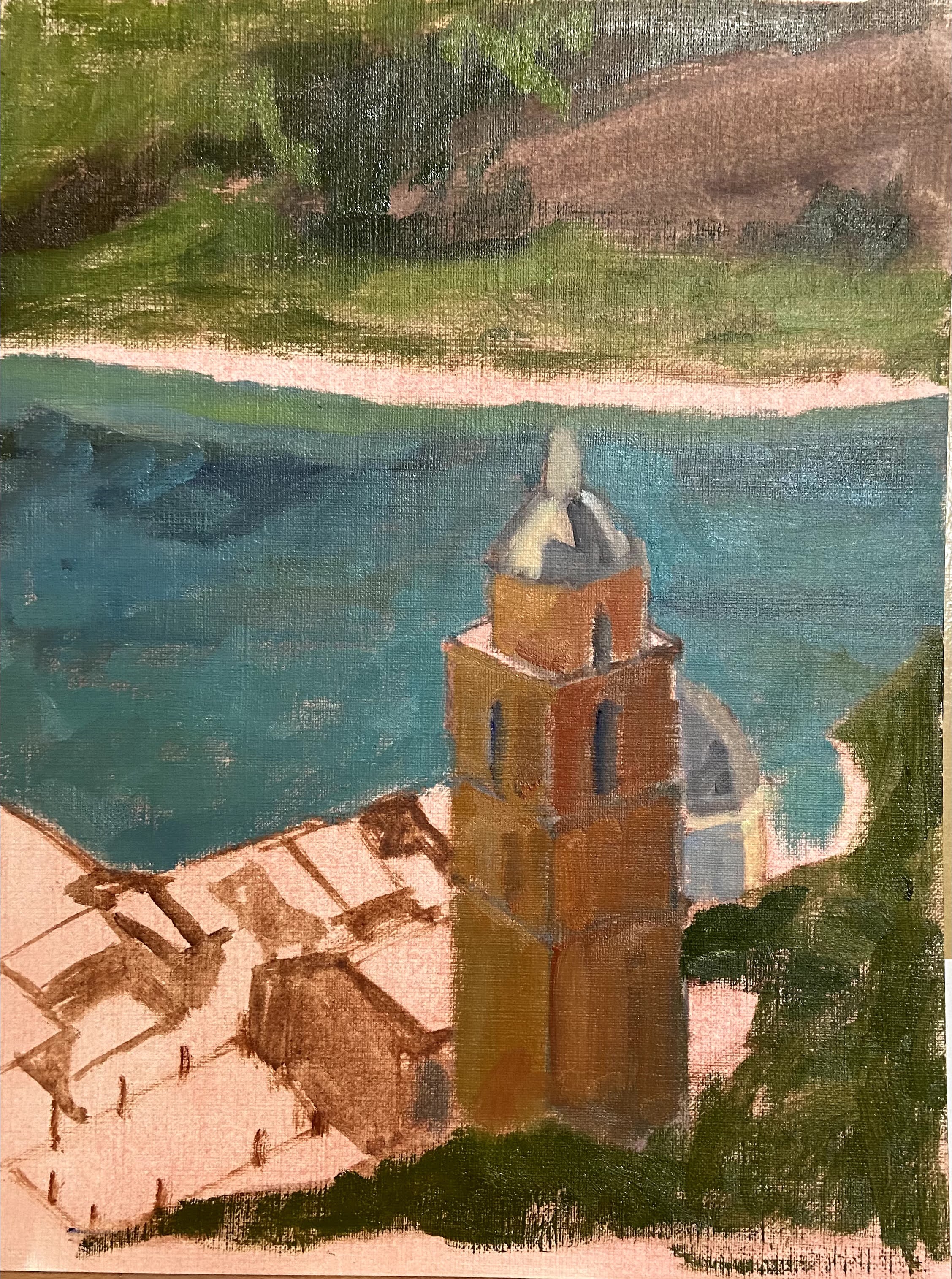
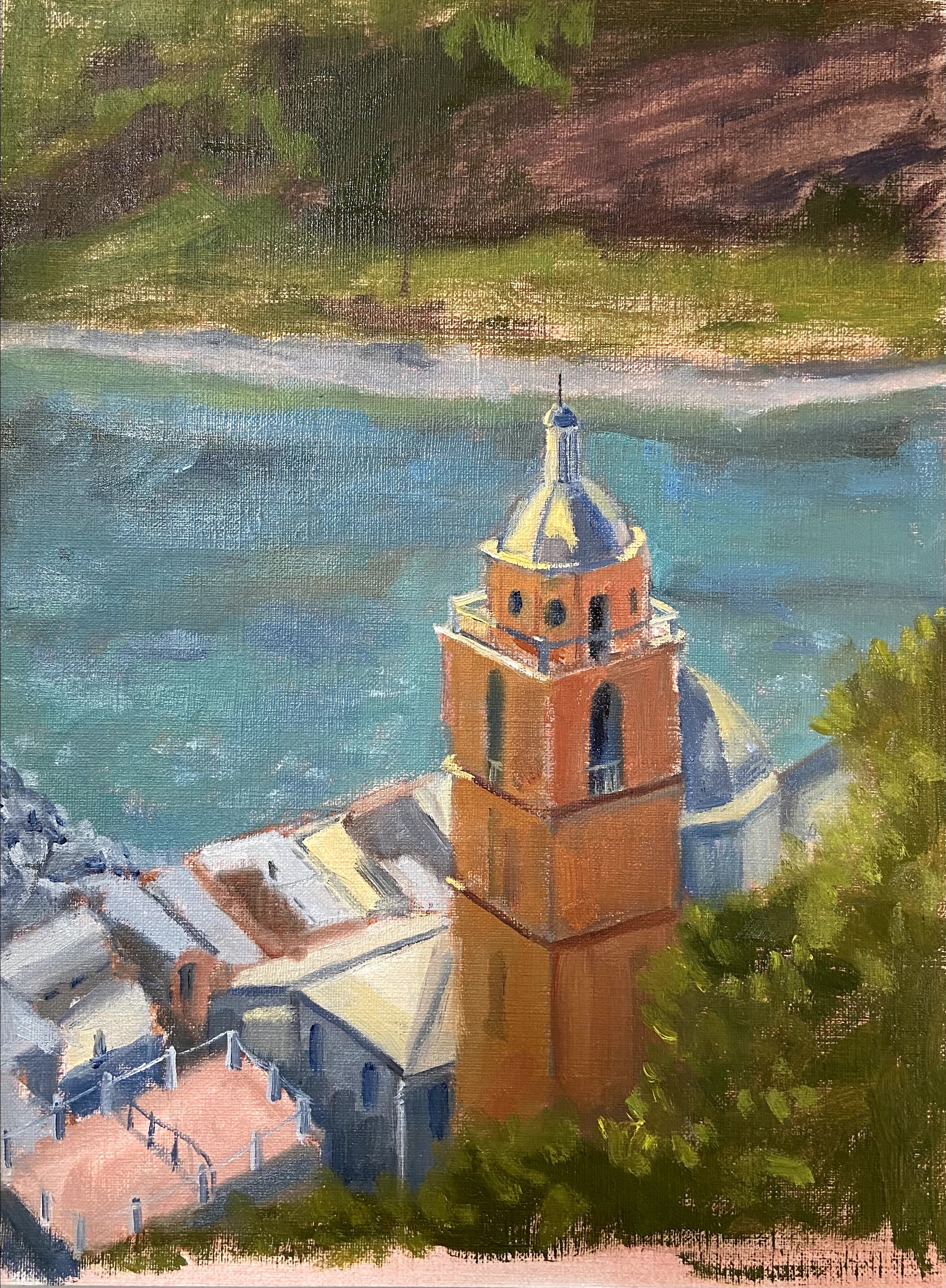
Porto Venere (study)| 9” x 12” | Oil on Canvas Paper
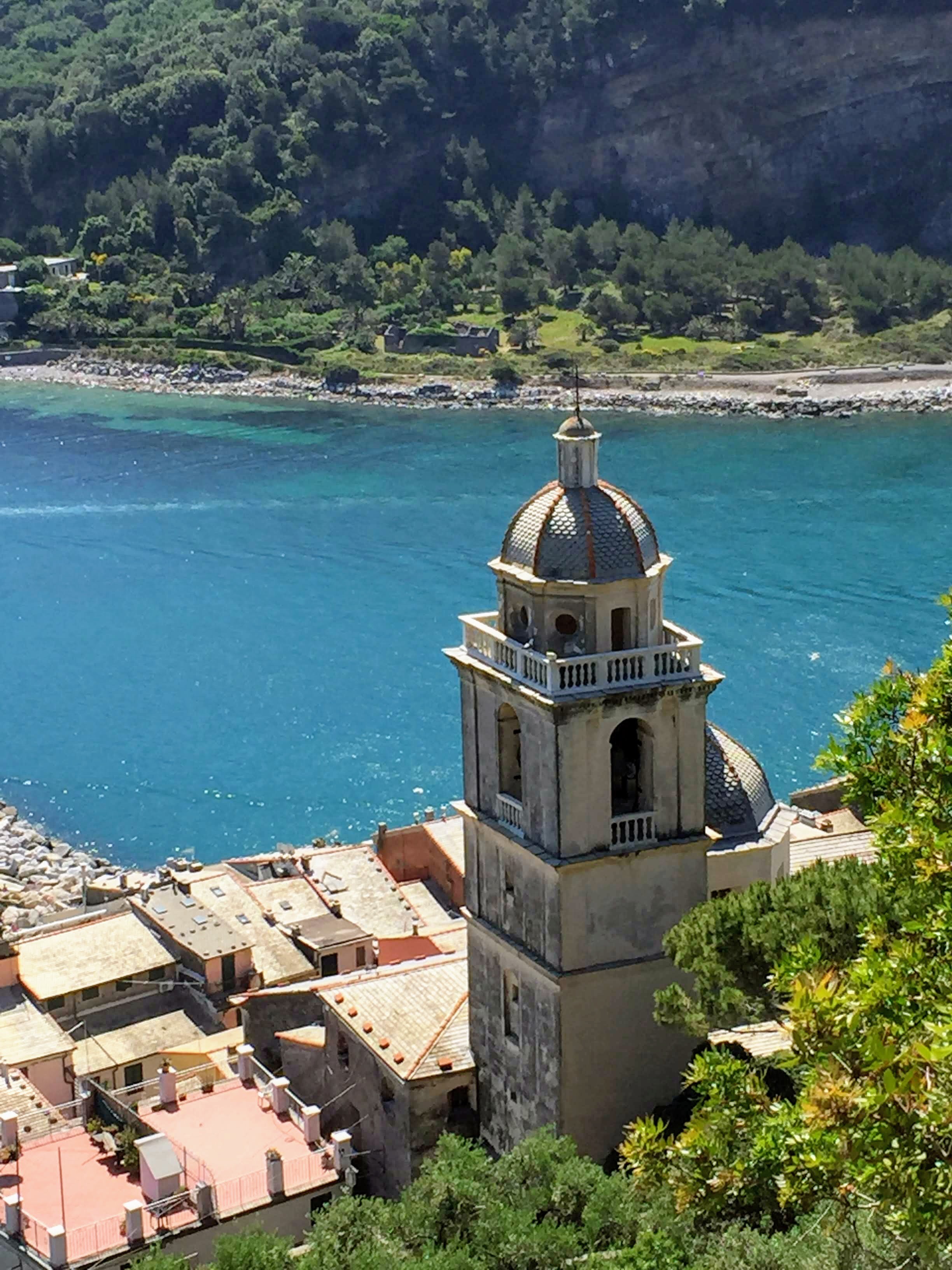
This composition has been on my short list for awhile, so I’m very excited to have put brush to canvas finally. The subject matter is a photo I took from the hillside in Porto Venere, Italy. The power of the sun shining on the church tower with the beautiful blue water in the background was an ideal setup for this piece. It kinda painted itself.
I’ve done a number of practice (studies) pieces in the past to get an idea of what I need to consider prior to tackling a larger composition. It’s extremely helpful to get a sense of proportions, values, and start thinking through edits that will make the piece work regardless of what’s in the photo or real life. My problem with doing a study is that I always end up getting sucked into the details – I just can’t help it – so they drag on and I lose the value of doing a practice piece.
To solve this problem, Porto Venere was time bound to 2 hours after the block-in was done. I literally ran a stopwatch to ensure I stayed true to the spirit of the study and focus on the compositional core elements, not the fine details. It forced me to make quick decisions and gave the piece a more painterly style, which I like and will try to incorporate into the full-size painting.