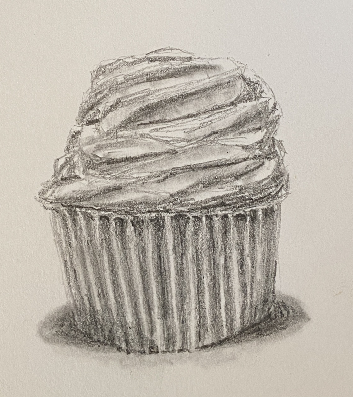
I’m going to do a new still life piece of a cupcake, but first I need to practice, because as it turns out, they’re deceptively tricky to draw. While I’ve eaten my weight in the delectable mini-cakes over the years, so I know them well, painting them I have not done. This study kinda just kept going, in large part because it was a fun challenge. While the outcome isn’t as righteously beautiful as the cupcakes from Captain Quackenbush, hopefully it still motivates the viewer’s sweet tooth.
The intention was to get a feel for how to draw (and subsequently paint) the weird geometries of icing, and how to properly shade/value the baking cups. I’m looking forward to the painting, which will probably incorporate some serious impasto elements to make the cupcake jump at the viewer and make them say “YUUMMMY!”.
My recent foray into mixed media, courtesy of plaster and acrylic, has opened up a new perspective for my still life compositions. A good place to start was with my favorite adult beverage, a tasty Porter.
This is a very small composition, 4×4”, but in large part thanks to the 3D-ish impact of the thick plaster, it has a lot textual appeal. I did this without a reference photo, or beer model for that matter, going from memory of similarly themed past paintings. This one is most notably related to Last Sip, but oddly enough it was infinitely easier to create for a couple of reasons. First, the smaller size makes things go much faster. But more notably, the use of colored plaster and the simplicity of the subject make for a quick creation.
I might have just gotten lucky, too, and nailed it on the first try.
I might return to this specific piece and do some direct painting using acrylics on the plaster, which would add more vibrancy and get rid of the slight chalky effect.
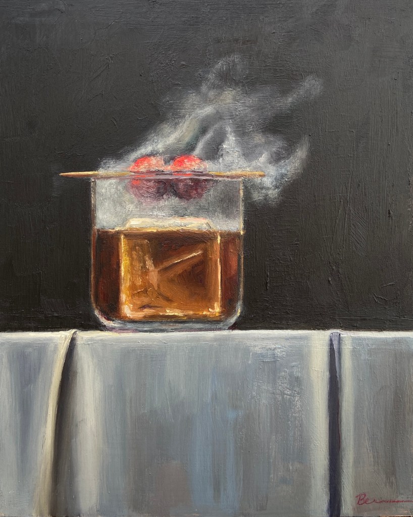
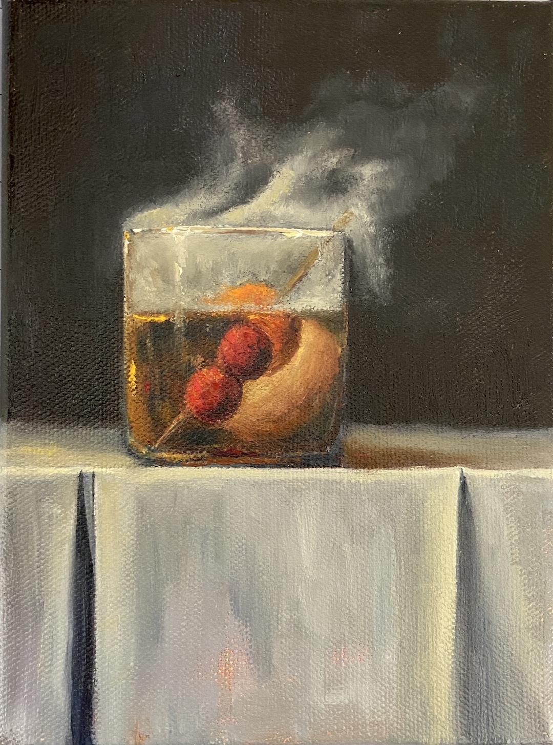
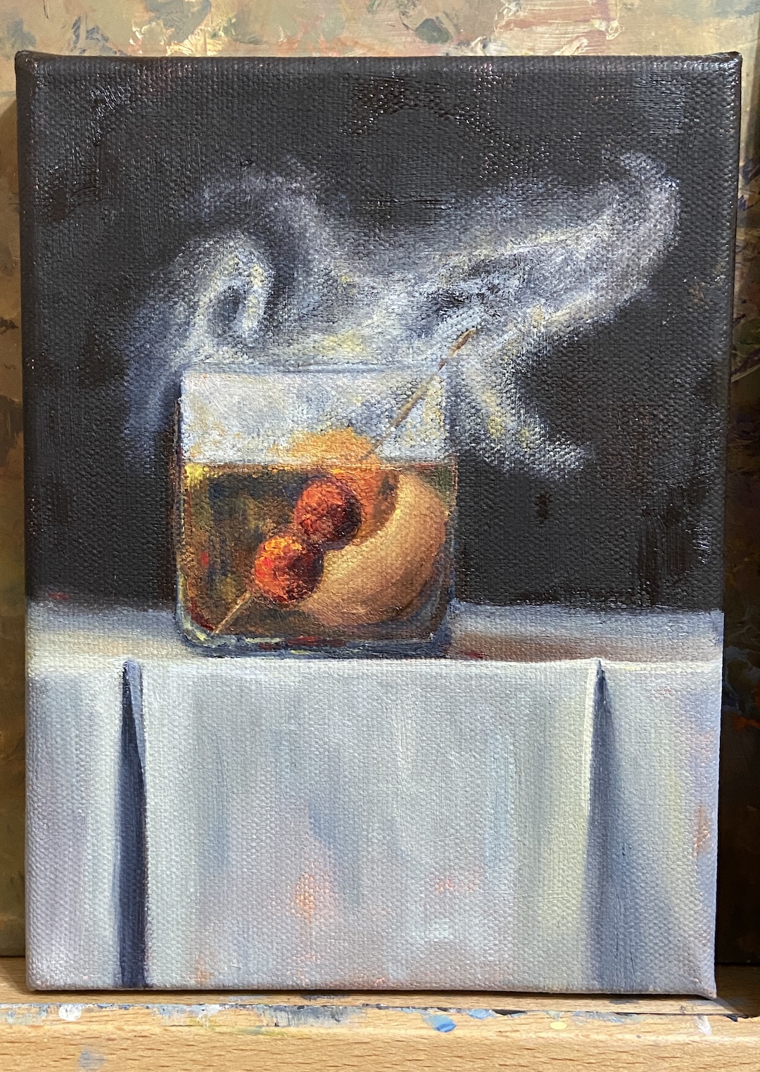
Building off my most recent still life, SMOKY OLD FASHIONED, I wanted to finish another piece with smoke effects so I could refine the process and build on the original. SMOKY ON ICE changes some core compositional structure, none of which is hard to miss, but obviously the focal point is the massive ice cube. The challenge, in addition to that pesky smoke, was making sure the other key elements worked the viewer back to the ice.
First, let’s talk about that ice cube. Even clear ice cubes have flaws, but they’re hard to see in standard light. Ironically, if you drop one in a low ball of whisky and incorporate some mood lighting, the imperfections will jump out. And these imperfections are the coolest part of a clear cube!
The cherries hovering over the glass, immersed in smoke, are a design decision to keep the proverbial “you” in the glass… with the imperfect ice cube… and all that tasty whisky (GlenAllachie for me, please)… you’re welcome! Lastly, I used a palette knife for the cherries to give them a different texture. It also worked out better with manipulating the red colors into the smoke without smudging, which was hard to avoid when using a brush. The ice cube was done with thinner paint and brushes, ensuring a smooth, glassy look. Thanks for reading!
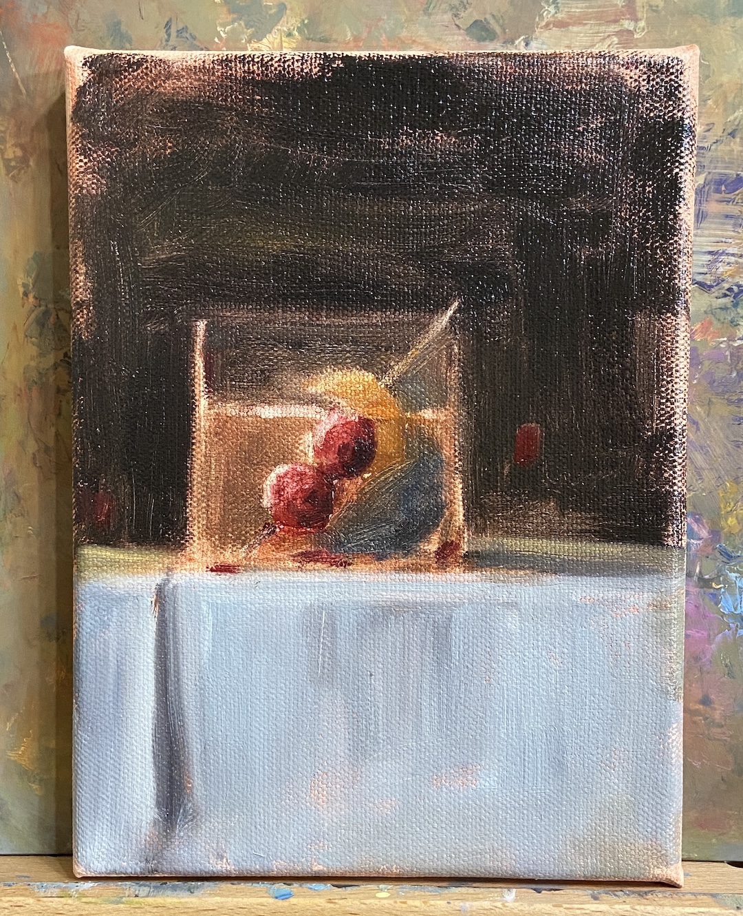
SMOKY OLD FASHIONED is a recent commission piece, something I love doing, especially when it’s for a gift or something sentimental. In this instance, the painting is for a gift for someone who apparently has everything. Painting to the rescue!
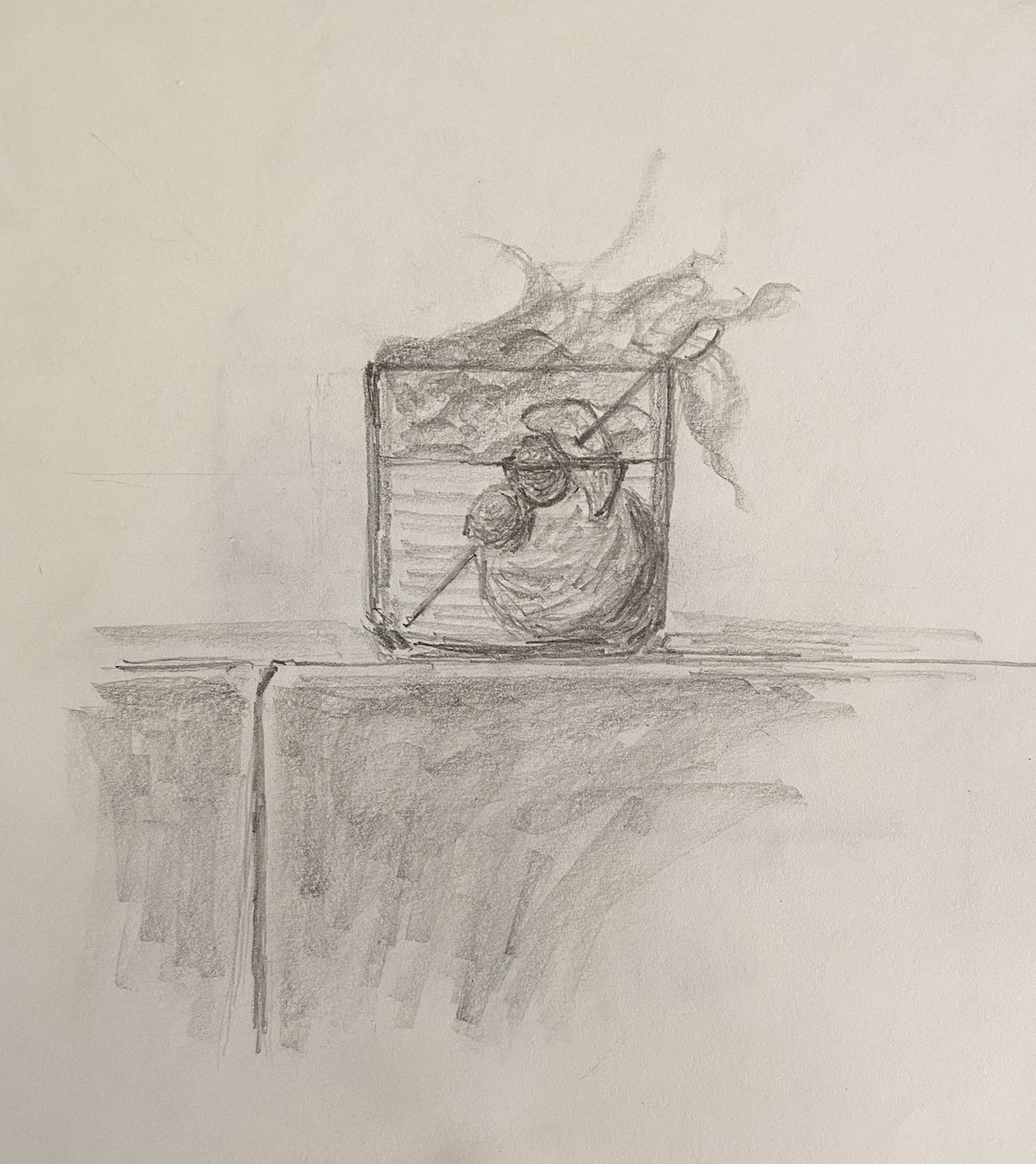
My process for custom work involves a number of preliminary discussions followed by sketches that give compositional options. Just like blocking in the value structure of the actual painting is key to a good outcome, with a custom piece, coming to an agreement on the core elements and structure of the composition is vital.
I’ve painted a number of libation-based still life compositions, but nothing with smoke. It required me to investigate if painting smoke was similar to creating fog, mist, or larger fire-based plumes.
The answer, it turns out, was an emphatic NO! It seems that once you pump smoke into a cocktail glass, weird shit happens and it becomes lifelike and animated. Looking at reference photos further complicates matters, introducing possibilities of upward windy smoky tendrils, or smoky bits that spill over the edge toward the table. Come to discover both of these considerations are smoked red herrings! Smoky tendrils are “fresh” burning anomalies, and the only smoke that sinks seems to be dry ice based smoke, which you can imagine is in a lot of cocktail glamour shots.
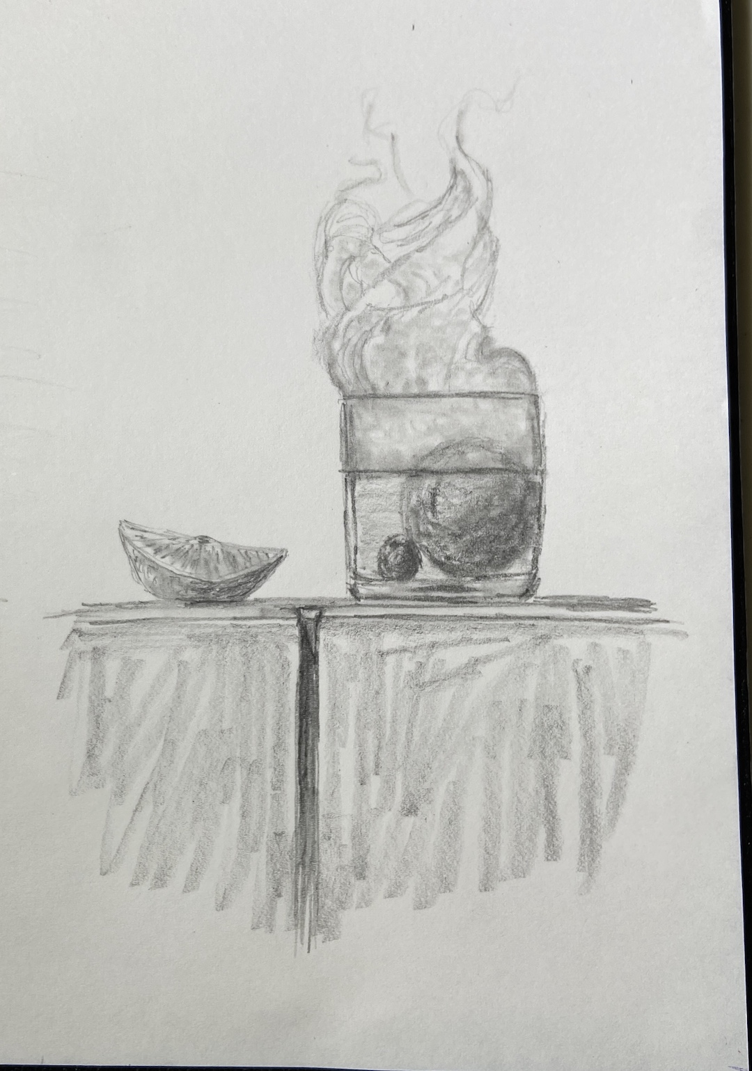
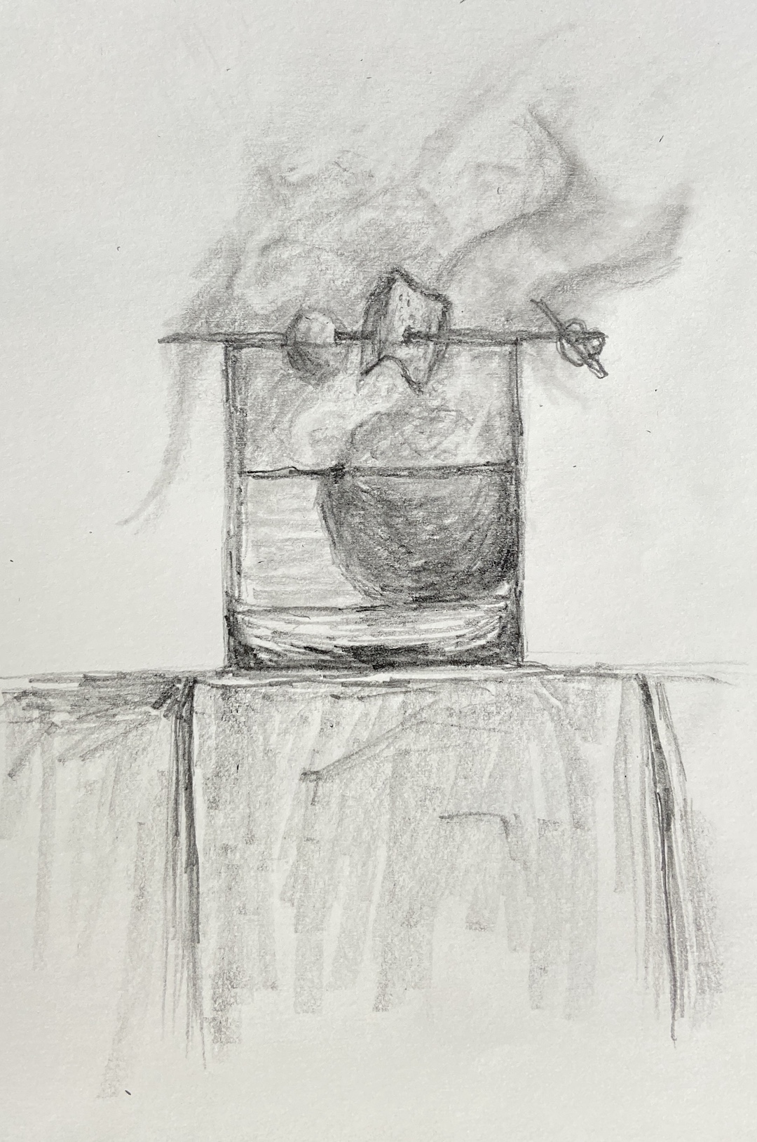
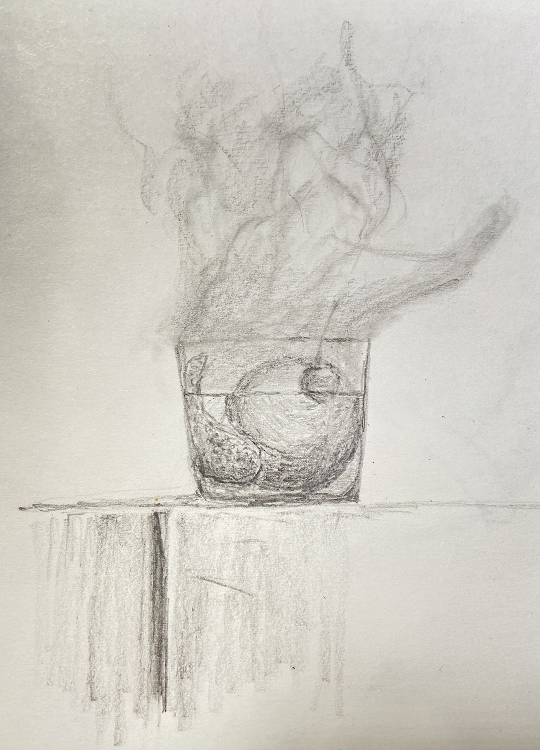
The trick with this piece was clearly… smoke! But before getting to that challenge, there was the issue of compositional tension. Technically, an Old Fashioned isn’t so much a cocktail as an origins story of composition. The Meehan’s Bartending Guide, my personal true North for all things cocktail, notes “the cocktail was first defined on May 6, 1806, in The Balance and Columbian Repository as ‘a stimulating liquor, composed of spirits of any kind, sugar, water and bitters’. By the time it showed up in a professional bar manual for the first time in Theodore Proulx’s 1888 The Bartender’s Manual, it was already “old-fashioned”.” My personal preference is rye whiskey, simple syrup, bitters, 1 cherry and an orange twist. Now back to the painting…
The request for this piece was to incorporate Luxardo cherries, orange peel, and a large round ice cube. Figuring out how best to structure this as a piece of art was trickier than I thought, even without the smoke. Once you put all that stuff into a lowball glass, it’s impossible to not notice the tension of so many things jammed into a small space. To tackle this problem we simply talked through various sketches that presented different solutions, and we ultimately landed on cherries on a toothpick, angled into the glass, orange peel also on the toothpick but above the whiskey line, and lastly a demotion of the round ice to the background. As a pleasant surprise, once the smoke was added, it significantly improved the compositional structure because it broadened the view and seems to have further reduced the tension, essentially granting the viewer a larger viewing room.
Lastly, the smoke technique. I still need to refine the approach, so stay tuned for more smoky cocktails, but the core approach seems sound. The smoke is not white, that’s the first thing. Turns out it’s about 20 variations of gray, leaning warm (cad yellow deep) above the glass, and a little cool (lemon yellow) below the rim. The brushwork boils down to a lot of push and pull between the light grays and the black background, using a lot of scumbling with an oversized round brush. As the smoke expands above the glass, it was important to make sure there was a very thin layer on the outside edges of the core smoke to lend it a sense of movement. The person who commissioned this piece has a cocktail smoker top, which sits on the top of the glass and is then pulled off in a flourish when the smoking is done, which pulls some of the smoke up and out of the glass. It’s all very entertaining, until you try to paint it!
Gallery! Welcome to Winter(ish)! I’m honored to be included in another group show at Art for the People Gallery in Austin. I’ll have 4 paintings in the show covering a wide range of topics – beaches, mountains, dogs, rowing, and champagne!
Ready for the ShowMIMOSABEACH DOGFLATIRONSMORNING ROWFalling into Winter show
The show runs October 28th, 2023 – January 5th, 2024, opening reception Saturday, November 4th, 12-4pm CDT.
Reach out if you have any questions, or better yet go to the gallery and check out all the arts:
MIMOSA | 12 x 16″ | Oil on Canvas Board | $400
MORNING ROW | 9 x 12″ | Oil on Canvas Paper | $275
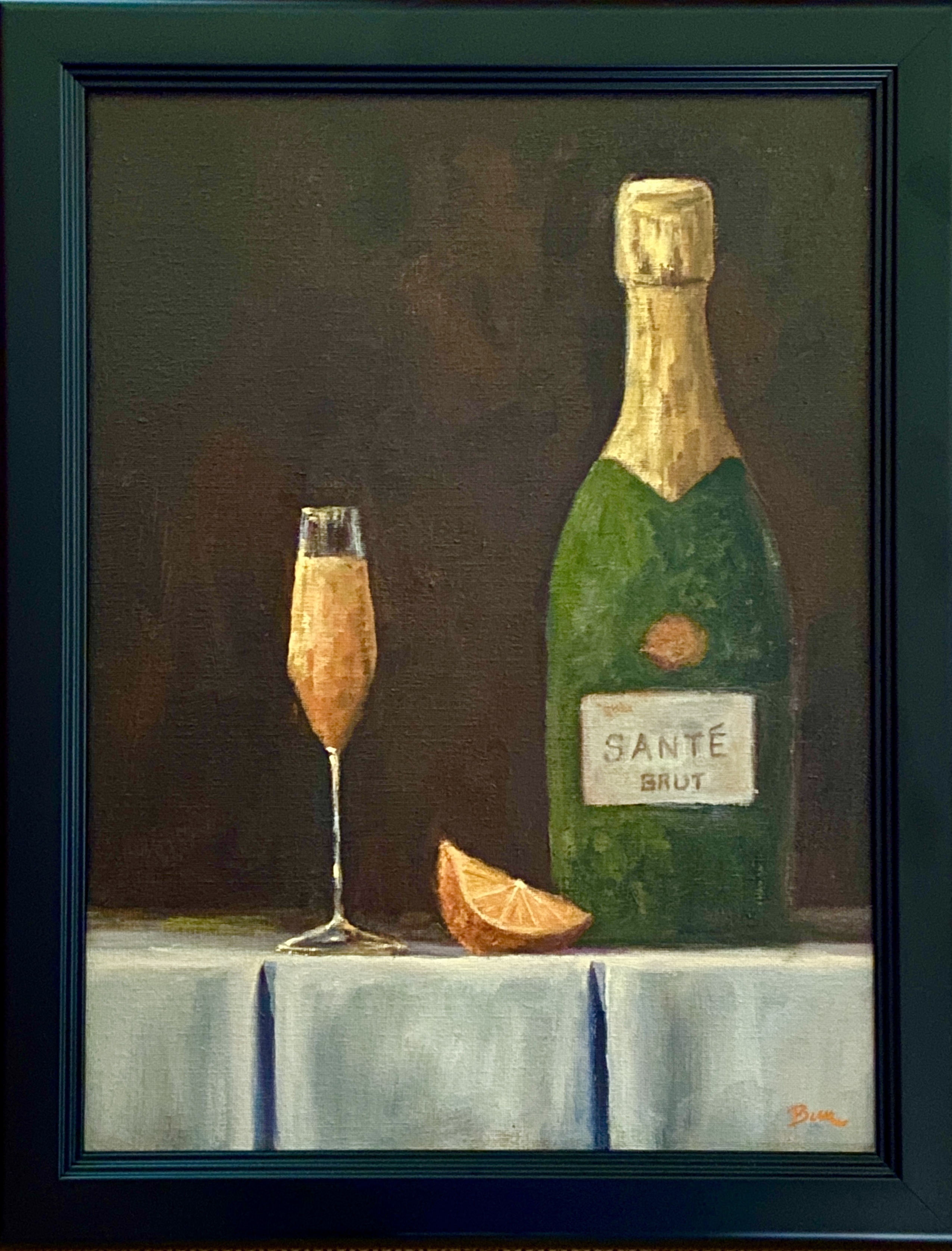
In celebration of brunches everywhere, I present MIMOSA! This was one of those pieces that everything just came together almost effortlessly. I thought this would be one of those still life works that lingered in the studio for weeks or months, starting and stopping as new challenges popped up, taking time to experiment with technique to get things figured out. Nope, nothing like that with MIMOSA. I should have known it would flow easily from the moment I threw together the sketch, which was done in about 5 minutes, nary an erasure mark to be found. Yes, there are imperfections, but relative to initial expectations it was a delight.
The anticipated challenges with MIMOSA were:
1. No reference photos. Everything was going to come from my head. I didn’t have a bottle of champagne available, no champagne flute that fit the idea I had in my woefully lacking imagination, and no motivation to go sift through the rotten produce at my local HEB to find a picture-ready orange.
2. No experience painting foil, much less the symmetrical foil of a champagne bottle.
3. No experience mixing / creating gold hues, as seen in the aforementioned champagne foil.
Most of the challenges noted above were more about the unknown rather than issues from past works. As it turns out, I have a better imagination than I thought it did, and patching together a still life setup is something I should consider doing more often. As to the foil and gold color mixing, either I got very lucky or it’s not that difficult.
One thing that helped quite a bit was the use of broken color, specifically in the mimosa and the gold foil of the champagne bottle. I used the same brush size and stroke direction intentionally, so as to connect the mimosa with the champagne bottle. As it turned out, my persistence of using broken color in other compositions seemed to coalesce in this piece, at least the outcome is something I really enjoy.
Lastly, I tried to fold in some subtle pieces that bring the composition together. The crisply folded white linen represents the formal occasions typical of champagne, contrasted with the faded, dusty look of an old, very valuable bottle of champagne. The orange, more obviously, to provide insights into what’s being quaffed, namely mimosas. And finally, the use of a tall, very slender flute that invokes elegance and formality, contrasted with the more informal, pedestrian offering of a drink mixed with orange juice, the mighty MIMOSA!
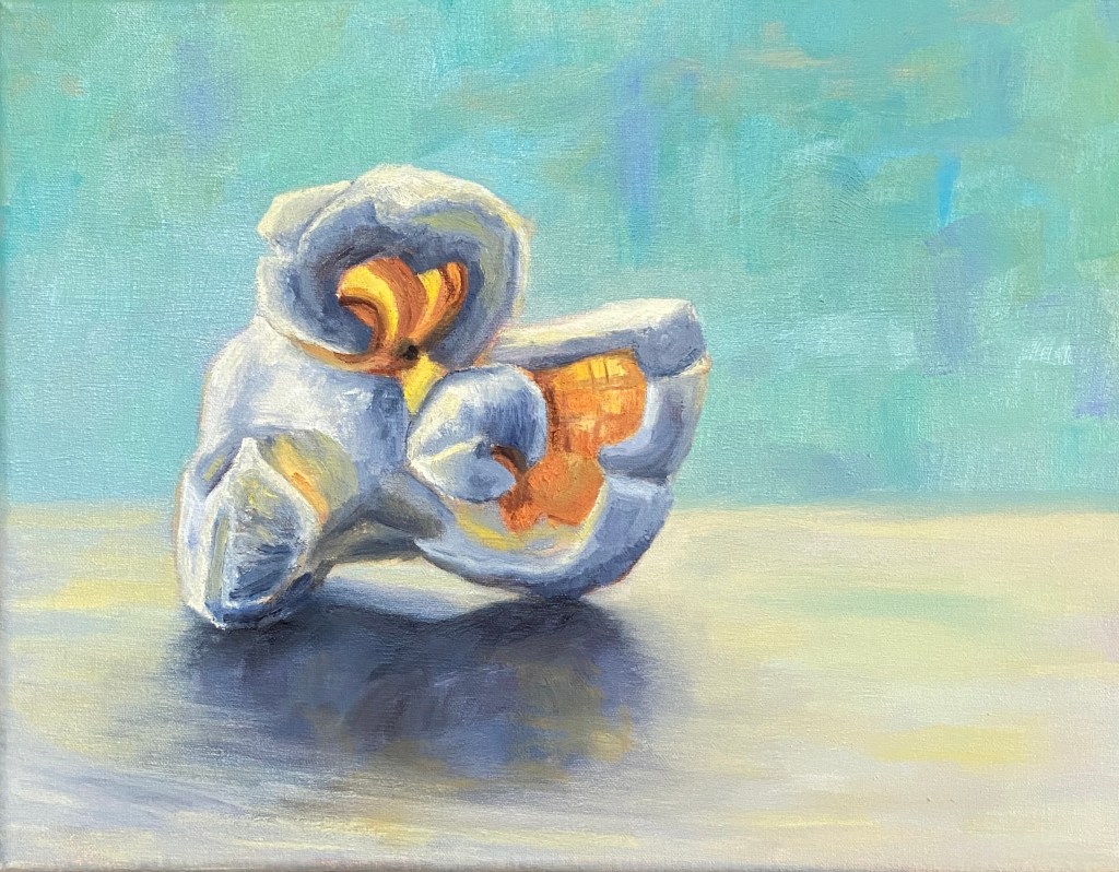
In the spirit of fun and interesting still life subjects, please welcome this tasty kernel… POPPED PERFECTION! This is my second popcorn themed composition, but unlike the original, which featured 3 pieces of the corny goodness, the focus is a single, beautiful popped kernel.
Popcorn is a tricky subject to paint, in large part because there’s nothing standard about any of it’s shapes or surfaces. Had I tried to paint this as a novice I would have found a new hobby and never painted again. That said, when you get it right, it’s a thrill!
There are a number of ways to add artistic interest to this type of still life. I wanted to emphasize the transparent elements of a nice big juicy piece of popped corn, thus the focal points with orange and yellow where light can penetrate. To really make the piece pop (sorry, couldn’t help myself) I used a blue background, which is the complementary hue to orange and therefore provides a strong contrast without having to worry too much about the similar values. Furthermore, the piece is very simplistic in terms of having nothing else on the canvas, which is meant to help it jump off the canvas from across the room.
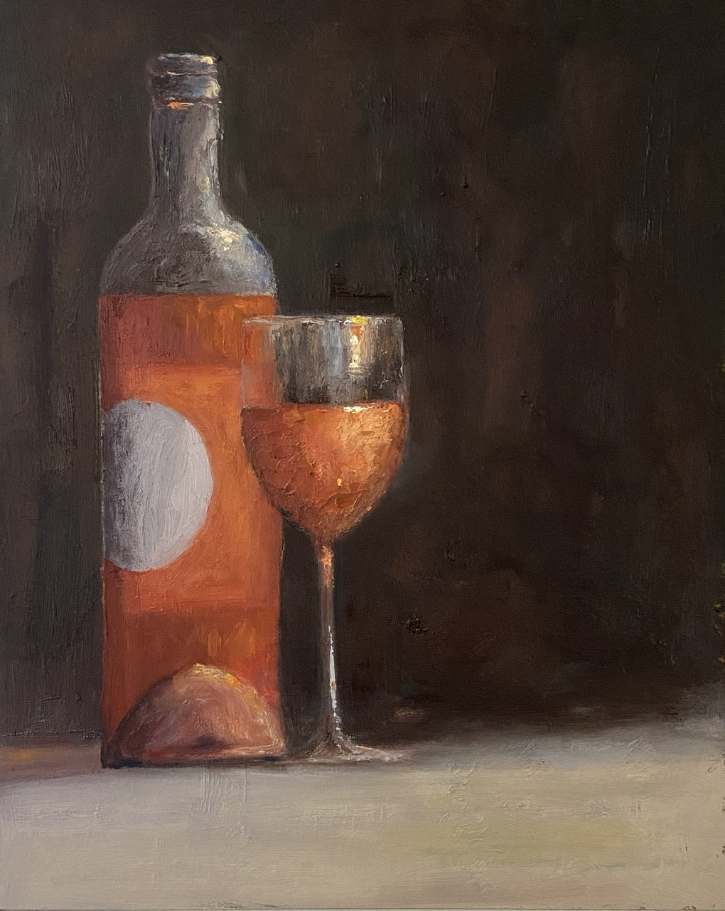
Inspired by travel with dear friends and recalling the joys of the day over a bottle of wine… or two… or three!
When time flies by chatting with friends, so too does the wine, and we all need a friend who suggests “ONE MORE BOTTLE?”. I’m lucky to have such friends.
This composition went through a few iterations and ultimately strayed so far from my original reference photo that it’s not worth sharing. The wine is a rosé from #grassinifamilyvineyards out of Santa Barbara. While I personally don’t care for many of the Santa Barbara area wines (Paso Robles is much more to my liking), the wine and setting at the Grassini tasting room patio was excellent.
The use of a dark background in this composition made for a difficult painting, namely getting the pink/orange color of the rosé to show up properly against the black backdrop. Do a Google search for “still life painting of wine”, sort by images, and see how far you have to scroll to find a composition that’s not red wine and not against a very dark background.
Regarding the largely blank right side of the composition, it’s designed to create tension for the viewer: Why the hell is half of the painting missing? Is it finished? Is there something there I can’t see? The truth is I initially planned to paint an empty bottle in that space, but ultimately felt like it would create more clutter and wouldn’t add anything of artistic interest – I mean who wants to stare at an empty wine bottle. That’s just sad. The artistic vacuum I opted for instead feeds to the ONE MORE BOTTLE theme.
Let me explain.
If you note the amount of wine in the glass and what’s remaining in the bottle, it’s pretty clear there is more in the glass than what’s not in the bottle. The viewer is left to assume that ONE MORE BOTTLE has been procured and the wine in the glass is actually what was from the previous bottle and perhaps a little topper from the new bottle.
Finally, rosé is a wine for daytime hours (at least for me), so the dark background and soft light indicates early evening or dusk, which in my mind is how time among friends can fly by – namely you start visiting at lunch in the light of day with a bottle of rosé and the next thing you know you’ve filled the recycle bin and it’s damn near time for dinner!
For the artists out there, a few notes of interest. First, there’s a lot of texture on the painting surface, which is largely a byproduct of dumb luck from working over a previous painting. Sometimes textures from old paintings are a real pain in the ass, which is why I usually gesso or sandpaper them to a smoother surface. However, this is the second painting I’ve done recently that’s used a previous failure and I neglected to smooth the surface. I gotta say, I prefer the textured option.
Lastly, I used a palette knife to do the wine in the wine glass to add texture and realism. Rosé is a chilled wine, so the glass has to have some element of water beading or glistening. Furthermore, it helps add visual interest with impasto-like thickness.
Thanks for reading and cheers to all your close friends!
As you well know about my artwork, I like to bounce around with subject matter and styles. This week’s work is a return to still life that I can relate to, namely a dram of whisky, in this case The GlenAllachie from the Speyside area of Scotland.
The artwork style is influenced by the work of Neil Carroll, the whisky by Billy Walker (more on him later). What I like about his work is the realistic look of the glass as it’s affected by the drink, be it beer, whisky or a pile of strawberries. He’s masterful with reflections, glass sweat (don’t know if that’s a real thing, but sounds good to me), and other elements that give a sense of realism while maintaining a painterly look.
WEE DRAM is a nod to the best Scotch whisky I’ve ever tasted, The GlenAllachie distillery in Speyside just outside the town of Aberlour. My wife and I visited this fantastic distillery on a recent trip to Scotland and loved everything about their operation – the people, the idyllic location, and of course the whisky. They have something really special going on at this Speyside gem, with Master Distiller, Billy Walker. We came home with one of their finest offerings, a 2006 Single Cask limited edition for The Spirit of Speyside Whisky Festival 2022, which serves as our new “special occasion” libation. While the 2006 Single Cask is no longer available, it looks like they’ve done it again with a 2007 Oloroso Puncheon. Fantastic!
The GlenAllachie DistilleryExceptional Single Cask Whisky
The challenges with this piece were largely in the balance of orange, red, and yellow that seem to shift and shine in the glass. One of those situations where the actual whisky looks a little fake when you really think about it – I mean where does that bright yellow sparkle come from?! I’ll have to try this again with a lighter background, allowing the whisky hues to be the star of the composition. I might need to go get another bottle from the GlenAllachie collection!
Hopefully you have a special occasion libation in your home. If not, go to The GlenAllachie have a dram of their magical elixir and bring home a bottle.
Pardon the vanity post, but I had to share the news that my avocado still life, “Just the Ripe Size,” has been selected for inclusion in a national juried show at Main Street Arts in Clifton Springs, New York.
The show runs November 5 – December 23, 2022. See the Main Street Arts website for more pics and information www.MainStreetArtsCS.org. If you live in upstate NY you can attend the opening reception on November 5th – there will be wine and prizes. For the truly ambitious art enthusiasts, you can also make a purchase… or two. After all the show is full of smalls, so prices tend to be more tempting.