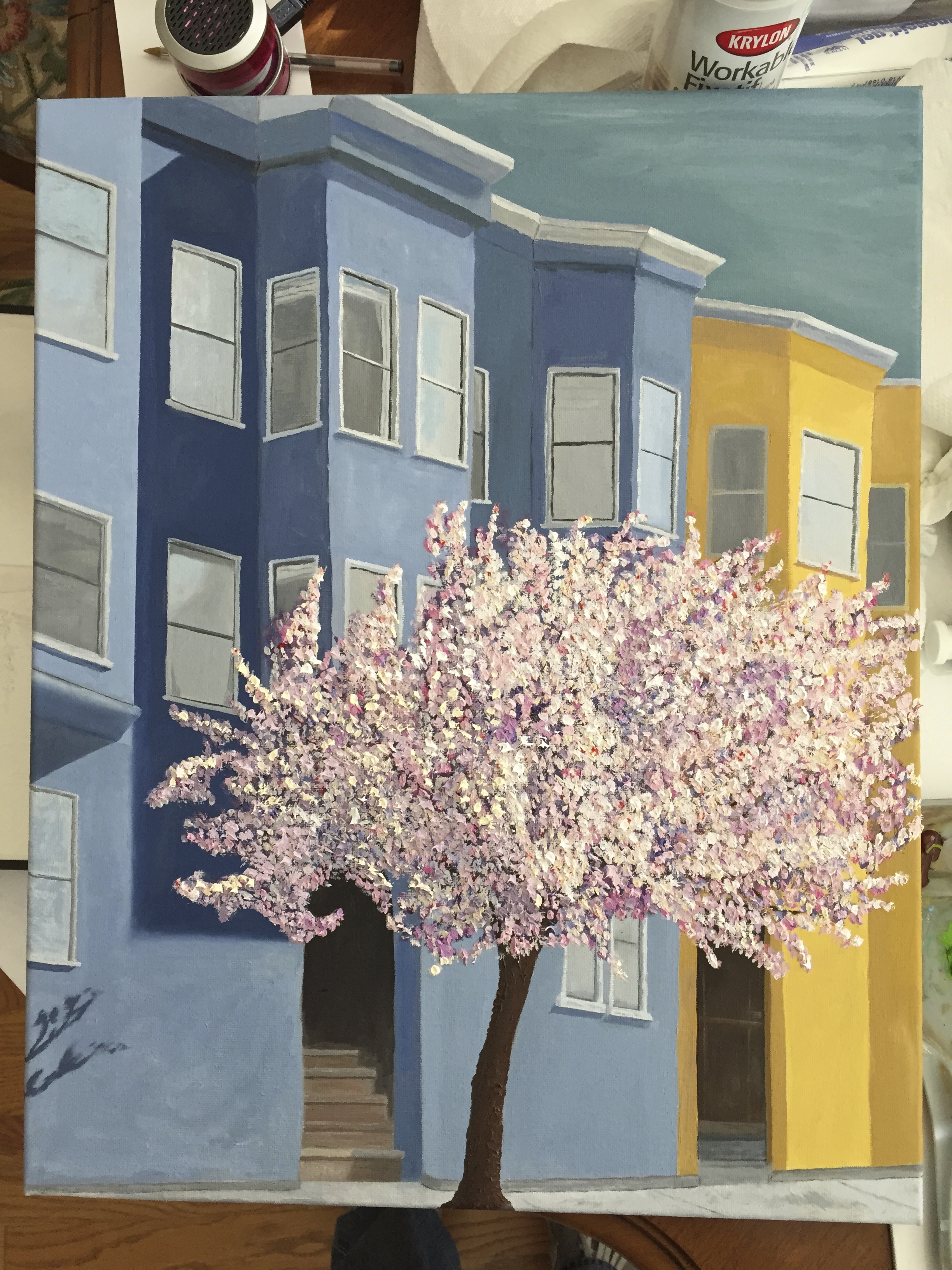
Overdue for this post, given that I finished this one a few weeks past, but better late than never. The final “touches” took more time than I thought, but it was important to get the depth of the tree right, which took some long steps out of my comfort zone with a very high value white to represent the bursting blossoms in bloom. It was a bright day, so the photo looked washed out and a little flat, so I went with my gut on what would work on the pseudo shady side (left side). Probably could have gone a little darker to add the right value contrasts, but at some point you have to say “done”!
In addition to the density and value range updates for the cherry blossom, I added more focus to the windows directly above the main doorway. Notice the curtains in their various states of being drawn up or back.
Having taken time to consider the finished painting for the past month, I’m happy with the technical variation and palette. However, as a composition I think it’s lacking. I tried to draw the viewer into the painting in a few ways: 1) the shape of the tree on left side curled around the entrance to the 2) main doorway with the stairs leading light steps up into the darkness, and 3) with more crisp details in the windows immediately around the top of the tree. There’s also some good compositional layout with the various angles of the building lines. That said, I don’t feel that the painting does enough to engage the viewer. I’d be interested to know what others think, so please offer up your criticisms, comments, guidance.

Great job, Bern! I just looked at your older posts — very impressive progress. what a learning experience, once again, right?! I also looked at the reference photo, and if there is any compositional problem, it might be with the photo, not with your painting work. If the tree is to be the focal point, then the building, which are beautiful,, and very well done, are a bit of a distraction from the tree. If the buildings are the point, then the tree might be distracting for the viewer. Personally, i would vote for the tree. Perhaps — if you were to do it again, but why would you?! — you might mute the buildings just a little, or move them further back. It wouldn’t match the photo, but it might help the composition issue you raised.
LikeLike