More European inspiration, this time from a little city called Cuenca, Spain, which is located about 100 miles east of Madrid. Cuenca is magnificent and thankfully not on the itinerary of the selfie-taking, speaker phone talking, culturally ignorant hordes. This city is in the mountains, founded by the Moors (like most everything in central Spain), and best known for their hanging houses, called “casas colgadas”. In my view, they’re the original “room with a view” architecture, and it’s frankly amazing they’re still clinging to the cliffs.
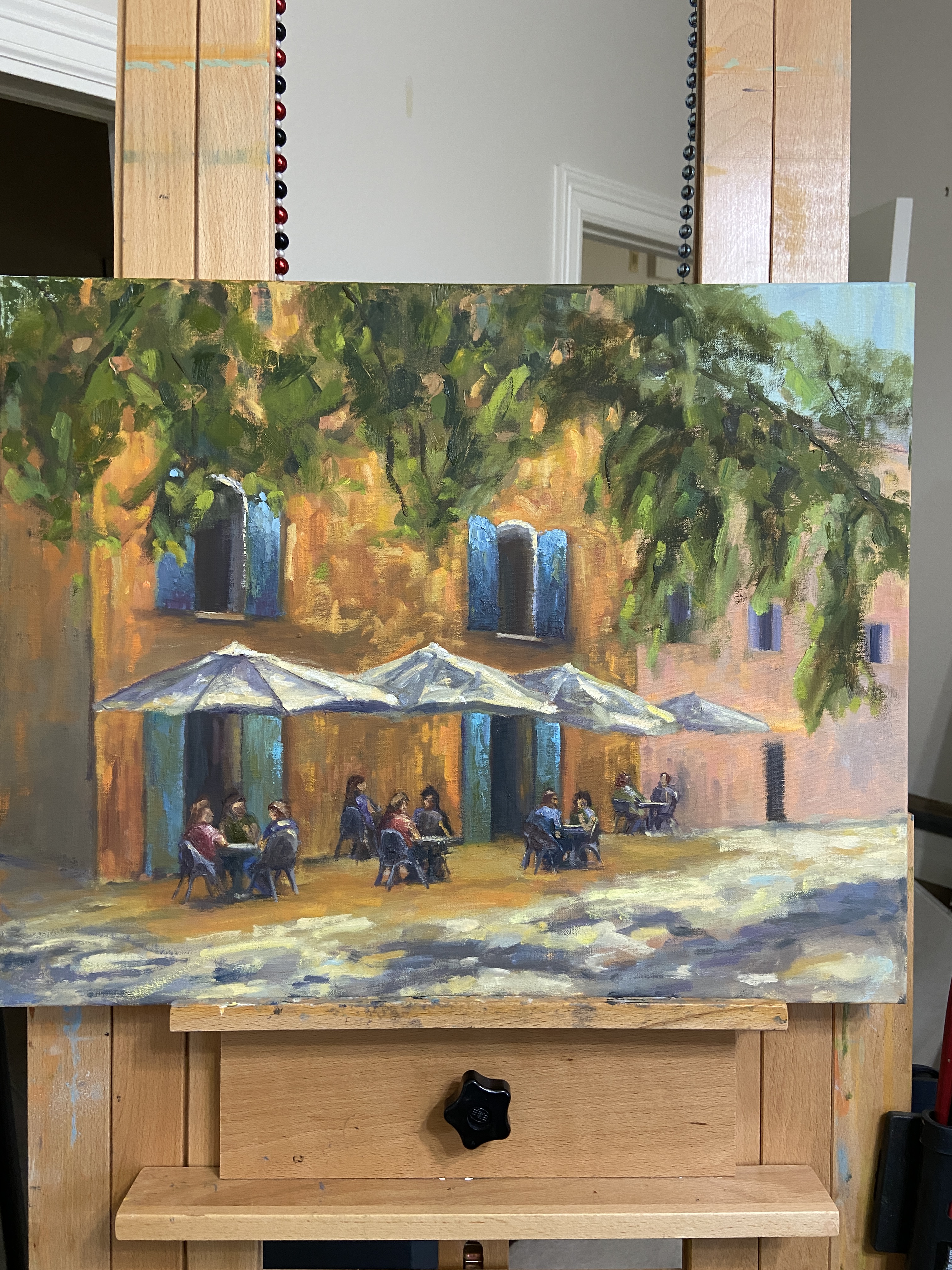
We were visiting in late May and did a lot of strolling as we explored the old town. This particular scene is from the Plaza Mayor, looking north towards the Cathedral of Santa Maria and San Julian of Cuenca. Even during this morning hour, there was a lot of activity and the city had a sense of energy and vitality, which I’ve tried to capture with this piece.
Initially, the intent was to do a quick study in preparation for a larger piece. While I still intend to do a larger, more composed painting, I kept getting sucked into the details of CUENCA. There are two focal points – I know, I know, that’s not how the rules work – but I’ve developed the opinion that multi-focal point perspective in a composition can work really well. In this case, focal point 1 is the Cathedral, which anchors the background as it captures the morning light before the rest of the buildings. Focal point 2 is the guy in the foreground walking right at you, also touched by the light, contrasted by the shaded patio immediately behind.
Lastly, there are various bits of sky blue incorporated through the piece. It’s an experiment to see if it gives the viewer the sense of having a relatively blue sky overhead, adding to the depth of the painting. Not sure if it works because I was actually in Cuenca to take this photo, therefore I always have that sense of a sky overhead when I think about this scene.
If you haven’t been to Cuenca, Spain… go! The setting, sights, food and people are wonderful.
Thanks for reading!
#austinart #artbern #berntx #crashboomzip #abplanalp #austinartists #pleinair #cafe #spanishcafe #spain #cuenca #patio #europe #atxart #atxartist #atxlife #contemporaryart #spainart