This is the first of numerous drawings I’ll be doing over the course of the coming 30 days. There are a number of goals involved with this exercise. Initially, I was going to set a lofty goal of a drawing-a-day, but reality has set in and the target has been tempered to draw-a-day.
This drawing, ROSE, is from day 3 of the challenge. I’ve done a painting called YELLOW ROSE in the past, based on the same reference photo, so it was interesting to return to this after a few years. I was surprised how quickly this drawing came together; some sort of long-term artistic muscle memory.
The other benefit of a self-imposed 30-day draw challenge is that it drives me to practice potential new compositions. Doing a quick sketch of a painting subject is helpful in the field for plein air, and for studio work, but sketches are typically done to refine the compositional strategy. However, doing a more complete drawing answers the question, “do I want to paint this?” Sometimes, you get into the details of a painting and realize that it’s not any fun because it’s either beyond your skill set, too tedious, or simply not very exciting.
In the coming weeks, stay tuned for more drawings auditioning to become paintings!
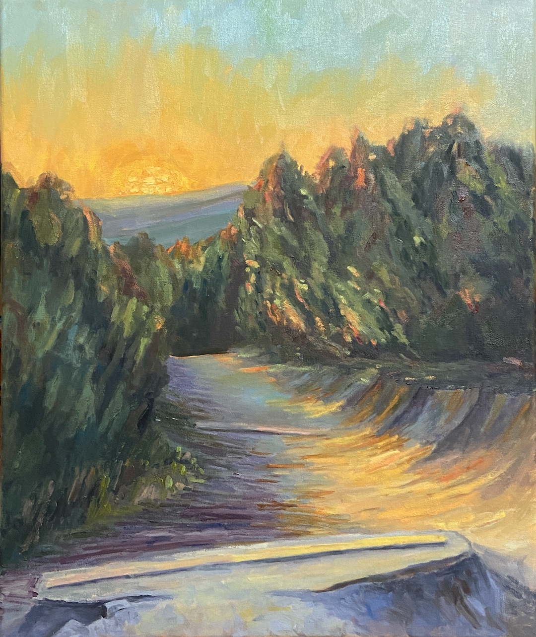
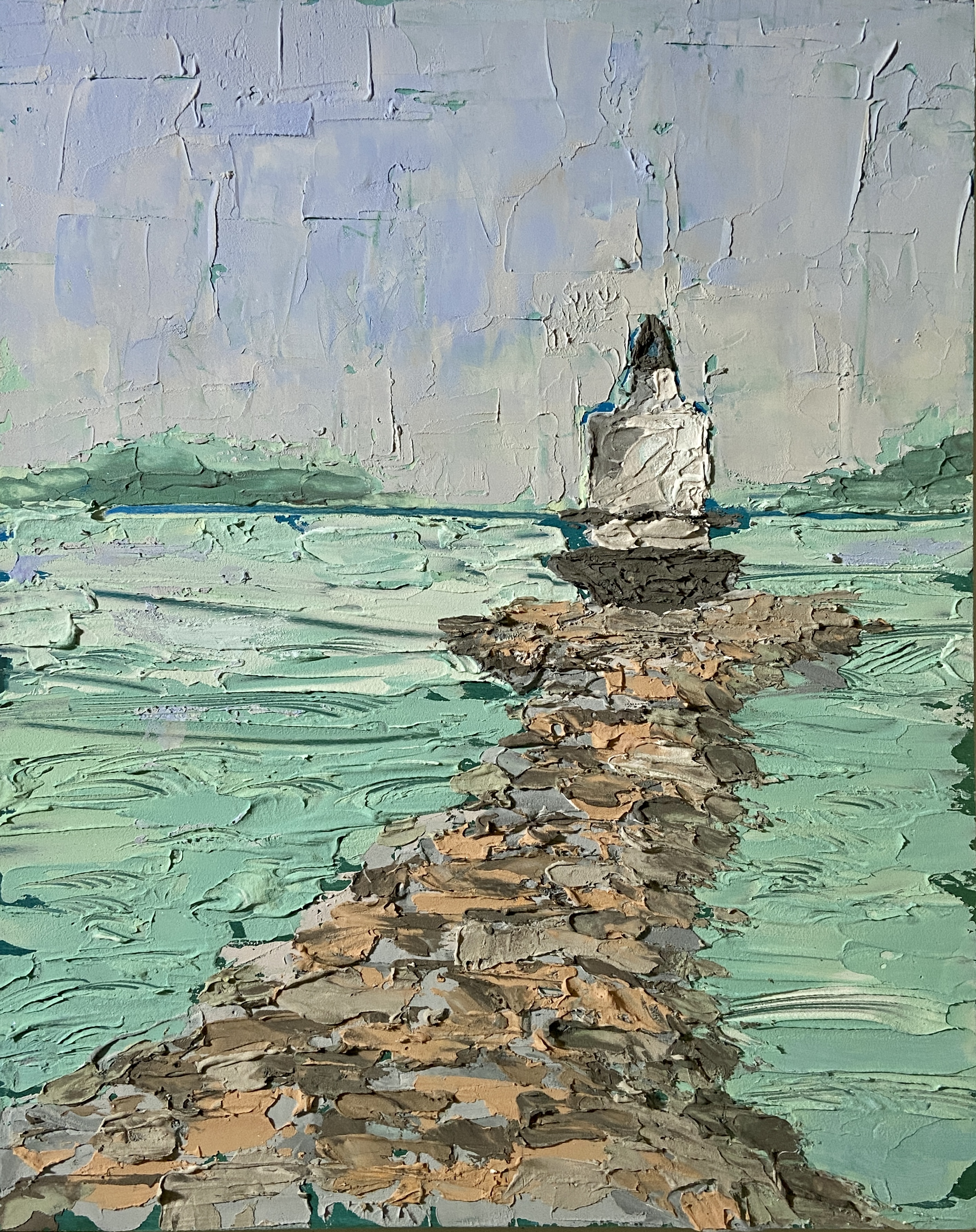
Say hello to the inaugural composition for 2025, HILL OF LIFE. If you’re a mountain biker living in Austin, then you know. For the rest of you, this is the northern endpoint of the Barton Creek Greenbelt, 7 miles upstream from one of Austin’s most iconic sights, Barton Springs.
It’s fitting that the two ends of the greenbelt are polar opposites. The southern end is accessible via a short walk from a parking lot, and is suited for swimming, cooling off, and relaxing in the shade of live oaks. Conversely, the northern entry is a sketchy ride down a steep, rocky, 300 foot drop-in and is suited for mountain bikers with a death wish or adrenaline junkies.
The HOL is actually an old maintenance road that was used (I believe) by the city to access the trail in emergencies, be it fire fighting or EMS services for some poor bastard who’s riding skills couldn’t cash the check their ego was writing. Over the years, the road was decommissioned and all that remains are the cement joints that connected the main sections. Over the years, erosion has created big “steps” off the lip of these joints… and therein lies the focal point of HILL OF LIFE. Oh, and great sunsets, too!
This piece started with plein air sketches, which was easy to do given this location is a 5 minute hike from my house. I had intended to do a plein air study from this location, too, but after the sketches and my own personal experience with this trail over 20+ years, I felt like a study wasn’t necessary. So I teed this up in the studio and started throwing paint at the canvas!
Hill of Life Old RoadHill of Life SunsetImpasto SunHill of Life Kerbey Lane Show
The obvious focal point is the huge setting sun, but I also consider the darkest section, namely the last ledge down the trail, as a main hook for the viewer. The odd looking concrete bar at the base of the painting is one of the aforementioned joints in the original road, which makes a little more sense when you look at the painting and reference photo side-by-side. I spent considerable time ensuring this was more realistic than impressionistic to garner interest in the piece, hopefully without causing confusion for those who haven’t been to the Hill of Life.
Lastly, the sun is done primarily with thicker paint application using a palette knife, which gives it more texture and a stronger presence on this larger canvas. It also allows for more blending, which I find helpful when trying to nail the value and warmth of something as intimidating as the sun.
For those of you in the Austin area, this piece is part of my solo show, “Something for Everyone”, on display (and for sale) through end of June at Kerbey Lane in San Marcos.
Greetings and Happy New Year!!! I’m kicking off 2025 with my first solo show courtesy of Kerbey Lane in San Marcos, TX! Given there are 25 pieces on display (all for sale btw), ranging in themes – still life, landscapes, even some pure whimsy – I’ve decided to call it “Something for Everyone”.
The process of hanging art at a restaurant during regular business hours was a bit intimidating, even on a slow Monday mid-afternoon. However, everything went well because it turns out my wife has a heretofore undiscovered talent for gallery design and hanging paintings! She was awesome… literally couldn’t have done it without her.
Some of the pieces on display are brand new – paint might not be entirely cured if I’m honest – while other pieces were part of my personal home collection, so this is their first foray into the real world. The show will run January through June, so be on the lookout for new works being added in the coming months.
I’ll be adding a special section to ArtBern that highlights the various pieces in “Something for Everyone”, so be on the lookout later this week.
One last item of note. A hearty THANK YOU to all the great staff at Kerbey Lane! They were welcoming, helpful, and wildly enthusiastic about the art. Knowing that they were excited to see the wide range of themes and subject matter, well, it was beyond rewarding for me to get that kind of feedback while hanging and effectively being in their way for 2 hours. Hey @kerbeylanecafe San Marcos, y’all are wonderful!
Thanks for reading!
Kerbey Lane San MarcosDining Room BoothsBar BoothsBathroom Waiting AreaTV AlternativesRiver View
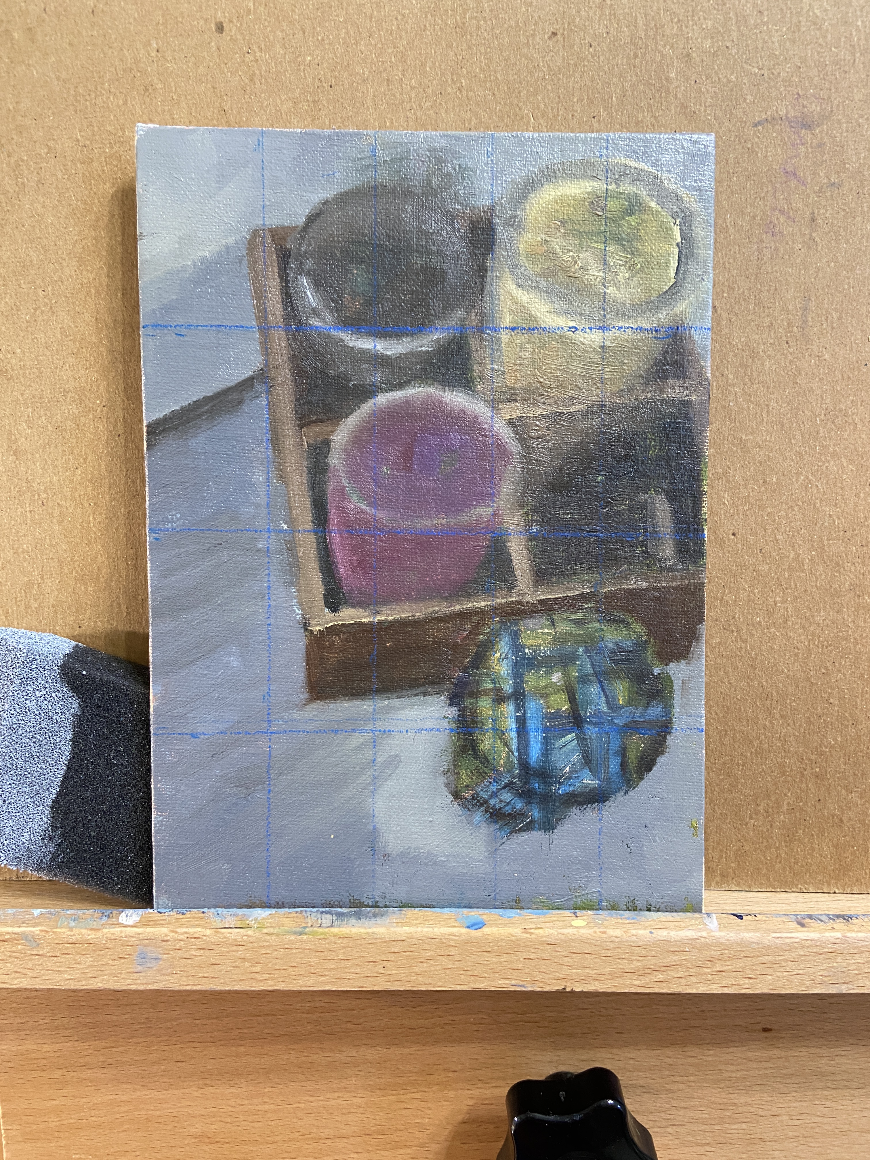
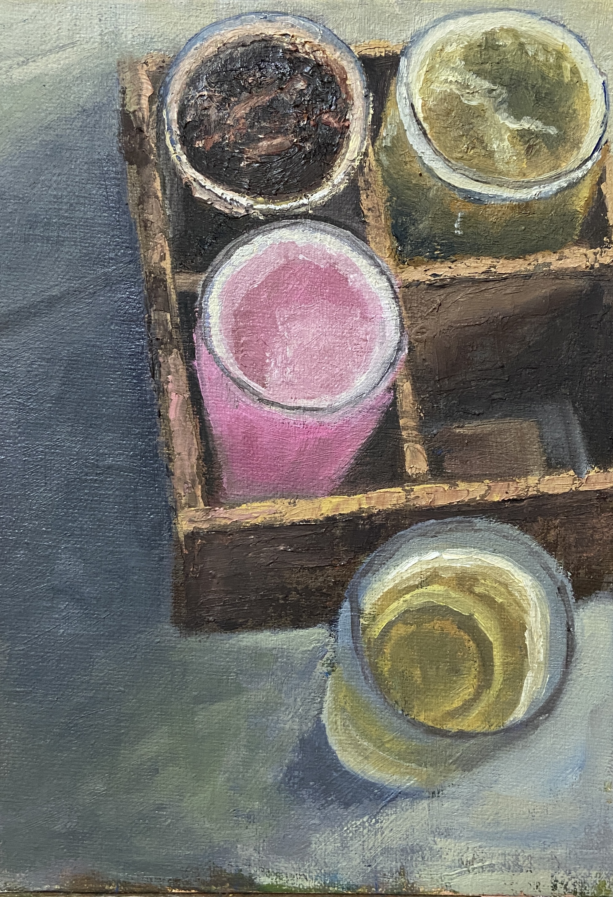
This piece was done earlier this year using a reference photo I took while in Portland, Maine. Most of my works in that area are either “en plein air” or based on my own coastal reference photos. For those of you who have followed my work over the years, you well know I tend to veer to still life from time to time, with a particular affinity for libations. Thus, BEER BOX, technically a beer flight, from Rising Tide Brewery in Portland comes as no surprise.
For the painters out there, remember the use of photo reference is a blessing and a curse. On the one hand, they capture a place or moment for future reference, when perhaps your memory might not be willing to cooperate. On the other hand, they can significantly distort reality and create more problems than they solve. While most of what you read about “painting from photos” (virtually every painting book covers this point) emphasizes the distortions created by photos relative to lighting and hues, IMHO the real terrorist activity of reference photos is their ability to jack with shapes.
In BEER BOX, I overlooked the shape shifting my iPhone had done to “improve” the photo. I even used a grid to try and get the shapes right, something I rarely employ, and I still didn’t realize the reference photo was just a bit tweaked! It’s hard to notice at first, but the top portion is actually skewed outward, kind of a mini fish-eyed effect. I noticed this after I’d already committed to the compositional structure, so I just rolled with it to see how it would turn out.
In the end, this piece proved to be a perfect mix of frustration and satisfaction. I think it turned out well, despite the odd birds-eye view, and I learned a lot in terms of subtle hue and value changes required to capture the depth of the beer box and how the glassware fades into the deep shadows.
BTW, Rising Tide Brewery makes some great beers and should be a stop on any Portland, Maine brewery crawl. I don’t recall the specific beers in this flight, but the 4 styles were Stout, IPA, Pilsner, and the pink one was a delicious Sour.
Day 2 of EAST Austin Studio Tour was a huge success for the Plein Air Austin group show! Lots of foot traffic at arguably the best location in the entire EAST show at EASTBOUND, a beautiful facility that had lots of people asking “how the hell did @pleinairaustin pull this off?!” Join us at a paint-out or better yet become a member and find out all our secrets.
On a personal note, I’m honored to have sold 3 original pieces this weekend. Headed to new homes are “Smoky On Ice”, “Spring Point Ledge Lighthouse 2”, and “Strolling Dog.”
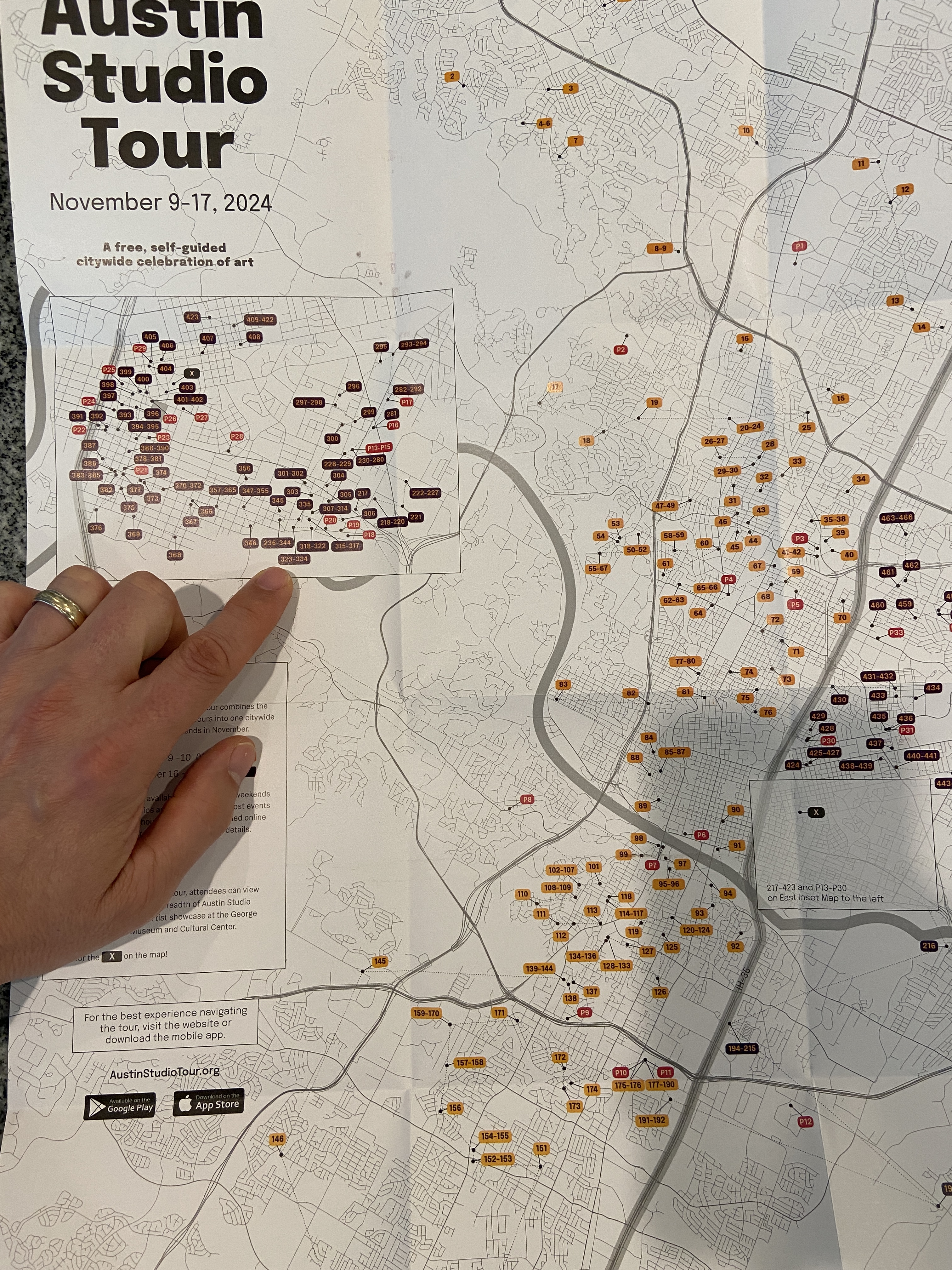
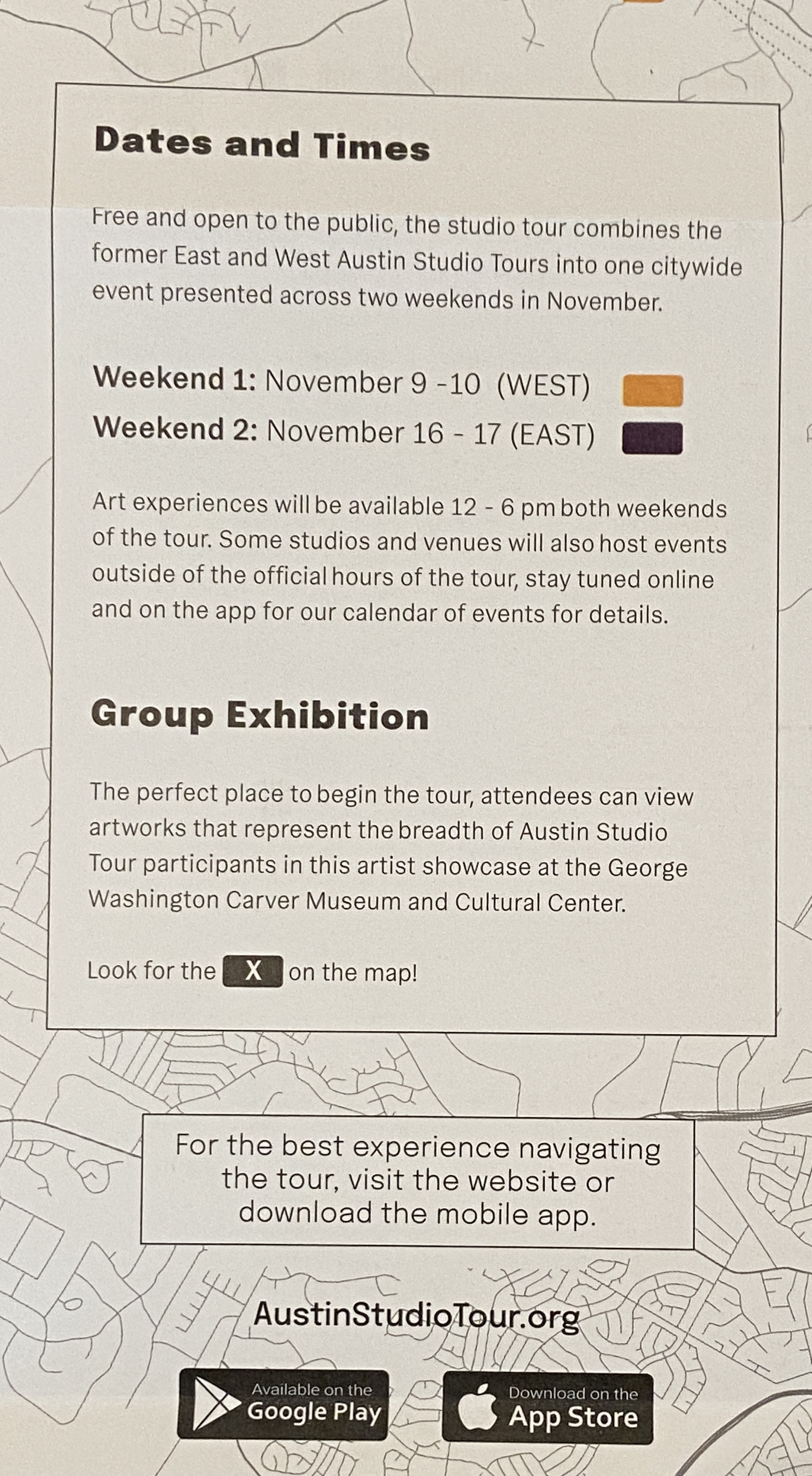
Exciting news on the art event front… I’ll be participating in the 31st edition of the Austin Studio Tour the weekend of November 16 & 17th! For those of you in the Austin area, if you haven’t checked out the studio tour in the past, I highly recommend it, even if I weren’t involved. It’s a very rare Austin event that’s chock full of talented artists, free of charge, and it doesn’t take over Zilker Park or Auditorium Shores for the month!
The Austin Studio Tour, in a nutshell: over the course of two weekends, more than 400 artists open up their studios or display in public spaces/galleries… for FREE! The city is basically split into East and West sides (I35 being the demarcation), whereby weekend 1 is “WEST” studio tour, and weekend 2 is what I like to call the OG “EAST” studio tour.
Weekend 1 is today and tomorrow, Nov 9 & 10th, weekend 2 is Nov 16 & 17th. Official opening times are noon – 6pm each day, but there are some that open beyond those times, including Friday evening.
I’m stop #327 at a building called EASTBOUND located at 3232 E Cesar Chavez St. I’ll be joined by a dozen of my painting friends from Plein Air Austin, well, more like I’ll be joining them, so visitors get a chance to see a TON of art at a single location.
I’ll have at least 20 pieces of original artwork for sale, including a bunch of new pieces that will make their debut at this show. It’s a mix of plein air originals, studio work, and per some interest from friends and family I’ll be adding some drawings to the mix.
Stay tuned for more updates, including a list of other artists showcasing their talents at our location, live plein air demo details, and “Beers with Bern” after party locations.
Get out and explore the talent of Austin artists! Hope to see y’all next weekend!
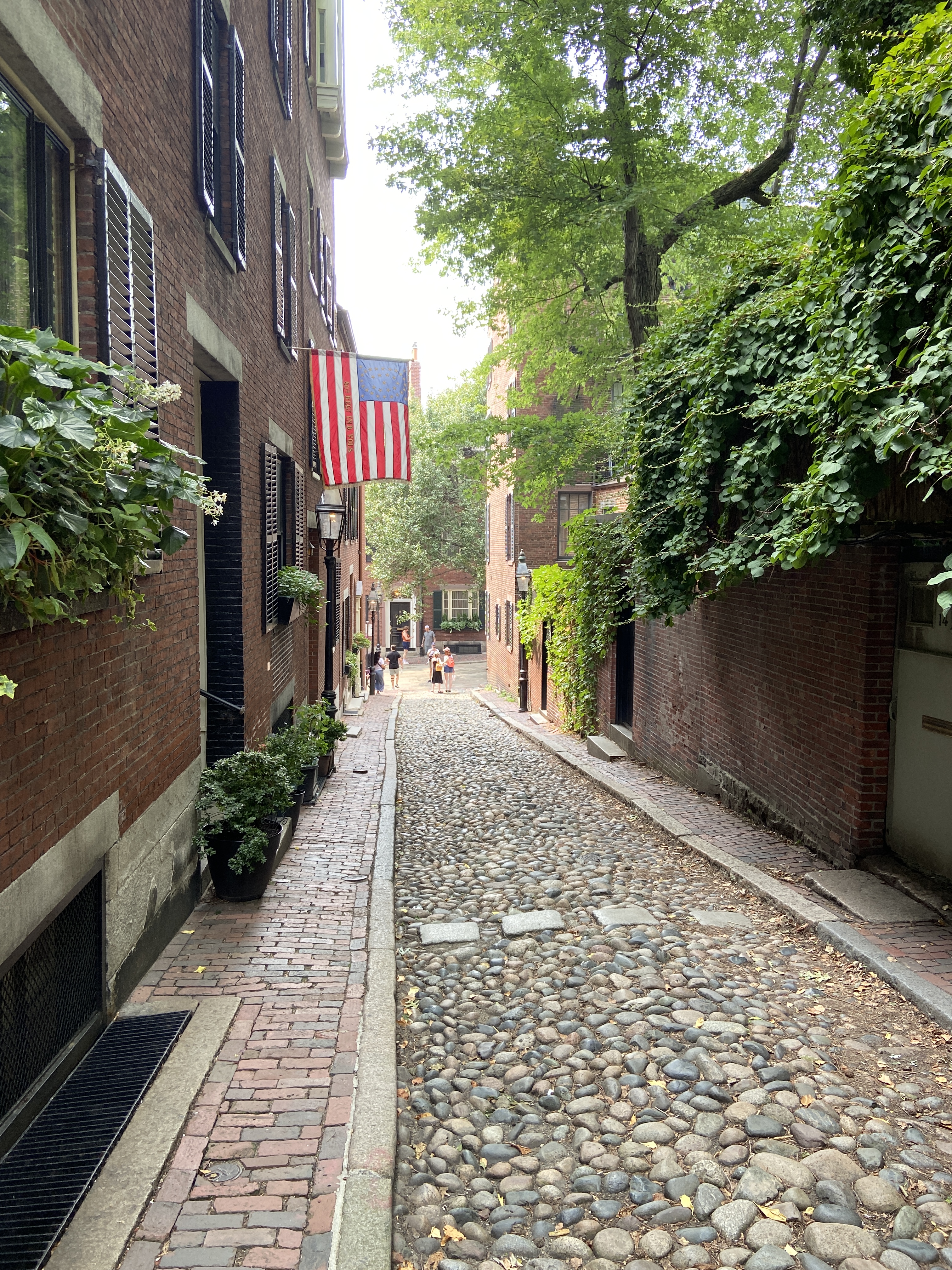
ACORN STREET progress ACORN STREET | 12×9 | Oil on Art Board
As promised, here is the finished work (maybe) of the ACORN STREET study. I say “maybe” because I might opt to add people and give it more activity, but I also like the calm, quiet morning vibe this gives off. I’m guessing the early mornings are the favorite time for the residents of this street as the tourist throngs are still in their AirBnBs second guessing why they hadn’t opted for a hotel with an in-room coffee machine and room service.
I wanted to ensure value contrasts and a loose painting style were key elements of this piece. The flag and sunlit building opposite were intended to draw the viewer down the street, which wasn’t difficult to do as this composition kinda designed itself. The big challenge since the original progress post was adjusting the light from the photo reference so that it realistically “hit” the flag, which meant letting it sneak up the end of the street more than was originally planned.
Lastly, the cobblestones were a last minute addition. I was trying to avoid anything too detailed in an effort to keep the painterly feel, but anyone who’s been on this street knows the cobblestones are integral to the charm. I need to refine my technique in future work, but there are a lot of cobblestone streets that I’d love to paint in the future!
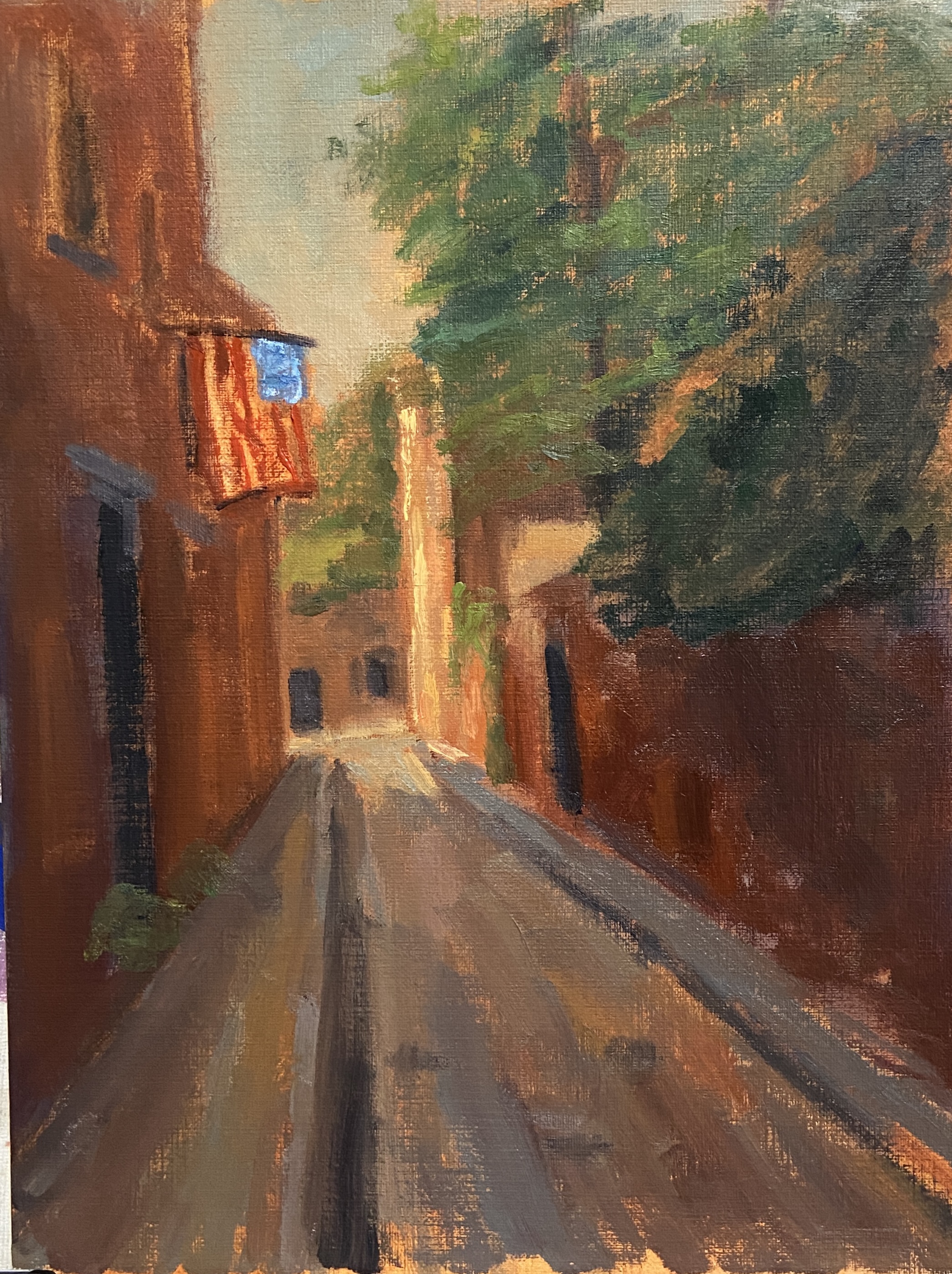
New work-in-progress, ACORN STREET, oil on canvas board. This piece is also serving the purpose of a study for a larger composition, provided it turns out well. It’s off to a good start, though, but it will take a few more hours on the easel to get there. The perspective and values are solid and should provide the foundation for an eye-grabbing painting.
This was also my first session as a student in an open studio class taught by Robin Cheers. Her artwork is beautiful, very painterly, and really captures a sense of place and activity. As an instructor, she made a very strong first impression and provided some great insights that will go a long way to improve my technique.
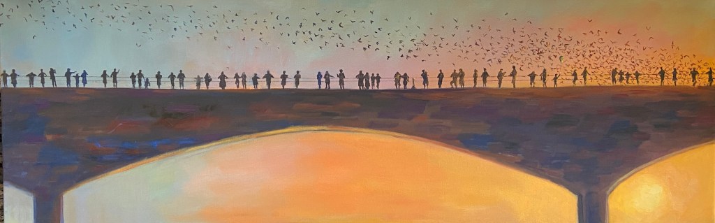
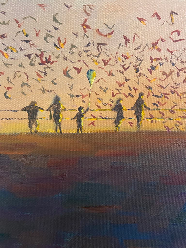
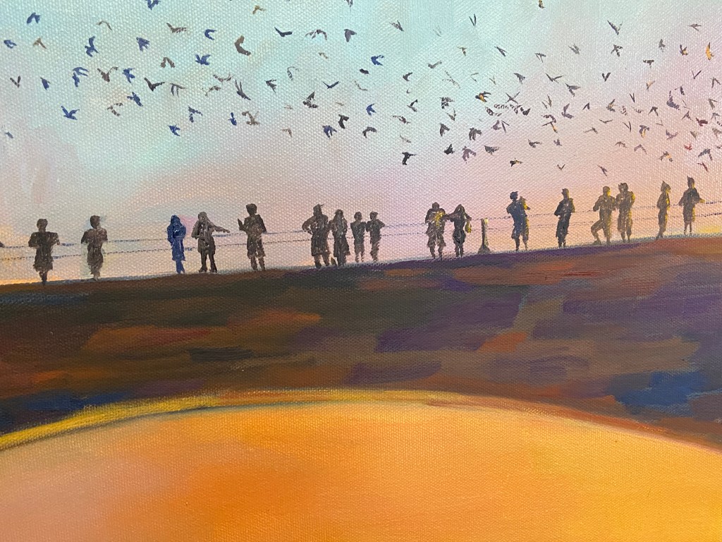
This piece is inspired by the bat colony under the Congress bridge in Austin, Texas, but note they are not the focal point. The 56 silhouettes along the bridge are the intended focal point, which as a group, show the evening observations of the bats on a summer evening. However, as you look at each individual person, you can see how their experience is unique. Hopefully you, as the observer, have some emotional response to some of these folks.
The sun plays a big part in this composition, cascading it’s golden light across the landscape, creating some strong value contrasts not only on the horizon, but also on the silhouettes, especially those on the right side of the bridge. It also creates a balance between warm and cool hues, with subtle purples in the middle creating a temperature transition. Lastly, the sun has been finished with a palette knife for an impasto effect, which helped amp up the brilliance.
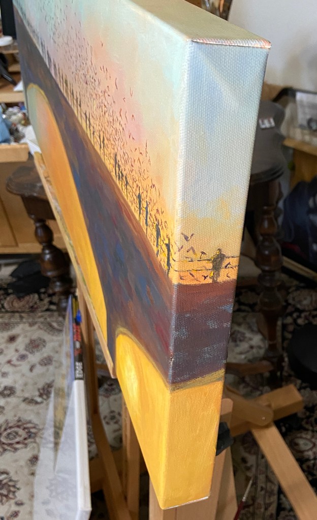
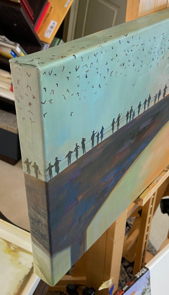
Another element of the composition is the use of the 1.5” edge of the canvas, allowing the bats and silhouettes to flow around the frame. The figures on each side are looking into the painting, which should help direct observers into the composition.
Stay tuned for additional bridge silhouette paintings!
The bats are coming! This is a skrawing, or is it a dretch… I dunno, whatever you call the in between gray area of an informal sketch and a structured drawing. Regardless, the plan is to do a larger piece, at least by my standards, of the iconic Austin bats departing their home under the Congress Street bridge.
The focal point will be the silhouettes of the people on the bridge, secondarily the bats. The anchor, not something that’s officially a painting term as far as I know, will be the brilliant sun in the lower right corner, which is very tricky in a drawing, so you’ll have to use your imagination. The value contrasts will be extreme, so balance is going to be key. Why I’m attempting this is beyond me…