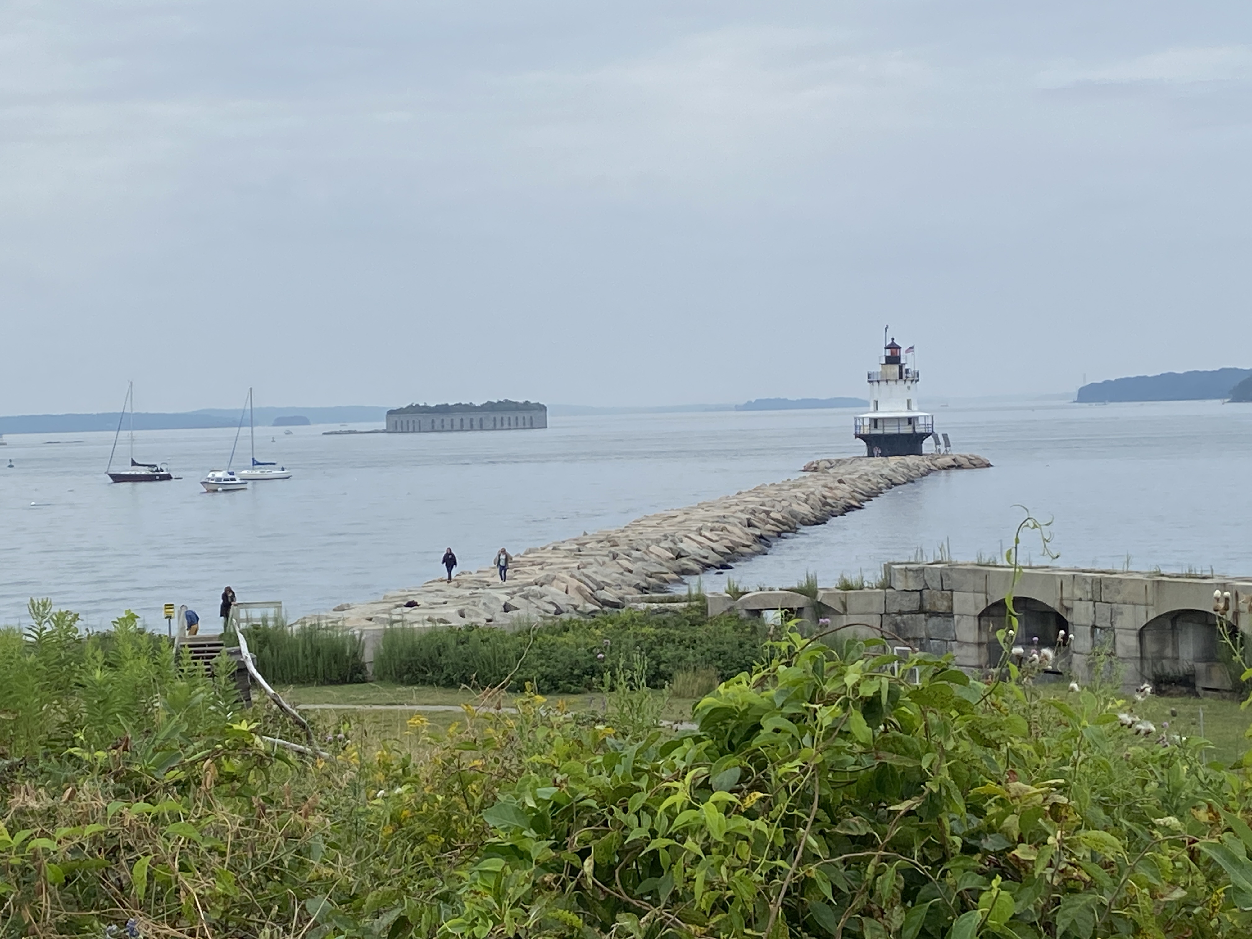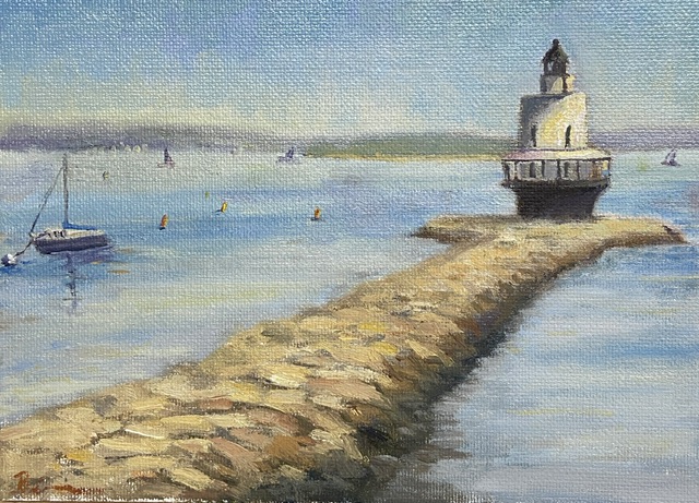
Finished! I’ve posted a couple of progress related updates regarding this composition and I’m happy to say the 3rd time is a charm… this one’s done! If you look at the previous progress post, you’ll notice the removal of the tiny island fortress of Fort Gorges, an extreme application of artistic license. It was giving me fits compositionally, in part because the intent to use it as a balance with the lighthouse on the right was more of a distraction than something complimentary. I was going to simply mute the greens of the trees and push it back in the scene, ensuring the lighthouse was the focus, but what I discovered was that it’s such an unusual structure that it took over the composition as the viewer is sucked into wondering “what the hell is that?” I mean seriously, how often do you see an old fort on an island with a miniature forest growing in the center? I tried to convince myself that I painted it so realistically and thus it was a distraction, but in reality it’s simply weird to see out of the full context of Casco Bay, so I wiped it out… in the interest of artistic integrity.
The fort was easy enough to wipe out, but the issue it was meant to address, namely a well balanced composition, was still a problem. Not a pro at just dropping shit into a painting out of thin air, this seemed like a good scenario for practice. I’m pretty happy with the result, but it took a conscious effort to ignore details and simply work in some loose brush strokes. I also incorporated some of the ubiquitous lobster buoys found in and around Casco Bay, and lastly some distant sailboats to give the sense of an active afternoon on the water.
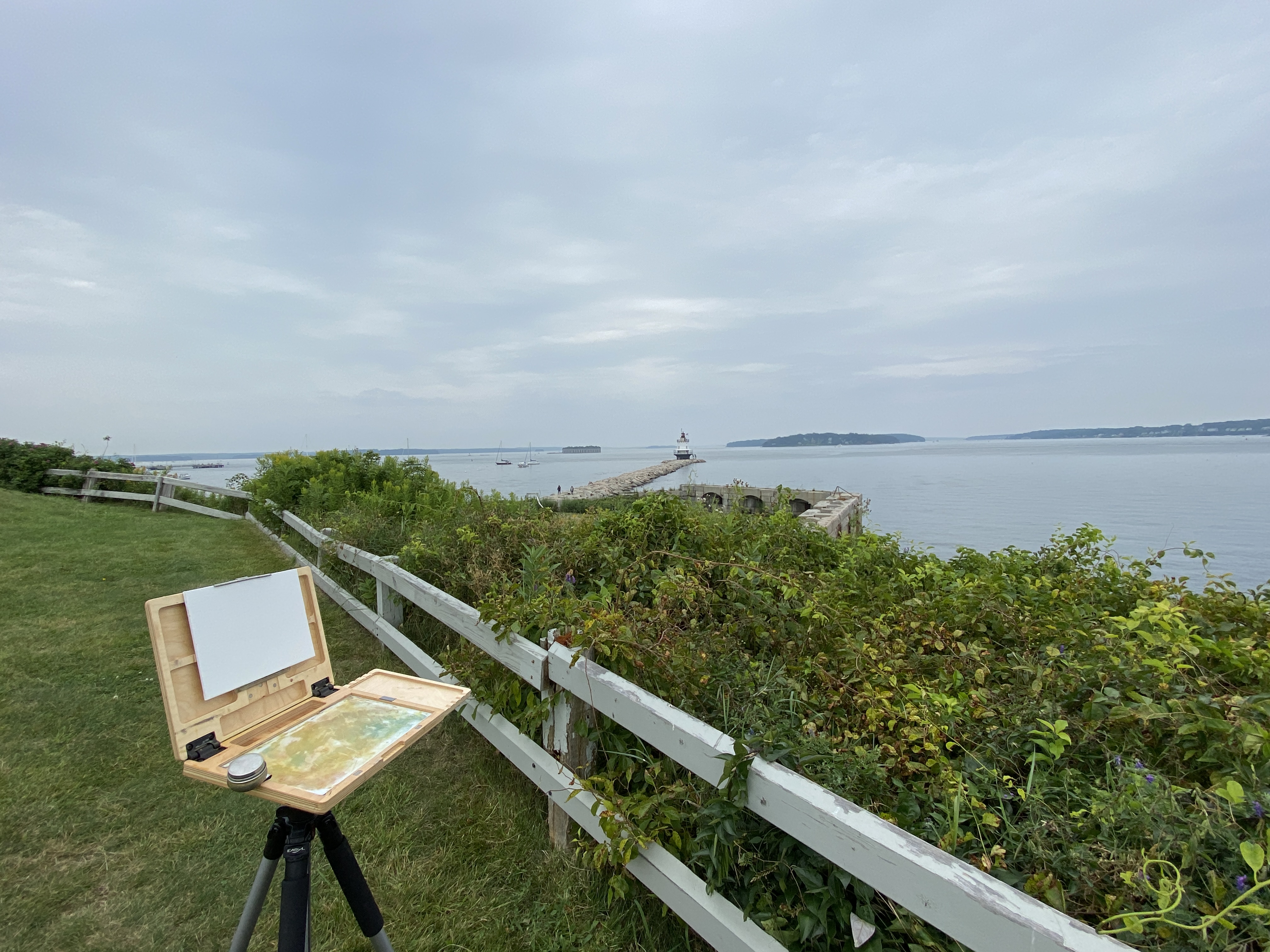
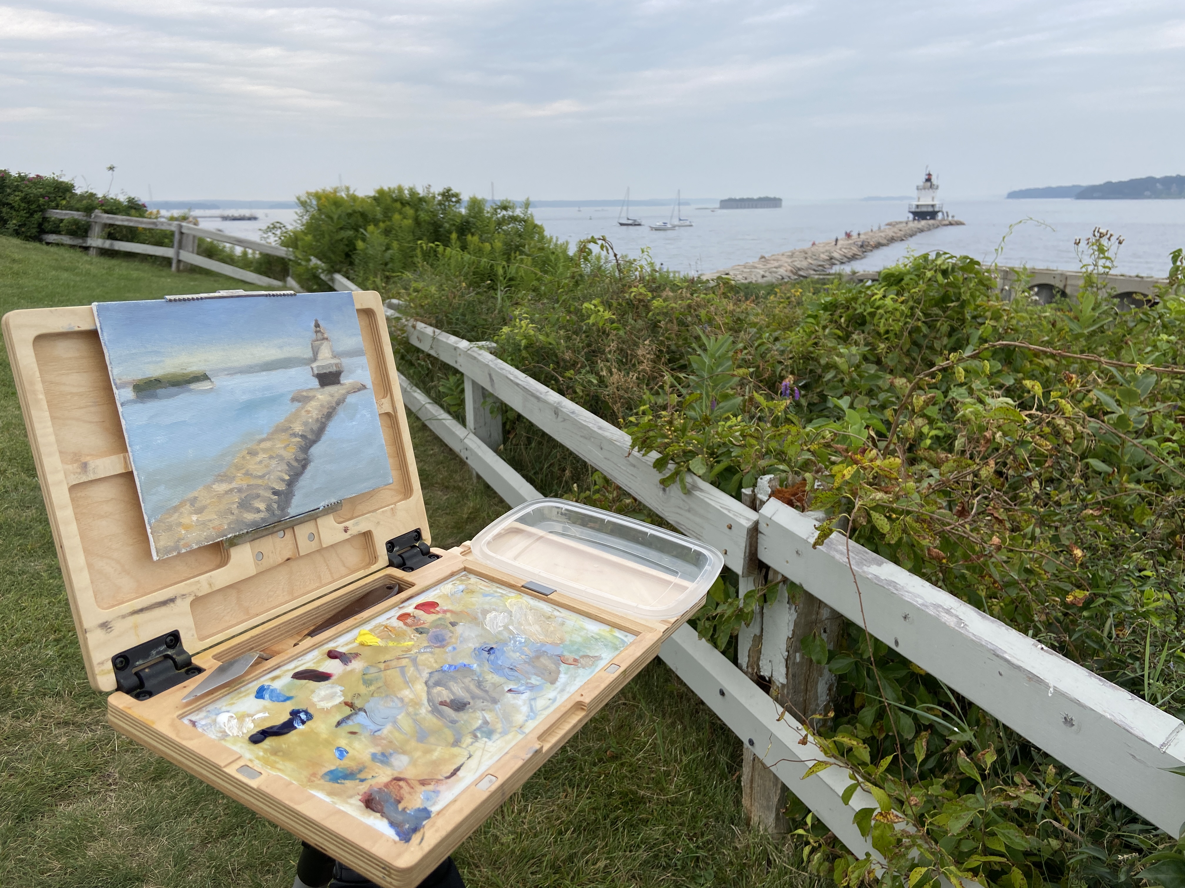
As to the focal point, the final result of the lighthouse and the complex stones of the jetty came out pretty well given my relatively minimal subject matter experience. As any of you artists know, tackling new subjects can be a reminder of the impossibility of knowing how to paint anything and everything equally well. The process was very enjoyable and satisfying, so there will be more lighthouses in the near future. I might expand my new found rock painting knowledge to some coastal scenes, too.
Thanks for reading!
#artbern #berntx #crashboomzip #painting #art #abplanalp #austinartists #atxartist #contemporaryart #southportlandmaine #abplanalp #bernabplanalp #springpointledgelighthouse #lighthouse #maine #portlandmaine #getoutside #fortgorges