SPRING POINT LEDGE LIGHTHOUSE 2 | Mixed Media on Wood | 8×10″
I recently attended a 2-day workshop at The Contemporary at Laguna Gloria. The focus was textured painting, which ultimately boiled down to playing with joint compound (gypsum spackle) and acrylic paint. I was amazed at how easy and fun it was to adapt to this medium.The technique is very straightforward, whereby one mixes acrylic paints into the joint compound, which is an off-white, and do whatever you want provided it’s put on a hard surface, for which I used wooden boards.
Most of the class did abstract pieces, which make sense as you get to play with pottery tools to get cool shapes and textures. It’s very forgiving, too, because you can simply wipe it off and start over again provided you don’t wait more than a day, at which point it hardens. I chose to do still life and landscape pieces, taking advantage of the impasto nature of the spackle. The instructor said she hadn’t considered doing landscape compositions with this technique, but to me it seemed intuitively suited for the textural nature of the real world.
I intend to add some vibrancy to this composition with acrylic paint… I think. This is definitely the start of a new and exciting medium! Stay tuned for a number of new pieces in spackle and acrylics.
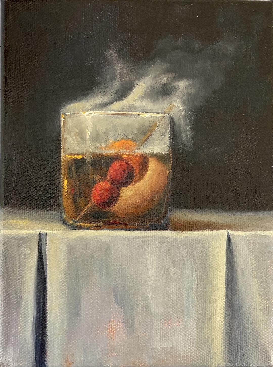
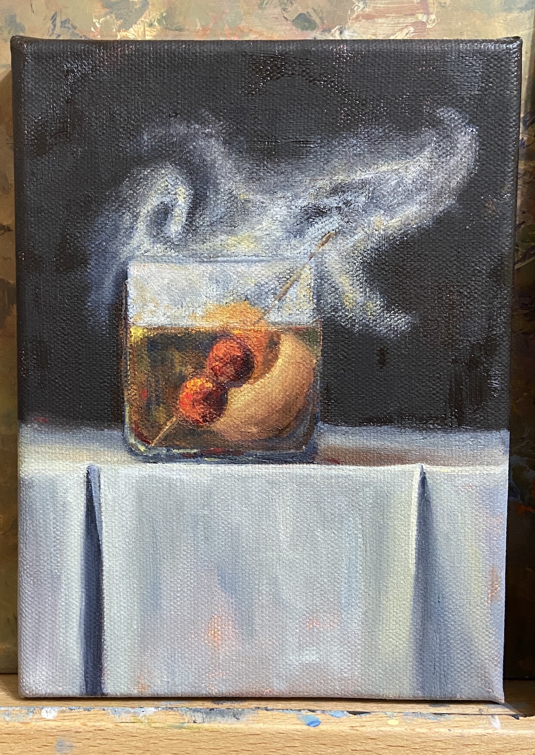
Building off my most recent still life, SMOKY OLD FASHIONED, I wanted to finish another piece with smoke effects so I could refine the process and build on the original. SMOKY ON ICE changes some core compositional structure, none of which is hard to miss, but obviously the focal point is the massive ice cube. The challenge, in addition to that pesky smoke, was making sure the other key elements worked the viewer back to the ice.
First, let’s talk about that ice cube. Even clear ice cubes have flaws, but they’re hard to see in standard light. Ironically, if you drop one in a low ball of whisky and incorporate some mood lighting, the imperfections will jump out. And these imperfections are the coolest part of a clear cube!
The cherries hovering over the glass, immersed in smoke, are a design decision to keep the proverbial “you” in the glass… with the imperfect ice cube… and all that tasty whisky (GlenAllachie for me, please)… you’re welcome! Lastly, I used a palette knife for the cherries to give them a different texture. It also worked out better with manipulating the red colors into the smoke without smudging, which was hard to avoid when using a brush. The ice cube was done with thinner paint and brushes, ensuring a smooth, glassy look. Thanks for reading!
Every once in awhile I find the motivation, and patience, to make a time lapse video of a painting. I did this for Smoky Old Fashioned, but it was done over the course of numerous short painting sessions (1-2 hours), so it gets a bit frenetic at times with lighting and zoom variations. Tight cropping and good music are included so as to distract from the lack of cinematography talent.
I’ve learned a lot about the process and iterations artists have to endure to get a composition just right by watching time lapse videos. Having done a few of my own this year, I’ve learned they’re also a great way to capture how I did something and be able to return to it later as reference for future work that harnesses the same subject matter.
I have the good fortune of 7 of my paintings being included at Austin Fine Art Gallery’s annual holiday group show of small arwtorks called “small WONDERS”! All works are framed and ready to go on your walls, or, given their relatively small size, they’re easy to ship to friends and family who might appreciate authentic art from an Austin artist.
BLACK LAB | Graphite on Paper | 11×13″
BULL CREEK, AUSTIN | Oil on Board | 6×8″
DOG TIRED | Oil on Board | 16×12″
JUST THE RIPE SIZE | Oil on Panel | 5×7″
SPRING POINT LEDGE LIGHTHOUSE | Oil on Board | 8×6″
POPCORN | Oil on Canvas | 14×11″
SOMETHING BLUE | Oil on Board | 12×9″
Small WONDERS will consist of over 300 mini works by over 35 greater Austin artists, ranging from 5×7’s to 16×20’s. Everything will be PRICED to GIFT with prices ranging from $100 to $600. Don’t miss this wonderful show to start or add to an art collection for you and your loved ones!There will be an opening reception on Saturday, December 9th from 4-7pm. There will be holiday treats, drinks and live music during the opening reception. The show runs through early January.
For more information about the gallery and this show specifically, go to www.artframingservices.com, navigate to the “small WONDERS” show announcement, and consider dropping by for some holiday cheer and say hi during the opening reception.
Artists showing include:
BERN ABPLANALP UMBREEN AHMAD TOM BENTLEY VICKI BREVELL TAMMY BROWN HOLLY CRAIG ALAN EHRLICH PAT FLATHOUSE ANN FLEMINGS JULIA FLETCHER SALLY FRASER OLGA GORALEWICZ LACY HUSMANN JESSICA GREENWOOD PING IRVIN CRAIG IRVIN CHRISTINE JAMES CAROLYN KILDAY MELISSA KOTZEV SCOTT LEOPOLD MARCH MATTINGLY LINDA MONTIGNANI M MURDOCK EDD OGDEN NANCY PATON RICARDO ROBLES JOYCELYN SCHEDLER ANASTASIA SHIMANSKAYA CELESTE SMITH CONNIE TAYLOR MINDEN TEN EYCK LILIANA VASQUEZ LINDA WELLS JOHN WEST ELIZABETH WILSON WALKER WINN RENEE WOMACK
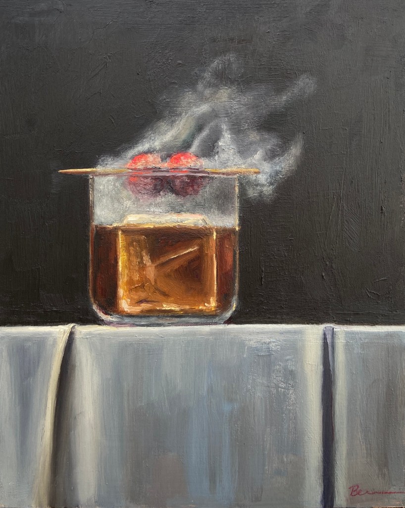
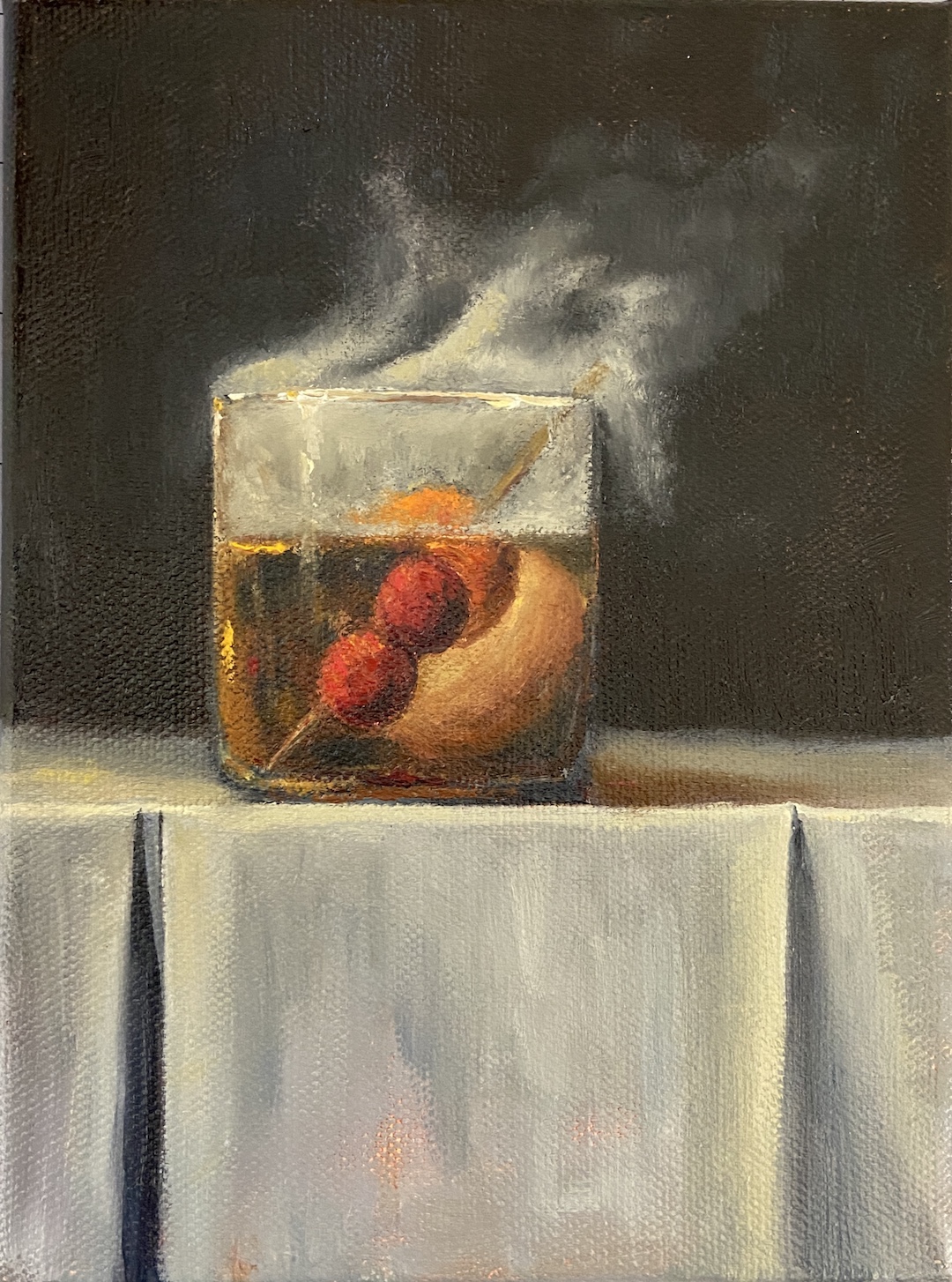
SMOKY OLD FASHIONED is a recent commission piece, something I love doing, especially when it’s for a gift or something sentimental. In this instance, the painting is for a gift for someone who apparently has everything. Painting to the rescue!
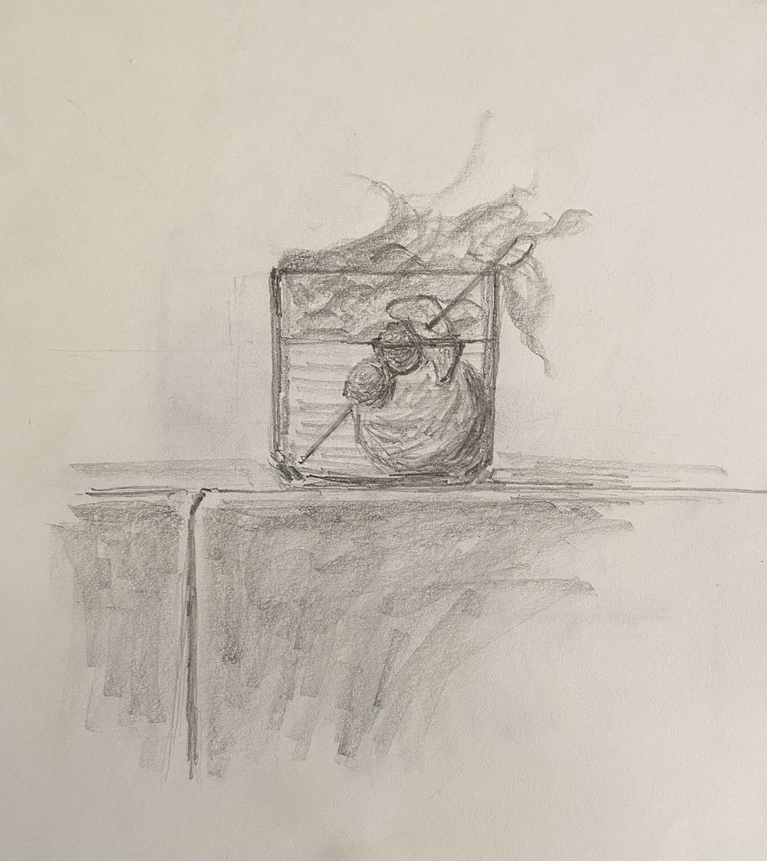
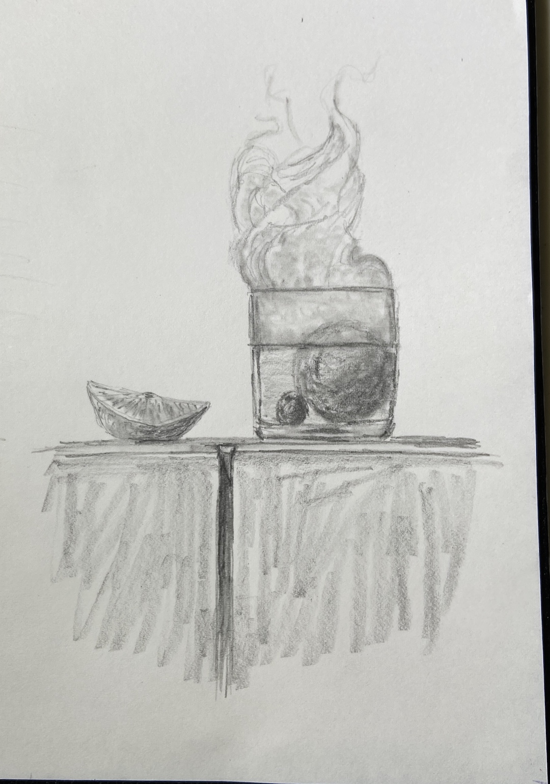
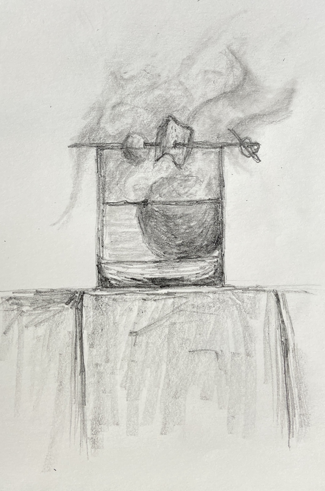
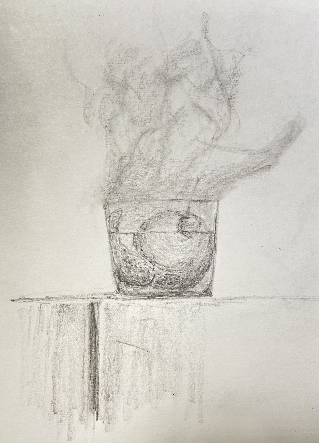
My process for custom work involves a number of preliminary discussions followed by sketches that give compositional options. Just like blocking in the value structure of the actual painting is key to a good outcome, with a custom piece, coming to an agreement on the core elements and structure of the composition is vital.
I’ve painted a number of libation-based still life compositions, but nothing with smoke. It required me to investigate if painting smoke was similar to creating fog, mist, or larger fire-based plumes.
The answer, it turns out, was an emphatic NO! It seems that once you pump smoke into a cocktail glass, weird shit happens and it becomes lifelike and animated. Looking at reference photos further complicates matters, introducing possibilities of upward windy smoky tendrils, or smoky bits that spill over the edge toward the table. Come to discover both of these considerations are smoked red herrings! Smoky tendrils are “fresh” burning anomalies, and the only smoke that sinks seems to be dry ice based smoke, which you can imagine is in a lot of cocktail glamour shots.
The trick with this piece was clearly… smoke! But before getting to that challenge, there was the issue of compositional tension. Technically, an Old Fashioned isn’t so much a cocktail as an origins story of composition. The Meehan’s Bartending Guide, my personal true North for all things cocktail, notes “the cocktail was first defined on May 6, 1806, in The Balance and Columbian Repository as ‘a stimulating liquor, composed of spirits of any kind, sugar, water and bitters’. By the time it showed up in a professional bar manual for the first time in Theodore Proulx’s 1888 The Bartender’s Manual, it was already “old-fashioned”.” My personal preference is rye whiskey, simple syrup, bitters, 1 cherry and an orange twist. Now back to the painting…
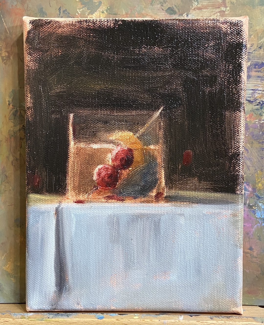
The request for this piece was to incorporate Luxardo cherries, orange peel, and a large round ice cube. Figuring out how best to structure this as a piece of art was trickier than I thought, even without the smoke. Once you put all that stuff into a lowball glass, it’s impossible to not notice the tension of so many things jammed into a small space. To tackle this problem we simply talked through various sketches that presented different solutions, and we ultimately landed on cherries on a toothpick, angled into the glass, orange peel also on the toothpick but above the whiskey line, and lastly a demotion of the round ice to the background. As a pleasant surprise, once the smoke was added, it significantly improved the compositional structure because it broadened the view and seems to have further reduced the tension, essentially granting the viewer a larger viewing room.
Lastly, the smoke technique. I still need to refine the approach, so stay tuned for more smoky cocktails, but the core approach seems sound. The smoke is not white, that’s the first thing. Turns out it’s about 20 variations of gray, leaning warm (cad yellow deep) above the glass, and a little cool (lemon yellow) below the rim. The brushwork boils down to a lot of push and pull between the light grays and the black background, using a lot of scumbling with an oversized round brush. As the smoke expands above the glass, it was important to make sure there was a very thin layer on the outside edges of the core smoke to lend it a sense of movement. The person who commissioned this piece has a cocktail smoker top, which sits on the top of the glass and is then pulled off in a flourish when the smoking is done, which pulls some of the smoke up and out of the glass. It’s all very entertaining, until you try to paint it!
Gallery! Welcome to Winter(ish)! I’m honored to be included in another group show at Art for the People Gallery in Austin. I’ll have 4 paintings in the show covering a wide range of topics – beaches, mountains, dogs, rowing, and champagne!
Ready for the ShowMIMOSABEACH DOGFLATIRONSMORNING ROWFalling into Winter show
The show runs October 28th, 2023 – January 5th, 2024, opening reception Saturday, November 4th, 12-4pm CDT.
Reach out if you have any questions, or better yet go to the gallery and check out all the arts:
MIMOSA | 12 x 16″ | Oil on Canvas Board | $400
MORNING ROW | 9 x 12″ | Oil on Canvas Paper | $275
The coast of Maine is one of the most beautiful in the country. Needless to say it provides plenty of inspiration for painting. While this is not a plein air piece per se, I did a study sketch plein air and spent hours on Fishermans Point enjoying the cool sea breeze and beautiful views.
The inclusion of the home on the sea cliff is not only intentional in this composition, but it is the name my wife gave the house, “Winners”. We have no idea who they are, but we’ve strolled by 2 Bay Road often and we know what we would do if we won the lottery.
This piece is a study of sorts, in large part because it’s a very tricky subject matter for me, combining all the hard things into one painting – boats, complex architecture, and rocks. Man, the effing rocks! I can say, however, this turned out pretty well and the learning experience was very rewarding. I also had the good sense to setup the time lapse camera, both as entertainment for all of you dear readers, as well as a way to remind myself how I went about this painting when I decide to do something similar.
SPRING POINT BOATS | 10 x 8” | Oil on Canvas Board
This is a follow-up to a previous post while in Maine. SPRING POINT BOATS was started en plein air, the session just long enough to allow me to lay in a solid structure and composition that was interesting. There was some artistic license taken in terms of boat placement and colors, but the remainder of the setting is, believe it or not, an accurate depiction.
While the paint didn’t effortlessly jump off the brush, something did click regarding boat shapes and structure. I’m not happy with how some of the areas look a bit chalky, but that should be easy to improve in future efforts. I believe I relied too much on Titanium White to lighten values throughout the piece, as opposed to reserving it primarily for the boats. However, the sense of a strong mid-afternoon sun on a calm day came through pretty well.
The last self-critique, and it’s a big one, is the compositional structure. I didn’t notice until the work was done, but now I can’t “unsee” it, that the lighthouse jetty looks artificial because it comes into the painting in a parallel that’s very distracting. It needs to be more angular, or at the very least, I need the sight line to be above the jetty so you can see the side and top, not just the side. I have to laugh, though, because I was so proud of my artistic licensure of the boats, yet I ignored the massive rock jetty in the background. Oh well, there’s always next time.
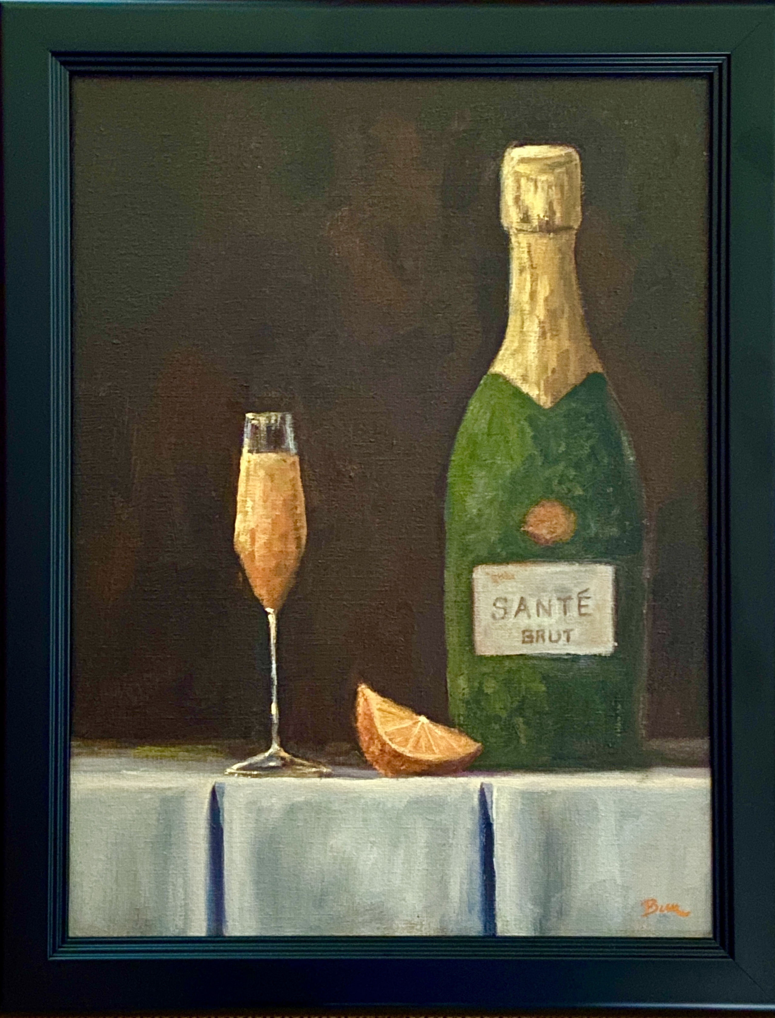
In celebration of brunches everywhere, I present MIMOSA! This was one of those pieces that everything just came together almost effortlessly. I thought this would be one of those still life works that lingered in the studio for weeks or months, starting and stopping as new challenges popped up, taking time to experiment with technique to get things figured out. Nope, nothing like that with MIMOSA. I should have known it would flow easily from the moment I threw together the sketch, which was done in about 5 minutes, nary an erasure mark to be found. Yes, there are imperfections, but relative to initial expectations it was a delight.
The anticipated challenges with MIMOSA were:
1. No reference photos. Everything was going to come from my head. I didn’t have a bottle of champagne available, no champagne flute that fit the idea I had in my woefully lacking imagination, and no motivation to go sift through the rotten produce at my local HEB to find a picture-ready orange.
2. No experience painting foil, much less the symmetrical foil of a champagne bottle.
3. No experience mixing / creating gold hues, as seen in the aforementioned champagne foil.
Most of the challenges noted above were more about the unknown rather than issues from past works. As it turns out, I have a better imagination than I thought it did, and patching together a still life setup is something I should consider doing more often. As to the foil and gold color mixing, either I got very lucky or it’s not that difficult.
One thing that helped quite a bit was the use of broken color, specifically in the mimosa and the gold foil of the champagne bottle. I used the same brush size and stroke direction intentionally, so as to connect the mimosa with the champagne bottle. As it turned out, my persistence of using broken color in other compositions seemed to coalesce in this piece, at least the outcome is something I really enjoy.
Lastly, I tried to fold in some subtle pieces that bring the composition together. The crisply folded white linen represents the formal occasions typical of champagne, contrasted with the faded, dusty look of an old, very valuable bottle of champagne. The orange, more obviously, to provide insights into what’s being quaffed, namely mimosas. And finally, the use of a tall, very slender flute that invokes elegance and formality, contrasted with the more informal, pedestrian offering of a drink mixed with orange juice, the mighty MIMOSA!
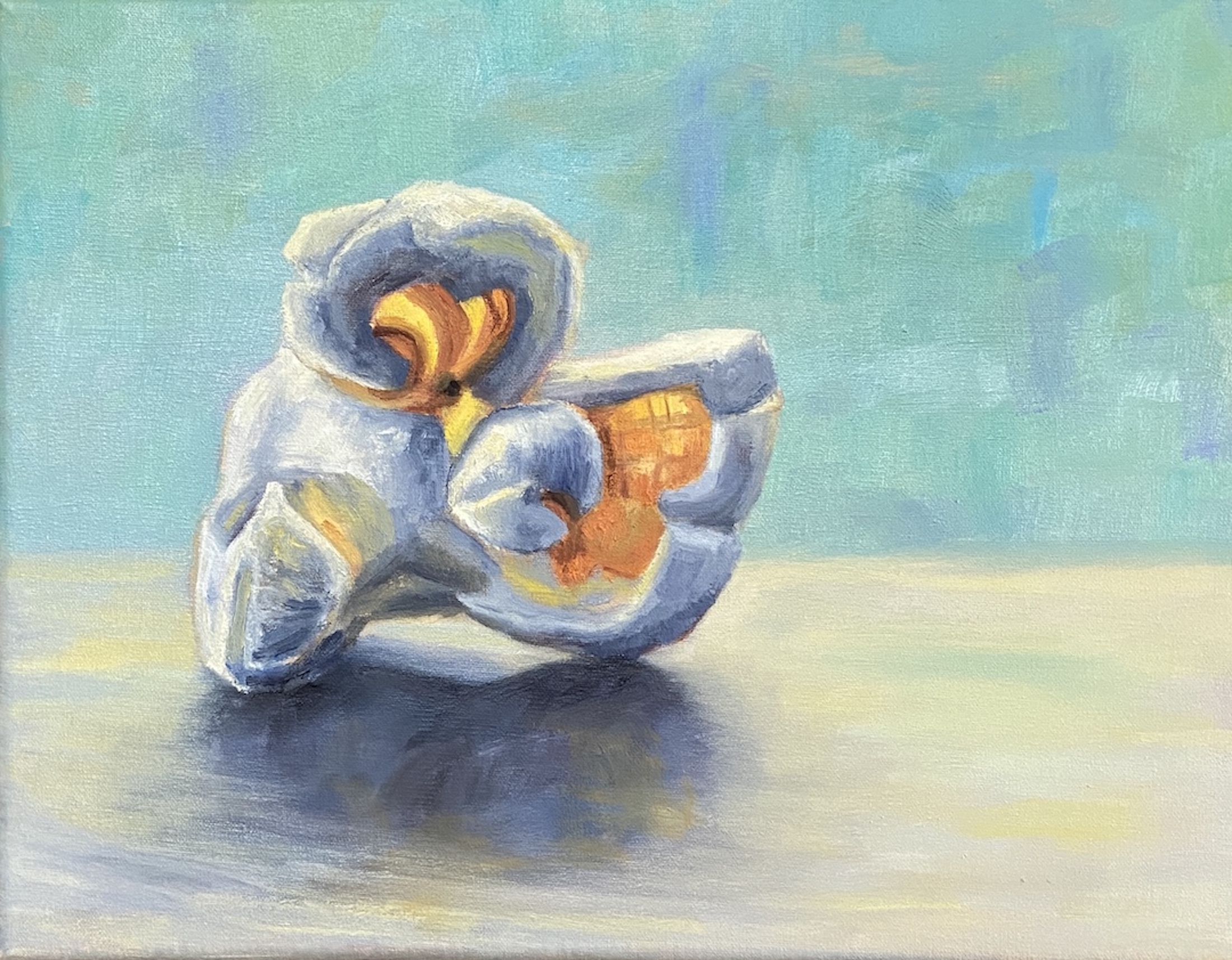
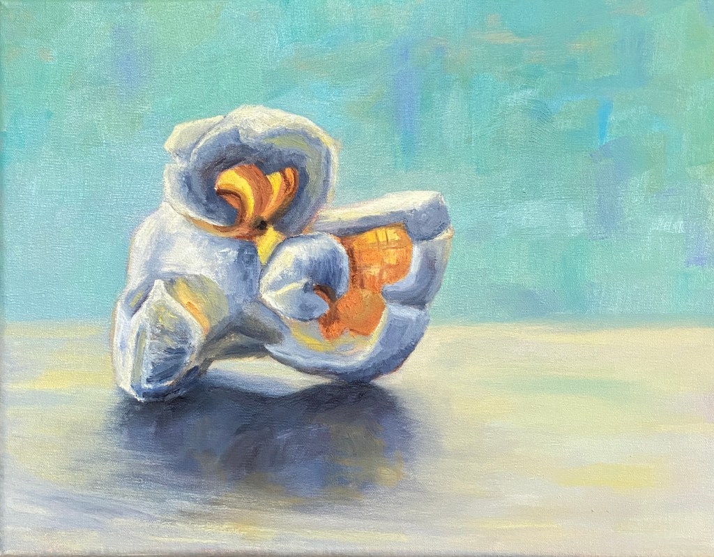
In the spirit of fun and interesting still life subjects, please welcome this tasty kernel… POPPED PERFECTION! This is my second popcorn themed composition, but unlike the original, which featured 3 pieces of the corny goodness, the focus is a single, beautiful popped kernel.
Popcorn is a tricky subject to paint, in large part because there’s nothing standard about any of it’s shapes or surfaces. Had I tried to paint this as a novice I would have found a new hobby and never painted again. That said, when you get it right, it’s a thrill!
There are a number of ways to add artistic interest to this type of still life. I wanted to emphasize the transparent elements of a nice big juicy piece of popped corn, thus the focal points with orange and yellow where light can penetrate. To really make the piece pop (sorry, couldn’t help myself) I used a blue background, which is the complementary hue to orange and therefore provides a strong contrast without having to worry too much about the similar values. Furthermore, the piece is very simplistic in terms of having nothing else on the canvas, which is meant to help it jump off the canvas from across the room.