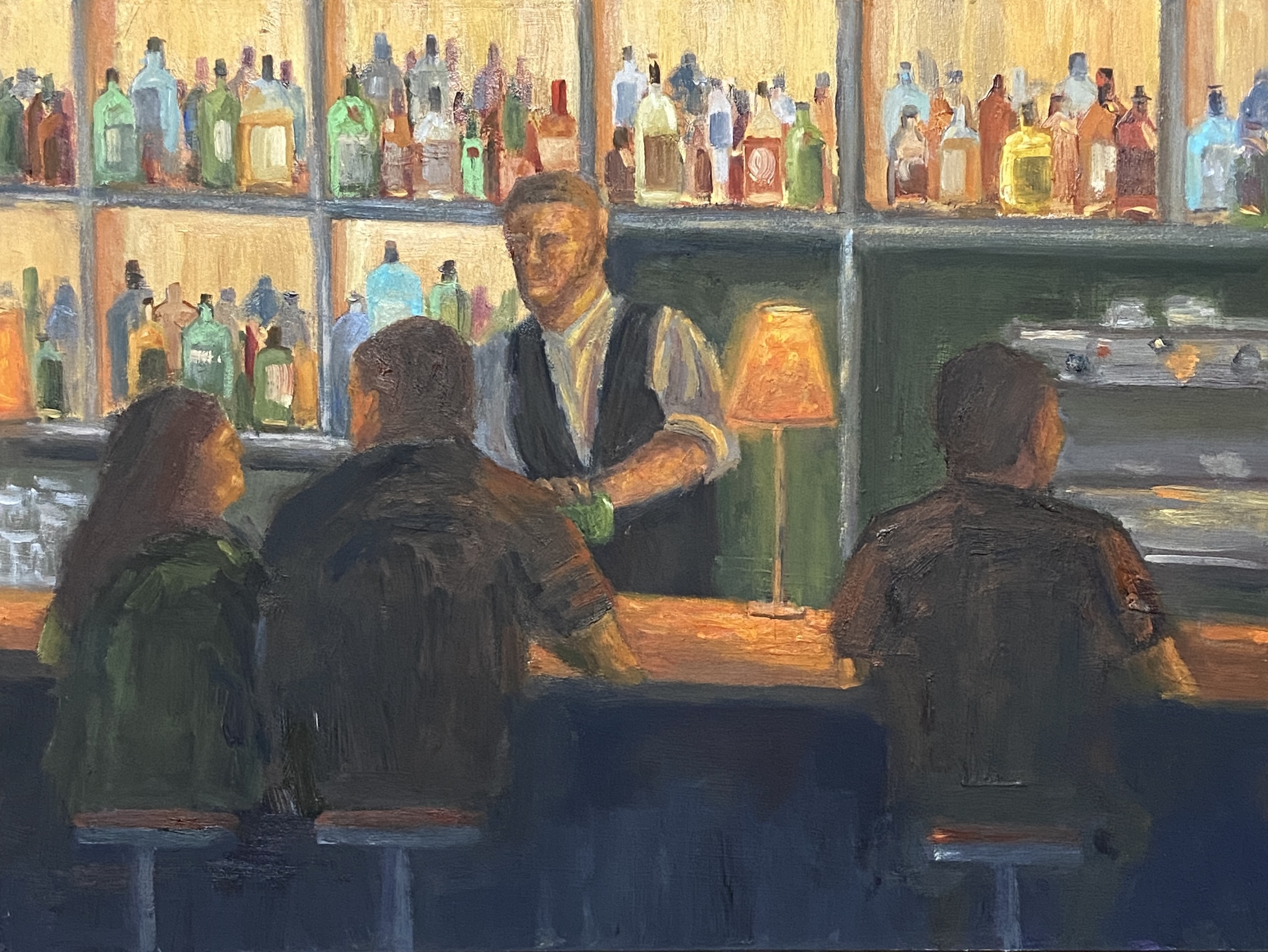
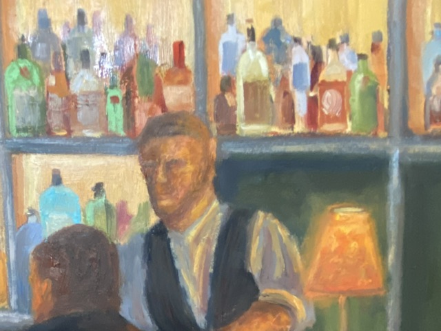
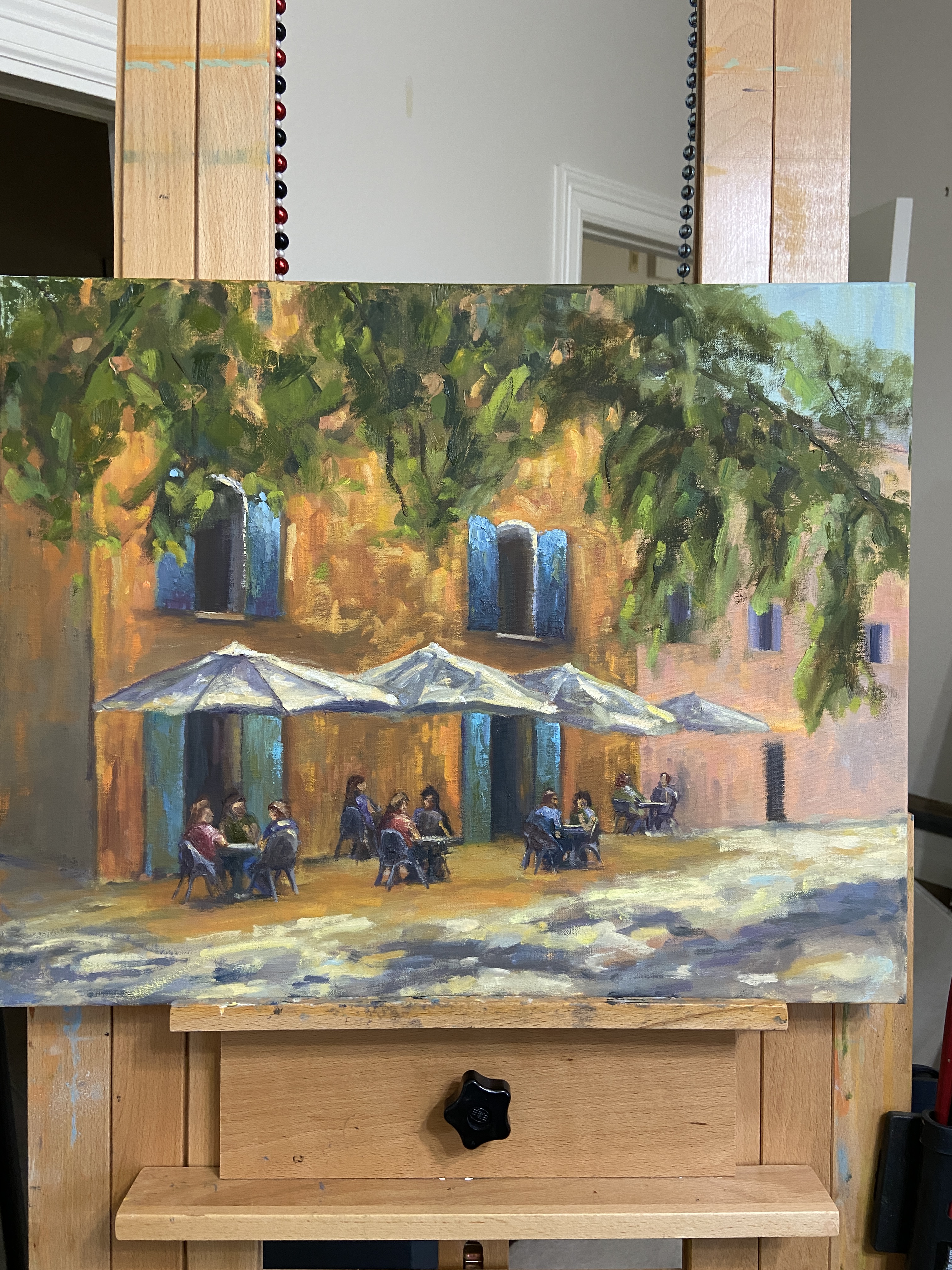
Curlycue Lemon Leaf

NEIGHBORLY LEMON | Graphite on Paper | 6×8”

The lemon used in this drawing was given to me and my wife by our long-time neighbor, who brought it from her kid’s home in California! She toted it home on the plane, along with some oranges, not as a “thank you” for watching her house while she was out of town… she was just being neighborly! 

Before I cut into this fine fruit, I wanted to do a proper drawing, as I was struck by it’s slightly odd shape and the long stem with a single leaf still attached. If I didn’t know better I would have guessed this lemon was stolen, quickly yanked from the tree under the cover of darkness! 

I used four different pencils to get the proper shading – H, B, 2B, and 4B. For those of you who don’t draw, these are how darkness levels are rated on pencils. For this example, H is the lightest, 4B the darkest. You’ll notice the reference photo has the lemon perched on a glass, making you ask “what is that about?”. This was intentional, a matter of pragmatism so I didn’t have to hunch over for a proper viewing angle.

Lastly, I’ll point out that the focal point is… the leaf! It’s not only unusual to see the stem/leaf on a lemon still life, but it’s also a unique shape, probably a result of being slightly emaciated, causing it to curlycue rather abruptly. Hopefully you can tell it’s a leaf and the fact that it’s a bit oddball doesn’t detract from the overall composition. 

Cheers! 

#austinart #artbern #berntx #crashboomzip #abplanalp #austinartists #stilllife #drawing #graphite #lemon #fruit #neighbor 

Glowing Happy Hour

LAMP GLOW | 10×14” | Oil on Panel
Reference Photo, Photographer Unknown

Oftentimes I use my own photos as inspiration for my paintings, but I also use pics from people I don’t know. This is something I believe most painters do, typically for a couple of possible reasons. First, I paint, I’m no photographer, so my photos are, well, not very good. Some things even an iPhone can’t fix. So I might use my own photo as the main reference, but find other options online of the same area to enhance the view. The other main reason for using a reference shot from someone else, be it an individual, magazine, etc., is because it’s something or some place I’ve never seen or been to personally. It’s this latter reason that applies to this new piece, LAMP GLOW. 

I spent a lot of time on the canvas with this one, which was expected given my lack of experience painting people in detail. In fact, I must have wiped the face of the bartender no less than 6 times, and reshaped the bar patrons many times as well. Ultimately, I’m happy with the result and I learned a lot in terms of technique and what NOT to do. 

Lamp Glow Detail

The focal point of LAMP GLOW is the glow from the lamp on the bar, not the lamp itself. Because the glow is a soft light with a mid-range value, it was a little tricky to make it work. Usually, the focal point of a composition is highlighted by things such as high contrast values or sharp edges. Lacking these options I pushed the saturation and ensured the soft, orange light bathed the primary elements in the painting, which (hopefully) makes the glowing lamp a clear focal point given it emanates throughout the scene. 

In terms of design decisions, I’m not sure I took the right approach regarding the liquor bottles in the background. While they turned out nicely, I think they’re ultimately a distraction and might be more effective if they were softer and less saturated. Oh, and painting 67 individual bottles is a wee bit tedious.

Stay tuned for more bar scenes! 

#austinart #artbern #berntx #crashboomzip #abplanalp #austinartists #bartender #bars #nightlife #happyhour #atxlife #steakhouse #lampglow #cocktails

French Café Sketch

FRENCH CAFÉ | Graphite on Paper

Here’s another installment from my January “draw-a-day” self-imposed challenge. While I didn’t draw every single day, I came pretty close. Most of what I did was practice for new paintings, which, as I’ve mentioned previously, can be immensely helpful in determining not only how to approach a new composition, but even if you want to do it in the first place! 

FRENCH CAFÉ is a sketch intended to inform a painting I just started. After having done an initial block-in on the canvas I realized this was going to need further consideration before moving forward. This sketch is that “further consideration”, allowing me to do a handful of things before returning to the canvas. 

For the curious, following is how this sketch will help the painting:

  • People: arrangement, sizing/scale, and simplification. The last point, simplification, is a by-product of drawing whereby one has to convey the essence of the figures purely through shapes, whereas the painted version will also leverage colors. 
  • Focal point: The sketch taught me that I’m lacking a focal point, so the painting will need to do a better job of focusing on a particular grouping of people at the tables. In this sketch, it’s not clear where the viewer should concentrate.
  • Details: Between the umbrellas, windows, people, and trees, there’s a lot going on. It will be important to exclude some elements in the painting to make it effective, and more enjoyable to paint. The vines growing up the walls will get 86-ed, as will some of the ground floor windows and doors. 
  • Values: There will need to be very high contrast of values between the shaded people and those areas that are in direct sunlight. You can tell that this sketch, while effective in many ways, really looks flat with the exception of the overhanging trees at the top. This is where I made a point to do high contrast in light and darks, adding a 6B pencil to the mix.

Stay tuned for the actual painting, which will be a challenge, albeit a well informed one thanks to this sketching exercise. 

#austinart #artbern #berntx #crashboomzip #abplanalp #austinartists #stilllife #drawing #graphite #frenchcafe #sketch #umbrellas 

Grapevine Art

OLD VINE | Graphite on Paper | 6×8”

Today is for the wine lovers out there! This is one of the various drawings from this month’s draw-a-day self-imposed idiocy. I think even oenophiles would have trouble recognizing this drawing at first glance, but it hopefully becomes apparent that this is a grape vine. An old, grape-less, dead vine, but a grape vine nonetheless. 

The reference photo is from my visit to The Piccolo Hotel (great place, btw) in Paso Robles, California. I didn’t realize what it was at first – I just thought it was a cool wood carving over the fireplace in the lobby. But when you get to looking at it in more detail, and taking into account the location (wine country!), the reality sets in that this is the epitome of upcycling! This grapevine, while alive, provided tasty wine… and in death is transformed into art! What’s not to love about that! 

The Library at The Piccolo, Paso Robles

As an art subject, it was very tricky initially. I thought it was going to be a disaster, in large part due to the details involved, but perseverance won out and all the wavy lines and dark circles coalesced into a pretty decent drawing. More importantly, it was a lot of fun to draw and something I’ve added to the short-list of formal compositions. Drawing or painting, I’m not sure which… maybe both. 

One final comment: Paso Robles wine is excellent! Makes sense, right? I mean, c’mon, the vines are beautiful, alive or dead! 


#austinart #artbern #berntx #crashboomzip #abplanalp #austinartists #stilllife #drawing #graphite #wine #oenophile #pasorobles #thepiccolohotel #sketch #staypiccolo #california.wines

Painting Auditions


ROSE | Graphite on Paper | 3 x 3”

This is the first of numerous drawings I’ll be doing over the course of the coming 30 days. There are a number of goals involved with this exercise. Initially, I was going to set a lofty goal of a drawing-a-day, but reality has set in and the target has been tempered to draw-a-day. 

This drawing, ROSE, is from day 3 of the challenge. I’ve done a painting called YELLOW ROSE in the past, based on the same reference photo, so it was interesting to return to this after a few years. I was surprised how quickly this drawing came together; some sort of long-term artistic muscle memory. 

The other benefit of a self-imposed 30-day draw challenge is that it drives me to practice potential new compositions. Doing a quick sketch of a painting subject is helpful in the field for plein air, and for studio work, but sketches are typically done to refine the compositional strategy. However, doing a more complete drawing answers the question, “do I want to paint this?” Sometimes, you get into the details of a painting and realize that it’s not any fun because it’s either beyond your skill set, too tedious, or simply not very exciting. 

In the coming weeks, stay tuned for more drawings auditioning to become paintings!

#austinart #artbern #berntx #crashboomzip #abplanalp #austinartists #stilllife #drawing #graphite #flower #rose #botanical #sketch 

Kerbey Lane Solo Show: “Something for Everyone”

Greetings and Happy New Year!!! I’m kicking off 2025 with my first solo show courtesy of Kerbey Lane in San Marcos, TX! Given there are 25 pieces on display (all for sale btw), ranging in themes – still life, landscapes, even some pure whimsy – I’ve decided to call it “Something for Everyone”.

The process of hanging art at a restaurant during regular business hours was a bit intimidating, even on a slow Monday mid-afternoon. However, everything went well because it turns out my wife has a heretofore undiscovered talent for gallery design and hanging paintings! She was awesome… literally couldn’t have done it without her.

Some of the pieces on display are brand new – paint might not be entirely cured if I’m honest – while other pieces were part of my personal home collection, so this is their first foray into the real world. The show will run January through June, so be on the lookout for new works being added in the coming months.

I’ll be adding a special section to ArtBern that highlights the various pieces in “Something for Everyone”, so be on the lookout later this week.

One last item of note. A hearty THANK YOU to all the great staff at Kerbey Lane! They were welcoming, helpful, and wildly enthusiastic about the art. Knowing that they were excited to see the wide range of themes and subject matter, well, it was beyond rewarding for me to get that kind of feedback while hanging and effectively being in their way for 2 hours. Hey @kerbeylanecafe San Marcos, y’all are wonderful!

Thanks for reading!


#austinart #artbern #berntx #crashboomzip #abplanalp #austinartists #pleinair #pleinairaustin #paa #austinstudiotour #sanmarcos #paintings #kerbeylanecafe #coffee #txst

Bent Beer Flight

BEER BOX | Oil on Board | 7×5”

This piece was done earlier this year using a reference photo I took while in Portland, Maine. Most of my works in that area are either “en plein air” or based on my own coastal reference photos. For those of you who have followed my work over the years, you well know I tend to veer to still life from time to time, with a particular affinity for libations. Thus, BEER BOX, technically a beer flight, from Rising Tide Brewery in Portland comes as no surprise. 

For the painters out there, remember the use of photo reference is a blessing and a curse. On the one hand, they capture a place or moment for future reference, when perhaps your memory might not be willing to cooperate. On the other hand, they can significantly distort reality and create more problems than they solve. While most of what you read about “painting from photos” (virtually every painting book covers this point) emphasizes the distortions created by photos relative to lighting and hues, IMHO the real terrorist activity of reference photos is their ability to jack with shapes. 

In BEER BOX, I overlooked the shape shifting my iPhone had done to “improve” the photo. I even used a grid to try and get the shapes right, something I rarely employ, and I still didn’t realize the reference photo was just a bit tweaked! It’s hard to notice at first, but the top portion is actually skewed outward, kind of a mini fish-eyed effect. I noticed this after I’d already committed to the compositional structure, so I just rolled with it to see how it would turn out. 

In the end, this piece proved to be a perfect mix of frustration and satisfaction. I think it turned out well, despite the odd birds-eye view, and I learned a lot in terms of subtle hue and value changes required to capture the depth of the beer box and how the glassware fades into the deep shadows. 

BTW, Rising Tide Brewery makes some great beers and should be a stop on any Portland, Maine brewery crawl. I don’t recall the specific beers in this flight, but the 4 styles were Stout, IPA, Pilsner, and the pink one was a delicious Sour. 

Thanks for reading!

#artbern #berntx #crashboomzip #abplanalp #austinartists #atxart #portlandmaine #landscapesmaine #maineart  #portlandmaineart  #southportland #southportlandmaine #capeelizabeth #risingtidebeer #beerflight #beer #mainebrewers

327 Austin Studio Tour

Exciting news on the art event front… I’ll be participating in the 31st edition of the Austin Studio Tour the weekend of November 16 & 17th! For those of you in the Austin area, if you haven’t checked out the studio tour in the past, I highly recommend it, even if I weren’t involved. It’s a very rare Austin event that’s chock full of talented artists, free of charge, and it doesn’t take over Zilker Park or Auditorium Shores for the month! 

The Austin Studio Tour, in a nutshell:  over the course of two weekends, more than 400 artists open up their studios or display in public spaces/galleries… for FREE! The city is basically split into East and West sides (I35 being the demarcation), whereby weekend 1 is “WEST” studio tour, and weekend 2 is what I like to call the OG “EAST” studio tour. 

Weekend 1 is today and tomorrow, Nov 9 & 10th, weekend 2 is Nov 16 & 17th. Official opening times are noon – 6pm each day, but there are some that open beyond those times, including Friday evening.  

I’m stop #327 at a building called EASTBOUND located at 3232 E Cesar Chavez St. I’ll be joined by a dozen of my painting friends from Plein Air Austin, well, more like I’ll be joining them, so visitors get a chance to see a TON of art at a single location. 

I’ll have at least 20 pieces of original artwork for sale, including a bunch of new pieces that will make their debut at this show. It’s a mix of plein air originals, studio work, and per some interest from friends and family I’ll be adding some drawings to the mix.

Stay tuned for more updates, including a list of other artists showcasing their talents at our location, live plein air demo details, and “Beers with Bern” after party locations.

Get out and explore the talent of Austin artists! Hope to see y’all next weekend! 

#austinart #artbern #berntx #crashboomzip #abplanalp #austinartists #atxart #atxartist #atxlife #pleinair #pleinairaustin #paa #austinstudiotour

Acorn Street, Boston

As promised, here is the finished work (maybe) of the ACORN STREET study. I say “maybe” because I might opt to add people and give it more activity, but I also like the calm, quiet morning vibe this gives off. I’m guessing the early mornings are the favorite time for the residents of this street as the tourist throngs are still in their AirBnBs second guessing why they hadn’t opted for a hotel with an in-room coffee machine and room service.

I wanted to ensure value contrasts and a loose painting style were key elements of this piece. The flag and sunlit building opposite were intended to draw the viewer down the street, which wasn’t difficult to do as this composition kinda designed itself. The big challenge since the original progress post was adjusting the light from the photo reference so that it realistically “hit” the flag, which meant letting it sneak up the end of the street more than was originally planned. 

Lastly, the cobblestones were a last minute addition. I was trying to avoid anything too detailed in an effort to keep the painterly feel, but anyone who’s been on this street knows the cobblestones are integral to the charm. I need to refine my technique in future work, but there are a lot of cobblestone streets that I’d love to paint in the future! 

#acornstreet #boston ​#​cobblestones #austinart #artbern #berntx #crashboomzip #abplanalp #austinartists #atxart #atxartist #atxlife ​#cambridge #flag #unitedstates #oilpainting #fineart #atx

Boston Study

New work-in-progress, ACORN STREET, oil on canvas board. This piece is also serving the purpose of a study for a larger composition, provided it turns out well. It’s off to a good start, though, but it will take a few more hours on the easel to get there. The perspective and values are solid and should provide the foundation for an eye-grabbing painting. 

This was also my first session as a student in an open studio class taught by Robin Cheers. Her artwork is beautiful, very painterly, and really captures a sense of place and activity. As an instructor, she made a very strong first impression and provided some great insights that will go a long way to improve my technique. 

Stay tuned for the finished work!

#acornstreet #boston #robincheers #austinart #artbern #berntx #crashboomzip #abplanalp #austinartists #atxart #atxartist #atxlife