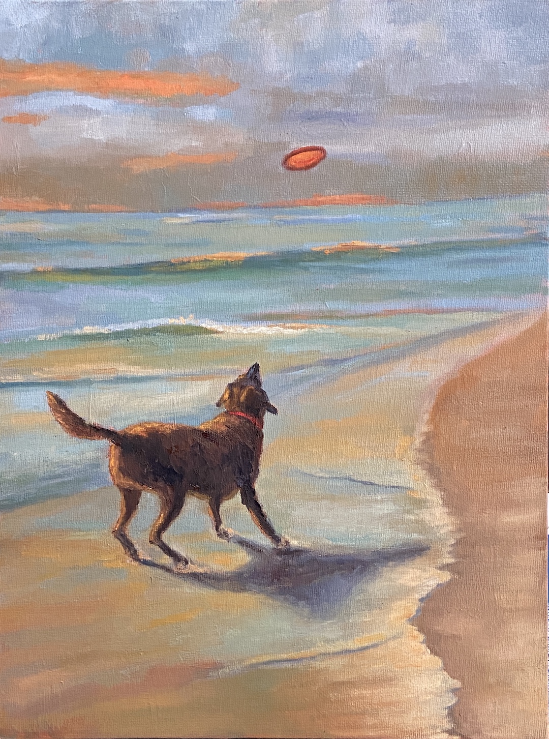
This is a preliminary drawing for a plein air session I plan to do later this week. This particular lighthouse is accessible via a jetty made of granite, which I can say from personal experience is deceptively long. As is the case with many lighthouses, the setting is often more impressive than the structure, which makes sense given they’re designed to protect navigators from the very dangerous geographies upon which they sit. Ironically, in a world where technology has made many lighthouses functionally irrelevant, they’re wildly popular destinations for visitors to explore… on land.
The other attraction to lighthouses, as an artist, is they’re much like snowflakes whereby no two are alike, so there’s something new to tackle with every composition. Combined with their intriguing landscapes, lighthouses are a must do as an artist.
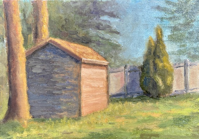
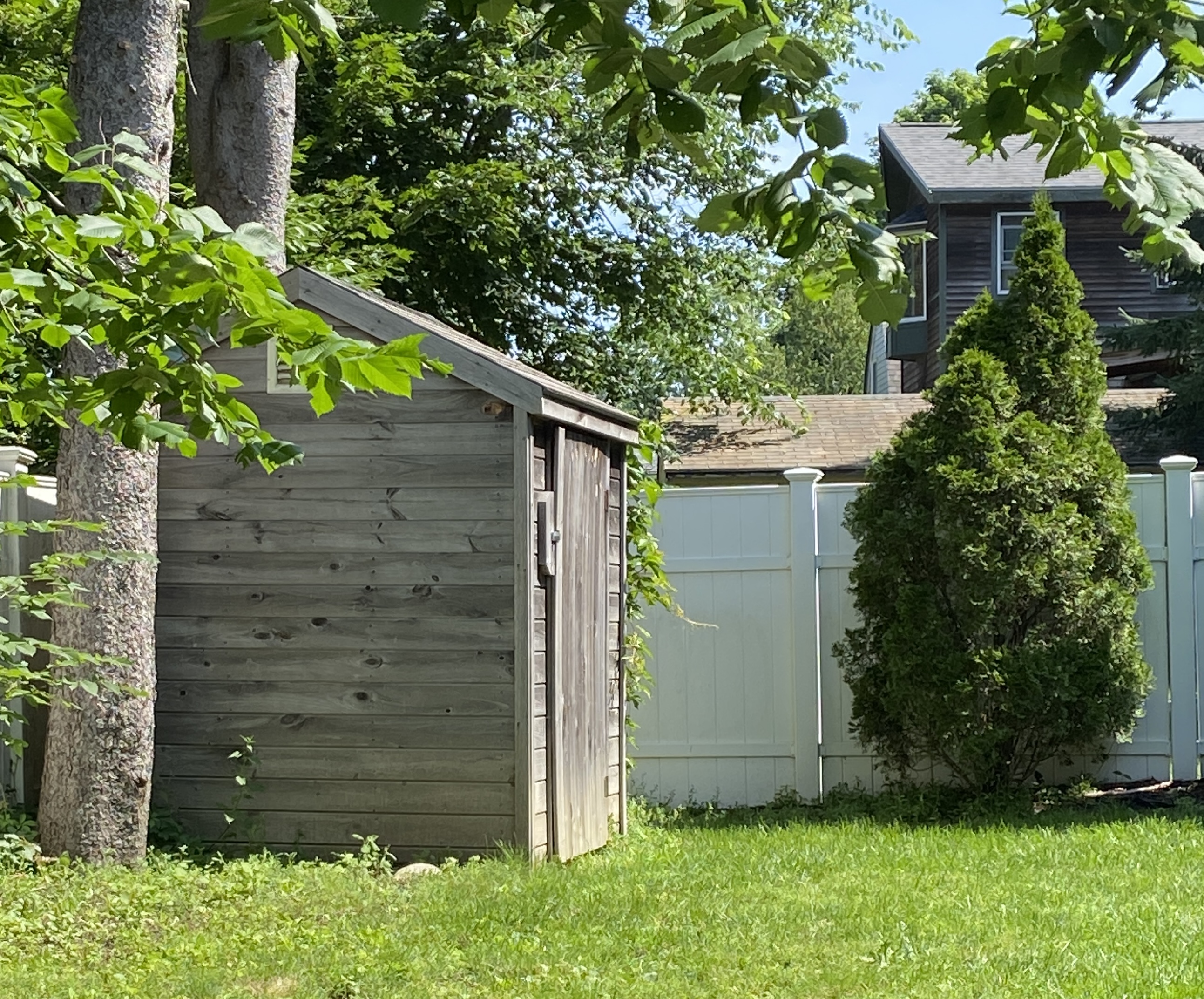
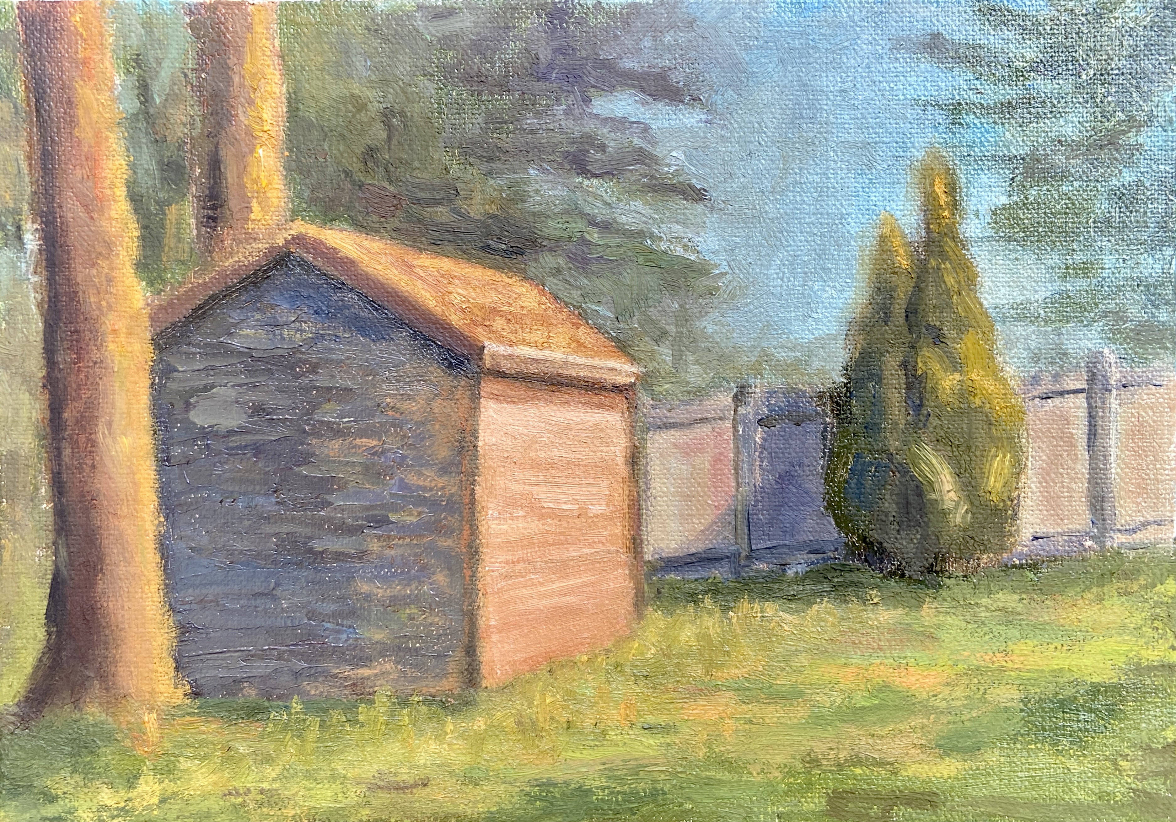
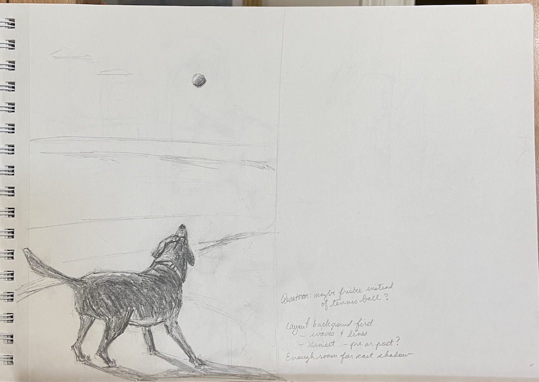
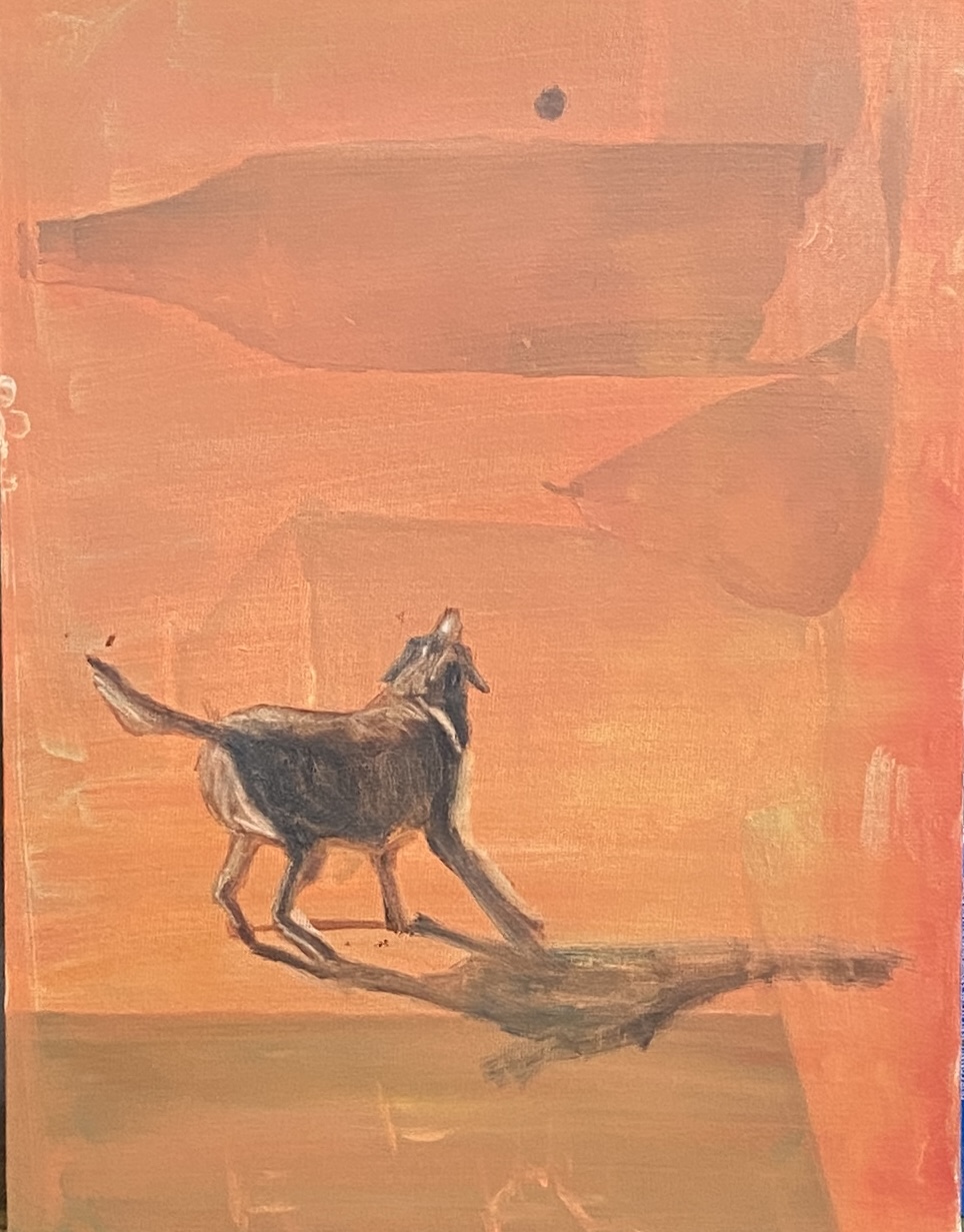
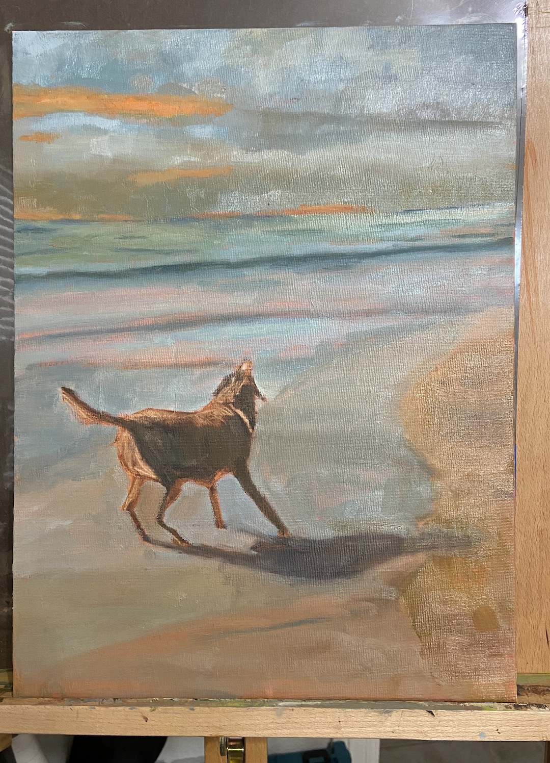
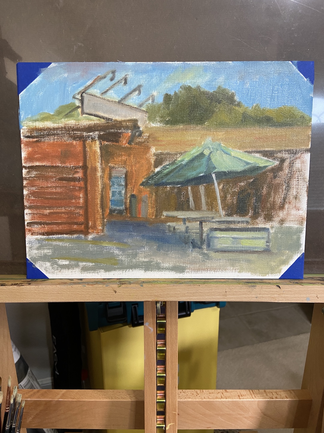
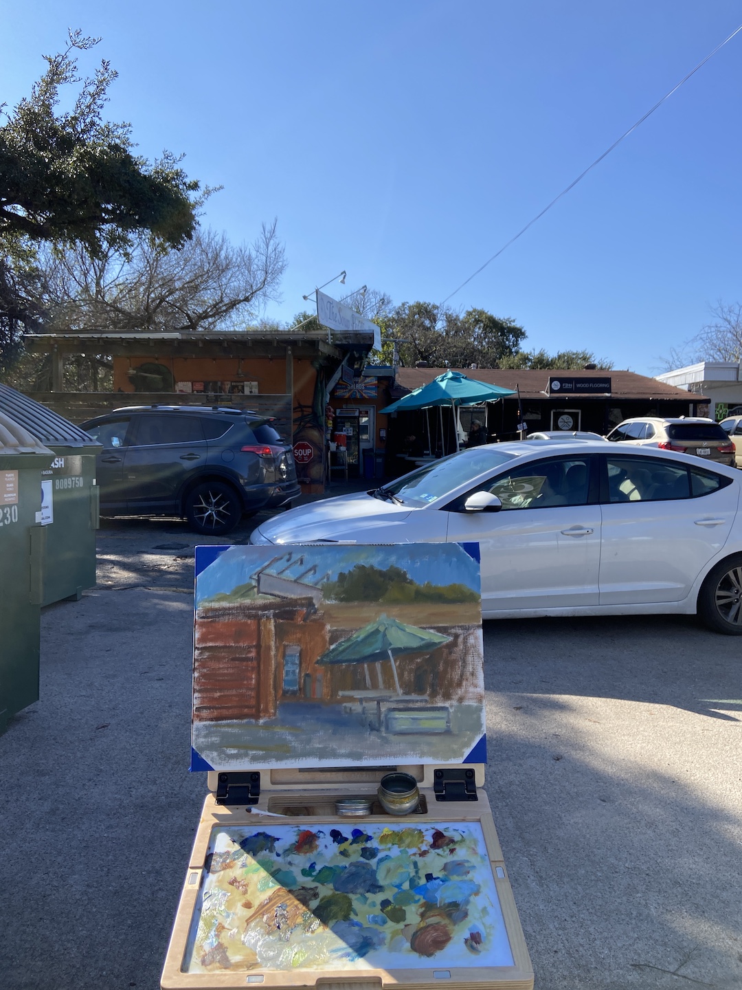
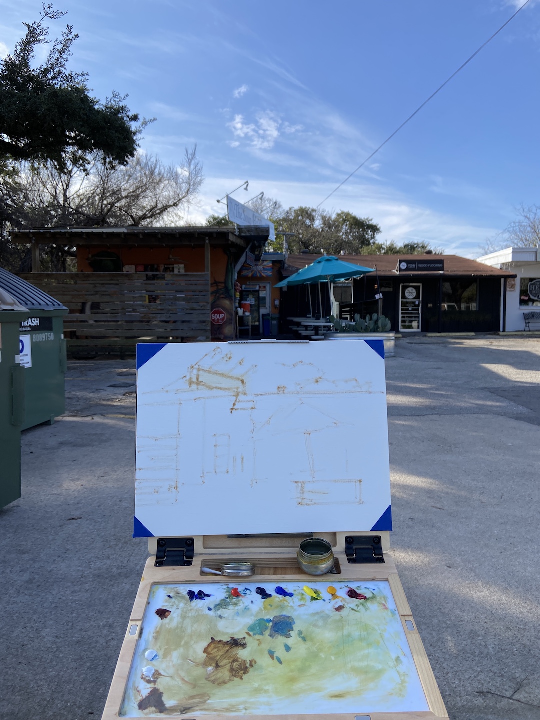
I like to do detailed drawings instead of quick sketches when the subject is complicated or something new. The jetty is very intimidating for me, so it was important to get a handle on how to simplify while not losing the feel of all those massive granite blocks. I’m not sure if the drawing approach will translate to the painting, but a few things become clear from this exercise. First, the layout of the blocks needs to have defined directional lines in the fore and mid ground planes to capture the overall shape of the jetty. Secondly, there are numerous tiny shadows and value variations that give the blocks their distinct shapes, which will require some trial and error once the paint hits the canvas.
Stay tuned for more on Spring Point lighthouse!
#artbern #berntx #crashboomzip #painting #art #abplanalp #austinartists #atxartist #contemporaryart #southportlandmaine #abplanalp #bernabplanalp #springpointledgelighthouse #lighthouse #lighthousepaintings