Porto Venere

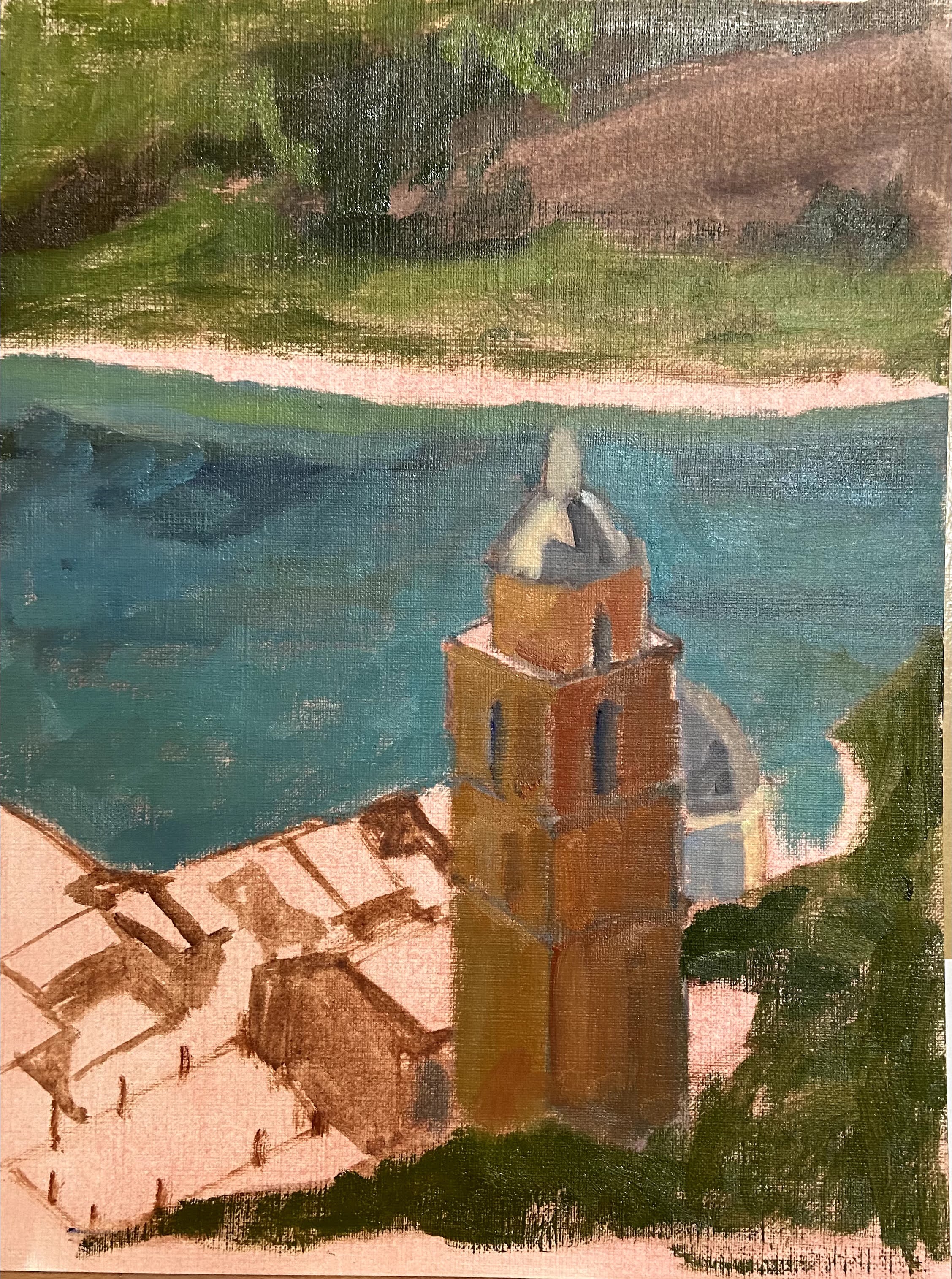
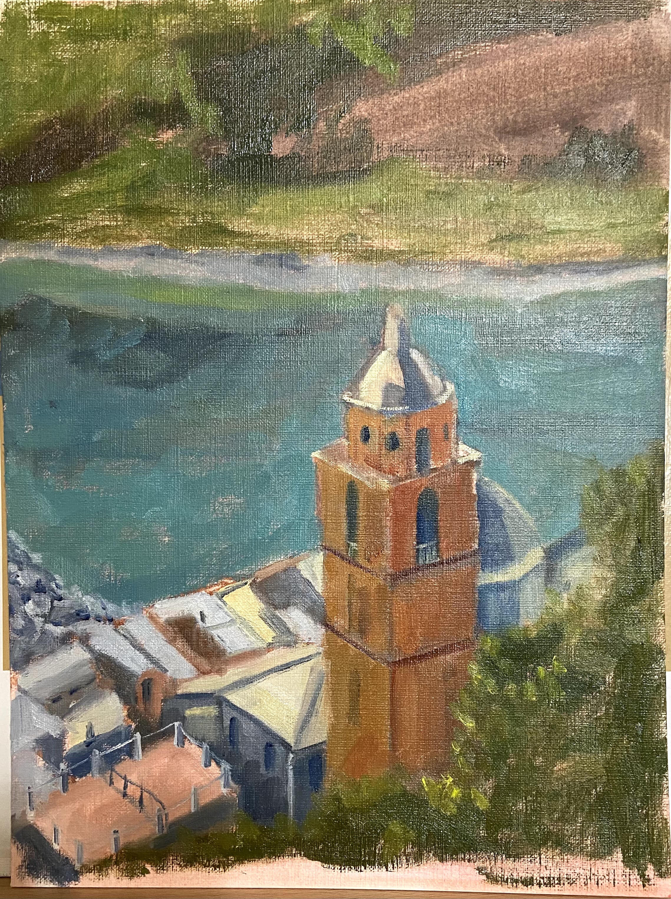
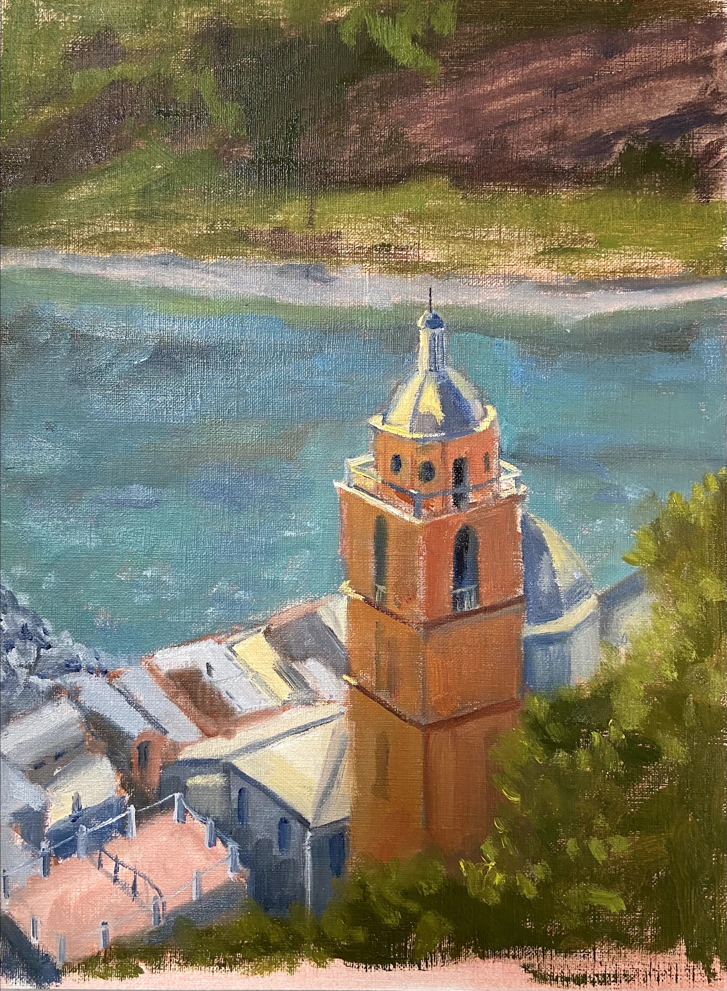
Porto Venere (study)| 9” x 12” | Oil on Canvas Paper
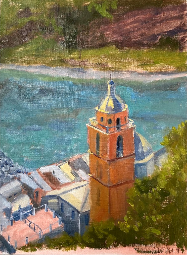
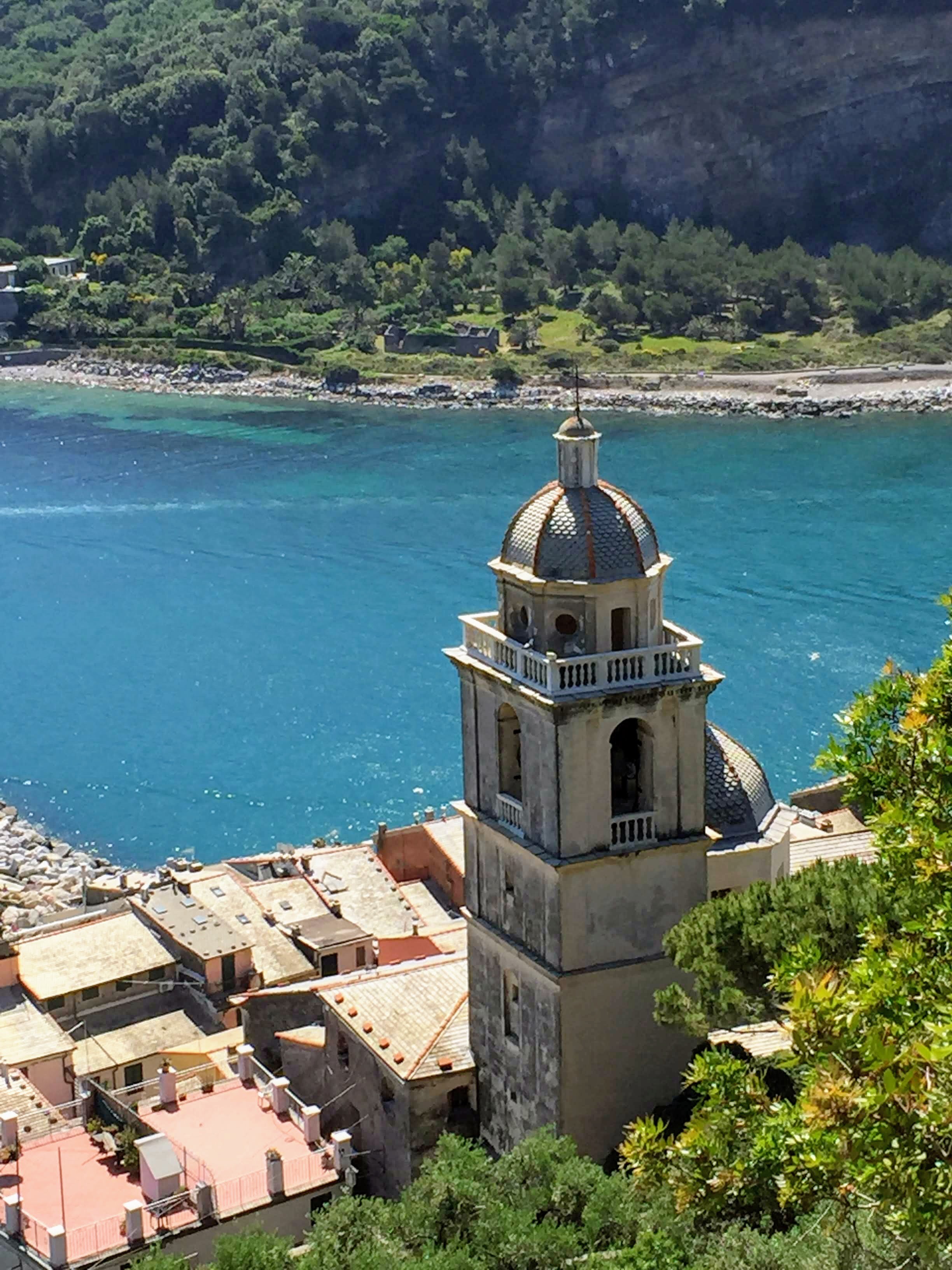
This composition has been on my short list for awhile, so I’m very excited to have put brush to canvas finally. The subject matter is a photo I took from the hillside in Porto Venere, Italy. The power of the sun shining on the church tower with the beautiful blue water in the background was an ideal setup for this piece. It kinda painted itself.

I’ve done a number of practice (studies) pieces in the past to get an idea of what I need to consider prior to tackling a larger composition. It’s extremely helpful to get a sense of proportions, values, and start thinking through edits that will make the piece work regardless of what’s in the photo or real life. My problem with doing a study is that I always end up getting sucked into the details – I just can’t help it – so they drag on and I lose the value of doing a practice piece.

To solve this problem, Porto Venere was time bound to 2 hours after the block-in was done. I literally ran a stopwatch to ensure I stayed true to the spirit of the study and focus on the compositional core elements, not the fine details. It forced me to make quick decisions and gave the piece a more painterly style, which I like and will try to incorporate into the full-size painting.

#portovenere #italy #cinqueterre #berntx #crashboomzip #painting #art
Getting Thirsty

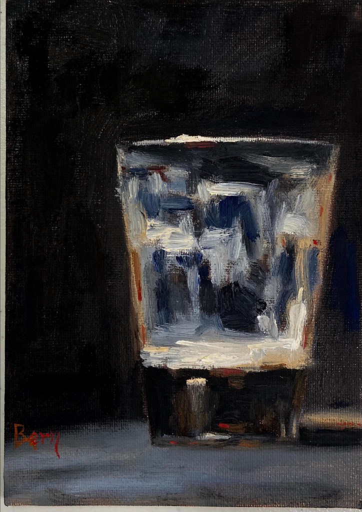
Last Sip | 5” x 7” | Oil on Canvas Board

Last Sip | Oil on Canvas

Dark beer as an inspiration seemed like a great idea for this quick still life. As you can guess, I do love a good dark porter, #512brewing!

This piece is also influenced heavily by the work of Neil Carroll, who has a great talent for making simple still life transform into beautiful, relatable art. In this case, also quite quaffable.

The Last Sip was a great piece for glassware still life. I liked the challenge of defining the pint glass despite having a dark beer on a very dark background. I thought that would be more difficult than it was, but the dominance of dark values actually made it easier to pull the glass reflections out of the piece.

I also tried to work in some warmer elements of sienna, orange, and out-of-the-tube red to distinguish the porter from the dark background coming through the clear glass.

Hope you’re thirsty… go grab a beer!

Yellow Rose Botanical

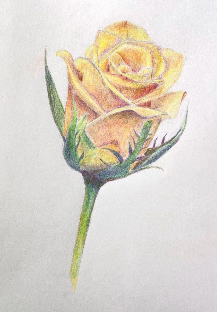
Yellow Rose Botanical | 8” x 10” | Colored Pencil on Paper

I finished my botanical drawing (virtual) classes last week and this Yellow Rose is my final project. The sessions were 2 hours weekly for 8 weeks, the instructor (Jenny Granberry – @jennygeeberry) was hilarious, and I learned a lot about both botanical artistry and how to use colored pencils properly.

Yellow Rose Botanical Drawing

The biggest challenge was figuring out how to incorporate a range of colors beyond basic yellows to add interest, value variations, and realism. I was using a limited palette (12 pencils), but through some trial and error I managed to land on a few color combinations that added a lot of depth to the overall piece.

I’m hoping to do a few botanical series over the course of this year. I like the idea of colored pencil drawing because it incorporates drawing and a lot of oil painting concepts, although the techniques are very different.

#contemporaryatx #berntx #crashboomzip #rose #art #drawing

Dangling Paws

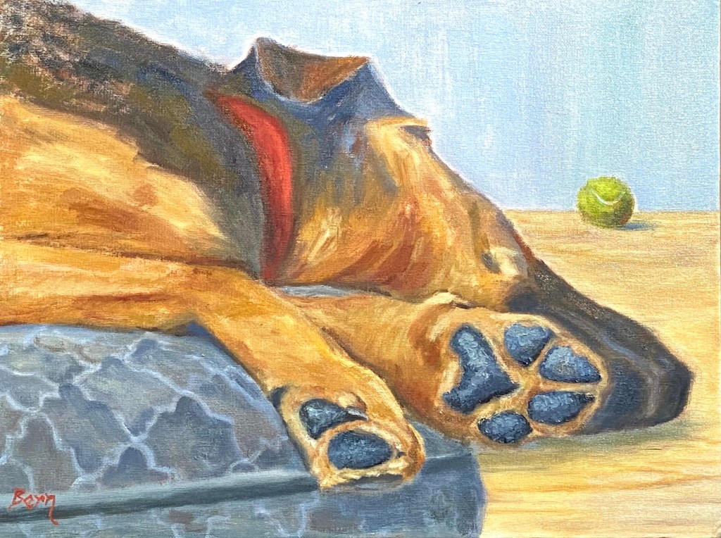
Dangling Paws | 18” x 12” | Oil on Canvas Board

This piece is inspired by playtime with Wolfy, who loves fetch despite the challenge of galloping around with his huge paws!

Dangling Paws

There were a few new challenges with this piece, namely capturing the various golden browns of Wolfy’s shepherd-hound coat, as well as the texture of his paws. The key to the coloring was working in various reds and warm yellows, but it took a lot of experimentation to get the right likeness. The paws were more about the texture from using a painting knife instead of a brush, which made the surface of the paws look rough and realistic.

However, the hardest part was the dog bed. I got it in my head that the pattern of the bed would help give the sense of plush comfort that Wolfy’s 85 pounds was enjoying as he slept with his head and paws dangling off the edges. It turned out to be effective, but the next time the bed will have no artistic flair.

Thanks for reading!

Rothenburg ob der Tauber

Oil on Panel | 9” x 12”

This composition is from a trip we made to Germany not too long ago, although after this awful year it seems like a hundred years in the past. Since traveling isn’t an option, I’ve decided to start painting great locations as a meager alternative.

If you Google Rothenburg ob der Tauber, this scene is what will show up in the list of photos. While I agree it’s an outstanding view, I wanted to drive the focal point to the clock tower instead of the orange wooden house in the foreground.

This is the end of a late Fall day, which wasn’t very clear without the addition of bundled up people walking through the streets. I struggled with the decision to add people to the piece, but in the end I wanted to convey the sense of season and a more idyllic time without tourists.

“Something Blue” Auction

Trying out an eBay auction this week for a piece posted recently called Something Blue. If you’re interested in bidding check it out here. The auction runs through Sunday 5pm CT.

Something Blue

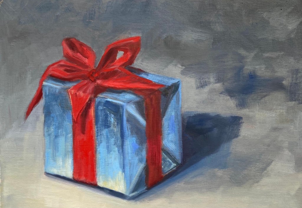
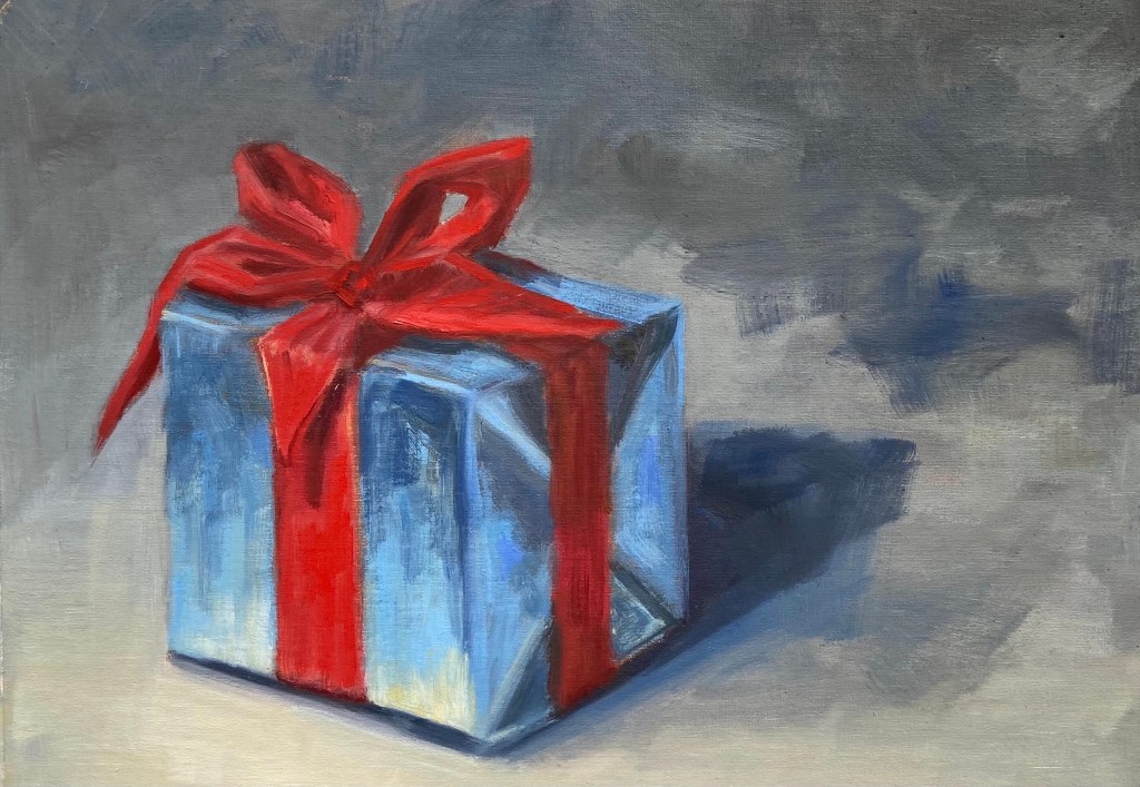
Blue Gift Red Bow | Oil on Canvas Paper | 12 x 9 | $30

Blue present with a bright red bow is a foray into holiday themed still life. Stay tuned for ornaments, candles, and more gifts.

Live Painting Demo – Austin Studio Tour

Greetings art fans! If you’re interested in watching me create a holiday themed painting LIVE, tune in on my Austin Studio Tour live stream event this Sunday, November 22nd from 2-4pm Central.


The details and links to the Zoom stream are posted on the home page of the Impasto website, https://crashboomzip.wordpress.com. This is a come-and-go event, so drop in if you’re interested anytime.

#AustinStudioTour2020

Ball! Ball! Ball! Ball!

Oil on Paper | 6” x 8”

If you’ve been reading my blog for the past year, you’ll recall the familiar look of this battered tennis ball in the Ball! Ball! Ball! composition. This was done on paper, while the original was on canvass board. I definitely prefer the teeth of the canvass board because it allows for a more textured look, lending to more realism in terms of teasing out the hairs of a well used tennis ball. 

Ball! Ball! Ball! Ball!

The palette was simple, but I never got the clay court orange just right. I’ll have to experiment before doing it again on a larger scale. The green of the ball itself is a base of Permanent Green Light, straight out of the tube, with variations of Cadmium Yellow Light and a touch of red. The shadow side of the ball is more traditional green from Ultramarine Blue and Cadmium Yellow Deep. 

Lastly, a comment on fine details. This ball doesn’t look like a tennis ball until the final white seam is added. It’s amazing how a very simple object such as this ball doesn’t come into focus until the one identifying element has been added. Without the seam, they’re all just yellow green fuzzy balls. 

“Emergent”: A Brushes With Cancer Collaboration

Oil on Canvas | 40” x 30” 

I’ve been working on a very exciting piece in a program called Brushes With Cancer, which “provides psycho-social support to those touched by cancer to improve the quality of life for cancer patients, their family and loved ones, through a unique art experience.” 

Emergent is a collaboration with JoAnn Sackett, another participant in the BWC program, who is a cancer survivor and the inspiration for the piece. You can learn more about our pairing and the creation of this piece at our page on the Brushes With Cancer Austin event site. 

It’s an honor to be involved with Brushes With Cancer and their Austin 2020 program. I hope you enjoy learning about their mission and enjoy the artwork in the links provided in this post.