Art for the People Gallery in Austin Tx, is a showcase for 100 local artists.
Art for the People Gallery in Austin has included 3 of my compositions in their Summer group show “ABUNDANCE”, which runs July 2nd through August 26th, 2022. I’m thrilled to be a part of this talented group of artists! If you’re interested in original artwork by Austin artists, check out AFTPG either in person in Austin or browse their online store.
The following paintings are part of the show (links lead to previous blog posts about these compositions):
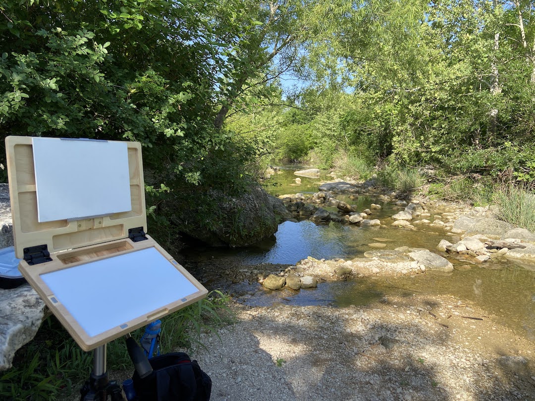
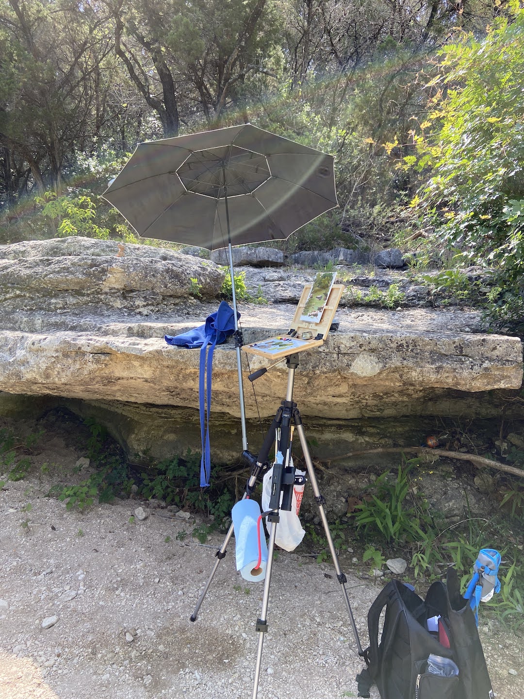
I might have chosen the wrong year to ramp up my en plein air experience, case in point the month of May in Austin is already registering 100 degree days. Ugh! Regardless, the mornings are bearable and I had to break in a new pochade box called u.go. by New Wave Art… more on that later.
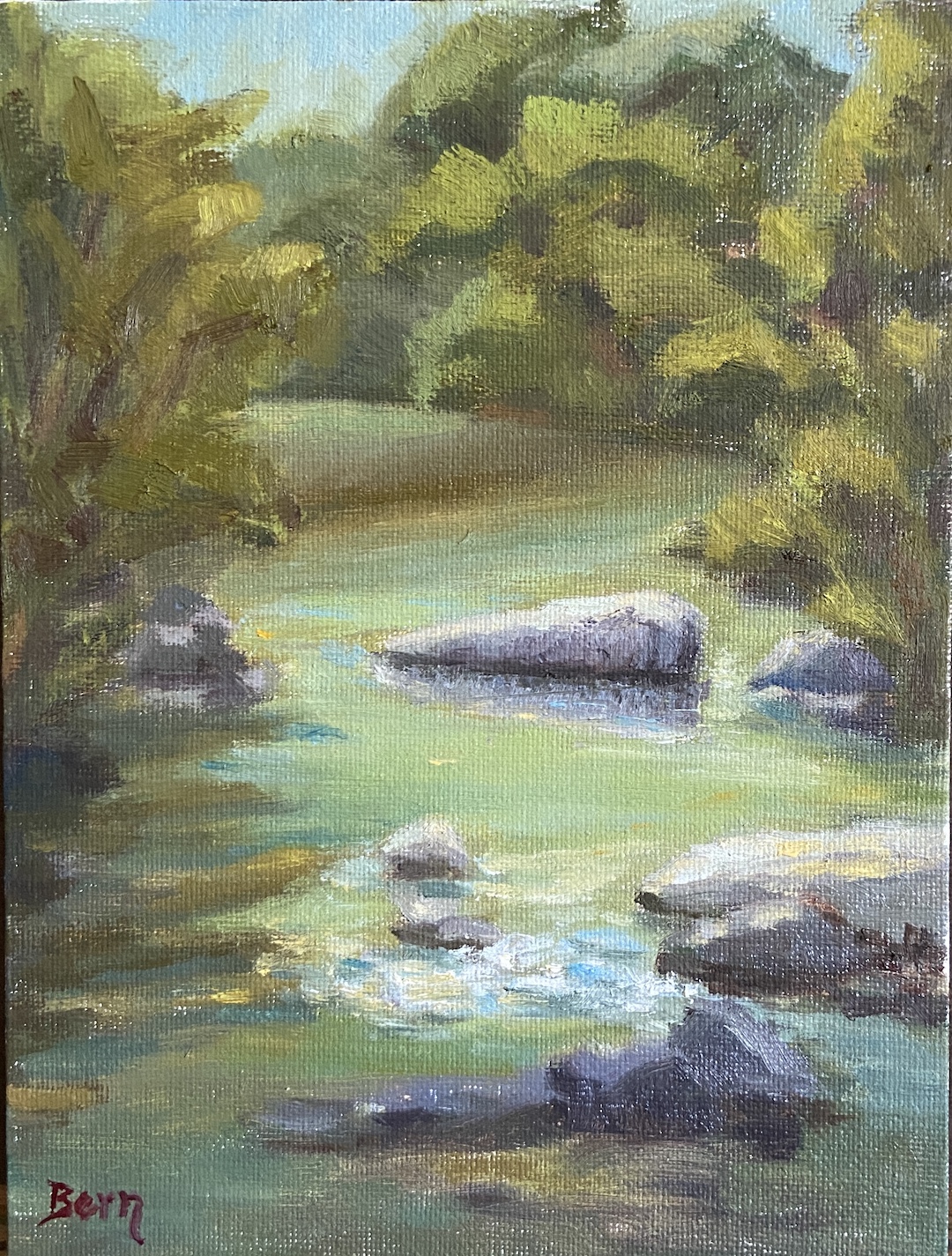
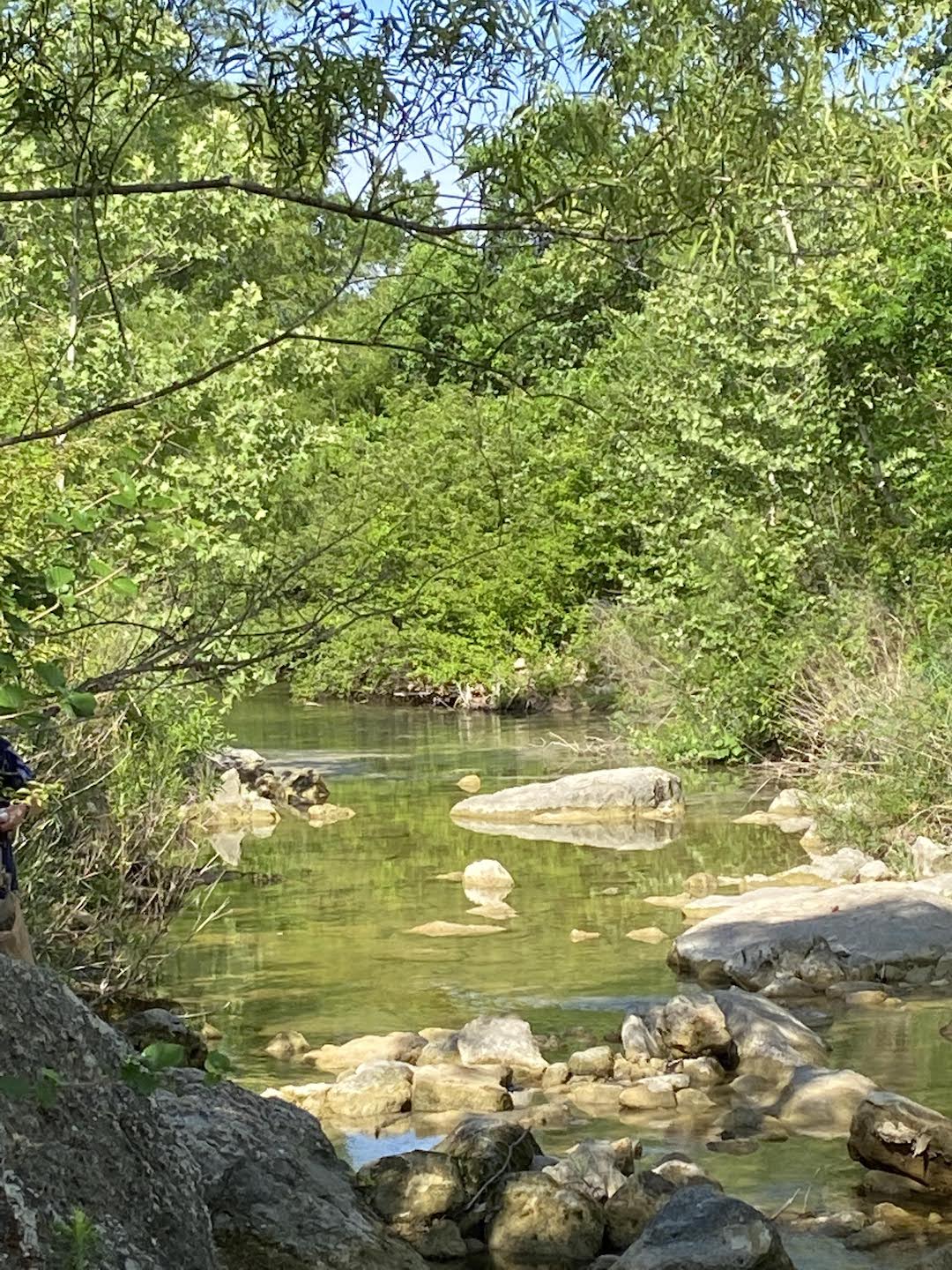
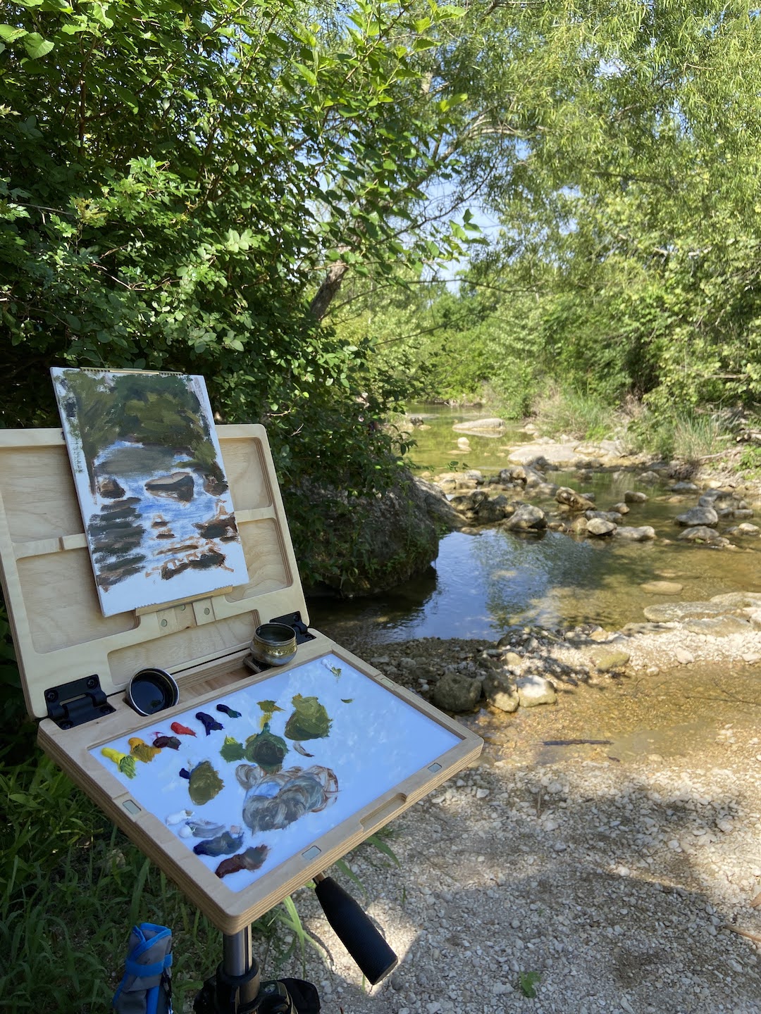
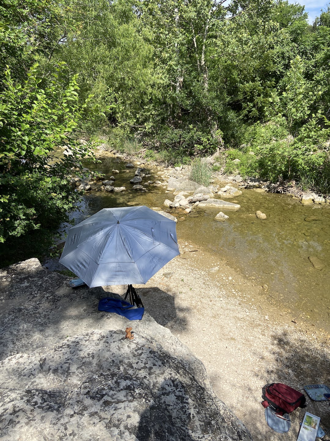
This session was at Bull Creek Park with a few other painters from Plein Air Austin. For those of you familiar with Austin, this is the northern stretch of Bull Creek near the Spicewood and 360 intersection. For the uninitiated, it’s ideal for painting outside because there’s usually some good water options along the creek and lots of shade.
The focal point of this composition was the rocks in both the foreground where the shade and light merge, and secondarily the larger rock bathed in sunlight. I was very happy with how this turned out even before I got back into the studio for refinements. I went into this plein air session committed to focusing on values, starting by driving the darks into darkness-of-a-bat-loving-cave kinda dark, then finding high contrast opportunities for the lightest lights. I took some artistic license in this area, fabricating some water movement that wasn’t there, but it made for a more compelling viewing experience in my opinion.
Additionally I muted the trees on the banks, especially the left side, so as to ensure they didn’t distract from the main focal points in the water. I had initially used much lighter, saturated yellow/greens on the trees, but that muted all the lighter values in the composition, which absolutely killed the scene. I’m pretty sure this is what I’ve done in past plein air sessions that has confounded me. I’ll keep my fingers crossed this will carry over into the next outing.
The use of olive green variations on the shadow parts of the distant water were also a change in approach. One of my fellow painters made this suggestion and it proved to work really well. Painting outside is fantastic! This particular outing was of note because I got to share ideas and chat with the other painters. We even treated it like a workshop and did a mini critique of our works at the end of the morning. This was particularly interesting because of the 4 painters, there were 3 different mediums represented – oil, water color, and gouache.
Lastly, my new u.go proved to be a great upgrade to my plein air armaments. Thank you to my awesome wife for giving me the perfect artist gift! The best part about the u.go is the portability. The length and width dimensions are almost identical to my EasyL pochade box, but it’s very thin, so it fits much easier in my pack. Very sturdy and compact design make it a must have piece of equipment for me.
A composition comes around sometimes and slaps you in the face, a hard reminder that you don’t know jack squat about painting. In this case, 3 Pots told me I need to work harder on my plein air compositions, starting with the basics. There’s something addictive about plein air painting, even on the bad days that seem like you can’t get anything right.
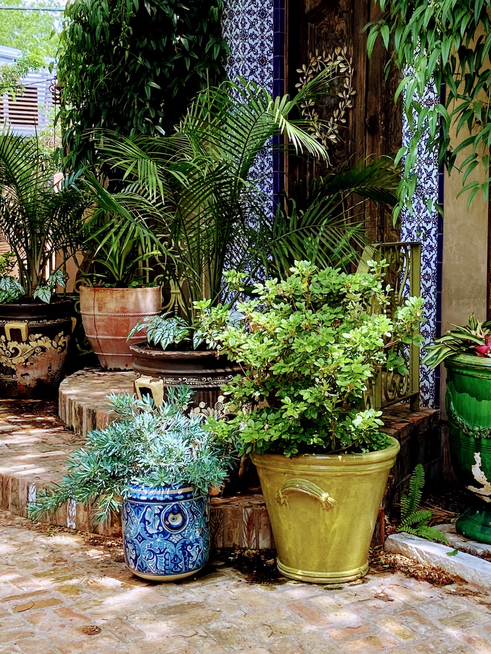
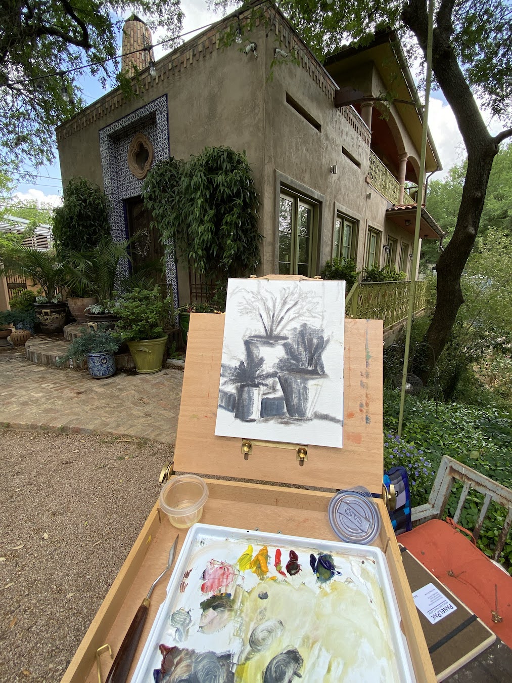
This plein air session was at a workshop in Austin with Laurel Daniel, an exceptional artist and talented instructor. We were at Jennifer’s Gardens in central Austin and during the afternoon session I focused on 3 pots that were sitting on some terra cotta steps. They were in the shade, error #1. The green plant was in a green pot and the blue plant was in a blue pot, error #2. I decided to paint them anyway, error #3.
Despite the challenges in the field, one thing I did get right and was pretty excited about, was the initial block in. I was able to quickly get all 3 pots laid in properly and to scale without issue, something a few years ago I would have needed a few sessions to get right. Then everything went flat.
Chronic Muted / Flat Plein Air Work
For the life of me I couldn’t get enough value contrast going, as if I was actually ignoring that basic design tenet. I really noticed in when I returned to the studio a few days later and was frankly amazed at the mono-value of the entire composition. There was also no getting around the design error of green pot on green plant and blue pot on blue plant.
I considered throwing it in the bin, but opted to spend a dedicated 2 hours, and not a minute more, to see how I could fix the core elements. The first step was to really push the darks throughout, which I would find later was the crux of the issue. I need to really recognize what “dark” looks like in outdoor lighting – more practice should remedy this issue. The next step of the fix was to blast the contrast in values next to the darkest darks with the brightest, most saturated hues. While I ended up painting over some of these areas later, the establishment of what the value range should entail was very helpful. Remember, error #1 was shitty composition selection, everything shaded and no lighting contrasts.
Reference Photo3 Pots Block In3 Pots – Field Work3 Pots – Fixed and Final
The remainder of the rework was trying to establish nuanced color differences between the artificial color of the pots and the “same” natural colors of the plants. This part was surprisingly interesting, something I’d never done before, but it proved a valuable learning experience that I know will come in handy with urban landscapes in the future.
I have another “flat” plein air piece to fix, but likely won’t have the patience to tackle it for a few weeks, but I will do a side by side comparison with 3 Pots when it’s done so we can see if I learned anything… or if I’m just a hopeless idiot sometimes.
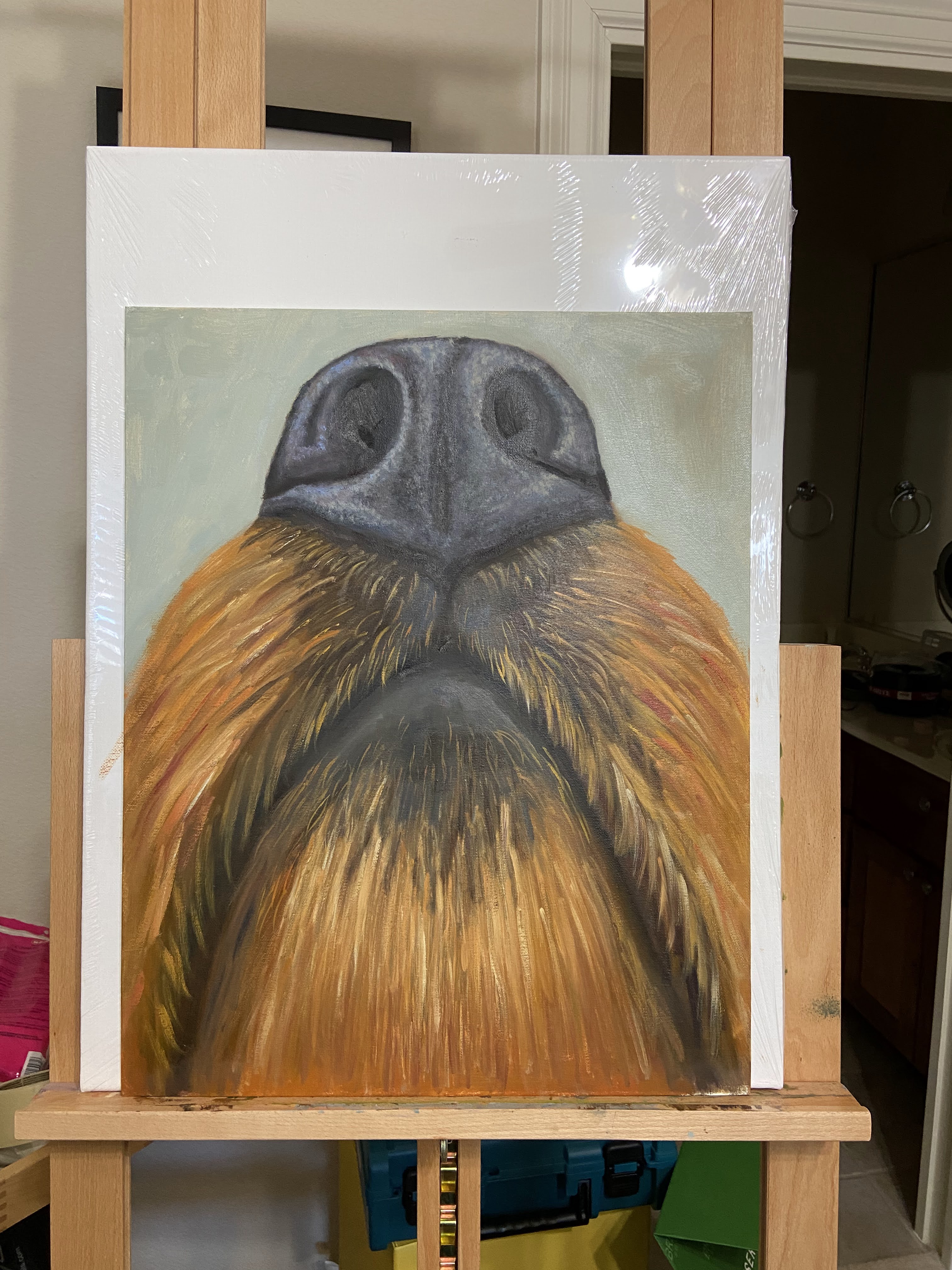
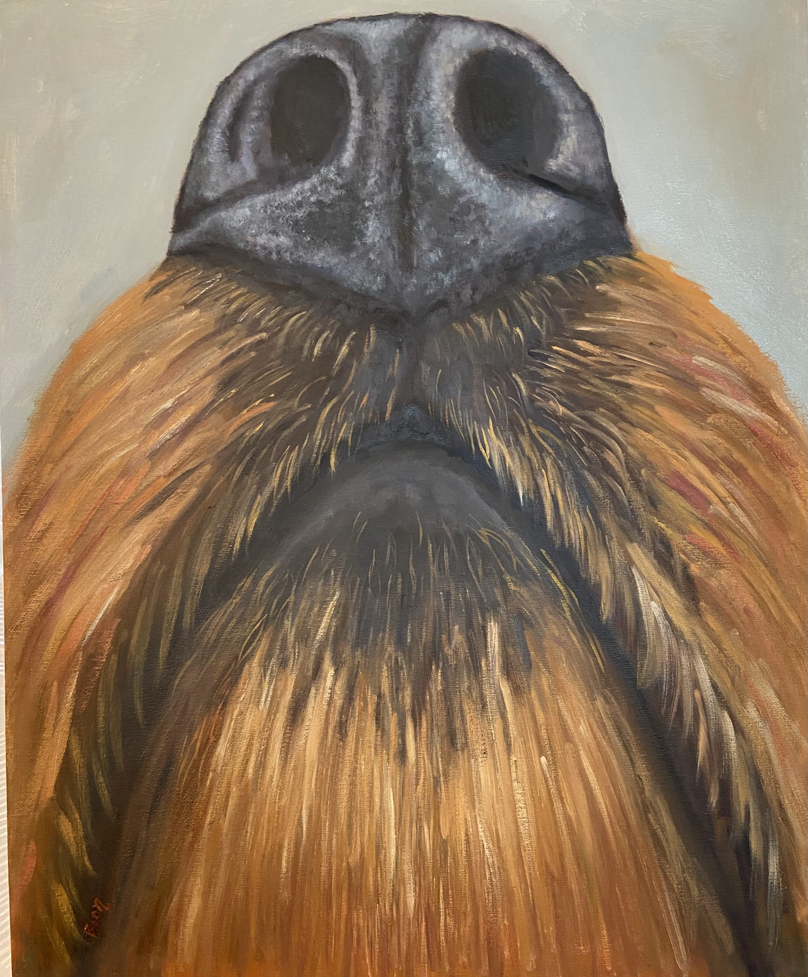
Those of you with nosy dogs might want to call this “hey, whatcha eatin’?” Either way, the nose of a dog is without question one of the most amazing features of any creature on the planet. I’ve read a couple of books that extol the power of the almighty wet nose, which has been helpful in understanding how my furballs perceive and investigate the world around them. It also led my wife and I to play games with our pups that essentially exercise their noses, which turns out is very effective in wearing them out.
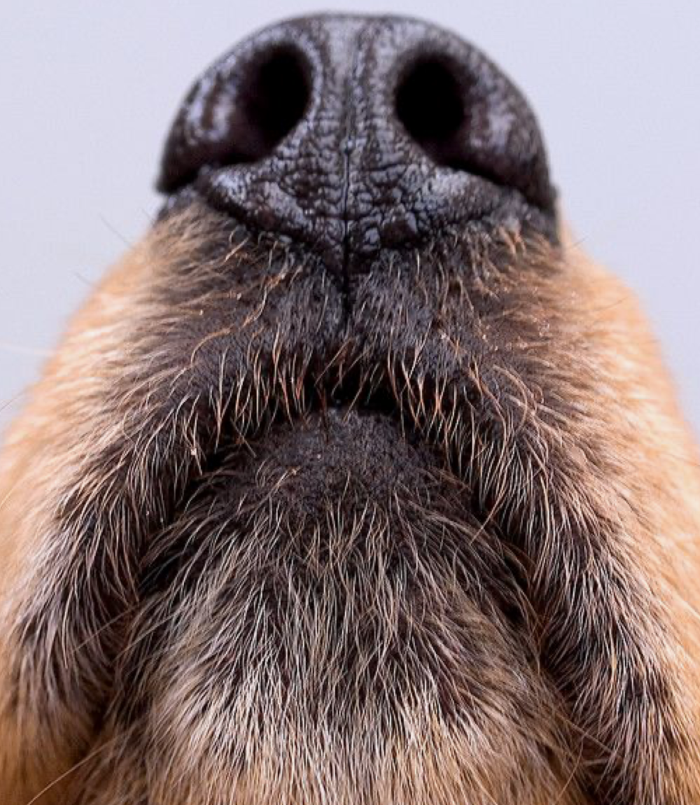
The perspective for this composition is from an unusual angle, namely underneath the head, but somehow looking up at the nose. It was a bit of self-inflicted mental torment because I kept pausing the work to make sure this is what a dog’s nose looks like when they go poking it up in the air. Every time I was sure the reference photo was somehow wrong, I would go check out my dog’s nose and sure enough, that’s what it looked like.
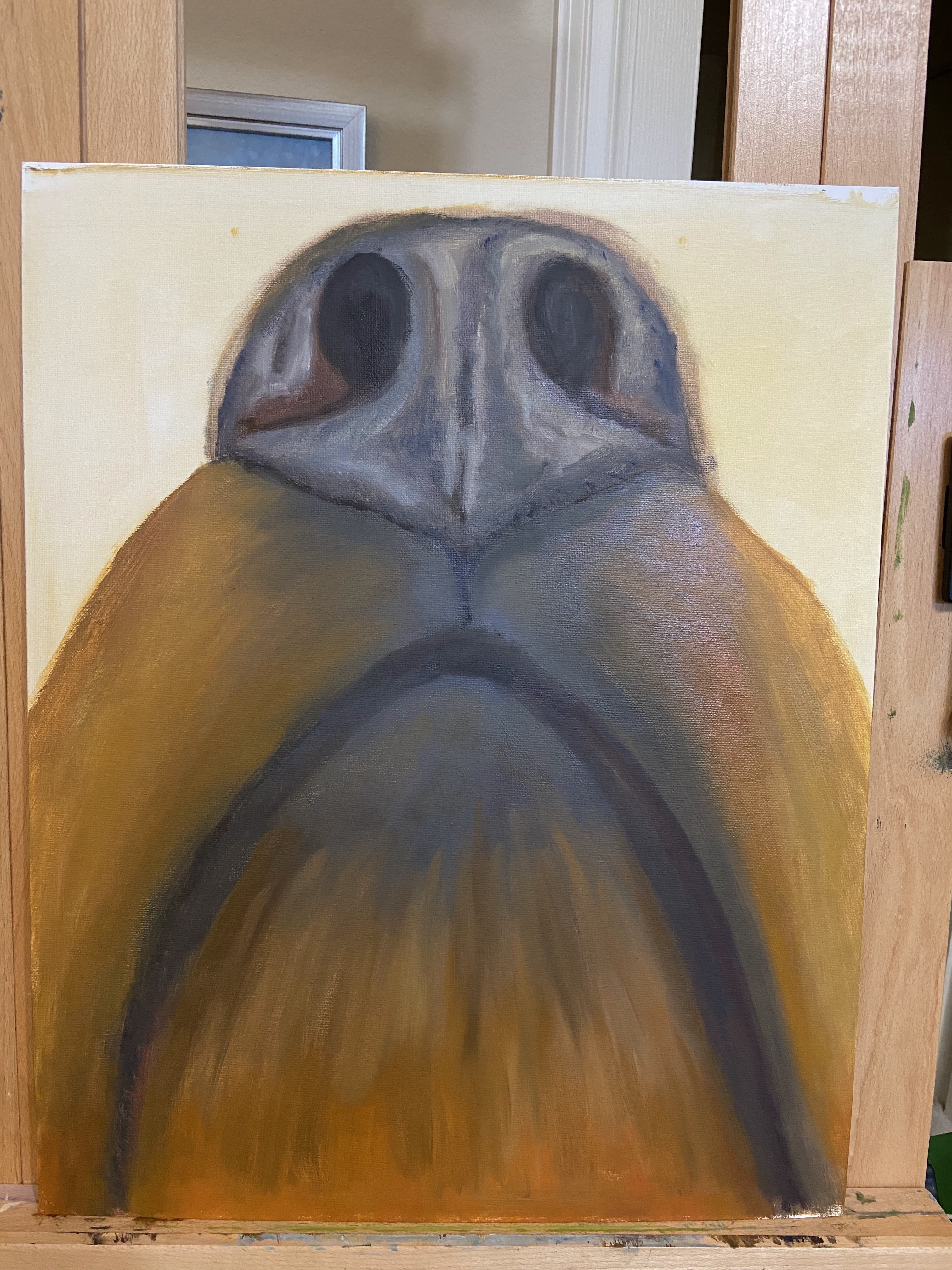
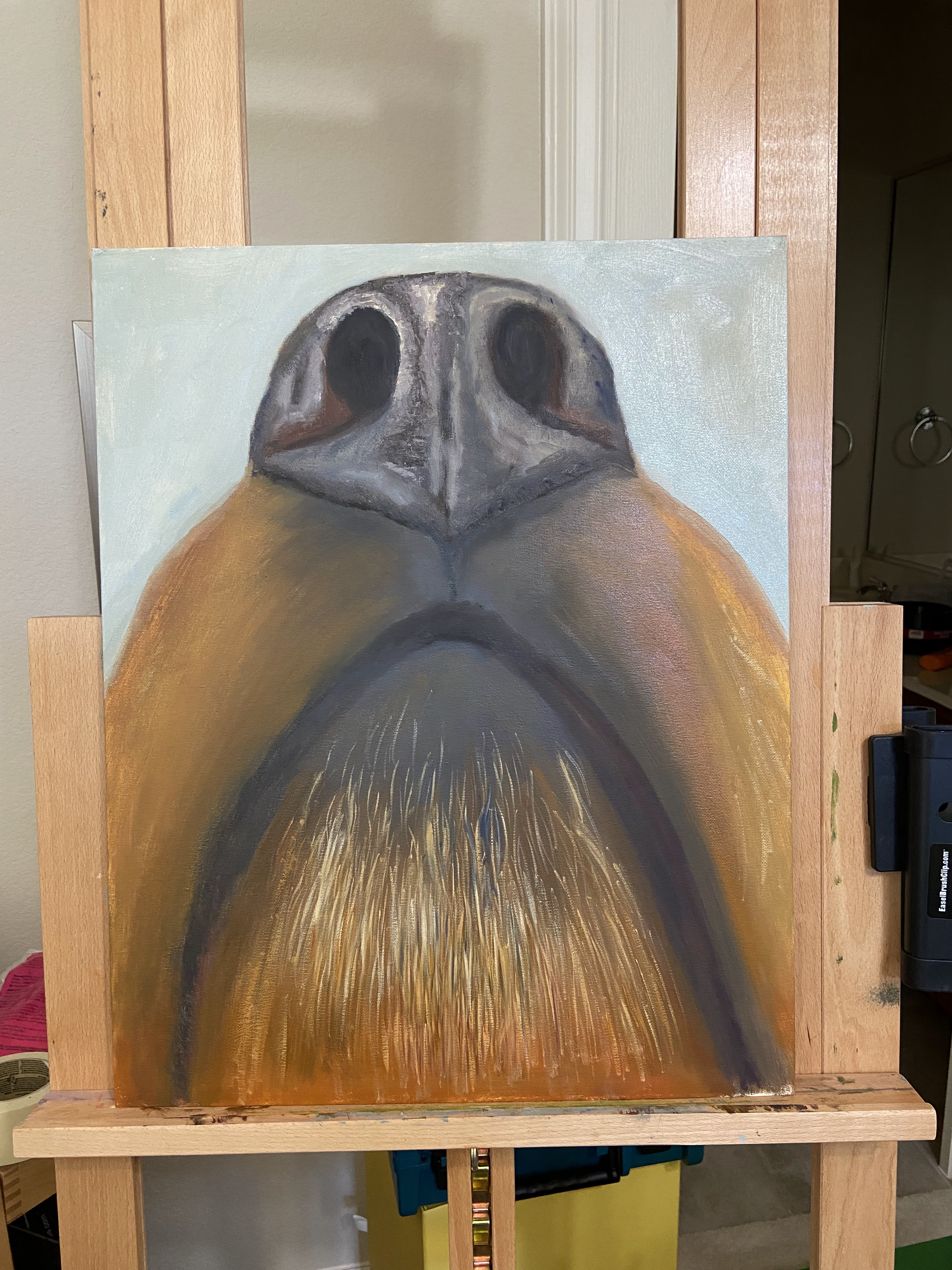
As a larger piece, I had some key decisions to make regarding how to render the fur and random hair structure under the mouth. I opted for size 4 and 6 brushes, mostly rounds and flats, to balance the realism of hair while not committing to individual strands throughout. The key with this kind of structure is to ensure disciplined layers that start dark and eventually work light. I also found it useful to do a fair amount of wet-on-wet to get a homogenous look / texture to the hair.
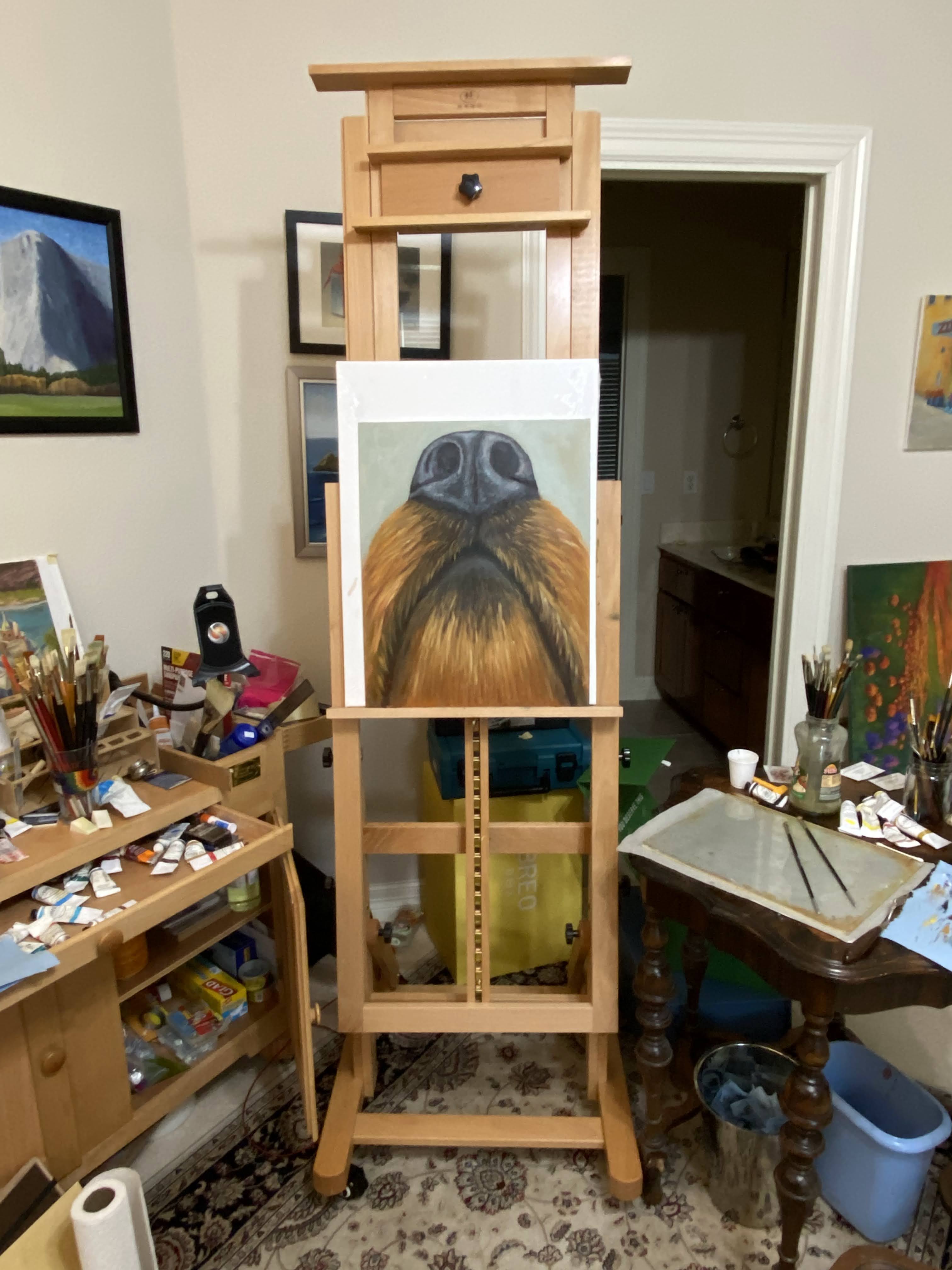
There was a lot of stepping back from this piece to get proper perspective. My plan (always have a plan!) was to view this painting from at least 10 feet, which would allow the observer to really get a sense of the whole snout and see the nose as the focal point. I know this will sound silly, but I kept likening it to an ice cream sundae with a bourbon cherry on top. To draw people to the nose, the texture was critical. This was largely accomplished through a variation of dark mixes, mind you no pure blacks, but warm blues, cool dark reds, and warm yellows to mute the saturation.
Lastly, from a technique perspective, I used a couple of really beat to shit brushes to create that classic dog nose texture. I did some scumbling I suppose, but most of what I was doing didn’t have a painting term – I was basically just smashing and tapping these old brushes loaded with paint all over the nose, creating various transitions in planes and values until it looked right.
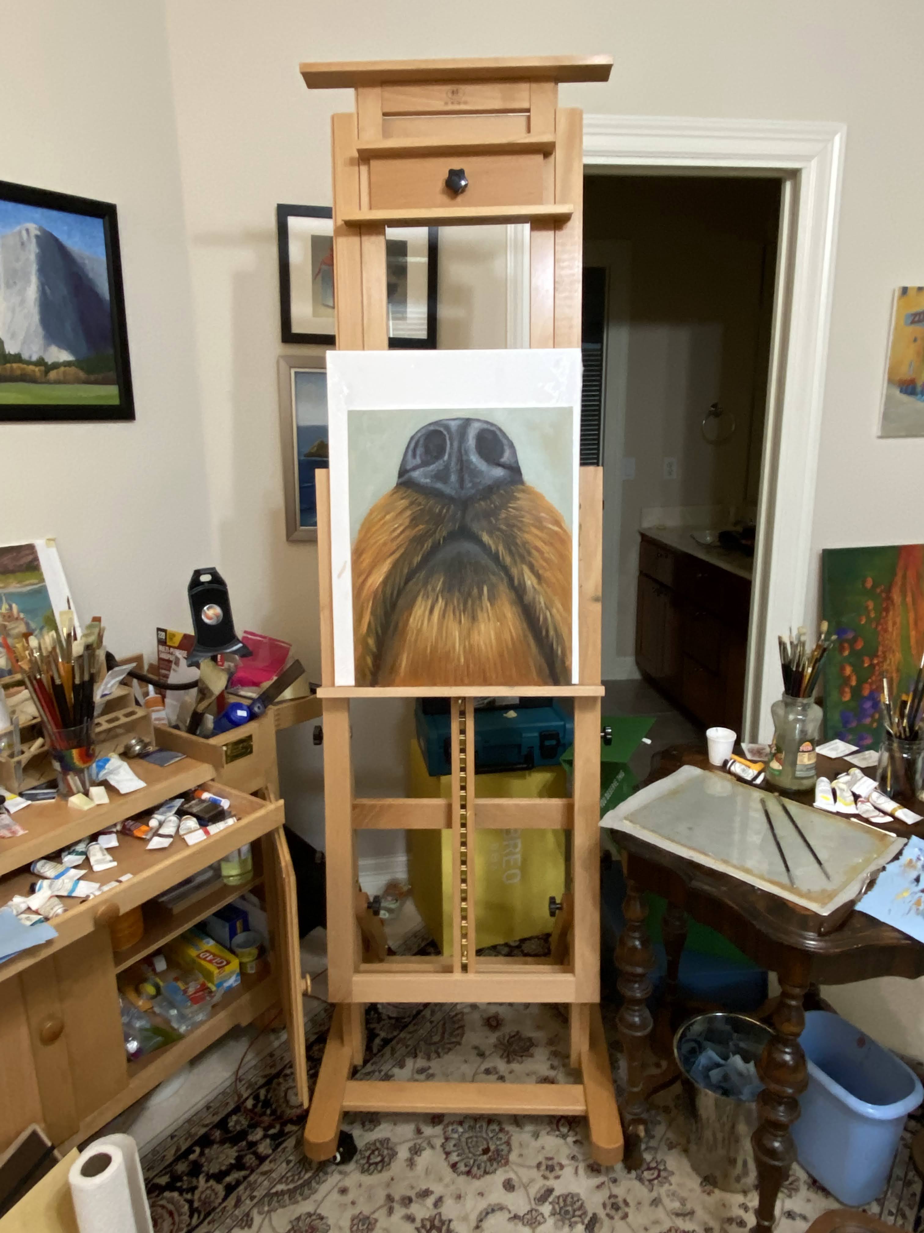
Reference PhotoBase LayersHair and Nose ExperimentationNostril Imbalance!Sniffer Final10′ View
I really enjoyed doing this piece and I’m ecstatic that my wife loves it, too. This particular piece is going on our walls once it’s dry, but it will not be the last time I paint a beloved dog sniffer.
This one was a challenge for a few reasons. First, this adorable pup is a newly rescued dog one of my good friends adopted recently, so there’s the pressure of getting it right for a multitude of reasons. Secondly, Lyra’s stare is very intense in this portrait, so the need to capture that “what are you looking at?” essence is a new challenge for me. And lastly, Lyra has LOTS OF SPOTS!
Looking through the progression shots in the gallery below, it’s clear that there were a few challenges with the length of her snout. There’s nothing more frustrating than nailing a dog’s nose only to realize that it needs to be erased because you gave the pup a Pinocchio nose. Glad I did opt to erase, though, because it made all the difference in getting her likeness right. In fact, this composition reminded me that I frequently err on the side of Pinocchio noses, so I need to remind myself every time I start a portrait to keep it short!
Back to my friends who adopted Lyra…. she’s a lucky girl to have found such a great home! My friends live in a part of the country that lends itself to great outdoor adventures and plenty of room to run. While there were some lose leash walking and other training challenges early on, Lyra eventually figured out what was expected of her and what seemed like insurmountable issues became distant memories. It never ceases to amaze me how adaptable dogs are to the world, so willing to forgive and live in the now while embracing those who show them love and compassion.

 Sniffer | 16 x 20″ | Oil on Canvas Board
 Dog Tired | 16 x 12″ | Oil on Canvas Board
 Shaken | 8 x 10″ | Oil on Board