Glowing Happy Hour

LAMP GLOW | 10×14” | Oil on Panel
Reference Photo, Photographer Unknown

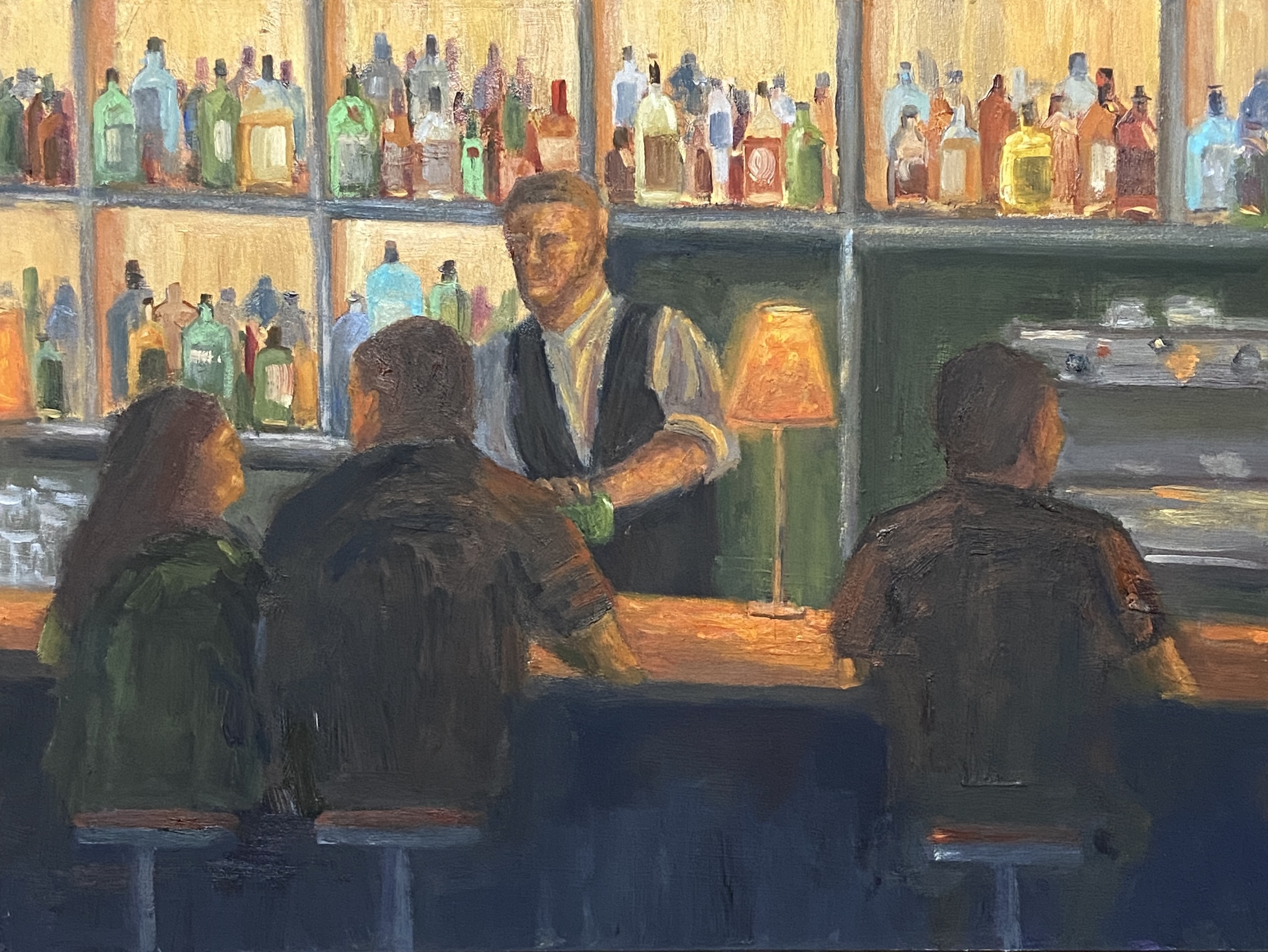
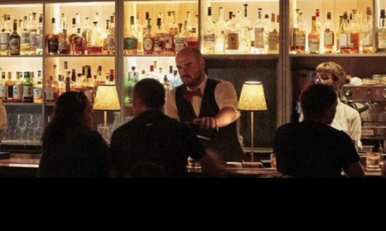
Oftentimes I use my own photos as inspiration for my paintings, but I also use pics from people I don’t know. This is something I believe most painters do, typically for a couple of possible reasons. First, I paint, I’m no photographer, so my photos are, well, not very good. Some things even an iPhone can’t fix. So I might use my own photo as the main reference, but find other options online of the same area to enhance the view. The other main reason for using a reference shot from someone else, be it an individual, magazine, etc., is because it’s something or some place I’ve never seen or been to personally. It’s this latter reason that applies to this new piece, LAMP GLOW. 

I spent a lot of time on the canvas with this one, which was expected given my lack of experience painting people in detail. In fact, I must have wiped the face of the bartender no less than 6 times, and reshaped the bar patrons many times as well. Ultimately, I’m happy with the result and I learned a lot in terms of technique and what NOT to do. 

Lamp Glow Detail

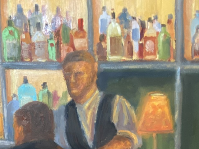
The focal point of LAMP GLOW is the glow from the lamp on the bar, not the lamp itself. Because the glow is a soft light with a mid-range value, it was a little tricky to make it work. Usually, the focal point of a composition is highlighted by things such as high contrast values or sharp edges. Lacking these options I pushed the saturation and ensured the soft, orange light bathed the primary elements in the painting, which (hopefully) makes the glowing lamp a clear focal point given it emanates throughout the scene. 

In terms of design decisions, I’m not sure I took the right approach regarding the liquor bottles in the background. While they turned out nicely, I think they’re ultimately a distraction and might be more effective if they were softer and less saturated. Oh, and painting 67 individual bottles is a wee bit tedious.

Stay tuned for more bar scenes! 

#austinart #artbern #berntx #crashboomzip #abplanalp #austinartists #bartender #bars #nightlife #happyhour #atxlife #steakhouse #lampglow #cocktails

Happy Hour – The Roosevelt

Happy Hour – The Roosevelt
Oil on board, 8″x6″
We’re returning to the still life series called Happy Hour. Cocktail #2 is hot off the easel and ready for your guesses. But first, time to reveal the answer to cocktail #1 from Happy Hour – Angostura… it was a Whiskey Old Fashioned! The Old Fashioned is one of the classic cocktails, but despite the simplicity of it’s composition, there are a number of subtle changes one can make in the base ingredients to create a wide range of variants. A very good recipe can be found here on PUNCH, my go to resource for all things cocktail. If you have a favorite riff on the Old Fashioned, please share in the comments!
Returning to Happy Hour – Roosevelt, the hints are few but specific. I excluded the city name from the napkin, but suffice to say it’s arguably the most important cocktail (and food) city in North America (although I defer to our Canadian readers for any challenges to this claim), birthplace of many classic libations. Any guesses? The answer will be revealed in the next cocktail series piece in a couple weeks.
The Roosevelt is another oil composition on an 8″x6″ gesso board. The type of cocktail glass is not something I would have tackled at this point, as it’s very complex and a bit beyond my comfort zone, but it was true to the cocktail, so I gave it a go. The other challenge was the color of the drink itself, a mix of cadmium red medium, cadmium yellow deep, titanium white and ultramarine blue; there are also some bits with cadmium yellow.
Next time I’ll pay more attention to the dark values in the drink itself, as I strayed from that tenet early on, getting a bit obsessed with trying to nail down the elusive pink/orange color of the drink. If you look at the block-in picture, it’s obvious that I knew there were very dark values in the drink itself, but I didn’t paint them in properly.
And beware the challenge of painting words, especially words with fancy letters… with lots of curves… on an undulating cocktail napkin! Definitely not something to do if you’re jacked up on caffeine – it requires a steady hand and a lot of patience. I had to make a big withdrawal from my limited Bank of Zen to get through it.
I was pleasantly surprised with the ease of doing the blurry, colored bar of illuminated bottles in the background. This is also true to the actual setting of The Roosevelt and a handy approach to call upon in future compositions.
Thanks for visiting and don’t forget to post your critiques and cocktail guesses in the comments!