VeddEr

VEDDER | Oil on Canvas | 24 x 18”

This was a commission piece for a friend, Jason, who had recently lost their beloved furry family member, Vedder. His wife, Alicia, reached out to me and wanted to have the piece done as a surprise. I knew the loss of Vedder was very difficult for both of them, having seen various remembrance posts from Jason on Facebook recently, it was clear this was a difficult time, so I wanted to make sure I got this right.

Alicia was extremely easy to work with, remaining very flexible in terms of what she wanted, essentially leaving most of the creative decisions up to me, saying she had confidence that whatever I created would be wonderful. At least that made one of us.

Then the pressure set in! This had to be perfection given the subject matter. 

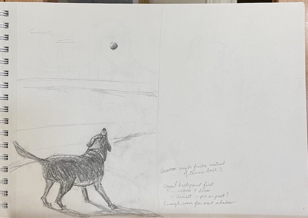
Ultimately I devised a number of possible compositions based on pictures and videos of Vedder, created sketches, and passed them along to Alicia for review. Thankfully her top 2 choices were the ones I wanted to paint the most. 

I’m not a pet portrait expert, at least not at this point in my creative experience. That said, I have done a number of what I like to call “dogs in motion” pieces, so not having to tackle the task of Vedder’s face in detail was going to make this a lot easier.

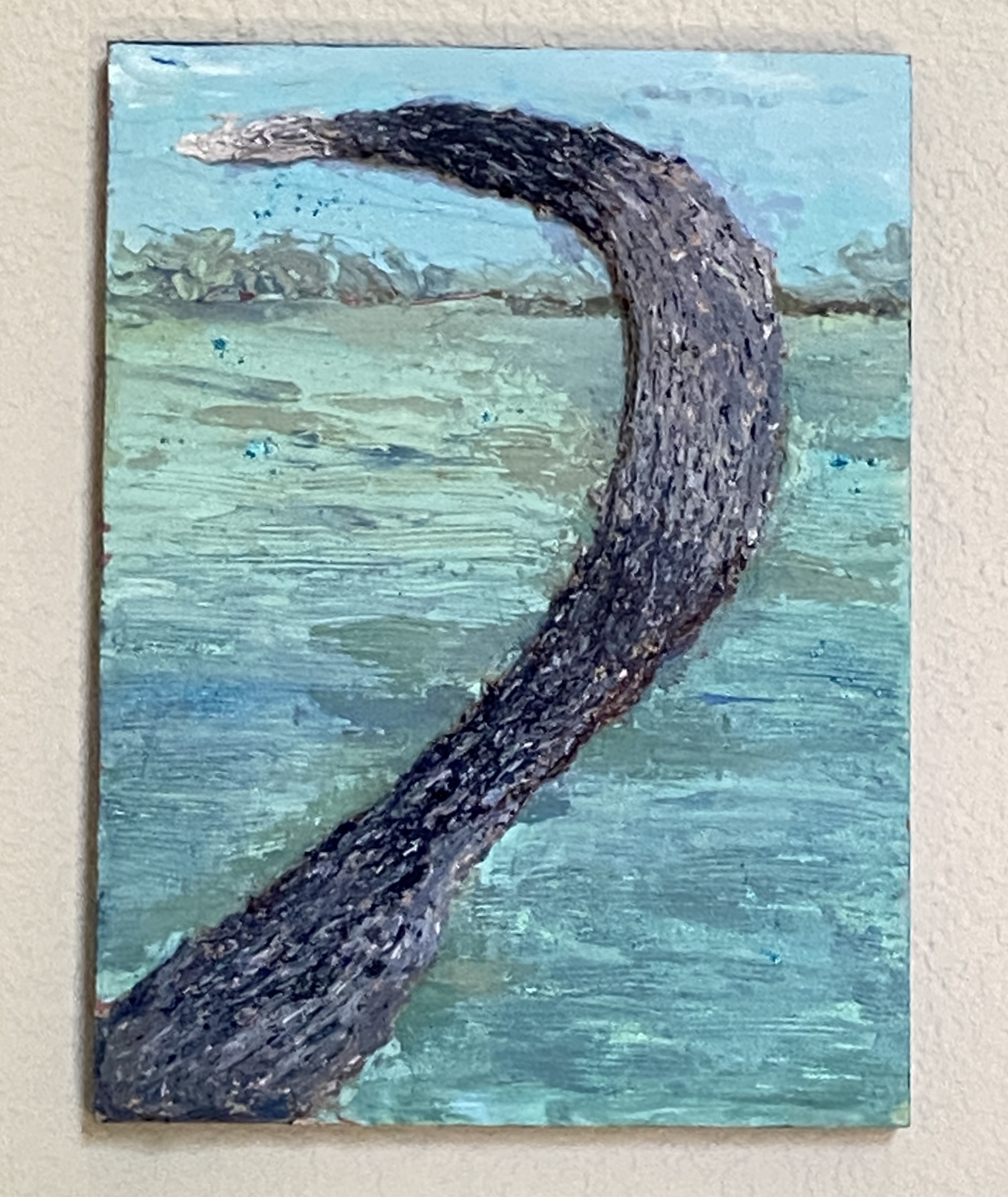
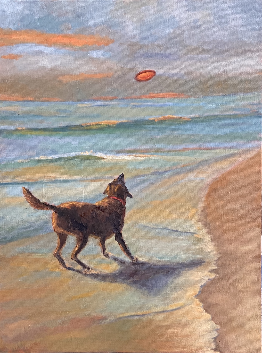
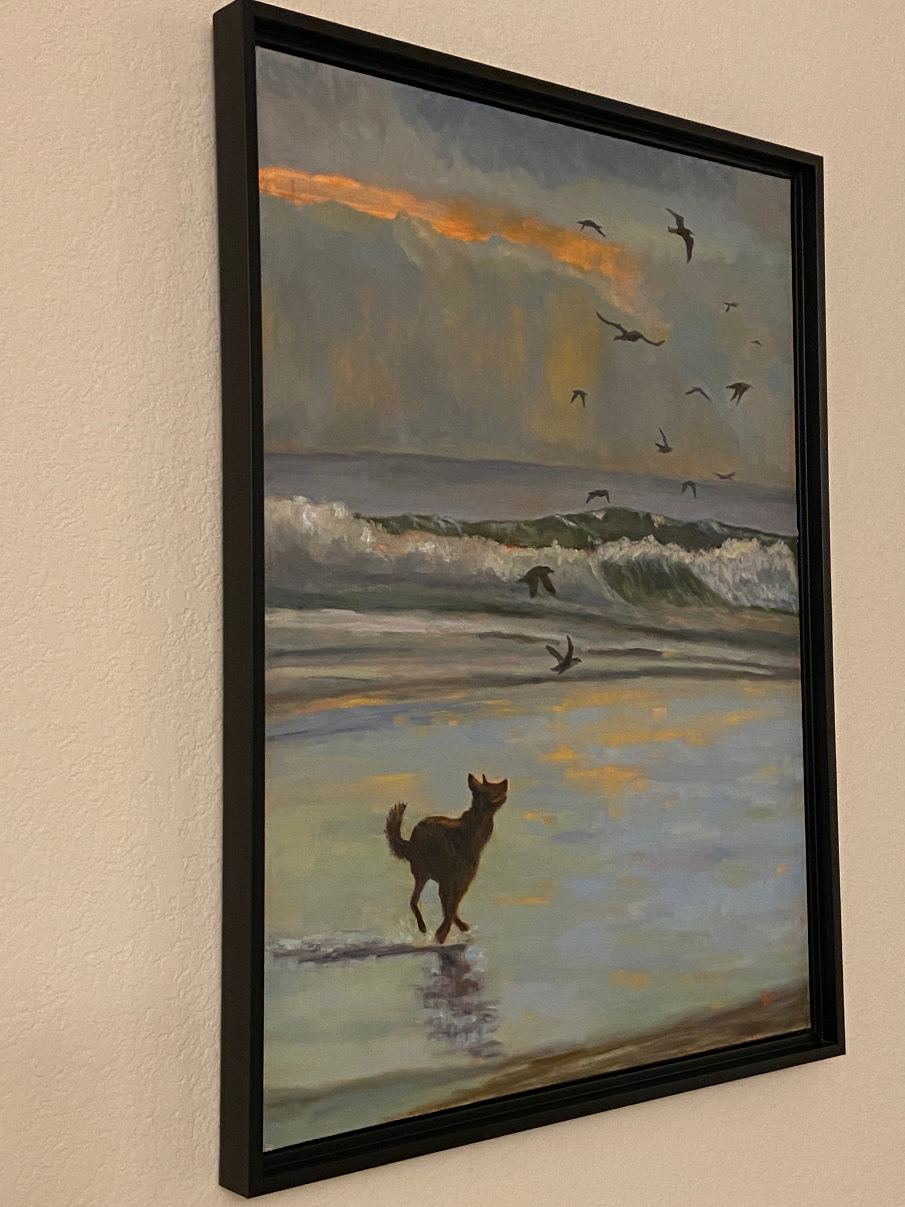
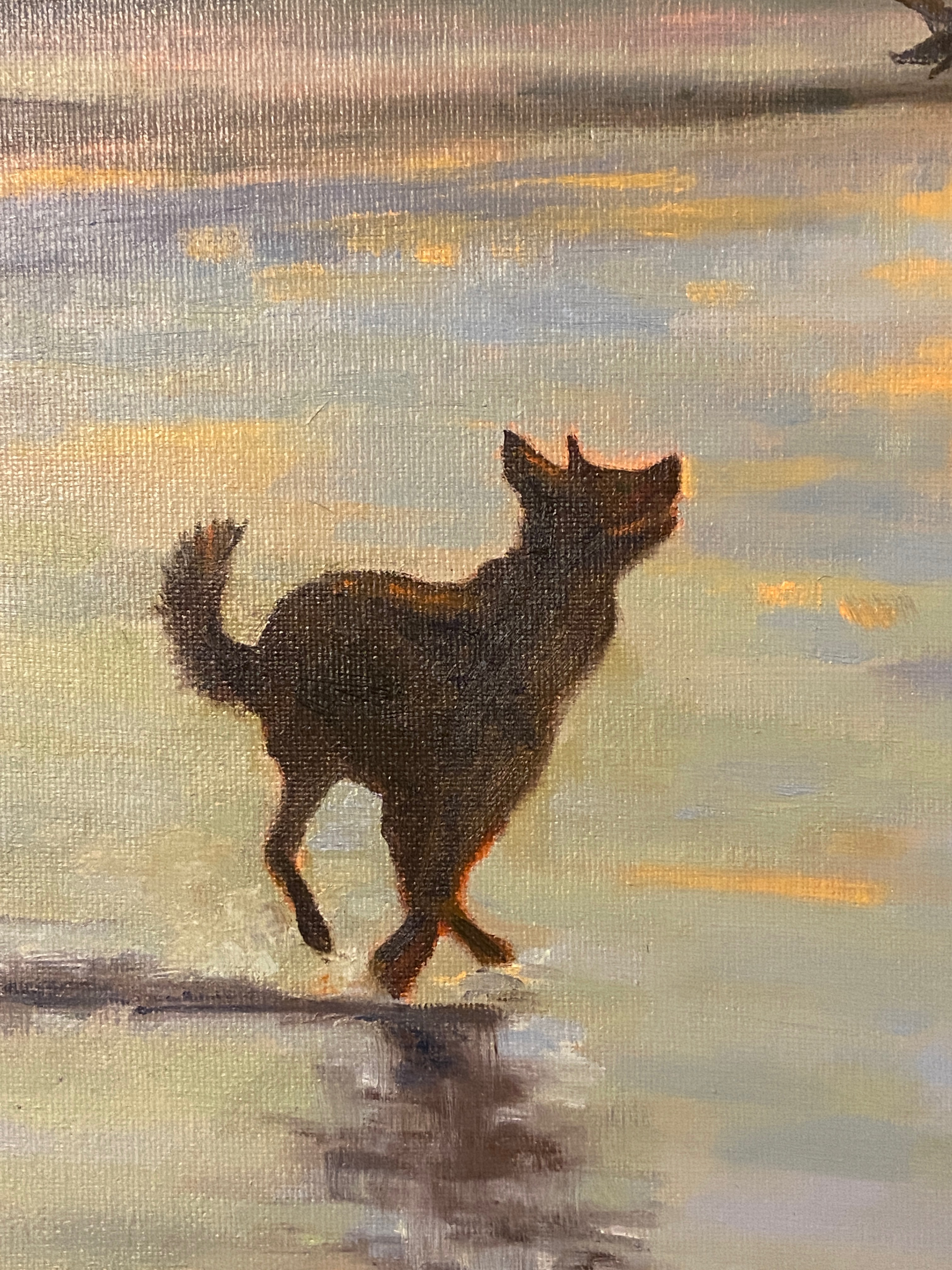
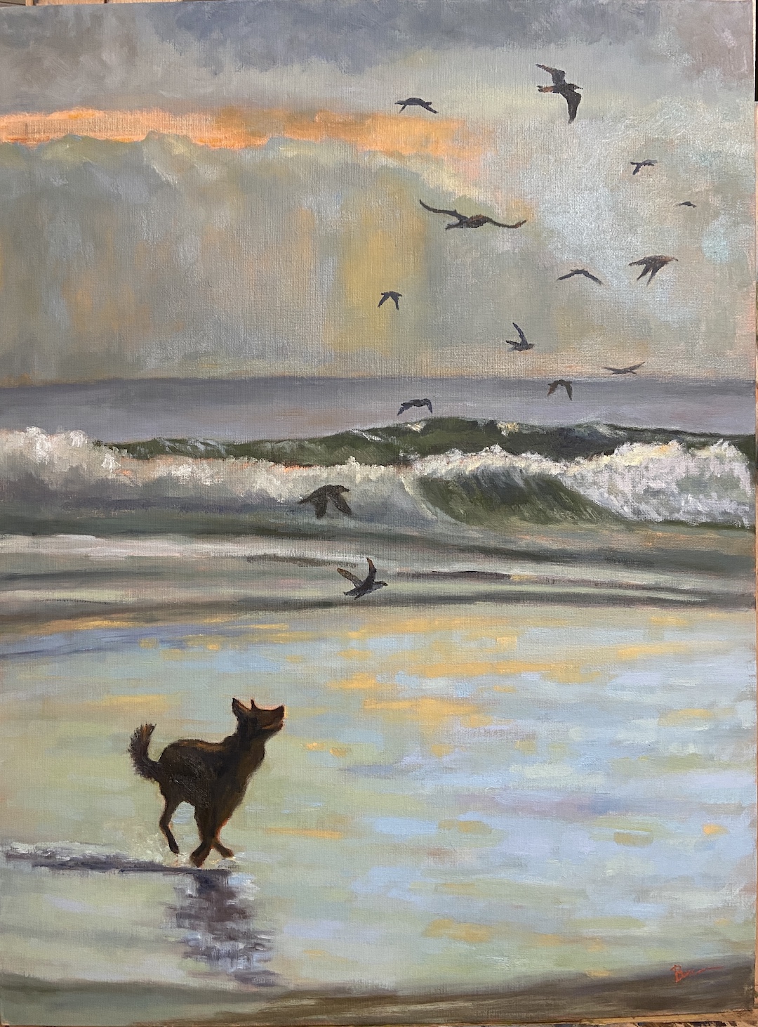
There were a few compositional elements I wanted to bake into this piece. First and foremost, Vedder had to look like Vedder, even if his face was in profile, there’s still the challenge of getting his body just right. I wanted someone who knew Vedder to walk into the room where the painting was hanging and be able to tell at a distance “hey, that’s Vedder!” Secondly, the setting had to be his favorite excursion location, which was this unnamed rocky beach along the coast (they live in the Los Angeles area), and there had to be clear elements that made it recognizable as that beach. Lastly, I wanted to include “Easter Eggs” in the composition that would give the work more meaning and personalization for Jason and Alicia. 

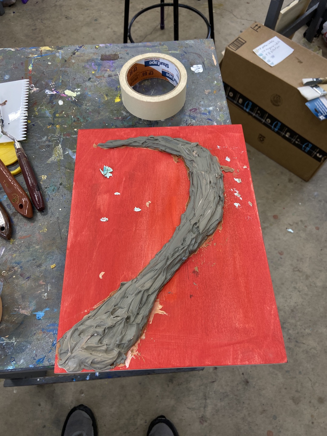
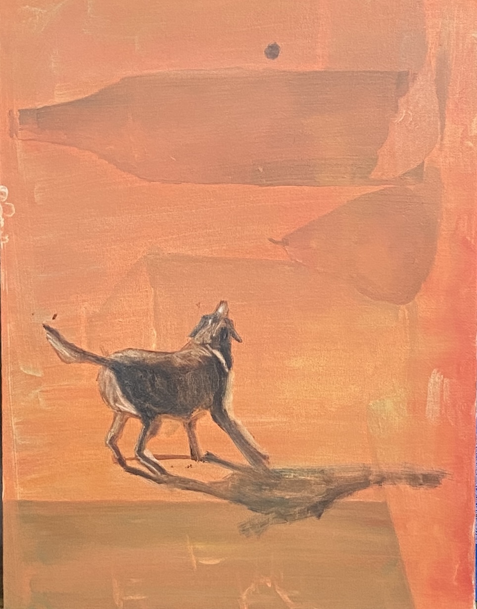
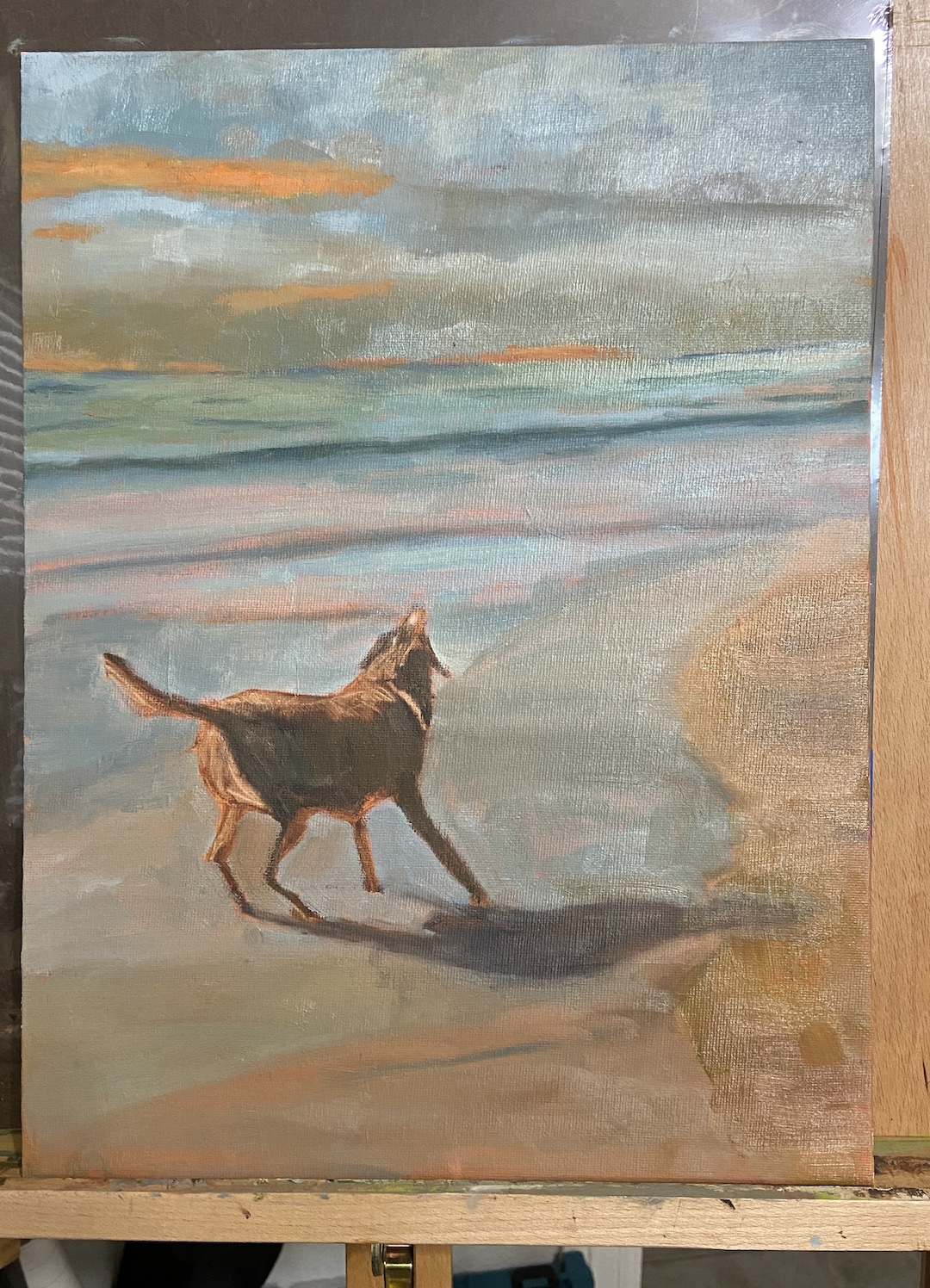
The initial block-in went well, despite the need to improvise the landscape a bit – the natural rocky jetty wasn’t in the same view as Vedder in photos, but it was an integral element of the beach, so it had to be included. The initial draft of Vedder’s silhouette was a lot more difficult, having gone through at least 10 variations before landing on the final version. I also made the decision to incorporate a calmer ocean than what was typically in the reference photos, which often featured a very active surf. 

The most difficult technical challenges were the very black coat of Vedder, and the !*$king sand! First, the sand…

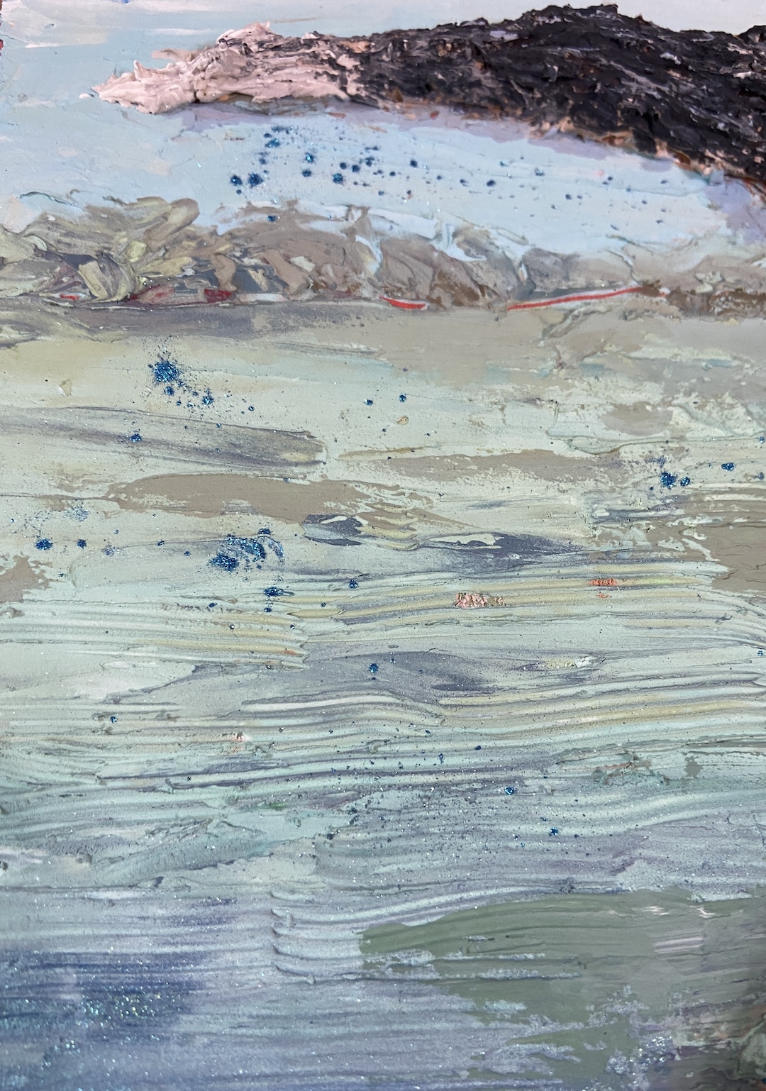
I’ll need to do a number of seascapes featuring beaches this year so I can capitalize on the lessons learned with sand. First, sand apparently comes in a wide range of colors, none of which you recognize until you try to paint said granules. I thought there was simply dry sand (light brown) and dark sand (dark brown). This is not the case. For the record, a beach full of sand has an infinite number of value and color gradations. Suffice to say it worked out, but I have a newfound appreciation for professional painters who incorporate footprints along the beach. 

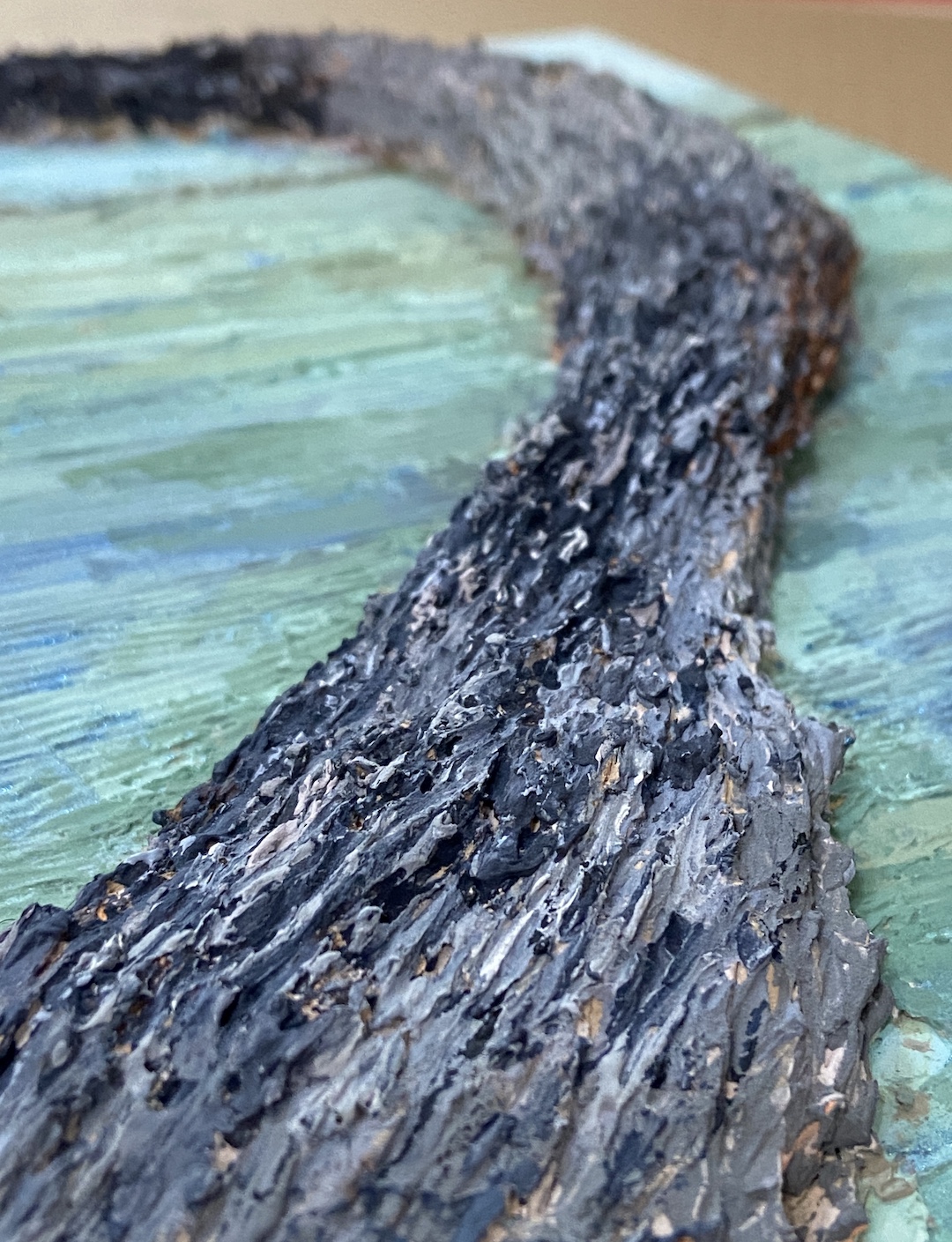
The biggest challenge, as expected, was Vedder. Getting the shape right, and I hope it is (you’d have to ask Jason and Alicia), wasn’t too bad, but trying to get the black hair to pop on the canvas and work the reflection of the sun on his coat, well that took some experimentation. Ultimately it came down to the magic of alternating warm and cool blues. I also incorporated a lot of knife work so there was some texture to his coat, as well as some fine brush work on the edges so he looked wet. When I asked Alicia what Vedder likes to do at the beach, thinking I could incorporate a ball, stick or frisbee into the artwork, she said “he just likes to run around”, or something to that effect. He was simply a happy, energetic, loving dog!

As to the Easter Eggs, namely hidden references in the artwork, I like to use these in commission pieces because it adds personalization and helps lend meaning to the work. The trick is to not do too many, keep them simple, and above all else, don’t compromise the quality of the art. In the case of VEDDER, I incorporated 3 Easter Eggs, two of which I’ll share here. First, Vedder’s paws create a rainbow reflection in the sheen of the water, representing the Rainbow Bridge. This element is designed to be subtle and not something you notice until you look very closely at the artwork. The other Easter Egg can be seen in the rocky peninsula. If you turn the painting upside down, reading left to right are the letters “VeddEr”. They’re not easy to see at first, but the intent is to make it hard to find initially, but then it’s impossible to look at the painting and not see them going forward.

Overall I’m very happy with how this piece turned out. More importantly, Jason and Alicia loved it, at least that’s what they told me. Haha! All kidding aside, the fact that I got a text from Jason with a picture of him holding the painting with a huge smile on his face was all the thanks I needed. 

The Stick Won’t Throw Itself

ZIP TOOT | Mixed Media on Board | 8×10”

Painting and the creative process has always been a zen-zone for me, even on days when the paint just won’t line up right! When life decides to punch you in the face, painting can be calming, even downright cathartic.   

Our beloved pup, Zip – aka “Zippy”, “Zipster”, “Zipper”, “Toot”, “The Pip” and dozens of other nicknames – took her trip to the Rainbow Bridge a couple months ago. She was a HUGE personality, the boss of any space she occupied, and a precious family member who will be forever in our hearts. She loved food, playing ball, car rides, hikes, and she even enjoyed the occasional trip with me into the landscape to paint “en plein air”. But more than anything in the world, she loved to swim, especially if a stick was involved. ZIP TOOT is a nod to her larger than life personality doing what she loved more than anything else.  

As to the artwork itself, this is another foray with spackle, but leveraging the unique opportunity to create textures that simply can’t be done in oil paint – at least not by me. The spackle was laid down in multiple layers, oftentimes so thick that it created a lot of cracking when it dried, which actually played well with the subject matter. Once the shape of the tail was done, I used a dark gray layer (almost black) as the base, then textured in lighter grays and whites. The effect is to give the impression of various hair colors intermixed, even in the areas that are dominated by black or white. Zip was a spotty dog, so getting this right was tricky, but manipulating the spackle while it was still soft made for an effective outcome. 

The final step was going back in with acrylic paint to make the entire tail look more vibrant, which is a weird comment given we’re dealing with black, white and grays. The background is intended to represent her swimming days, the last of which were on Lake Austin at a boat ramp next to Mozart’s Coffee. If you look closely you can see some blue glittery bits splashed around the tip of her tail, reminding me of her need to shake thoroughly between throws and her all-out rush back into the water to recover her favorite stick. 

Go play with your dog cuz the stick won’t throw itself.

RIP Zip

#artbern #berntx #crashboomzip #painting #art #abplanalp #austinartists #atxartist #atxart #atxlife #contemporaryart #bernabplanalp #zip #mozartscoffee #rainbowbridge #fetch #mixedmedia #dogswimming 

FALLING INTO WINTER – Group Show at Art for the People

Gallery! Welcome to Winter(ish)! I’m honored to be included in another group show at Art for the People Gallery in Austin. I’ll have 4 paintings in the show covering a wide range of topics – beaches, mountains, dogs, rowing, and champagne!

The show runs October 28th, 2023 – January 5th, 2024, opening reception Saturday, November 4th, 12-4pm CDT.


Reach out if you have any questions, or better yet go to the gallery and check out all the arts:

MIMOSA | 12 x 16″ | Oil on Canvas Board | $400

MORNING ROW | 9 x 12″ | Oil on Canvas Paper | $275

BEACH DOG | 9 x 12″ | Oil on Canvas Paper | $275

FLATIRONS | 8 x 6″ | Oil on Art Board | $240

Thanks for reading!

#artbern #berntx #crashboomzip #abplanalp #austinartists #atxart #artforthepeoplegallery #aftpg #rescuedogs #dogsofinstagram #pleinairaustin #austinpetsalive #beachdog #stillife #champagne #happyhour #mimosa #brunch #mimosawalk #bouldercolorado #eldoradocanyon #flatirons #cubuffs #coachprime #lakeaustin360 #texasrowing #ladybirdlake #texasrowingcenter #bartonsprings #lakeaustin360

In the Waning Light of Day

DISC DOG | 12 x 16″ | Oil on Canvas Panel

DISC DOG is inspired by the life we live with our canine family members and those bonding moments that form lifetime memories, like frisbee on a beach in the waning daylight hours. 

A few months ago I did a piece called BIRD DOG, which was a silhouette similar to DISC DOG, but it pushed the contrasts more intensely. DISC DOG incorporates more hues while maintaining the impact of a silhouette and the unbridled enthusiasm for life that only a dog, especially those thankful rescue dogs, can convey. The underpainting was a light cadmium red and burnt sienna, which shows through in some areas, but more importantly served as a helpful guide for laying down the clouds with a setting sun somewhere “off camera”. I painted over a previous composition for this piece, something I rarely do, so I was pleasantly surprised to essentially have a pre-treated surface on which to work. Somewhere under DISC DOG lurks a really bad painting of monochromatic wine bottles. 

Oddly enough, the most challenging element of DISC DOG was the frisbee. As you can see from the sketch, I noted the idea of using a frisbee instead of a ball. While the ball would have been much easier, the body position of the dog is more akin to waiting to jump at a frisbee rather than chasing a ball in the air. The trick with the frisbee turned out to be the odd look it had as a silhouette. For the life of me I couldn’t get it to convey “FRISBEE”. I kept wiping out and repainting versions of what looked like UFOs. Ultimately I switched gears away from the dark shape and allowed the light from the setting sun to make it pop, but tried to do so without making it the focal point of the composition. The angle of the disc, the lines of the waves, the red collar, and various other elements try to move the viewer to the dog as the star of the piece.

Special thanks to Austin Pets Alive! for all the great rescue work they do for the animals of the city of Austin, the state of Texas, and various cities throughout the United States. In Austin alone, every year there are thousands of rescue dogs playing frisbee, like DISC DOG, thanks to the tireless work, innovation, love and compassion of APA! and their wonderful staff and army of volunteers.  

Beachcombers

What’s not to like about a pack of puppies frolicking down the beach following their mom while playing with a stick bigger than themselves? NOTHING, that’s what!

I’d done a previous piece similar to this one called PUPPY BUTTS, but it was half the size and half the number of puppies. It was sold at an Art for the People Gallery show last year, but I received so many positive comments about it that I decided to do another one. 

The focal point was a bit of an accident, which happened after I’d blocked in all the pups. Sitting back considering how I was going to actually paint the dogs, yes with wine, the two on the right just seemed to be playing, and the idea of incorporating a stick jumped into my head. It’s hard to see from the photo, but the puppies with the stick are painted with a palette knife instead of a brush, adding contrasting texture to draw further interest. The singular, adorable black puppy is also meant to draw the viewer to that part of the pack. 

It’s hard to know as an artist when a composition is done, which I tend to agree with in most cases. But when it comes to dog-related paintings, at the point that it makes you laugh, smile, or cry… it’s done.  

#artbern #berntx #crashboomzip #painting #art #abplanalp #austinartists #atxartist #atxart #atxlife #petsofinstagram #contemporaryart #fosteringsaveslives #dogsofig #adoptme #takemehome #austinpetsalive #mutts #muttsofinstagram #beachdogs #puppies #puppiesdoingcutestuff #puppy #doglover #dogoftheday #artforthepeoplegallery

New Group Show – CELEBRATION

Art for the People Gallery in Austin has included 2 of my new paintings in their Winter 2023 group show “CELEBRATION”, running January 28th – March 24th, 2023. I’m very excited to be included in this VERY talented group of artists! If you’re interested in original artwork by Austin artists, check out AFTPG either in person in Austin or browse their online store. 


If you’re interested in any of my pieces, I’m happy to answer questions or better yet, go to the gallery and check them out in person!

BIRD DOG | 18 x 24″ | Oil on Canvas Board

BLOWN AWAY | 18 x 24″ | Oil on Board


Thanks for reading!

#artbern #berntx #crashboomzip #abplanalp #austinartists #atxartist #atxart #artforthepeoplegallery #aftpg #rescuedogs #dogsofinstagram #dogsofinsta #petsofinstagram #contemporaryart #fosteringsaveslives #dogsofig #adoptme #takemehome #austinpetsalive #mutts #muttsofinstagram #snouts #wetnoses #beachdog #beaches #galveston #whimsicalart #umbrellas

Dog Cures Ornithophobia

Bird Dog painting, 18 inches by 24 inches, oil on canvas board
BIRD DOG | 18 x 24″ | Oil on Canvas Board

BIRD DOG is intended to capture the pure joy of a dog playing on the beach. If I got it right, you should smile or giggle at the scene. For those of you who love birds, rest assured no birds were harmed in the making of this painting.

I was inspired by a photo of a dog playing on a beach, but the most striking thing for me was the stylistic impact of the silhouette. There’s something compelling about the lack of details in the darkened shapes of the dog and birds, perhaps giving more to the imagination of the viewer, allowing it to be personalized. Additionally, the silhouettes lend themselves well to a sense of motion. I’m not sure why it strikes me this way, but I think it has something to do with the stark value contrasts created by the silhouettes on the colored landscape.

Broken Color Palette

My mom happened to mention her recent use of the broken color technique on one of her compositions, something I’d not heard of previously. As it turns out, the technique whih proved to be a very exciting way to add depth and vibrancy to the composition. In short, broken color is a technique often used by the Impressionists that leveraged optical color mixing to make things look less flat and murky. This article, Broken Color and Optical Color Mixing, does a great job describing and illustrating the technique.

I used this approach to re-do the reflective elements on the beach, which I must say was a huge improvement. I took a black and white photo of the color palette of the beach to ensure the values were the same, which makes the technique more effective because the various colors work as one and don’t compete with each other. I’m very excited to use this in my plein air landscapes in the coming months!

BIRD DOG is also a foray into waves, another subject relatively new to me at this level of detail. I enjoy seascapes and incorporating water into my landscapes, but most of that has been lakes and streams. Capturing the force and complexity of ocean waves is a whole different endeavor, but I thoroughly enjoyed the challenge and will incorporate waves in future works.

The final decision to be made was regarding the birds. My wife, a frequent source of very helpful suggestions and insights to work in progress, suggested I pare down the array of birds. At some point, she noted, the number of birds pushes the feel of the work from playful fun on the beach to terror at the seaside. And she was right! As I added the bird silhouettes in the final stage, at 14 it felt like any more would start to slide into Hitchcock territory. Compared to the study, which had 21 birds and begged the question “who’s chasing who?”, the final composition was more playful and struck the right “dog on beach having a great time running around like it was the best day of their life” tone.

Thanks for reading and don’t forget to go play with your pups!

#artbern #berntx #crashboomzip #painting #art #abplanalp #austinartists #rescuedogs #bestfriends #dogsofinstagram #dogsofinsta #dogstagram #oilpainting #fineart #petsofinstagram #contemporaryart #fosteringsaveslives #dogsofig #adoptme #takemehome #austinpetsalive #mutts #muttsofinstagram #beachdog #dogsplaying #silhouetteseries #brokencolor #birddog

Rescue Noses

WET NOSE | 18 x 24″ | Oil on Canvas

This is a follow-up piece from SNIFFER, a very similar composition of the wonderful nose of a dog. If you’re a dog parent you’ve seen this perspective before, so I hope it makes you giggle. WET NOSE came to fruition because the original SNIFFER was accepted in a show at Art for the People Gallery in Austin earlier this year, but I had promised my wife that if it went to the show I would make her a new one that could be hung in the house. 

I tend to like to move around with composition topics and challenge myself with new subjects, so I haven’t done many repeat compositions in the past. Painting SNIFFER for the second time in a few months was going to afford me a rare opportunity to learn from the first piece and see if I could make improvements on WET NOSE

The first notable benefit of the repeat performance was speed. I didn’t have to spend much time thinking through an approach, and the setup / block-in went very fast. The other time efficiency was in mixing paint colors properly on the first effort without much, if any, experimentation. This is where having a painting journal comes in handy, as I’d made notes of color mixtures for SNIFFER and only had to make some minor tweaks for the new piece. 

I would love to do more dog noses from this perspective, but switch up the mutt mixtures so there are different nose types and hair colors. It would also be interesting to really push the details further painting on a gesso board instead of canvas and see how realistic the nose could become. 

Thanks for reading and please remember to foster or adopt or BOTH. It’s a rewarding experience for everyone involved, and for those who are very breed focused, remember breeders don’t make breeds, they make bread. If you want a particular breed of dog, note that there are thousands of breeds at the shelter and rescue groups (Austin Pets Alive if you live in / around Austin area). As for me, I’m a mutt kinda guy.

Unbridled Zeal For Life

Barks & Birds (study) | 9 x 12” | Oil on Canvas Paper

The unbridled zeal for life is hard to epitomize more than watching a big dog playing on a beach. While I don’t support a dog chasing wildlife, in the case of birds I don’t mind because in all my days I’ve never seen a dog come close to catching one. But the pure joy of exploring and running on a beach is something that brings a smile to every doggy parent out there. 

Barks & Birds is a study to figure out the technique and subtle variations in hues and values needed for a larger composition. I’ve seen photographs of dogs on the beach in silhouette, but I think a painting lends more atmosphere to the scene than most photographs I’ve seen. I made some basic mistakes with this study, having painted the silhouettes first, but I wanted to get the darks mixed properly and take a crack at the shapes, especially the dog, who I like to call Mr Happy Pants. 

The study also allowed me to mix a number of grays to capture that end-of-day post sunset atmosphere. I gambled with the underpainting, using a very saturated orange, but I love how it turned out… a happy accident indeed. I initially thought it would provide some nice highlights around the silhouettes, but as it turns out it nailed the sunset color behind the clouds. 

Lastly, the waves. I didn’t really care about this detail as part of this study, but probably because I kept my technique very loose (i.e. didn’t care how it looked) and fast, they turned out really well. I concentrated on the mix of greenish-blue, which will show better in a larger, more finished composition, but I’ll be keeping it very loose when I do the waves next time. Might need a bottle of wine for that part. 

Thanks for reading!

#artbern #berntx #crashboomzip #painting #art #abplanalp #austinartists #atxartist #atxart #pleinair #beach #beachdogs #atxlife #rescuedogs #bestfriends #dogsofinstagram #dogsofinsta #dogstagram #oilpainting #fineart #petsofinstagram #contemporaryart #fosteringsaveslives #dogsofig #austinpetsalive #mutts #muttsofinstagram #snouts #wetnoses #shephers #hugyourdog

“ABUNDANCE” Group Show at Art for the People Gallery

Art for the People Gallery in Austin Tx, is a showcase for 100 local artists.

Art for the People Gallery in Austin has included 3 of my compositions in their Summer group show “ABUNDANCE”, which runs July 2nd through August 26th, 2022. I’m thrilled to be a part of this talented group of artists! If you’re interested in original artwork by Austin artists, check out AFTPG either in person in Austin or browse their online store. 


The following paintings are part of the show (links lead to previous blog posts about these compositions):

Sniffer | 16 x 20″ | Oil on Canvas Board

Dog Tired | 16 x 12″ | Oil on Canvas Board

  Shaken | 8 x 10″ | Oil on Board

Thanks for reading!

#artbern #berntx #crashboomzip #painting #art #abplanalp #austinartists #atxartist #atxart #atxlife #sedona #pleinairaustin #artforthepeoplegallery #aftpg #rescuedogs #bestfriends #dogsofinstagram #dogsofinsta #dogstagram #petsofinstagram #contemporaryart #fosteringsaveslives #dogsofig #adoptme #takemehome #austinpetsalive #mutts #muttsofinstagram #snouts #wetnoses #blacklabs #labradorretrievers #martinigin #monkey47 #martinipainting