Art for the People Gallery in Austin has included 2 of my new paintings in their Winter 2023 group show “CELEBRATION”, running January 28th – March 24th, 2023. I’m very excited to be included in this VERY talented group of artists! If you’re interested in original artwork by Austin artists, check out AFTPG either in person in Austin or browse their online store.
If you’re interested in any of my pieces, I’m happy to answer questions or better yet, go to the gallery and check them out in person!
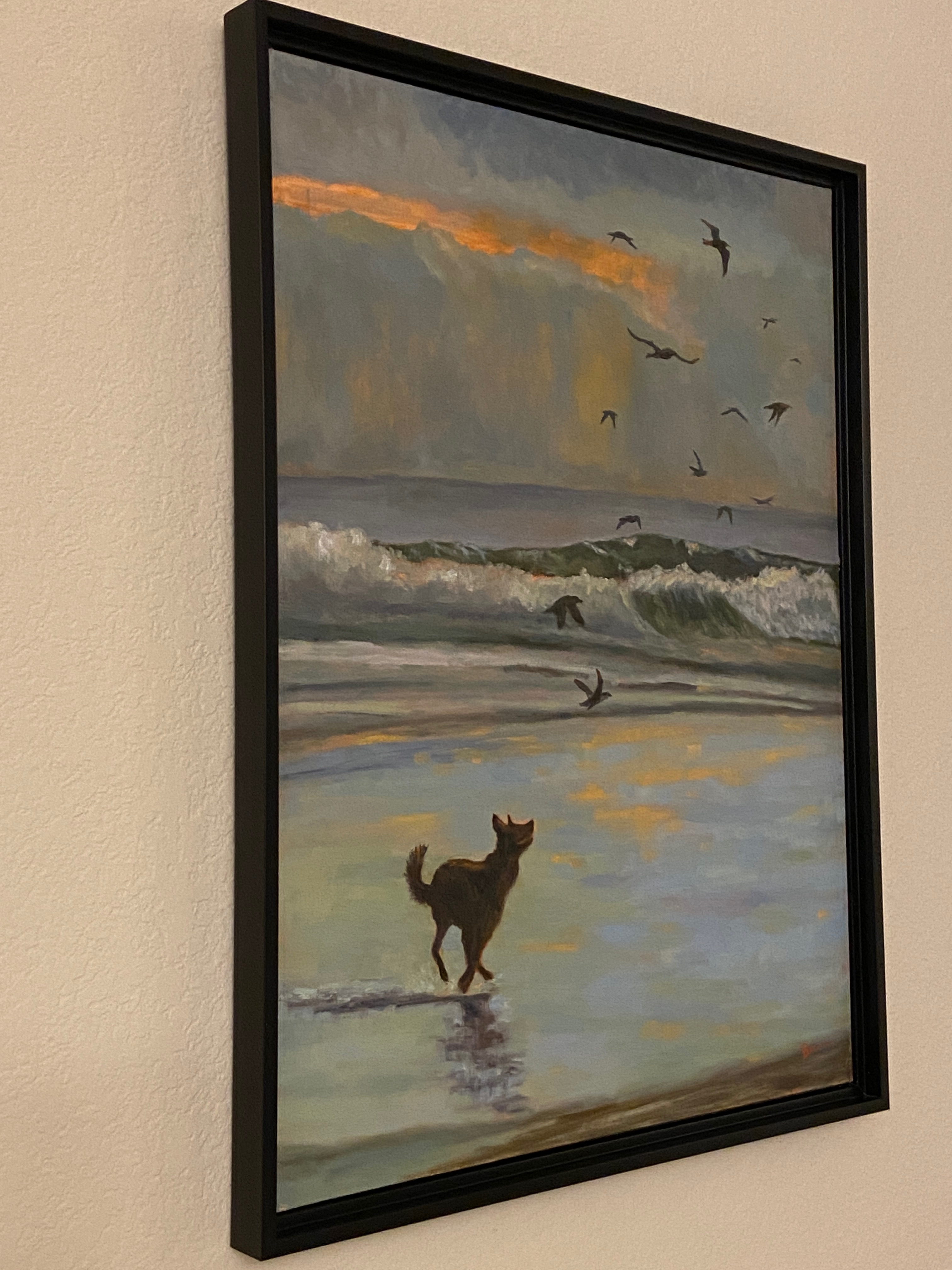
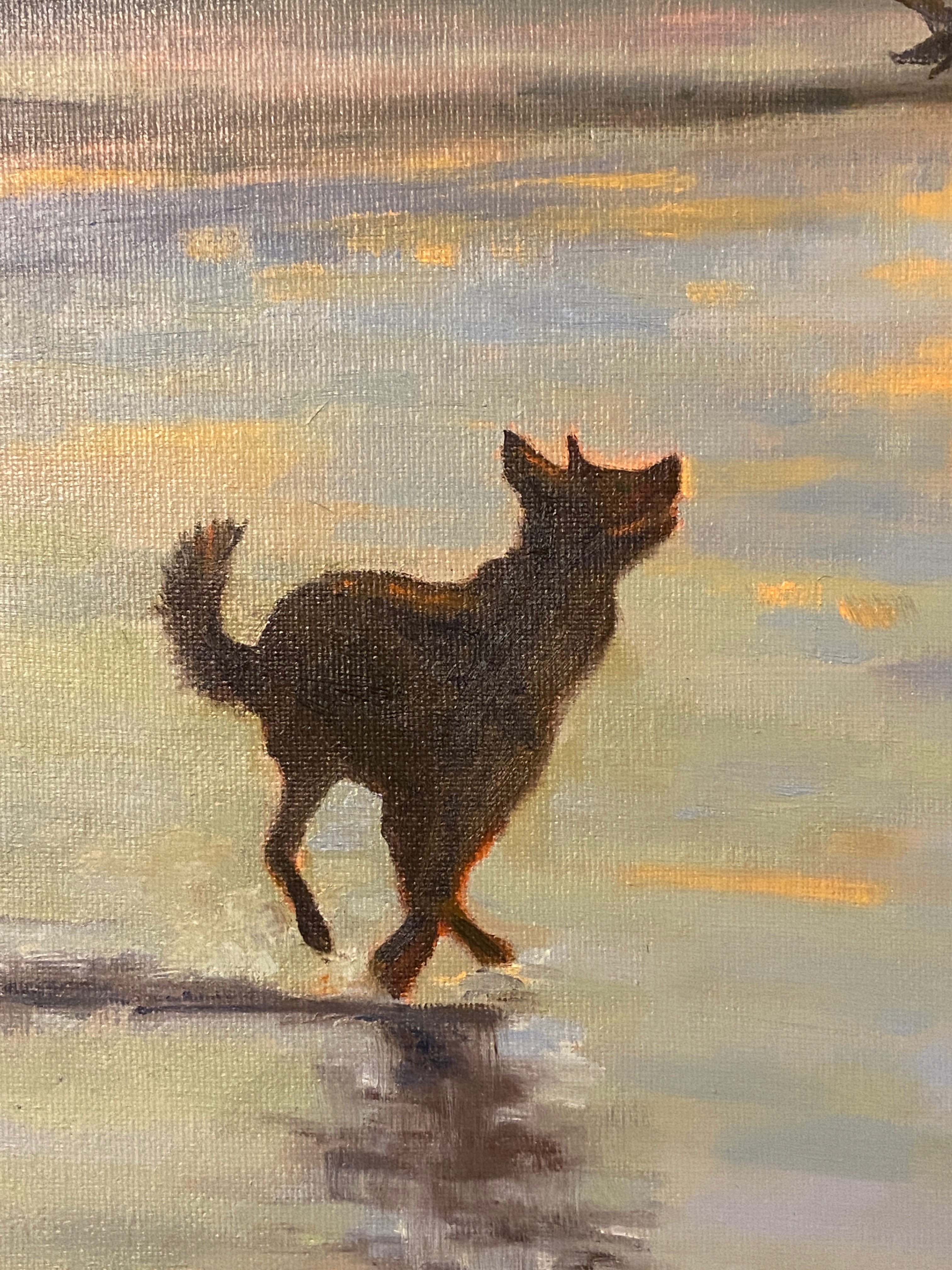
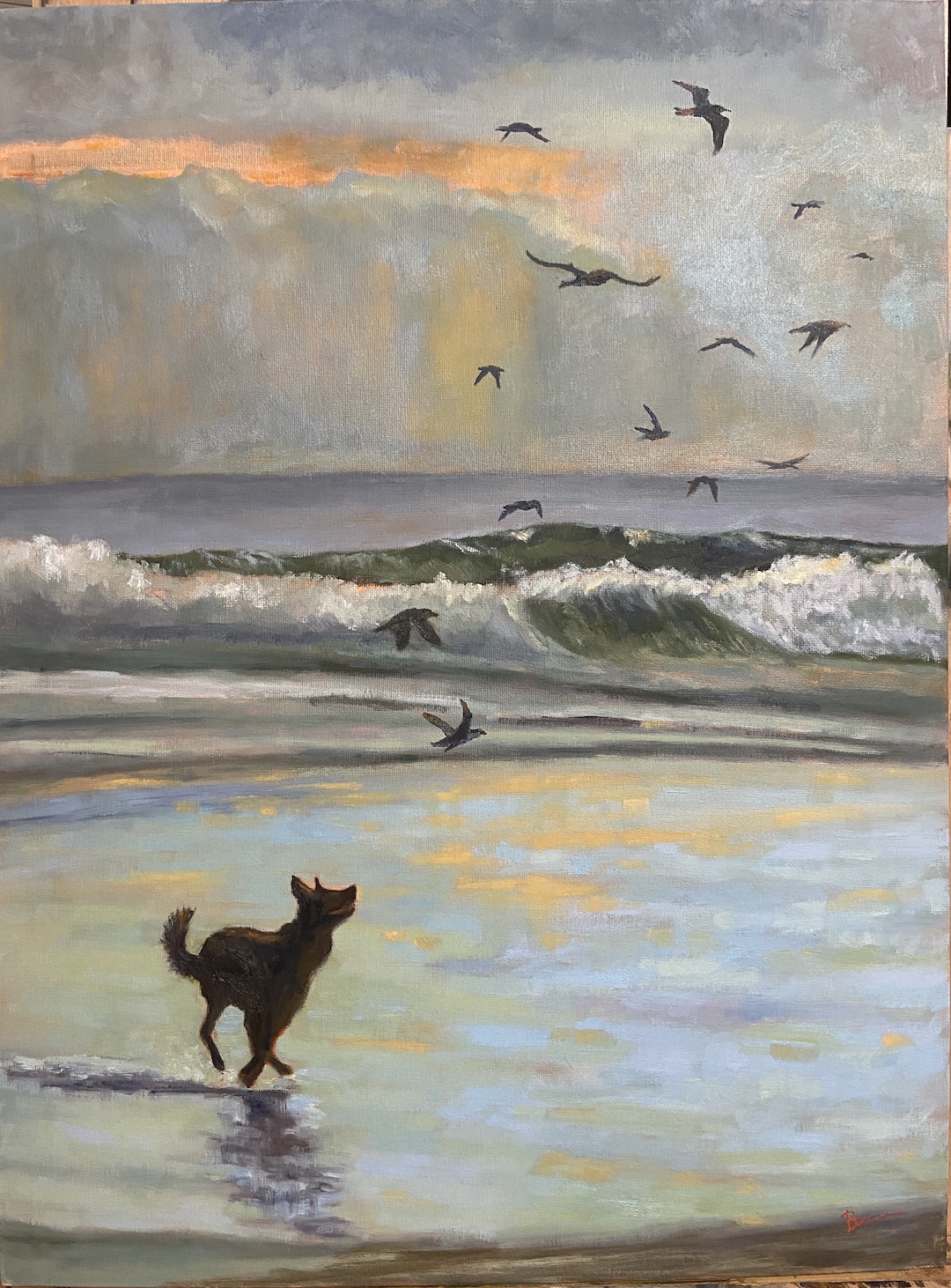
BIRD DOG is intended to capture the pure joy of a dog playing on the beach. If I got it right, you should smile or giggle at the scene. For those of you who love birds, rest assured no birds were harmed in the making of this painting.
I was inspired by a photo of a dog playing on a beach, but the most striking thing for me was the stylistic impact of the silhouette. There’s something compelling about the lack of details in the darkened shapes of the dog and birds, perhaps giving more to the imagination of the viewer, allowing it to be personalized. Additionally, the silhouettes lend themselves well to a sense of motion. I’m not sure why it strikes me this way, but I think it has something to do with the stark value contrasts created by the silhouettes on the colored landscape.
Broken Color Palette
My mom happened to mention her recent use of the broken color technique on one of her compositions, something I’d not heard of previously. As it turns out, the technique whih proved to be a very exciting way to add depth and vibrancy to the composition. In short, broken color is a technique often used by the Impressionists that leveraged optical color mixing to make things look less flat and murky. This article, Broken Color and Optical Color Mixing, does a great job describing and illustrating the technique.
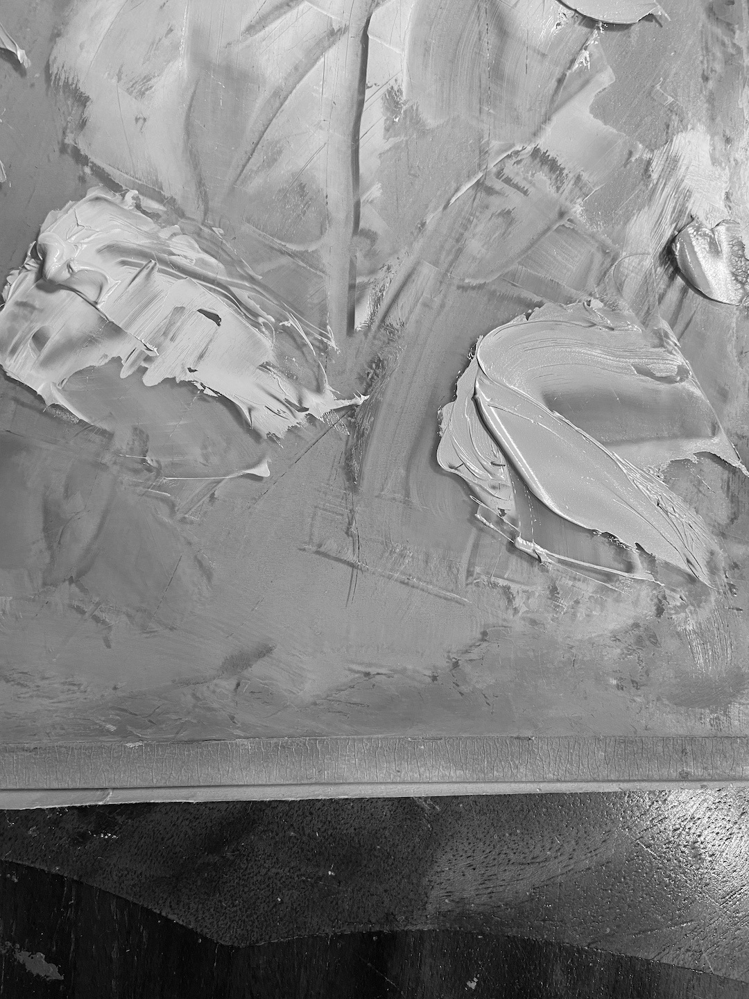
I used this approach to re-do the reflective elements on the beach, which I must say was a huge improvement. I took a black and white photo of the color palette of the beach to ensure the values were the same, which makes the technique more effective because the various colors work as one and don’t compete with each other. I’m very excited to use this in my plein air landscapes in the coming months!
BIRD DOG is also a foray into waves, another subject relatively new to me at this level of detail. I enjoy seascapes and incorporating water into my landscapes, but most of that has been lakes and streams. Capturing the force and complexity of ocean waves is a whole different endeavor, but I thoroughly enjoyed the challenge and will incorporate waves in future works.
The final decision to be made was regarding the birds. My wife, a frequent source of very helpful suggestions and insights to work in progress, suggested I pare down the array of birds. At some point, she noted, the number of birds pushes the feel of the work from playful fun on the beach to terror at the seaside. And she was right! As I added the bird silhouettes in the final stage, at 14 it felt like any more would start to slide into Hitchcock territory. Compared to the study, which had 21 birds and begged the question “who’s chasing who?”, the final composition was more playful and struck the right “dog on beach having a great time running around like it was the best day of their life” tone.
Thanks for reading and don’t forget to go play with your pups!
Early progress shot reveals previously used canvasBefore use of broken colorRe-painted beach using broken colorRealization that beach was lacking, saw same problem in studyBroken color beach and birds added to completed Bird Dog
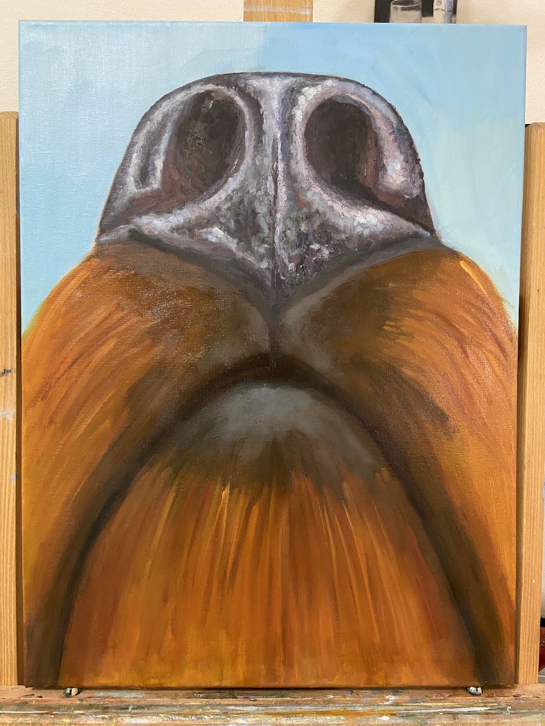
This is a follow-up piece from SNIFFER, a very similar composition of the wonderful nose of a dog. If you’re a dog parent you’ve seen this perspective before, so I hope it makes you giggle. WET NOSE came to fruition because the original SNIFFER was accepted in a show at Art for the People Gallery in Austin earlier this year, but I had promised my wife that if it went to the show I would make her a new one that could be hung in the house.
I tend to like to move around with composition topics and challenge myself with new subjects, so I haven’t done many repeat compositions in the past. Painting SNIFFER for the second time in a few months was going to afford me a rare opportunity to learn from the first piece and see if I could make improvements on WET NOSE.
The first notable benefit of the repeat performance was speed. I didn’t have to spend much time thinking through an approach, and the setup / block-in went very fast. The other time efficiency was in mixing paint colors properly on the first effort without much, if any, experimentation. This is where having a painting journal comes in handy, as I’d made notes of color mixtures for SNIFFER and only had to make some minor tweaks for the new piece.
I would love to do more dog noses from this perspective, but switch up the mutt mixtures so there are different nose types and hair colors. It would also be interesting to really push the details further painting on a gesso board instead of canvas and see how realistic the nose could become.
Thanks for reading and please remember to foster or adopt or BOTH. It’s a rewarding experience for everyone involved, and for those who are very breed focused, remember breeders don’t make breeds, they make bread. If you want a particular breed of dog, note that there are thousands of breeds at the shelter and rescue groups (Austin Pets Alive if you live in / around Austin area). As for me, I’m a mutt kinda guy.
Barks & Birds (study) | 9 x 12” | Oil on Canvas Paper
The unbridled zeal for life is hard to epitomize more than watching a big dog playing on a beach. While I don’t support a dog chasing wildlife, in the case of birds I don’t mind because in all my days I’ve never seen a dog come close to catching one. But the pure joy of exploring and running on a beach is something that brings a smile to every doggy parent out there.
Barks & Birds is a study to figure out the technique and subtle variations in hues and values needed for a larger composition. I’ve seen photographs of dogs on the beach in silhouette, but I think a painting lends more atmosphere to the scene than most photographs I’ve seen. I made some basic mistakes with this study, having painted the silhouettes first, but I wanted to get the darks mixed properly and take a crack at the shapes, especially the dog, who I like to call Mr Happy Pants.
The study also allowed me to mix a number of grays to capture that end-of-day post sunset atmosphere. I gambled with the underpainting, using a very saturated orange, but I love how it turned out… a happy accident indeed. I initially thought it would provide some nice highlights around the silhouettes, but as it turns out it nailed the sunset color behind the clouds.
Lastly, the waves. I didn’t really care about this detail as part of this study, but probably because I kept my technique very loose (i.e. didn’t care how it looked) and fast, they turned out really well. I concentrated on the mix of greenish-blue, which will show better in a larger, more finished composition, but I’ll be keeping it very loose when I do the waves next time. Might need a bottle of wine for that part.
Art for the People Gallery in Austin Tx, is a showcase for 100 local artists.
Art for the People Gallery in Austin has included 3 of my compositions in their Summer group show “ABUNDANCE”, which runs July 2nd through August 26th, 2022. I’m thrilled to be a part of this talented group of artists! If you’re interested in original artwork by Austin artists, check out AFTPG either in person in Austin or browse their online store.
The following paintings are part of the show (links lead to previous blog posts about these compositions):