So Much Granite!

This is a preliminary drawing for a plein air session I plan to do later this week. This particular lighthouse is accessible via a jetty made of granite, which I can say from personal experience is deceptively long. As is the case with many lighthouses, the setting is often more impressive than the structure, which makes sense given they’re designed to protect navigators from the very dangerous geographies upon which they sit. Ironically, in a world where technology has made many lighthouses functionally irrelevant, they’re wildly popular destinations for visitors to explore… on land. 

The other attraction to lighthouses, as an artist, is they’re much like snowflakes whereby no two are alike, so there’s something new to tackle with every composition. Combined with their intriguing landscapes, lighthouses are a must do as an artist. 

I like to do detailed drawings instead of quick sketches when the subject is complicated or something new. The jetty is very intimidating for me, so it was important to get a handle on how to simplify while not losing the feel of all those massive granite blocks. I’m not sure if the drawing approach will translate to the painting, but a few things become clear from this exercise. First, the layout of the blocks needs to have defined directional lines in the fore and mid ground planes to capture the overall shape of the jetty. Secondly, there are numerous tiny shadows and value variations that give the blocks their distinct shapes, which will require some trial and error once the paint hits the canvas. 

Stay tuned for more on Spring Point lighthouse!

#artbern #berntx #crashboomzip #painting #art #abplanalp #austinartists #atxartist #contemporaryart #southportlandmaine #abplanalp #bernabplanalp #springpointledgelighthouse #lighthouse #lighthousepaintings
Keep Those Pencils Sharp

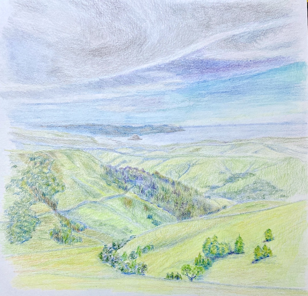
Central Coast – Morro Bay | 9 x 12” | Colored Pencil on Paper

A few months ago we took a trip to indulge in wines of Paso Robles, California. This is a beautiful area, a little hard to get to, and the wine is fantastic. Don’t get me wrong, I’m no wine snob… my palette is worth a $40 bottle of wine at best. However, over the years we’ve done a lot of travel around the world and there is no better way to find wines you like than to be in the actual region and explore. Again, we tend not to go to places for the purpose of doing wine tastings, but what else are you going to have with dinner?

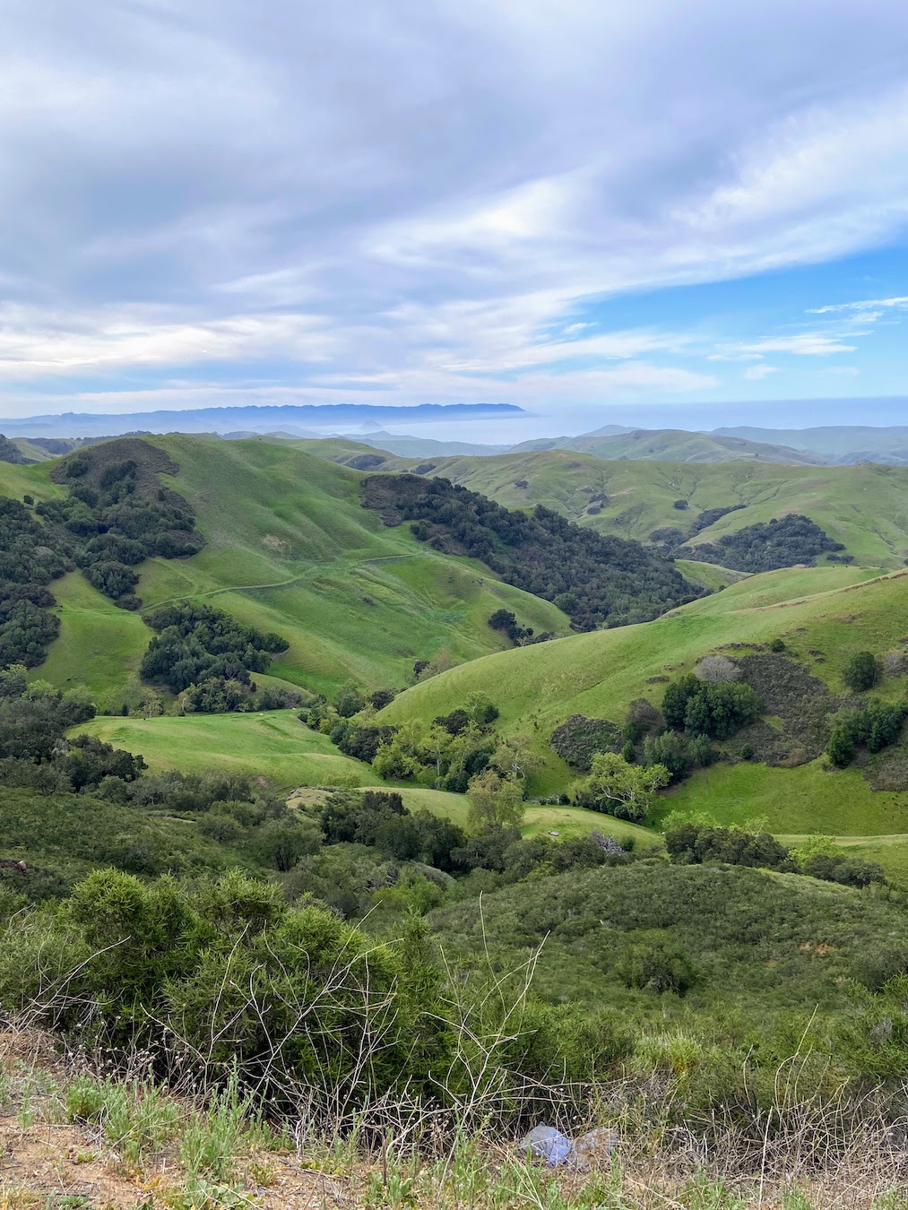
We took a beautiful drive from Paso Robles, CA to Morro Bay. Along the way we came across this stunning view, giving a first glance of the ocean as we wound through the hills. As you can see from the reference photo, it’s beautiful, but as an artist you see a whole lotta green! 

I chose to do this piece in colored pencil instead of oil paint for two reasons. First, I’ve recently started experimenting with colored pencils and the investment in a new pencil set needed some return. Secondly, it gets brutally hot in my upstairs studio during the summer, so having the pencils setup downstairs is an easy way to get my creative fix for the day if I don’t feel like running the AC for 3 hours in the middle of the afternoon. Pragmatism, go figure. 

I’ve done a few practice sessions with colored pencils after taking a workshop from Jenny Granberry, who is a great artist and instructor, a rare combination. This piece was a challenge and intended as a massive practice exercise with the goal of something “completed” in the end. This composition was a challenge for reasons beyond my lack of colored pencil experience. First, I can’t remember the last time I’d done a drawing-based landscape, and secondly, the greens! 

What I find the most interesting part of this piece is the fact that I worked from the top down (far to near), and I don’t know about you, but I can definitely see that the bottom part of the drawing is notably better than the top. I can hear Jenny now… keep your pencils sharp and go slow. I hear you Jenny, I hear you, it just took half a page to get there. 

As to the greens, I focused on blending variations of blues in the more distant hills, segueing to stronger yellow in the foreground. I wasn’t excited about the final look initially, as it lacked warmth from the sun, so I drank some wine to work up some liquid courage to grab an orange/red pencil to add an overlay to the foreground hills. Unlike oil painting, you can’t just wipe off pencil – true, it can be erased, but then you’re compromising the “tooth” of the paper, and at some point I hope to be good enough that something like that matters. 

In the end, Central Coast – Morro Bay was a great learning experience and provided a wealth of knowledge through trial and error. I also think I’ll return to this subject matter in landscape perspective for a larger oil painting. 

Thanks for reading!

Soulful Eyes

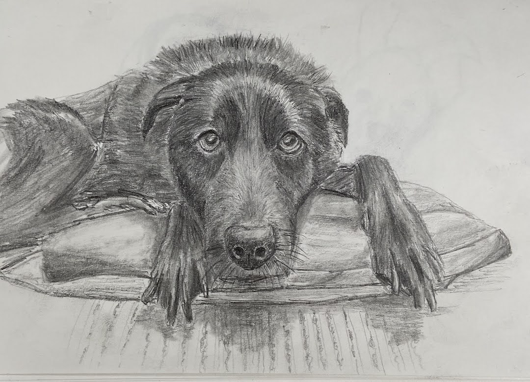
Vedder | 8 x 6” | Graphite on Paper

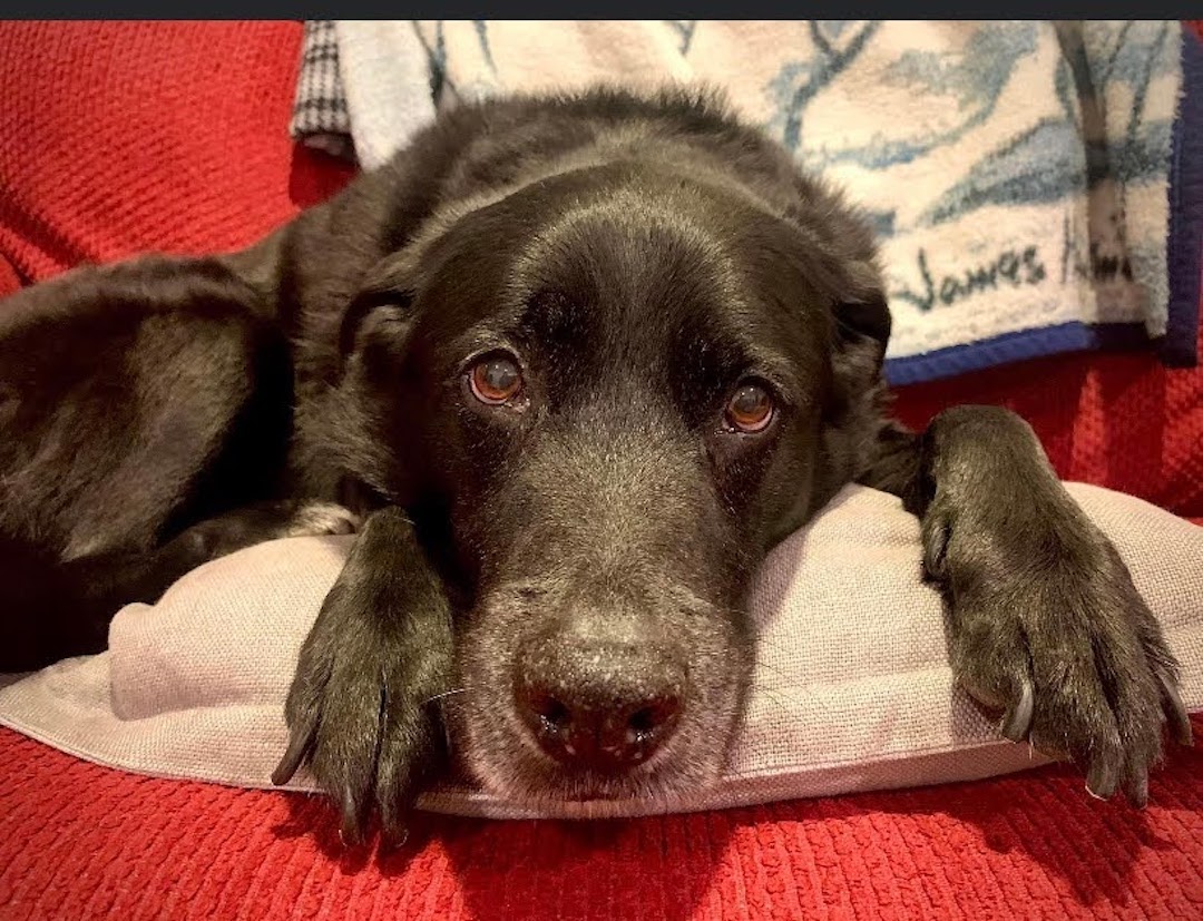
This is a friend’s dog, Vedder, who I’ve never met… the dog, not the friend. I only know about this adorable black lab (I’m guessing… looks like a black lab, hoping he’s a rescue dog, too) because I occasionally check Facebook and he manages to take a lot of really good photos of his dog. As a doggy dad myself, I know how hard it is to get a good pic of your dog, especially a black one. 

I’ve been spending a lot more time this year working on dog portraits and other dog related compositions. Many of them have fallen short of anything resembling artwork, thus the lack of posts on this topic. However, some things have started to click lately and I believe it’s because I’ve returned to the core exercise of drawing instead of painting dogs. I’ll bounce back to painting them very soon, but sometimes my brain needs a reset in terms of how it translates between my eyes and the canvas. 

Vedder was all about getting the face, especially those soulful eyes, just right. I’m pretty happy with the outcome, especially since the initial drawing block-in required very little adjustment. In other words, the proportions of the face and related features was accurate from the outset, something I hadn’t been getting right with the brush and canvas. 

Drawing dogs is very tedious, but it’s offset by very rewarding outcomes. The process of drawing hair via thousands of “strokes” is a test of patience, which artists really need, but oftentimes it can be elusive as you’re excited to get a composition done. Vedder is an older pup, how old I’m not sure, so he has features such as white hairs and a well-used dog nose. These are very tricky to get onto the paper with graphite only. As you can tell from this composition I missed the mark on that front, but the rest of the details I hope capture the personality of Vedder. I’ll have to cross post this on Facebook to see if my friend has an opinion. 

On the technical front, I used 3 pencils – HB, 2B, and 4B. The paper is very basic, no idea what it actually is because it’s a sketchbook that I usually tote around on trips when I want to get some sketching done to capture the place for posterity. Very convenient, but the paper has no teeth which makes it hard to layer hair strokes with value shading.

Thanks for reading… and GO HUG YOUR DOG!

#artbern #berntx #crashboomzip #painting #art #abplanalp #bernabplanalp #austinartists #rescuedogs #bestfriends #dogsofinstagram #dogsofinsta #dogstagram #oilpainting #fineart #petsofinstagram #contemporaryart #fosteringsaveslives #dogsofig #adoptme #takemehome #austinpetsalive #mutts #muttsofinstagram #snouts #wetnoses #blacklabs #hugyourdog

Yellow Rose Botanical

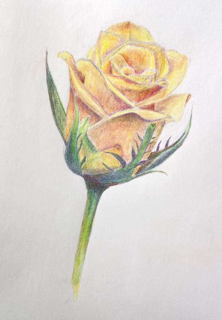
Yellow Rose Botanical | 8” x 10” | Colored Pencil on Paper

I finished my botanical drawing (virtual) classes last week and this Yellow Rose is my final project. The sessions were 2 hours weekly for 8 weeks, the instructor (Jenny Granberry – @jennygeeberry) was hilarious, and I learned a lot about both botanical artistry and how to use colored pencils properly.

Yellow Rose Botanical Drawing

The biggest challenge was figuring out how to incorporate a range of colors beyond basic yellows to add interest, value variations, and realism. I was using a limited palette (12 pencils), but through some trial and error I managed to land on a few color combinations that added a lot of depth to the overall piece.

I’m hoping to do a few botanical series over the course of this year. I like the idea of colored pencil drawing because it incorporates drawing and a lot of oil painting concepts, although the techniques are very different.

#contemporaryatx #berntx #crashboomzip #rose #art #drawing

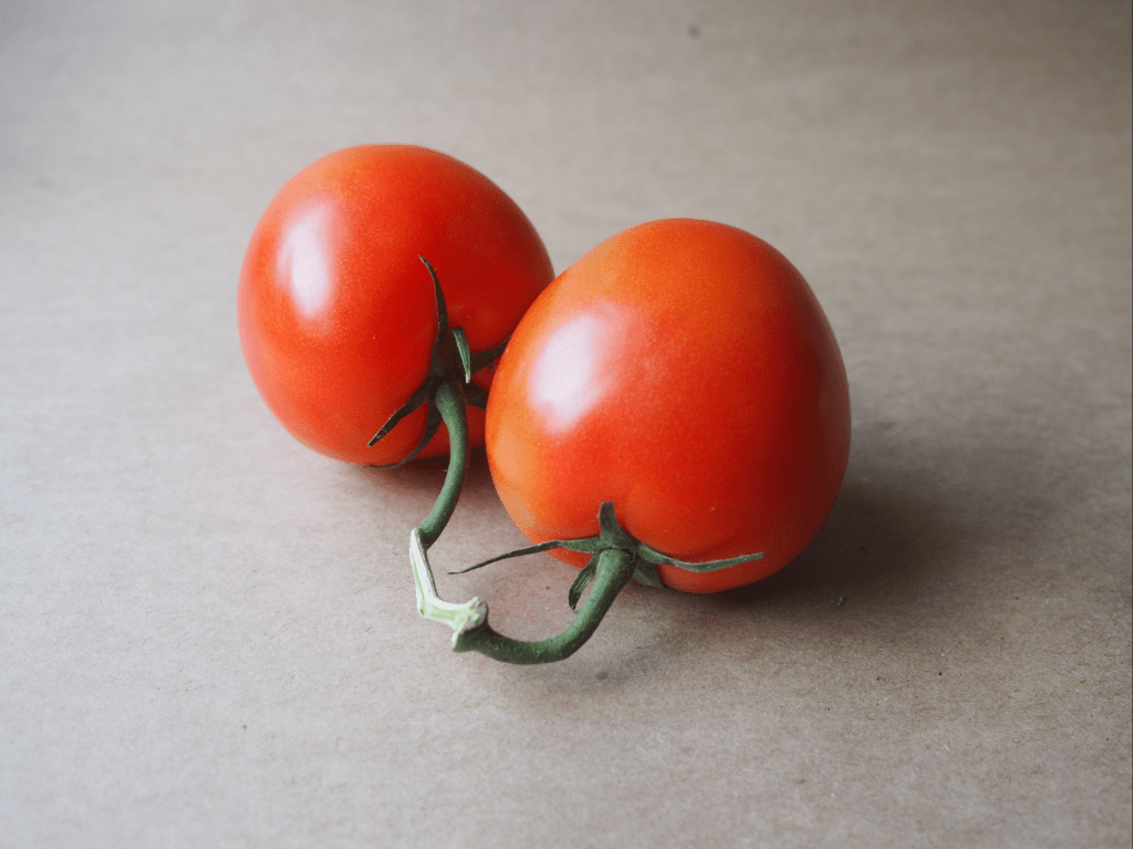
Vine Tomatoes in Colored Pencils

As we settle into a new year, hopefully a better one than 2020, I thought it was time to learn something new on the art front. To that end, I’ve been attending a weekly Botanical Drawing class. The theme of “new” is splattered all over this class – it’s done virtually (a first for me), focused on botanical drawing (another first), and in colored pencil medium (yet another first… kinda). 

This week’s subject was a pair of tomatoes on the vine. The first two classes were graphite only, no colored pencils, so this was the first session that introduced color. I’m using a small set of 12 SoHo colored pencils, which are very vibrant and so far seem to do the trick. It’s going to be a challenge pivoting from oil painting, where colors are seemingly endless through mixing of a core set of hues. The colored pencils are a different challenge because there’s only so much layering of colors that the paper will tolerate. In oil painting, if you overdo it with oil paint colors it goes brown or a dirty grey, but you can wipe it off the canvas. The colored pencils, however, can only support a limited amount of mixing on paper, and it’s largely un-erasable. It’s a wee bit stressful at times!

I really like the challenge of capturing the reality of botanicals, which is at the heart of botanical drawing. It will be interesting to see how the various compositions evolve on the color and value front over the remaining 5 weeks of class. 


This week’s composition vine tomatoes is done on standard paper and measures about 7 x 5”.