“Rescued”

IMG_3636

“Rescued” is done and hung on the wall downstairs in our powder room! This was my first “commissioned” piece, done for my wife who wanted something with a lot of saturated color and big! The design is entirely from her and the passion and love she has for rescuing dogs, of which we’ve had the pleasure of fostering 114… and counting. When my wife says “rescue”, she means literally rescued from the kill list at the Austin pound, not “rescue” from a pet store (don’t do it… just adds to the breeding problem), and these dogs are often in really bad shape – parasites, detached intestinal walls, starvation, neglect, flea infestations, ticks, kennel cough, Parvo and more.  But she nurses them back to health, even waking at all hours of the night to feed them meds every couple of hours, and finds each one of them loving homes. She is amazing!

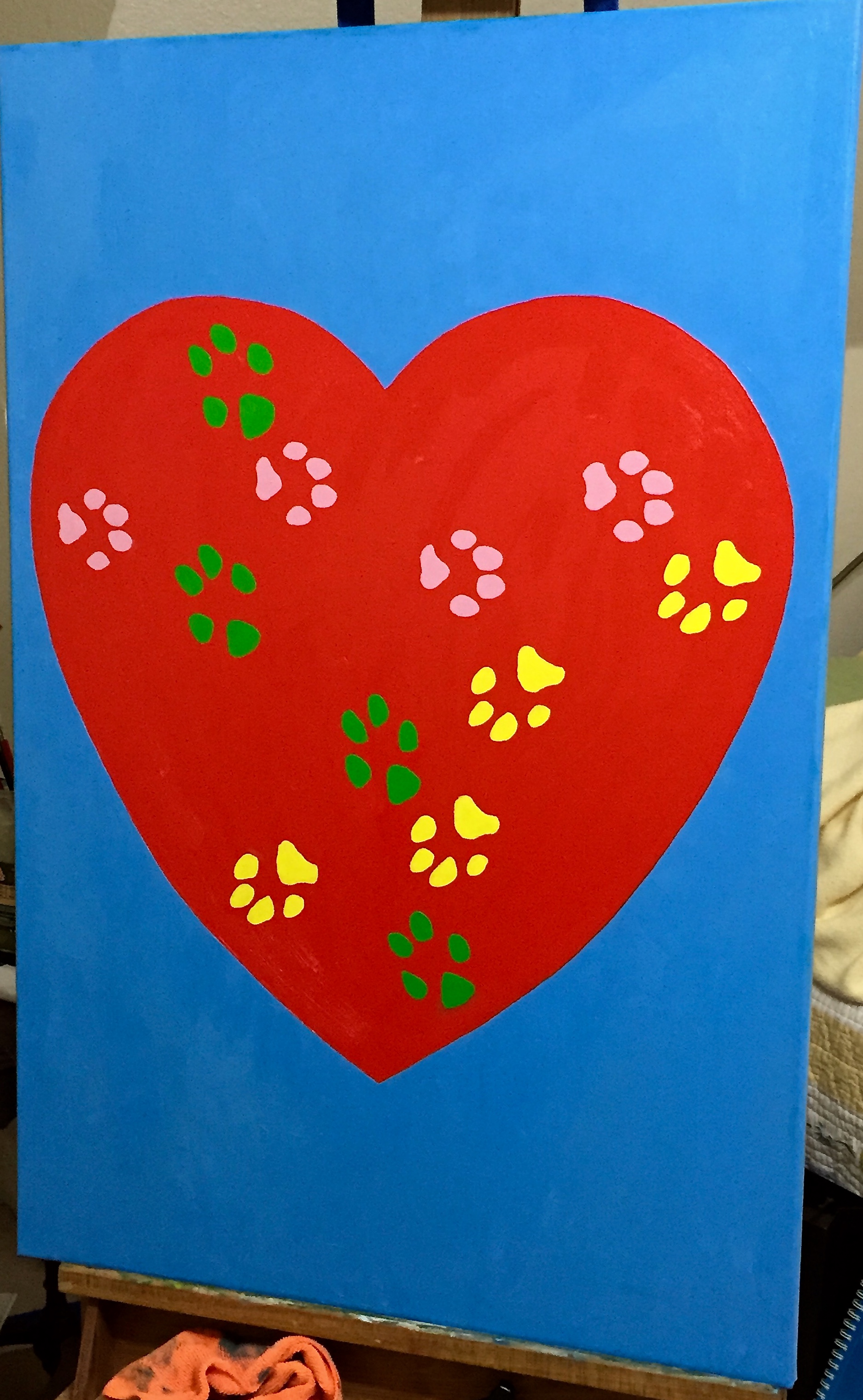
She also had the primary design in mind, of which you see in the picture – a large heart with the paw prints of our 3 dogs (yes, rescues all of them) on it. We had a lot of fun collaborating on the details, although she would say there was some stress involved in figuring out the right colors for each dog’s prints, which ended up as follows:

  • Pink – Crash, female, age 13
  • Green – Boom, male, age 12
  • Yellow – Zip, female, age 3

The process for getting the dog’s paw prints on the painting is worthy of a separate post, so I’ll pause here today and give an update on that entertaining adventure in my next update.

Tech details of the painting for those interested:

  • Canvass, 24″x36″
  • Colors were almost straight out of the tube, but had to make some small tweaks:
    • Blue background – Titanium White + a small amount of Pthalo Blue + tiny bit of Orange.
    • Red heart – Cad red medium
    • Green paws – Permanent Green Light + Titanium White
    • Yellow paws – Lemon Yellow + Titanium White
    • Pink paws – Titanium White + small amount of Alzarin Crimson
  • I added the Titanium White in heavier doses with the yellow and pink paws because it helps add opacity to those more transparent colors. Sitting atop the red heart it was helpful to cut back on the bleed through.

For the dog rescue lovers out there, the group we work with, Austin Pets Alive, is fantastic and is by far the most influential and impactful rescue group in Austin, perhaps all of central Texas. If you want to learn more, check them out.

Going Big!

Started a new project this past week. I won’t reveal the final design details, but suffice to say its going to be very different from anything I’ve done so far in many ways:

  • No reference photo: Instead it’s inspired by my wife, who is the source of this great idea, and it’s something very personal for both of us. While I don’t have the convenience of a picture to look at whenever I need guidance, I get to collaborate with her and evolve the idea together as it comes out of her imagination.
  • This is BIG! At least for me. This is going to be twice the size of any work I’ve done in the past – 24″ x 36″.
  • The technical challenges are very different, too. At first I thought it would be much easier because I’m using mostly just 2 colors, but neither are straight from the tube, which means the need to mix enough volume to cover the entire area is something of a challenge, which I didn’t realize until I was already running out of the first batch. You really have to mix a large volume up front so the area is covered in a contiguous hue, or else it will look uneven, i.e. the top half will look darker, lighter, duller, etc than the bottom half. In a landscape painting, even a large piece, you can get away without worrying about slight variations because you use it around the entire piece to create depth and texture to the objects, but this is a modern piece that needs continuity (at least for part of it.. hint hint of what’s to come) throughout.
  • The other technical challenge is doing the large heart shape freehand. I didn’t use a stencil, and actually took some time to create a demo piece on a much smaller scale to get the proportions and shape aligned with what my wife wanted. Then it was a matter of dusting off some high school math on ratios to translate to the larger format, i.e. the 10″ x 11″ heart is what dimension on the 24″x36″ canvas? Patience on the drawing front paid off.

The photos below show the staging and completion of stage 1. I promise you, stage 2 and the challenges involved will be very exciting, so stay tuned for updates in the coming week.

IMG_3528 Reference drawing/painting. This was used to get the palette choices figured out and the proportions and shape of the heart established. The original idea was red on yellow, but all we could see was McDonalds, which led to a lot of laughter as we tested out new background options. The baby blue was final decision. The heart is cadmium red + a little white + a little permanent green light. The blue is Titanium White + a little Pthalo Blue. Looks greenish on this test piece b/c the yellow was bleeding through.

IMG_3530

This is what 24×36 looks like on my easel. It dwarfs the pieces stacked up on the floor – still dealing with renovation messes, so all the art isn’t back up on our walls yet.

IMG_3531

Transferred to the canvass, the red heart is looking great!

Finished with Phase 1 after getting the blue background slathered on. Getting the line crisp along such a large object made my shoulder ache, but it was great practice for painting adjacent wet paints. No easy feat, especially with the curvatures of the heart. I had to rotate it around the easel many times to get the right painting angle.

The color combination in real life is a little less saturated, but it works really well together. Hats off to my wife for making the palette call on this one. I wouldn’t have thought to go with such bright hues, but it works really well. Finally, the picture doesn’t show the texture contrasts – I used a palate knife for the blue area and brush for the heart. More on that later.

IMG_3533