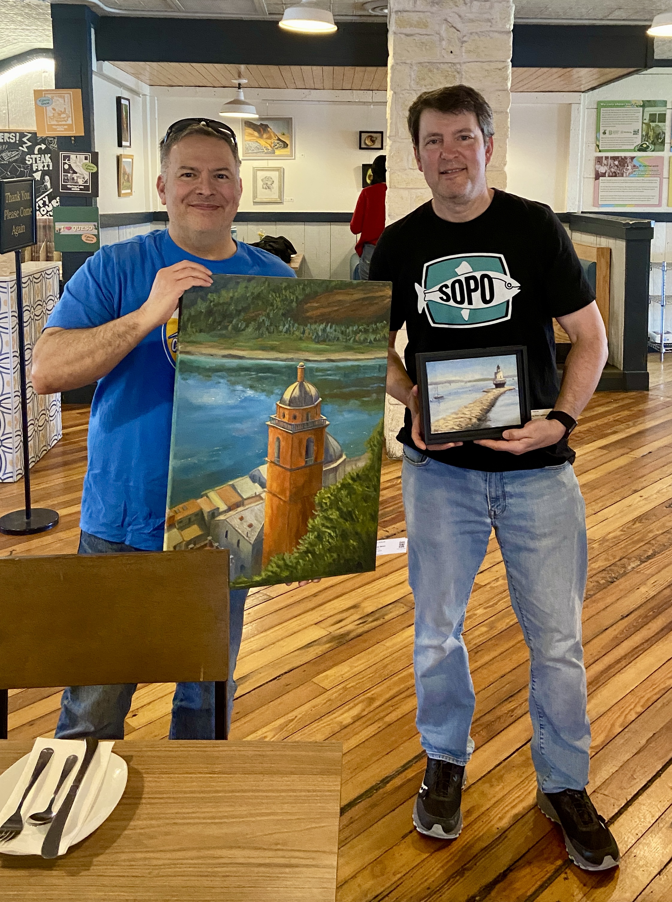
New Collector John with Artist Bern (me, wearing SoPo shirt)
I recently had the good fortune of selling 2 pieces from my solo show, “Something for Everyone”, at Kerbey Lane Restaurant in San Marcos, TX. I got to meet John, who bought 2 of my favorite pieces, “Porto Venere Bell Tower” and “Spring Point Lighthouse”. It’s awesome that he liked two pieces that were different in so many ways – size (small vs large), pallets (bright, warm vs subdued, cool), and landscape locations (Porto Venere, Italy vs South Portland, Maine)! Just proves how versatile art can be!
One of the most rewarding things about selling a painting, even rivaling the cold hard cash, is the chance to meet people who are actually intrigued by something I created. The inspiration I have for a composition isn’t always what piques a collector’s interest. Having the opportunity to chat with new buyers is always an interesting and enjoyable experience for me, as I get to learn about some sliver of their lives and where their newly purchased artwork will fit into their world.
3 BOATS ON CASCO (study) | 5×8” | graphite on paper
Figuring out why a composition is failing can be a real challenge at times. If the painting fundamentally sucks, I know it’s a lack of talent or experience on my part. Sometimes, however, it just doesn’t look right. It’s on this latter front that I often find myself with boats.
Granted, I don’t have extensive experience painting seascapes that highlight boats. They’re tricky and I believe lots of practice is the key to get the blizzard of weird angles, maddening levels of detail, and the reality that they move constantly, even when anchored, working in concert as a composition.
Last week I did a short plein air session of boats – it was a total failure, although the outing itself was great time spent on the coast. I decided to try drawing the same scene in the studio to see if I could figure out the issues. As it turns out, this small study solved a lot of problems, of which there were 2 big ones.
First, the viewing angle was too steep, meaning it works better with a more horizontal perspective. The painting I had done was simply too aerial, probably in part because I was standing on a pier and secondly it was low(ish) tide, so everything was below my line of sight.
Secondly, the composition included something very unusual, namely Fort Gorges, which is literally a Civil War era fort seemingly floating around in Casco Bay. It’s an iconic part of the Bay for those who know Portland, Maine, but for those “from away”, it’s basically a big ‘ol WTF part of the horizon. It’s made all the more confusing to the uninitiated because it has a tree filled square in it’s center, which makes Fort What-the-Fuck even more awkward with what looks like a Jolly Green Giant broccoli patch springing skyward. How does one work that convincingly into a composition. NOBODY!
Upon realization that Fort WTF needed to be ignored, aka artistic license, the final version of the drawing was complete. Note that in the pictures there is a before and after version to show the impact of using a drastic design decision to make the composition work. Whaddya think?
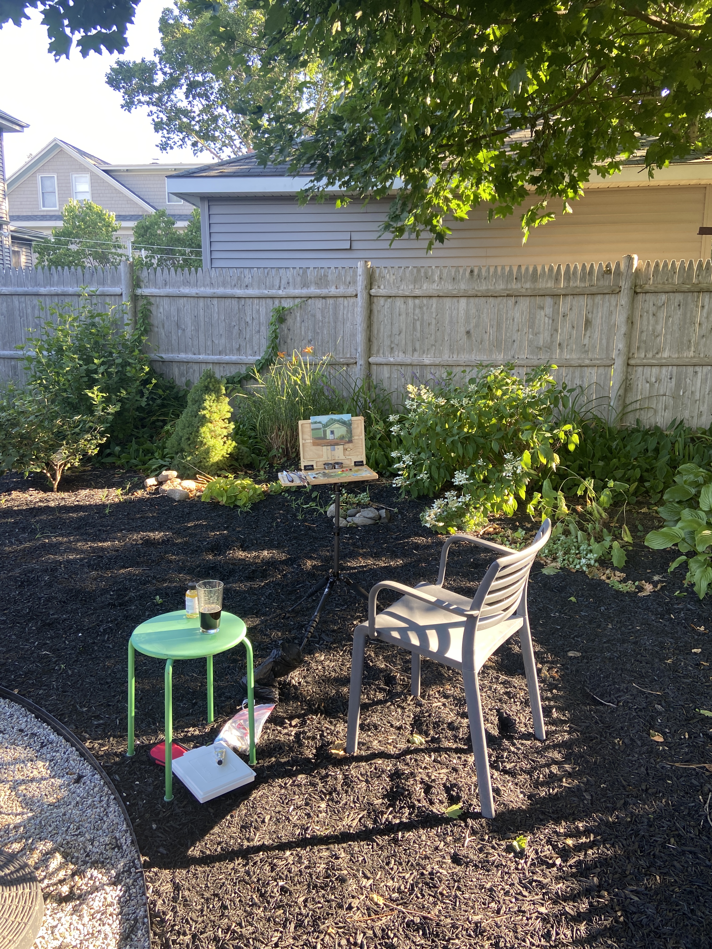
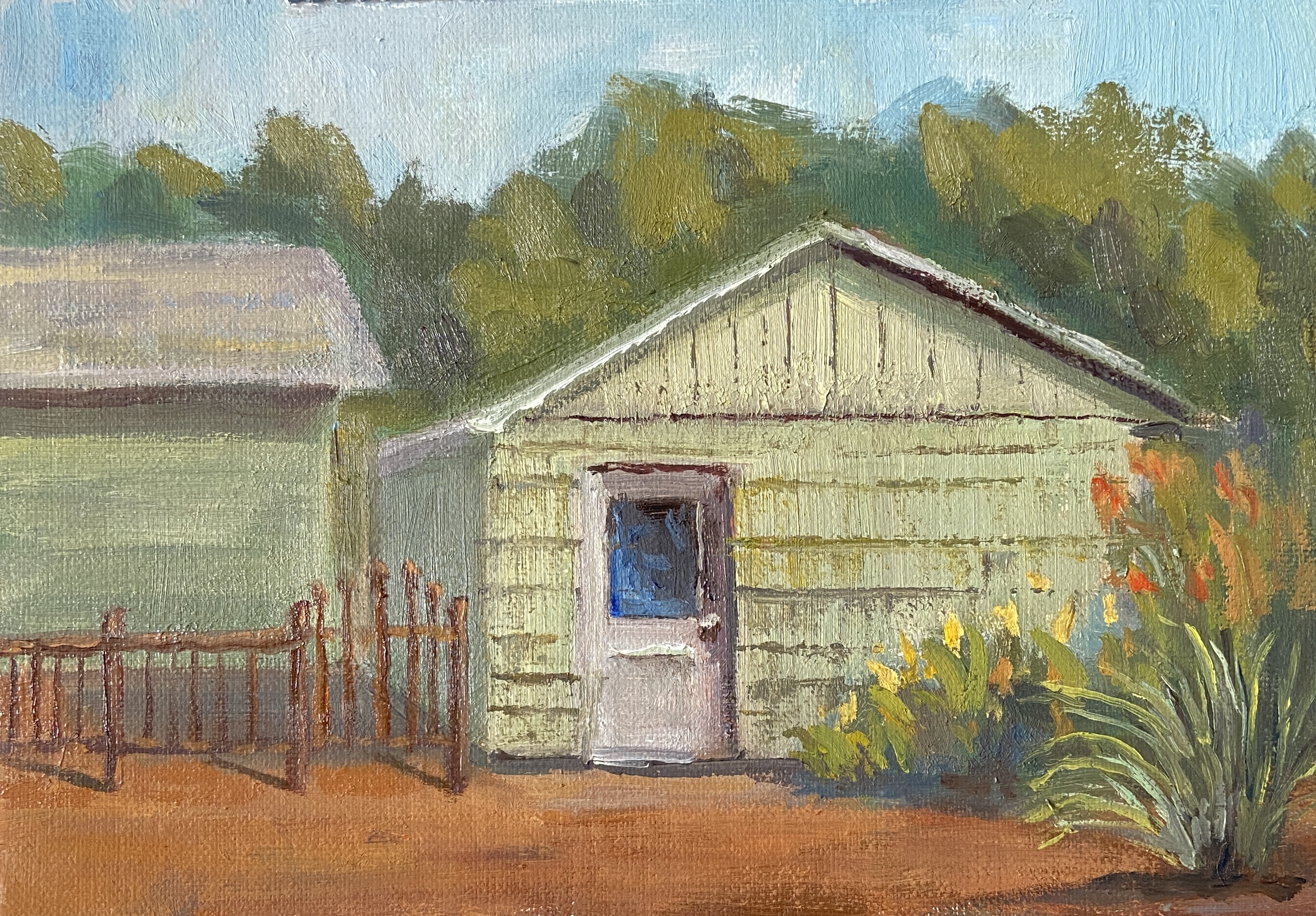
Greetings from South Portland, Maine! Plein air sessions in the July Texas heat aren’t exactly an inspirational setting for creativity, so this piece is brought to you by the cool breezes of the land of 75,000 moose.
This garage was painted over the course of 3 short sessions in the mid/late afternoon. The shadows created by the sun really make the garage door pop, so I wanted make that the clear focal point without making the white to prominent. The final solution was to tweak it so the black window of the door was the primary focus, using the high contrast in values with the white door as an easy viewing vortex.
In terms of the other elements, a lot of artistic license was taken to pare down the details and keep things simple. That said, it was important for me to include the iron fence and the color of the garage. The fence because the ironwork is very eye catching given the design. As to the green hue of the garage, while I’ll admit it’s not my preferred color, I wanted anyone who’s seen this house and garage to instantly recognize it as “hey, it’s that green garage!”
Lastly, I made a decision in the final minutes of painting, after having thought I was done, which significantly improved the finished piece. Because I don’t have a before and after shot, I can only describe what I did, which was to add the high contrast “rows” on the garage, then scraping down to give the sense of textured panels. I was pretty sure the move was going to muddle the whole thing, but as it turns out it was a vast improvement. I must learn to be much aggressive when painting and this sessions went a long way in validating that approach.
I’m privileged to be included in another group show at Art for the People Gallery in Austin! I’ll have two pieces in the show, FISHERMANS POINT and SMOKY ON ICE. I’m especially stoked at this opportunity because these pieces showcase two very distinct painting styles, namely landscape and still life.
The show runs June 7th – August 17th, 2024, opening reception NEXT SATURDAY, June 8th, 12-4pm CDT at the new location of Art for the People Gallery in Austin, Texas.
Note that the Art for the People Gallery has moved locations and is no longer on South 1st street. They are part of Good Dad Studios located at 2801 S. I-35 Frontage Rd. Good Dad Studios is Texas’ largest artist complex, which means they have a lot of artist studio space, and within the facility are galleries and other businesses, one of the most notable being Art for the People Gallery.
Reach out if you have any questions, or better yet go to the gallery and check out all the art.
If you’ve lived in South Portland, you knew the Fishing Shacks. If you don’t, please get out more and explore the wonders of your own backyard!
For the uninitiated, the last of the 3 remaining, dare I say “iconic”, Fishing Shacks were sucked into Casco Bay on January 13, 2024. Over their 120+ years, these historical structures had endured whatever the tumultuous Maine coast could throw at them, but a record tide (14.57 feet) coupled with a massive storm surge was a one-two punch they simply couldn’t withstand.
Many Fishing Shacks On Willard BeachShacks Stored Fishing Gear… Maybe Bodies 🙂Fishing Shacks With Metal RoofsReference Photo of Fishing Shacks – August 2023
Despite their absence, they leave many fond memories, a rare marriage of human structures and the natural environment which, together, made Fishermans Point a better place. As an artist, one of my primary inspirations is to return to a fond location and remember the time I spent there by recreating a view or experience on the canvas. Regarding the Fishing Shacks, my wife and I spent many happy hours soaking in the sights, sounds, and sea air on Fishermans Point, the shacks standing guard. It was, and still is, our happy place… just a little different now.
The painting (not my first of the shacks, see Fishing for Edward Hopper) is meant to capture that unique light at the end of the day when the world is bathed in golden rays and everything looks just a little more inviting. I used very little artistic license regarding the shacks themselves, as I wanted to preserve their actual structure as much as possible, including their positioning on the rocky point.
Experimenting with color to figure out the right palette for the waterZoom In Shacks
I used a painting knife and broken color on the illuminated side of the shacks to ensure they were the focal point of the work, most notably the railing leading to the first shack, guiding the viewer into the work. The use of high contrast values of the railing against the sunlit side of the shack should pull you back to that point every time you look at the piece, supported further by the diagonal cast shadows of the railing on the shack wall.
Compositionally the piece could be unbalanced and wonky, the shacks and rocky point stacked on the right side.To offset this issue, I incorporated a lot of high value, strong chroma setting sun reflection in the still(ish) blue waters on the left side. This is a relatively new compositional strategy I learned from another artist, Jeanne Hougen , who I had the pleasure of taking a class earlier this year.
Lastly, there is some hidden meaning in this composition, most notably the lack of the rocky point and the supporting stilts of the shacks in the water’s reflection. This was done intentionally and is meant to represent the physical disconnection of the shacks from Fishermans Point, but also a reminder of their powerful presence in the memories of all of us who shared time with them looking across the bay.
Reference PhotoBlock InProgress – Sky Sets ToneBright Blue Water Aint RightWorking in ReflectionsSunlight Reflection for BalanceSHACKS OF GOLD | 20×16″ | Oil on Canvas
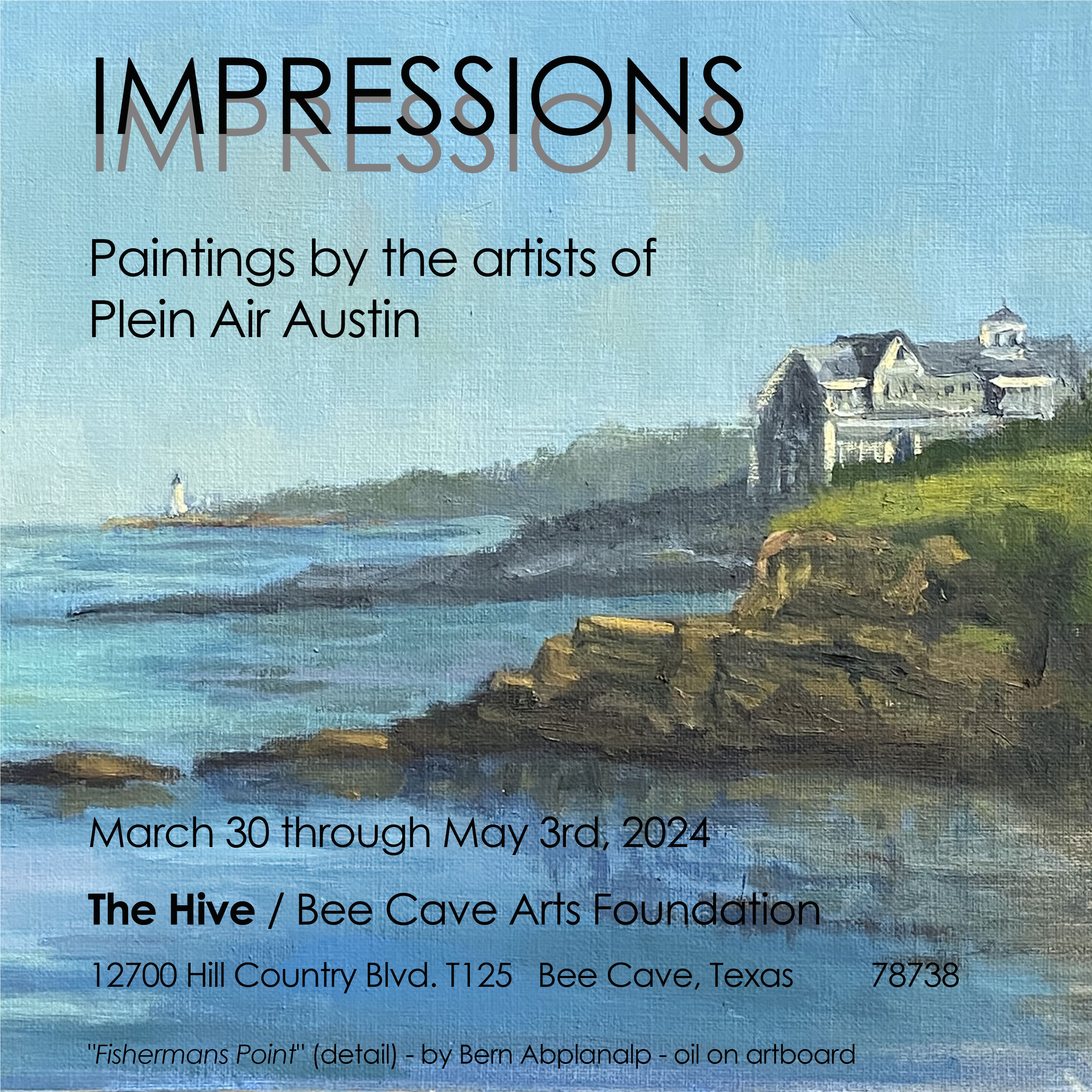
I’m very excited to be included in a new exhibition called “IMPRESSIONS: Paintings by the artists of Plein Air Austin”, happening at The Hive in Bee Caves, TX. This show celebrates the 150th anniversary of the Impressionist painters. If you don’t know much about the Impressionists, even if you don’t like the style (weirdo!), the history is fascinating.
In short, the movement, as it were, was actually facilitated by an American painter, John Rand, who in 1841 invented… wait for it… paint in a tube! Over the following years, some artists started to take their hobby outdoors (thanks to their tubes of paint) and began capturing the scenes of the world around them, a major break from compositional structures of the time, and emphasizing light and color to give a sense of place.
The debut party for the Impressionists is what’s marked as the anniversary, which occurred in 1874 in Paris at a show called “The Cooperative and Anonymous Association of Painters, Sculptors, and Engravers”. This group of arty-farty rebels included some of the (now) most recognizable names of the art world, including Monet, Renoir, Pissarro, Degas and Cézanne.
One final fun fact. The term “Impressionists” was initially an insulting critique from the press, who hated the style, calling one of Monet’s paintings “Impression, Sunrise” and comparing it to wallpaper.
Back to the opening, where 6 of my pieces will be included in this fantastic group show of plein air works. Opening reception will be Saturday, April 6th, 2-4pm. Swing by if you’re so inclined and meet some artists who love the outdoors and have created some amazeballs artwork! Let me know if you plan to drop by and I’ll keep an eye out for you.
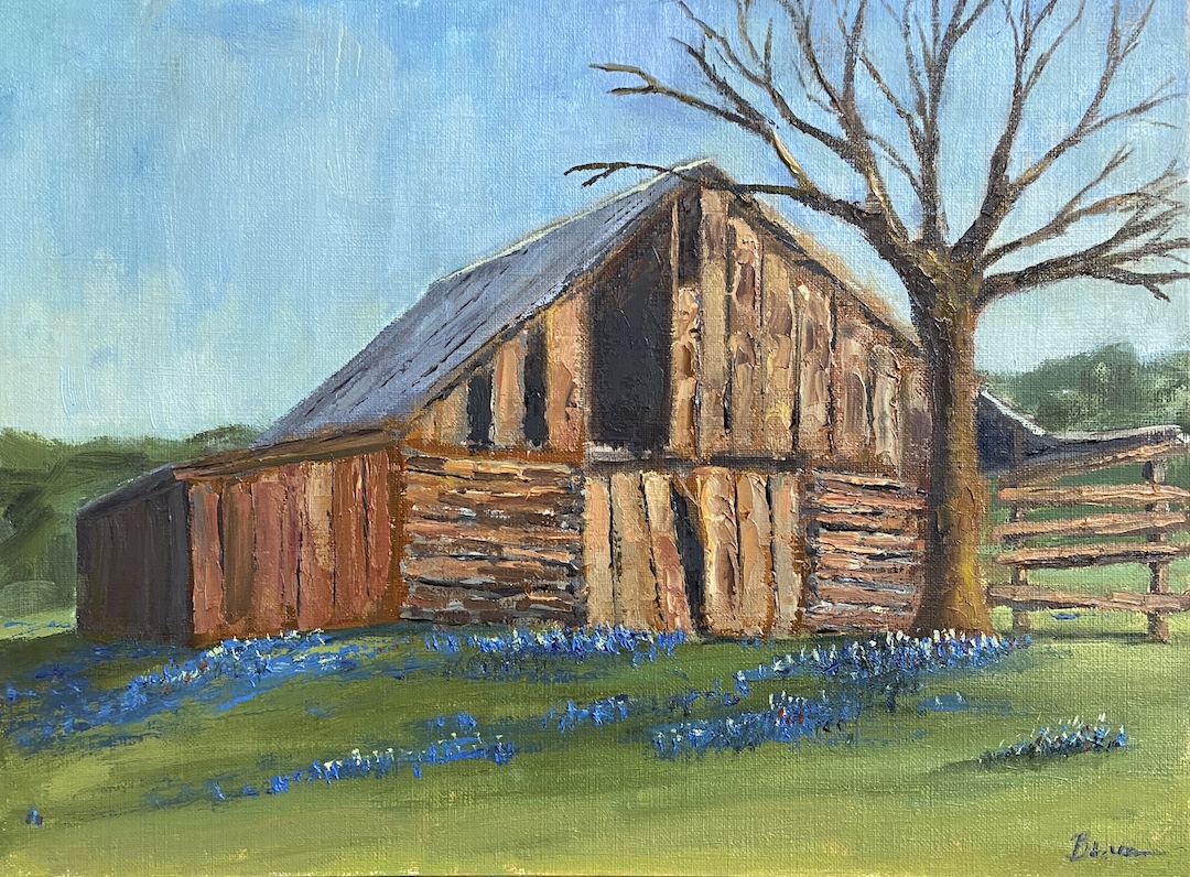
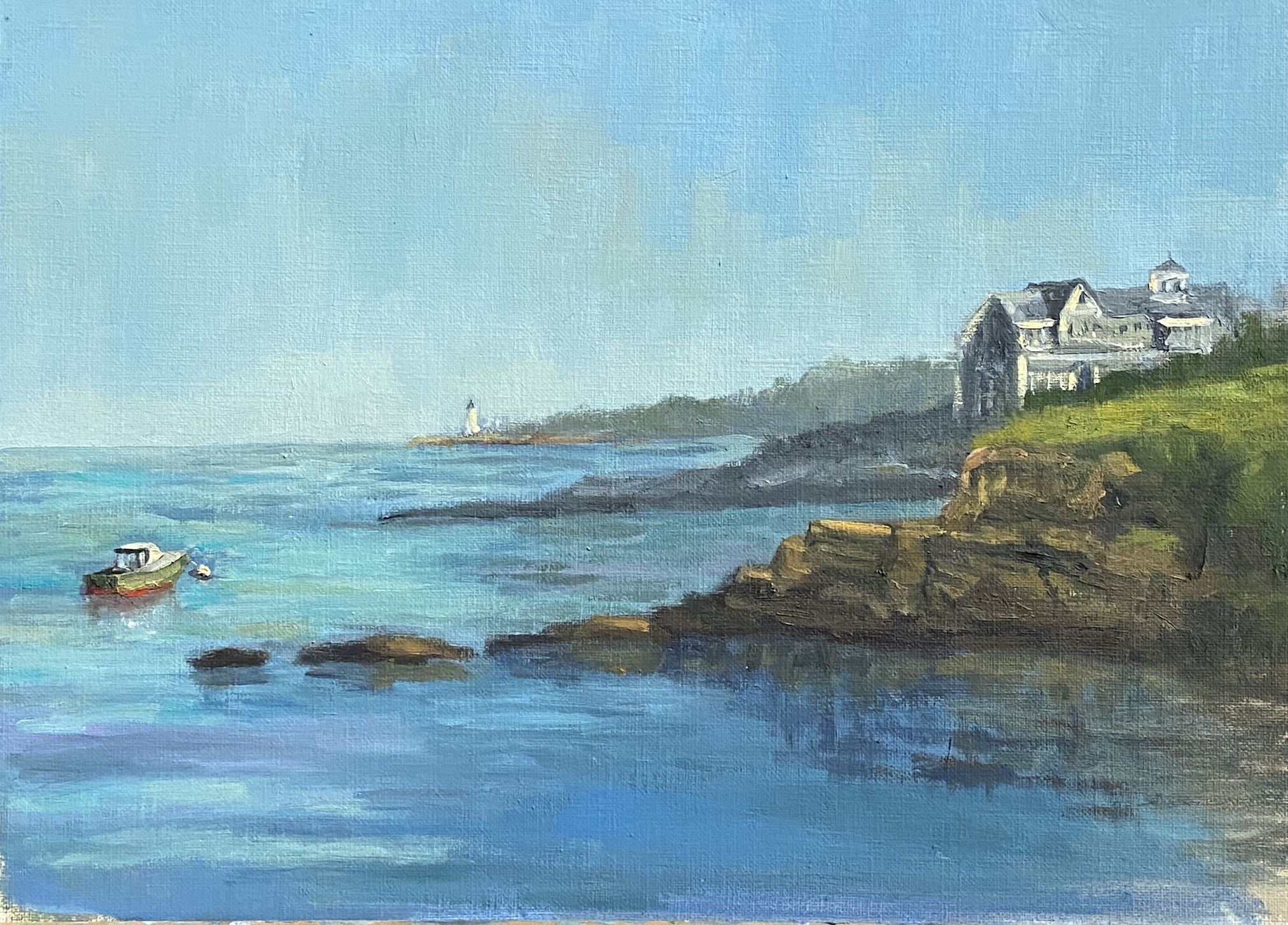
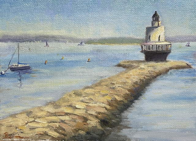
COMMONS FORD RANCH BARN | Oil on Board | 9×12″ FISHERMANS POINT | Oil on Board | 9×12″ BREAKWATER MARINA | Oil on Canvas Board | 8×10″ SPRING POINT LIGHTHOUSE 1 | Oil on Canvas Board | 9×12″SPRING POINT LIGHTHOUSE 2 | Mixed Media on Board | 10×8″ GREENWICH VIEW | Oil on Canvas | 20×16″ 6 Paintings in IMPRESSIONS Show
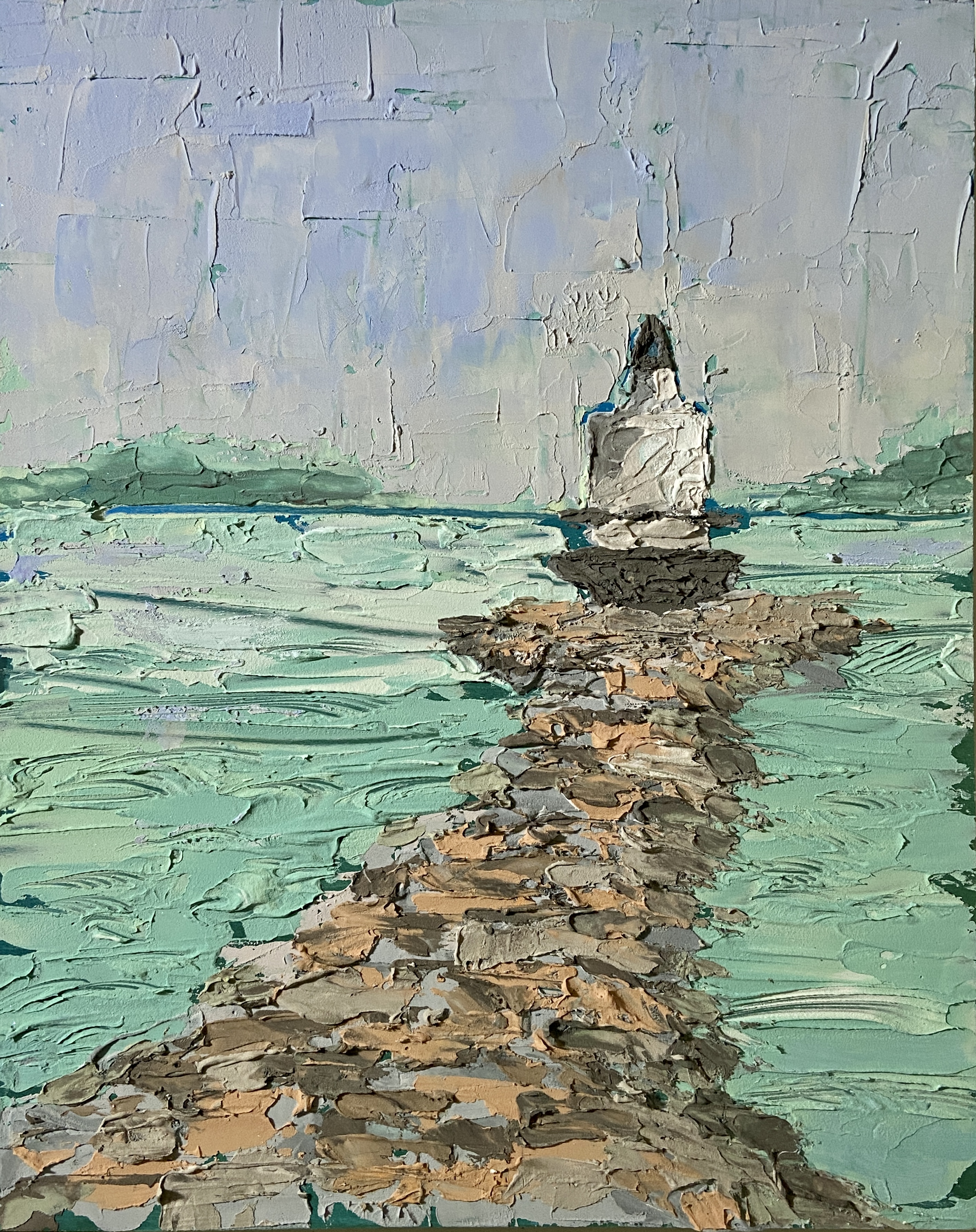
SPRING POINT LEDGE LIGHTHOUSE 2 | Mixed Media on Wood | 8×10″
I recently attended a 2-day workshop at The Contemporary at Laguna Gloria. The focus was textured painting, which ultimately boiled down to playing with joint compound (gypsum spackle) and acrylic paint. I was amazed at how easy and fun it was to adapt to this medium.The technique is very straightforward, whereby one mixes acrylic paints into the joint compound, which is an off-white, and do whatever you want provided it’s put on a hard surface, for which I used wooden boards.
Most of the class did abstract pieces, which make sense as you get to play with pottery tools to get cool shapes and textures. It’s very forgiving, too, because you can simply wipe it off and start over again provided you don’t wait more than a day, at which point it hardens. I chose to do still life and landscape pieces, taking advantage of the impasto nature of the spackle. The instructor said she hadn’t considered doing landscape compositions with this technique, but to me it seemed intuitively suited for the textural nature of the real world.
I intend to add some vibrancy to this composition with acrylic paint… I think. This is definitely the start of a new and exciting medium! Stay tuned for a number of new pieces in spackle and acrylics.
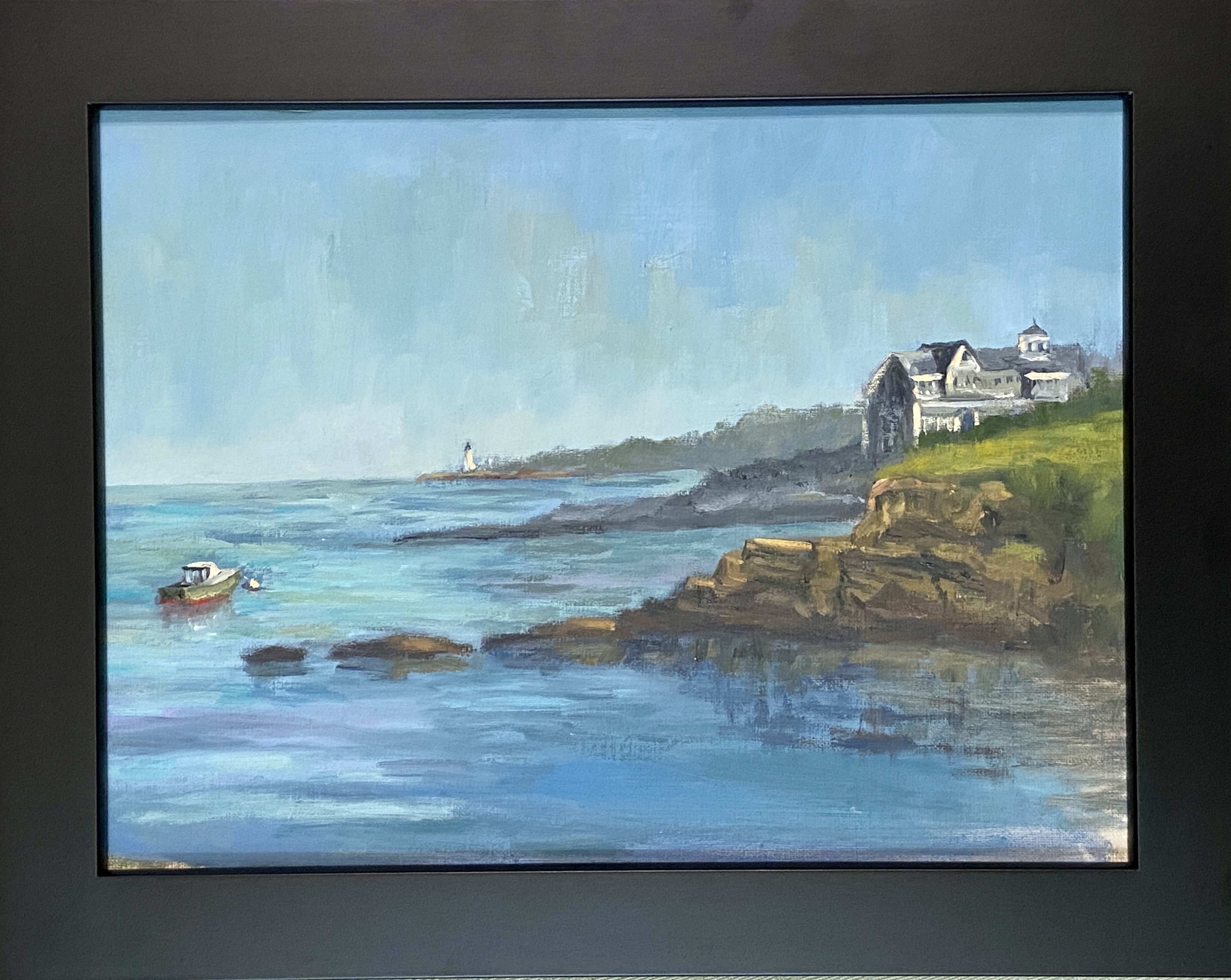
The coast of Maine is one of the most beautiful in the country. Needless to say it provides plenty of inspiration for painting. While this is not a plein air piece per se, I did a study sketch plein air and spent hours on Fishermans Point enjoying the cool sea breeze and beautiful views.
The inclusion of the home on the sea cliff is not only intentional in this composition, but it is the name my wife gave the house, “Winners”. We have no idea who they are, but we’ve strolled by 2 Bay Road often and we know what we would do if we won the lottery.
This piece is a study of sorts, in large part because it’s a very tricky subject matter for me, combining all the hard things into one painting – boats, complex architecture, and rocks. Man, the effing rocks! I can say, however, this turned out pretty well and the learning experience was very rewarding. I also had the good sense to setup the time lapse camera, both as entertainment for all of you dear readers, as well as a way to remind myself how I went about this painting when I decide to do something similar.
SPRING POINT BOATS | 10 x 8” | Oil on Canvas Board
This is a follow-up to a previous post while in Maine. SPRING POINT BOATS was started en plein air, the session just long enough to allow me to lay in a solid structure and composition that was interesting. There was some artistic license taken in terms of boat placement and colors, but the remainder of the setting is, believe it or not, an accurate depiction.
While the paint didn’t effortlessly jump off the brush, something did click regarding boat shapes and structure. I’m not happy with how some of the areas look a bit chalky, but that should be easy to improve in future efforts. I believe I relied too much on Titanium White to lighten values throughout the piece, as opposed to reserving it primarily for the boats. However, the sense of a strong mid-afternoon sun on a calm day came through pretty well.
The last self-critique, and it’s a big one, is the compositional structure. I didn’t notice until the work was done, but now I can’t “unsee” it, that the lighthouse jetty looks artificial because it comes into the painting in a parallel that’s very distracting. It needs to be more angular, or at the very least, I need the sight line to be above the jetty so you can see the side and top, not just the side. I have to laugh, though, because I was so proud of my artistic licensure of the boats, yet I ignored the massive rock jetty in the background. Oh well, there’s always next time.
SPRING POINT BOATS is a work in progress from a gorgeous day on a pier overlooking a marina adjacent to Spring Point Ledge Lighthouse. This initial session was about 2.5 hours, half of which was spent establishing the composition structure and a practice sketch to verify the arrangement of the boats. Note that boats move, even when they’re tightly anchored in the marina, so photos of each boat in the desired position are essential to finishing a seascape like this in the studio.
The temperature was perfection in the shade, my wife was with me enjoying the outdoors and providing very helpful compositional tips, and there was a family of Ospreys on the other side of the marina (right behind us) that are the talk of the town… amongst bird people at least. I’ll admit they are interesting to watch, as the parent (not sure which one, I’m not up to speed on Osprey gender identification) was busy dropping off fresh caught fish for the two babies. At some point, one of the bird watchers rounded the corner of the pier where I was painting, said “hi”, and I was convinced she was about to ask to see what I was working on, only to then question “why aren’t you painting the Ospreys?” Of course I told her I hate birds, was dismayed at the tankards of shit they spray all over town, and that their screeching was something of nightmares.
Of course that was with my inside voice. My public self, using my actual voice, told her instead that the Ospreys were entertaining but difficult to paint, an answer she seemed to deem acceptable – perhaps she hadn’t considered the complexity of painting moving birds in a nest of twigs atop a 75’ pole in the middle of the bay. She giggled and shuffled away, apparently never having noticed I was painting. Perhaps some grumpy plein air painters – you know who you are – scared her off in the past and she’s afraid to ask. I digress…
As to this painting, I had already decided this was going to be a 50/50 job, namely half outside, half in studio. The goal was to lay down a solid structure and really balance the massive blue expanse of the sky and sea with the focal points of the boats. The lighthouse should give perspective and some added interest to the piece, but the intent to so give the sense of place sitting on the water watching the day go by. For me, this is still very difficult because virtually all sailboats are dominated by white, either the sails or the top deck, so the brush strokes have to be very intentional and the values need to shift much stronger than what I see “live”, at least that’s how I think it should be done.
Stay tuned for the completed work, which I’ll keep very loose and painterly in an attempt to put the viewer outside with the boats.