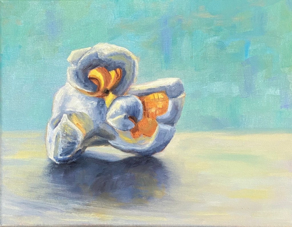
In the spirit of fun and interesting still life subjects, please welcome this tasty kernel… POPPED PERFECTION! This is my second popcorn themed composition, but unlike the original, which featured 3 pieces of the corny goodness, the focus is a single, beautiful popped kernel.
Popcorn is a tricky subject to paint, in large part because there’s nothing standard about any of it’s shapes or surfaces. Had I tried to paint this as a novice I would have found a new hobby and never painted again. That said, when you get it right, it’s a thrill!
There are a number of ways to add artistic interest to this type of still life. I wanted to emphasize the transparent elements of a nice big juicy piece of popped corn, thus the focal points with orange and yellow where light can penetrate. To really make the piece pop (sorry, couldn’t help myself) I used a blue background, which is the complementary hue to orange and therefore provides a strong contrast without having to worry too much about the similar values. Furthermore, the piece is very simplistic in terms of having nothing else on the canvas, which is meant to help it jump off the canvas from across the room.
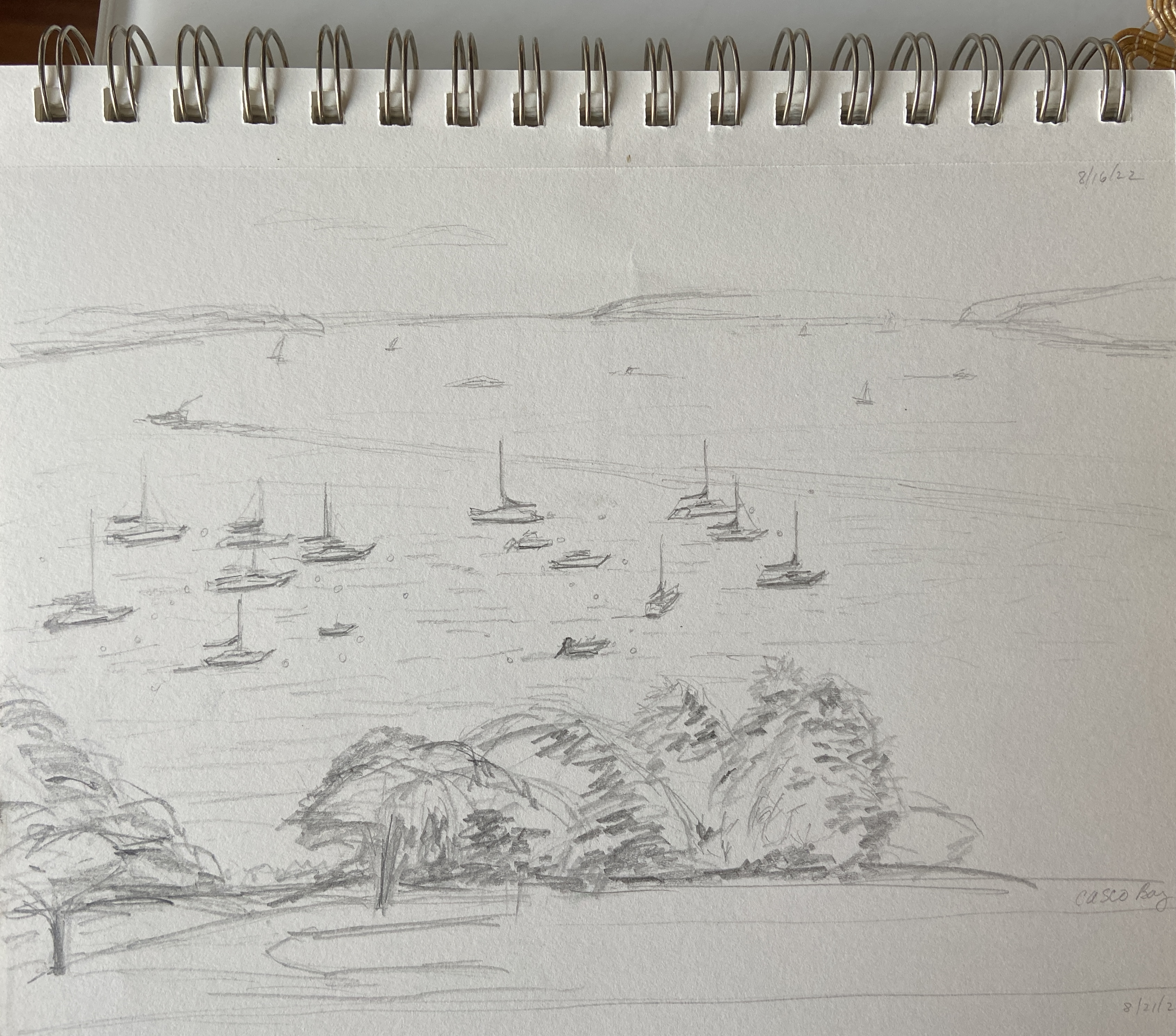
SPRING POINT BOATS is a work in progress from a gorgeous day on a pier overlooking a marina adjacent to Spring Point Ledge Lighthouse. This initial session was about 2.5 hours, half of which was spent establishing the composition structure and a practice sketch to verify the arrangement of the boats. Note that boats move, even when they’re tightly anchored in the marina, so photos of each boat in the desired position are essential to finishing a seascape like this in the studio.
The temperature was perfection in the shade, my wife was with me enjoying the outdoors and providing very helpful compositional tips, and there was a family of Ospreys on the other side of the marina (right behind us) that are the talk of the town… amongst bird people at least. I’ll admit they are interesting to watch, as the parent (not sure which one, I’m not up to speed on Osprey gender identification) was busy dropping off fresh caught fish for the two babies. At some point, one of the bird watchers rounded the corner of the pier where I was painting, said “hi”, and I was convinced she was about to ask to see what I was working on, only to then question “why aren’t you painting the Ospreys?” Of course I told her I hate birds, was dismayed at the tankards of shit they spray all over town, and that their screeching was something of nightmares.
Of course that was with my inside voice. My public self, using my actual voice, told her instead that the Ospreys were entertaining but difficult to paint, an answer she seemed to deem acceptable – perhaps she hadn’t considered the complexity of painting moving birds in a nest of twigs atop a 75’ pole in the middle of the bay. She giggled and shuffled away, apparently never having noticed I was painting. Perhaps some grumpy plein air painters – you know who you are – scared her off in the past and she’s afraid to ask. I digress…
As to this painting, I had already decided this was going to be a 50/50 job, namely half outside, half in studio. The goal was to lay down a solid structure and really balance the massive blue expanse of the sky and sea with the focal points of the boats. The lighthouse should give perspective and some added interest to the piece, but the intent to so give the sense of place sitting on the water watching the day go by. For me, this is still very difficult because virtually all sailboats are dominated by white, either the sails or the top deck, so the brush strokes have to be very intentional and the values need to shift much stronger than what I see “live”, at least that’s how I think it should be done.
Stay tuned for the completed work, which I’ll keep very loose and painterly in an attempt to put the viewer outside with the boats.
This is a follow-up from the Gaggle of Geese post a few weeks ago. The finishing “touches” for the studio ended up being a little more like finish “construction”, but I finally got to a point that seemed good enough.
Let me admit, I don’t like this composition, but I really like parts. Others might see something more appealing, as art tends to work that way, but it seems artists trying to sell works tend to force themselves into liking everything they paint. To the uninitiated, know that they’re lying. There’s not an artist out there who likes even most of their final pieces. At the end of the day, our compositions tend to have really cool elements that we love, and various faults that distract us to no end.
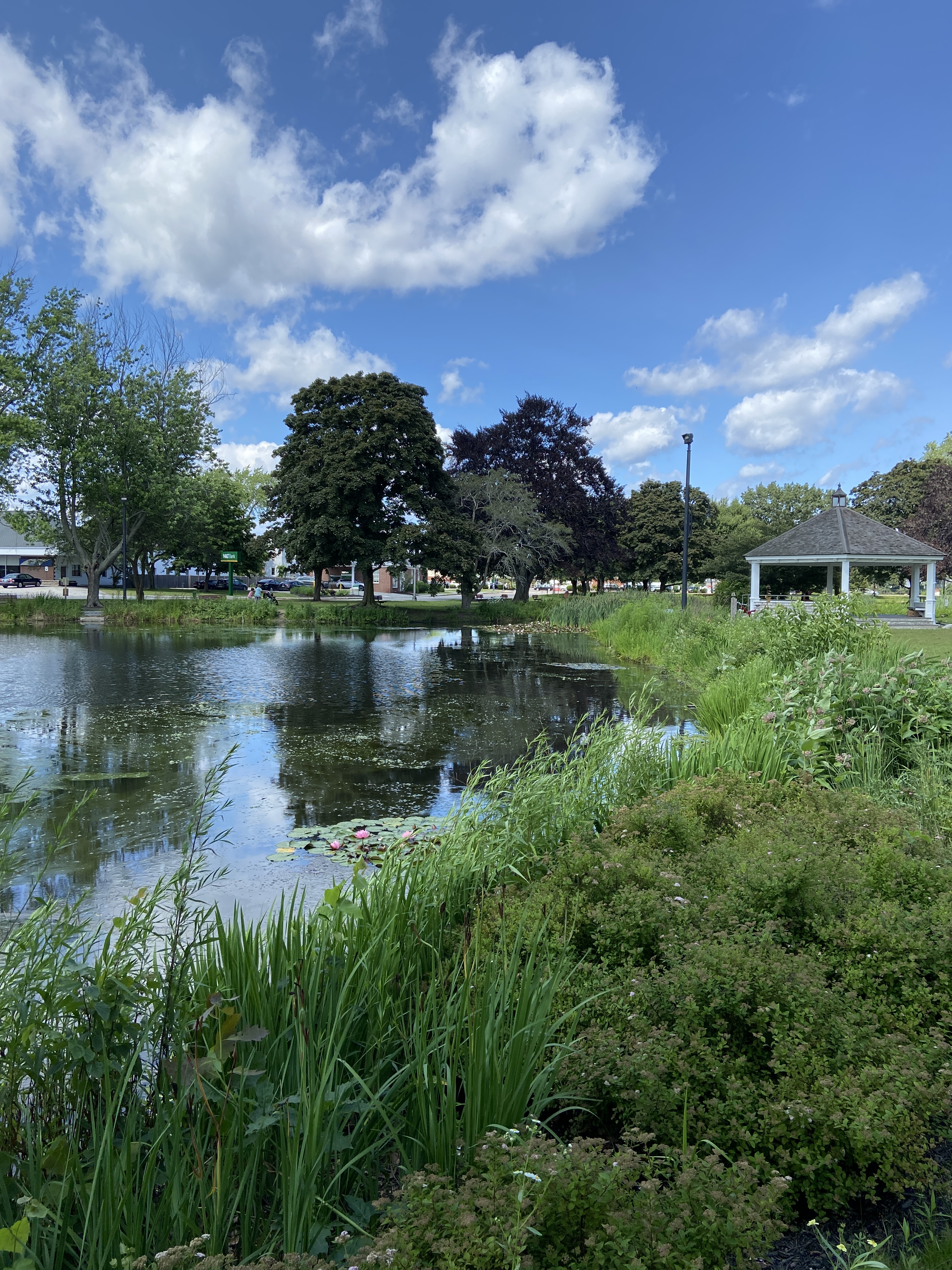
MILL CREEK POND was a joy to paint. If you’ve read the previous post and seen the video of the geese, you understand why. In terms of the studio work, I was really focused on simplifying the trees. Apparently I ignored a few basic compositional tenets along the way and ended up with two trees perfectly aligned left and right, meeting in the middle of the canvas. So annoying, but that’s what happens if you don’t step back frequently at the beginning and take the time to ensure the layout works.
Regardless of the “amateur hour” compositional oversights, I had a lot of fun learning how to simplify the masses of the trees, especially the purple oak. Living in Texas, there are no purple oaks, and everything that’s green has a coating of yellow cedar pollen, so things skew very warm. Painting a very dark purple oak tree with huge leaves that gather in numerous masses is, well, an awkward endeavor and hard to create on the first go. Ultimately I gave up, said it’s good enough, and pivoted to the warmth of the setting sun on the trunks, grass, and lily pads.
Hope you enjoy the final product regardless of my self-critique. It worked out in the end… kinda. Thanks for reading!
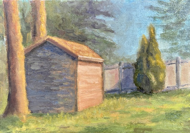
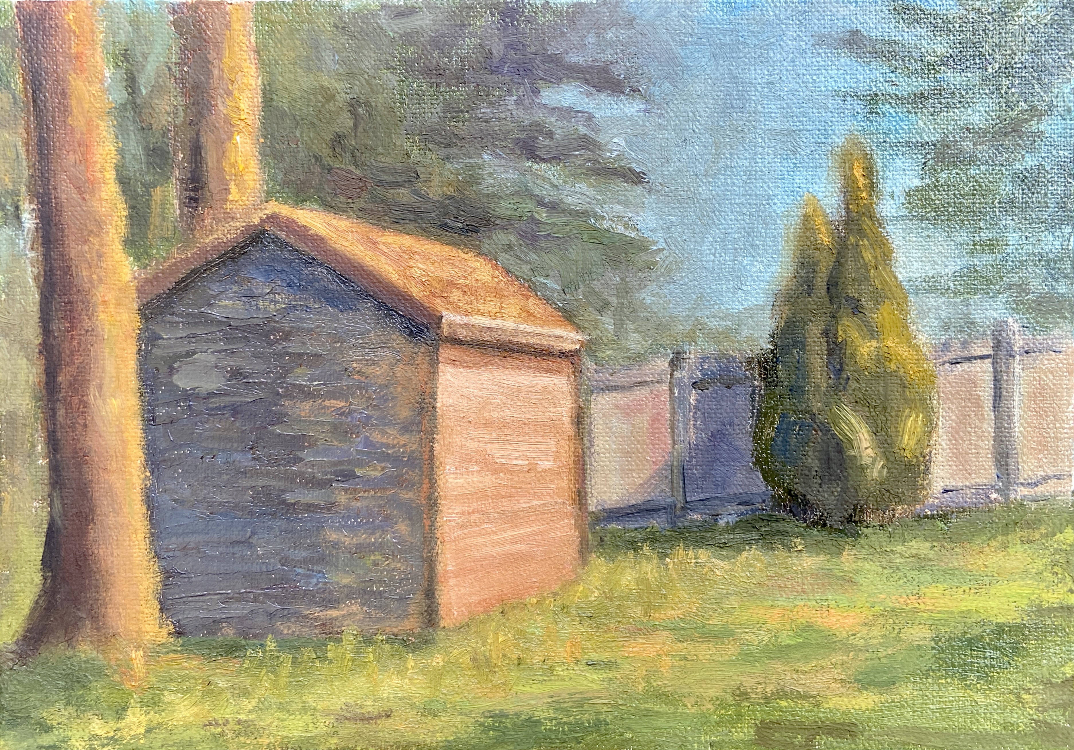
In an effort to up my “en plein air” game, I’m going to do a few sessions this summer focused on simplification. The plan is to either find scenes that are lacking details and complexity, or zoom in on the focal area of a detailed scene and cut out the noise in an effort to simplify.
The Preble Shed is an example of the former approach, namely it ain’t complicated… it’s a shed. However, I spent a lot of time also streamlining the background, almost ignoring what trees were actually in the background. I also made a point to blend, perhaps even muddle, the tree edges into the sky. I think it worked pretty well and added atmospheric perspective, something that has eluded many of my previous efforts. Progress!
Not surprisingly, the shed itself was the real challenge. It has a thick coating of paint because there were a number of re-dos as I struggled to find a good light and dark color pairing. I noticed that so many professional artists who do sun-drenched urban landscapes tend to focus on white or very light yellow, using a contrasting blue-purple for the shadowed sides of the structure, which works really well, but honestly strikes me as a little boring. My goal with the shed was to use some hues that could be incorporated into other elements of the landscape – namely the flanking tree in the foreground, the fence in the background, and the sunlit grasses. I went with orange, about the 50th attempt, and can’t tell if I stopped there because I was satisfied or just worn out trying.
I typically don’t share work in progress posts, but I think that tendency will have to change as I ramp up my “en plein air” sessions. Why? Well, there are so many entertaining things that happen when you’re in the field trying to make art. Some of it can be frustrating, like sudden wind gusts that knock over everything, to entertaining and curious, such as bugs that end up as impasto effects in a painting.
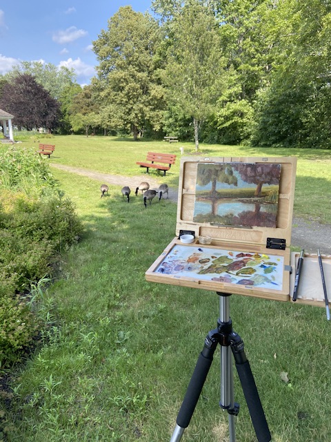
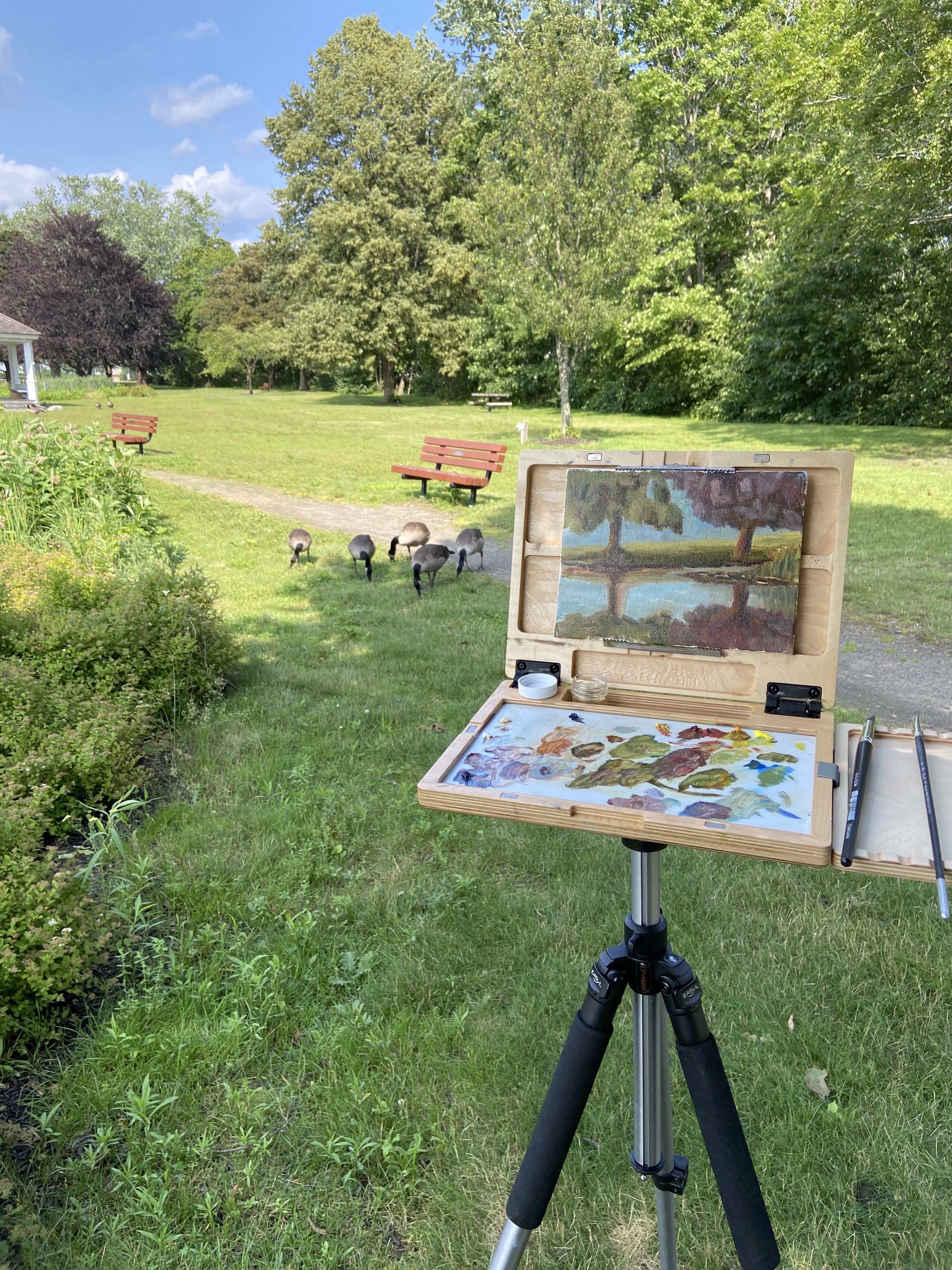
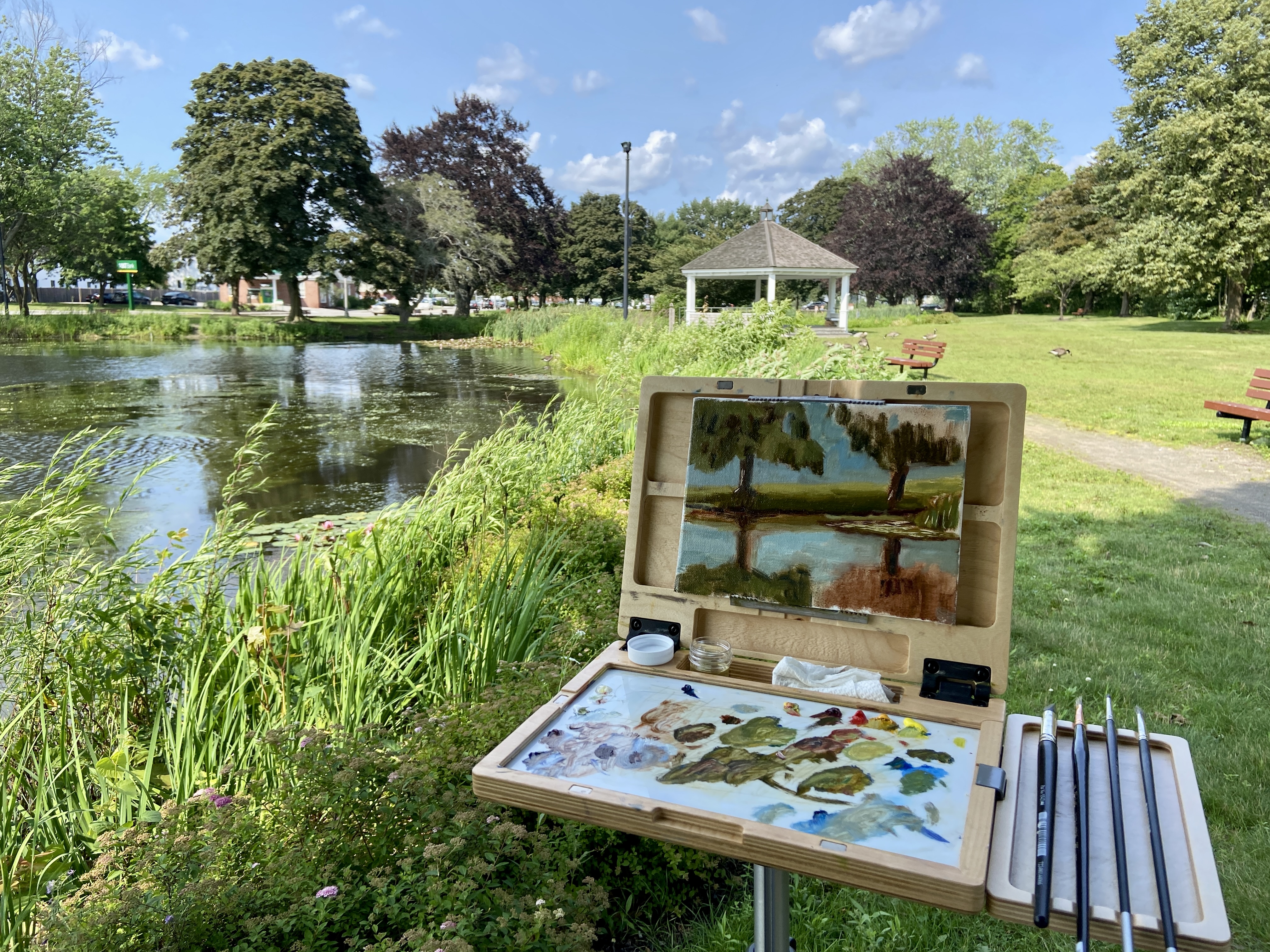
Today, I was painting by a beautiful pond on a calm afternoon, as if that weren’t perfect enough, when along comes a gaggle (is it gaggle?) of geese. Apparently I had setup adjacent to their entry ramp into the pond, but my presence didn’t distract them at all. Usually I have a dog in tow, which tends to keep all manner of water fowl in the water, but I didn’t have my handy apprentice, Zip, with me today. She doesn’t care much about the geese, but she finds goose poop to be the caviar delicacy of the great outdoors.
As to the artwork, the focal point, which is impossible to tell at this mid-paint stage, is the strip of water lilies wrapped around the right side of the composition. I was only in the field for a little over an hour, but I’m happy with the structure of the painting and the aggressive approach with the dark values, which I tend to screw up initially.
Stay tuned for an update of the finished work in the studio. Thanks for reading!
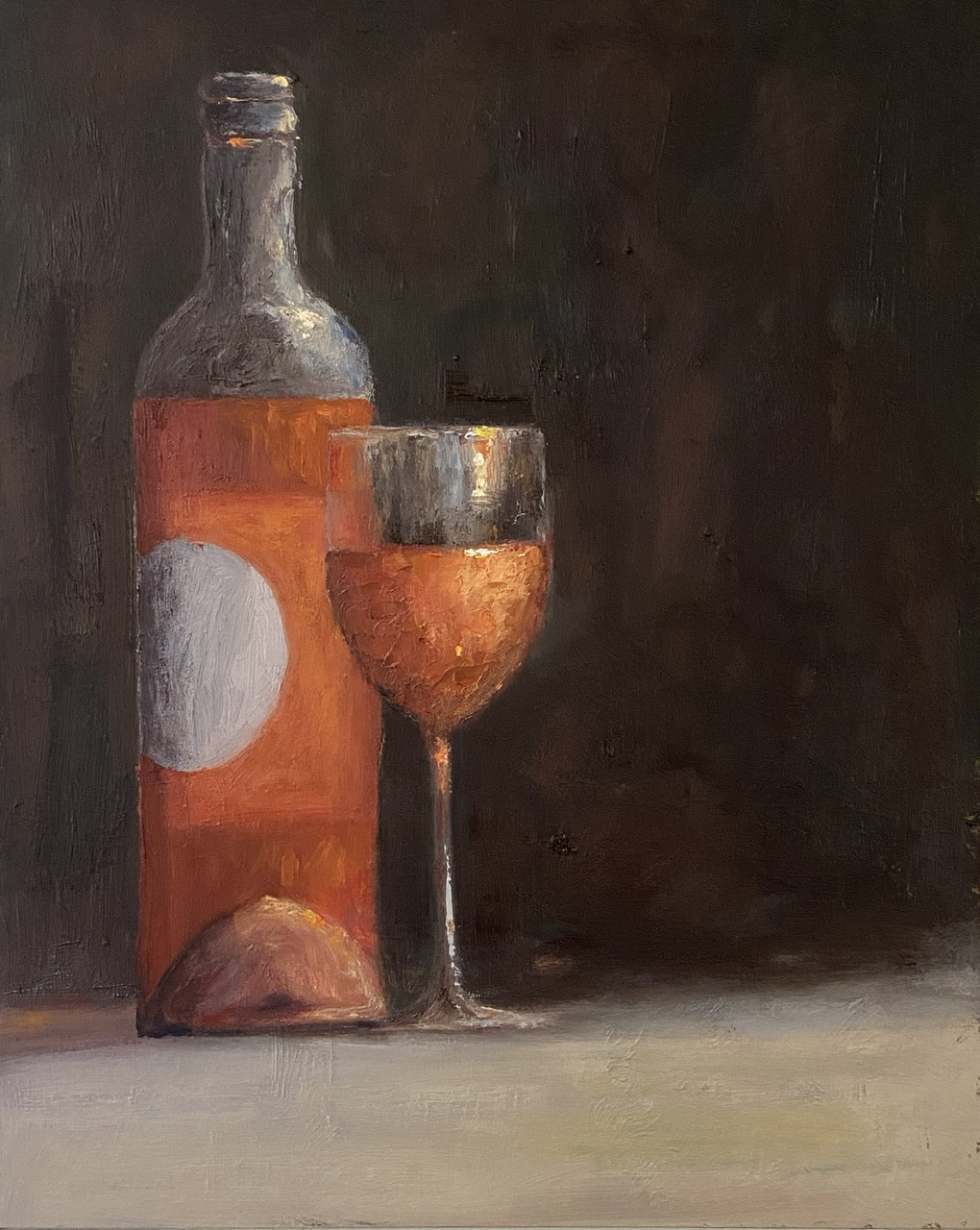
Inspired by travel with dear friends and recalling the joys of the day over a bottle of wine… or two… or three!
When time flies by chatting with friends, so too does the wine, and we all need a friend who suggests “ONE MORE BOTTLE?”. I’m lucky to have such friends.
This composition went through a few iterations and ultimately strayed so far from my original reference photo that it’s not worth sharing. The wine is a rosé from #grassinifamilyvineyards out of Santa Barbara. While I personally don’t care for many of the Santa Barbara area wines (Paso Robles is much more to my liking), the wine and setting at the Grassini tasting room patio was excellent.
The use of a dark background in this composition made for a difficult painting, namely getting the pink/orange color of the rosé to show up properly against the black backdrop. Do a Google search for “still life painting of wine”, sort by images, and see how far you have to scroll to find a composition that’s not red wine and not against a very dark background.
Regarding the largely blank right side of the composition, it’s designed to create tension for the viewer: Why the hell is half of the painting missing? Is it finished? Is there something there I can’t see? The truth is I initially planned to paint an empty bottle in that space, but ultimately felt like it would create more clutter and wouldn’t add anything of artistic interest – I mean who wants to stare at an empty wine bottle. That’s just sad. The artistic vacuum I opted for instead feeds to the ONE MORE BOTTLE theme.
Let me explain.
If you note the amount of wine in the glass and what’s remaining in the bottle, it’s pretty clear there is more in the glass than what’s not in the bottle. The viewer is left to assume that ONE MORE BOTTLE has been procured and the wine in the glass is actually what was from the previous bottle and perhaps a little topper from the new bottle.
Finally, rosé is a wine for daytime hours (at least for me), so the dark background and soft light indicates early evening or dusk, which in my mind is how time among friends can fly by – namely you start visiting at lunch in the light of day with a bottle of rosé and the next thing you know you’ve filled the recycle bin and it’s damn near time for dinner!
For the artists out there, a few notes of interest. First, there’s a lot of texture on the painting surface, which is largely a byproduct of dumb luck from working over a previous painting. Sometimes textures from old paintings are a real pain in the ass, which is why I usually gesso or sandpaper them to a smoother surface. However, this is the second painting I’ve done recently that’s used a previous failure and I neglected to smooth the surface. I gotta say, I prefer the textured option.
Lastly, I used a palette knife to do the wine in the wine glass to add texture and realism. Rosé is a chilled wine, so the glass has to have some element of water beading or glistening. Furthermore, it helps add visual interest with impasto-like thickness.
Thanks for reading and cheers to all your close friends!
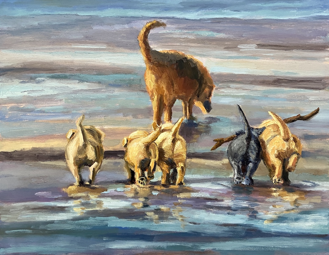
What’s not to like about a pack of puppies frolicking down the beach following their mom while playing with a stick bigger than themselves? NOTHING, that’s what!
I’d done a previous piece similar to this one called PUPPY BUTTS, but it was half the size and half the number of puppies. It was sold at an Art for the People Gallery show last year, but I received so many positive comments about it that I decided to do another one.
The focal point was a bit of an accident, which happened after I’d blocked in all the pups. Sitting back considering how I was going to actually paint the dogs, yes with wine, the two on the right just seemed to be playing, and the idea of incorporating a stick jumped into my head. It’s hard to see from the photo, but the puppies with the stick are painted with a palette knife instead of a brush, adding contrasting texture to draw further interest. The singular, adorable black puppy is also meant to draw the viewer to that part of the pack.
It’s hard to know as an artist when a composition is done, which I tend to agree with in most cases. But when it comes to dog-related paintings, at the point that it makes you laugh, smile, or cry… it’s done.
MOTHBALL was inspired by a photograph I saw at a gallery show in Roundrock, Texas. My apologies for not citing the photographer’s name for this piece (I simply didn’t note his name at the time), but I did include the original photo for reference and if I can figure out his name I will update accordingly. Regardless, what grabbed my attention from the photo was that it was from the perspective of the moth, like a pilot landing a plane.
My goal with MOTHBALL initially was to simply emulate the photo as a painting, but about halfway through I got it in my head to steer towards the whimsical, which I did by taking the moth’s perspective via a few beers and a dram of whiskey. To achieve this goal, I incorporated 2 key design decisions. First, an assumption that the vision of a moth is very different from ours. Granted, I have no idea how a moth sees the world, but it’s safe to assume the focus is the flower and everything else is Mothvision noise… and probably green. Secondly, and most importantly, I wanted to get in the head of the moth and emulate how she saw the flower – this is where I shifted from beers to whiskey. What I came up with was something that screamed “YUMMY DELICIOUSNESS!”, essentially a rich, vibrant, active flower with pollen roiling on top like the surface of the sun.
The time lapse video below starts at the point I decided to go full Mothvision. If you pay close attention you can see the changes and deletions made along the way to make things work better.
Overall I’m very happy with MOTHBALL, although I recognize it’s a niche audience who might be drawn to such a concept. Hopefully the explanation provided here can at least drive some appreciation for the intention of the art.
BLOWN AWAY is a foray into a new area for me, namely the wonderful world of whimsy.
My wife and I were exploring Scotland earlier this year and were impressed by the art presence throughout many of their cities and towns. The inspiration for BLOWN AWAY came from street murals in Glasgow, Scotland, which are amazing by the way. Some of the work is jaw dropping, not just in it’s artistic beauty, but also in its messaging and creativity.
This composition was challenging on many fronts, most notably the profile of the child blowing the dandelion. To be clear, I’m not a portrait artist, never will be, don’t have any interest… BUT it comes in handy from time to time. This was my first portrait, aside from a painfully horrible self-portrait attempted years ago and subsequently burned shortly after completion. I have to admit I’m very happy with the outcome – well, if I’m honest, I’m more surprised than anything.
The umbrellas were my wife’s idea, which resonated with me as soon as she made the suggestion. However, the artist in me forgot how hard they can be to get just right, especially when their arrangement is pure chaos. I should have done a time lapse video so you can see the constant turning of the panel to paint the umbrellas in their varied orientations.
The final challenge was compositional. While I don’t fully embrace, nor know, all compositional rules and recommendations, I’ve come to appreciate the effectiveness of not straying from the core basics. Case in point, how do I avoid actively moving the viewer off the painting while embracing the action of blowing seeds off a dandelion, which magically turn into umbrellas. The solution I tried to incorporate – if it works is up to you to decide – was the use of brilliant light on the dandelion and the boy’s face, which are concentrated on the left side, and pull the viewer’s gaze back to that area after they initially follow the unfolding umbrellas to the right. Secondly, the shape of the overall mass of the umbrellas was intentional, so as to point to the focal point of the dandelion. Lastly, and this is a bit more subtle, the opening of the two largest, far right umbrellas was done as a sort of barrier with regards to being opened in a way that points back to the focal point.
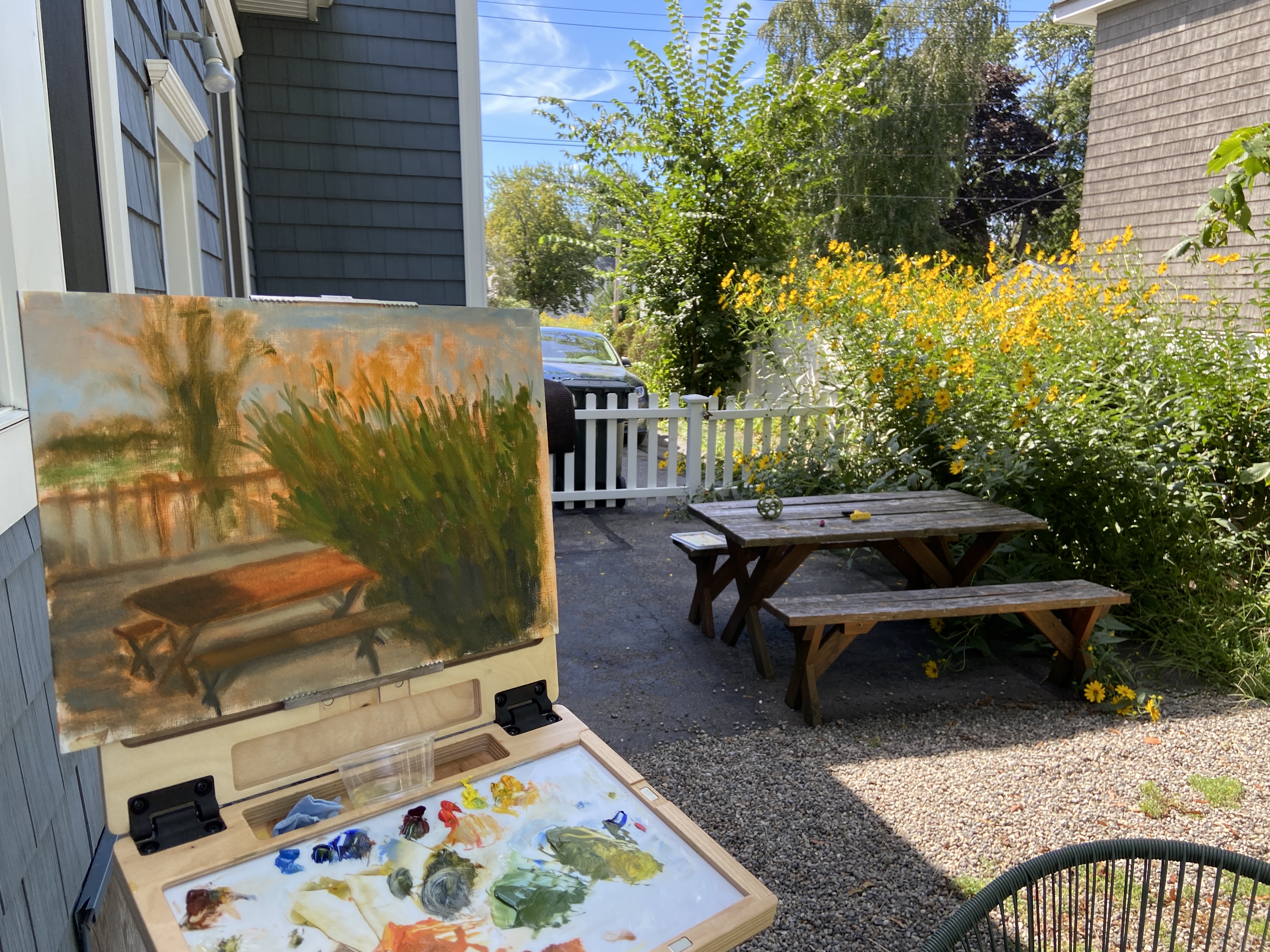
I’ve been traveling a bit this summer and managed to get in some plein air work! At first it was mostly drawings of coastal scenes – lots and lots of boats and beautiful coastline. But lately I’ve managed to get in some solid time with the paints and I’m working a few pieces in parallel.
I still need to return to a few of the plein air locations before I can finish with studio refinement. One basic change I’ve tried with the recent plein air compositions is essentially simplifying the focal areas and zooming in so there’s less to tackle. That’s been hard for me because I typically want to capture as much of the landscape view as possible in any given composition because it’s so damn beautiful.
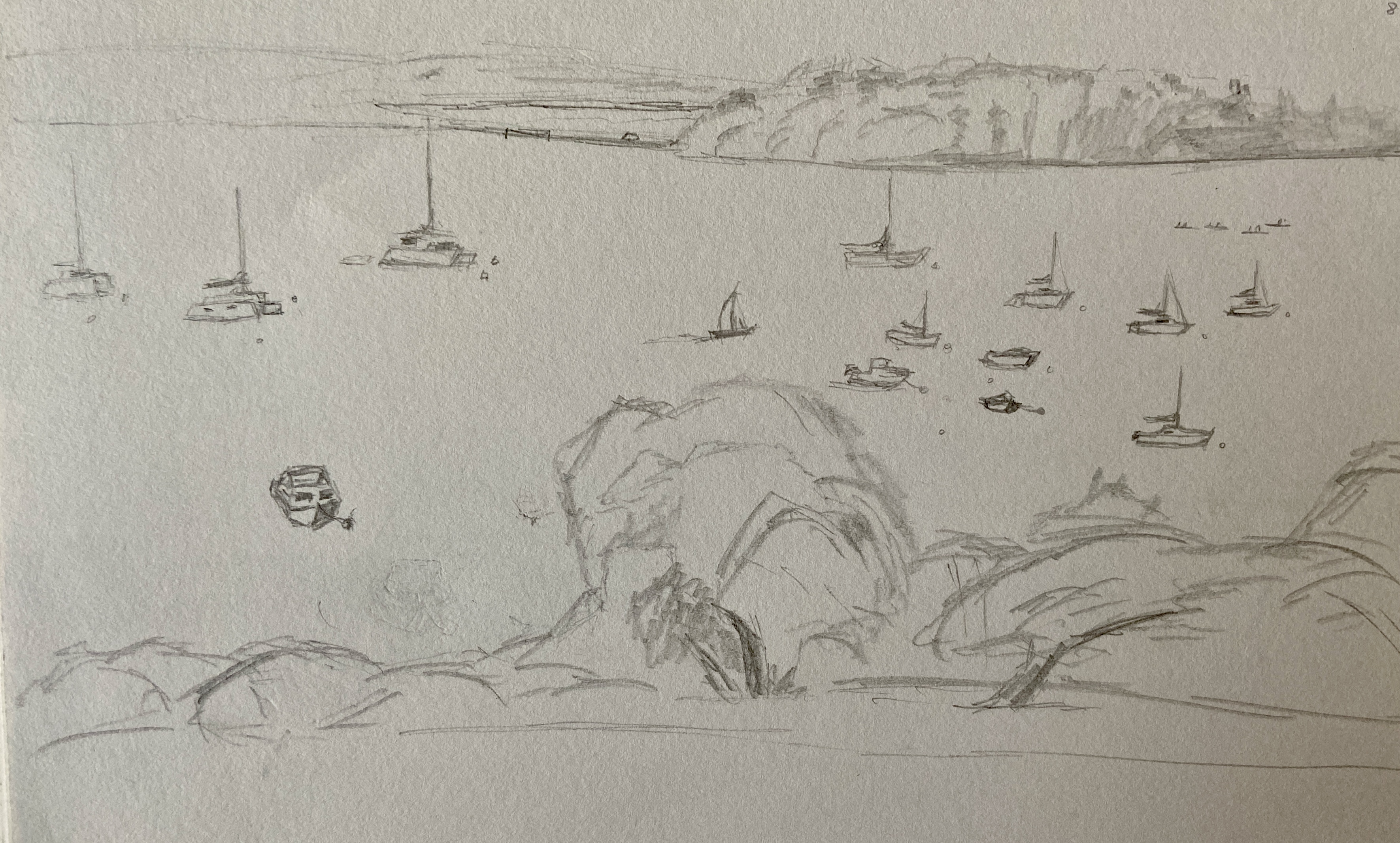
Next projects will be some very photogenic coastal lighthouses. I’ve done a few practice sketches to get a feel for how I want to approach the works and not self-inflict panic during the speedy reality of painting on site. What’s really apparent, at least in my drawings, is that the lighthouse is going to be a piece of cake – it’s the rocky seaside that might well drive me insane. But I believe if I keep it “fast and loose” and focus on the lighthouse, the rocks will be simplified in a supporting role.
Hopefully I’ll be able to post a couple of completed pieces in the coming week.