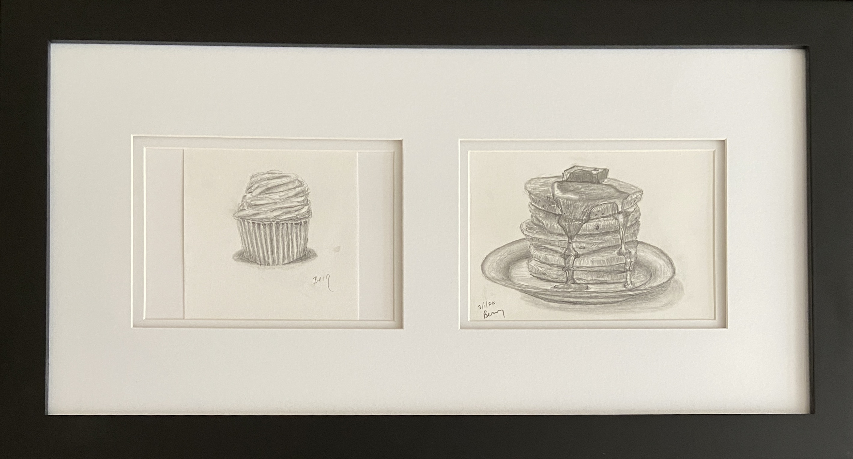
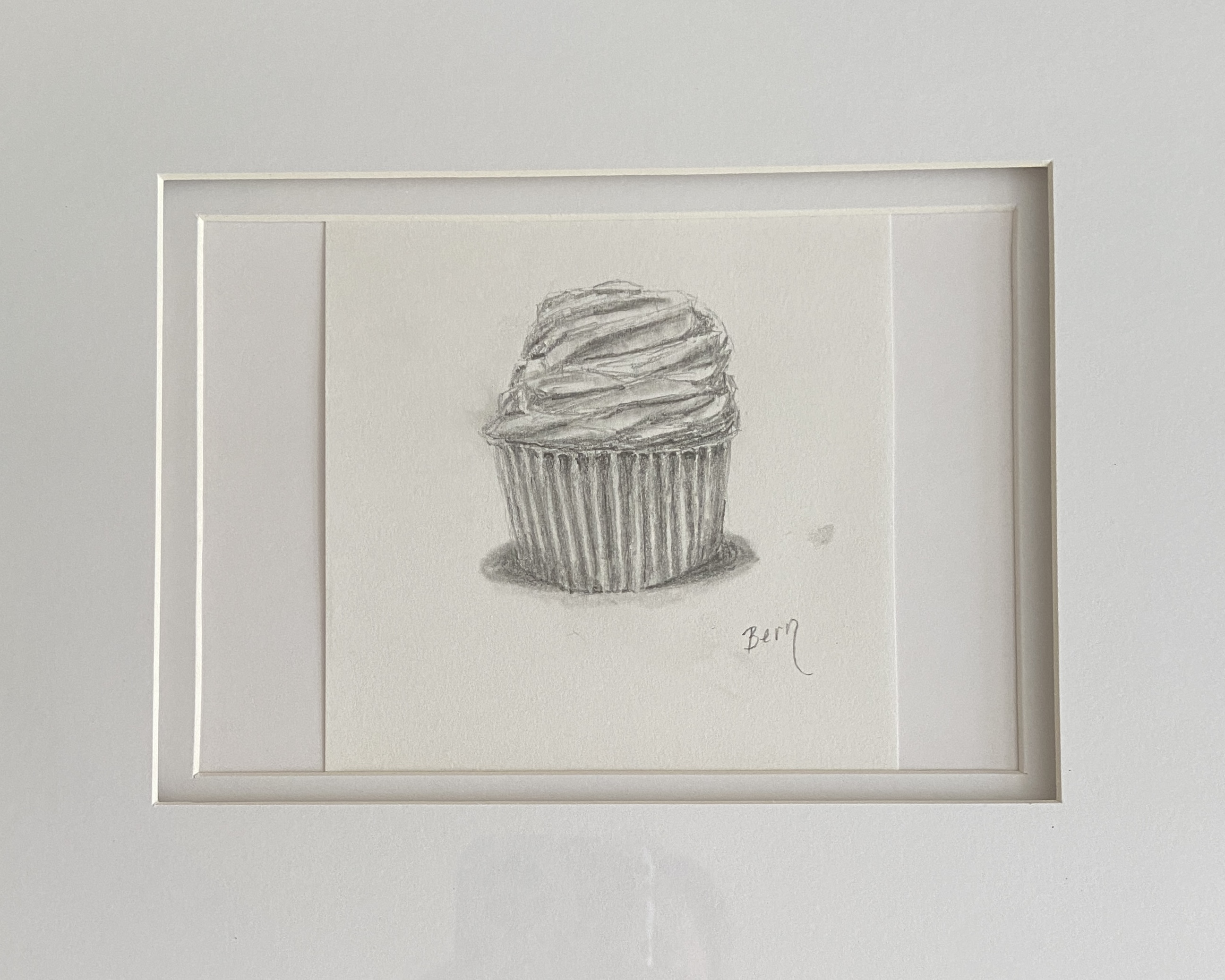
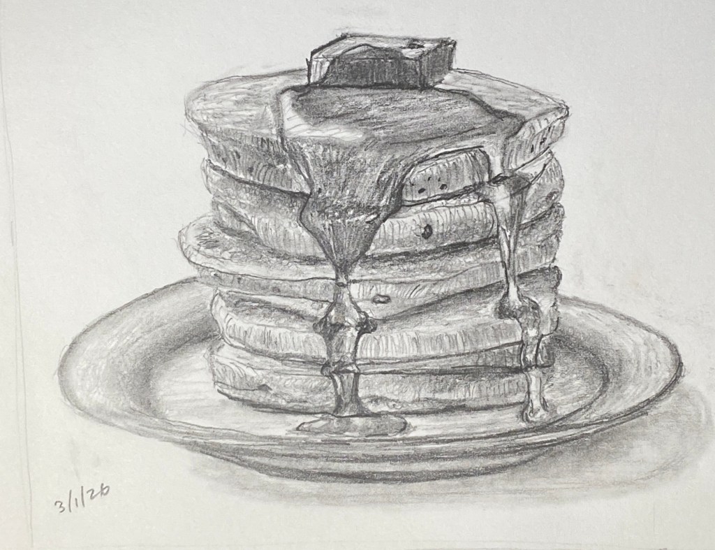
CAKES is the name of this diptych, which includes CUPCAKE and PANCAKES, both of which are 5 x 7” drawings. CUPCAKE, from 2024, has been in my private collection of studies, but when I recently completed PANCAKES I knew it was a match that just had to be framed!
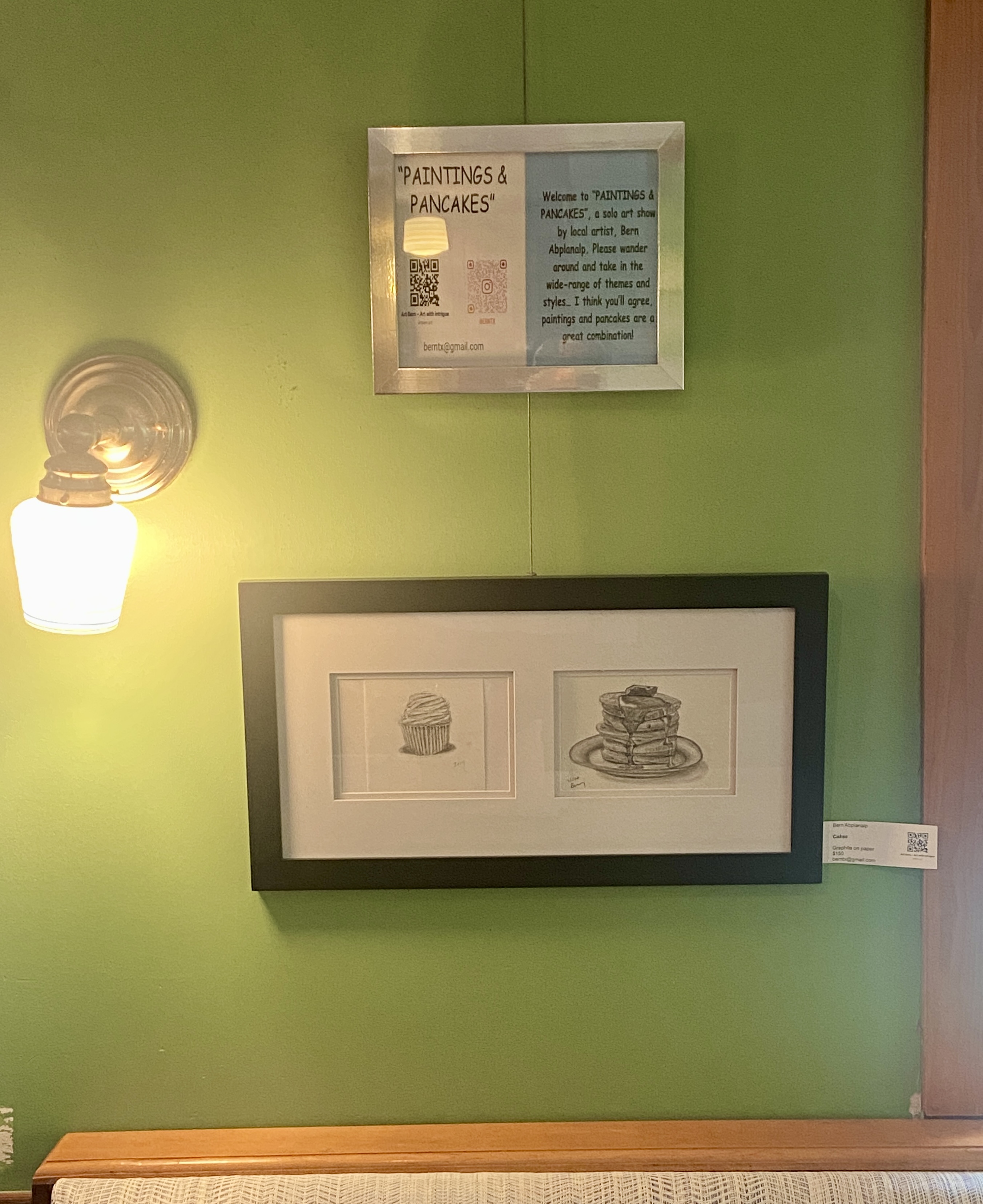
This diptych composition can be viewed at my Kerbey Lane show, “Paintings and Pancakes”, running through June 30th. As a reminder, this show has more than 30 works spanning a wide range of subject matter, including a few new paintings of iconic Austin scenes – Paramount Theater, Pennybacker Bridge, and the Congress Avenue Bats. If you live in Austin or you’re here for South by Southwest, swing by and check things out while enjoying one of the best brunch offerings in town.
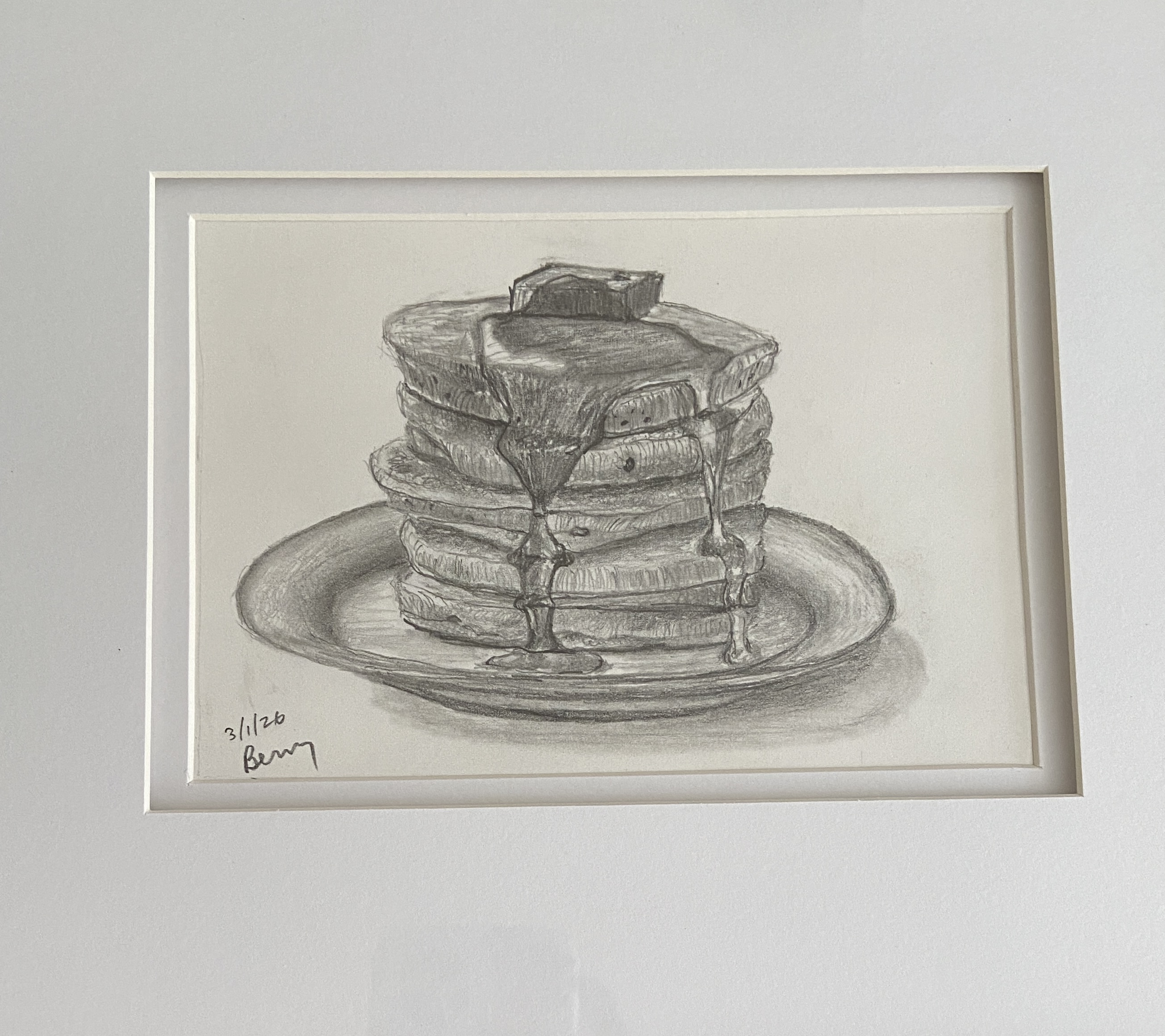
PANCAKES was initially going to be a study in preparation for a still life of said pancakes. My wife, however, said the drawing was better than any painting she could imagine, and thus PANCAKES à la pencil was born. Either way I was going to end up hungry staring at pancakes all day.
The trick, at least for me, with drawing a completely new subject matter is gauging how best to introduce realistic reflections with the limitations of graphite, which in case you hadn’t noticed is a singular hue. As it turns out, reflections were going to be the least of my worries, as pancakes are expected to be “fluffy”, while syrup tends to mimic a slow flowing waterfall with behavioral problems.
I ended up using curved directional lines (vertical) and undulating horizontals to give the sense of a fluffy pancake, as well as drawing a number of the small, oddly shaped “circles” that make up the baking soda induced air holes of any self-respecting pancake recipe. At some point during the course of a still life, one hits the right level of detail that makes it look realistic. For me, honing the details beyond this subjective threshold starts to erode the artistic appeal of the piece at the cost of realism. While I can appreciate appeal of the challenge, as well as the skills to make a painting or drawing look as good as a photo, I don’t understand why someone would want to hang it on their wall.
Ultimately, PANCAKES has already inspired me to consider more brunch-themed subjects. Top of the list is eggs Benedict, and if I’m feeling particularly confident, chicken and waffles would be a worthy challenge.
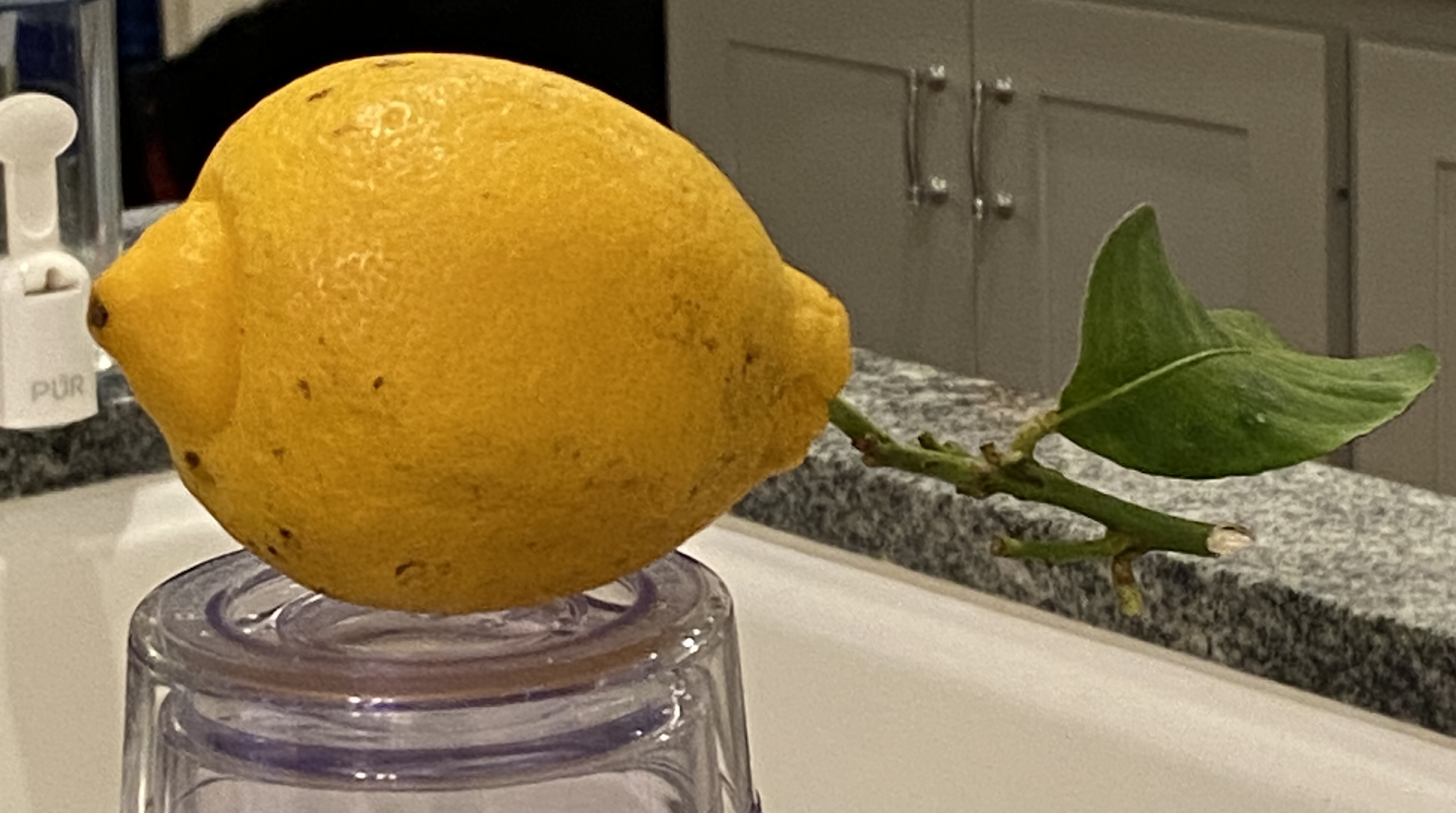
The lemon used in this drawing was given to me and my wife by our long-time neighbor, who brought it from her kid’s home in California! She toted it home on the plane, along with some oranges, not as a “thank you” for watching her house while she was out of town… she was just being neighborly!
Before I cut into this fine fruit, I wanted to do a proper drawing, as I was struck by it’s slightly odd shape and the long stem with a single leaf still attached. If I didn’t know better I would have guessed this lemon was stolen, quickly yanked from the tree under the cover of darkness!
I used four different pencils to get the proper shading – H, B, 2B, and 4B. For those of you who don’t draw, these are how darkness levels are rated on pencils. For this example, H is the lightest, 4B the darkest. You’ll notice the reference photo has the lemon perched on a glass, making you ask “what is that about?”. This was intentional, a matter of pragmatism so I didn’t have to hunch over for a proper viewing angle.
Lastly, I’ll point out that the focal point is… the leaf! It’s not only unusual to see the stem/leaf on a lemon still life, but it’s also a unique shape, probably a result of being slightly emaciated, causing it to curlycue rather abruptly. Hopefully you can tell it’s a leaf and the fact that it’s a bit oddball doesn’t detract from the overall composition.
Here’s another installment from my January “draw-a-day” self-imposed challenge. While I didn’t draw every single day, I came pretty close. Most of what I did was practice for new paintings, which, as I’ve mentioned previously, can be immensely helpful in determining not only how to approach a new composition, but even if you want to do it in the first place!
FRENCH CAFÉ is a sketch intended to inform a painting I just started. After having done an initial block-in on the canvas I realized this was going to need further consideration before moving forward. This sketch is that “further consideration”, allowing me to do a handful of things before returning to the canvas.
For the curious, following is how this sketch will help the painting:
People: arrangement, sizing/scale, and simplification. The last point, simplification, is a by-product of drawing whereby one has to convey the essence of the figures purely through shapes, whereas the painted version will also leverage colors.
Focal point: The sketch taught me that I’m lacking a focal point, so the painting will need to do a better job of focusing on a particular grouping of people at the tables. In this sketch, it’s not clear where the viewer should concentrate.
Details: Between the umbrellas, windows, people, and trees, there’s a lot going on. It will be important to exclude some elements in the painting to make it effective, and more enjoyable to paint. The vines growing up the walls will get 86-ed, as will some of the ground floor windows and doors.
Values: There will need to be very high contrast of values between the shaded people and those areas that are in direct sunlight. You can tell that this sketch, while effective in many ways, really looks flat with the exception of the overhanging trees at the top. This is where I made a point to do high contrast in light and darks, adding a 6B pencil to the mix.
Stay tuned for the actual painting, which will be a challenge, albeit a well informed one thanks to this sketching exercise.
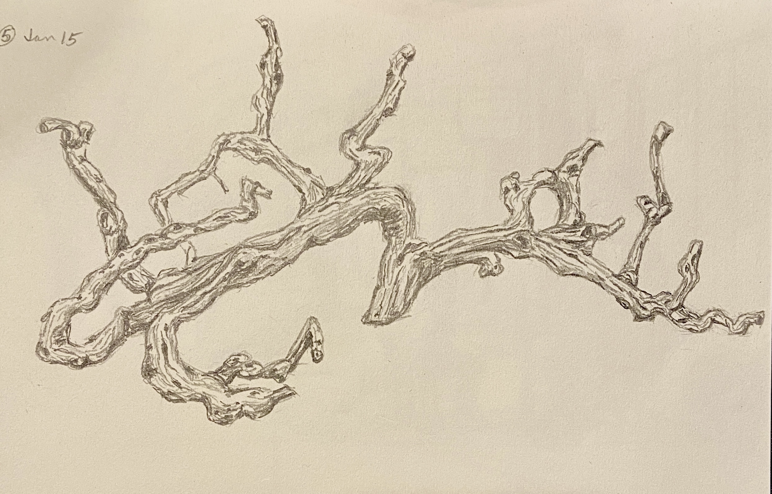
Today is for the wine lovers out there! This is one of the various drawings from this month’s draw-a-day self-imposed idiocy. I think even oenophiles would have trouble recognizing this drawing at first glance, but it hopefully becomes apparent that this is a grape vine. An old, grape-less, dead vine, but a grape vine nonetheless.
The reference photo is from my visit to The Piccolo Hotel (great place, btw) in Paso Robles, California. I didn’t realize what it was at first – I just thought it was a cool wood carving over the fireplace in the lobby. But when you get to looking at it in more detail, and taking into account the location (wine country!), the reality sets in that this is the epitome of upcycling! This grapevine, while alive, provided tasty wine… and in death is transformed into art! What’s not to love about that!
The Library at The Piccolo, Paso Robles
As an art subject, it was very tricky initially. I thought it was going to be a disaster, in large part due to the details involved, but perseverance won out and all the wavy lines and dark circles coalesced into a pretty decent drawing. More importantly, it was a lot of fun to draw and something I’ve added to the short-list of formal compositions. Drawing or painting, I’m not sure which… maybe both.
One final comment: Paso Robles wine is excellent! Makes sense, right? I mean, c’mon, the vines are beautiful, alive or dead!
This is the first of numerous drawings I’ll be doing over the course of the coming 30 days. There are a number of goals involved with this exercise. Initially, I was going to set a lofty goal of a drawing-a-day, but reality has set in and the target has been tempered to draw-a-day.
This drawing, ROSE, is from day 3 of the challenge. I’ve done a painting called YELLOW ROSE in the past, based on the same reference photo, so it was interesting to return to this after a few years. I was surprised how quickly this drawing came together; some sort of long-term artistic muscle memory.
The other benefit of a self-imposed 30-day draw challenge is that it drives me to practice potential new compositions. Doing a quick sketch of a painting subject is helpful in the field for plein air, and for studio work, but sketches are typically done to refine the compositional strategy. However, doing a more complete drawing answers the question, “do I want to paint this?” Sometimes, you get into the details of a painting and realize that it’s not any fun because it’s either beyond your skill set, too tedious, or simply not very exciting.
In the coming weeks, stay tuned for more drawings auditioning to become paintings!
The bats are coming! This is a skrawing, or is it a dretch… I dunno, whatever you call the in between gray area of an informal sketch and a structured drawing. Regardless, the plan is to do a larger piece, at least by my standards, of the iconic Austin bats departing their home under the Congress Street bridge.
The focal point will be the silhouettes of the people on the bridge, secondarily the bats. The anchor, not something that’s officially a painting term as far as I know, will be the brilliant sun in the lower right corner, which is very tricky in a drawing, so you’ll have to use your imagination. The value contrasts will be extreme, so balance is going to be key. Why I’m attempting this is beyond me…
3 BOATS ON CASCO (study) | 5×8” | graphite on paper
Figuring out why a composition is failing can be a real challenge at times. If the painting fundamentally sucks, I know it’s a lack of talent or experience on my part. Sometimes, however, it just doesn’t look right. It’s on this latter front that I often find myself with boats.
Granted, I don’t have extensive experience painting seascapes that highlight boats. They’re tricky and I believe lots of practice is the key to get the blizzard of weird angles, maddening levels of detail, and the reality that they move constantly, even when anchored, working in concert as a composition.
Last week I did a short plein air session of boats – it was a total failure, although the outing itself was great time spent on the coast. I decided to try drawing the same scene in the studio to see if I could figure out the issues. As it turns out, this small study solved a lot of problems, of which there were 2 big ones.
First, the viewing angle was too steep, meaning it works better with a more horizontal perspective. The painting I had done was simply too aerial, probably in part because I was standing on a pier and secondly it was low(ish) tide, so everything was below my line of sight.
Secondly, the composition included something very unusual, namely Fort Gorges, which is literally a Civil War era fort seemingly floating around in Casco Bay. It’s an iconic part of the Bay for those who know Portland, Maine, but for those “from away”, it’s basically a big ‘ol WTF part of the horizon. It’s made all the more confusing to the uninitiated because it has a tree filled square in it’s center, which makes Fort What-the-Fuck even more awkward with what looks like a Jolly Green Giant broccoli patch springing skyward. How does one work that convincingly into a composition. NOBODY!
Upon realization that Fort WTF needed to be ignored, aka artistic license, the final version of the drawing was complete. Note that in the pictures there is a before and after version to show the impact of using a drastic design decision to make the composition work. Whaddya think?
UMBRELLA IN SHADE (study) | 5×8” | graphite on paper
This is a plein air sketch from my rental backyard in Maine, which has a big, red umbrella as well as a massive oak tree for shade. At certain times of day the umbrella gets shaded by the oak tree, which creates a neat value contrast underneath. While I didn’t get the pass through lighting just right, its always satisfying to get an object like an umbrella properly drawn.
On a compositional note, I definitely will look to do a future painting of an umbrella from this underneath perspective. I really like the mystery it creates whereby the viewer has no idea what’s happening on the table, or even in the background below 3 or 4 feet. Oddly enough, the lack of a “bottom” seems to continually redirect me back into the composition. Does it work that way for you, too?
This study doesn’t make the cut for a “real” painting, but it was fun to draw, so perhaps I might try another angle one day soon. In the meantime I’ll keep an eye out around town for a bright, colorful patio umbrella for a proper painting effort.
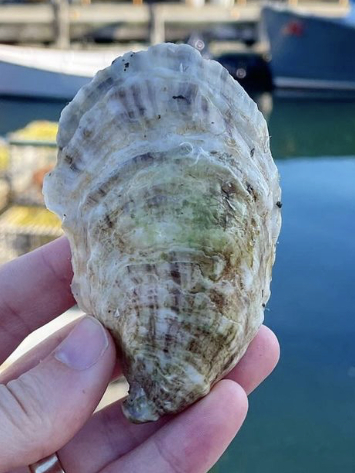
HALF SHELL STUDY | Graphite on Paper | 4×6”SOPO Seafood Oyster, South Portland, ME
East coast oysters, specifically Maine oysters, are the best in the world according to my palette. My favorite place to eat oysters is at SoPo Seafood in South Portland, Maine. In a word – AMAZEBALLS! – the food surpassed only by the charm, expertise, and knowledge of the staff.
A painting of a massive oyster shell is forthcoming, thus this study drawing. What I learned is that oyster shells have a LOT of friggin’ lines! Not something you really think about when eating oysters, but the shells are beautiful, albeit a bit on the gray side.