I’ve been working on this piece off and on for the past few weeks. Sometimes I can get my head locked onto an idea that is not necessarily a bad concept, but I overlook the execution challenges, which are either a) well above my skill level, or b) something I forgot I hate doing. In this case it was the latter, specifically my reticence for painting anything with lettering. It’s so tedious, difficult, and frankly it blows my mind up a little every time I try.

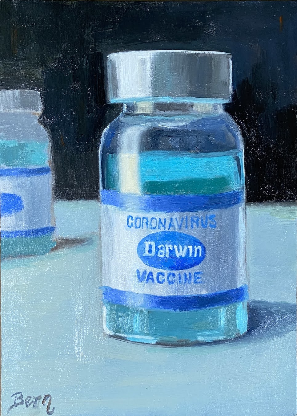
The reference photo for Darwin was essential because it provided the actual Pfizer vaccine label details, and this particular photo was handy because it had that laboratory look and feel. I was drawn to the blue hues and the metallic lid, so I tried to emphasize those elements. Let’s be honest, a vial of vaccine is, well, not the most compelling still life.
From a technical perspective, there were a few challenges with Darwin. The most obvious was the lettering, which I did free hand in the hopes that it would have a painterly feel to it, as opposed to using a stencil with perfect lines and symmetry. However, even with a stencil, the biggest challenge would have been the contour of the round vial and the very subtle changes the letters make based on their positioning. Lastly, the sea of blues was very tricky because the source of the blue color is unknown and yet it permeates the table and the vaccine liquid itself.
It was also very important to point out that the “Darwin” name was replacing the vaccine manufacturer’s name, in this case Pfizer. I haven’t done a lot of compositions with alternative messaging, but this idea jumped in my head one day and it seemed to convey a number of thoughts and opinions, which could be open for interpretation depending on your own perspectives and beliefs.
For me, I’ve always said that Darwin was wrong, and the COVID pandemic is the poster child of this sentiment. Survival of the fittest doesn’t apply to humanity – it hasn’t since the Bronze Age. The “strong” are frequently challenged to counterbalance the obstinance, stupidity, incompetence, and most of all, the narcissism of the “weak” within our species. Would Darwin advocate for a vaccine? I think not – pretty sure he was a herd immunity kinda guy. But was he an anti-vaxxer? Or is Darwin actually right when it comes to COVID, namely that once the vaccines were rolled out, 99% (or something close to that figure) of deaths were the unvaccinated. Hmmmm… something to think about.
You gotta love the non-committal nature of messaging through art!
#artbern #berntx #crashboomzip #painting #art #abplanalp #austinartists #atxartist #atxart #atxlife #COVID #darwin #vaccinesrule #darwinwaswrong #pfizervaccine #vaccineswork #hangupanddrive