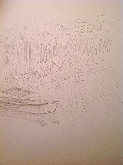
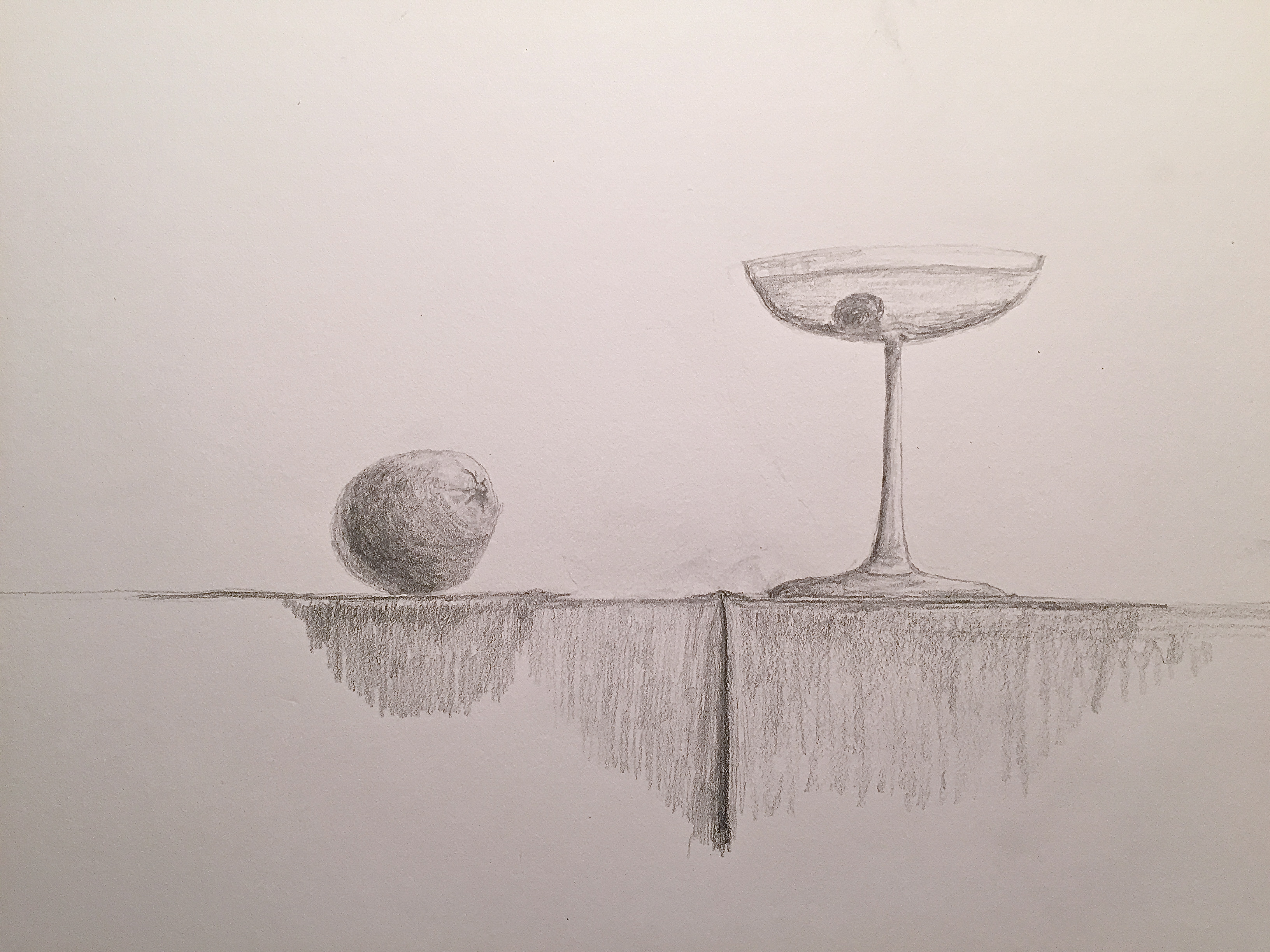
Please excuse the hasty sketch today. This is the non-lily pad part of Giverny. The whole place is amazing, despite the crowds, and it’s easy to overlook this reflective pond bathed in green bamboo, green underbrush, and green boats – trust me, its a lot. The pond reflections of the bamboo are more detailed than the actual real bamboo b/c the angle of reflection reveals a larger swath. Needless to say I ignored that reality in this quick sketch. Hope the spirit of the place conveys despite the roughness.
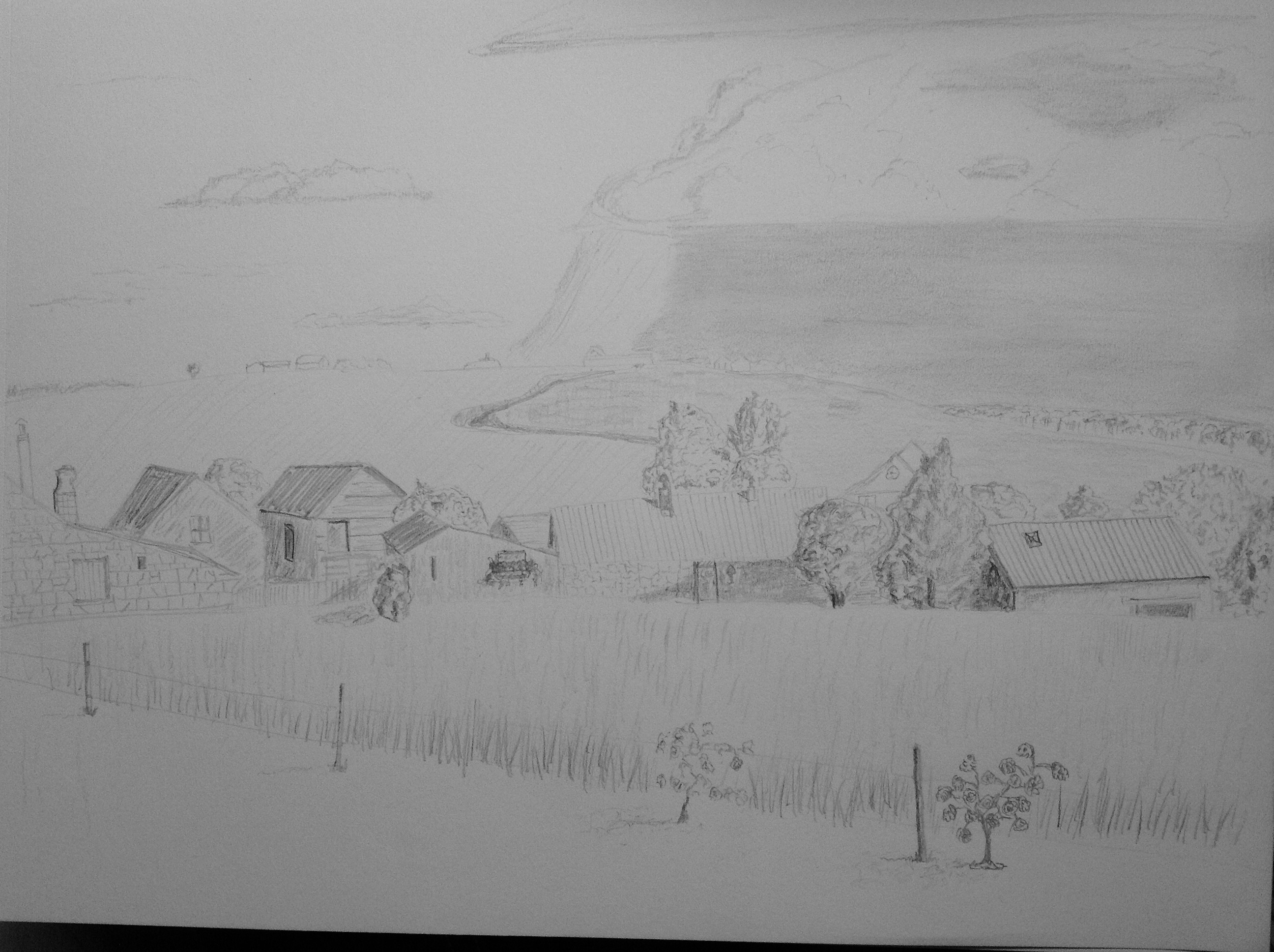
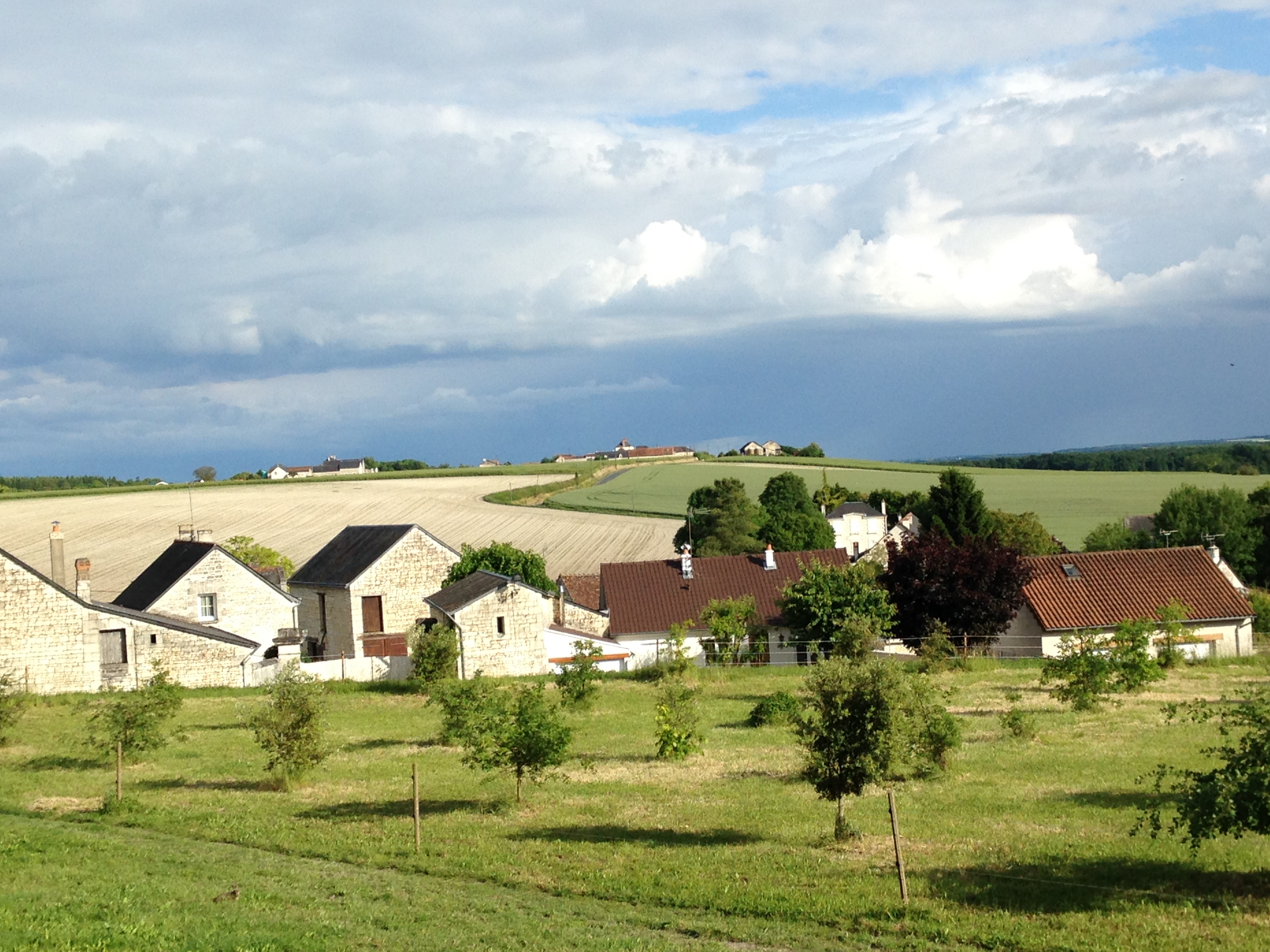
Today’s sketch inspired by my wife and our anniversary trip to the French countryside in the romantic Loire Valley region. The light was very strong from the right side of the sketch, so the shadows were very pronounced, as was the coming storm, which never materialized by the way. The rose bushes in the foreground are testers – not part of the actual reference photo, but rather a suggestion from my wife in hopes of adding some bright color to the soon-to-be painted version. Never sketched a rose bush before, but I think it’s a great addition to the sketch.
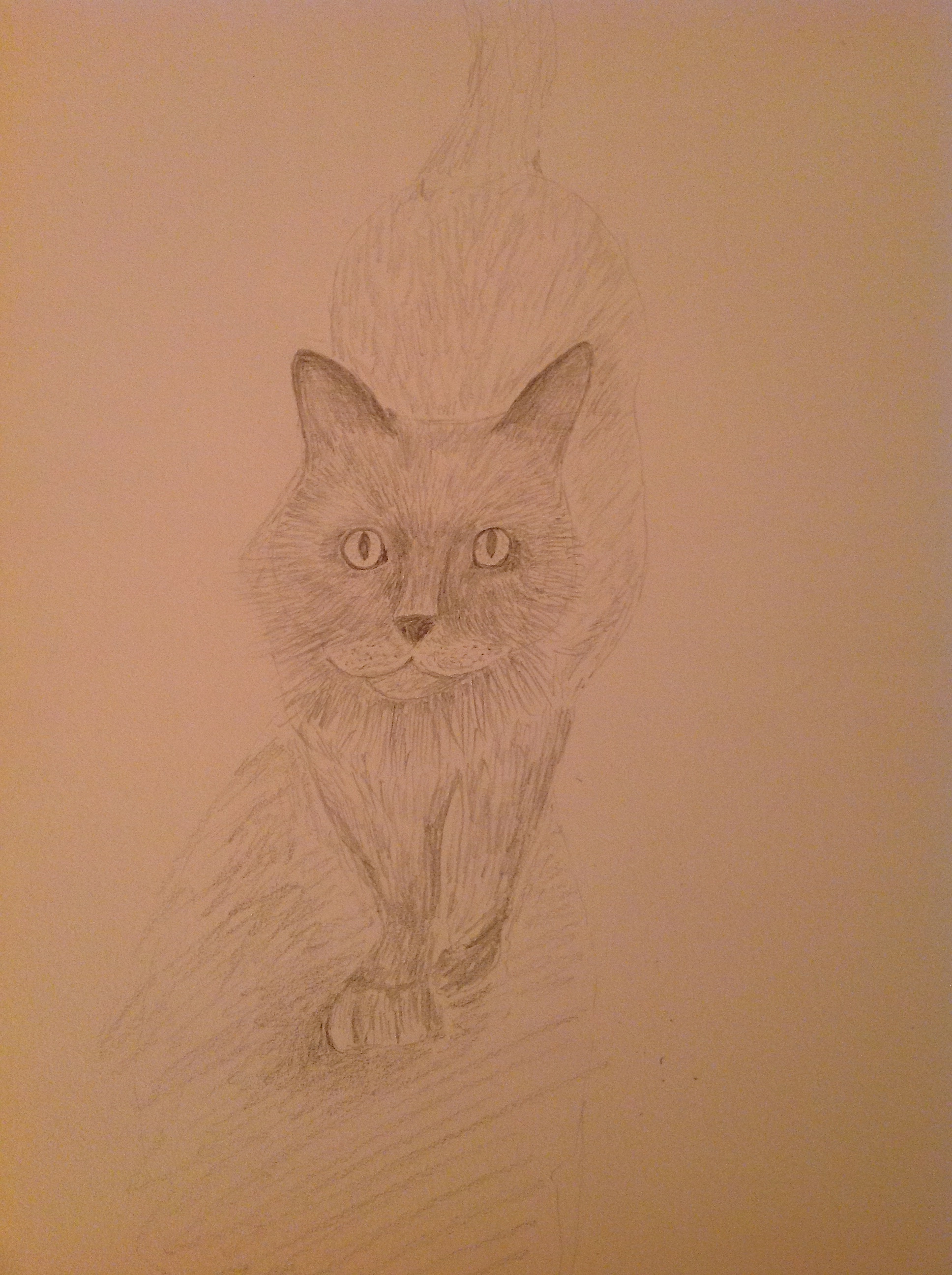
Sketching cats is not a good idea when you don’t have a few hours to spare. Just way too many hairs to draw! Spent the most time on getting the proportions of the head/ears/nose right. After that I just drew a few thousand individual lines until I got too tired.
Did a pivot back to the “canvas” today, so Daily Sketch continues tomorrow.
I returned to the challenge of the cellophane wrapped vase, having run into numerous problems that I just couldn’t figure out. But after some time to think through why the cellophane just didn’t look right, I came up with 3 primary issues to fix:
Too many highlights. The painting looked like it had run into a bird poop tornado! Luckily I had learned how to remove these with a painting knife from the Cheifetz workshop last month; added some pics of the removal of one of the offending highlights.
The highlights were to rounded. The cellophane highlights should be at hard angles which helps give the sense of stiff shapes, as opposed to softer material like fabrics.
The values were wrong. Needed warmer grays on the light source side (left) and a wider range of lights.
In the end, I’m pleased with the results given it was a first effort with this somewhat complicated medium. Next time I will make sure the wrapping of the still life object is done with more purpose and in tighter bunches. This composition was poorly designed on my part. The cellophane was a loose gathering on the left side and lacked enough tight fitting accents, which would have made it easier to interpret.