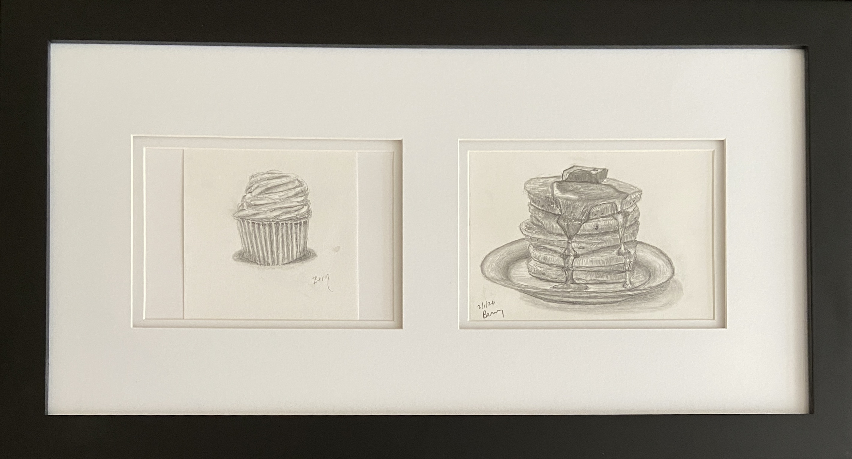
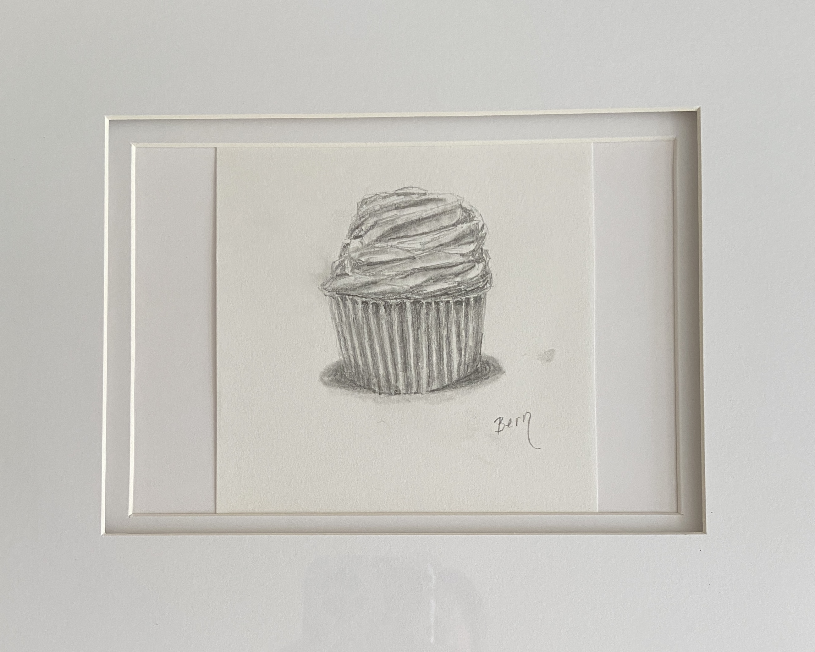
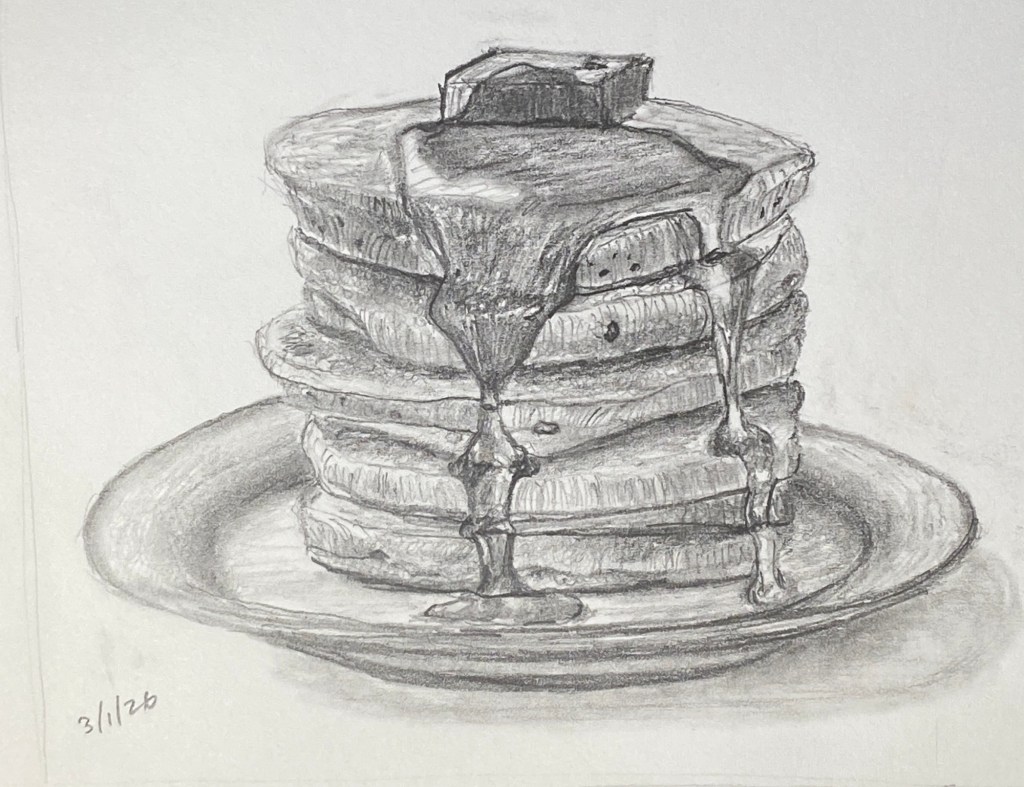
CAKES is the name of this diptych, which includes CUPCAKE and PANCAKES, both of which are 5 x 7” drawings. CUPCAKE, from 2024, has been in my private collection of studies, but when I recently completed PANCAKES I knew it was a match that just had to be framed!
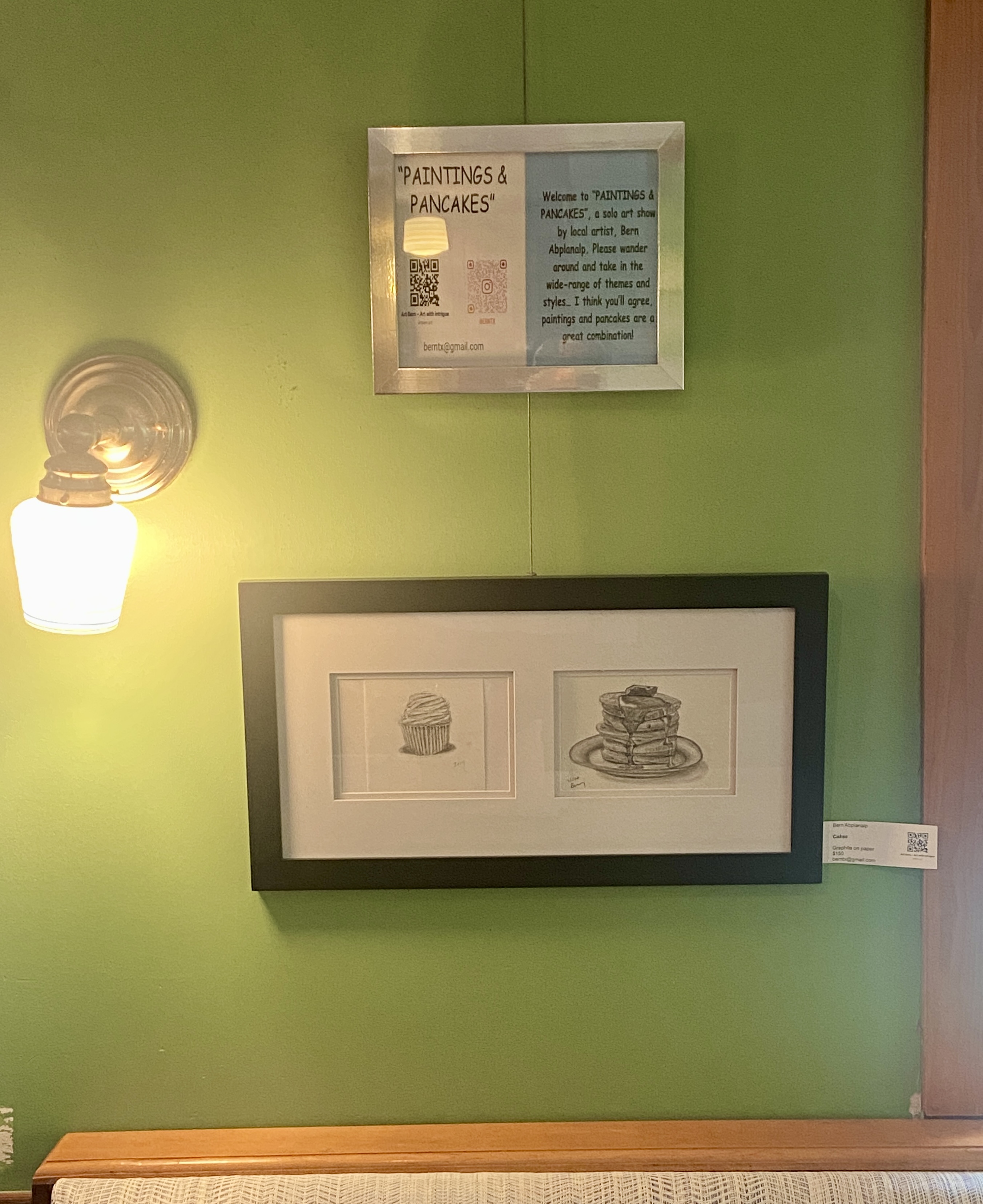
This diptych composition can be viewed at my Kerbey Lane show, “Paintings and Pancakes”, running through June 30th. As a reminder, this show has more than 30 works spanning a wide range of subject matter, including a few new paintings of iconic Austin scenes – Paramount Theater, Pennybacker Bridge, and the Congress Avenue Bats. If you live in Austin or you’re here for South by Southwest, swing by and check things out while enjoying one of the best brunch offerings in town.
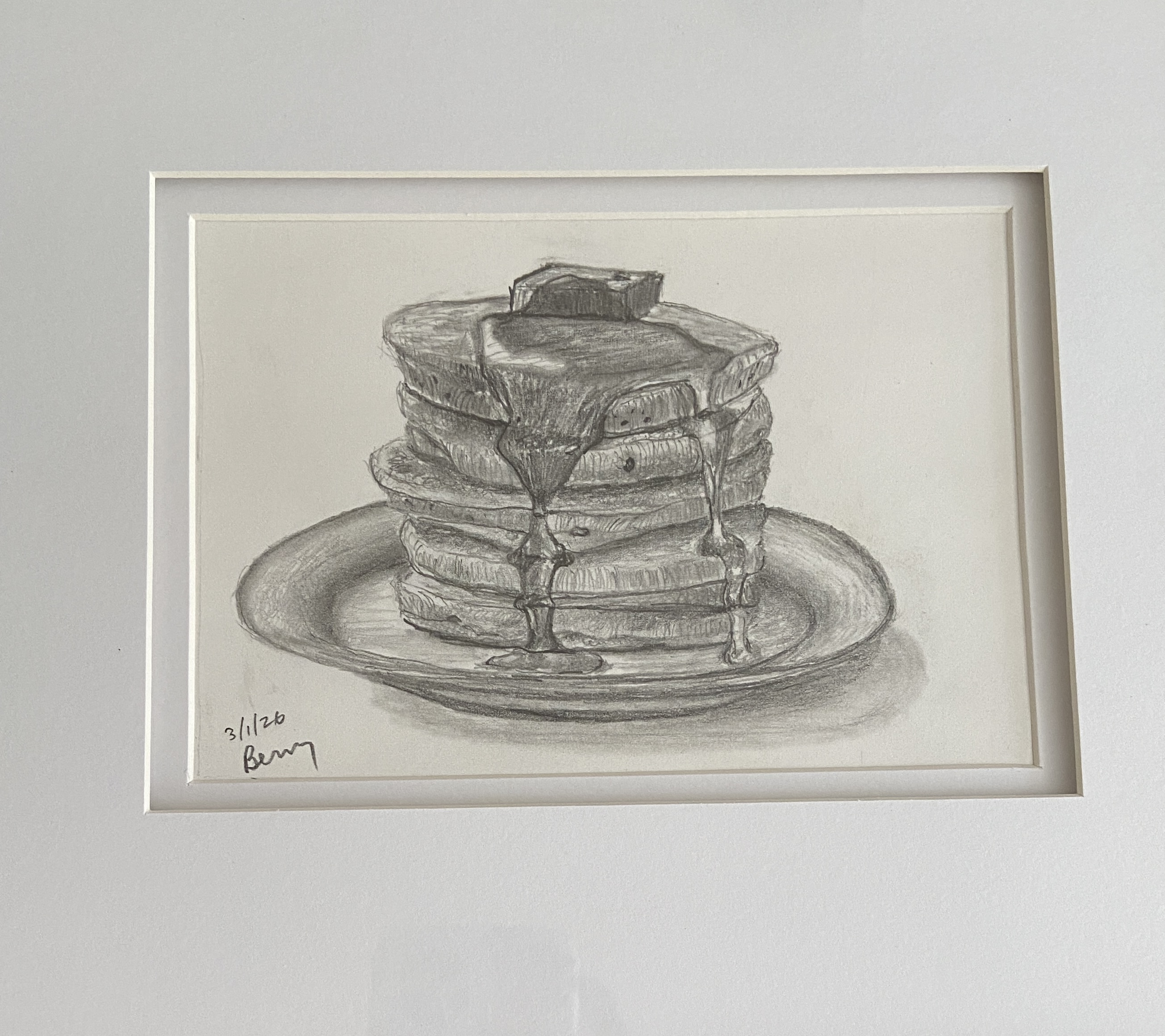
PANCAKES was initially going to be a study in preparation for a still life of said pancakes. My wife, however, said the drawing was better than any painting she could imagine, and thus PANCAKES à la pencil was born. Either way I was going to end up hungry staring at pancakes all day.
The trick, at least for me, with drawing a completely new subject matter is gauging how best to introduce realistic reflections with the limitations of graphite, which in case you hadn’t noticed is a singular hue. As it turns out, reflections were going to be the least of my worries, as pancakes are expected to be “fluffy”, while syrup tends to mimic a slow flowing waterfall with behavioral problems.
I ended up using curved directional lines (vertical) and undulating horizontals to give the sense of a fluffy pancake, as well as drawing a number of the small, oddly shaped “circles” that make up the baking soda induced air holes of any self-respecting pancake recipe. At some point during the course of a still life, one hits the right level of detail that makes it look realistic. For me, honing the details beyond this subjective threshold starts to erode the artistic appeal of the piece at the cost of realism. While I can appreciate appeal of the challenge, as well as the skills to make a painting or drawing look as good as a photo, I don’t understand why someone would want to hang it on their wall.
Ultimately, PANCAKES has already inspired me to consider more brunch-themed subjects. Top of the list is eggs Benedict, and if I’m feeling particularly confident, chicken and waffles would be a worthy challenge.
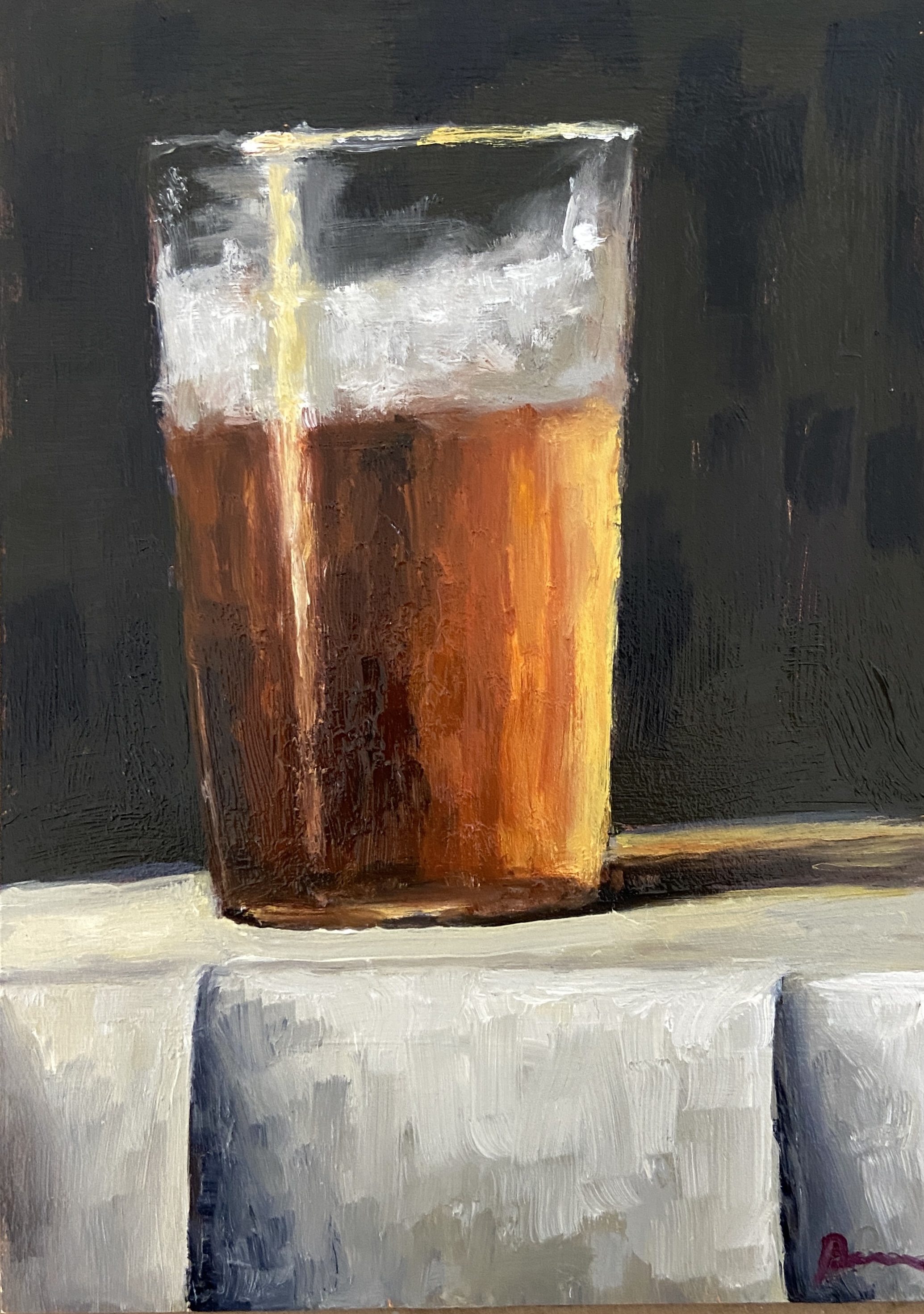
This still life still makes me thirsty! I have a wide range when it comes to tasty beers, but a good amber ale is one of my favorites – I’m looking at you, Thirsty Goat!
Imagine a warm Spring day – we’re getting close, so start day dreaming – but the humidity is low and the shaded patios are calling. Time for a few pints with friends while you solve the problems of the world, plan the ultimate vacation, or simply people watch and admire the current state of humanity.
Now that we’ve covered the inspiration for AMBER ALE, on to the artistic elements. This isn’t my first half-drunk pint still life – I’ll admit the series needs a better name – so I knew to spend the proper time creating the mother color for the amber beer. Everything else pretty much evolved from there, a sort of virtual “filling of the glass” from the inside out. Even the untrained eye can spot the mix of brush work and palette knife, but note the focal points are the thicker bits laid on with the knife.
In terms of critiques to recall for next time, I’m going to ditch the white tablecloth. Not sure what I’ll use instead, but probably something less contrasting than white… perhaps the edge of a wood table.
AMBER ALE will join the rest of the gang at the “Paintings and Pancakes” show at Kerbey Lane, where it will adorn the walls for your entertainment and purchase if you’re so inclined.
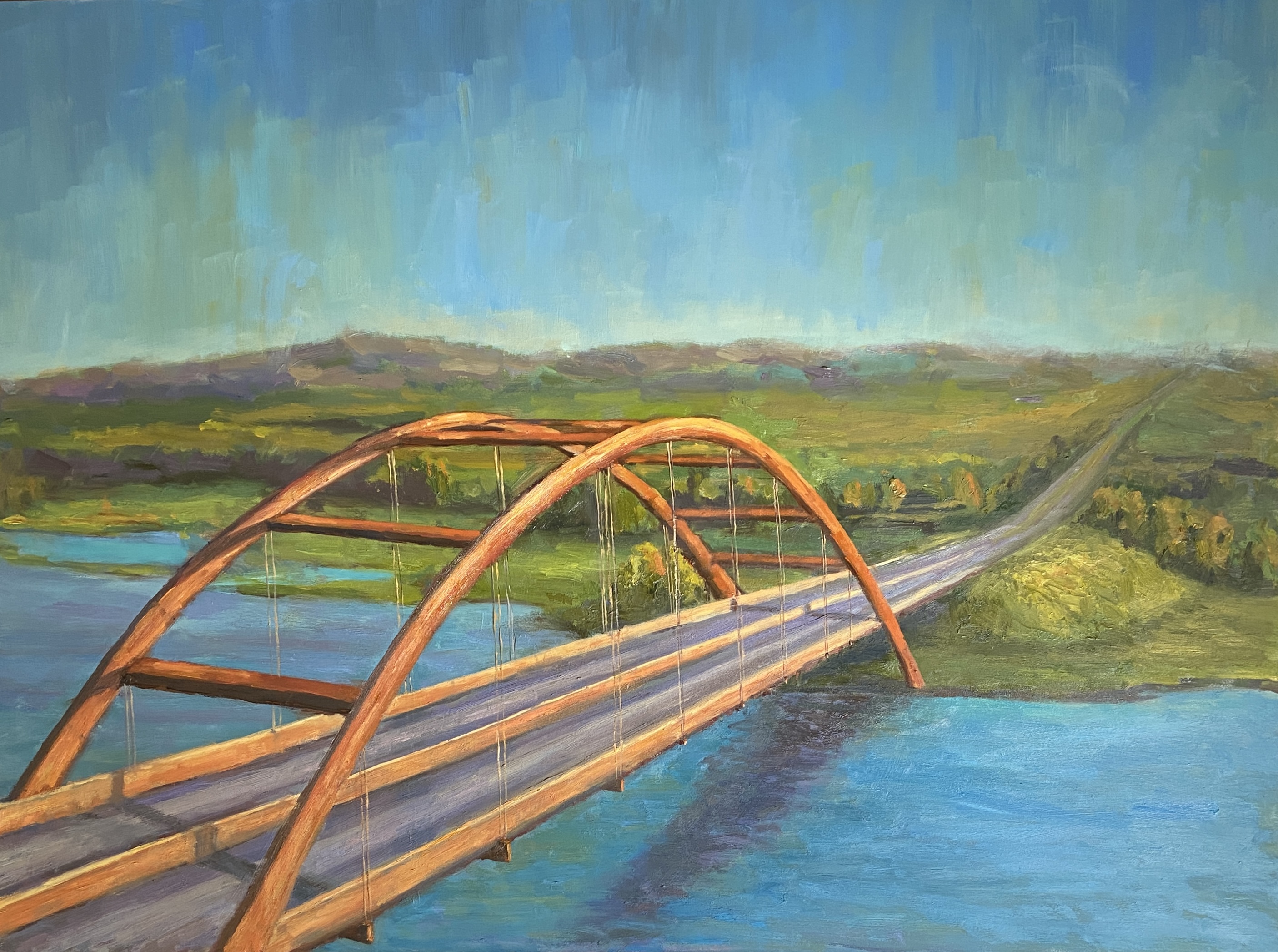
One of the most iconic landscapes of Austin is the Pennybacker Bridge, as viewed from the overlook near Courtyard Drive, which includes the pristine Austin Country Club golf course, Lake Austin, the quintessential rolling hills of central Texas, and lastly the Austin skyline. Instagram thirsty “influencers” (still not entirely sure what that means) and overwhelming herds of tourists have essentially overrun this viewing area, so in an act of social generosity I did a large painting of this scene so you don’t have to throw elbows with the dregs of the social media obsessed.
Named after Percy V. Pennybacker, a Texas engineer who made a name for himself creating innovating welding techniques, apparently, the fact that the bridge happens to have the color of a nicely aged penny has nothing to do with the Pennybacker name.
This was a bit tricky from an artistic perspective in a few ways. First, the obvious challenge of the bridge shapes and related linear perspective. Secondly, there was the need to simplify the landscape, which has a lot going on in real life. Lastly the hue of the bridge, which let’s face it, if you can’t get the coloring right on this one, there’s really no point.
The bridge is beautiful, but its shape is a maddening challenge. I refuse to use projections or tracing for my work, which has proven helpful, albeit far from perfection, when it comes to landscapes and plein air work. I’ve noticed over the years that I can free-hand a wealth of shapes and structures that I couldn’t do previously. While it took a number of adjustments throughout this project, ultimately the bridge looks “right”.
Next challenge was the complexity. If you’ve seen this view live, you know there’s a lot more going on in the background than what’s captured in this painting – distant skyline, bumper to bumper traffic, and Austin Country Club. The skyline was nixed because it is distant, and I didn’t want to take away from the focal point of the bridge; traffic has no appeal, and dropping cars along the highway would have been an exercise in tedium; and finally the country club was simplified to be the golf course without the greens and manicured fairways. Ultimately, I’m happy with the simplified outcome and the more serene feel it lends the landscape.
And last but not least, the coloring of the bridge. It’s a beautiful copper hue, and when it’s drenched in late afternoon sunlight, the shadows and highlights are striking! I used a broken color technique, starting with a large pool of a mother color, then worked in variations along the way.
PENNYBACKER BRIDGE will be making it’s debut at my current show at the original Kerbey Lane restaurant, running through end of June. Come check it out and have some coffee and pancakes while you’re there perusing the artwork.
And now for something completely different! Lo and behold the first abstract piece I’ve done in years. Why, you ask? It was a gift for my niece, who had seen something similar on eBay but she didn’t win the auction. Arty farty uncle to the rescue! Well, truth be told, my wife was the one who asked if I could help out and create something similar.
Of course! I love the challenge of making a copy of an existing painting. On the occasion that my imitation successfully mimics the original, I get quite the painterly adrenaline rush!
There were two primary enhancements I made to this abstract piece, one a brilliant suggestion from my wife, the other a need to play with impasto mediums. First, my wife noted that our niece is a big Cowboys football fan, so why not substitute the metallic gold of the original with silver. For the uninitiated to the cult of Jerry Jones, the team colors are blue and silver, thus the resulting palette. The other detour was the introduction of thick impasto elements, which I felt would add further interest to an otherwise limited composition.
I was quite happy with the outcome, although I think the use of gold per the original piece is a better look… for me. Customizing for my niece gave it more meaning, and makes for a better art story when there’s something personal driving the trajectory.
I’m inclined to dabble with more abstract compositions from time to time. It’s a nice pivot from the more exacting nature of landscapes and still life works. I can also experiment with palettes that deviate from my standard setup. Should prove interesting!
Original Reference ArtworkImpasto ElementsFinished Piece
What makes something iconic? “Widely recognized and well-established” is the Merriam-Webster technical definition. For me, it’s something that is instantly recognizable and evokes a sense of place, which means that one person’s “iconic” is another person’s “what the…?”
As an artist, creating an artwork based on an iconic place can be a tall order, something that the voice in your head quips “you better get this right”. There’s also a category of artists, the ones with more ego than talent or sense, who consider many subjects beneath them and not worth the flex of their brush. For these nimrods, the most egregious waste of their precious time is painting something iconic, cataloging the entirety of these subjects as passé, predictable and pedestrian.
What the aforementioned dolts don’t seem to understand is that most people gravitate to artwork that’s relatable, and there’s no better way to make something relatable than to make it recognizable! When it comes to leveraging the power of an iconic subject for a painting, I think its important to “get it right”, whatever that really means, but also put it in a setting or context that grabs the viewer’s attention. One way to pull this off is to present the icon in the evening, known as a “nocturne” in fancy art vernacular, whereby the setting is atypical yet still recognizable.
ONE NIGHT ONLY is, hopefully, instantly recognizable by any resident, past or present, of Austin, Texas. The Paramount Theater, and arguably to a lesser degree, the State Theater, epitomize the Old Guard that is downtown Austin. The Austin skyline has transformed over the past 15 years at an insane pace, but it’s hard to wax nostalgia over skyscrapers, in large part because, in my humble opinion, none are iconic, with two possible exceptions. First is the State Capitol, the original skyscraper of Austin, which held the crown of the tallest building in Austin for more than 70 years! Second, the Frost Tower Building (full disclosure, it’ one of, if not my wife’s favorite downtown building), which while it held the crown for a meager 4 years (2004 – 2008), was such a beautiful piece of architecture, residents readily recognized it in pictures and movies… by name! In other words, it was iconic.
Finally, there are a few technical details you might find of interest, and perhaps elicit some additional joy from the painting. Or not.
First, there was a lot of simplification, which was driven by equal parts fear and intent. As chance would have it, the very basic, loose structure of the dark buildings in the background turned out to be a happy accident. Initially, these were a simple dark value block-in that were necessary to contrast the very bright elements of the signs. I never bothered to go back and refine this area, frankly forgot about it, and then realized it did a fantastic job of directing viewers to the focal points. The second bit of artistic license was the exclusion of pretty much all of the Paramount building details. This is the fear factor, whereby I didn’t want to tank the composition with the distraction of what would have certainly been mediocre windows and brick detail. The cast shadows on the roof paired with the glowing orange wall is meant to anchor the right side of the work, which would have been difficult to do with architectural details.
As you can tell from the progression gallery below, the lettering of the signs was done by hand, no stencil and it evolved quite a bit over painting sessions. I practiced the lettering on separate paper canvas, experimenting with different brush shapes and sizes, as well as variations in paint load.
Regarding the Paramount marquis, the ultimate focal point of the work, it has virtually no paint! I washed the underpainting off of that area early on, and like the simplified background buildings, I never went back to it until the very end, and that was only to add “ONE NIGHT ONLY” lettering.
Lastly, note the lack of people on the street. This was intentional, but I struggled with the decision. I like adding people to urban scenes like this, in large part because they add interest, motion, and a sense of place. However, without them, the scene has that feel of a theater that has a full house and nobody is lingering outside. Hopefully that intent translates to you, too.
ONE NIGHT ONLY will be making its public debut this week at my solo show at Kerbey Lane Cafe (Westlake), “Paintings and Pancakes”. Come by and check out the 25+ pieces of artwork while enjoying the sweet nectar of pancakes and syrup!
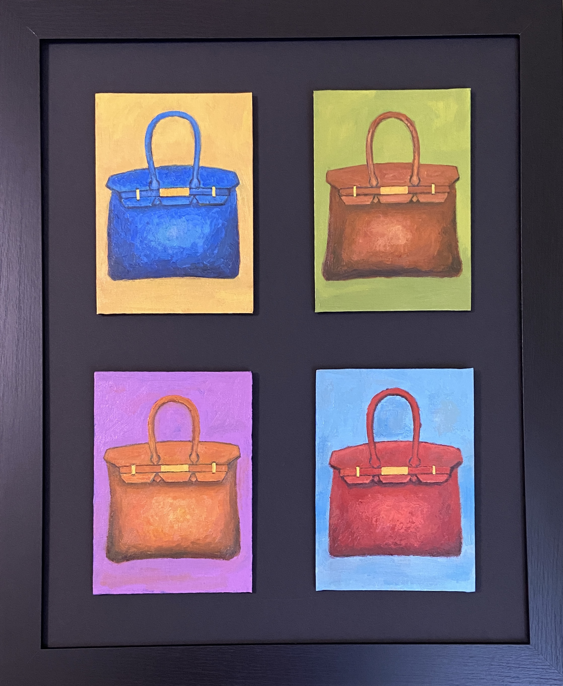
ENVY | 4 @ 5 x 7”, Grouping 16 x 20” | Oil on Canvas Boards
Finally, the Birkins are done and assembled as the ultimate quadriptych, ENVY! Hopefully it’s readily apparent that this composition is inspired by Andy Warhol, which is somewhat ironic because Warhol’s work never resonated with me. That said, I can’t deny he had some uniquely creative compositions that piqued one’s interest.
The Hermès Birkin Bags (Sotheby’s has an Interesting article about the origin of the Birkin name) make for excellent still life models, I guess… given they cost $15,000 and beyond, I didn’t have one handy for modeling in the studio. However, between my wife’s distractingly pink knockoff “Firkin”, and the internet’s infinite library of images, I was able to cobble together plenty of reference material.
I really enjoy doing still life pieces, but things like purses and clothing have very tricky shape and textural challenges that are, quite frankly, intimidating to translate on canvas. To help me temper the difficulty level, I allowed myself the flexibility to NOT create 4 identical purses, but rather focus on the design elements that are common across a given Birkin release and really blow up the interest level with colors. The end result was 4 Birkins that have very similar handles, hardware and shape, but none are identical.
In terms of focal point and compositional strategy, the quadriptych lends itself to some interesting options. Ultimately, my intention was to allow the viewer to pick the focal point, which was done by looking around the composition and evaluating for themselves which bag they liked the most, thus the focal point… for them. My wife, who has a real eye for framing, had the bright idea of using a black background and black frame to ensure the panels really pop for the viewer. Given the high key value of each panel, the use of black readily achieves the goal of pushing the paintings at the viewer.
One last note regarding ENVY, notably the custom framing. I used a matt board cutter to replace the white background that was original to the frame. The panels themselves are “stuck” to the matting using Command Picture Hanging Strips, which are essentially heavy duty Velcro that “clip” together. This makes the panels float above the matting a little – I had to paint the extremely skinny, almost non-existent edges of the panels black so the white of the canvas board wasn’t visible in the raised structure.
ENVY will be added to my solo show, “Paintings and Pancakes” at Kerbey Lane Cafe in Austin (Westlake location), Texas. Swing by and check out the 25 pieces currently on display and available for purchase!
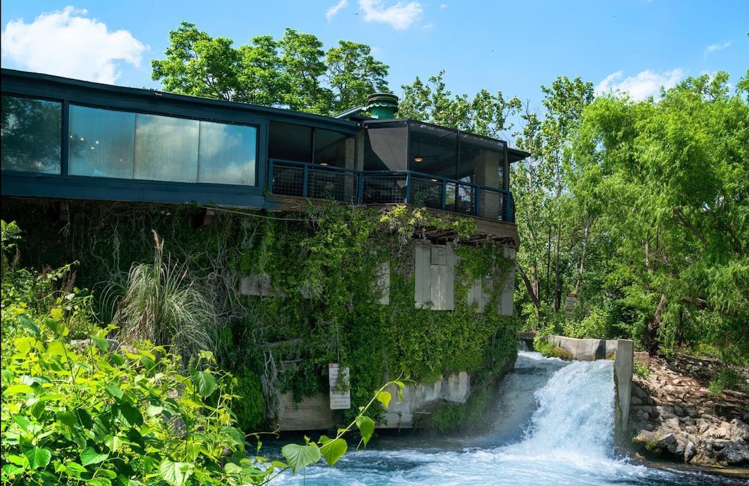
KERBEY LANE CAFE, SAN MARCOS | 9 x 12” | Oil on Canvas Board
As a nod of thanks and appreciation, I recently completed a landscape of the Kerbey Lane Cafe in San Marcos, where I recently wrapped up a solo show, “Something for Everyone”. The restaurant is located in a historical building on the San Marcos River. The view of the river from the patio is amazing, but the sight of the restaurant from the river itself is arguably the better perspective.
Now the first time you look at this painting, you might actually need the reference photo to know what you’re looking at. It’s not every day that one comes across a restaurant with “river AND a waterfall” as a seating option AND $7 local brewery pints!
This painting introduced new challenges and the according hard lessons along the way. Two of particular note dealt with architectural elements:
Window Reflections: I’ve done reflective surfaces numerous times, so I understand the foundational techniques. However, the windows on the back of the restaurant had a coating that effectively made them massive mirrors. This meant the sky reflections needed to be more precise, yet despite numerous wipes and re-paints of the windows, I couldn’t get it just right… something just looked artificial about it. On a whim I put the vertical window seams into the composition and “voila!”, suddenly it translated as mirrored windows!
Screen Windows: There is a real nuance to getting this right, and something I’d never tackled before. I’ll be honest, luck had more to do with the final result than anything – my artistic creativity isn’t the best of friends with architectural features of the world. If you look closely at the screened-in patio, you’ll notice the most prominent part is in the sunlight, and that area is nothing more than the original underpainting of burnt sienna. The very thick, toothy nature of the canvas board also contributed ideally to the aesthetic without much need for artistic technique. That said, I’ll remember this bit of serendipity the next time I run into a screened porch.
Ultimately, I’m very happy with the final result. The staff at this location were fantastic supporters of my artwork and an absolute pleasure. I’ll have to do another show at that location in the future.
Getting more Kerbey Lane love this Summer with a new solo show, “PAINTINGS & PANCAKES,” at the Westlake location! As of July 2nd, more than 20 pieces of artwork adorn the walls of the restaurant. I’ll be swapping in at least 6 new pieces this month, so the show will always have wet canvases joining the sweet smell of syrup and pancakes!
A huge thank you to @kerbeylanecafe for another opportunity to work together on what’s likely the greatest collaboration concept of all time – art and food!
Check back later this week to see pictures from the show!
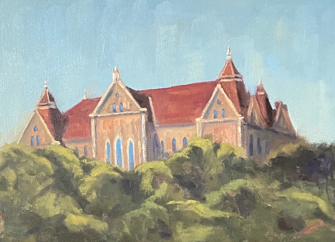
OLD MAIN – TEXAS STATE | 9 x 12” | Oil on Canvas Board
I’m a fan of wandering university campuses, both in the US and abroad, in large part because they’re often home to intriguing architecture, beautiful grounds, and chock full of history. Some do it better than others. For example, the University of Texas is by many measures a great school, but let’s be honest, people don’t go there for campus aesthetics. Alternatively, wander onto the stunning grounds of the University of Colorado and you may never leave.
However, there are also a long list of wonderful colleges and universities – no, I don’t know the difference -hidden between neighborhoods and history, more notable for their pride than their size, and arguably constitute the backbone of “usable” degrees. While I’ve never spent a day as a student at Texas State University, I can say with assurity that the San Marcos campus has enough beautiful open space and intriguing buildings to make for a nice afternoon wander.
In this piece I wanted to capture the university using an iconic building… say hello to OLD MAIN at Texas State. I assume this is one of, if not the site of the original building on campus, which is a beautiful piece of architecture. I used a reference photo from the University website, but it was pretty flat in terms of lighting, yet the perspective of the composition was excellent. I opted to “wing it” with the lighting, incorporating strong sunlight that lit up the facade and cast dark shadows downstream.
Ideally this piece finds a home with a Texas State alumni, but failing that it would be well suited for a fan of architecture. I’ve been pushing my painting style to be more impressionistic, but I had to tamp that back a little with OLD MAIN so as to include the necessary details of this beautiful building.
OLD MAIN will be added to the “Something for Everyone” show at Kerbey Lane Cafe in San Marcos. Drop by for a beer, some pancakes and art!