Shoreline Park in Santa Barbara is one of those places that almost makes the cost of existing in California understandable. Stunning views of the ocean, cool breezes, and sunsets that make you say “C’mon! Seriously!”
If I lived in the area I would definitely do a number of plein air sessions at this location, but I had to settle for personal photos taken while strolling the shoreline. Interestingly, I started this piece a couple months ago, then set it aside and just didn’t get back to it for awhile. In that gap I managed to inadvertently delete my reference photo!
Turns out my bonehead move was a bit of good fortune as it forced me to work from memory and not a photo reference. Turns out I rely too much on photo details, which often distort values and hues, and it was easier to capture the essence of this scene without the distraction.
As to the composition itself, this was the first time I’d done something with such a strong sun. While it’s not meant to be the focal point, it’s the source of brilliant light that envelops the palms and makes them spectacular. From a design perspective, I wanted to incorporate some strong contrasts between the tops and bottoms of the palms, whereby the tops were more painterly and softened, while the bases were structured and crisp. The intent is to have the viewer drawn to the center of the palms bathed in sunlight, but then move up and down the trees to see the different light effects.
Lastly I’ll note the intentional exclusion of people, picnic tables, cars, and other such signs of humanity. Sometimes that’s done because I’m lacking motivation (or skill) to tackle those details, but in this instance it’s a nod to Santa Barbara as the source of Earth Day, which was started here way back in 1969.
3 BOATS ON CASCO (study) | 5×8” | graphite on paper
Figuring out why a composition is failing can be a real challenge at times. If the painting fundamentally sucks, I know it’s a lack of talent or experience on my part. Sometimes, however, it just doesn’t look right. It’s on this latter front that I often find myself with boats.
Granted, I don’t have extensive experience painting seascapes that highlight boats. They’re tricky and I believe lots of practice is the key to get the blizzard of weird angles, maddening levels of detail, and the reality that they move constantly, even when anchored, working in concert as a composition.
Last week I did a short plein air session of boats – it was a total failure, although the outing itself was great time spent on the coast. I decided to try drawing the same scene in the studio to see if I could figure out the issues. As it turns out, this small study solved a lot of problems, of which there were 2 big ones.
First, the viewing angle was too steep, meaning it works better with a more horizontal perspective. The painting I had done was simply too aerial, probably in part because I was standing on a pier and secondly it was low(ish) tide, so everything was below my line of sight.
Secondly, the composition included something very unusual, namely Fort Gorges, which is literally a Civil War era fort seemingly floating around in Casco Bay. It’s an iconic part of the Bay for those who know Portland, Maine, but for those “from away”, it’s basically a big ‘ol WTF part of the horizon. It’s made all the more confusing to the uninitiated because it has a tree filled square in it’s center, which makes Fort What-the-Fuck even more awkward with what looks like a Jolly Green Giant broccoli patch springing skyward. How does one work that convincingly into a composition. NOBODY!
Upon realization that Fort WTF needed to be ignored, aka artistic license, the final version of the drawing was complete. Note that in the pictures there is a before and after version to show the impact of using a drastic design decision to make the composition work. Whaddya think?
UMBRELLA IN SHADE (study) | 5×8” | graphite on paper
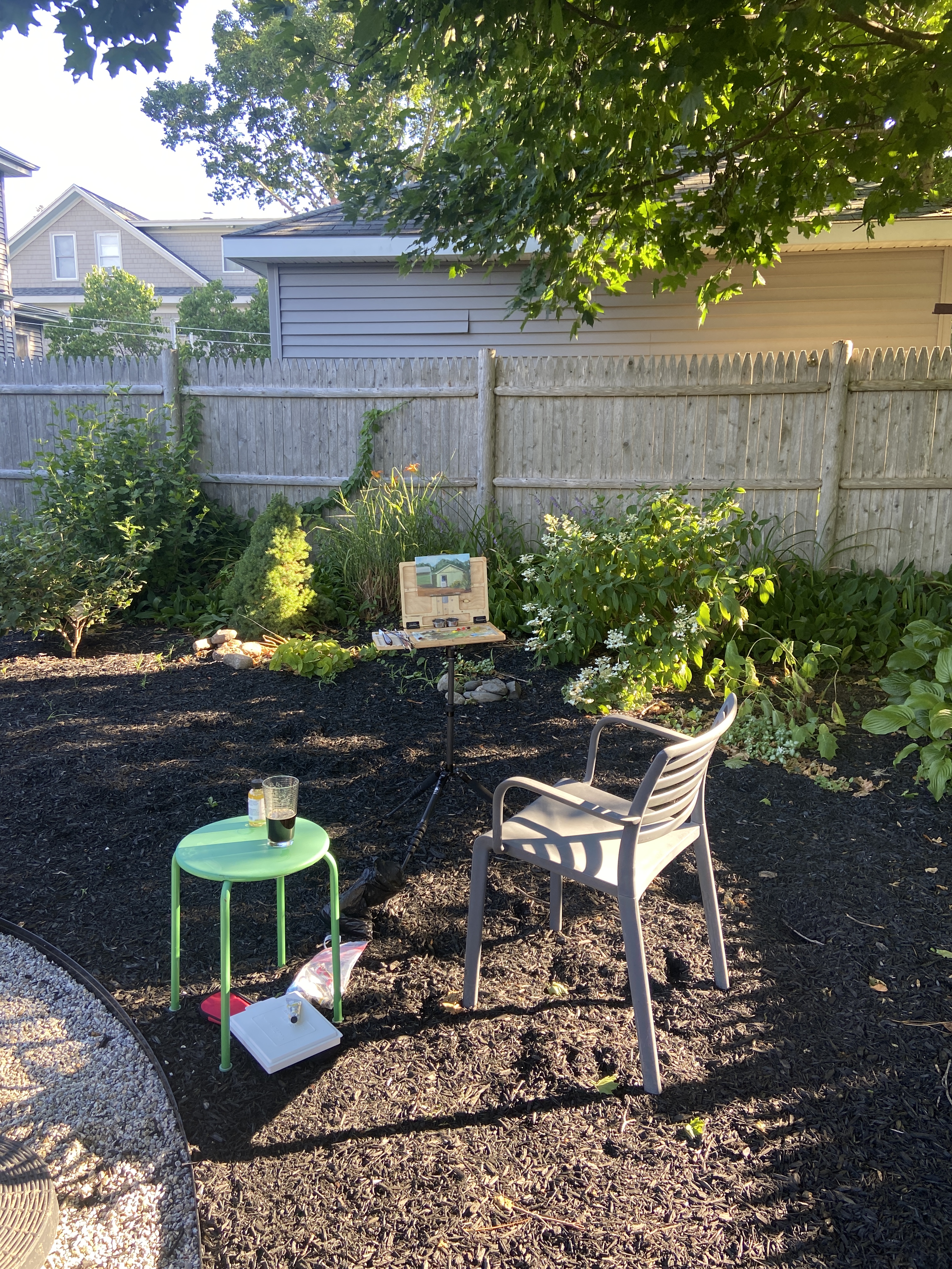
This is a plein air sketch from my rental backyard in Maine, which has a big, red umbrella as well as a massive oak tree for shade. At certain times of day the umbrella gets shaded by the oak tree, which creates a neat value contrast underneath. While I didn’t get the pass through lighting just right, its always satisfying to get an object like an umbrella properly drawn.
On a compositional note, I definitely will look to do a future painting of an umbrella from this underneath perspective. I really like the mystery it creates whereby the viewer has no idea what’s happening on the table, or even in the background below 3 or 4 feet. Oddly enough, the lack of a “bottom” seems to continually redirect me back into the composition. Does it work that way for you, too?
This study doesn’t make the cut for a “real” painting, but it was fun to draw, so perhaps I might try another angle one day soon. In the meantime I’ll keep an eye out around town for a bright, colorful patio umbrella for a proper painting effort.
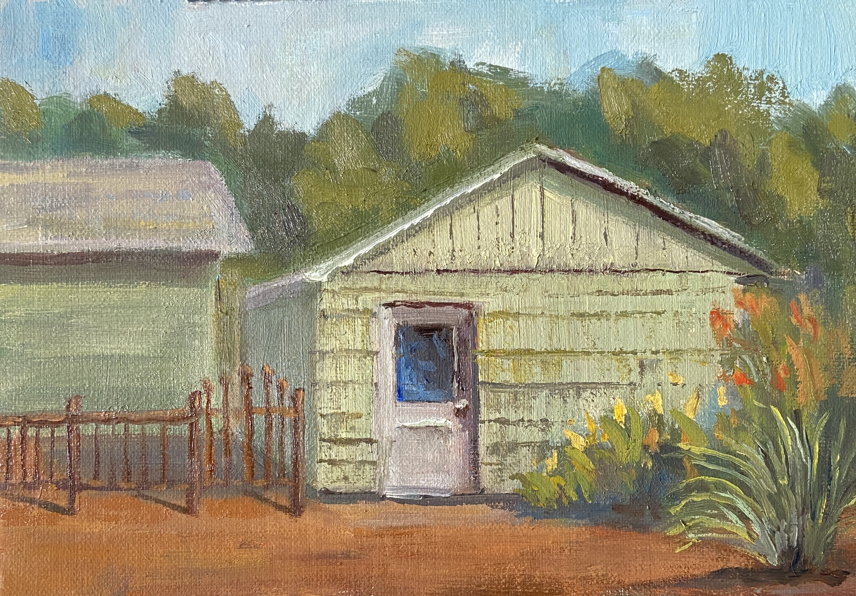
Greetings from South Portland, Maine! Plein air sessions in the July Texas heat aren’t exactly an inspirational setting for creativity, so this piece is brought to you by the cool breezes of the land of 75,000 moose.
This garage was painted over the course of 3 short sessions in the mid/late afternoon. The shadows created by the sun really make the garage door pop, so I wanted make that the clear focal point without making the white to prominent. The final solution was to tweak it so the black window of the door was the primary focus, using the high contrast in values with the white door as an easy viewing vortex.
In terms of the other elements, a lot of artistic license was taken to pare down the details and keep things simple. That said, it was important for me to include the iron fence and the color of the garage. The fence because the ironwork is very eye catching given the design. As to the green hue of the garage, while I’ll admit it’s not my preferred color, I wanted anyone who’s seen this house and garage to instantly recognize it as “hey, it’s that green garage!”
Lastly, I made a decision in the final minutes of painting, after having thought I was done, which significantly improved the finished piece. Because I don’t have a before and after shot, I can only describe what I did, which was to add the high contrast “rows” on the garage, then scraping down to give the sense of textured panels. I was pretty sure the move was going to muddle the whole thing, but as it turns out it was a vast improvement. I must learn to be much aggressive when painting and this sessions went a long way in validating that approach.
I’m privileged to be included in another group show at Art for the People Gallery in Austin! I’ll have two pieces in the show, FISHERMANS POINT and SMOKY ON ICE. I’m especially stoked at this opportunity because these pieces showcase two very distinct painting styles, namely landscape and still life.
The show runs June 7th – August 17th, 2024, opening reception NEXT SATURDAY, June 8th, 12-4pm CDT at the new location of Art for the People Gallery in Austin, Texas.
Note that the Art for the People Gallery has moved locations and is no longer on South 1st street. They are part of Good Dad Studios located at 2801 S. I-35 Frontage Rd. Good Dad Studios is Texas’ largest artist complex, which means they have a lot of artist studio space, and within the facility are galleries and other businesses, one of the most notable being Art for the People Gallery.
Reach out if you have any questions, or better yet go to the gallery and check out all the art.
GOING, GOING, GONE! | Triptych | 10×16” | Mixed Media on Wood
Sometimes things don’t go to plan. Bob Ross had a phrase for this in the art world, “happy accidents”. What dear ol’ Bob didn’t clarify was that sometimes the plan goes to shit before the painting begins!
GOING, GOING, GONE was supposed to be 3 square panels of equal size, the only progression being the artwork itself. However, before planning the composition I hadn’t verified the existence of 3 identical panels in my studio… AFTER having painted the middle panel, i.e. “GOING”. So rather than being the patient, pragmatic person who pauses the artistic process and acquires 2 additional identical panels before proceeding, I searched my studio for the next best option! It’s hard to tamp down unbridled excitement for starting a piece of art, so I’ll give myself a little break in that I was ready to get this thing moving without delay!
Turns out I was having a Bob Ross moment. The triptych, while unconventional, proved to be very effective in terms of turning your expectations upside down. Specifically, the pint of beer is drunk down over 3 stages, whilst the side of the panels increases. I’m sure the experience isn’t universal, but my senses get upended a little as I digest the 3 panels and have to do a double take because the detail, values, and saturation decrease as the panels dramatically increase in size. I hope it has the same effect for you, otherwise it might be a little boring.
As to the mixed media approach, I simply wanted to build on my recent foray into this technique. I suppose this could be done quite effectively with standard oil painting, but there’s something fundamentally different with the texture and chalky finish of spackle and acrylic paint that makes these artworks stand out from a crowd. That said, I think these pieces are like saltillo tile – you either love it or hate it – but either way you can appreciate its unique nature.
Lastly, I’m excited to frame this triptych, although I have no idea how I’m going to do it. However, I do like the vertical layout as done in the photo, which is a little different spin on the typical triptych layout, but it also forms the shape of a pint glass… so there’s that.
Stay tuned for the final decision. Perhaps it’s a painting you’d like on your wall?
When I first started painting, the term “study” was something I did to suspicious food at a dive restaurant. Over time, I learned that “study” oftentimes meant “practice”, typically done as a trial effort before tackling the same composition on a larger scale. This interpretation is meant to allow the artist to figure out technique, color palette, and orientation of the work. Fast forward to current day, I’ve come to find that “study” can mean a brutal self-critique of a practice painting that becomes more than a mere invalidation of the compositional structure, but rather a realization that you buggered it up entirely!
Of course sometimes a “study” can magically have no serious flaws, the plaint flowed effortlessly, and all your compositional ideas worked beautifully. Sometimes.
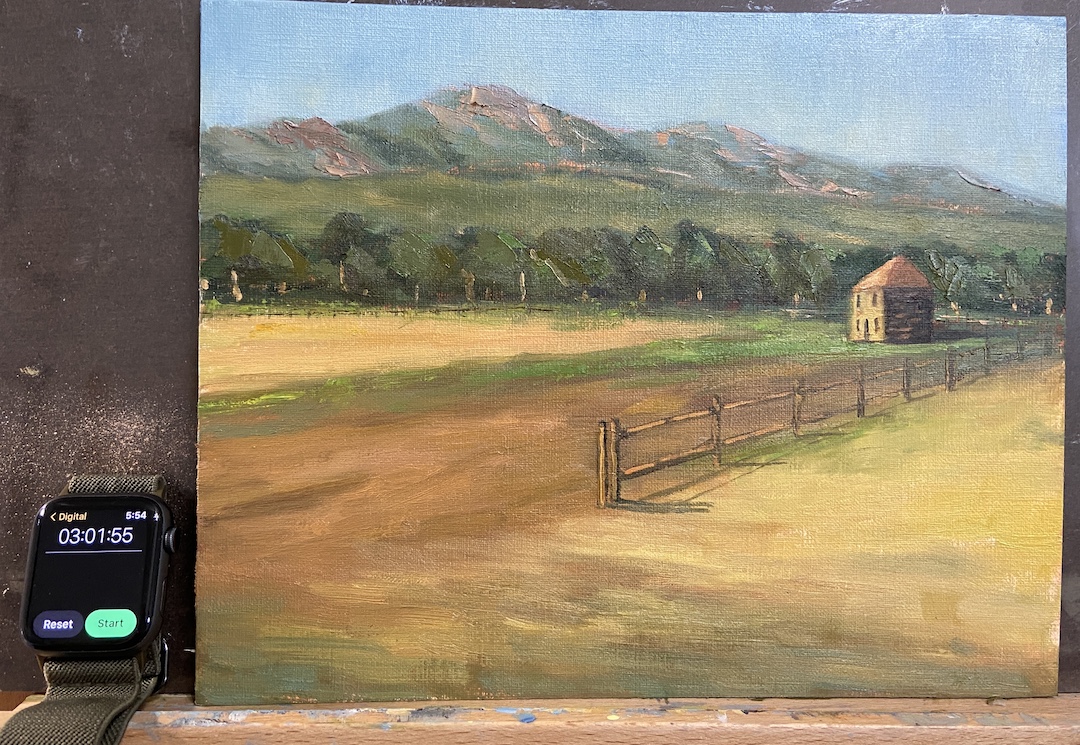
The study FLATIRON HOMESTEAD is proof that this practice has merit! That said, I like this piece because at the end of the day it was a lot of fun, the palette is pretty good, and doing a “real” painting is a likely outcome. There are progress photos per usual, but I’ve also included an annotated version of the completed study to point out the issues of which are detailed below.
This was painted from a reference photo taken by my mom during a plein air session we did last year near El Dorado Canyon, Colorado. It’s a beautiful location as you can see for miles along the Front Range with the Flatirons as the backdrop. To insert a human-made structure as the focal point of the piece felt wrong and awkward, but in the end it worked out.
I did a couple of sketches to mock-up compositional options, taking more time than I normally would, which I think proved beneficial because the core approach turned out to be much more compelling than the reference photo itself. The other key to this study was setting a time limit, which I chose to be 3 hours. The idea being to not overthink it, but give myself enough time to get the core elements fleshed out properly. This worked well because in the end I had to make major design change decisions (see fence line) quickly, focus on values over hues, and avoid the complication of detailed brush strokes.
Following is the summary of what I learned from this “study”:
1. The tree line is oddly symmetrical in terms of height. Not good! Need to change that next time and always be conscious of varying heights.
2. The fence line is a little too straight, even after the compositional decision to remove part of the fence so it didn’t cut the painting in half.
3. Light source is inconsistent. This would never happen if I painted this en plein air because it would have been impossible to ignore the sun, but drop me in the studio and things can get whacky. The sun is overhead for the flatirons and fields between the trees and the mountains, but the foreground and focal point are clearly lit by a sun that’s more on the horizon, albeit not sunrise.
4. Cast shadows of the fence line are critical and extremely effective. On a larger piece this will really grab the viewer and suck them into the painting.
5. The homestead building angles aren’t right, most likely the front side that’s lit by the sun needs to be a little less wide. This is the only real negative I found by having a time limit because I could have taken the time to repaint this part… then again, why bother if this is a “study”?
6. The highlighted tree trunks, meant to capture the high value contrast of the sunlight coming across the field, are effective and something I want to use in a larger piece, but in this study they are way too big/wide. Should have used a lighter touch with a think brush.
7. The sky color is excellent! I made an adjustment in the 2nd hour to the sky, deciding it was too blue and dark. This has been a problem for me in the past with landscapes, but I think this provides better awareness going forward, namely start lighter than I think it accurate and darken if needed.
8. The flatirons look really good, even though they’re just supporting background to the main elements. I used a palette knife to scrape the granite colors into the greens and that worked well. Need to remember that trick for future efforts.
So, that about sums it up. As you can see, you can learn a lot if you “study”!
Flatiron Homestead ReferenceBlock In – Values!Uhm… lotta greenPalaette and Values WorkingFence Line Needs Help3 Hours Limit!Final FLATIRON HOMESTEAD
If you’ve lived in South Portland, you knew the Fishing Shacks. If you don’t, please get out more and explore the wonders of your own backyard!
For the uninitiated, the last of the 3 remaining, dare I say “iconic”, Fishing Shacks were sucked into Casco Bay on January 13, 2024. Over their 120+ years, these historical structures had endured whatever the tumultuous Maine coast could throw at them, but a record tide (14.57 feet) coupled with a massive storm surge was a one-two punch they simply couldn’t withstand.
Many Fishing Shacks On Willard BeachShacks Stored Fishing Gear… Maybe Bodies 🙂Fishing Shacks With Metal RoofsReference Photo of Fishing Shacks – August 2023
Despite their absence, they leave many fond memories, a rare marriage of human structures and the natural environment which, together, made Fishermans Point a better place. As an artist, one of my primary inspirations is to return to a fond location and remember the time I spent there by recreating a view or experience on the canvas. Regarding the Fishing Shacks, my wife and I spent many happy hours soaking in the sights, sounds, and sea air on Fishermans Point, the shacks standing guard. It was, and still is, our happy place… just a little different now.
The painting (not my first of the shacks, see Fishing for Edward Hopper) is meant to capture that unique light at the end of the day when the world is bathed in golden rays and everything looks just a little more inviting. I used very little artistic license regarding the shacks themselves, as I wanted to preserve their actual structure as much as possible, including their positioning on the rocky point.
Experimenting with color to figure out the right palette for the waterZoom In Shacks
I used a painting knife and broken color on the illuminated side of the shacks to ensure they were the focal point of the work, most notably the railing leading to the first shack, guiding the viewer into the work. The use of high contrast values of the railing against the sunlit side of the shack should pull you back to that point every time you look at the piece, supported further by the diagonal cast shadows of the railing on the shack wall.
Compositionally the piece could be unbalanced and wonky, the shacks and rocky point stacked on the right side.To offset this issue, I incorporated a lot of high value, strong chroma setting sun reflection in the still(ish) blue waters on the left side. This is a relatively new compositional strategy I learned from another artist, Jeanne Hougen , who I had the pleasure of taking a class earlier this year.
Lastly, there is some hidden meaning in this composition, most notably the lack of the rocky point and the supporting stilts of the shacks in the water’s reflection. This was done intentionally and is meant to represent the physical disconnection of the shacks from Fishermans Point, but also a reminder of their powerful presence in the memories of all of us who shared time with them looking across the bay.
Reference PhotoBlock InProgress – Sky Sets ToneBright Blue Water Aint RightWorking in ReflectionsSunlight Reflection for BalanceSHACKS OF GOLD | 20×16″ | Oil on Canvas
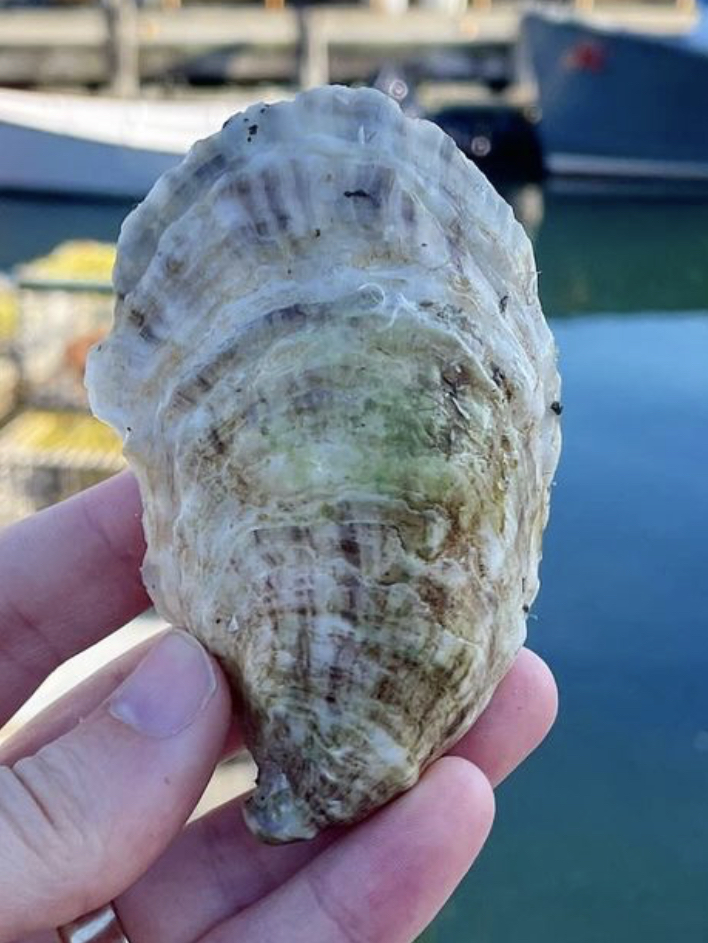
HALF SHELL STUDY | Graphite on Paper | 4×6”SOPO Seafood Oyster, South Portland, ME
East coast oysters, specifically Maine oysters, are the best in the world according to my palette. My favorite place to eat oysters is at SoPo Seafood in South Portland, Maine. In a word – AMAZEBALLS! – the food surpassed only by the charm, expertise, and knowledge of the staff.
A painting of a massive oyster shell is forthcoming, thus this study drawing. What I learned is that oyster shells have a LOT of friggin’ lines! Not something you really think about when eating oysters, but the shells are beautiful, albeit a bit on the gray side.
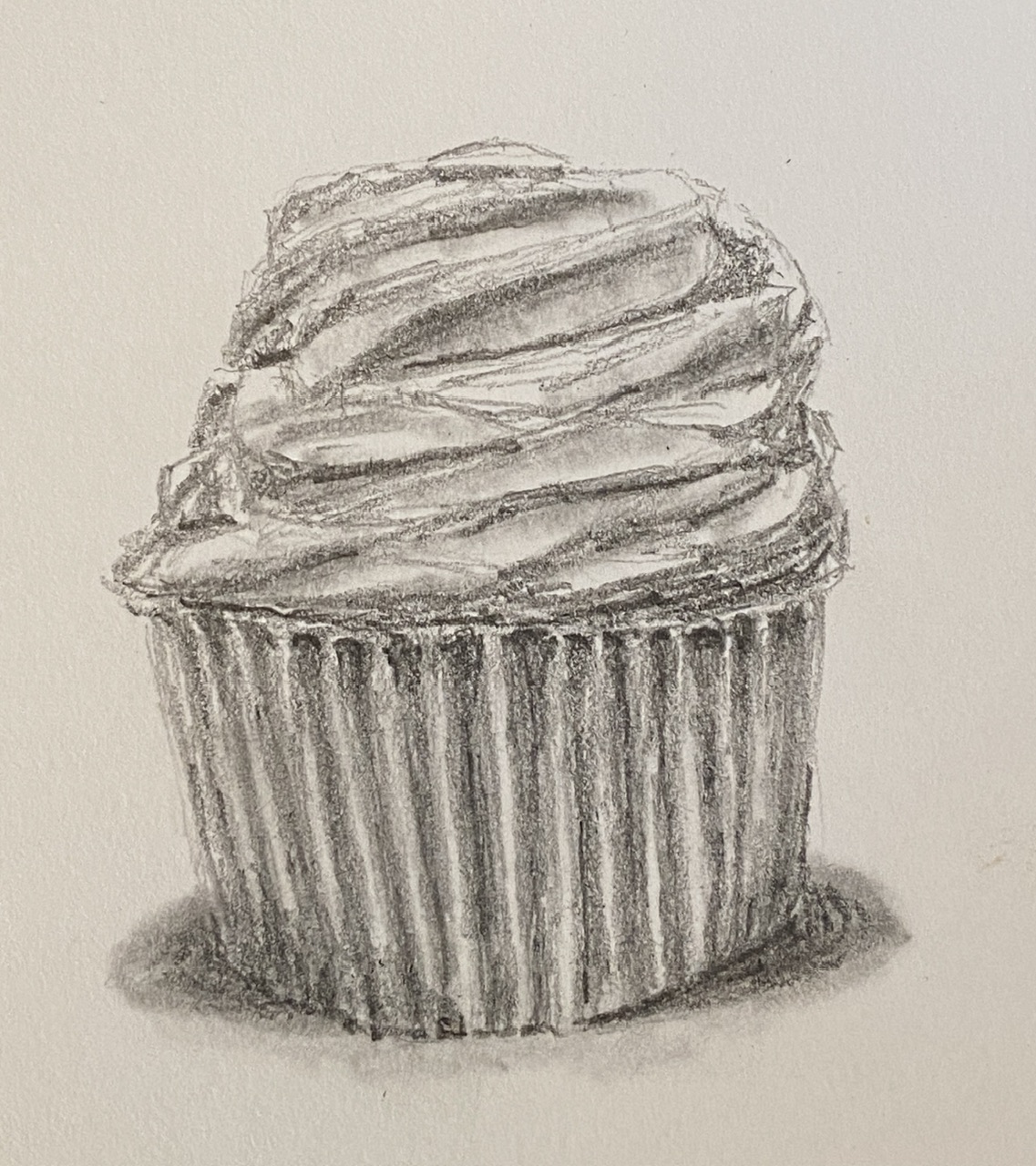
I’m going to do a new still life piece of a cupcake, but first I need to practice, because as it turns out, they’re deceptively tricky to draw. While I’ve eaten my weight in the delectable mini-cakes over the years, so I know them well, painting them I have not done. This study kinda just kept going, in large part because it was a fun challenge. While the outcome isn’t as righteously beautiful as the cupcakes from Captain Quackenbush, hopefully it still motivates the viewer’s sweet tooth.
The intention was to get a feel for how to draw (and subsequently paint) the weird geometries of icing, and how to properly shade/value the baking cups. I’m looking forward to the painting, which will probably incorporate some serious impasto elements to make the cupcake jump at the viewer and make them say “YUUMMMY!”.